
Great SaaS homepage design isn't about copying a pretty layout. It's about understanding why a specific choice converts. Here are 15 standout examples, the transferable lesson in each, and how those same principles play out in real client work.
Fifteen SaaS homepages, the design lesson behind each, and how to apply it.
TL;DR
Fifteen standout SaaS homepages, each teaching one specific, transferable design decision, not just a pretty screenshot.
Three real Groto client projects (PathwaysX, PolicyBazaar, Barista) where we applied the same principles in production.
The shared pattern: lead with outcome, show the real product, place proof next to the call to action, and say one thing clearly.
What's worth stealing from each example is the reasoning behind the choice, not the visual style itself.
SaaS homepage design gets judged fast. A visitor lands, forms an opinion about credibility and value in a handful of seconds, and either keeps reading or bounces. None of the homepages below earned their spot on this list by accident. Each one made a specific, considered decision, about what to say first, what to show instead of describe, and where to place proof, that adds up to a page a skeptical visitor actually trusts and that's built for website conversion, not just admiration. This piece breaks down fifteen examples, the exact lesson behind each, and where we've applied the same thinking on real client work.
Most "best SaaS homepage" roundups are just galleries of pretty screenshots: nice to look at, useless to learn from. This one is different, and it's worth being clear up front that a homepage is doing a different job than a splash page—it has to serve every kind of visitor, not just move one audience toward one action. Below are fifteen of the most instructive SaaS homepage examples, plus three real projects from our own studio, and for each, the specific, transferable lesson you can actually apply to your own homepage. Because the point of studying great homepages isn't to admire them. It's to understand why they convert, then steal the principle.
Before the list, a few traits show up again and again across the best SaaS homepages:
Ruthless positioning above the fold: one clear claim instead of ten hedged ones.
Real product visuals in place of stock illustrations.
Motion that adds meaning instead of just decorating the page.
Clarity that answers a visitor's question before they have to ask it.
If you want the fuller framework behind these principles, our guide on homepage design principles goes deeper.
1. Gini: adapt the homepage to different kinds of users
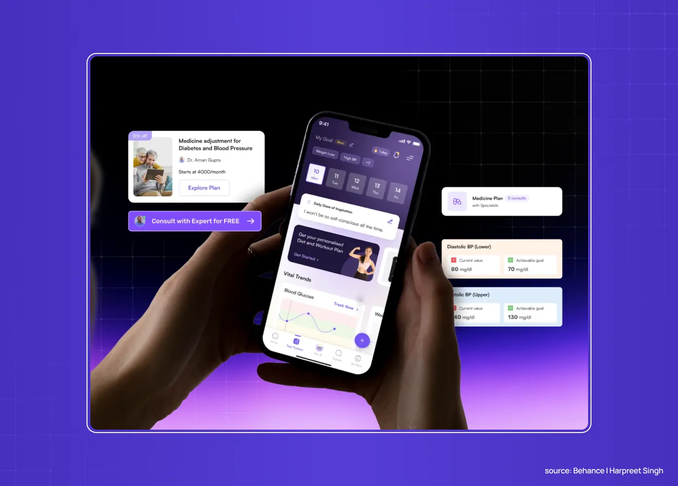
Gini's health tracking platform spans DNA insights, symptom tracking, and AI-powered food logging, three very different entry points depending on why someone showed up. We redesigned Gini's platform around exactly this problem.
Leads with one flexible value proposition instead of forcing every feature into a single hero message.
Segments the page by use case, so a visitor who came for food logging isn't wading through DNA-test explanations meant for someone else.
Uses the product's own AI-driven personalization as proof that the platform adapts to the visitor, not the other way around.
The lesson: When a product genuinely does different things for different people, the homepage's job isn't to describe every feature. It's to route each visitor to the one value proposition that matches why they showed up.
2. STBL.io: build trust for a category visitors don't already understand
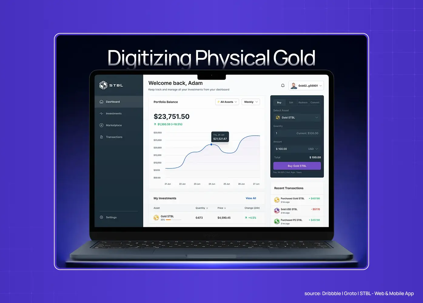
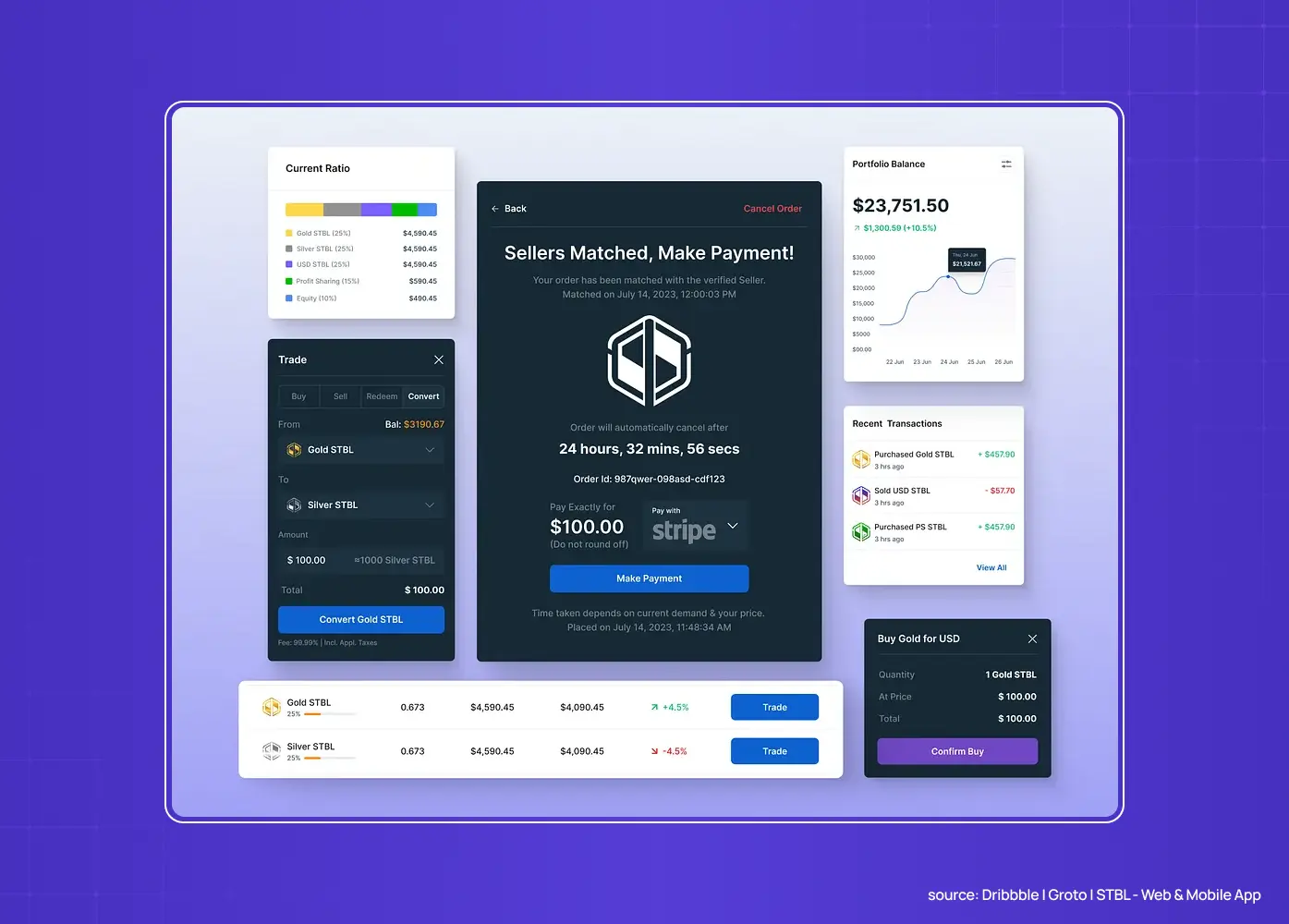
STBL.io's bullion-backed investment app entered a category most visitors had never encountered, gold-backed digital investing, and had to explain that as convincingly as it demonstrated the product itself. We built STBL.io's investment app from the ground up around this exact challenge.
States plainly what the product actually is before showing any interface, because the category itself needs explaining first.
Uses the bullion backing mechanism as the central trust signal, since it's the single fact most likely to overcome skepticism.
Keeps the path to the product simple once trust is established, instead of following credibility with a long feature tour.
The lesson: If your category is unfamiliar, spend the homepage's first move on credibility, not features. Visitors can't evaluate a feature list for something they don't yet believe is real.
3. Linear: sell the feeling, not the feature list
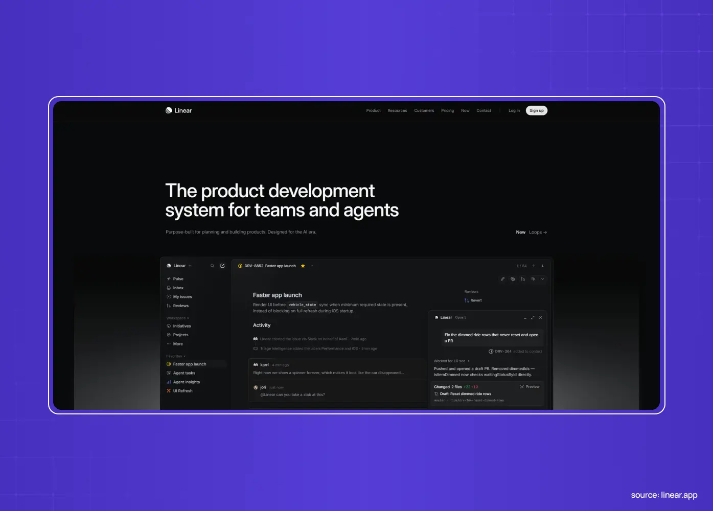
Linear is the most-referenced homepage in SaaS design right now, and for good reason.
Opens with a single line about how the product feels, fast and precise, instead of a bulleted feature list
Shows a real product clip in the hero, not a placeholder animation
Uses sub-100ms interactions, keyboard-shortcut cues, and dark mode by default, so the site itself feels as fast as the product it's selling
The lesson: Lead with the emotional outcome and let the product demonstrate the rest. Make the medium match the message. If your product promises speed, your homepage needs to feel fast too.
4. Stripe: craft as a credibility signal.
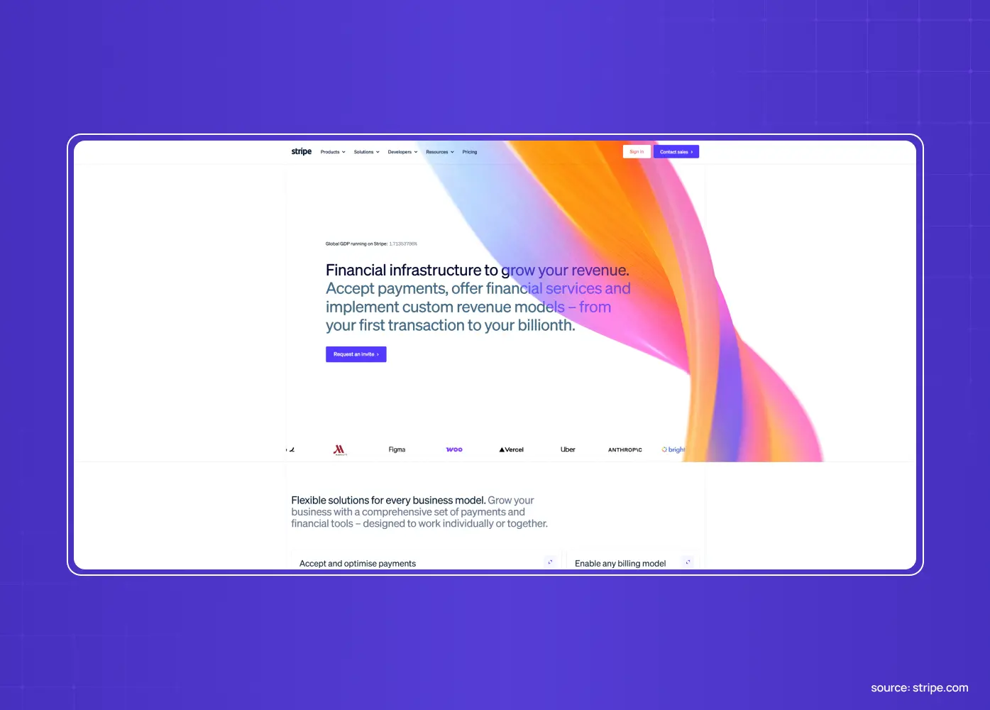
Stripe is the gold standard of homepage craft.
Gradient animation canvases and meticulous grid layouts throughout
Clean inline code tabs that speak directly to developers
Polish that signals technical excellence before a visitor reads a single word
The lesson: Visual craft isn't decoration. It's a proxy for product quality. If your buyers care about rigor, your homepage's level of polish is itself an argument.
5. Notion: make the homepage onboard the visitor
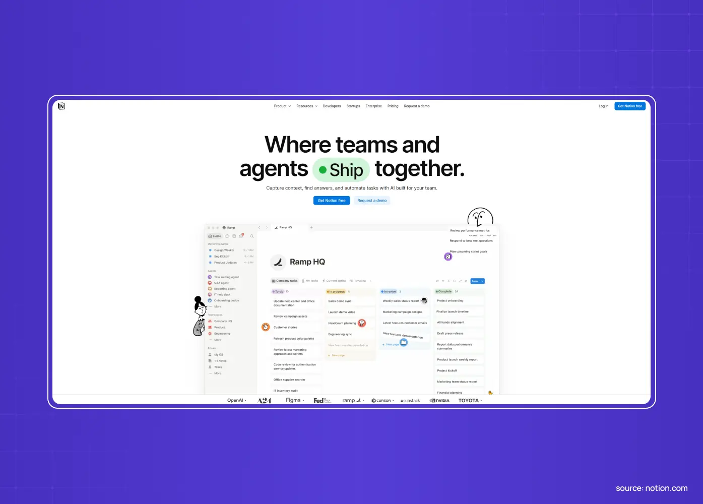
Notion uses its own product's visual language (blocks, drag handles, soft pastels) as the design system for its marketing site.
Opens with a simple value proposition and one clean action, no feature dump
Mirrors how the product actually works, so visitors understand the mental model before they've clicked anything
Functions as product onboarding before signup, not just a pitch
The lesson: Your homepage can teach the product, not just describe it. When the marketing site mirrors how the product works, visitors arrive at signup already knowing how to use it.
The Groto parallel: We used the same onboarding-first logic on PathwaysX, an AI-powered B2B hiring platform. Instead of describing the assessment engine in a features list, the interface walks a hiring manager through the same personality-based flow a candidate would see, so nobody has to guess how the product works before they've tried it. This kind of interface-first thinking is core to how we approach SaaS UX design.
6. Figma: show, don't tell
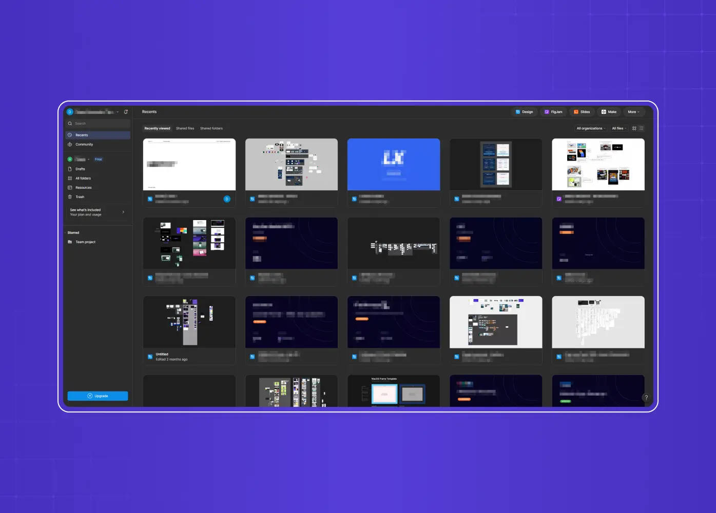
Figma embeds a live, interactive design canvas right in the hero.
Visitors get the actual product, not a screenshot of it
They can poke at it before signing up for anything
Uncertainty collapses the moment someone can touch the tool instead of reading about it
The lesson: The most persuasive thing on a SaaS homepage is often the product itself, made interactive. If you can let visitors do the core action in the hero, do it.
7. Vercel: make "what you can build" instantly clear
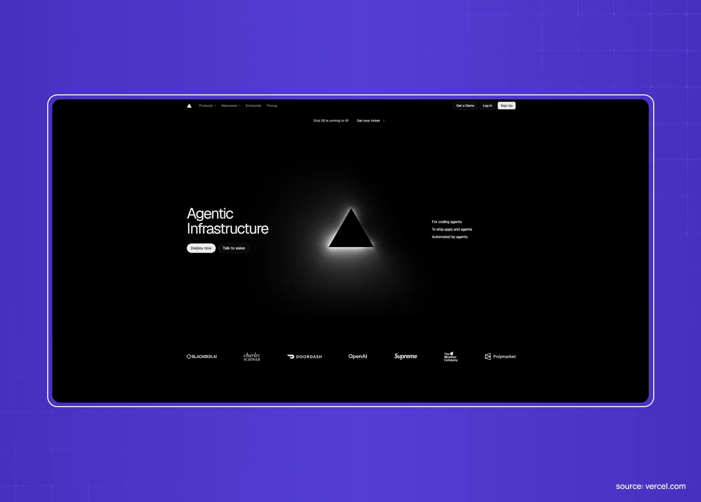
Vercel's homepage nails clarity.
Strong typography and fast loading set the tone immediately
Messaging tells visitors what they can build before explaining how the platform works
Recognizable brand logos (OpenAI, Zapier, DoorDash) stack throughout the page as trust signals
The lesson: Answer "what can I do with this?" above the fold, then reinforce with logos your buyer recognizes, on a page built mobile-first from the start since that fast-loading clarity has to hold up on a phone screen too. Outcome-first messaging plus credible proof is a reliable combination.
The Groto parallel: For PolicyBazaar, we rebuilt the mobile and web experience around the same principle: show the outcome (a faster, clearer insurance comparison) before asking anyone to trust the process. Reducing drop-offs and boosting sign-ups came down to sequencing clarity and proof ahead of the ask, the same UX strategy thinking Vercel applies to its own homepage.
8. Slack: dramatize the collaboration
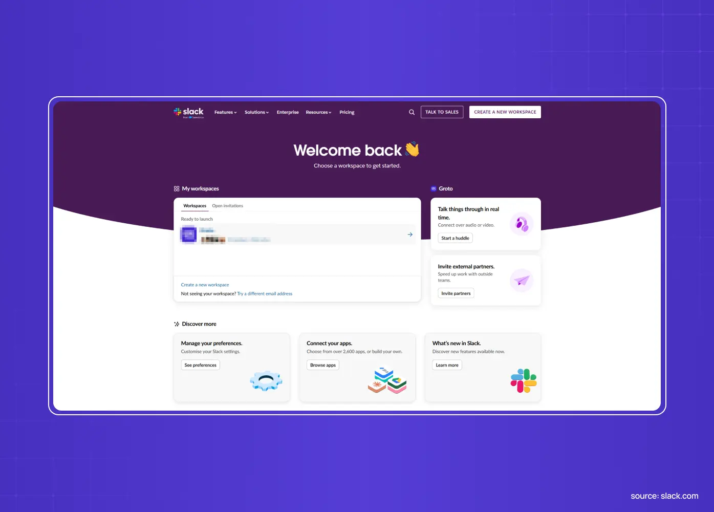
Slack's homepage brings its core value to life with motion.
Dynamic chat-bubble animations show teams communicating instead of just claiming it
Client-logo carousels and responsive layouts reinforce the collaboration story
The motion demonstrates the product's central benefit at a glance; it isn't decorative
The lesson: Use motion to demonstrate your value, not to decorate the page. Animation earns its place when it shows the product doing the thing it's for.
9. Proof: put the numbers where the doubt is
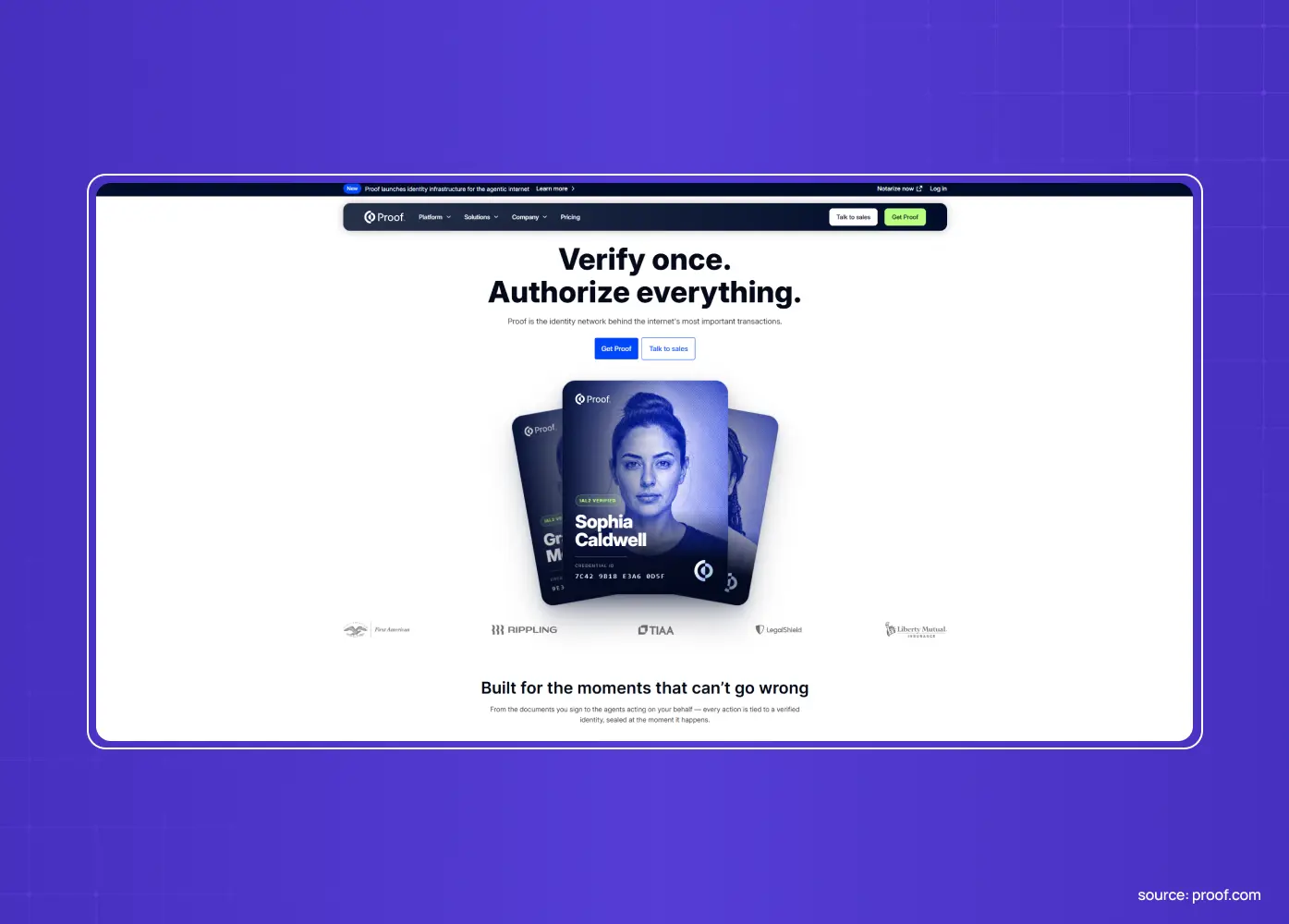
Proof leads with a benefit-driven headline and surrounds its CTAs with credibility.
Client logos, testimonial quotes, and concrete metrics sit close to the action, not tucked into a separate section
Social proof reassures visitors exactly at the moment they're deciding whether to act
Nothing about the trust-building feels like an afterthought
The lesson: Place specific, quantified proof next to your CTAs, the same conversion elements that show up again and again across high-performing pages. Social proof persuades most where the decision actually happens, not on a page nobody scrolls to.
10. Webflow: let the output be the pitch
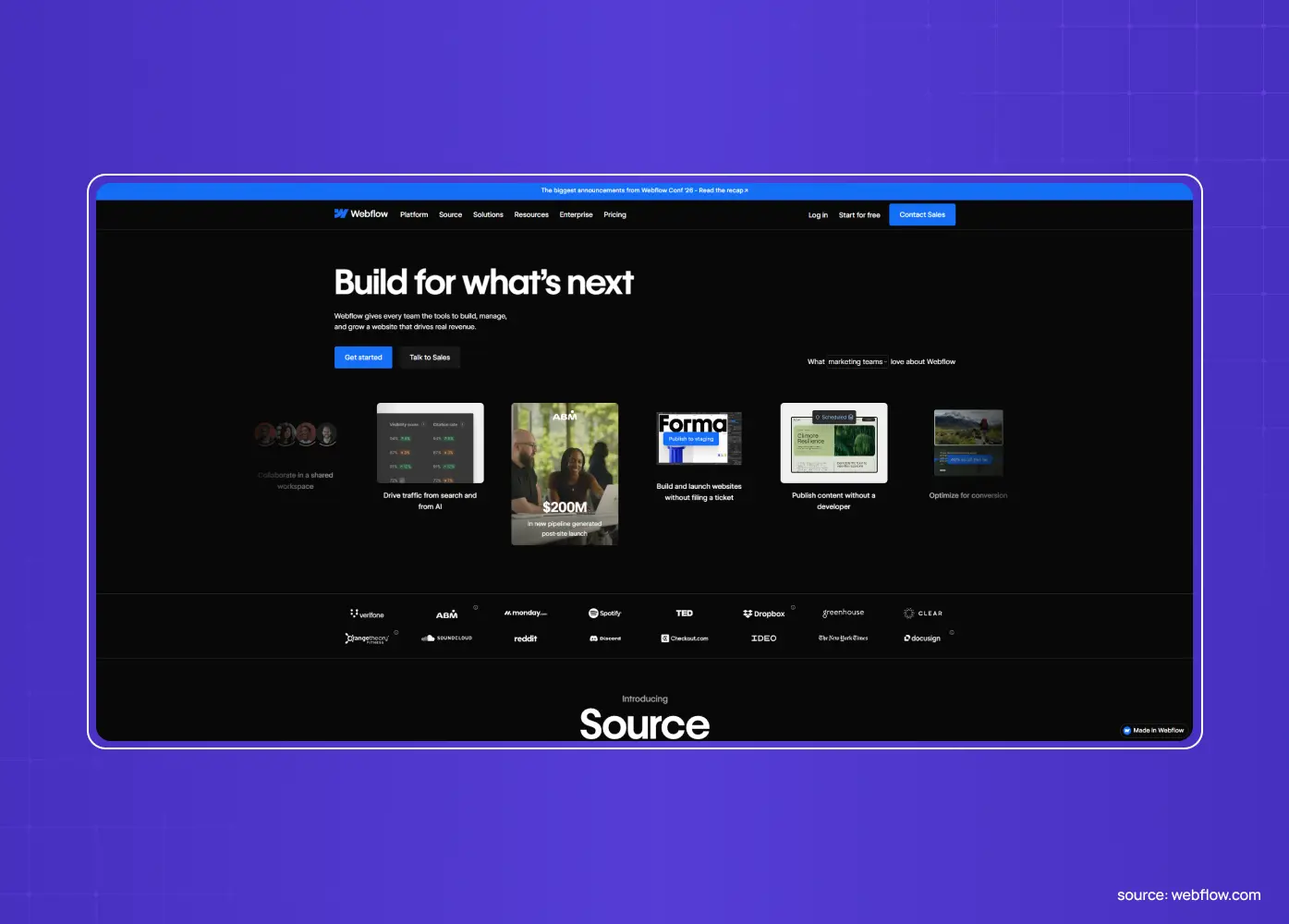
Webflow showcases what people actually build with the tool.
Real, visually striking customer sites carry the argument instead of a feature list
The product's output becomes the marketing
Visitors see the ceiling of what's possible before they've built anything themselves
The lesson: If your product creates something visible, let that output carry the homepage. Showing the best of what customers make is more convincing than describing features.
11. Superhuman: commit to one sharp positioning
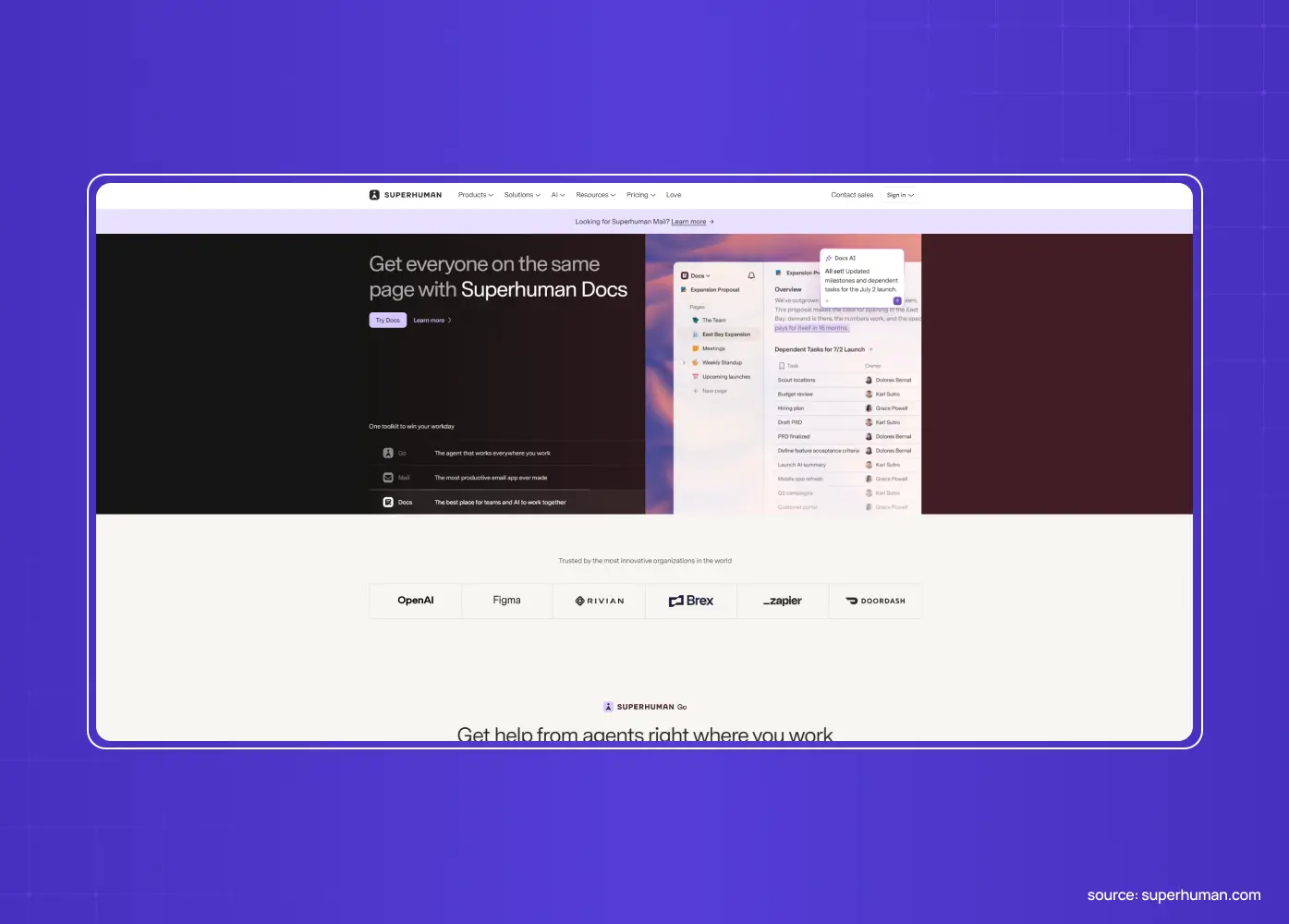
Superhuman built its homepage around a single, uncompromising claim: speed.
Skips a full feature list in favor of one narrow, confident message
Stakes out "the fastest email experience" and lets that clarity do the selling
A narrow message beats a broad, hedged one, every time
The lesson: Pick one thing to be known for and build the homepage around it. Ruthless positioning above the fold out-converts a feature list trying to appeal to everyone.
The Groto parallel: Barista needed the same discipline. Instead of positioning it as "another AI tool," we redesigned it around one idea: a PR platform that works like a teammate, not a dashboard. Clearer workflows and smarter collaboration followed from that single positioning choice, not the other way around. Getting that starting position right is usually a UX strategy decision before it's ever a visual one.
12. Loom: demonstrate the core action immediately
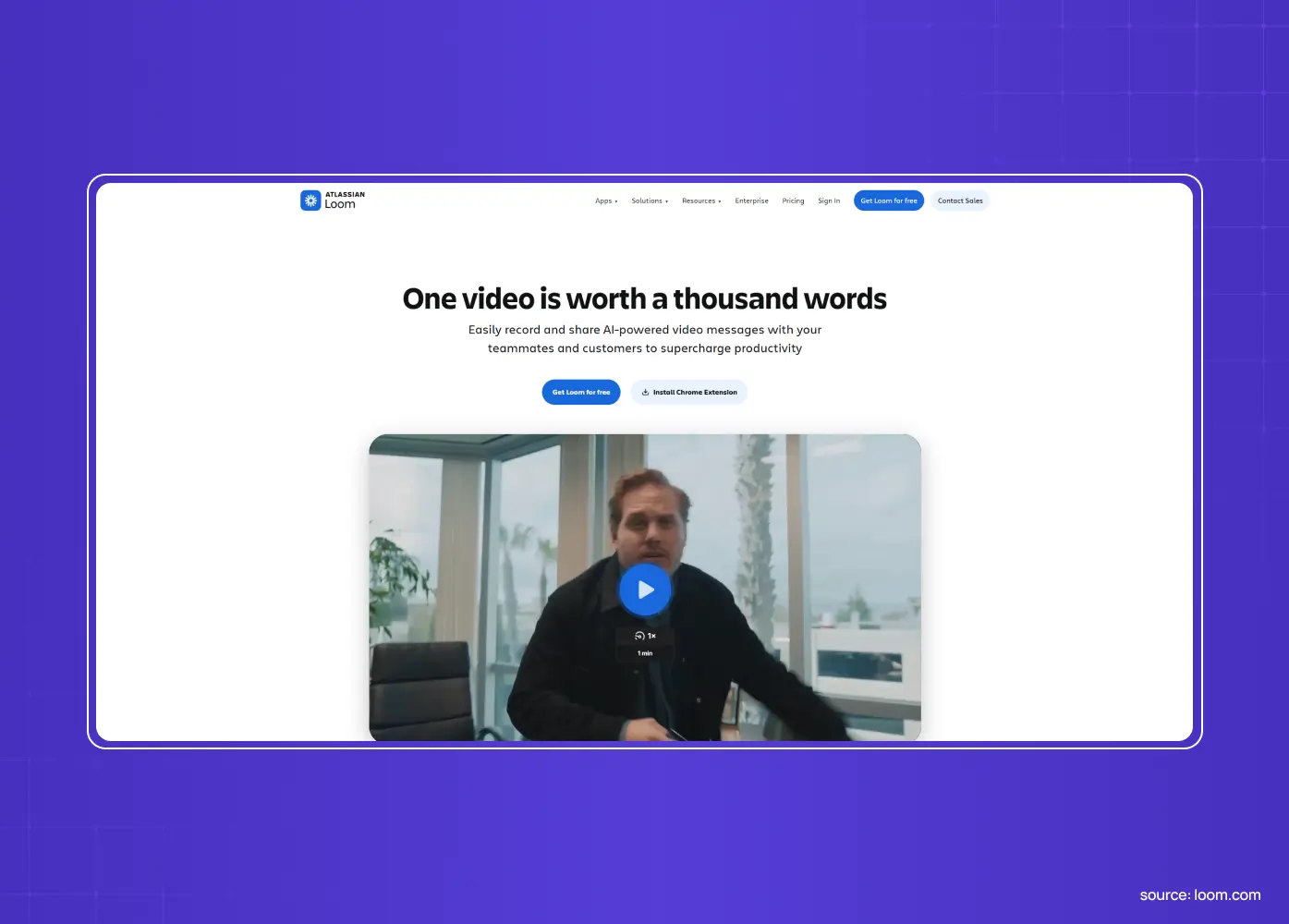
Loom, a product for async video, unsurprisingly leads with video.
Shows the product doing the exact thing it helps you do, instead of explaining it in the abstract
Skips a paragraph of copy in favor of a demonstration
Video-led pages tend to convert notably higher than static ones
The lesson: Demonstrate your core action in the medium your product is about. When the homepage performs the value instead of describing it, comprehension is instant.
13. Ramp: let one CTA carry all the visual weight
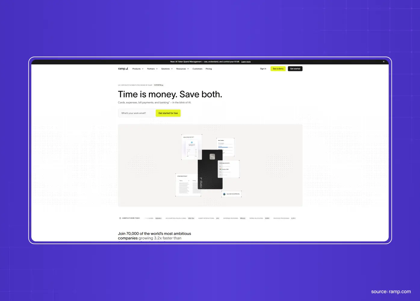
Ramp's homepage is almost entirely white, with a single bright CTA button breaking the pattern.
Nothing competes with the call to action for attention
Scrolling transitions straight into the actual product interface instead of a static image
The contrast between the restrained page and the working interface keeps visitors scrolling
Outcome metrics appear before any feature description, so the visitor knows what's at stake before reading how the product works
The lesson: Restraint is a design choice, not an absence of one. When everything on the page is neutral except the button you want clicked, the button wins.
14. ClickUp: solve a feature-heavy product with navigation, not restraint
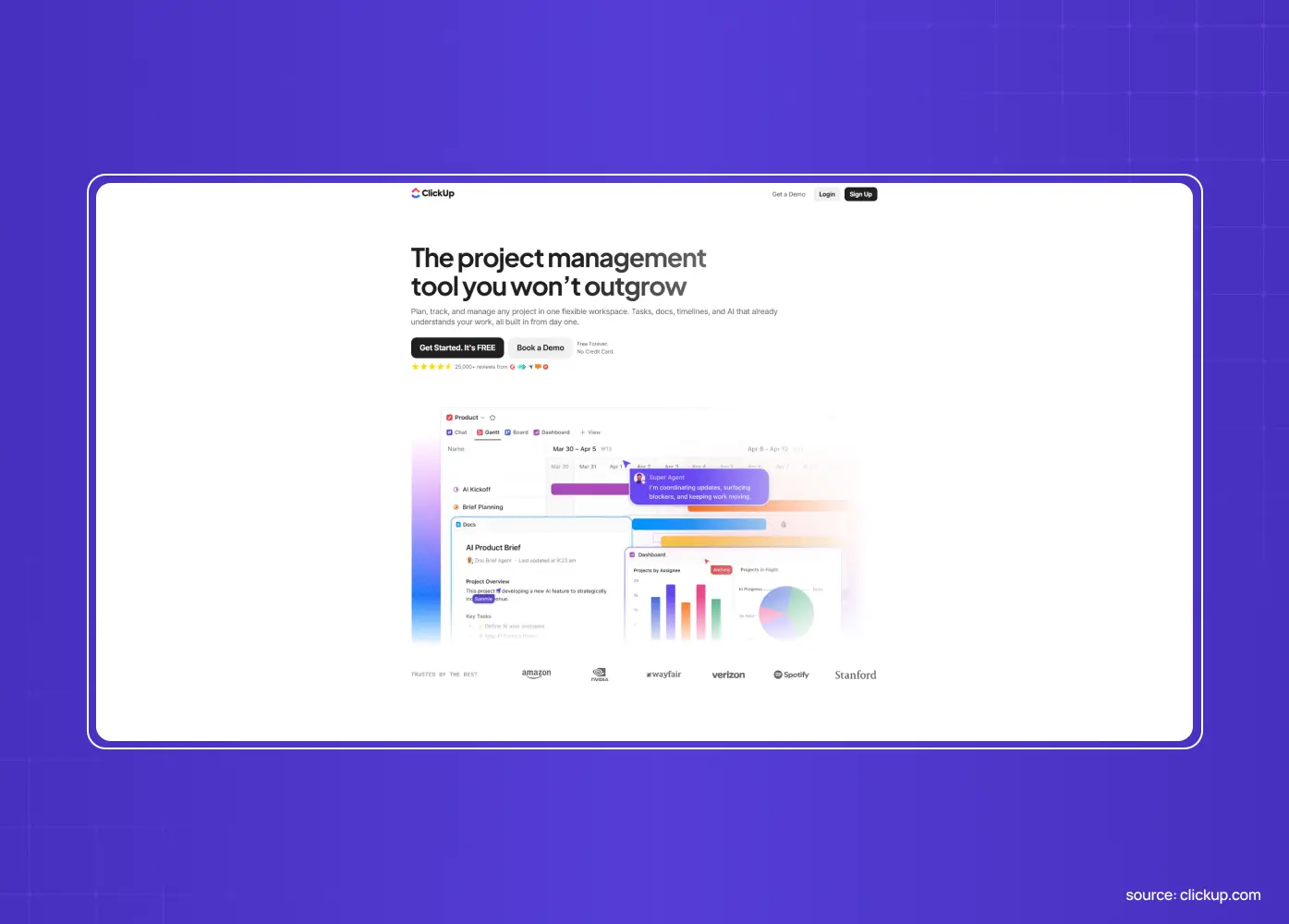
ClickUp has more surface area than most SaaS products, and its homepage is built for that reality.
A clearly categorized navigation bar lets visitors self-select into the use case that matters to them
Dedicated landing pages exist for nearly every feature and persona
The footer even includes comparison pages against competitors, turning navigation into an SEO asset
A dedicated resource hub separates educational content from the sales pitch, so visitors researching the category aren't funneled straight into a demo request
The lesson: If your product genuinely does a lot, don't force a single narrow homepage message. Build clear navigation that lets different visitors find their own way in, which is really a website structure decision as much as a homepage one.
15. Sierra: say almost nothing, and mean it
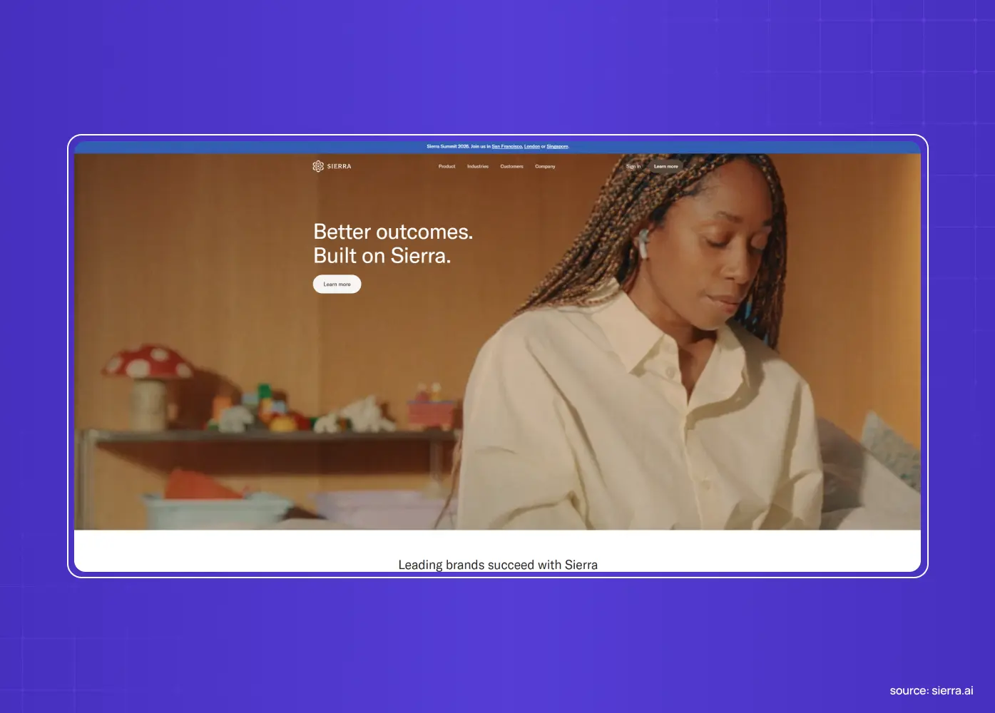
Sierra's homepage is five words of copy, one warm human photo, and a logo wall.
No feature list, no benefits section, nothing to scroll through before the point lands
A single human photograph replaces every product screenshot most SaaS homepages lean on
The restraint itself signals that the product doesn't need to prove itself to earn attention
The lesson: Confidence can be a design choice, not just a tone of voice. When a homepage says almost nothing and still holds attention, that's earned through positioning, not decoration, and it only works if the rest of your brand can back up the claim.
16. Adaline: turn the scroll into a reveal
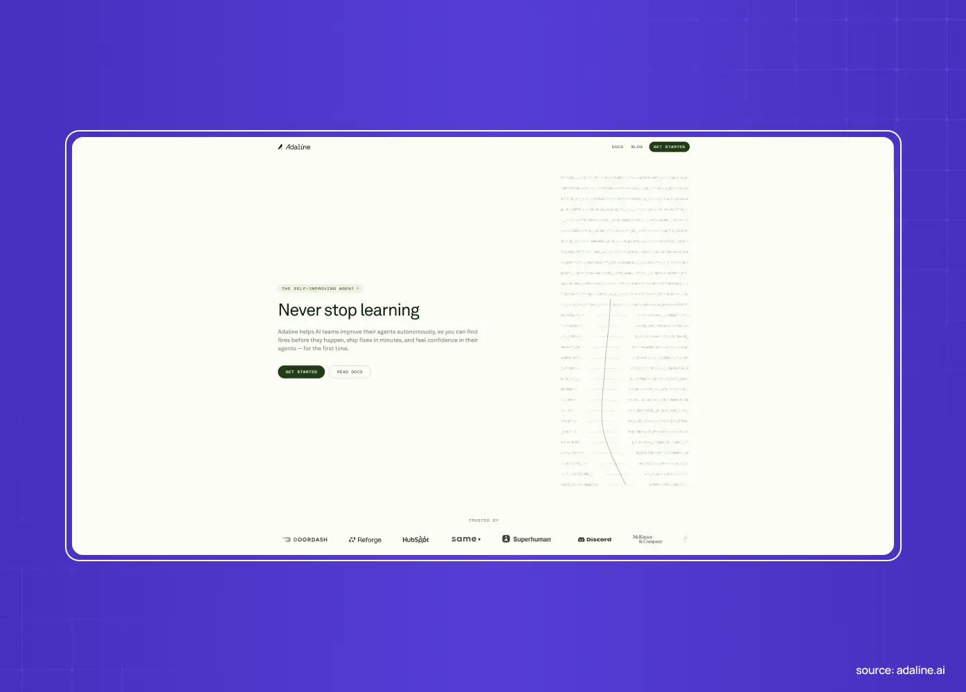
Adaline opens with a photorealistic landscape, lake, trees, mountains, filling the entire hero, before scrolling transitions straight into the actual product interface.
The nature-to-product shift creates a visual "aha" moment instead of a static handoff
Scroll-triggered transitions do the explaining that a paragraph of copy would otherwise need
The jarring contrast between the calm landscape and the technical interface keeps visitors engaged long enough to understand what the product does
The lesson: Scroll can be a storytelling tool, not just a way to get through content. A well-built transition earns a few extra seconds of attention that a static page never gets.
17. Greptile: lead the headline with a number
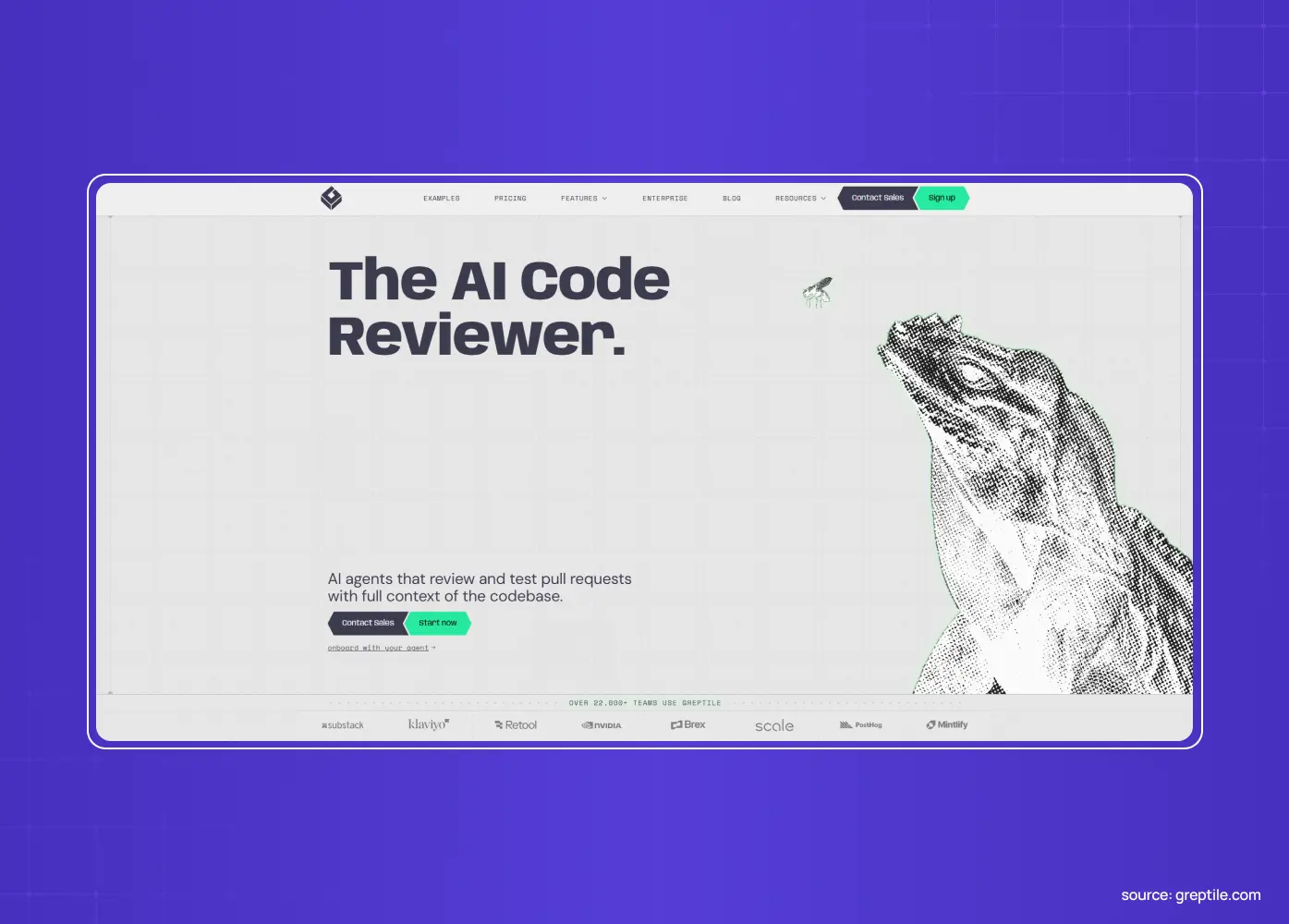
Greptile's headline isn't a claim, it's a number: a specific, quantified outcome stated as the very first thing a visitor reads.
No category introduction, no problem setup, just the exact result developers care about
The specificity of the number does more convincing than any adjective could
Everything below the fold exists to support a claim the visitor already believes, because it was stated as fact, not sold as a pitch
The lesson: If you have a genuinely strong number, lead with it. A specific outcome stated plainly is harder to dismiss than a benefit described in marketing language.
What these homepages get right
Look across all fifteen examples and a handful of SaaS design best practices keep repeating on the homepage specifically:
Outcome or feeling first, features later. Linear, Vercel, Ramp, Greptile, and Superhuman all lead with what the visitor gets or feels, not a spec sheet.
Show the real product, not stock art. Figma, Notion, Loom, and Webflow make the product (or its output) the hero.
Motion and craft with a purpose. Stripe, Slack, and Adaline use polish, animation, and scroll transitions to signal quality and demonstrate value, never just to decorate.
Proof placed where decisions happen. Vercel and Proof put recognizable, specific credibility next to the action.
Clarity through subtraction. Sierra takes this furthest with five words of copy, while most of the rest say one thing clearly instead of ten things at once. ClickUp is the deliberate exception, because its product genuinely needs the extra surface area.
None of this is an accident of good taste. These are deliberate conversion decisions, which is exactly why copying the look of a great homepage rarely works. You have to copy the reasoning, not the layout. If your team is weighing a redesign, this is usually the point where a second opinion on positioning and messaging pays for itself, before a single pixel changes.
Conclusion
Good SaaS homepage design comes down to a series of deliberate choices, not aesthetic trends:
Sell the feeling (Linear) and signal quality through craft (Stripe)
Onboard before signup (Notion) and let people touch the product (Figma)
State what visitors can build (Vercel) and dramatize the value (Slack)
Place proof where doubt peaks (Proof) and let the output pitch itself (Webflow)
Commit to one position (Superhuman) and demonstrate the core action (Loom)
Let restraint carry the CTA (Ramp) and build navigation for genuine complexity (ClickUp)
Say almost nothing and mean it (Sierra), turn the scroll into a reveal (Adaline), and lead with a number worth believing (Greptile)
Steal the principle behind each choice, not the pixels, and apply it to your product's specific value and audience.
If you want a homepage that earns its place on a list like this, designed around how your visitors actually decide and not just how it looks, book a discovery call with Groto. We design SaaS and product homepages built to convert, the core asset in most SaaS go-to-market plans, the same way we approached PathwaysX, PolicyBazaar, and Barista. Let's make yours the example someone else studies next.