

Most guides to types of websites stop at format — blog, portfolio, e-commerce. This one goes further. We map every major website category to the design requirements, success metrics, and common mistakes that actually determine whether it works.
Every website has a job. Most designs fail because they ignore it.

Most guides to types of websites are organised around format — blog, portfolio, e-commerce, splash page, news, directory — and stop there. What they skip is the more useful question: what job is this website actually trying to do, and what design requirements follow from that job?
The difference matters because two websites that look completely different on the surface — a SaaS marketing site and a lead generation landing page — can share the same conversion goal and the same failure mode. Meanwhile, two websites that look nearly identical — a SaaS dashboard and a documentation site — are doing entirely different jobs and succeed or fail on entirely different design dimensions.
This guide maps the major types of websites to the design decisions that determine whether each type works. We call this framework the Website Purpose Matrix: five primary website jobs, each with distinct design requirements, success metrics, and common mistakes that generic website builders and design services consistently get wrong — starting with the underlying website structure decisions that determine whether any of those jobs can be done well.
TL;DR
Every website has a primary job — and that job, not its format, determines its design requirements.
The five jobs are: Convert, Transact, Retain, Inform, and Engage.
SaaS companies typically need two distinct website types: a convert website (marketing site) and a retain website (product dashboard) — each requiring different design skills.
Most agencies handle convert, transact, and inform websites well. Retain websites (dashboards, web apps) require specialist product design capability.
The costliest SaaS design mistake: over-investing in the marketing site while under-investing in the product dashboard.
The Website Purpose Matrix: Five Jobs a Website Can Do
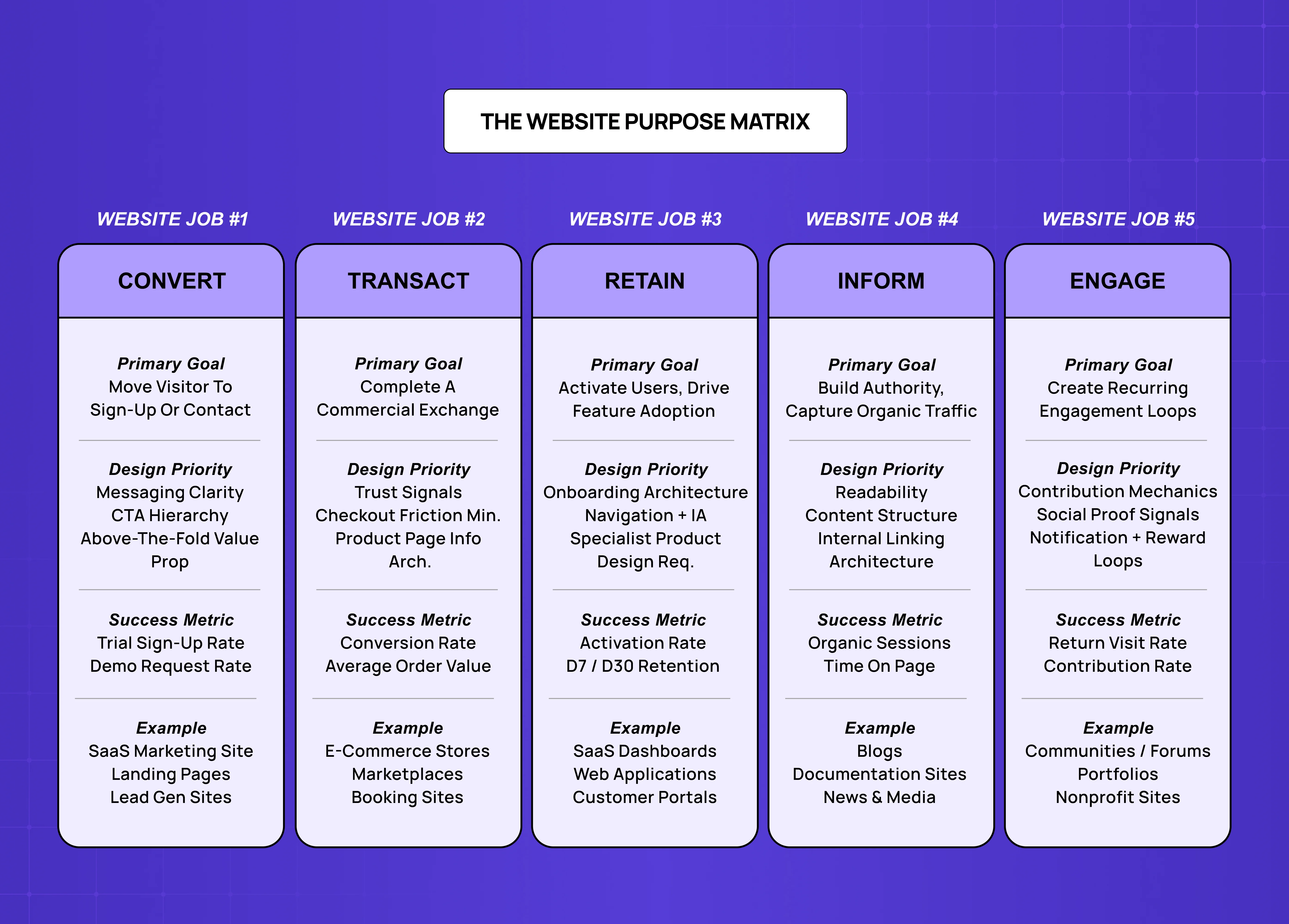
Before exploring each type in depth, it helps to see the full map. Every website is primarily trying to do one of five things: convert visitors into leads or customers, enable transactions, retain and activate existing users, build authority and capture organic traffic, or create community loops that bring people back.
Website Job | Primary Goal | Success Metric | Design Priority |
Convert | Visitor → lead or trial | Sign-up rate, demo requests | Messaging clarity, CTA hierarchy |
Transact | Visitor → purchase | Conversion rate, AOV | Trust signals, frictionless checkout |
Retain | User → active, expanding | Activation rate, feature adoption | Onboarding, navigation, information architecture |
Inform | Visitor → trust, organic traffic | Organic sessions, time on page | Readability, content structure, internal linking |
Engage | User → recurring return | Return visits, contribution rate | Social proof, notification, reward loops |
The rest of this post walks through each job category in depth — with the specific website types that fall into each, and the design requirements that determine whether they succeed.
01. Convert Websites: Where Messaging Does the Design Work
Convert websites exist to move a visitor who has never heard of you to the point of taking a defined action — signing up for a trial, booking a demo, or submitting a contact form. The action is the entire purpose of the page or site.
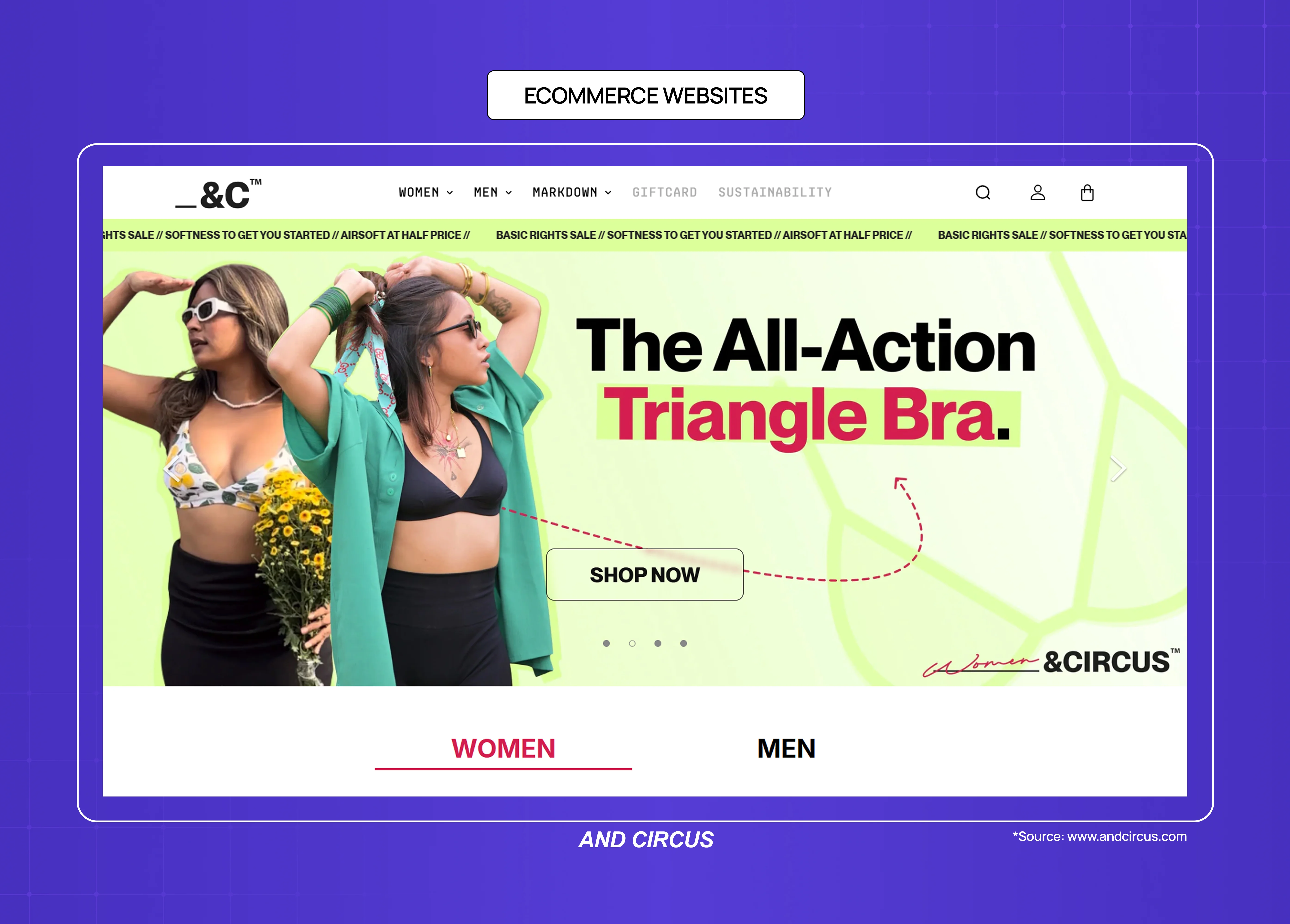
SaaS Marketing Websites
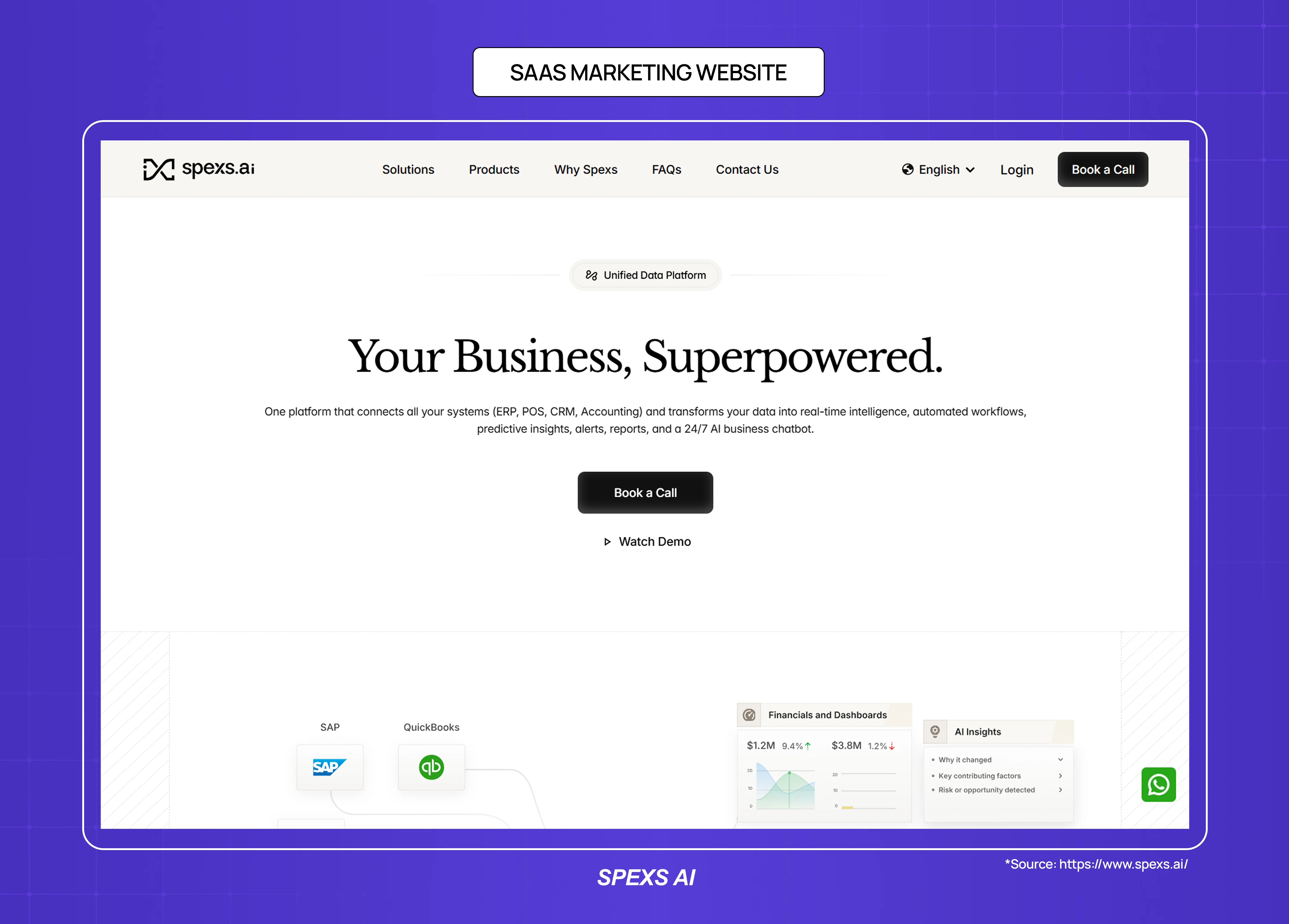
A SaaS marketing website is the primary convert website for most software companies. It covers the homepage, product pages, pricing page, and feature pages — all of which are trying to get a specific type of visitor (typically a buyer with a problem) to take one step closer to trying or buying the product.
The design requirement that most SaaS marketing sites get wrong is message hierarchy. The question "what does this product do, for whom, and why does it matter" must be answerable in under five seconds from the homepage — which is why homepage design principles are the most important single investment in a SaaS marketing site.
Most SaaS marketing sites fail this test because they lead with product capability rather than user outcome — "AI-powered workflow automation" rather than "stop losing deals to slow follow-up." The design job is to make the value proposition visible, not just present.
Primary design requirements: above-the-fold clarity, social proof placement, CTA visibility, and responsive website design for mobile performance
Success metric: trial sign-up rate, demo request rate
Common mistake: feature-first messaging, buried CTAs, social proof that appears too late in the scroll
Landing Pages
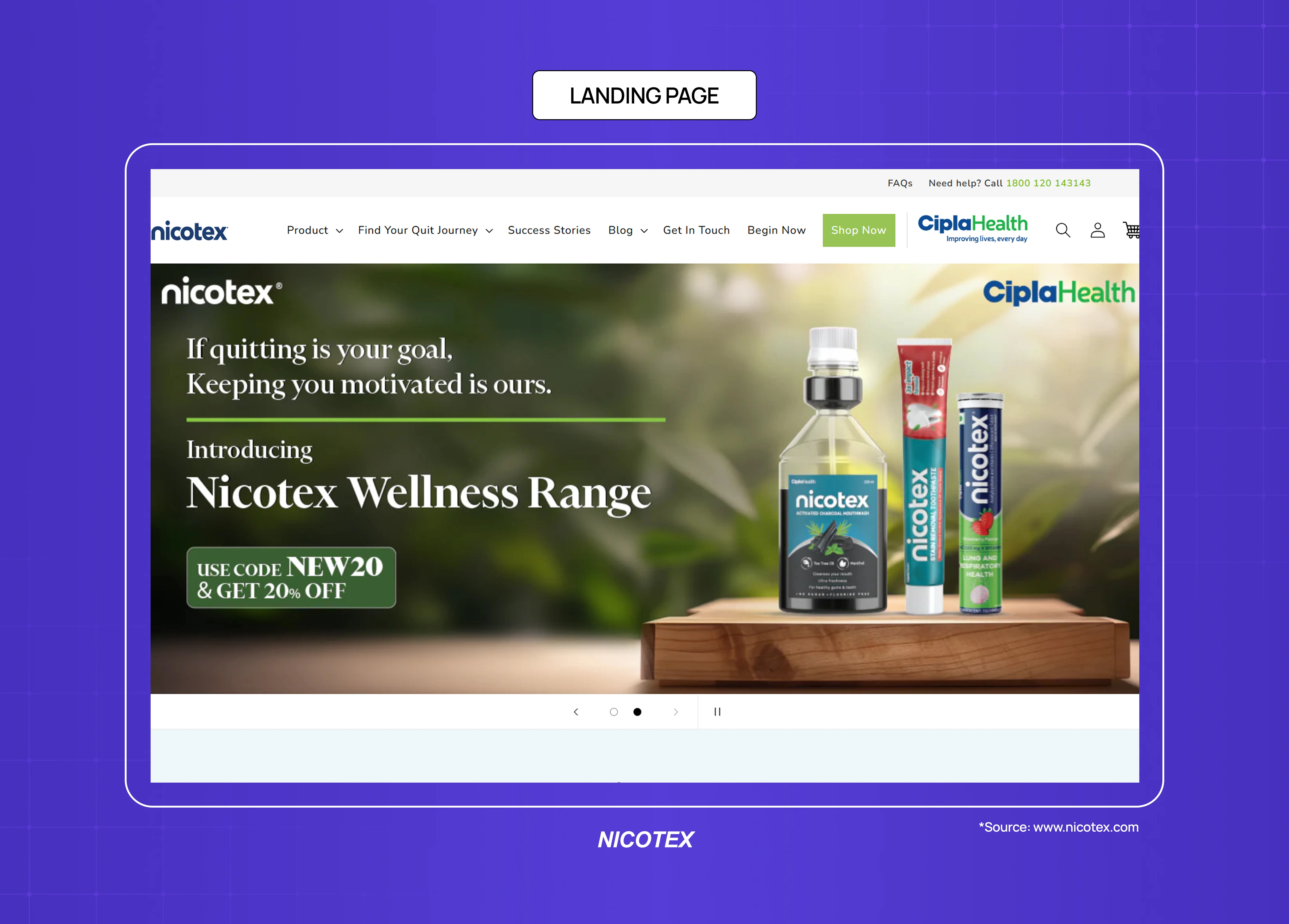
Landing pages are purpose-built convert websites stripped to a single action — the best landing page design examples show exactly how far that single-action constraint can be taken. Unlike a full marketing site, a landing page removes navigation, secondary links, and anything that could distract from one conversion goal — a paid ad click converting to a trial, an email campaign click converting to a download, a conference presentation click converting to a demo.
Primary design requirements: single-focus layout, headline-offer alignment, form friction minimisation, mobile speed
Success metric: conversion rate against traffic source
Common mistake: too many competing calls to action; page headline that doesn't match the ad or email that drove the click
Lead Generation Websites
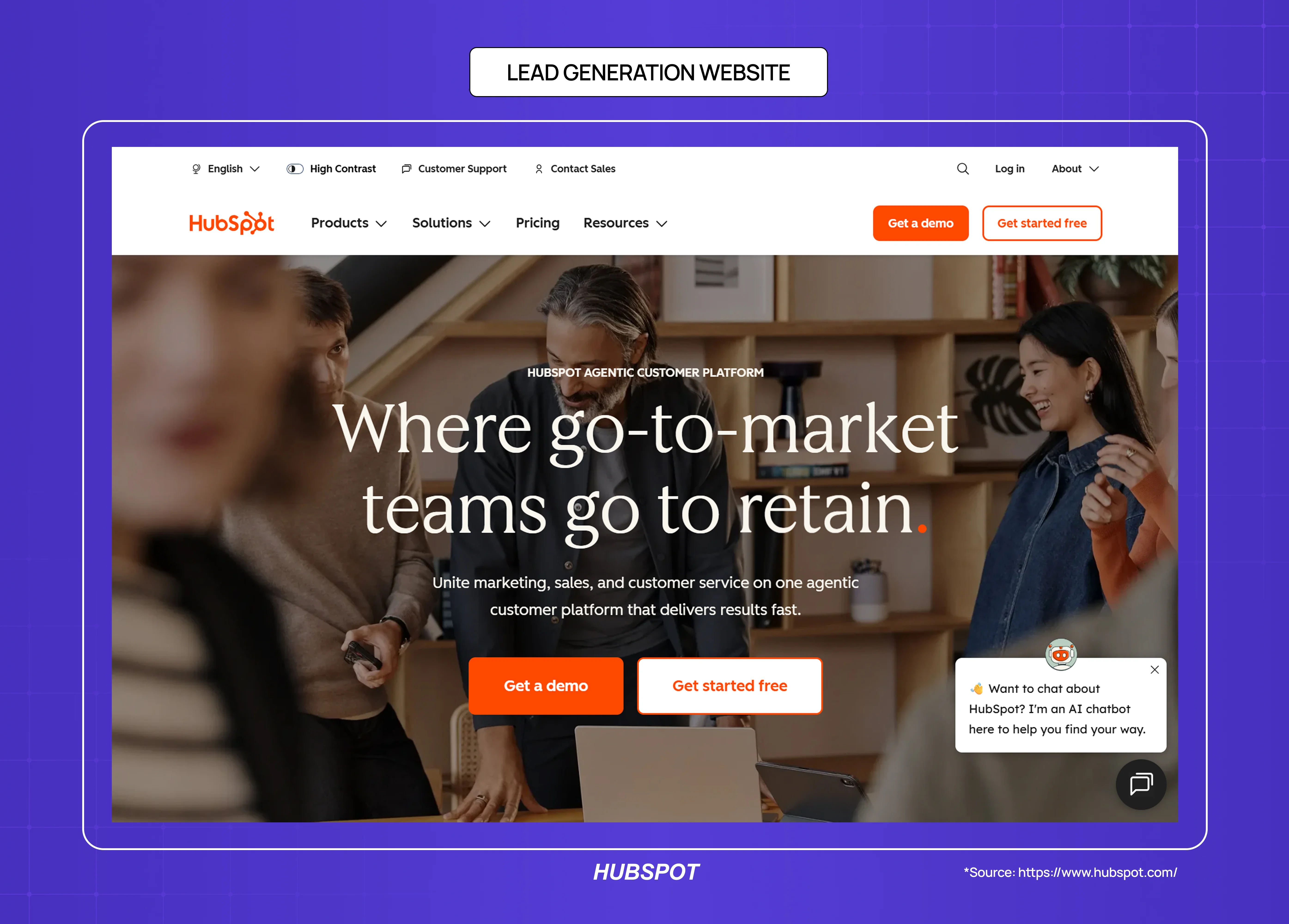
Lead gen websites are convert websites where the exchange is information rather than a purchase — a potential client fills in a form in exchange for a quote, consultation, or detailed proposal. Professional services, agencies, consultancies, and B2B companies in longer sales cycles typically operate in this category.
Primary design requirements: credibility signals (case studies, client logos, team credentials), clear expectation-setting about what happens after the form submit, minimal form fields
Success metric: form completion rate, lead quality
Common mistake: asking for too much information upfront, unclear value exchange
02. Transact Websites: Where Trust and Friction Determine Revenue
Transact websites exist to complete a commercial exchange. A visitor arrives with purchase intent, and the website's job is to convert that intent into a completed transaction without introducing enough friction, doubt, or confusion to cause abandonment.
E-Commerce Websites
E-commerce is the most studied transact website type, and the design research is consistent: the primary variables in conversion are trust signals (reviews, return policy, security indicators), page load speed, and checkout friction (number of form fields, guest checkout availability, payment method options).
The underappreciated design dimension in e-commerce is product page information architecture — the question of how much information a buyer needs, in what order, to make a confident purchase decision. A product page that buries size information or hides shipping costs creates abandonment at the decision point, not the checkout.
Primary design requirements: product photography, review placement, size/variant clarity, mobile-optimised checkout, page speed
Success metric: add-to-cart rate, checkout completion rate, return rate
Common mistake: slow product image loading, surprising costs at checkout, unclear return policy placement
Marketplace Websites
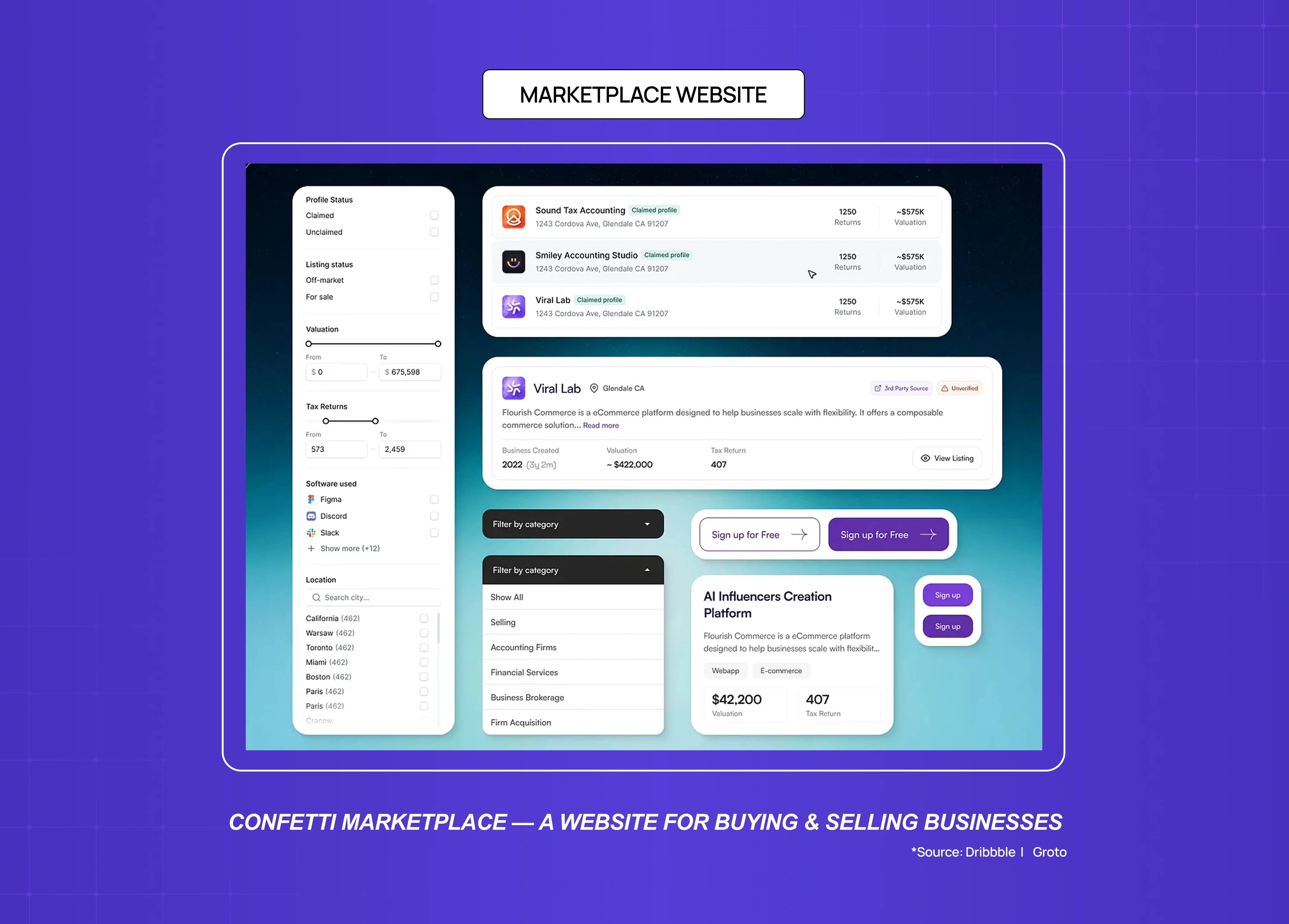
Marketplace websites are transact websites with a supply and demand structure — the website doesn't own the inventory but connects buyers and sellers. The design problem is structurally harder than standard e-commerce because trust must be established in both directions, and quality signals are highly variable across listings.
Primary design requirements: search and filter architecture, trust signals for sellers (reviews, verification, response rate), comparison-enabling layouts
Success metric: search-to-booking/purchase conversion, repeat transaction rate
Common mistake: search results that surface irrelevant listings, insufficient seller trust signals
Booking and Appointment Websites
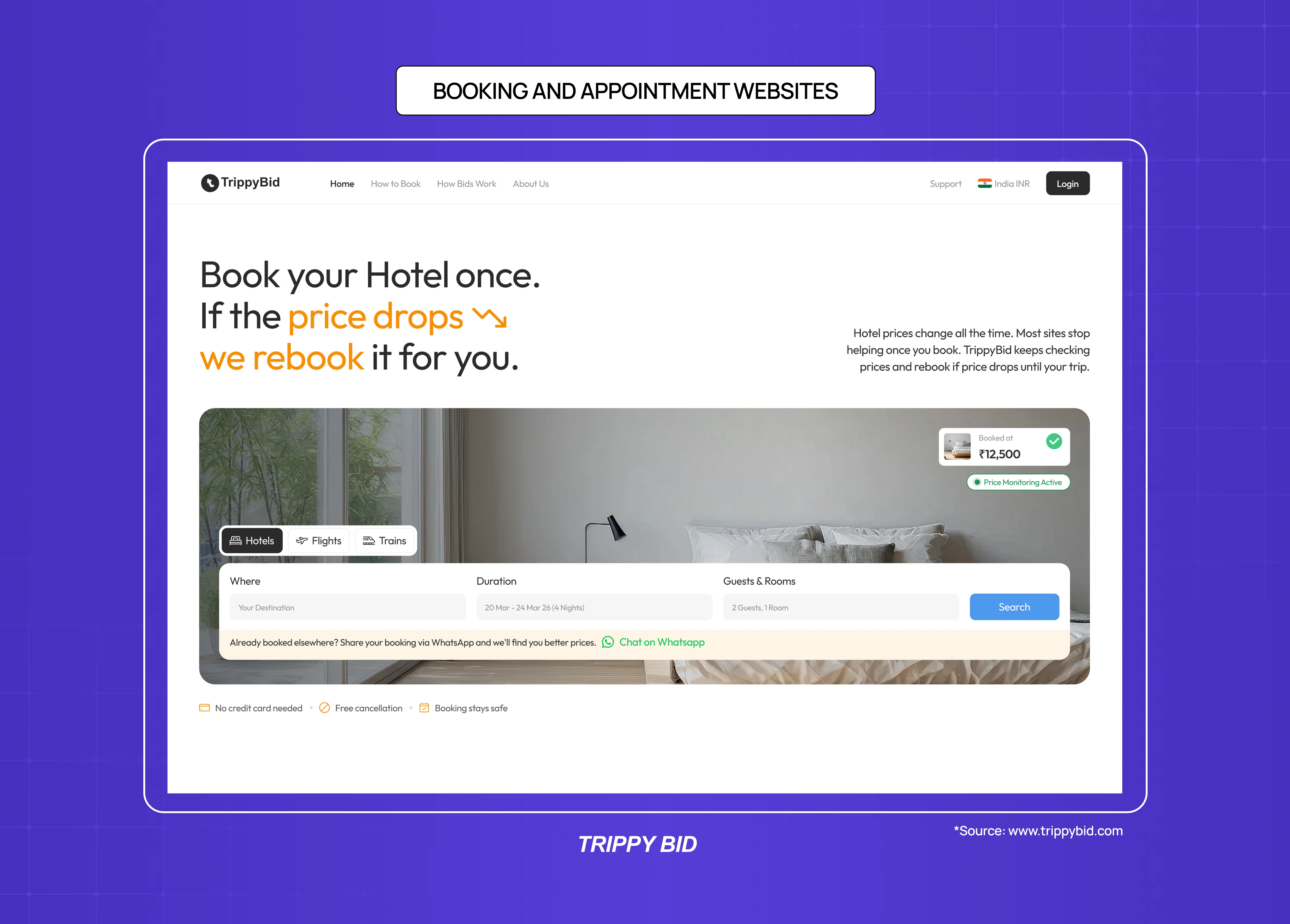
Booking websites (for services, experiences, reservations) are transact websites where the purchase is time rather than a physical product. The primary design challenge is representing availability, managing booking logic, and reducing the cognitive load of calendar-based decisions.
Primary design requirements: availability calendar UX, clear pricing for time slots or service types, confirmation flow clarity
Success metric: booking completion rate, no-show rate (a proxy for booking confidence)
Common mistake: overcomplicated availability display, unclear cancellation terms at booking point
03. Retain Websites: The Website Category Most Agencies Can't Help With
Retain websites are the category most often confused with other website types — and the category where generic design services consistently fail. A retain website is a logged-in product: a SaaS dashboard, a web application, a customer portal, or an internal tool. The user is already a customer. The website's job is to activate them, keep them engaged, and help them find value fast enough to stay.
This is a categorically different design discipline from marketing creative or graphic design — and it changes how you should think about how to choose the right web design agency. Retain websites require UX research, information architecture, onboarding flow design, and an understanding of activation metrics — none of which are offered by marketing design subscriptions.
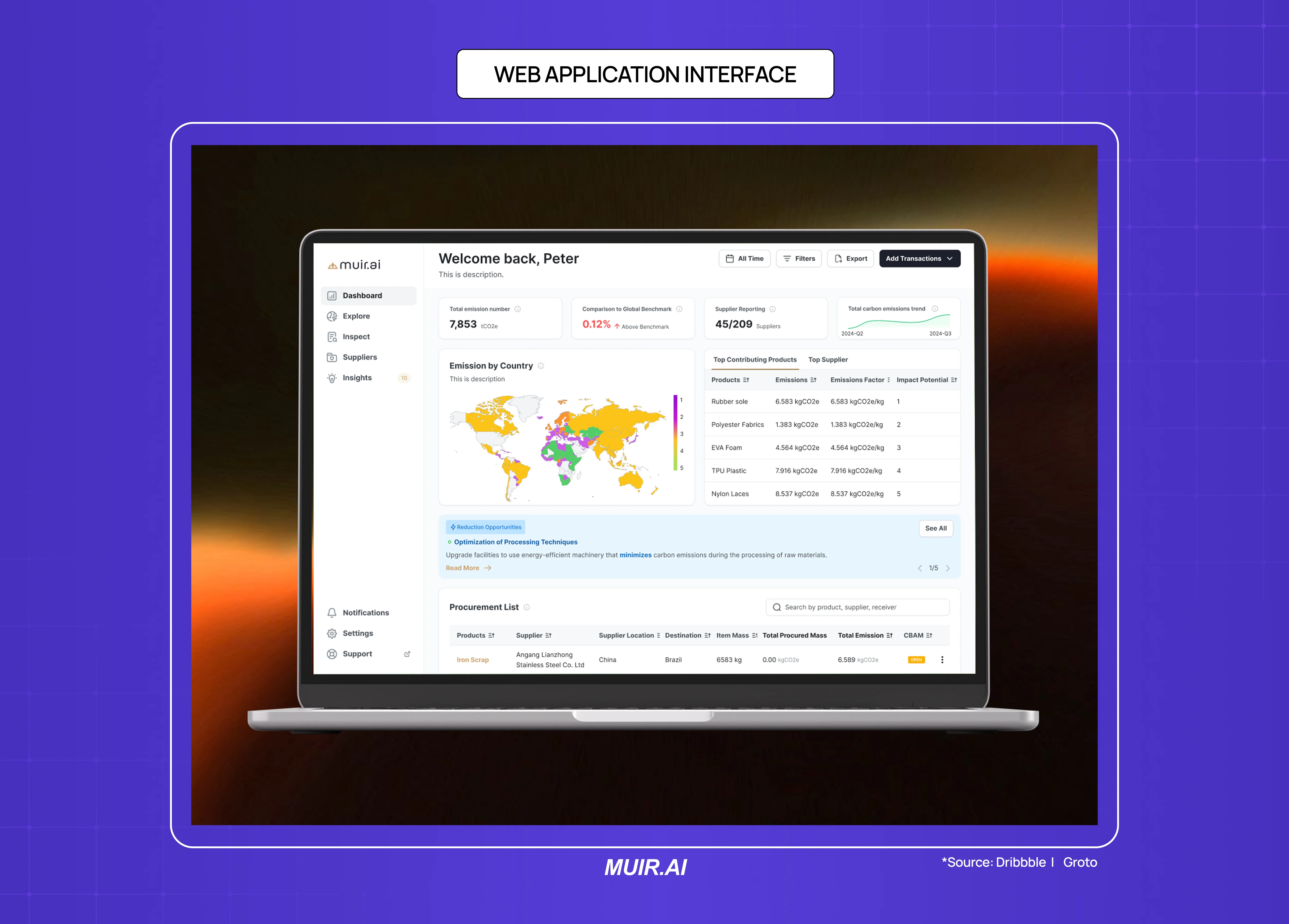
SaaS Product Dashboards
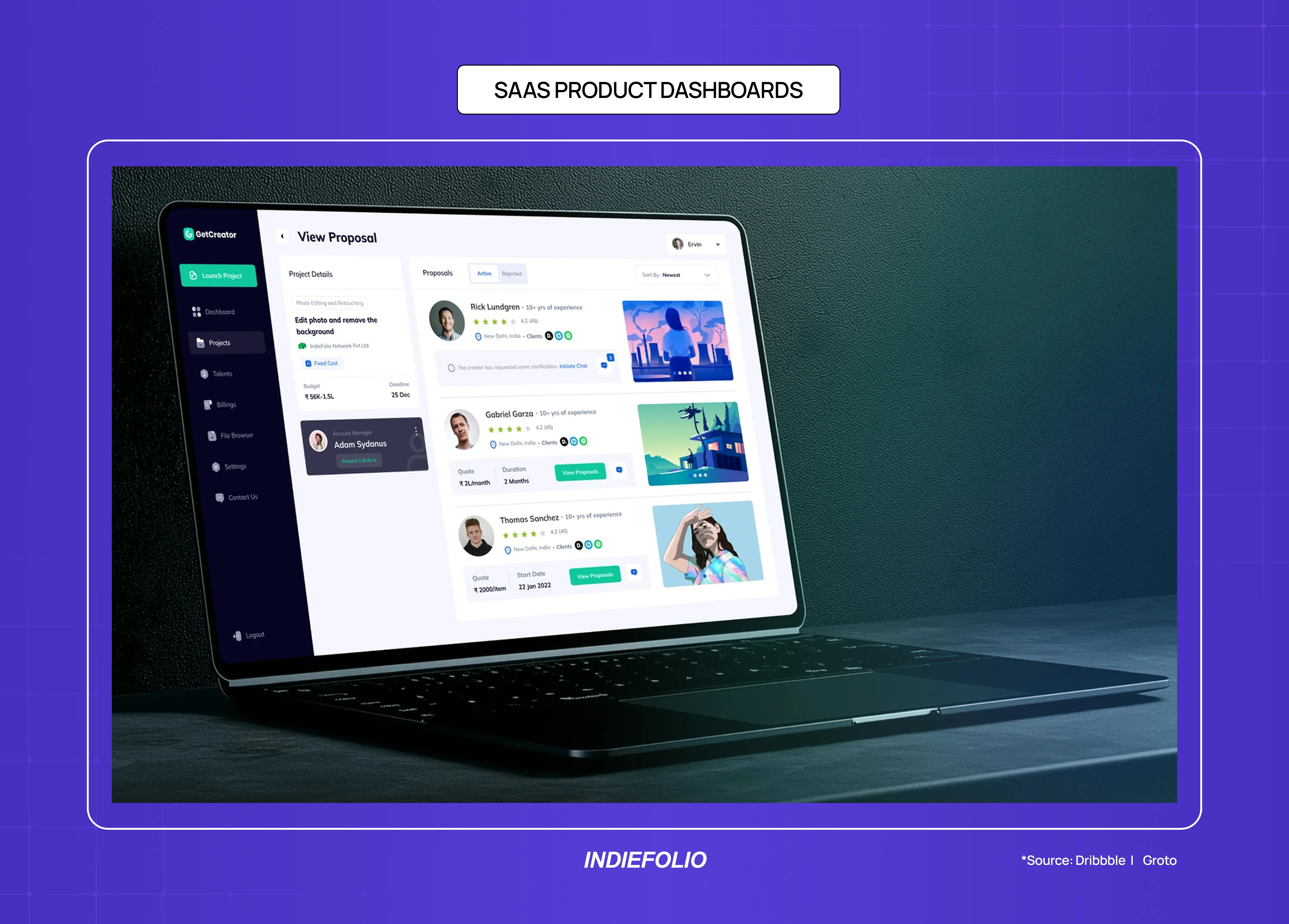
A SaaS dashboard is the primary retain website for most B2B software companies. After a user signs up (on a convert website), the dashboard is where they either find value and stay, or fail to orient and churn.
Research consistently shows that the majority of free trial churn happens within the first session — a failure of dashboard design, not product capability.
The primary design requirement for a SaaS dashboard is orienting clarity: a new user should be able to answer "what do I do first?" within five seconds of landing on the dashboard for the first time. Most dashboards fail this test because they're designed to show existing users all their data, not to guide new users to their first moment of value.
Primary design requirements: onboarding flow, empty state design, navigation architecture, information hierarchy within data-dense layouts
Success metric: activation rate (user reaching defined "aha moment"), Day 7 and Day 30 retention
Common mistake: designing the dashboard for power users when the product is still in early growth; showing empty states without guidance
Web Application Interfaces
Web applications — project management tools, analytics platforms, CRM systems, scheduling tools — are retain websites with complex interaction requirements. The design job is to make recurring tasks efficient and complex tasks comprehensible.
Primary design requirements: task flow efficiency, progressive disclosure of advanced features, error handling and recovery, keyboard navigation for power users
Success metric: task completion rate, support ticket volume (as proxy for interface comprehension failure), feature adoption breadth
Common mistake: overloading the primary navigation with every feature before users have established core workflows
AI-Native Interfaces and Copilot Dashboards
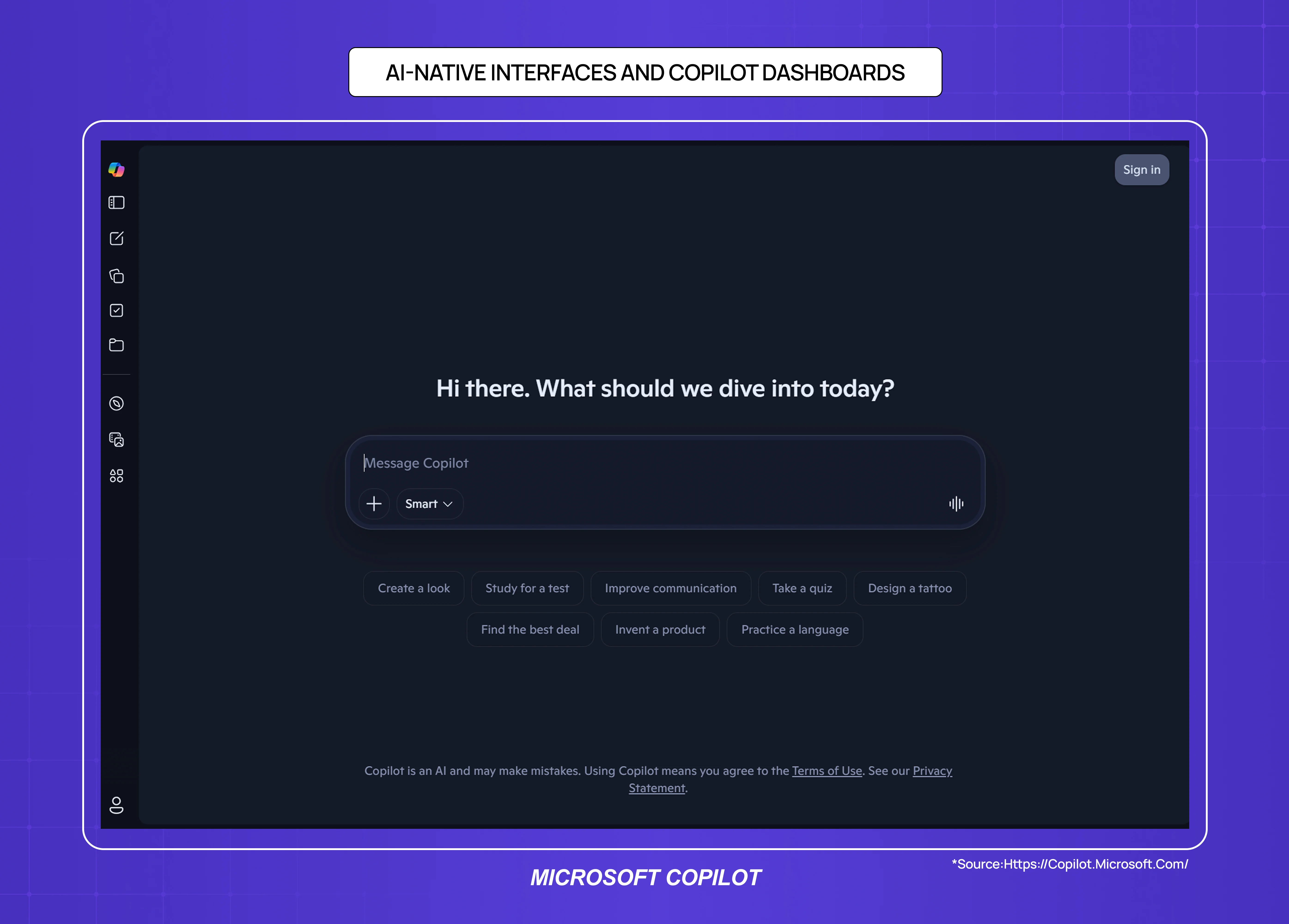
AI-native products — tools built around a language model, recommendation engine, or autonomous agent — are an emerging sub-type of retain website. The user isn't navigating a fixed feature set; they're interacting with a system that responds, adapts, and generates output in real time.
The design challenge is fundamentally different from a traditional dashboard: there's no predictable interface state, no fixed navigation path, and the user's mental model of "what the product does" is still forming with every session. This level of design complexity is the opposite end of the spectrum from simpler website builds, where predictable structure and proven templates are the right fit rather than a constraint.
Primary design requirements: prompt interface clarity, output legibility, trust and explainability signals (why did the AI do that), graceful error handling for hallucinations or failures
Success metric: task completion rate, user trust score, session depth
Common mistake: treating the chat interface as a finished product; most AI-native products need significantly more information architecture around the core interaction to retain users beyond the first session
Customer Portals
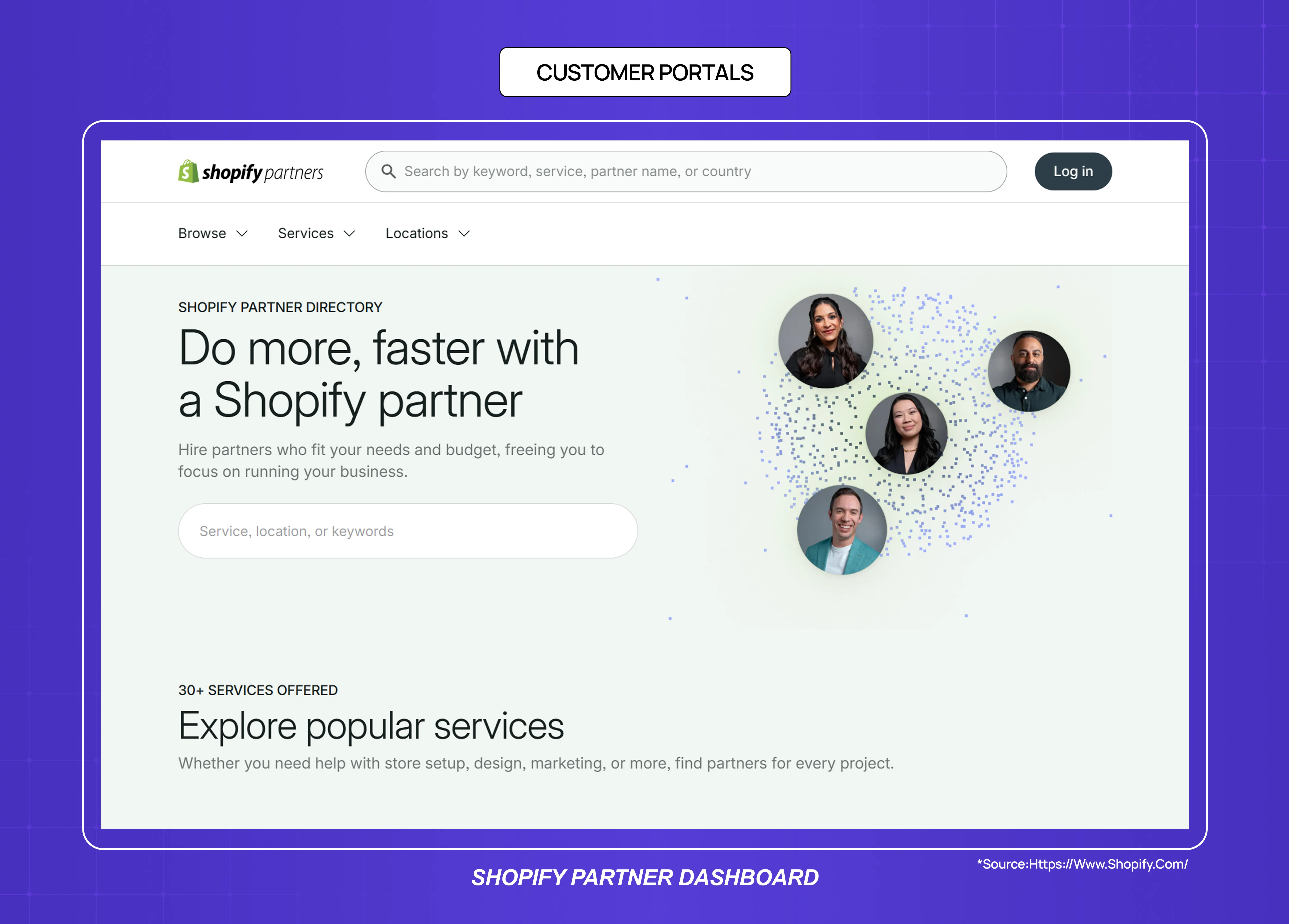
Customer portals are retain websites for high-touch B2B relationships — a place where clients access deliverables, invoices, support history, and project status. The design job is to reduce support overhead while increasing client confidence.
Primary design requirements: clear status indicators, document/asset access architecture, contextual communication (tied to specific projects or deliverables)
Success metric: support ticket deflection rate, client NPS
Common mistake: generic portal templates that don't match the specific information hierarchy of the service relationship
04. Inform Websites: Designing for Trust at Scale
Inform websites are built to answer questions, and their primary commercial function is accumulating organic search traffic that converts into brand trust, newsletter subscribers, or eventually customers. The design job is to make authoritative content accessible, credible, and easy to navigate.
Blog and Content Websites
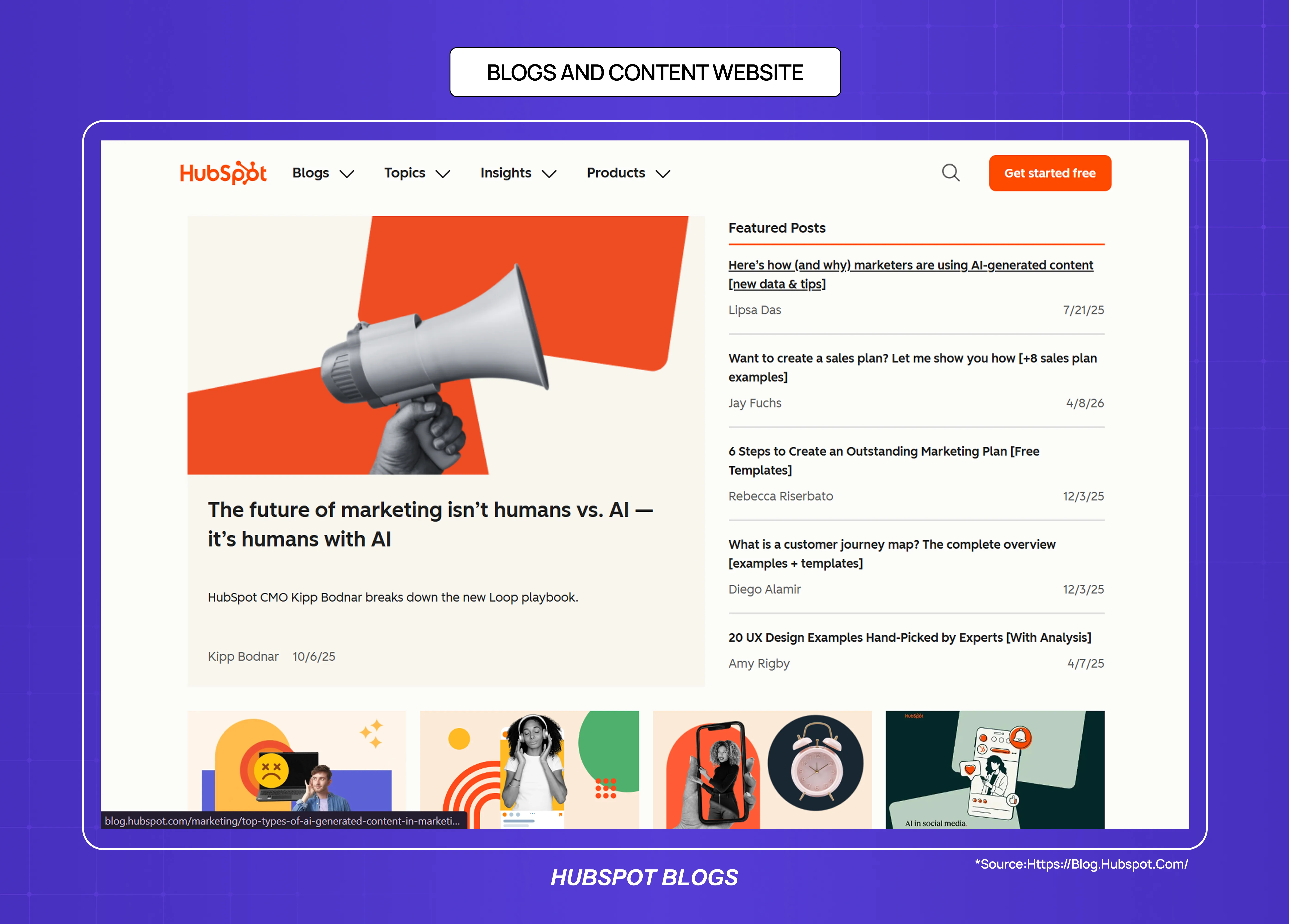
A blog is an inform website where the primary content unit is an article. For SaaS companies, blog content serves two purposes: SEO traffic acquisition and credibility-building with potential buyers who are researching the category.
The design requirements for a blog are simpler than other website types but frequently over-engineered. The primary variables are reading experience (line length, font size, spacing), trust signals (author credentials, publication date, content freshness indicators), and internal linking architecture (making related content discoverable without interrupting the reading flow).
Primary design requirements: typography and reading comfort, content credibility signals, internal linking, mobile reading experience
Success metric: organic sessions, average time on page, email/newsletter sign-up conversion from content
Common mistake: sidebars with excessive promotional content that interrupt reading; no author information on specialist topics
Documentation Websites
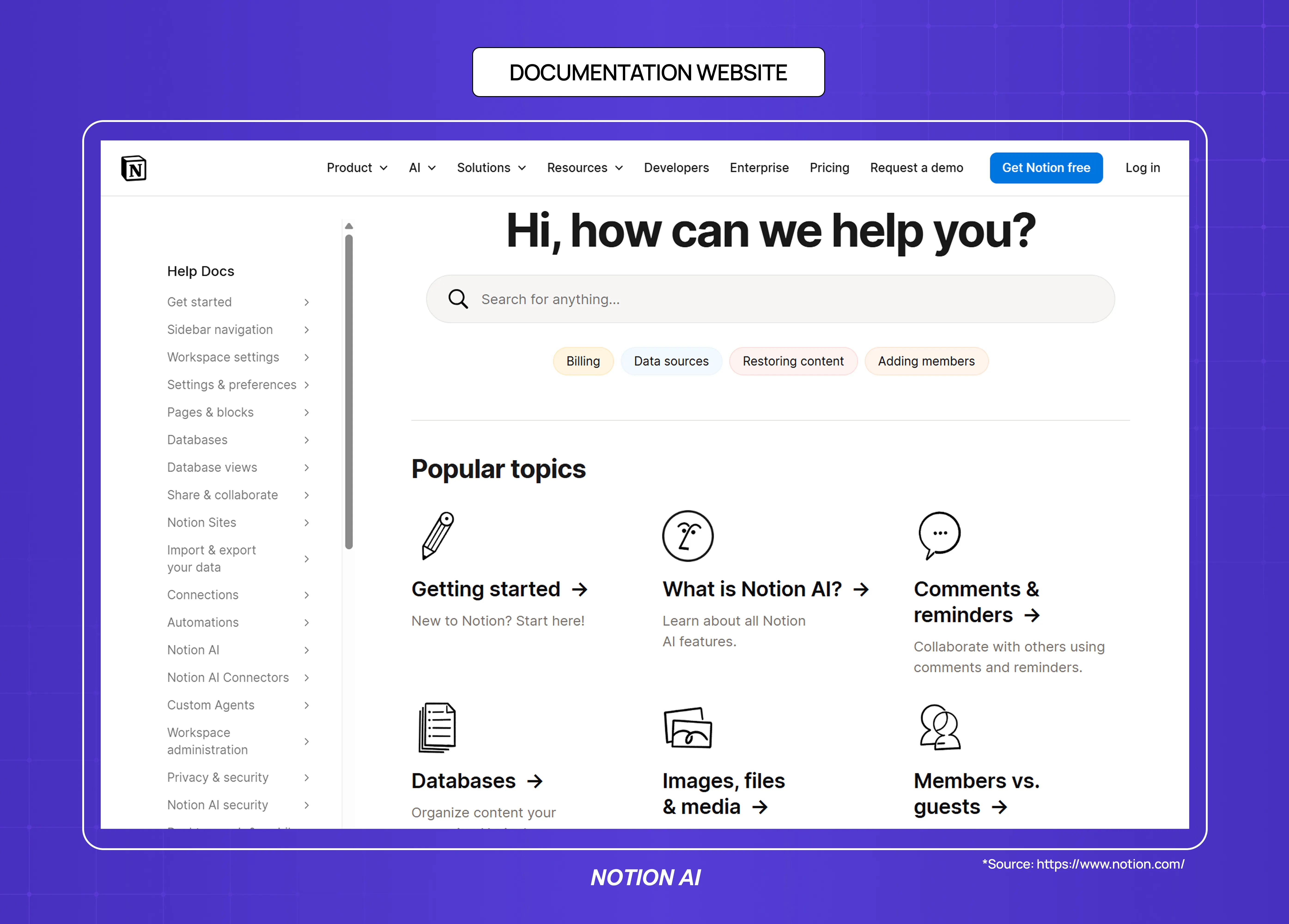
Documentation websites are inform websites with a task-oriented user: someone who already uses the product and needs to find a specific answer. The design job is navigability — the user should reach the right information in under three clicks.
Primary design requirements: search quality and placement, left-rail navigation structure, content hierarchy within long-form technical pages, code block formatting
Success metric: search success rate, time to first helpful result, support ticket deflection
Common mistake: navigation that mirrors internal product architecture rather than how users think about their questions
News and Media Websites
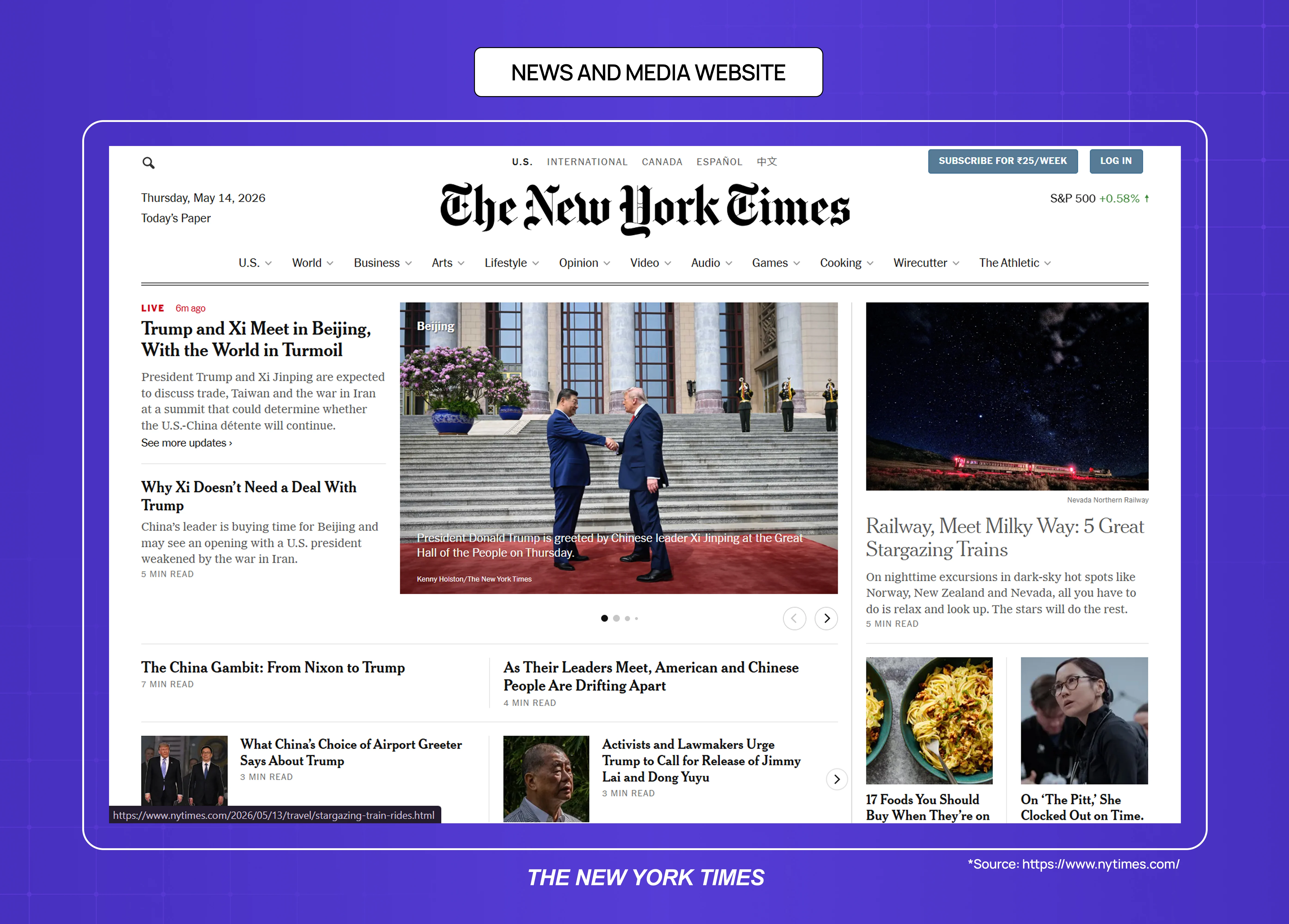
News and media websites are inform websites where recency and credibility are the primary trust signals. Design requirements differ from evergreen blog content because readers arrive with a different intent — breaking information rather than researched answers.
Primary design requirements: page speed (time-sensitive readers leave slow pages), article structure (inverted pyramid, clear headline hierarchy), ad density management, mobile-first responsive design
Success metric: return visit rate, pages per session, newsletter subscriber conversion
Common mistake: ad load that exceeds content density, interstitials that interrupt returning readers
05. Engage Websites: Designing for Loops, Not Landings
Engage websites are built around return visits, contributions, and social dynamics rather than single-session transactions. A visitor arriving on an engage website is not primarily there to buy or find a specific answer — they're there to participate in something ongoing.
Community and Forum Websites
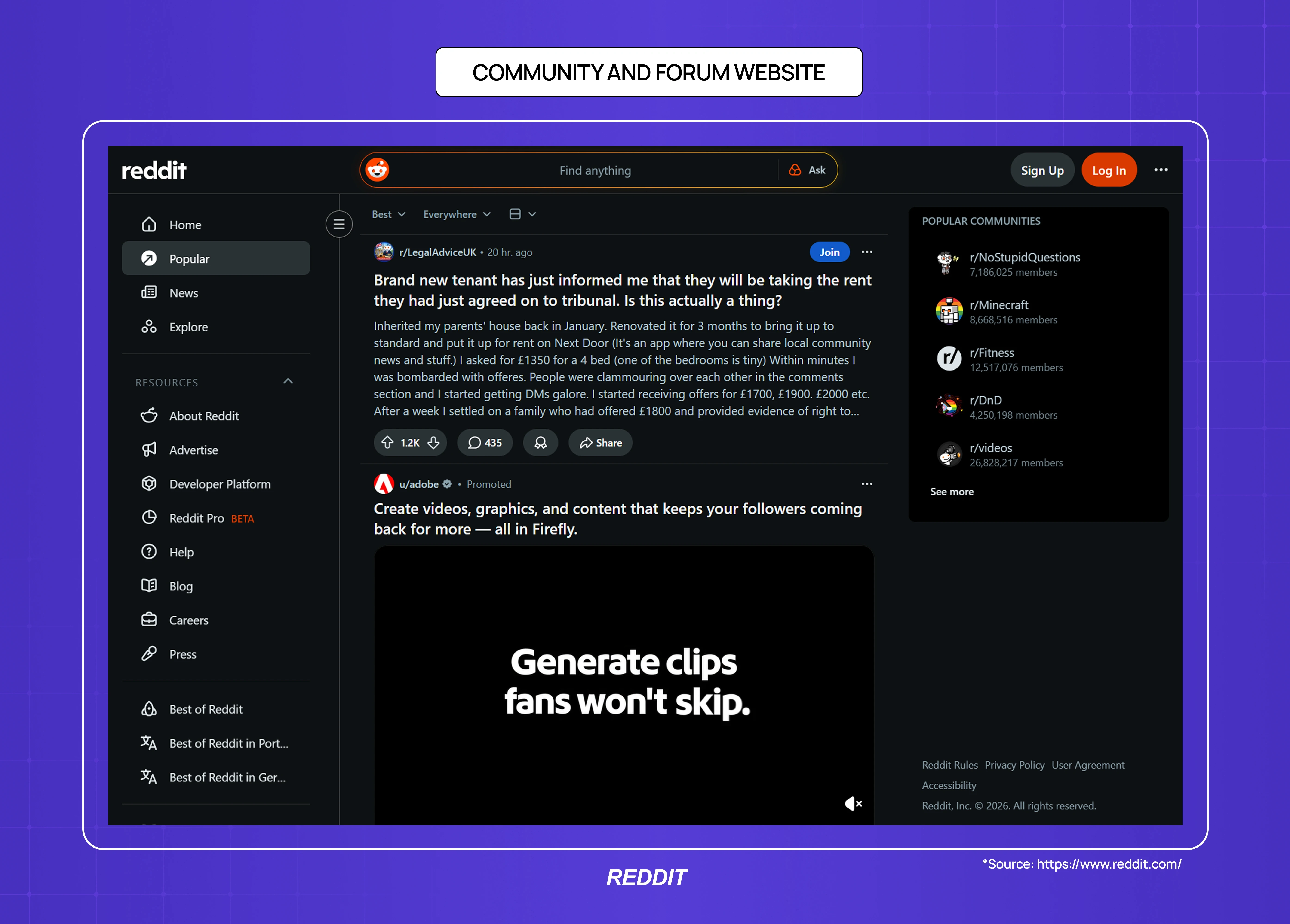
Community websites (forums, discussion boards, Q&A platforms) are engage websites where the design job is to lower contribution barriers while surfacing high-quality content.
The paradox of community design is that the website must serve two very different users simultaneously: the lurker who reads but doesn't post, and the contributor whose activity creates value for everyone else.
Primary design requirements: easy contribution mechanics, reputation/credibility signals for contributors, content sorting and discovery, notification architecture that drives return
Success metric: contributor-to-lurker ratio, post volume, return visit rate
Common mistake: requiring account creation before allowing any participation; poor mobile contribution UX
Portfolio Websites
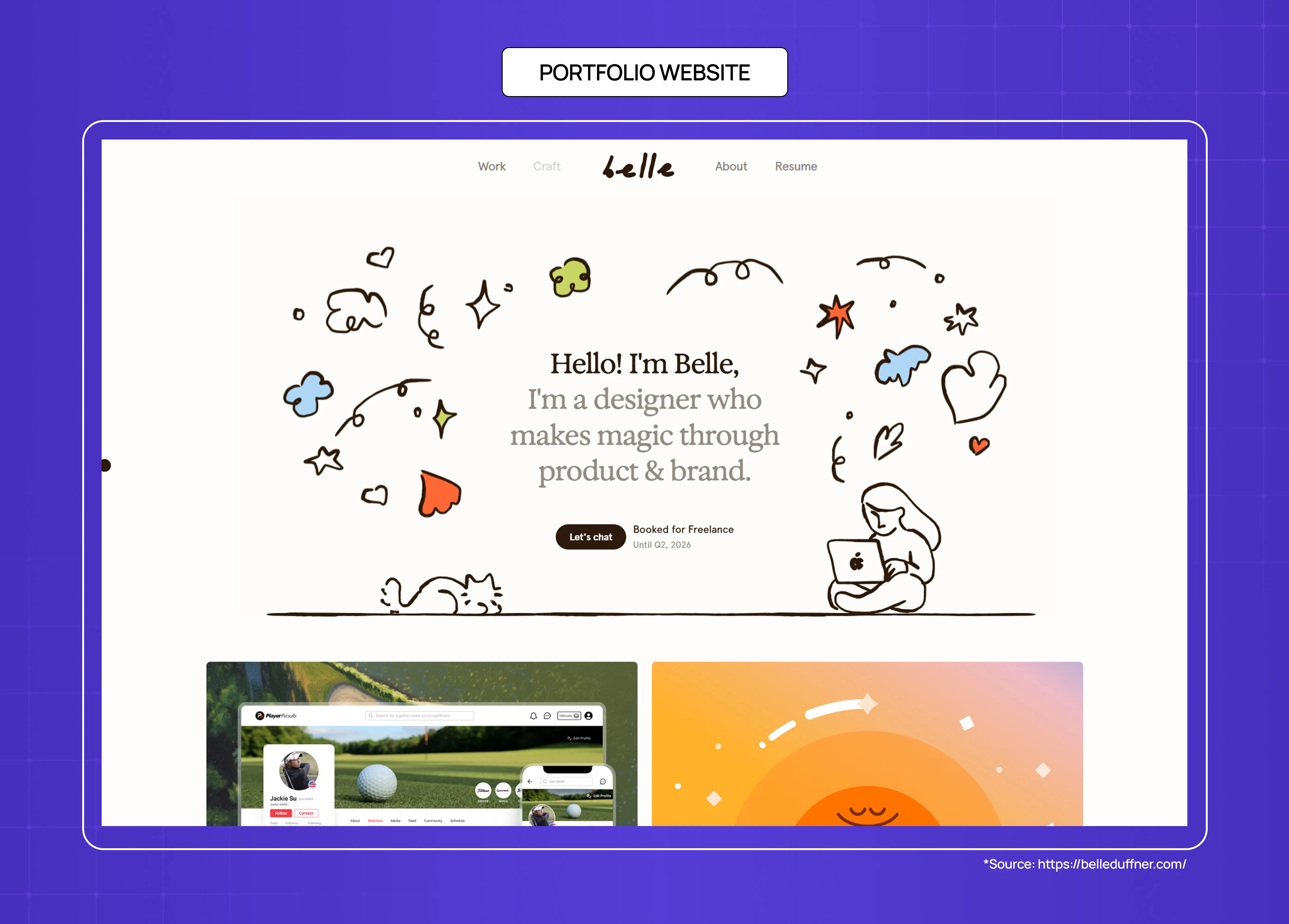
Portfolio websites are engage websites for creative professionals and agencies — the goal is to provoke a response (a commission, an inquiry, a follow) rather than a transaction. Studying best website design examples makes this clear: the design job is to communicate quality and perspective rapidly, because a portfolio visitor is making an aesthetic judgment within seconds.
Primary design requirements: image and media loading speed, case study depth (showing process, not just output), contact accessibility
Success metric: inquiry rate, time on portfolio (a proxy for genuine interest)
Common mistake: auto-playing video or audio on load; project descriptions that list deliverables rather than showing thinking
Nonprofit and Cause Websites
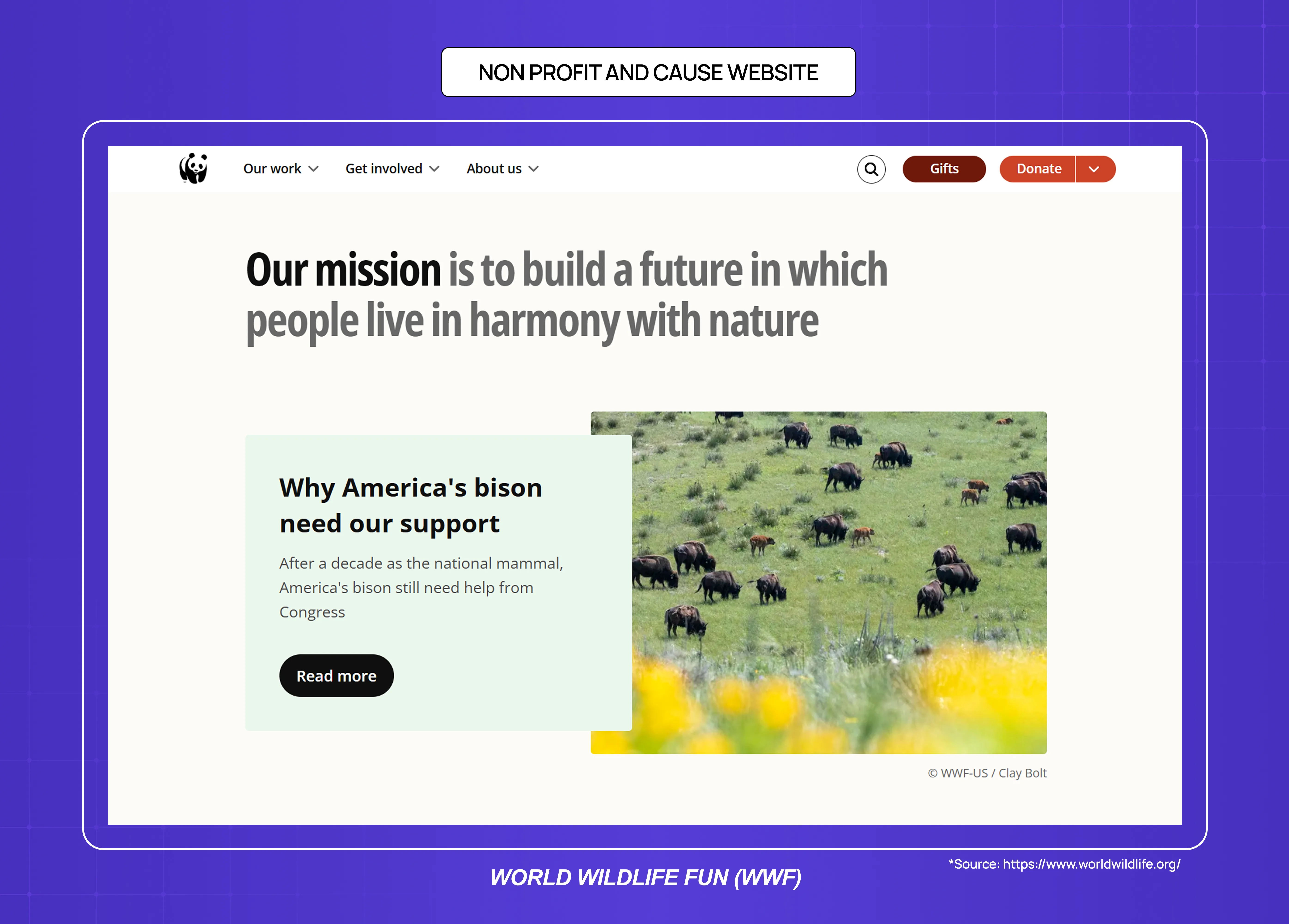
Nonprofit websites are engage websites where the conversion goal is often emotional — a donation, a volunteer sign-up, or a petition signature. The design job is to communicate urgency and impact clearly enough that a visitor who arrived curious leaves having taken action.
Primary design requirements: emotional narrative design, donation flow friction minimisation, impact evidence (what past donations have achieved)
Success metric: donation conversion rate, average donation value, recurring donor conversion
Common mistake: impact statistics buried below the fold; donation forms that require account creation
How to Choose the Right Website Type for Your Business
Understanding website types — and the modern web design principles that apply regardless of category — is useful when you know what you're building. But many teams are deciding between website types, or realising their current website is doing the wrong job.
You're a SaaS company and need to improve conversion from your marketing site — Your website is a convert website. The design requirement is message clarity and CTA hierarchy. If your trial sign-up rate is below benchmark (roughly 2–5% for SaaS free trials), the problem is usually above-the-fold messaging, not aesthetics — something you’ll notice across the best landing page design examples that consistently convert well.
You're a SaaS company and need to improve activation and retention — Your product dashboard is a retain website. No marketing design service can help with this. The design requirement is onboarding architecture and empty state design. Groto specialises in exactly this problem — rebuilding SaaS dashboards and onboarding flows to hit activation metrics.
You're an e-commerce brand and conversion rate is declining — Your website is a transact website. The problem is usually trust signals, checkout friction, or page speed — not visual design. Audit your checkout abandonment data before commissioning a redesign — and understand how to approach a website redesign for a transact site specifically, since the process differs from a marketing site overhaul.
You're a B2B company and need to generate qualified leads — Your website is a convert website with a lead generation goal. The primary design variable is social proof placement and form friction. A well-placed case study or client logo can outperform a full visual redesign in conversion impact.
You're building organic traffic and credibility — You need an inform website. The primary design requirements are reading experience and content architecture. Template-based solutions (WordPress, Webflow) are sufficient for most blogs — the question of responsive web design vs custom frontend builds matters far more for transact and retain sites than for inform ones. The investment in a blog should be in content quality and internal linking structure rather than custom design.
Conclusion
Every website type has a primary job, and that job determines its design requirements — not the other way around.
The five primary website jobs are: convert, transact, retain, inform, and engage. Design decisions that work for one category often actively harm another.
SaaS companies typically operate two distinct website types: a convert website (marketing site) and a retain website (product dashboard). They require different design skills, different success metrics, and different vendors.
Most generic design subscriptions and creative services can handle convert, transact, and inform websites. Retain websites (SaaS products, dashboards, web applications) require specialist product design capability.
The most expensive website design mistake for SaaS companies is under-investing in retain website design while over-investing in convert website design. Improving activation by 10 percentage points has a larger LTV impact than improving marketing site conversion by 10 percentage points, because activation affects every customer you acquire.


