The Hidden Cost of Poor User Experience
Rather than asking how much implementing good and bad design improvements costs, consider what bad design currently costs your business.
If just 10 customers monthly abandon your site due to poor user experience, with an average customer value of $100, that equals $12,000 in lost revenue annually—before considering the negative word-of-mouth impact.
Effective design ensures customers can easily:
Find what they need without frustration
Complete purchases without unnecessary obstacles
Return for repeat business
Recommend your business to others
The Numbers Behind Bad Design Are Shocking

The statistics paint a clear picture of how bad site design affects business performance:
75% of consumers judge your business credibility based solely on your website design quality
Users form their first impression in just 50 milliseconds—giving you a fraction of a second to make a positive impact
88% of online shoppers refuse to return after experiencing a poor user interface
Design Problems Driving Your Customers Away
Mobile Experience Failures
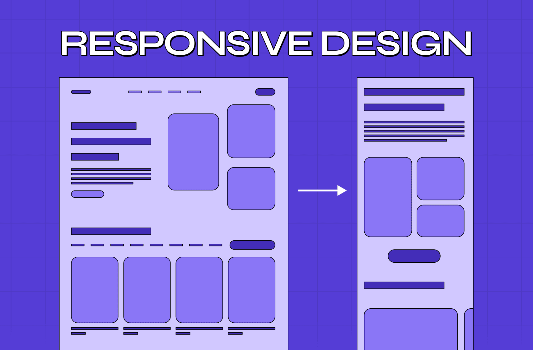
Most website traffic now comes from mobile devices, yet many sites remain difficult to use on smaller screens. When buttons are too small or text is unreadable without zooming, users become frustrated and leave. Your mobile experience should be thoughtfully designed for fingers, not mouse pointers.

Slow Loading Speeds
Modern users expect instant gratification online. Sites taking longer than 3 seconds to load lose approximately 40% of visitors—essentially throwing away nearly half your marketing investment. Page speed has become a critical factor in both user experience and search engine rankings.
Confusing Navigation Systems
Users arrive at your site with specific goals in mind. When your navigation feels like a maze with unclear labels or buried information, visitors get lost and frustrated. Navigation should guide users naturally toward the information or actions they seek, not create obstacles.
How to Fix Your Bad Design Elements
#1 Create Clear, Purposeful Buttons
Tiny text links and ambiguous call-to-action buttons confuse users about what actions they can take. Replace small or unclear elements with prominent buttons featuring direct, action-oriented text. "Get Your Free Guide" performs significantly better than generic labels like "Submit" or "Click Here."
Surround clickable elements with sufficient space to prevent accidental clicks on mobile devices. This simple adjustment dramatically improves mobile usability.
#2 Improve Site Speed
Large, unoptimized images often cause significant loading delays. Compress and properly format all images for web display without sacrificing quality. Remove unnecessary animations and scripts that slow loading without adding value.
Simplify pages where possible—every additional element increases loading time and potentially distracts from your core message or offering.
#3 Simplify Your Navigation
Navigation labels should be immediately understandable to new visitors, avoiding clever but confusing terminology. Implement robust search functionality that forgives common typos and guides users toward relevant results.
Position important information (pricing, contact details, business hours) prominently in expected locations. Users shouldn't need to hunt for basic information.
What Makes Good Design: Core Principles
Understanding what is good design helps clarify what is bad design by contrast. Good design follows established principles that prioritize user needs:
Functionality First
Design must work flawlessly across all devices and user contexts. Beautiful but broken features frustrate users more than plain but functional ones.
Visual Clarity and Hierarchy
Elements should guide the eye naturally toward the most important information first. Users should understand where to look without conscious effort.
Consistency Across Experiences
Navigation patterns, button styles, and terminology should remain consistent throughout your site — because consistency isn't just a usability principle, it's the foundation of design and brand experience: every inconsistent touchpoint erodes the trust users need to stay, convert, and return.
Accessibility for All Users
Your design should accommodate users with different abilities, including those using screen readers or requiring larger text sizes. Accessibility improves the experience for everyone.
Common Design Mistakes Businesses Make
Prioritizing Aesthetics Over Usability
While visual appeal matters, function must come first. A beautiful site that frustrates users fails at its primary purpose. Balance aesthetic considerations with practical usability.
Ignoring Mobile Users
Creating a desktop-first design and treating mobile as an afterthought alienates the majority of your audience. Mobile-first design approaches ensure the core experience works well on all devices.
Overloading Pages With Content
Cramming too much information onto a single page overwhelms users and obscures your key messages. Strategic white space improves comprehension and guides attention effectively.
Neglecting Page Speed Optimization
Many businesses underestimate how quickly users abandon slow sites. Regular speed testing and optimization should be standard practice, not an occasional concern.
Key Takeaways
First impressions form instantly—your design immediately affects how customers perceive your business credibility
Mobile optimization isn't optional when most users access sites on smartphones
Speed matters tremendously—every second of loading time costs you customers
Clear navigation and intuitive interfaces directly impact conversion rates
Good design pays for itself by preventing customer loss and enhancing brand reputation
Your website represents your business online—when designed thoughtfully with user needs at the forefront, it becomes your most effective sales and service tool. When design problems frustrate users, even the best products and services fail to convert.
Is your website design helping or hurting your business? Consider a professional assessment by us at Groto to identify specific conversion obstacles and implement targeted solutions.


