Learn how to implement responsive design breakpoints effectively to ensure your website delivers optimal user experience across smartphones, tablets, and desktop computers.
Create adaptive websites with strategic responsive design breakpoints

Every website today must function flawlessly across dozens of different screen sizes, from 320-pixel smartphones to 4K desktop monitors spanning 3840 pixels. Responsive design breakpoints create the structural foundation that allows your layout to adapt intelligently at specific screen widths, ensuring users get an optimized experience regardless of their device. For businesses that need this built correctly from the start, responsive web design services cover the full breakpoint architecture — from mobile-first implementation through cross-device validation.
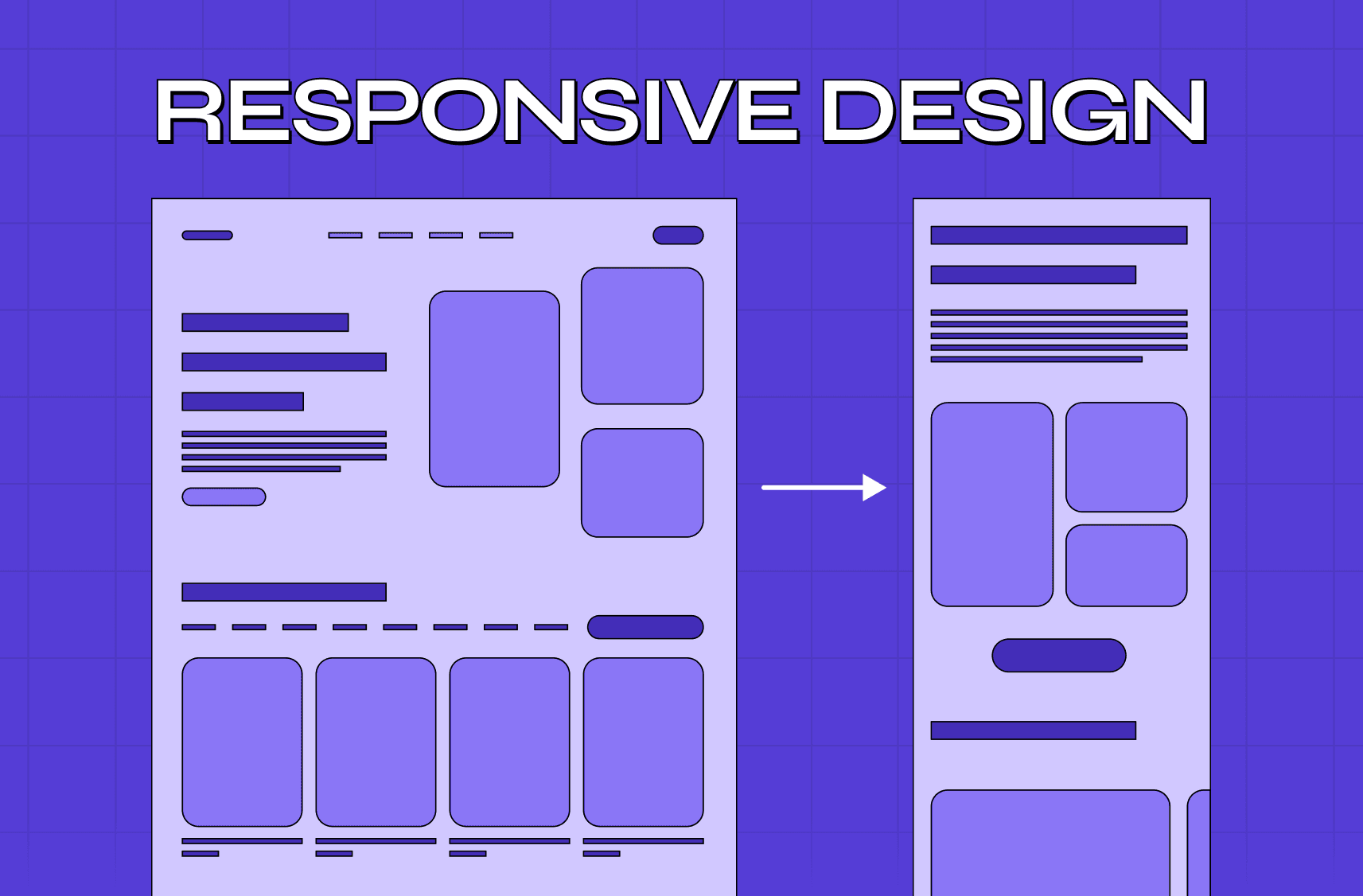
Responsive design breakpoints are predetermined screen widths where your website's CSS applies different styling rules to restructure the layout. When someone visits your site on a 375-pixel iPhone, your breakpoint system might display navigation as a hamburger menu and stack content in a single column. The same visitor accessing your site from a 1920-pixel desktop sees a horizontal navigation bar with multi-column content layouts automatically.
Consider Netflix's interface: on mobile devices below 480 pixels, movie titles display in vertical scrolling lists with large thumbnail images. At tablet breakpoints around 768 pixels, the same content shifts to a two-column grid. Desktop screens above 1200 pixels showcase elaborate multi-row carousels with detailed hover overlays. Each transformation happens seamlessly based on responsive screen widths, creating device-appropriate experiences without separate mobile websites.
What Are Breakpoints in Responsive Web Design?
Before going deep on breakpoints, understanding responsive web design as a whole gives you the foundational context — breakpoints function as conditional triggers in your CSS that activate specific layout configurations when screen dimensions meet predetermined criteria. These breakpoints utilize CSS media queries to detect viewport characteristics and apply corresponding style rules, creating adaptive interfaces that respond to available screen real estate.
Media queries form the technical backbone of breakpoint implementation, using syntax like @media (min-width: 768px) to target screens at or above tablet dimensions. The browser evaluates these conditions continuously, applying appropriate styles as users rotate devices or resize windows. This real-time responsiveness ensures consistent functionality across all viewing scenarios.
Standard Breakpoint Categories
Modern web development recognizes six primary breakpoint categories that correspond to common device types and usage patterns:
Extra Small Devices (320-479px)
Basic smartphones, older Android devices, and feature phones comprise this category. Content must stack vertically with generous touch targets measuring at least 44 pixels square. Navigation typically collapses into hamburger menus, and forms require full-width input fields for comfortable typing on small virtual keyboards.
Small Devices (480-767px)
Large smartphones and compact tablets fall into this range. Layouts can accommodate slightly more complex arrangements, such as two-column forms or side-by-side call-to-action buttons. Product catalog pages might display two items per row instead of single-column arrangements used for smaller screens.
Medium Devices (768-1023px)
Standard tablets in portrait orientation and small laptops represent this category. Multi-column layouts become viable, with sidebar navigation and content areas sharing screen space. E-commerce sites often introduce filtering panels alongside product grids at this breakpoint.
Large Devices (1024-1199px)
Tablets in landscape mode and standard laptops utilize this range. Complex grid systems with three or four columns work effectively. Advanced navigation patterns like mega menus become practical, and secondary content areas can appear without overwhelming primary content.
Extra Large Devices (1200-1439px)
Desktop monitors and large laptops benefit from extensive layout possibilities. Multiple sidebars, complex data tables, and rich media galleries display comfortably. Dashboard interfaces can showcase numerous widgets simultaneously without appearing cluttered.
Ultra Large Devices (1440px+)
High-resolution monitors, ultrawide displays, and 4K screens require careful consideration of maximum content widths to prevent excessive line lengths that harm readability. These breakpoints often focus on enhanced white space and larger typography rather than cramming additional content.
Breakpoint Implementation Strategies
The mobile-first approach has become the industry standard for responsive breakpoints — and building mobile-first from the ground up covers the full methodology in depth, from content hierarchy decisions to touch interface optimization that goes well beyond breakpoint syntax alone.
This progressive enhancement ensures baseline functionality across all devices while adding sophisticated features for capable displays. The approach also improves performance by loading essential styles first and layering enhancements as needed.
Content-Driven Breakpoint Selection
Effective responsive screen widths align with your content's natural breaking points rather than arbitrary device dimensions — and those breaking points are shaped by decisions made at the website structure level: how content is hierarchically organised, how pages relate to each other, and what information needs to be visible at every screen size before a single media query is written.
Consider a news website's article layout: text remains readable until around 1400 pixels width, where line lengths become uncomfortably long. Rather than using a standard 1200-pixel desktop breakpoint, implementing a custom 1400-pixel breakpoint that introduces sidebar content or limits line width serves users better.
Typography particularly benefits from content-driven breakpoints. Headlines that fit comfortably at 32 pixels on desktop might require reduction to 24 pixels at tablet widths and 20 pixels on mobile. These adjustments should occur where readability naturally degrades, not at arbitrary screen dimensions.
Industry-Specific Breakpoint Considerations
Different industries require specialized approaches to responsive design breakpoints based on their unique user behaviors and content requirements — and before mapping those requirements, understanding how website type shapes breakpoint needs clarifies which device priorities, content structures, and interaction patterns your breakpoint strategy actually needs to account for.
E-commerce platforms prioritize product visibility and purchase flow optimization. Mobile breakpoints focus on large product images and streamlined checkout processes. Tablet breakpoints introduce filtering options and comparison features. Desktop breakpoints maximize product density while maintaining comfortable browsing experiences.
Financial services emphasize data presentation and security considerations. Mobile breakpoints simplify complex financial data into digestible summaries. Tablet breakpoints can display basic charts and graphs. Desktop breakpoints accommodate comprehensive dashboards with multiple data visualizations simultaneously.
Educational platforms balance content consumption with interactive elements. Mobile breakpoints prioritize video playback and reading comfort. Tablet breakpoints introduce note-taking interfaces and simple quizzes. Desktop breakpoints enable complex interactive exercises and multi-panel course materials.
Healthcare websites must accommodate users across age groups and technical proficiency levels. Mobile breakpoints emphasize large touch targets and simplified navigation. Tablet breakpoints support form completion for appointment scheduling. Desktop breakpoints provide comprehensive patient portals with multiple information sections.
How to Use Breakpoints in Responsive Web Design?
Implementing responsive design breakpoints effectively requires systematic planning that begins with audience analysis and extends through testing and optimization. The process involves technical implementation, design considerations, and ongoing refinement based on user behavior data.
Step 1: Analyze Your Audience's Device Usage
Begin breakpoint planning by examining your website analytics to understand actual device usage patterns among your visitors. Google Analytics provides detailed screen resolution data that reveals the most common viewport sizes accessing your site. This data-driven approach ensures your breakpoints serve real user needs rather than theoretical device categories.
Look beyond simple resolution statistics to understand user behavior patterns at different screen sizes. Mobile users might primarily browse product catalogs but complete purchases on desktop. Tablet users could engage extensively with video content but prefer mobile for quick information lookup. These behavioral insights inform which features to prioritize at each breakpoint.
Consider geographic variations in device usage. Emerging markets might show higher percentages of budget Android devices with smaller screens, while developed markets could skew toward larger premium devices. International audiences require breakpoint strategies that accommodate diverse device landscapes.
Step 2: Design Mobile-First Base Styles
Start your CSS with styles targeting the smallest expected screen size, typically 320 pixels wide. This mobile-first foundation forces prioritization of essential content and functionality while creating a performance-optimized baseline that works universally.
Mobile-first base styles should emphasize touch-friendly interfaces with generous tap targets, readable typography without zooming, and simplified navigation patterns. Avoid complex interactions that don't translate well to touch interfaces.
Step 3: Implement Progressive Enhancement
Use min-width media queries to add complexity and sophistication as screen size increases. Each breakpoint should introduce meaningful improvements to user experience rather than arbitrary layout changes.
Progressive enhancement ensures that advanced features only load when devices can handle them effectively, maintaining performance across the device spectrum while providing rich experiences where appropriate.
Step 4: Optimize Typography Across Breakpoints
Typography requires careful scaling across responsive screen widths to maintain readability and visual hierarchy. Different viewing distances and screen densities affect optimal font sizes, line heights, and spacing decisions.
Consider reading patterns at different screen sizes. Mobile users often scan quickly, requiring clear hierarchy and concise content. Desktop users might engage with longer-form content, allowing for more sophisticated typography treatments and extended reading experiences.
Step 5: Handle Navigation Across Device Types
Navigation represents one of the most critical breakpoint considerations, as interaction patterns vary dramatically between touch and mouse interfaces. Mobile navigation must accommodate thumbs and fingers, while desktop navigation can utilize precise cursor interactions.
Advanced navigation patterns like mega menus or dropdown systems should only activate at appropriate breakpoints where screen real estate and interaction capabilities support them effectively.
Step 6: Implement Flexible Grid Systems
Modern CSS Grid and Flexbox provide powerful tools for creating responsive layouts — and when designing these systems in Figma before writing code, the using Figma grids for responsive layouts guide shows how to set up grid lines, columns, and layout frames that mirror your breakpoint structure accurately.
Flexible systems complement traditional breakpoints by handling intermediate screen sizes gracefully, reducing the need for numerous specific media queries.
Step 7: Test Across Real Devices
Browser developer tools provide convenient testing environments, but real device testing reveals crucial differences in rendering, performance, and user interaction. Different operating systems, browsers, and hardware capabilities affect how your breakpoints perform in practice.
Create a device testing matrix that includes representatives from each major breakpoint category. Budget Android devices reveal performance issues invisible on high-end testing equipment. Older iPads expose touch interaction problems that desktop testing misses. Various browser engines highlight compatibility concerns across platforms.
Consider testing tools like BrowserStack or CrossBrowserTesting for comprehensive device coverage when physical device access is limited. These services provide real device testing across numerous combinations of hardware, operating systems, and browsers.
Step 8: Monitor and Optimize Performance
Each media query and breakpoint adds complexity to your CSS, potentially impacting loading times and rendering performance. Monitor Core Web Vitals metrics across different device categories to ensure your responsive implementation doesn't harm user experience.
Use CSS preprocessing tools to optimize media query output and eliminate redundant rules. Critical CSS techniques can prioritize above-the-fold styles for faster initial rendering across all device types.
Advanced Breakpoint Techniques
Container queries represent the evolution of responsive design — and when your product reaches this level of modular complexity, understanding the responsive vs custom-built frontend tradeoffs helps you decide whether advanced responsive techniques are enough or whether a custom frontend architecture better serves your scaling needs.css
Variable fonts provide sophisticated typography scaling that goes beyond simple font-size changes at breakpoints. Weight, width, and optical size can adjust smoothly based on available space and viewing conditions.
Element queries and ResizeObserver APIs enable JavaScript-powered responsive behaviors that complement CSS breakpoints. These techniques allow for complex interactions and animations that adapt to container dimensions dynamically.
Responsive Design Breakpoints Comparison Chart
Breakpoint Category | Width Range | Common Devices | Layout Strategy | Typography | Touch Targets | Performance Notes |
Extra Small | 320-479px | iPhone SE, Basic Android | Single column, stacked elements | 16px base, 1.4 line-height | 44px minimum | Minimize CSS, prioritize critical path |
Small | 480-767px | iPhone 12, Large Android | Limited two-column, larger margins | 16-18px base, 1.5 line-height | 44px minimum | Progressive enhancement begins |
Medium | 768-1023px | iPad, Android tablets | Multi-column grids, sidebars | 16-20px base, 1.5 line-height | 44px recommended | Balance touch and mouse interactions |
Large | 1024-1199px | iPad Pro, Laptops | Complex grids, navigation bars | 16-18px base, 1.6 line-height | Mouse precision available | Add hover states and animations |
Extra Large | 1200-1439px | Desktop monitors | Full layouts, multiple sidebars | 16-18px base, 1.6 line-height | Mouse-optimized | Rich interactions and micro-animations |
Ultra Large | 1440px+ | 4K monitors, Ultra-wide | Constrained width, enhanced spacing | 16-20px base, 1.6+ line-height | Precision interactions | Focus on readability over density |
This comprehensive breakdown shows how responsive screen widths impact every aspect of design decisions, from layout structure to interaction patterns. Each category requires specific considerations for optimal user experience.
Industry-Specific Breakpoint Applications
E-commerce Implementation
Product grids scale from single items on mobile to six-item rows on ultra-wide displays. Shopping cart functionality adapts from full-screen overlays on mobile to persistent sidebars on desktop. Checkout processes simplify to single-column forms on small screens but can accommodate multi-step wizards on larger displays.
SaaS Dashboard Optimization
Data visualization adapts from simplified metrics cards on mobile to comprehensive multi-chart dashboards on desktop. Navigation collapses to hamburger menus on small screens but expands to persistent sidebars with nested categories on larger displays. Form complexity scales from basic input fields to advanced multi-section interfaces.
Content Publishing Platforms
Article layouts optimize reading experience across devices. Mobile focuses on comfortable single-column text with minimal distractions. Tablet introduces sidebar navigation and related content suggestions. Desktop enables multi-column layouts with extensive metadata and social sharing options.
Educational Technology
Interactive exercises adapt complexity based on available screen space. Mobile versions emphasize touch-friendly drag-and-drop activities. Tablet implementations introduce more sophisticated interactions like drawing and annotation tools. Desktop versions support complex simulations and multi-panel reference materials.
Why Groto is uniquely positioned to help with responsive design strategy
Your website might have great content, but if it's not responsive across all devices, users will abandon it before engaging. That's where Groto comes in.
We're a full-stack design agency that transforms complex responsive design challenges into seamless, user-validated experiences across every screen size. Whether you're struggling with mobile optimization, implementing advanced breakpoint strategies, or creating cohesive experiences from smartphone to desktop—we've built responsive systems for exactly that.
Our approach combines data-driven breakpoint analysis with sophisticated visual design, helping you create truly adaptive experiences in weeks—not quarters. You bring the vision. We bring the responsive expertise, strategic implementation, and the process to make it work flawlessly.
We've helped global brands and startups alike create websites that users love on every device. Let's help you do the same.
(91) 8920-527-329
hello@letsgroto.com
Key Takeaways
→ Responsive design breakpoints are specific screen widths where your CSS applies different styling rules to optimize layouts for various devices, from 320px smartphones to 1440px+ desktop monitors
→ Mobile-first implementation using min-width media queries provides the most robust foundation, starting with base styles for small screens and progressively enhancing for larger displays
→ Choose 4-6 strategic breakpoints based on your audience's actual device usage rather than arbitrary device categories—common effective ranges include 480px, 768px, 1024px, and 1200px
→ Content-driven breakpoints often outperform device-driven ones — a principle rooted in the core principles behind modern web design that prioritize user behavior and content clarity over arbitrary technical standards across every device context.
→ Modern CSS Grid and Flexbox reduce reliance on rigid breakpoints by creating flexible layouts that adapt automatically to available space
→ Test responsive implementations across real devices and monitor performance metrics to ensure breakpoints enhance rather than hinder user experience across all screen sizes