Harpreet Singh

Founder and Creative Director

How to Improve Online Form Conversion Rates (Without Redesigning Your Entire Website)

Feb 19, 2026

A practical guide to improving online form conversion rates by reducing friction, building trust, and optimizing form structure to lower CAC and increase qualified leads.

Online forms are often the biggest conversion bottleneck in SaaS and B2B products. This guide explains how to reduce friction, lower CAC, improve lead quality, and increase form completion rates using proven UX principles.

Your form might be leaking more revenue than you think.


Most companies don’t lose conversions on their headline.

They lose them at the form.

You can have:

  • Paid traffic flowing in

  • Strong messaging

  • Clear product positioning

And still struggle with sign-ups, demo requests, or qualified leads.

Why?

Because your form is introducing friction at the exact moment trust is still forming.

And that friction has real business consequences:

  • Wasted ad spend

  • Rising customer acquisition cost (CAC)

  • Slower pipeline velocity

  • Sales teams chasing low-intent leads

  • Longer sales cycles

Poor form UX doesn’t just reduce conversions. It compounds cost.

Let’s break down how to fix it.

Why Most Online Forms Quietly Kill Conversions

When a user reaches your form, they’re not fully committed yet.

They’re evaluating risk.

They’re thinking:

  • Is this worth my time?

  • What happens after I submit?

  • Will I get spammed?

  • Is this going to turn into a sales call immediately?

But most traditional forms:

  • Ask for phone numbers upfront

  • Require too many fields

  • Don’t clarify next steps

  • Feel transactional instead of helpful

This increases psychological friction.

And friction delays decisions.

And delayed decisions increase drop-offs.

In performance terms, that means:

  • Lower form completion rates

  • Lower demo bookings

  • Lower trial starts

  • Higher acquisition cost

If you want to improve form conversion rates, the problem isn’t usually traffic.

It’s sequencing.

The Real Business Cost of Poor Form UX

Let’s be clear about impact.

When forms underperform:

1. Your CAC Increases

You pay for traffic.
Fewer users convert.
Cost per lead rises.
Cost per acquisition rises.

Even a 10–20% improvement in form conversion can materially reduce acquisition costs.

2. Sales Time Gets Wasted

When users feel pressured into providing details early:

  • They enter fake numbers

  • They provide low-intent emails

  • They book calls prematurely

Sales teams then:

  • Chase cold leads

  • Sit through unqualified demos

  • Experience longer closing cycles

Better form UX filters intent instead of forcing it.

3. Pipeline Velocity Slows

High-friction forms delay activation.
Delayed activation reduces engagement.
Reduced engagement weakens conversion momentum.

Form friction rarely shows up as a single dramatic failure.

It shows up as “why is growth slower than expected?”

A 3-Step Framework to Improve Form Conversion Rates

This isn’t cosmetic advice. It’s structural.
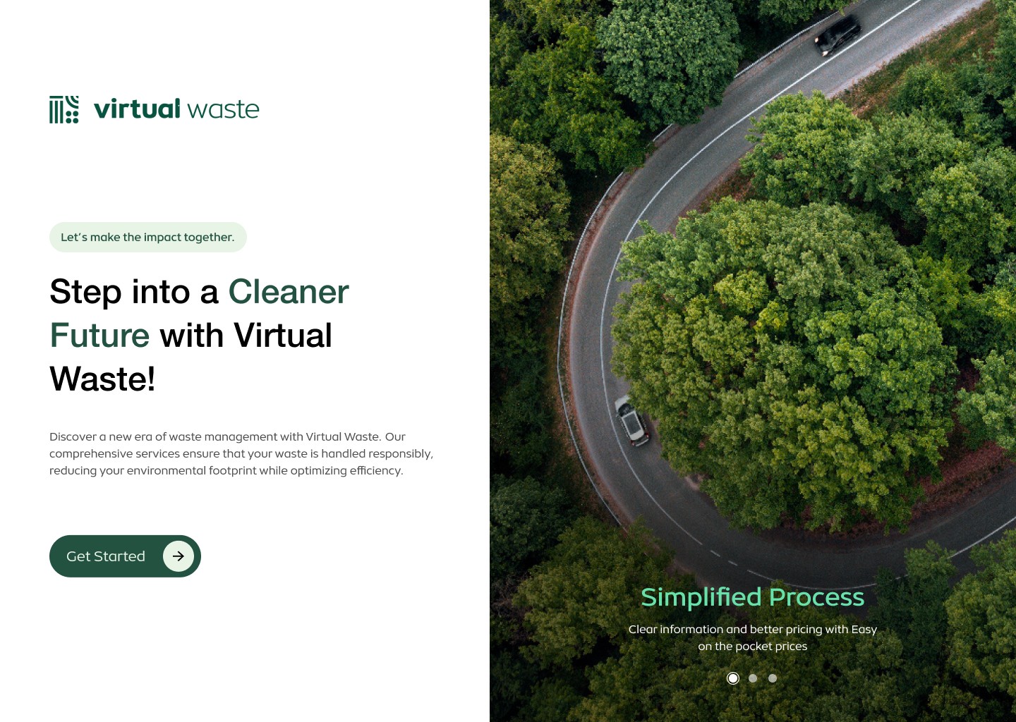

Step 1: Show Value Before Asking for Data

Most forms open with a request.

High-converting forms open with clarity.

Instead of: “Fill out this form”

Start with:

  • What they get

  • How long it takes

  • What happens next

  • Whether it’s commitment-free

For example:
“See how your onboarding compares in 60 seconds.”
“Get instant access. No sales call required.”

When perceived value increases before data exchange, resistance decreases. 

This simple shift often improves completion rates because users feel informed, not pressured.
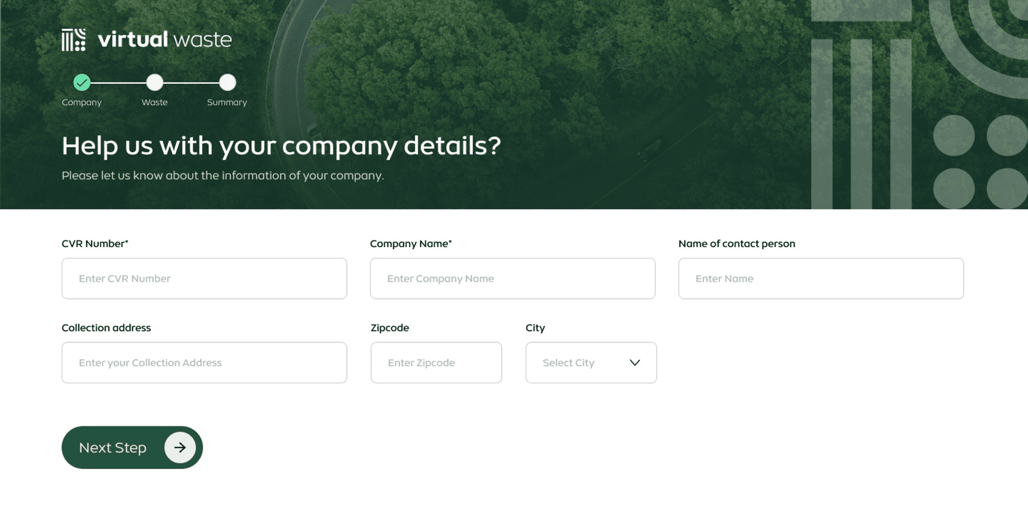

Step 2: Reduce Initial Fields Aggressively

One of the most reliable ways to reduce form abandonment is:

Ask for less.

Instead of:

  • Name

  • Company

  • Role

  • Phone

  • Industry

  • Budget

Start with:

  • Email

  • Or even just a single field

You can gather:

  • Company size later

  • Role during onboarding

  • Phone number after qualification

  • Intent via behavior instead of static form fields

This is progressive commitment.

Lower the barrier first.
Deepen engagement later.

Companies that simplify early-stage forms often see:

  • Higher submission rates

  • Better quality later-stage leads

  • Improved onboarding completion

Because momentum builds before interrogation begins.

This is especially critical in SaaS funnels where early friction directly affects activation and trial-to-paid conversion.
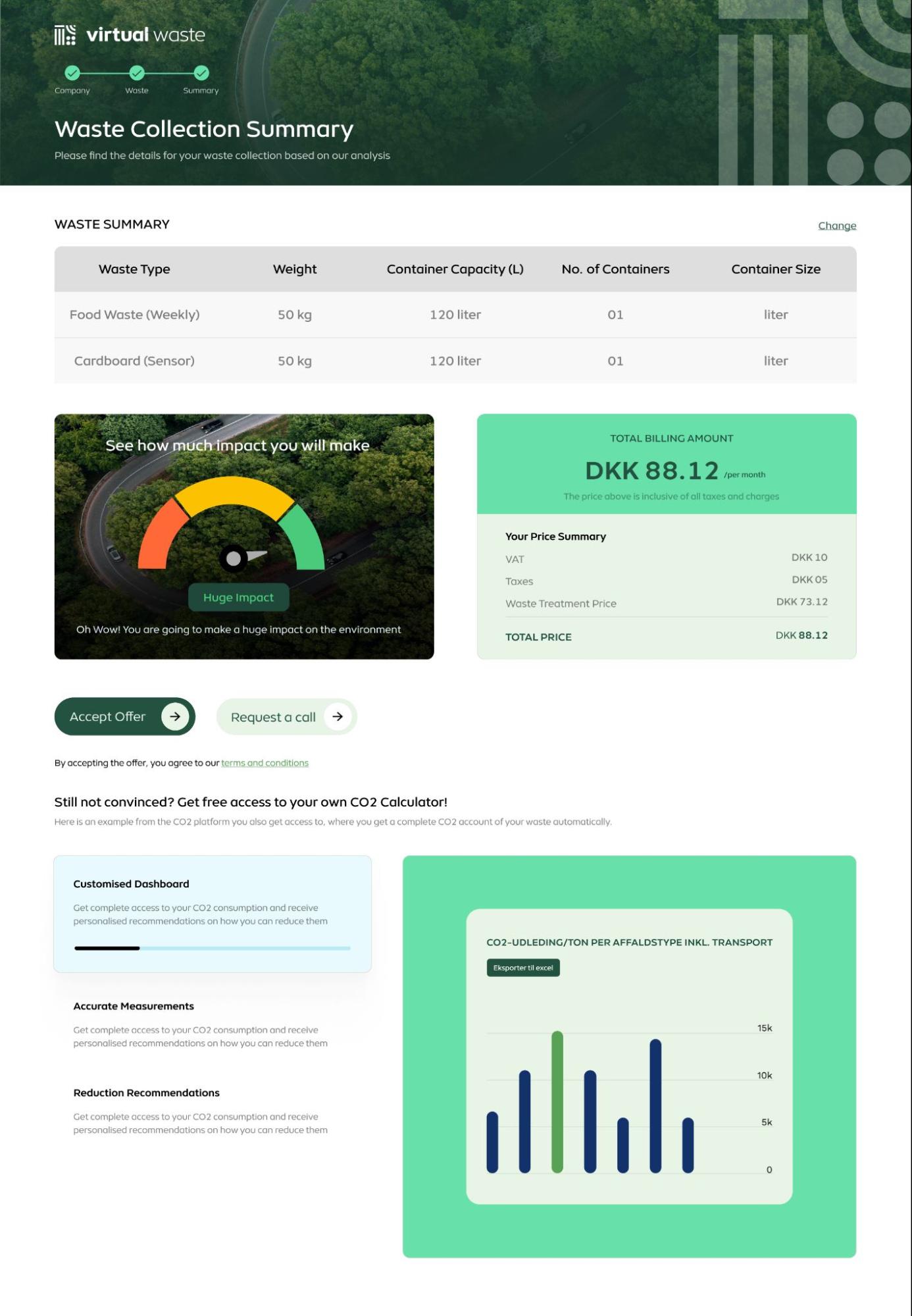

Step 3: Separate Low-Intent From High-Intent Actions

Not every user is ready for a sales call.

If your only CTA is “Request Demo,” you force everyone into the same commitment level.

Instead:

  • Primary CTA: Low-friction entry (trial, sign-up, audit preview)

  • Secondary CTA: High-intent action (book strategy call)

This creates:

  • Higher total conversion

  • Better-qualified calls

  • Less wasted sales effort

Users who voluntarily escalate are far more likely to convert.

Advanced Levers That Improve Form Performance

Beyond structure, there are small UX details that create disproportionate impact.

Clarify What Happens After Submission

Uncertainty reduces submission.

Add clarity:

  • “No spam. Ever.”

  • “You’ll receive instant access.”

  • “Takes under 60 seconds.”

  • “We’ll review and respond within 24 hours.”

Certainty reduces hesitation.

This hesitation is a classic user experience breakdown that often stems from deeper structural UX mistakes.

Break Long Forms Into Steps

Multi-step forms increase perceived progress.

Once a user completes Step 1, they are psychologically more likely to complete Step 2.

Completion momentum is real.

Reduce Visual Weight

A 7-field form can feel heavier than a 10-field form depending on layout.

Improve:

  • Spacing

  • Label clarity

  • Error handling

  • Field grouping

Effort perception influences completion more than actual effort.

How to Know If Your Form Is Costing You Revenue

You likely need form UX optimization if:

  • Traffic is stable but lead volume is flat

  • Demo bookings fluctuate unpredictably

  • Sales complains about low-quality leads

  • Users start forms but don’t complete

  • Trial-to-paid conversion feels weaker than expected

These aren’t marketing problems. They’re user experience problems.

And they’re fixable.

Why Small Fixes Create Big Business Impact

Here’s the reinforcement that reduces skepticism:

You don’t need a full redesign to improve conversions.

In many cases, form restructuring alone can:

  • Improve submission rates

  • Improve lead quality

  • Reduce CAC

  • Accelerate activation

  • Increase trial-to-paid conversion

Because when users feel safe, informed, and in control - they convert faster.

Want a Clear Diagnosis of Your Form Friction?

If your acquisition looks strong but conversions feel underwhelming, the issue may not be traffic or messaging.

It may be your form architecture.

In a 20-minute UX audit call, you’ll walk away with:

  • A friction map of your current form flow

  • Identification of unnecessary data requests

  • Clarity on sequencing issues

  • A prioritized list of quick wins vs structural changes

  • Guidance on progressive data capture


No vague advice.
No redesign upsell.
Just clarity on where conversions are leaking and what to fix first.

Book a 20-minute UX audit call and let’s identify whether your form is helping growth - or quietly slowing it down.

Sometimes the biggest growth unlock isn’t more traffic.

It’s fewer fields.

FAQs

1. How do I know if my form is hurting conversions?

Look for high drop-offs at the form stage, low demo bookings despite healthy traffic, rising cost per lead, or sales complaining about low-quality submissions. If users click “Get Started” but don’t complete the form, friction is likely the issue.

2. What is the ideal number of fields in a high-converting form?

There’s no universal number, but fewer initial fields generally increase completion rates. For early-stage conversion, asking only for an email or two essential details often outperforms long qualification-heavy forms. Additional information can be collected later through progressive profiling.

3. Should I remove phone number fields entirely?

Not necessarily. Instead of removing them completely, reposition them. Make phone numbers optional or request them only after users understand the value. High-intent users will provide them voluntarily, improving lead quality and reducing wasted sales time.

4. Do multi-step forms convert better than single-page forms?

In many cases, yes. Multi-step forms reduce perceived effort and create psychological momentum. Breaking forms into smaller steps often improves completion rates, especially for longer data collection processes.

5. Can improving form UX really reduce customer acquisition cost?

Yes. When form completion rates increase, you generate more leads from the same traffic. This lowers cost per lead and improves overall acquisition efficiency. Even a 10–20% lift in form submissions can significantly impact CAC.

6. What’s the fastest way to improve form performance?

Start with:

  • Removing unnecessary fields

  • Clarifying what happens after submission

  • Adding trust cues

  • Simplifying layout and spacing

These changes are often quick to implement and can create measurable gains without a full redesign.

7. When should I get a professional UX audit for my forms?

If traffic is strong but conversions are inconsistent, if sales cycles feel slow, or if users frequently abandon midway, a UX audit can uncover structural friction you may not see internally. A professional review helps prioritize fixes based on business impact, not just aesthetics.

Extreme close-up black and white photograph of a human eye

Let’s bring your vision to life

Tell us what's on your mind? We'll hit you back in 24 hours. No fluff, no delays - just a solid vision to bring your idea to life.

Profile portrait of a man in a white shirt against a light background

Harpreet Singh

Founder and Creative Director

Get in Touch

Harpreet Singh

Founder and Creative Director

How to Improve Online Form Conversion Rates (Without Redesigning Your Entire Website)

Feb 19, 2026

A practical guide to improving online form conversion rates by reducing friction, building trust, and optimizing form structure to lower CAC and increase qualified leads.

Online forms are often the biggest conversion bottleneck in SaaS and B2B products. This guide explains how to reduce friction, lower CAC, improve lead quality, and increase form completion rates using proven UX principles.

Your form might be leaking more revenue than you think.


Most companies don’t lose conversions on their headline.

They lose them at the form.

You can have:

  • Paid traffic flowing in

  • Strong messaging

  • Clear product positioning

And still struggle with sign-ups, demo requests, or qualified leads.

Why?

Because your form is introducing friction at the exact moment trust is still forming.

And that friction has real business consequences:

  • Wasted ad spend

  • Rising customer acquisition cost (CAC)

  • Slower pipeline velocity

  • Sales teams chasing low-intent leads

  • Longer sales cycles

Poor form UX doesn’t just reduce conversions. It compounds cost.

Let’s break down how to fix it.

Why Most Online Forms Quietly Kill Conversions

When a user reaches your form, they’re not fully committed yet.

They’re evaluating risk.

They’re thinking:

  • Is this worth my time?

  • What happens after I submit?

  • Will I get spammed?

  • Is this going to turn into a sales call immediately?

But most traditional forms:

  • Ask for phone numbers upfront

  • Require too many fields

  • Don’t clarify next steps

  • Feel transactional instead of helpful

This increases psychological friction.

And friction delays decisions.

And delayed decisions increase drop-offs.

In performance terms, that means:

  • Lower form completion rates

  • Lower demo bookings

  • Lower trial starts

  • Higher acquisition cost

If you want to improve form conversion rates, the problem isn’t usually traffic.

It’s sequencing.

The Real Business Cost of Poor Form UX

Let’s be clear about impact.

When forms underperform:

1. Your CAC Increases

You pay for traffic.
Fewer users convert.
Cost per lead rises.
Cost per acquisition rises.

Even a 10–20% improvement in form conversion can materially reduce acquisition costs.

2. Sales Time Gets Wasted

When users feel pressured into providing details early:

  • They enter fake numbers

  • They provide low-intent emails

  • They book calls prematurely

Sales teams then:

  • Chase cold leads

  • Sit through unqualified demos

  • Experience longer closing cycles

Better form UX filters intent instead of forcing it.

3. Pipeline Velocity Slows

High-friction forms delay activation.
Delayed activation reduces engagement.
Reduced engagement weakens conversion momentum.

Form friction rarely shows up as a single dramatic failure.

It shows up as “why is growth slower than expected?”

A 3-Step Framework to Improve Form Conversion Rates

This isn’t cosmetic advice. It’s structural.


Step 1: Show Value Before Asking for Data

Most forms open with a request.

High-converting forms open with clarity.

Instead of: “Fill out this form”

Start with:

  • What they get

  • How long it takes

  • What happens next

  • Whether it’s commitment-free

For example:
“See how your onboarding compares in 60 seconds.”
“Get instant access. No sales call required.”

When perceived value increases before data exchange, resistance decreases. 

This simple shift often improves completion rates because users feel informed, not pressured.


Step 2: Reduce Initial Fields Aggressively

One of the most reliable ways to reduce form abandonment is:

Ask for less.

Instead of:

  • Name

  • Company

  • Role

  • Phone

  • Industry

  • Budget

Start with:

  • Email

  • Or even just a single field

You can gather:

  • Company size later

  • Role during onboarding

  • Phone number after qualification

  • Intent via behavior instead of static form fields

This is progressive commitment.

Lower the barrier first.
Deepen engagement later.

Companies that simplify early-stage forms often see:

  • Higher submission rates

  • Better quality later-stage leads

  • Improved onboarding completion

Because momentum builds before interrogation begins.

This is especially critical in SaaS funnels where early friction directly affects activation and trial-to-paid conversion.


Step 3: Separate Low-Intent From High-Intent Actions

Not every user is ready for a sales call.

If your only CTA is “Request Demo,” you force everyone into the same commitment level.

Instead:

  • Primary CTA: Low-friction entry (trial, sign-up, audit preview)

  • Secondary CTA: High-intent action (book strategy call)

This creates:

  • Higher total conversion

  • Better-qualified calls

  • Less wasted sales effort

Users who voluntarily escalate are far more likely to convert.

Advanced Levers That Improve Form Performance

Beyond structure, there are small UX details that create disproportionate impact.

Clarify What Happens After Submission

Uncertainty reduces submission.

Add clarity:

  • “No spam. Ever.”

  • “You’ll receive instant access.”

  • “Takes under 60 seconds.”

  • “We’ll review and respond within 24 hours.”

Certainty reduces hesitation.

This hesitation is a classic user experience breakdown that often stems from deeper structural UX mistakes.

Break Long Forms Into Steps

Multi-step forms increase perceived progress.

Once a user completes Step 1, they are psychologically more likely to complete Step 2.

Completion momentum is real.

Reduce Visual Weight

A 7-field form can feel heavier than a 10-field form depending on layout.

Improve:

  • Spacing

  • Label clarity

  • Error handling

  • Field grouping

Effort perception influences completion more than actual effort.

How to Know If Your Form Is Costing You Revenue

You likely need form UX optimization if:

  • Traffic is stable but lead volume is flat

  • Demo bookings fluctuate unpredictably

  • Sales complains about low-quality leads

  • Users start forms but don’t complete

  • Trial-to-paid conversion feels weaker than expected

These aren’t marketing problems. They’re user experience problems.

And they’re fixable.

Why Small Fixes Create Big Business Impact

Here’s the reinforcement that reduces skepticism:

You don’t need a full redesign to improve conversions.

In many cases, form restructuring alone can:

  • Improve submission rates

  • Improve lead quality

  • Reduce CAC

  • Accelerate activation

  • Increase trial-to-paid conversion

Because when users feel safe, informed, and in control - they convert faster.

Want a Clear Diagnosis of Your Form Friction?

If your acquisition looks strong but conversions feel underwhelming, the issue may not be traffic or messaging.

It may be your form architecture.

In a 20-minute UX audit call, you’ll walk away with:

  • A friction map of your current form flow

  • Identification of unnecessary data requests

  • Clarity on sequencing issues

  • A prioritized list of quick wins vs structural changes

  • Guidance on progressive data capture


No vague advice.
No redesign upsell.
Just clarity on where conversions are leaking and what to fix first.

Book a 20-minute UX audit call and let’s identify whether your form is helping growth - or quietly slowing it down.

Sometimes the biggest growth unlock isn’t more traffic.

It’s fewer fields.

FAQs

1. How do I know if my form is hurting conversions?

Look for high drop-offs at the form stage, low demo bookings despite healthy traffic, rising cost per lead, or sales complaining about low-quality submissions. If users click “Get Started” but don’t complete the form, friction is likely the issue.

2. What is the ideal number of fields in a high-converting form?

There’s no universal number, but fewer initial fields generally increase completion rates. For early-stage conversion, asking only for an email or two essential details often outperforms long qualification-heavy forms. Additional information can be collected later through progressive profiling.

3. Should I remove phone number fields entirely?

Not necessarily. Instead of removing them completely, reposition them. Make phone numbers optional or request them only after users understand the value. High-intent users will provide them voluntarily, improving lead quality and reducing wasted sales time.

4. Do multi-step forms convert better than single-page forms?

In many cases, yes. Multi-step forms reduce perceived effort and create psychological momentum. Breaking forms into smaller steps often improves completion rates, especially for longer data collection processes.

5. Can improving form UX really reduce customer acquisition cost?

Yes. When form completion rates increase, you generate more leads from the same traffic. This lowers cost per lead and improves overall acquisition efficiency. Even a 10–20% lift in form submissions can significantly impact CAC.

6. What’s the fastest way to improve form performance?

Start with:

  • Removing unnecessary fields

  • Clarifying what happens after submission

  • Adding trust cues

  • Simplifying layout and spacing

These changes are often quick to implement and can create measurable gains without a full redesign.

7. When should I get a professional UX audit for my forms?

If traffic is strong but conversions are inconsistent, if sales cycles feel slow, or if users frequently abandon midway, a UX audit can uncover structural friction you may not see internally. A professional review helps prioritize fixes based on business impact, not just aesthetics.

Extreme close-up black and white photograph of a human eye

Let’s bring your vision to life

Tell us what's on your mind? We'll hit you back in 24 hours. No fluff, no delays - just a solid vision to bring your idea to life.

Profile portrait of a man in a white shirt against a light background

Harpreet Singh

Founder and Creative Director

Get in Touch