

Many teams ship interfaces that look good but still lose users at key moments. This guide covers the top UX mistakes and UI mistakes that hurt conversions, why they occur, and how to fix them with concrete design strategies.
Small design errors can leak conversions silently.
Most products don’t lose conversions because of bad ideas.
They lose them because of small, overlooked UX mistakes that quietly add friction at the worst possible moments.
Many of these UX mistakes originate earlier at the product level, where design decisions are made without a clear SaaS product design strategy.
Buttons that don’t explain what happens next.
Dashboards that look polished but don’t guide decisions.
Forms that feel heavier than they need to be.
Individually, these UI mistakes seem minor. Collectively, they create user experience problems that slow users down, break trust, and reduce conversions long before a pricing page or sales conversation even begins.
The problem is that many of these UX errors don’t show up in design reviews. They only appear in behavior: abandoned flows, low feature adoption, repeated support questions, and users who “just didn’t get it.”
This guide breaks down the most common UX mistakes that hurt conversions, why they happen, and how to fix them using practical, behavior-driven design decisions — not theory, trends, or cosmetic tweaks.
If you’re trying to improve UX in a way that actually moves activation, retention, or revenue, this is where to start.
Why UI/UX Mistakes Matter for Conversions
When you hear the word conversion, you probably think it's all about how the product looks. Understanding conversion fundamentals makes clear why it's really about clarity, momentum, and trust. A product can be visually polished but still leak users because of subtle user experience problems that interrupt flow, increase cognitive effort, or create hesitation.
These issues are often invisible until teams step back and review the product holistically through focused UX design services.
Some design errors are obvious. Others are hidden until they show up in analytics as drop-offs, abandonment, or low feature adoption.
Below are the most common UX errors and usability mistakes that sabotage conversions - with practical insights on how to improve UX and fix them.
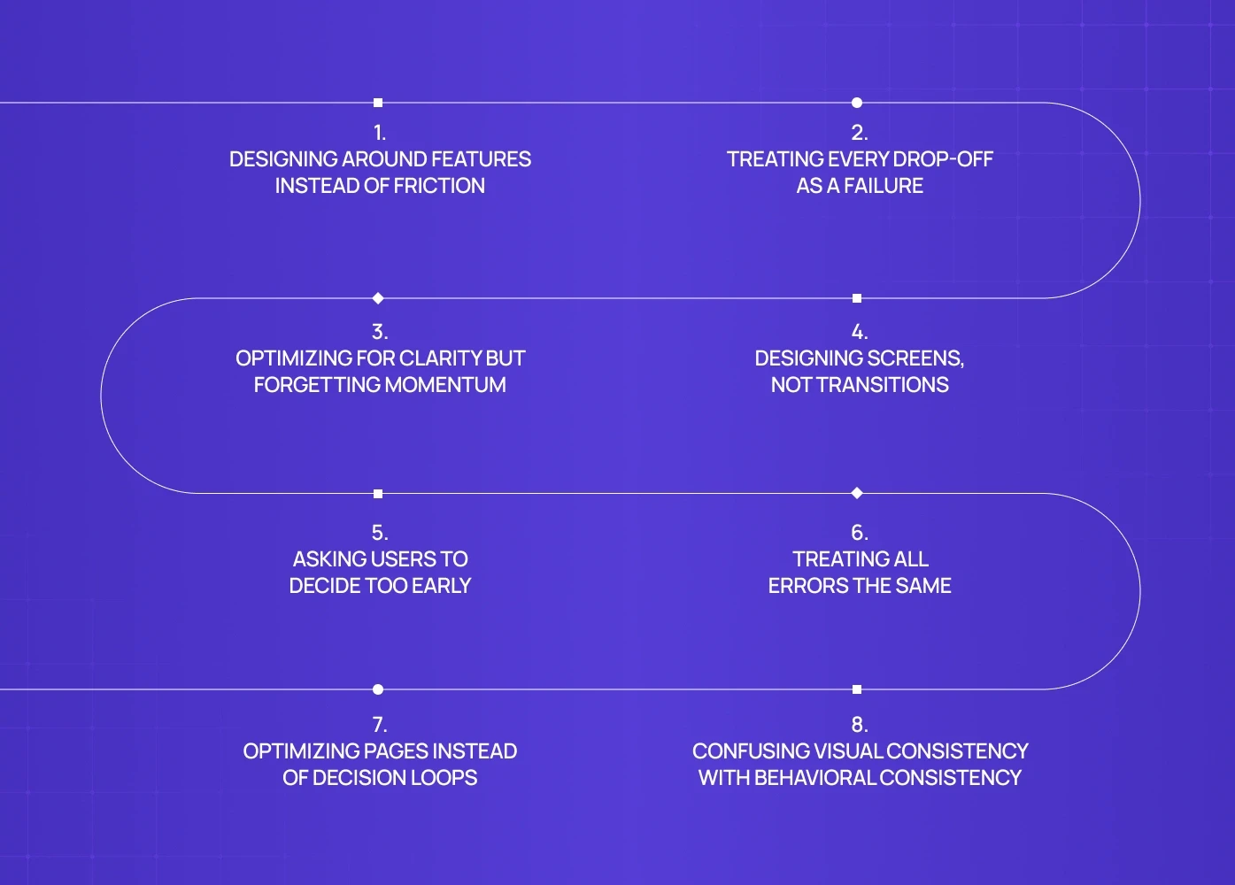
1. Designing Around Features Instead of Friction
A common UX mistake we see across complex products is designing screens around feature availability rather than user friction.
In projects like PathwaysX (B2B hiring platform), the initial challenge wasn’t missing functionality. The product already supported complex workflows for recruiters and employers. The issue was that users consistently slowed down at specific handoff points - especially when switching between candidate discovery, evaluation, and shortlisting.
Why this hurts conversions
When UX prioritizes “showing everything” instead of easing difficult moments, users mentally stall. They’re not blocked - they’re unsure.
That uncertainty is often where conversion leaks happen.
How this gets fixed
Instead of redesigning entire dashboards, the focus shifts to:
identifying friction-heavy moments
reducing decision load at those points
clarifying what happens after each action
This is how UX stops being descriptive and starts being assistive.
2. Treating Every Drop-Off as a Failure
Not every user who leaves is a lost conversion.
Why this hurts conversions
When UX removes all friction upfront, users progress without commitment. This inflates early engagement metrics but often leads to sharper drop-offs later.
The correction
Good UX introduces intent-filtering friction:
clearer framing of what the product is (and isn’t)
subtle checkpoints that confirm relevance
sequencing that prioritizes understanding before acceleration
Conversion quality improves when progression is earned, not rushed. Running a heuristic UX evaluation before optimising for intent-filtering helps teams confirm whether the friction they're removing is genuinely harmful or whether it's the kind that filters unqualified users before they reach key conversion points.
3. Optimizing for Clarity but Forgetting Momentum
Another frequent UX issue appears when teams over-optimize clarity at the expense of momentum.
Many teams mistake explanation for progress. They add more text, more tooltips, more guidance - assuming users want reassurance. But what users actually want is a sense of forward motion. If every step feels like a pause to read, evaluate, or confirm, the experience starts to feel heavier than it is. Conversion doesn’t drop because users are confused - it drops because they feel stuck in place.
Why this hurts conversions
Users don’t abandon because things are unclear — they abandon because progress feels slow.
Even well-written UX can stall conversion if it doesn’t reinforce forward motion.
What actually helps
Visual progress cues, language that emphasizes completion rather than instruction, and immediate feedback after actions all reinforce forward motion — the same conversion logic that runs through product page design that converts, where layout hierarchy and sequencing decisions determine whether users move toward a commitment or stall before reaching it. Clarity should enable momentum, not replace it.
4. Designing Screens, Not Transitions
Many UX mistakes live in the spaces between screens.
Why this hurts conversions
When transitions are unclear, users interpret delay as failure.
Even short pauses without feedback can erode trust.
How teams fix this
visible system responses
progressive loading instead of blank waits
feedback that confirms action instantly
Good UX doesn’t just show states — it explains change.
5. Asking Users to Decide Too Early
Decision overload is a recurring UX error, especially in products with setup-heavy flows. Early decisions create psychological risk. When users don’t yet understand outcomes, every choice feels irreversible, even when it isn’t. This leads to hesitation, abandonment, or safe defaults that reduce long-term engagement. The UX mistake isn’t complexity. It’s asking for commitment before confidence exists.
Why this hurts conversions
People avoid committing to decisions they don’t yet understand.
The fix
Reordering the experience: let users see value — and for some products, a splash page is the earliest opportunity to do exactly that, framing the product's purpose and qualifying intent before any configuration or commitment is asked of the user — then introduce configuration, then ask for commitment. This sequencing alone can improve completion without adding or removing features.
This sequencing alone can improve completion without adding or removing features.
6. Treating All Errors the Same
Most products treat errors as a single category.
In admin-heavy or data-sensitive products, this becomes dangerous. Minor validation issues and critical failures are communicated the same way, creating unnecessary anxiety.
Why this hurts conversions
When users can’t judge severity, they assume risk.
This is one of the most underestimated usability mistakes we see in real products.
The correction
Errors should differ by:
severity
recoverability
urgency
UX should tell users not just what happened, but how worried they should be.
7. Optimizing Pages Instead of Decision Loops
Another non-obvious UX mistake is optimizing individual screens without understanding the loop users repeat. This problem shows up frequently in analytics-heavy products, where dashboards surface data but fail to support decisions, something we break down further in our guide on SaaS dashboard UX best practices.
Why this hurts conversions
Improving one screen doesn’t help if the loop remains mentally expensive.
The fix
Map and optimize:
recurring decisions
repeated actions
confidence-building moments
Conversion improves when repeated flows feel lighter each time.
8. Confusing Visual Consistency With Behavioral Consistency
Design systems often solve how things look, not how they behave.
Across several projects, we’ve seen products where buttons, inputs, and components were visually consistent but behaved differently across contexts.
Why this hurts conversions
Users trust patterns they can predict.
When identical elements behave differently, trust breaks silently.
The fix
Consistency must apply to:
Interaction outcomes
Response timing
Feedback patterns
Component-level decisions like segmented control UI, where identical visual treatment across different contexts creates behavioral confusion when the underlying logic differs
The Pattern Across Real Products
Across Groto projects - from consumer apps to B2B platforms - the same pattern holds:
High-performing products don’t win because they look better.
They win because they remove hesitation at the right moments.
Most conversion issues are not design skill problems.
They’re sequencing, prioritization, and intent-alignment problems.
Want an Outside Eye on Your UX?
Most teams already sense something is off — users hesitate, flows feel heavier than they should, and conversions stall for reasons that aren’t obvious in design reviews.
A focused UX audit helps surface:
where users slow down or second-guess actions
which decisions are being asked too early
which patterns quietly erode trust or momentum
If you want clarity on what’s actually hurting conversions - and what to fix first - you can book a 20-minute call with our team. We’ll walk through your product, highlight friction points, and map practical next steps based on real usage patterns.
Book a 20-minute UX review call →
FAQs
1. What are the most common UX mistakes?
Navigation confusion, weak CTAs, form friction, inconsistent UI, and slow performance are among the top UX issues hurting conversions.
2. How do I know if UI mistakes are hurting my product?
Look for user drop-offs in analytics, repeated support queries, low task completion rates, and high abandonment after key actions.
3. Can minor UX fixes improve conversions?
Yes. Small improvements in clarity, feedback, and hierarchy often deliver outsized conversion lifts.
4. Should design fixes be tested before launch?
Always. Usability tests, prototype validation, and A/B experiments ensure your fixes work in real contexts.
5. When should I hire UX experts to fix errors?
If your team is stuck on recurring UX issues, deep usability problems, or inconsistent design logic, external UX expertise can help break the cycle.


