

Most SaaS interfaces look good—but still fail to retain users. This guide explains the design principles, UX patterns, and system-level decisions that improve adoption, reduce churn, and help SaaS teams scale faster.
Modern SaaS design is strategy, not aesthetics. Here’s what actually drives retention.
Your SaaS product design is not a decoration layer; it’s your most powerful retention engine.
Most growing startups get the basics right: they have a dashboard, maybe a checklist, and good aesthetics. Yet, many still bleed trial users and struggle with feature adoption. Why? Because they treat SaaS UI design as a feature rather than a core business strategy.
Most SaaS design articles explain “what” to do.
This one explains why, when & how—at the level of real product decisions.
This is not UI inspiration. This is revenue strategy expressed through product design.
Why 2026 Matters
SaaS teams are entering a tougher market this year — feature parity is now standard, AI is an expectation (not a differentiator), and time-to-value has become the key metric for retention. IIn 2026, great UI isn't enough — a scalable SaaS design system plus behaviour-driven UX is what separates products that survive from those that stall after MVP. And underlying all of it is SaaS branding as a retention strategy: the consistent emotional impression users form across every touchpoint that determines whether they renew, refer, or churn.
Read on to understand how to build a SaaS product that converts faster and feels genuinely intuitive to your users. And if you want tailored guidance, you can book a call with our Creative Director for hands-on advice.
The Real Problem With Most SaaS UI/UX
Most SaaS products today are visually clean but strategically vague. And a product without strategy won’t convert, no matter how on-point its features are. Visuals don’t guarantee sales. They ship fast. They look decent.
But founders still ask:
“Why aren’t users converting after the free trial?”
“Why does onboarding leak users?”
“Why do our engineers ship slowly even when the UI is done?”
This happens because SaaS teams don’t have a structured SaaS product strategy. They have UI. They have features. But they don’t have design logic.
This is where real SaaS product design begins.
That’s also why many scaling founders partner with specialised SaaS UI/UX design services when organic growth stalls.
Who This SaaS Design Guide Is Really For
You’ll actually benefit from this if…
If You Are… | And You’re Thinking… | This Will Help You… |
SaaS Founder | “Why are trials not converting?” | Plug conversion leaks with UX clarity |
Head of Product | “Why is UX so inconsistent?” | Build scalable UX patterns |
CTO | “Why do features take too long to ship?” | Reduce design debt → tech debt |
“Why isn’t the hero section converting?” | Align copy with product UX | |
SaaS Application Developer | “How do I build reusable components?” | Use scalable frontend architecture |
Not for you if you just want UI tweaks or website reskins. This framework is for teams that want retention, not decoration.
What We’ve Seen in 40+ SaaS Audits
Across 40+ SaaS teardown audits, we consistently observe three impact patterns:
• 20–35% retention lift after fixing activation flows
• 30–40% faster engineering sprints once the frontend architecture + UI library align
• Clear drop in feature bloat, leading to better adoption curves
These results come from behaviour-driven SaaS product design — not UI reskins. That UI-library-and-architecture alignment, in particular, is the work a design-systems partner is brought in to own.
Modern Trends Shaping SaaS UX in 2025
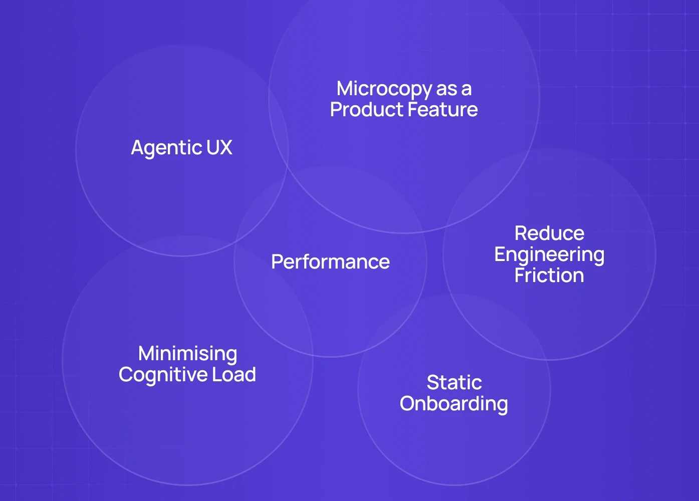
SaaS products don’t win today because they look good. They win because they anticipate user intent, reduce effort, and make complex actions feel lightweight. Based on what we've seen across B2B SaaS, AI-first products, vertical SaaS platforms, and enterprise UX sprints, here are the trends shaping 2026 — beyond the usual dark mode and neumorphism chatter.
1. Agentic UX – Not Just AI Features, but AI-Driven Interfaces
AI adoption is no longer a SaaS feature. The UX itself is evolving.
The new direction: interfaces that react to intent, learn from patterns and shape flows dynamically.
What this looks like in SaaS:
Forms that auto-suggest answers based on user history
Dashboards that reorder modules based on recent behaviour
In-app assistants that perform tasks, not just chat
This isn't "AI integration." This is AI as infrastructure — and it demands strong UX system design, not bolt-on AI widgets. Understanding product design vs management becomes especially consequential here, because agentic UX decisions sit at the boundary where design strategy and product prioritization must operate from the same framework.
We’ve applied this approach in multiple AI product UX projects across India & the US.
2. Minimising Cognitive Load Becomes a Competitive Advantage
Users aren’t overwhelmed because products are complex.
They're overwhelmed because they are forced to think too much.
2026 SaaS UX focuses on lowering mental effort:
Progressive disclosure instead of feature dumps
One-decision-per-screen layouts
Pre-filled templates as starting points for complex tasks
SaaS UI feels lighter not because it’s minimal — but because every element has a clear purpose.
You can see this applied in our B2B SaaS UX case study where we redesigned core flows based on cognitive load rankings.
3. Microcopy as a Product Feature
The era of flashy UI is ending. The smallest copy decisions are driving conversions.
Button copy now aligns with user intent loops
Empty states provide job-to-be-done clarity, not decoration
Onboarding flows behave like guided checklists, not welcome screens
This is where UX writing strategy meets SaaS product strategy — and it’s becoming one of the biggest levers in retention and activation.
4. From Static Onboarding to Guided Product Education
2026 SaaS UX moves away from tours and towards job-driven onboarding. That shift starts before users reach the product — SaaS signup UX determines whether users arrive with momentum or already fatigued by friction. Rather than showing features, great products now help users complete their first meaningful action within minutes.
What works:
Dynamic onboarding flows based on user segment
Progress trackers instead of “Next / Skip” buttons
Contextual help that appears only when friction signals arise
This ties directly to activation rate, design debt, and feature adoption velocity.
5. Design Systems That Reduce Engineering Friction
Design Systems are no longer “nice-to-have for branding”.
They have become product infrastructure.
In scaling SaaS teams, the biggest UX problem isn’t design.
It’s inconsistency and rework. Codebases slow down. Features clash.
Frontend debt increases exponentially.
By 2026, the strongest SaaS products are built on:
Systemised UI components
Token-based consistency
Reusable interaction patterns
API-driven UX logic
This is where design services evolve from Figma handover to production-ready UI libraries directly used by engineering teams — and SaaS application development and design systems covers how that architectural shift fits within the broader development lifecycle, from multi-tenant infrastructure decisions through to the frontend build patterns that make design system adoption sustainable at scale.
6. Performance Is Now Perceived UX
Speed and responsiveness are now UX signals.
A product that loads in 0.2 seconds feels smarter. Feels premium.
2026 trend: UX + engineering teams working on shared product metrics
Sub-500ms interaction time
Instant viewport loading
Real-time feedback animations
Latency-based UI prioritisation
When backend data loads slow, the UI still responds — this gives the user the illusion of constant motion, keeping cognitive trust intact.
The SaaS UI/UX Framework We Use at Groto
Every SaaS product that succeeds follows this 3-layer system—even if they don’t know they do:
SaaS Layer | Purpose | Without It | With It |
UX Strategy | Align goals with behaviour | Guesswork | Clear conversion paths |
UX Architecture | Design scalable journeys & flows | Broken handoffs | Scalable flows |
SaaS UI Design | Visual hierarchy & clarity | Looks good, doesn’t convert | UX that sells |
Design System | Reusable components | Feature shipping slows | Faster sprints |
Why You Should Care About a SaaS Product Roadmap
Without a UX-led roadmap, teams don’t scale — they react. Features get built based on stakeholder requests instead of user behaviour. What starts as “we’ll add this later” becomes inconsistent UX, slow shipping cycles, and mounting debt. A structured product roadmap prevents this by aligning UX, engineering, and GTM decisions around outcomes — not guesswork, and product and UX roadmap alignment is what makes that structure hold as teams scale beyond the founding pair.
Part 1—SaaS UX Best Practices That Actually Work
1. Don’t Start With UI—Start With Behaviour
We ask every SaaS client to answer one question before designing anything: "What is the first behaviour we need from this user?" That answer shapes product UX. This is why demos, dashboards, and onboarding must be designed backwards — from revenue — the same logic that makes product page design that converts so instructive for SaaS teams, showing how layout hierarchy and intent-driven copy decisions on high-stakes pages translate directly into user action.
➡ Recommended read: Landing Page Conversion Checklist → Perfect for SaaS trials
2. “Time-To-Value” Is the New UX Metric
Forget beautiful UI.
Ask: "How quickly can a new user reach their first success?" — the same question that shapes every decision in MVP UX design for SaaS, where clarity and time-to-value determine whether users ever return for a second session.
Bad UX (common) | Strong UX (high-retention SaaS) |
8 mandatory steps before access | 1-click demo + optional setup |
Feature tour at start | Contextual guidance only when needed |
Tool feels complex | Tool feels useful |
💡 Dropbox, Notion & Plaid mastered this.
This is what we optimise in our SaaS onboarding UX audits.
3. Personalisation Beats Standard Onboarding
Every SaaS user isn’t equal.
Why do most onboarding flows look identical?
Instead → Adaptive onboarding:
Let users choose their goal up front.
“What would you like to do first?”
✓ Import data
✓ Set up dashboard
✓ Invite teammates
✓ Explore templates (most clicked)
This alone cuts churn during onboarding by 20–40% based on our client results.
4. SaaS UI Design Mistake: Too Much Freedom, Too Early
New users don’t want power.
They want clarity.
Bad example: “Welcome! Explore our dashboard.”
Strong example: “Let’s set up your first dashboard — it takes 2 minutes.”
Clarity beats flexibility. Every time.
Part 2 — The Architecture Problem Nobody Talks About
When we audit SaaS products, the #1 hidden problem isn’t UI…
…it’s frontend architecture.
Poor SaaS Frontend = Slow Releases + Design Debt
Signs your frontend isn’t built for SaaS scale:
Repeated CSS overrides
Inconsistent UI components — including navigation patterns like UI component consistency that break when implemented differently across modules
Developers rebuilding UI from scratch
No design system
Confusing handoffs between design & engineering
➡ That’s when you need custom frontend builds — not just UI redesign.
Part 3 — The SaaS Design System Formula
When your SaaS starts scaling →
the single biggest unlock is building a Design System A structured SaaS design systems reference gives teams the component architecture, token logic, and governance patterns needed before they start building — so the system scales with the product rather than requiring a rebuild six months later.
It gives you:
Value | Impact |
Faster feature delivery | Engineering sprints speed up |
Reusable components | Visual consistency across modules |
Lower tech debt | Better code hygiene |
Predictable velocity | Easier collaboration |
This is why even Series A startups are now looking for design + code partners — not UI freelancers.
Part 4 — What Founders Should ACTUALLY Track
Most SaaS teams optimize for UI feedback. But your real UX scorecard goes deeper — knowing which SaaS UX metrics belong on that scorecard helps teams track signals that predict retention rather than just measure activity.
Metric | Ideal Range | Why It Matters |
Time-to-First-Value | < 2 minutes | Core user retention metric |
First-Week Retention | > 35% | Determines revenue path |
Feature Adoption Curve | Consistent improvement | Shows compounding UX |
Engineering Sprint Efficiency | Increase over time | Indicates scalable frontend |
These are exactly what we measure during a Groto SaaS UX Sprint.
When Should You Call a SaaS Product Design Agency?
Signs You’re Ready | Why It Matters |
Not enough users finish onboarding | UX is unclear |
Free-to-paid conversion low | Value isn't visible |
Team shipping slower | Design debt → tech debt |
UI looks fine but feels clunky | UX logic is missing |
Stakeholders keep requesting redesigns | No UX strategy |
If 2+ of these are true — you don't need UI work. You need SaaS product strategy + design system + UX alignment — and for teams whose design needs extend beyond a single engagement, finding the right design partner for ongoing SaaS sprints matters as much as understanding redesign cost and scope before that first conversation begins.
Our Approach at Groto
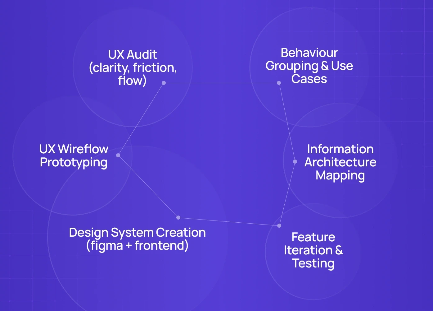
When we work with SaaS products, we apply a 6-step scalable system:
UX Audit (clarity, friction, flow)
Behaviour Grouping & Use Cases
Information Architecture Mapping
UX Wireflow Prototyping
Design System Creation (figma + frontend), built on atomic design structure so components compose cleanly from the smallest parts up
Feature Iteration & Testing
This is how we cut churn, reduce dev bottlenecks, and increase conversions.
Not theory — process.
Want a Real Audit of Your SaaS UX?
We can break down your current product experience and:
✔ Find conversion leaks
✔ Show scalable UX patterns
✔ Map a rollout plan for your team
Book a 20-minute strategy call → speak with our Creative Director (Top 3% globally)
Teardown and see where your SaaS is leaking users — before you scale and compound the cost.
FAQ
1. Do these principles apply to early-stage SaaS?
Yes — but simplified. For MVPs, focus only on clarity & time-to-value.
2. Can I use a template and still scale?
Yes—until complexity arrives. At that point, templates slow down engineering.
3. How long does a SaaS redesign take?
UX audit → 2 weeks. Full redesign + system → 6–10 weeks depending on scope.
4. What industries does this work for?
We’ve applied this to AI tools, B2B SaaS, fintech, marketplaces & e-commerce SaaS.
5. What if I only need frontend scalability?
That’s where our development team steps in — modular frontend builds with live UX systems.
6. What does this actually cost?
Projects vary depending on scope, but typically range from $8K–150K. Most clients begin with an audit sprint before scaling into full design + frontend builds.
7. Will this disrupt our current shipping?
No. We work in parallel with existing teams — sprints run alongside delivery. We remove debt while improving velocity.
8. How do we measure if it worked?
We track four metrics: time-to-value, activation rate, engineering sprint time, and design debt reduction. If these improve — your UX system is working.
9. Do these principles apply to MVPs?Yes, but simplified. For early-stage products, we focus only on clarity, first-use success, and lean UX architecture.


