

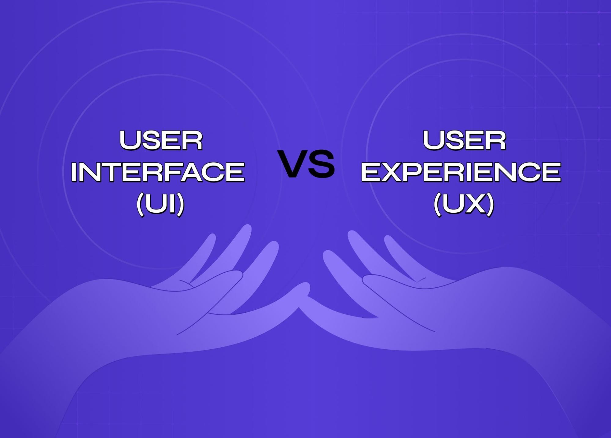
Most teams treat UI and UX as one job — they're not. One shapes how a product looks, the other shapes how it actually works. This guide breaks down both, where they collide, and why the best products get neither wrong.
UI looks right. UX works right. Most products struggle to nail both

Ever used an app that looked absolutely stunning but felt frustrating the moment you tried to actually do something with it? Or something plain that just worked, every single time? That gap between how a product looks and how it behaves is where ui/ux design lives.
It's not a single thing. It's two disciplines that share a canvas, constantly negotiating with each other. And if you're a designer or just someone curious to understand what they mean, why they're often lumped together, and where they actually differ, this is the only guide you need to read.
Breaking Down the Basics: UI vs UX
Before definitions or even ui ux design full forms, try a mental model.
Picture a restaurant:
The lighting, plating, menu typography - that's UI
How long you waited, how natural the evening flowed - that's UX
Both shape the experience. Neither is optional.
Aspects | UI Design | UX Design |
Asks | Does this look and feel right? | Does this journey make sense? |
Focus | Surfaces and interactions | Systems and logic |
Output | Visual components, design system | Users flows, wireframes, research |
Measures success by | Aesthetics, clarity, delight | Ease, efficiency, satisfaction |
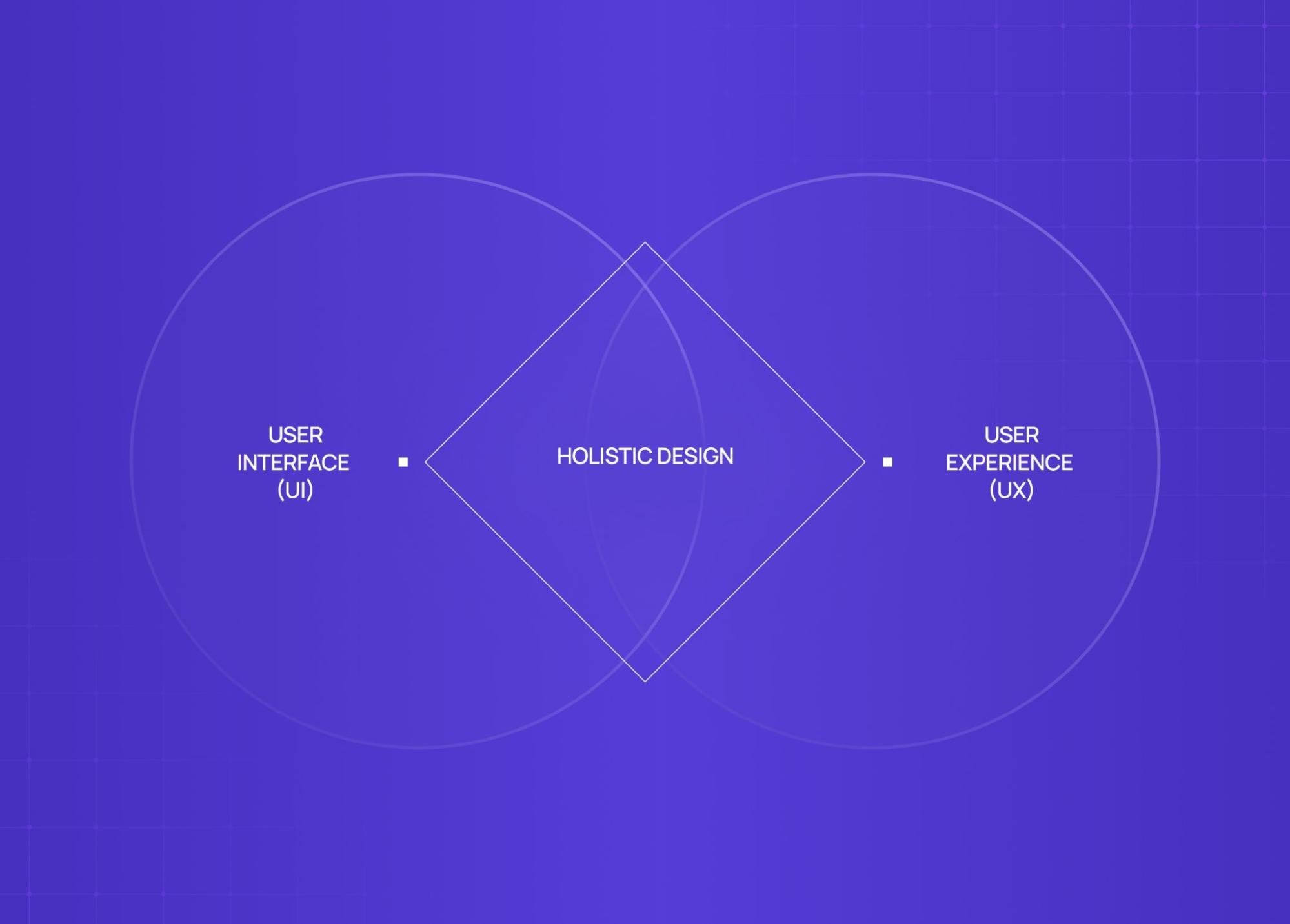
In short: UI is craft. UX is strategy — and UI vs UX design differences go deeper than titles, especially when building for SaaS where both disciplines directly affect retention. Great products need both.
When we redesigned PolicyBazaar's insurance shopping flow, the visual layer was only part of the conversation. "The bigger unlock was restructuring the decision architecture — which is exactly what UX strategy addresses at its core: reducing choices at critical drop-off points so users move forward instead of abandoning."What Does UI Design Actually Involve?
User interface design is every visual and interactive decision a user encounters. It's not just "making things pretty" - it's functional decision-making at a pixel level.
What our UI designers spend their time on:
Chooses typography, spacing, and colour systems
Decides how components behave on hover, tap, and error states
Builds and maintains design systems for consistency across screens
Ensures accessibility: contrast ratios, touch targets, readability
Designs the micro-moments: loading states, transitions, empty states
What "good UI" feels like to a user: Nothing. They don't notice it. They just feel confident and in control.
The Visual Building Blocks of UI
Components Reusable elements — buttons, modals, input fields, cards. A design system is a library of these with rules for when and how to use them.
Grid Systems The invisible structure behind any layout. Columns, gutters, margins — these make content feel ordered without feeling rigid, the kind of visual interface fundamentals that anchor every other UI decision that follows.
Colour Systems More than a palette. A proper colour system accounts for:
Hierarchy (what draws the eye first)
States (default, hover, disabled, active)
Accessibility (contrast ratios for colour blindness)
The accessibility dimension is where UX and AX design intersect most directly — contrast ratio decisions sit at the boundary between visual design craft and the accessibility discipline that governs inclusive interface standards.
Micro-interactions The small animated responses that make a product feel alive:
A button that pulses when loading
A form field that gently shakes on wrong input
A "like" animation that rewards the tap
What Does UX Design Actually Involve?
Before any screen gets designed, a ui ux designer on the UX side has to answer: who is this for, and why does it need to exist? And UX is broader than most people realise — UX disciplines that shape product design breaks down all 12 areas of practice, from research and information architecture to service design and behavioural psychology, that collectively produce the experiences this workflow is trying to create.
The UX design workflow:
Research: Understanding what is UX research — user interviews, competitor analysis, and behavioural data — is where the UX workflow begins. What users actually need is often different from what they say they need.
Wireframes: Low-fidelity layouts that test logic, not looks. Intentionally rough.
Prototyping: Clickable flows to simulate the experience before it's built.
Testing: Real users, real friction. Find where the logic breaks before it's expensive to fix.
Iterate: The first version is always a hypothesis — and which UX design methodologies a team applies at this stage determines how fast and how accurately that hypothesis gets validated. Testing tells you if it's right.
Designing for the Who, Why, and How
User Personas Not demographic spreadsheets. Useful personas capture:
Motivations and anxieties
The context in which they use the product
What success looks like for them specifically
Journey Mapping Traces the full arc: before, during, and after the product interaction — which is also where user journey vs user flow start to mean different things. Often reveals the biggest friction point isn't inside the app at all — it's the sign-up flow before anyone gets in.
Pain Points The moments where existing experiences fail people. Every meaningful UX decision starts here. AI in UX is increasingly being applied at this stage — machine learning tools can surface behavioral pain points at scale from session data before a single user interview is scheduled.
Where UI and UX Collide (And Why That's a Good Thing)
UI and UX design is not a clean handoff. It's a constant negotiation — and that friction is what makes screen design fundamentals matter: every surface decision is the result of UX and UI pushing back on each other until the right answer holds.
Where they overlap:
A UX flow shapes UI layout decisions before a single screen is designed
UI constraints push back on UX architecture when a flow is logically right but visually unworkable
Research from UX - "our users are on mobile, one thumb, low light" - rewrites UI decisions on scale, contrast, and touch targets
The result: Better products come from both disciplines in dialogue, not operating in silos.
The best products we've shipped — including the Camb.ai redesign, where we helped take a 140+ language AI dubbing platform from technically impressive to genuinely usable — came from this back-and-forth, not from either discipline working in isolation.
The UI/UX Design Process From Scratch
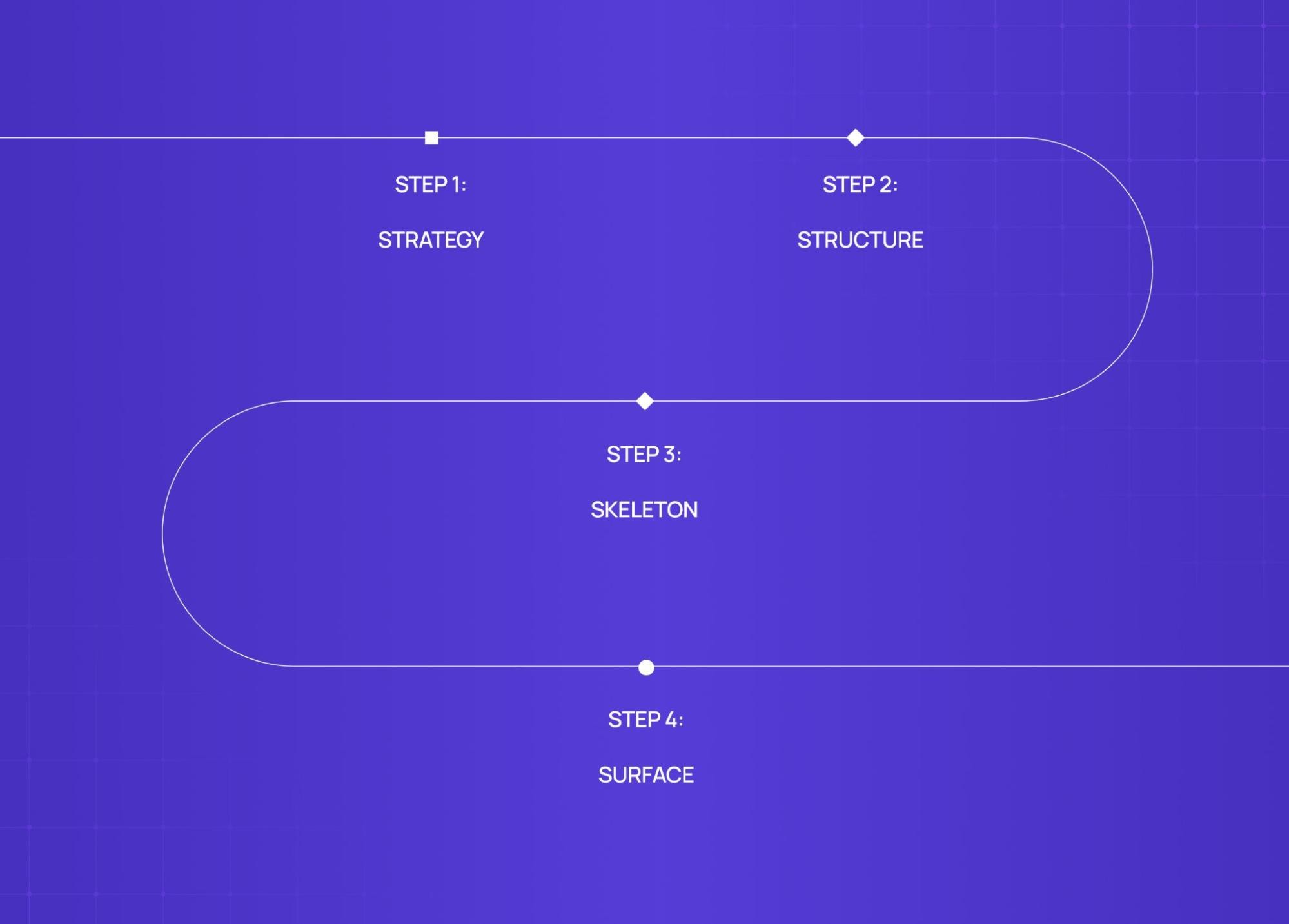
Every product goes through roughly the same phases — and following a structured UX design process step by step is what separates teams that ship right the first time from those who rebuild. The quality of each phase determines everything downstream. The quality of each one determines everything downstream.
1. Strategy Define the problem before designing the solution.
Who is this for?
What does success look like?
What constraints exist (technical, business, timeline)?
2. Structure Build the information architecture.
Sitemaps and navigation patterns
User flows (how many steps to the most important action?)
Content hierarchy
3. Skeleton Wireframe the layouts.
Low-fidelity, on purpose
Tests logic and flow, not visual appeal
Good wireframes generate early disagreement — that's the point
4. Surface Visual design arrives here.
Typography, colour, spacing, component design, motion
This phase is only as strong as the foundation beneath it
A beautiful surface on a confused structure is still a broken product. We've been brought in to fix enough of those to know.
How Do Designers Actually Build These Interfaces? Enter Figma
For most of digital design history, UI and UX lived in separate tools. Wireframes in one. Visual design in another. Collaboration meant emailed files. That separation is now being challenged further by agentic experience design, where AI layers are becoming part of the design canvas itself.
Figma changed that.
What is Figma? A browser-based design platform that brought the entire UI/UX workflow onto one shared canvas.
Why it matters:
UX wireframes and UI visuals live in the same file
Developers inspect specs without a handoff document
Stakeholders comment in context, not in email threads
Multiple designers collaborate in real time
Figma's component and variable systems also make design systems significantly easier to build and maintain at scale. It's the tool our team runs every project on — and the industry standard for a reason - though if you're still deciding on tooling, Figma vs Sketch vs Adobe XD is worth a look.
UI/UX Design as a Career: What to Expect
The ui ux designer title covers a wide range of actual responsibilities depending on company size and structure.
At startups: One designer often covers both — research, flows, visual design, and developer handoff.
At larger companies: Roles split into:
UX Rese archer (interviews, testing, data)
UX Designer (flows, wireframes, architecture)
UI / Visual Designer (surface layer, design system)
On salary — and we'll be direct about this:
Level | India (LPA) | US (Annual) |
Junior (0-2 yrs) | 4 - 8L | $60K - $80K |
Mid-Level (2-5 yrs) | 10 - 20L | $90K - $120K |
Senior (5+ yrs) | 25 - 40L+ | $130k - $160K+ |
Note: Figures from Glassdoor, AmbitionBox, LinkedIn benchmarks (2024-26). For a more detailed global breakdown, Coursera's UX designer salary guide is a solid reference. Senior roles at startups often exceed ranges.
What actually gets designers hired isn't the degree or the certification. It's the portfolio — specifically, case studies that show the problem, the process, and the decisions. Understanding how to build a UX portfolio that demonstrates this depth is what separates candidates who get callbacks from those who don't. Recruiters can tell within two minutes whether someone understands the design thinking process or just knows how to use Figma.
Common Misconceptions About UI/UX Design
We hear these constantly — from clients, from candidates, sometimes from designers themselves.
"UX is just wireframes" Wireframes are an output. UX is research, strategy, problem framing, systems thinking. The wireframe just makes the decisions visible — and understanding design versus PM roles clarifies where UX strategy ends and product management begins, a boundary that matters especially when both disciplines are competing to own the problem framing.
"UI is just making things pretty" Every visual choice is functional. Button colour affects conversion. Typography affects reading fatigue. Spacing affects perceived complexity. None of this is decorative.
"More features = better UX" Usually the opposite. Good UX often means removing things — and the clearest way to understand this is through bad UX design examples that show exactly how added complexity destroys usability. The discipline is eliminating noise without removing genuine utility.
"You need to be a visual artist" UI rewards visual sensibility. But the skills that matter most — empathy, systematic thinking, asking good questions — have nothing to do with drawing ability.
"UI/UX is only for digital products" Airport wayfinding. ATM flows. Hospital intake forms. Voice interface design. All UX problems. The medium changes. The discipline doesn't.
Conclusion: Why Both UI and UX Matter Together
Here's the simplest way to put it:
UX without UI = a product that works but no one wants to use
UI without UX = a product that looks good but makes no sense
Both together = something that earns trust the first time and keeps it
What is ui ux design, really? It's the discipline of making sure that when someone picks up a product, they feel capable, not confused. Confident, not lost. The strongest outcomes come from a clear UI/UX strategy framework that holds both disciplines accountable to the same outcome.
That's harder than it sounds. And it takes both.
Across 140+ projects, the ROI of UX design becomes measurable fast — sign-up rates that doubled, support tickets that dropped by half, and clients who've collectively raised $8M+ post-redesign.
If you're evaluating external support, understanding what a UI/UX design agency does — the actual roles, deliverables, and responsibilities — is a useful first step. Groto has shipped design work for products across fintech, health, edtech, and SaaS, including PolicyBazaar, Camb.ai, and STBL.io.


