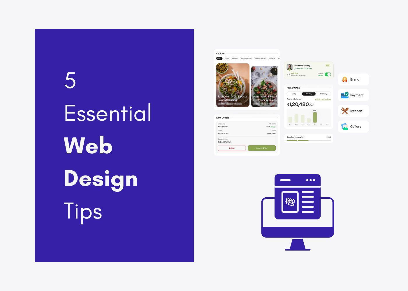
Your users aren't reading your screens — they're glancing at them for half a second and making a call. Screen design is what controls that call. This is the complete guide to getting it right, from concept to high-fidelity.
Screen design isn't decoration. It's the difference between a product that converts and one that doesn't.
Screen after screen, your users are making split-second judgments about your product. Whether it's a sign-up form, a dashboard they open every morning, or an error state they hit unexpectedly — every screen either builds trust or quietly chips away at it. That's the job of screendesign, and it's one most product teams underestimate until the metrics start telling them otherwise.
In this guide, we walk through what screen design actually means, the principles that make it work, the process behind it, and the tools teams use to get it right. If you're building a SaaS product, a mobile app, or any digital interface, this is the foundation that has to be solid before anything else.
TL;DR
Screendesign is the discipline of planning and composing everything a user sees and interacts with on a screen — layout, color, type, navigation, and interaction, all working together.
Good screen design starts before any tool is opened: define what the system is to its users before designing how it looks.
Users scan screens, they don't read them — structure every screen to support scanning, not careful reading.
Core components include layout and hierarchy, scannability, typography, color, navigation patterns, visuals, and medium-matching.
In SaaS, every screen has one job — and most failing screens are trying to do three.
Screen design directly affects conversion, activation, retention, and how credible a product appears to buyers and investors.
The process runs: define purpose → map information architecture → wireframe → build a style guide → high-fidelity design → test with real users.
Figma is the dominant design tool; Screenlane and Mobbin are the leading inspiration and reference platforms.
Most screen design mistakes point to skipped process steps, not bad visual taste.
What Is Screendesign?
Screendesign is the practice of deciding what goes on a screen, where it goes, and why — across websites, mobile apps, SaaS dashboards, and anything else where a person interacts with a digital interface through a display.
It's not just about making things look good. Good screen design sits at the intersection of visual aesthetics, information architecture, interaction logic, and user psychology — for the full picture of what UI/UX design actually involves, screen design is the output layer where all of those disciplines converge. At Groto, we think of it as the practice of making every screen do its job clearly — guiding attention, communicating hierarchy, and reducing friction at every step.
One distinction worth drawing early: screen design is not the same as front-end development. Design defines what appears and why it's arranged that way. Development defines how it gets built. Both matter, but conflating them is one of the most common reasons screen-level decisions get made too late in the process.
Start with Concept, Not with Screens
This is the principle most teams skip, and it's the one that causes the most rework downstream.
Before any screen is sketched, a team needs a clear answer to a more fundamental question: what is this system to its users? Not how it looks — what it is. What mental model does it create? What metaphor does it operate on? How does it fit into the user's existing world?
Designers who start directly in a design tool — placing buttons, picking colors, drawing navigation bars — are designing how the system presents itself before they've defined what the system is. Those decisions often have to be undone. Time spent on interaction details without a well-defined underlying conceptual structure is frequently wasted.
The practical implication for any product team: before touching a design tool, align on the product's conceptual model. Document it. Let it constrain the screen design decisions that follow. The visual layer should express the concept — not define it.
What Makes a Good Screen: 3 Properties Every SaaS Screen Must Have
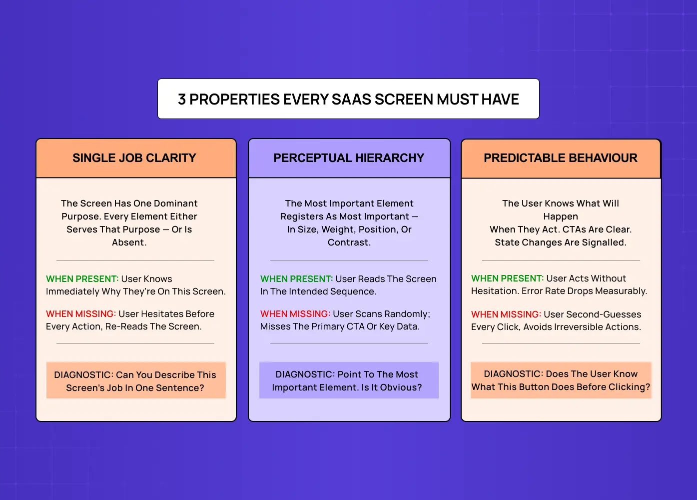
Before diving into components and process, there's a simpler diagnostic worth understanding first. A well-designed screen — especially in a SaaS product — has three properties. When all three are present, the screen feels effortless. When any one is missing, the screen creates friction that compounds across every user session.
01 — Single-Job Clarity
The screen has one dominant purpose. Every element either serves that purpose — or is absent. When this is present, the user knows immediately why they're on this screen. When it's missing, they hesitate before every action and re-read the screen trying to orient themselves.
Diagnostic: Can you describe this screen's job in one sentence? If not, the screen has a problem that no amount of visual polish will fix.
02 — Perceptual Hierarchy
The most important element registers as the most important — in size, weight, position, or contrast — without requiring the user to read the screen to understand its structure. When this is present, users read the screen in the intended sequence. When it's missing, they scan randomly and miss the primary CTA or key data point entirely. The techniques that make this work are covered in depth in the guide on emphasis in design.
Diagnostic: Point to the most important element on the screen. Is it immediately obvious to someone seeing it for the first time?
03 — Predictable Behaviour
The user knows what will happen when they act. CTAs are unambiguous. Navigation is consistent. State changes are signalled before they occur. When this is present, users act without hesitation and error rates drop measurably. When it's missing, users second-guess every click and avoid irreversible actions — which in a productivity tool means they avoid doing things the product needs them to do.
Diagnostic: Does the user know what this button does before clicking it?
Core Components of Screen UI Design
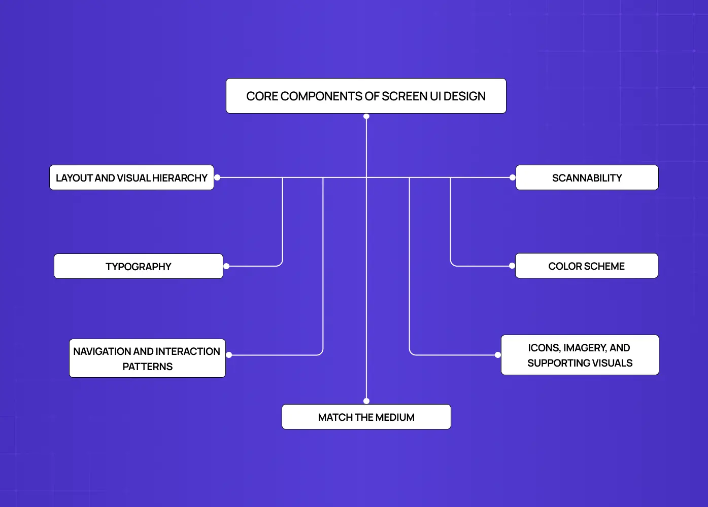
Once the conceptual foundation is clear, screen design works across several overlapping layers simultaneously. Get one layer wrong and it ripples upward through everything above it. These layers are all expressions of the 13 principles of design — contrast, balance,proximity, hierarchy — applied at the screen level.
Layout and Visual Hierarchy
Layout is the foundation. It determines where every element lives on a screen and how the eye moves through the content. A strong layout creates visual hierarchy — a clear sense of what's most important, what's secondary, and what's contextual detail. The visual design principles that govern this hierarchy are what every screen layout decision draws from.
Grid systems keep elements aligned and proportional across screen sizes — the guide on types of grids and their importance in modern design covers which grid structure fits which screen complexity.
Proximity groups related elements and separates unrelated ones.
Contrast draws the eye toward the most important action or piece of information.
White space gives elements room to breathe, reducing cognitive load without removing content.
Focal points ensure users always have a clear answer to "where do I look first?"
Scannability
Users almost never read screens carefully. They scan — quickly moving across the interface looking for anything that matches their goal. This has a direct consequence for how screens should be structured.
Break information into headings, bullets, lists, and visual groupings rather than long prose.
Keep labels and link text short and immediately recognizable.
Display information visually where possible — a chart communicates faster than a paragraph of numbers.
Prioritize the most important content for the top and left of the screen, following natural reading patterns.
Avoid burying key actions in text or hiding navigation in unconventional locations.
Scannability isn't a visual preference — it's a behavioral reality. Screens that require careful reading create friction; screens that support scanning reduce it.
Typography
Type shapes how readable and trustworthy a screen feels. It's one of the most underestimated levers in screen UI design.
Font choice communicates tone — a fintech product has different type requirements than a consumer wellness app.
A clear typographic hierarchy (heading → subheading → body → caption) guides users through content without confusion.
Line height and letter spacing affect legibility at scale, especially on mobile — the guide on what tracking does to legibility at scale explains the mechanics behind this and how to calibrate it correctly.
Consistent typographic systems — defined in a style guide — prevent screens from feeling visually fragmented across a product.
Color Scheme
Color does two jobs simultaneously: it communicates meaning, and it establishes identity.
A color system defines primary, secondary, and semantic colors (success, warning, error, neutral).
Color contrast ratios are a core accessibility requirement — not an optional enhancement.
Background and foreground relationships must hold up across different device brightness settings and ambient lighting conditions.
Brand colors inform the palette, but functional UX requirements should govern how and where they're applied.
Navigation and Interaction Patterns
How users move between screens matters as much as what's on any individual screen.
Navigation placement (top bar, sidebar, bottom nav) should match both platform conventions and the product's structural complexity.
Interaction affordances — buttons that look tappable, links that look clickable — reduce user hesitation without requiring explanation.
Transitions and micro-interactions communicate state changes and provide feedback that keeps users oriented.
Consistent patterns across screens reduce the learning curve for new users and reduce cognitive effort for experienced ones.
Icons, Imagery, and Supporting Visuals
Visual elements support comprehension when used well — and create noise when used carelessly.
Icons should be immediately recognizable; if they require explanation, they're not doing their job.
Imagery should serve the content, not decorate the page.
Illustrations work particularly well for empty states, onboarding screens, and error moments.
Every visual element should have a functional reason for being on the screen.
Match the Medium
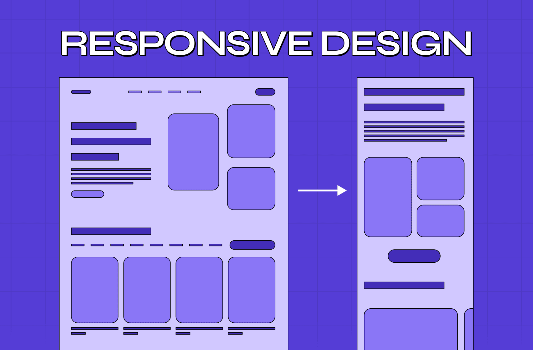
One of the clearest signs of a poorly considered interface is a screen that doesn't account for the constraints and capabilities of the device it appears on — the guide on mobile-first responsive design best practices covers how to approach this structurally from the start. A layout built for desktop that simply shrinks for mobile. A visual metaphor that doesn't translate to touch. Subtle colors on a screen that can't render them accurately.
Screen design has to account for:
Screen size and resolution across the target device range.
Input method — touch, mouse, keyboard, voice — and how it affects what affordances are appropriate.
Ambient context — a mobile app used outdoors needs different contrast considerations than a desktop tool used in an office.
The rendering limitations of the target medium.
Getting this right isn't a polish step. It's a structural decision that should be made at the beginning of the design process, not retrofitted at the end.
The Screen Job Framework: Every Screen Has One Job
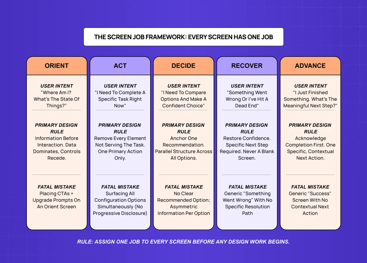
Here's the thing most guides to screen design get wrong. They catalogue components — here are cards, here are navigation bars, here are modals. That's the vocabulary of screen design, not the grammar. The grammar — the rules that determine whether a screen actually works — comes from understanding what job the screen is supposed to do for the user at that exact moment in the product journey.
In SaaS products especially, screen design is not a layout problem. It's a clarity-of-purpose problem. When a dashboard tries to orient new users, surface power features, and drive an upgrade decision simultaneously, it fails at all three — not because it looks bad, but because no single screen can serve three different user intents without fracturing focus.
At Groto, we use the Screen Job Framework before any screen is built or rebuilt. It defines five screen types by user intent — because the most useful way to organize screens isn't by component type or visual style. It's by what the user actually needs to accomplish the moment they arrive.
The 5 Screen Types
01 — ORIENT (Home dashboard, project overview)
User intent: "Where am I? What's the state of things?"
Design rule: Information before interaction. Data dominates, controls recede.
Fatal mistake: Placing CTAs and upgrade prompts on an orient screen — they compete with situation awareness and the screen fails at its primary job.
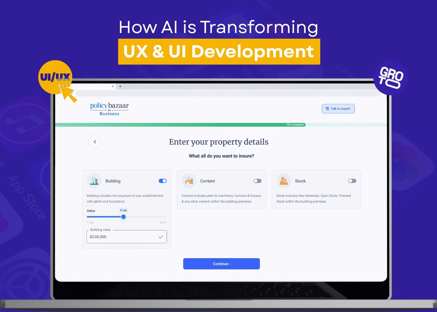
02 — ACT (Forms, editor, config panels)
User intent: "I need to complete a specific task right now."
Design rule: Remove every element not directly serving the task. One primary action only.
Fatal mistake: Surfacing all configuration options simultaneously with no progressive disclosure — intimidating the user before they've started.
03 — DECIDE (Pricing, plan comparison, feature selection)
User intent: "I need to compare options and make a confident choice."
Design rule: Anchor one recommendation. Maintain parallel structure across all options.
Fatal mistake: No clear recommended option and asymmetric information per option — the user can't make a fair comparison and defaults to paralysis.
04 — RECOVER (Error states, empty states, zero-results views)
User intent: "Something went wrong or I've hit a dead end."
Design rule: Restore confidence. Specific next step required. Never a blank screen.
Fatal mistake: Generic "Something went wrong" with no specific resolution path — leaving the user stuck at the exact moment their confidence is lowest.
05 — ADVANCE (Post-task confirmations, upgrade prompts, feature discovery)
User intent: "I just finished something. What's the meaningful next step?"
Design rule: Acknowledge completion first. One specific, contextual next action.
Fatal mistake: Generic "success" screen with no contextual next action — leaving the highest-converting moment in the user journey completely unused.
The Multi-Job Trap: Why Most SaaS Screens Fail
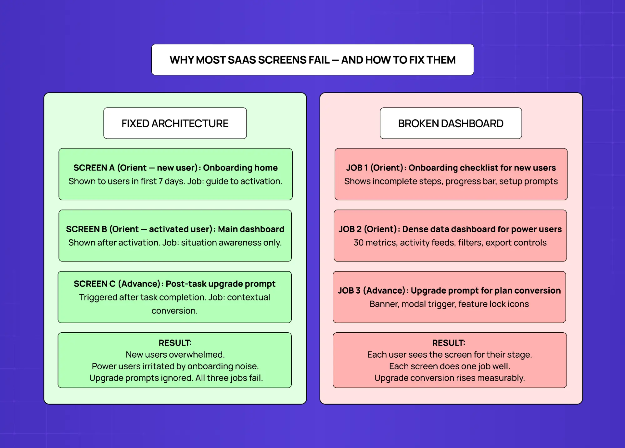
The most common screen design failure in SaaS isn't poor visual execution. It's a single screen assigned multiple conflicting jobs — and it happens to almost every product team eventually.
Here's how it plays out. A dashboard gets built with a clear job: situation awareness for activated users. Then onboarding gets added. Then an upgrade prompt banner. Then a feature announcement. Each addition seems reasonable in isolation. The cumulative effect is a screen that has completely lost its purpose.
The broken version looks like this:
Job 1 (Orient — new users): Onboarding checklist, progress bar, setup prompts.
Job 2 (Orient — power users): 30 metrics, activity feeds, filters, export controls.
Job 3 (Advance): Upgrade prompt banner, modal trigger, feature lock icons.
Result: New users are overwhelmed. Power users are irritated by onboarding noise they've already completed. Upgrade prompts are ignored because they appear when the user is trying to work, not evaluate plans. All three jobs fail.
The fix isn't removing features. It's separating screens:
Screen A (Orient — new user): Onboarding home, shown in the first 7 days. Job: guide to activation.
Screen B (Orient — activated user): Main dashboard, shown after activation. Job: situation awareness only.
Screen C (Advance): Post-task upgrade prompt, triggered after task completion. Job: contextual conversion.
Each user sees the screen for their stage. Each screen does one job well. Upgrade conversion rises because the prompt appears when the user is confident and receptive — not when they're trying to complete a task.
The Screen Job Audit — 3 Questions
Before designing or redesigning any screen, run through these:
What job was this screen supposed to do? Inferred from the product flow and the user's arrival context.
What jobs is it currently doing? List every element and the intent it serves.
Which jobs belong here — and which need their own screen? Restructure, don't just remove.
The output is a screen with a clear job, a coherent hierarchy, and measurable success criteria — not just a redesigned layout.
Why Screen Design Directly Affects Business Outcomes
Screen design isn't just a design team concern — it's a product and growth concern. Every friction point in a screen costs conversions. Every moment of confusion in an onboarding flow costs retention. Every inconsistent interface pattern costs trust.These outcomes are why digital product design principles treat screen-level decisions as business decisions, not aesthetic ones.
At Groto, we've seen this pattern repeatedly: teams that treat screen design as decoration pay for it in their metrics later.
The business outcomes most directly shaped by screen-level decisions:
Conversion rate — every screen in the acquisition path either removes friction or creates it; the homepage design principles guide covers the highest-stakes screen in that path in detail.
Activation rate — how quickly new users reach their first moment of value is almost entirely a screen design problem.
Retention — users stay with products that feel consistent and easy to navigate.
Support volume — confusing screens generate support tickets; clear screens reduce them.
Perceived credibility — investors, enterprise buyers, and first-time visitors form opinions based on what they see before they experience what a product does.
The Screen Design Process
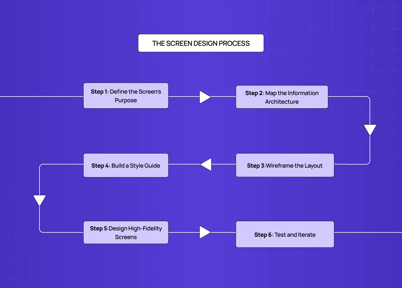
A good app screen UI doesn't happen by opening a design tool and making things look polished. It follows a deliberate sequence.
Define the Screen's Purpose
Every screen has a job. Before anything else, define what the user needs to accomplish on this screen and what the product needs the user to do. If those two things are in tension, the screen has a design problem before a single element is placed.
Map the Information Architecture
Decide what content belongs on this screen, what belongs elsewhere, and how it's prioritized. Hierarchy decisions happen here — before they're expressed visually. Teams that skip this step consistently produce screens that are either overloaded or confusingly sparse.
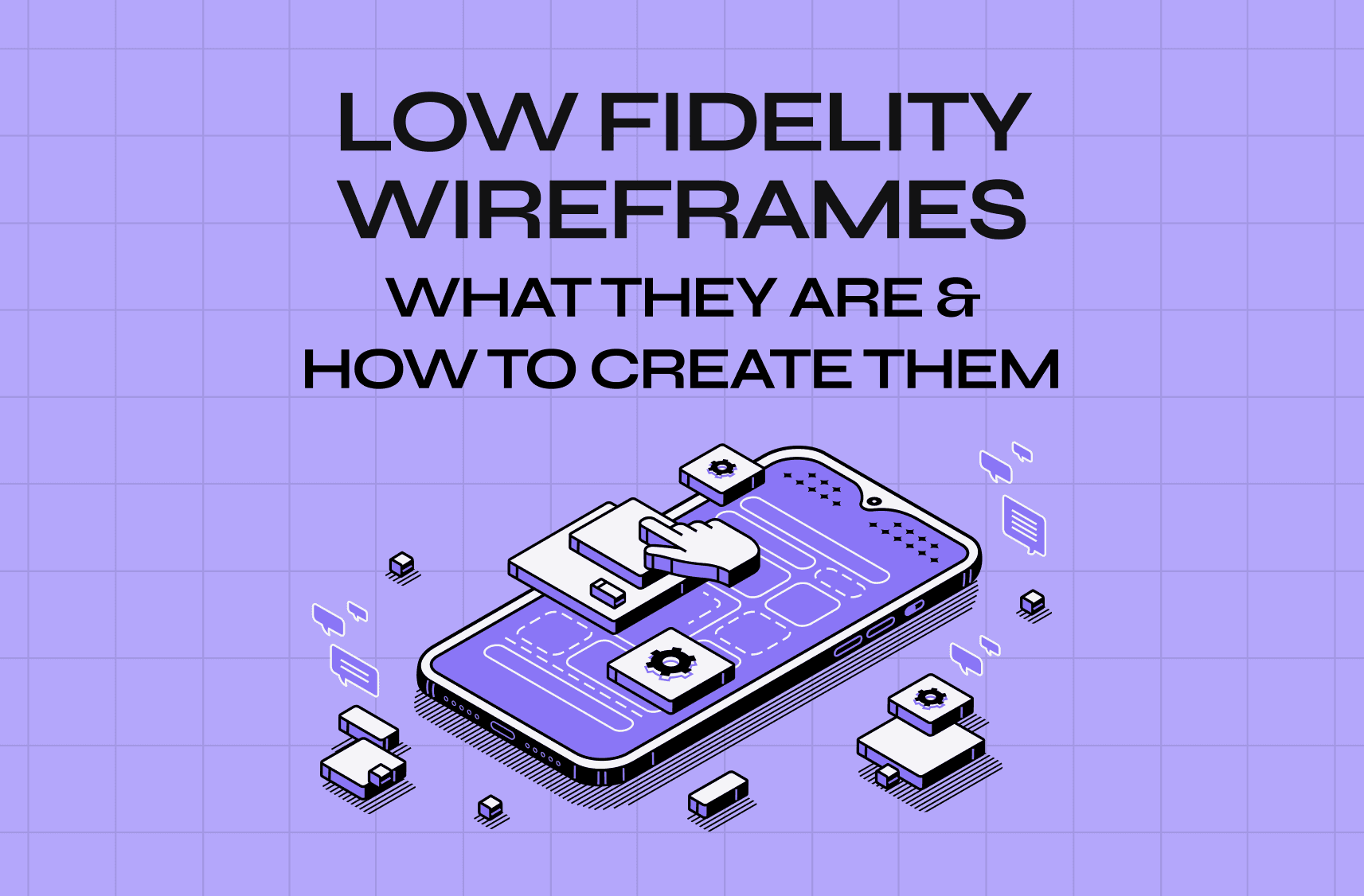
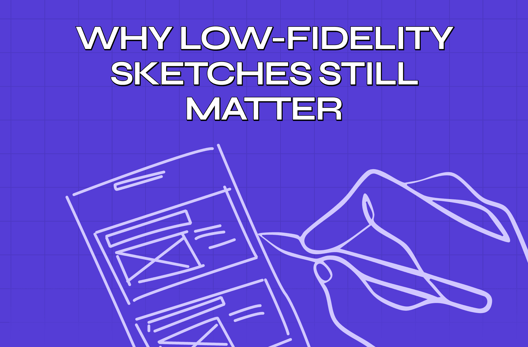
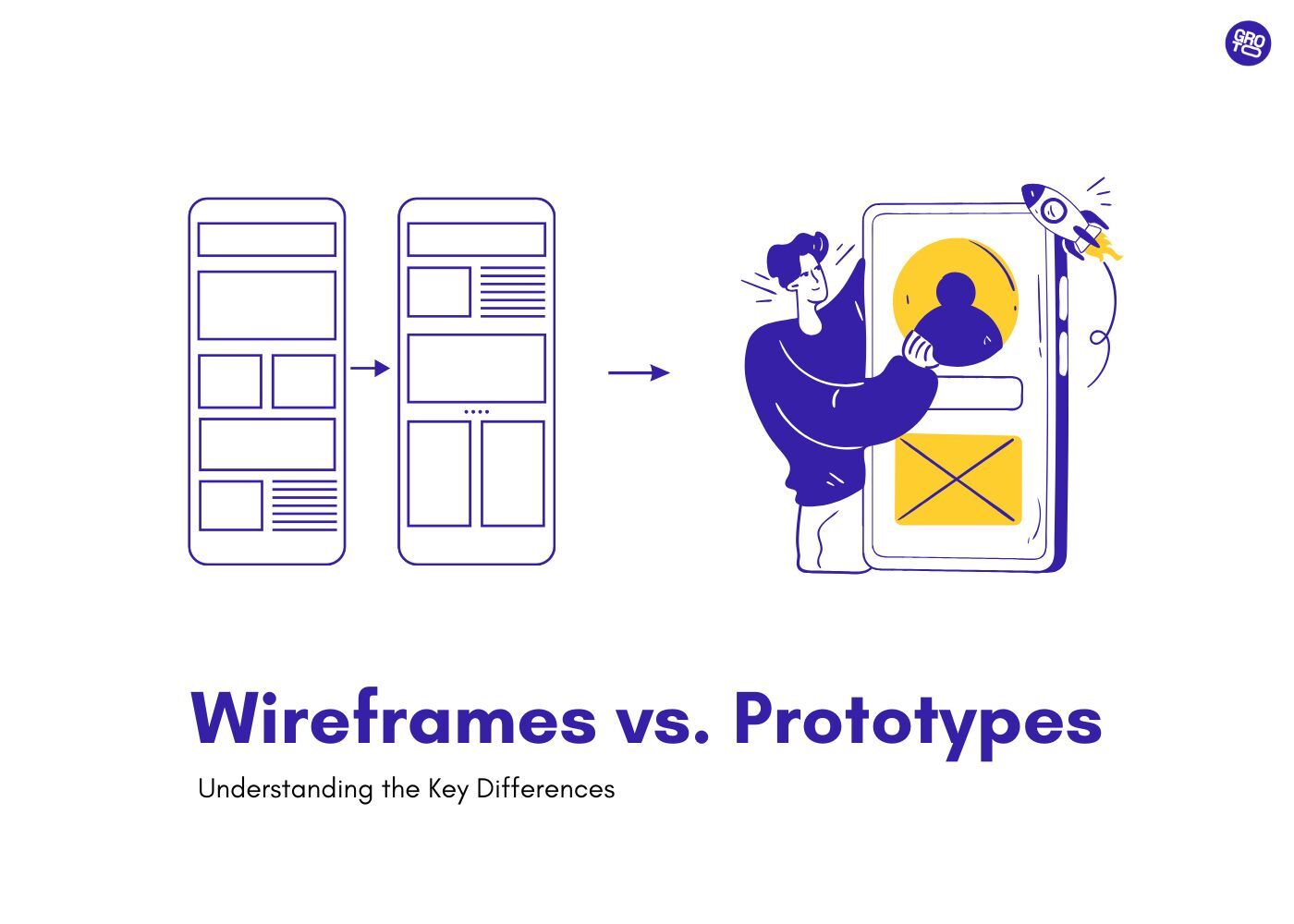
Wireframe the Layout
Start low-fidelity. Wireframes define structure without the distraction of color and type, making it easier to evaluate whether the layout works for the user's task. Many teams skip this step and discover the problem during development — which is significantly more expensive to fix.
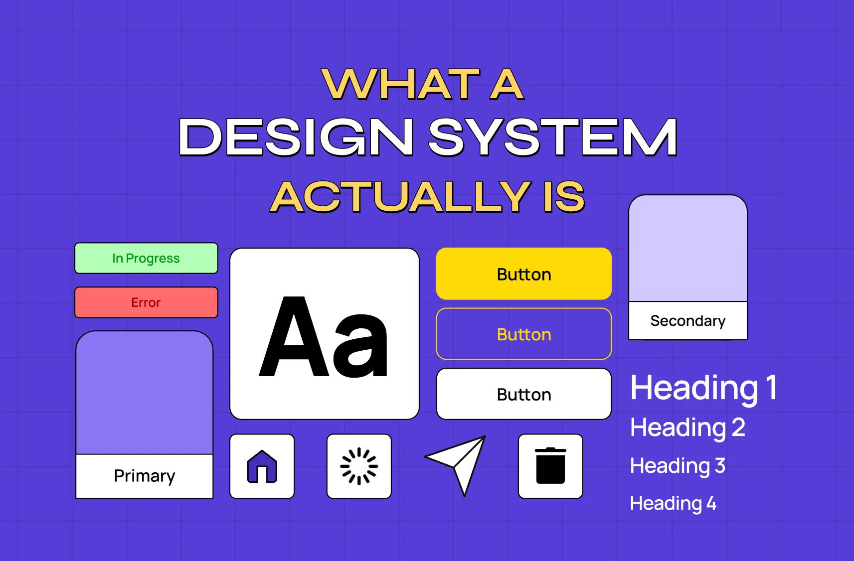
Build a Style Guide
Before moving to high-fidelity screens, a style guide documents the visual rules that will govern the entire product. This is the single most important step for ensuring consistency across a product with many screens and multiple contributors — for teams ready to move beyond a style guide into a full component system, the guide on design systems for SaaS products covers what that transition involves.
Style guide components typically include:
Page and component layout rules.
Typographic scale and font role assignments.
Color system with use-case documentation.
Icon library and imagery guidelines.
Component states: default, hover, focus, disabled, error.
Interaction and motion principles.
Accessibility standards including contrast ratios.
Tone of language guidelines for UI copy and error messaging.
Design High-Fidelity Screens
With structure and rules established, high-fidelity design fills in the detail. This is where visual craft matters — but it should be constrained by the decisions already made, not restarting from zero.
Test and Iterate
Screens should be tested with real users before they're handed to development. Usability issues found at the design stage cost a fraction of what they cost after launch. No amount of craft in the high-fidelity work substitutes for real-world validation.
Screen Design Tools and Inspiration Resources
The right tool depends on team size, collaboration needs, and where the team is in the process.
Design tools:
Figma — the current industry standard for collaborative UI screen design; supports components, auto-layout, and design systems natively and works entirely in the browser.
Adobe XD — a strong option for teams already in the Adobe ecosystem.
Sketch — a well-established tool for Mac-based design teams, particularly for component-heavy work.
For a detailed comparison of all three, the Figma vs Sketch vs Adobe XD guide covers the trade-offs by team size, workflow, and use case.
Inspiration and reference platforms:
Screenlane — a curated gallery of real app screens organized by screen type (onboarding, dashboards, sign-up, checkout). Useful for benchmarking how other products handle specific UI moments without having to download and explore those apps manually.
Mobbin — one of the most comprehensive screen design reference libraries available, with deep filtering by app, screen type, and UI pattern. When comparing Mobbin vs Screenlane, Mobbin offers more depth and better filtering while Screenlane is faster to browse for quick inspiration on a specific flow.
Dribbble and Behance — broader creative inspiration, though less focused on functional UI patterns and real product flows; for curated examples of screen design applied to live products, the best website design examples collection provides more directly applicable reference points.
For teams looking for a screen design alternative to desktop tools, UI screen design online platforms like Figma and Framer remove installation friction and support real-time collaboration — making them well-suited for distributed teams working across screens simultaneously.
Common Screen Design Mistakes — and What They Signal
These aren't just aesthetic problems. Each typically points to a process gap rather than a craft failure.
Inconsistent spacing and alignment — signals the absence of a grid system or a design system that hasn't been enforced.
Unclear primary actions — usually means the screen's purpose wasn't defined before design began.
Too much content on one screen — a symptom of skipped information architecture work, or the multi-job trap in action.
Inaccessible color contrast — signals color was chosen for aesthetics without functional testing or awareness of accessibility standards.
Navigation that changes between screens — a design system problem; interaction patterns weren't established before screens were built.
No empty states or error states designed — common when teams design only the happy path and treat edge cases as an afterthought.
Design that ignores the medium — touch targets too small for mobile, contrast that fails outdoors, layouts that break at non-standard screen sizes.
Conclusion
Screendesign, done well, is one of the highest-leverage investments a product team can make. Here's what to carry forward:
Screen design covers conceptual structure, layout, typography, color, navigation, scannability, icons, and interaction — all working together as a system.
Every good screen has three properties: single-job clarity, perceptual hierarchy, and predictable behaviour — missing any one creates friction that compounds.
The process starts before any tool is opened: define what the product is to its users before designing how it presents itself.
Use the Screen Job Framework to assign one intent to every screen before design begins — Orient, Act, Decide, Recover, or Advance.
The multi-job trap is the most common cause of failing SaaS screens — the fix is separating jobs across screens, not layering them onto one.
Users scan screens, they don't read them — design for scanning by breaking content into headings, lists, and visual groupings.
Design must match its medium — screen size, input method, context of use, and rendering constraints all shape what good screen design looks like.
Business metrics — conversion, activation, retention, support volume — are directly shaped by decisions made at the screen level.
A style guide is the mechanism that holds screen design decisions together across a product and a team.
The most expensive screen design mistakes happen when process steps are skipped, not when visual taste differs.
Testing with real users before development is the most effective way to catch screen-level problems while they're still cheap to fix.