Learn essential mobile first design principles and responsive design principles to create superior mobile experiences with proven implementation strategies and optimization techniques.
Complete guide to mobile first responsive design best practices

Your website gets 60% of its traffic from mobile devices, but users still bounce within seconds. Poor mobile responsive design costs you customers every day, while competitors with superior mobile experiences capture the market share you're losing.
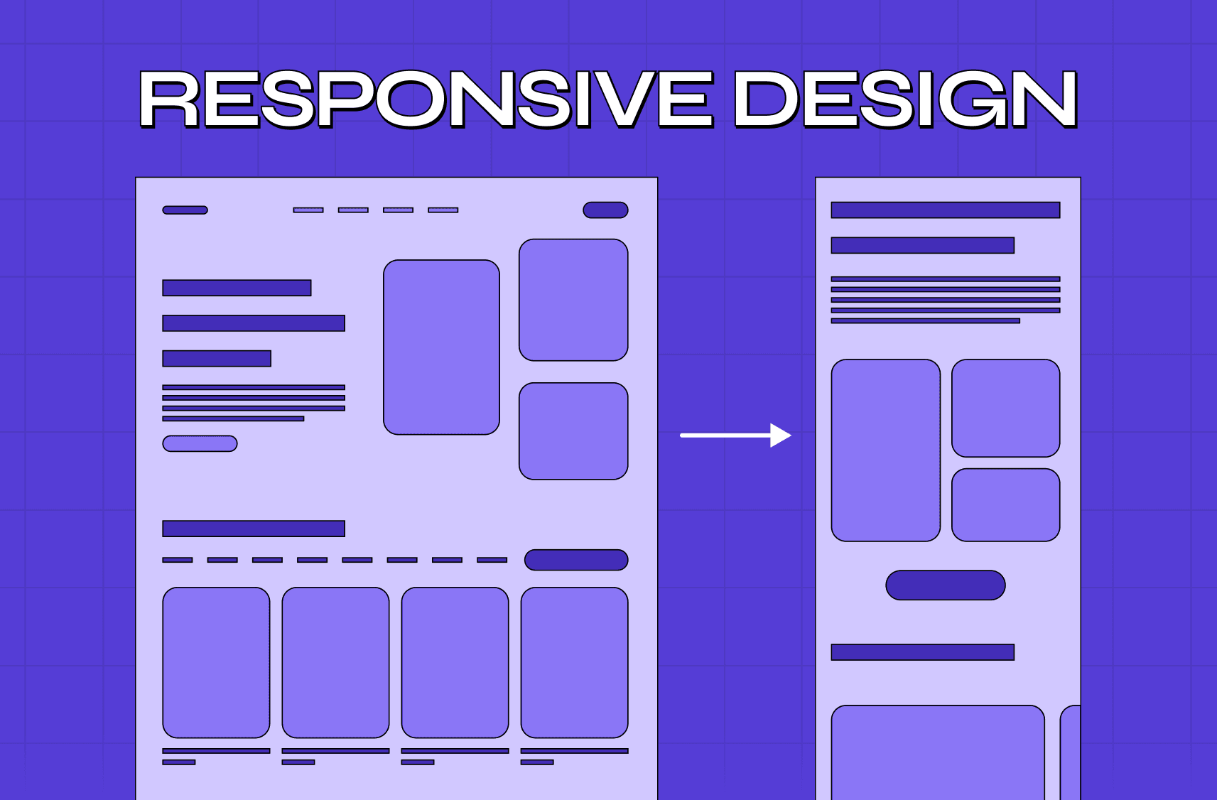
Most designers still approach mobile as an afterthought, shrinking desktop layouts instead of building from mobile up. Mobile first design principles require completely different thinking about content hierarchy, user flows, and interface design that actually works on small screens.
The gap between good and poor mobile experiences has never been more obvious to users. Companies that master mobile first responsive design see dramatically higher engagement rates, better conversion performance, and stronger search rankings than those clinging to desktop-first approaches.
What makes mobile first design principles essential
Understanding the mobile-first approach
Mobile first design principles start with the smallest screen constraints and progressively enhance for larger devices. Instead of removing elements from desktop layouts, you add functionality as screen space increases.
Users judge mobile experiences within the first 3 seconds of loading. Poor typography, cramped interfaces, or slow loading times immediately signal low quality. Mobile users expect the same functionality as desktop but optimized for touch interaction and limited attention spans.
Impact on search engine rankings
Search engines prioritize mobile-optimized sites in rankings. Google's mobile-first indexing means your mobile version determines your search visibility across all devices. Sites without proper mobile responsive design lose organic traffic regardless of desktop quality.
Core responsive design principles that actually work
Flexible grid systems and layouts
If you want a full grounding before diving in, responsive design fundamentals explained covers the core concept from scratch. Responsive design principles center on flexible layouts that adapt smoothly across device sizes — fluid grids use percentages instead of fixed pixels, allowing content to resize naturally without horizontal scrolling.
Flexible images and media scale proportionally within their containers. Setting max-width 100% prevents images from exceeding container boundaries while maintaining aspect ratios. Learn more about effective grid systems and their importance in modern design.
Strategic breakpoint implementation
Breakpoints define where layouts change to accommodate different screen sizes — and a proper responsive design breakpoint strategy covers the exact pixel ranges, content-based vs device-based approaches, and how to avoid the awkward in-between states that break mobile experiences.
Understanding responsive design breakpoints helps create smooth transitions between different screen sizes and ensures optimal experiences across all devices.
Mobile first responsive design implementation strategies
Starting with mobile constraints
Mobile first responsive design begins with designing the smallest screen experience before expanding upward. Start with essential content and core functionality, then progressively add features for larger screens.
Content hierarchy becomes critical when screen space is limited — and that hierarchy starts with website structure decisions made before a single screen is designed. The most important information must appear above the fold on mobile. Secondary content and supplementary features can be revealed through progressive disclosure or moved to larger screen layouts.
Touch-optimized interface design
Touch targets need minimum 44px dimensions for comfortable finger interaction. Spacing between interactive elements prevents accidental taps that frustrate users and hurt conversion rates — sizing and spacing decisions that sit within the broader touch interface design layer every mobile screen depends on.
Essential mobile design fundamentals for better UX
Simplified navigation patterns
Navigation simplification reduces cognitive load on mobile devices. Hamburger menus work when properly implemented, but critical navigation items should remain visible. Avoid dropdown menus that require precise cursor control.
Typography and readability optimization
Typography scaling ensures readability across all screen sizes. Minimum 16px font size prevents zooming requirements that break responsive layouts. Line height and spacing adjustments improve reading comfort on small screens — all decisions that sit within the broader discipline of screen design for mobile UX.
Mobile-optimized form design
Form optimization streamlines user input on mobile devices. Reduce form fields to absolute essentials, use appropriate input types for better keyboards, and implement smart defaults and autocomplete functionality.
Performance optimization for mobile first sites
Speed optimization strategies
Loading speed directly impacts user engagement and search rankings. Mobile users expect sub-3-second loading times. Optimize images, minimize code, and prioritize critical rendering path for faster initial page loads — and pairing these optimizations with responsive web design services for mobile ensures that performance improvements and device-specific layout behavior are handled together, so a faster page doesn't inadvertently break the experience on the screens where speed matters most.
Image and media optimization
Image optimization reduces bandwidth usage and loading times. Use modern formats like WebP when supported, implement responsive images with srcset attributes, and compress images without visible quality loss.
Code efficiency and compression
Code minification and compression reduce file sizes. Remove unnecessary whitespace, comments, and redundant code. Enable gzip compression on your server to reduce transfer sizes by 60-80%.
Mobile responsive design SEO strategies
Mobile-first indexing considerations
Mobile-first indexing means Google primarily uses your mobile version for ranking and indexing. Ensure mobile versions contain the same content and structured data as desktop versions to maintain search visibility.
Core Web Vitals optimization
Page speed affects both user experience and search rankings. Core Web Vitals measure loading performance, interactivity, and visual stability. Poor scores directly impact search rankings and user satisfaction metrics.
Local search optimization
Local search optimization becomes more important as mobile users frequently search for nearby businesses. Implement local business schema markup and optimize for location-based queries to capture mobile search traffic.
Technical implementation guidelines for mobile design
CSS Grid and Flexbox implementation
Flexible grid systems adapt to different screen sizes using CSS Grid or Flexbox. Flexible grid systems using CSS Grid or Flexbox handle most responsive needs effectively — but for scaling products with complex interaction requirements, understanding when to choose custom frontend over responsive helps you make the right architectural call before committing engineering resources to either path.
Viewport configuration
Viewport meta tags control how pages display on mobile devices. The proper viewport declaration prevents default zoom behavior and ensures responsive layouts work as intended across different devices and browsers.
Progressive Web App integration
Progressive Web Apps enhance mobile experiences with app-like functionality — and they represent just one piece of a broader shift in how mobile products are being built. Mobile UX trends shaping 2026 covers the full landscape of what's coming, from adaptive interfaces to predictive navigation patterns that go well beyond PWA implementation. Learn more about AI integration in modern UX design for advanced implementations.
Testing and optimization for mobile first design
Cross-device compatibility testing
Cross-device testing ensures consistent functionality across different mobile devices, screen sizes, and operating systems. Test on actual devices when possible, as emulators don't always accurately represent real-world performance.
Browser compatibility verification
Browser compatibility testing verifies that responsive layouts work correctly across different mobile browsers. Safari on iOS and Chrome on Android can render the same CSS differently, requiring specific adjustments.
Real-world user testing
User testing on mobile devices reveals usability issues that desktop testing misses. Watch users complete actual tasks on their own devices to identify friction points and optimization opportunities.
Common mobile responsive design mistakes to avoid
Desktop-first thinking pitfalls
Desktop-first thinking creates mobile experiences that feel cramped and difficult to use. Shrinking desktop layouts instead of redesigning for mobile constraints results in poor user experiences and high bounce rates.
Touch interface oversights
Ignoring touch interface requirements leads to frustrated users. Links and buttons that work fine with mouse cursors become unusable when sized inappropriately for finger interaction on touchscreens.
Performance bottlenecks
Performance overlooking hurts mobile users disproportionately. Features that load quickly on high-speed connections become unusable on slower mobile networks, creating significant user experience gaps.
Scaling mobile designs to larger screens
Progressive enhancement methodology
Progressive enhancement adds functionality and visual richness as screen space increases. Start with core functionality that works on all devices, then enhance experiences for users with larger screens and faster connections.
Layout expansion strategies
Layout expansion utilizes additional screen space effectively without creating excessive white space or overly long line lengths. Multi-column layouts, sidebar content, and larger images improve larger screen experiences.
Feature revelation techniques
Feature revelation shows additional functionality on larger screens while maintaining core functionality parity. Advanced features can be more prominent on desktop while remaining accessible on mobile through progressive disclosure.
Key Takeaways
Mobile first design principles start with smallest screens and progressively enhance for larger devices
Responsive design principles use flexible grids, scalable images, and strategic breakpoints for smooth adaptation
Mobile first design principles start with smallest screens and progressively enhance for larger devices — and these sit within a broader set of web design principles for business growth that connect responsive performance to conversion, retention, and competitive positioning across every screen size.
Performance optimization through image compression and code minification improves mobile loading speeds
Mobile first responsive design impacts SEO rankings through Google's mobile-first indexing
Cross-device testing ensures consistent functionality across different mobile platforms and browsers
Progressive enhancement adds features for larger screens while maintaining mobile core functionality
Touch interface requirements need minimum 44px targets and appropriate spacing between elements
Why Groto excels at mobile first responsive design
Your mobile experience determines whether users trust your product enough to continue using it. Poor mobile design kills conversions before users see your value proposition.
We're a full-stack design agency that transforms SaaS and AI experiences into clear, useful, and user-validated products. Whether you're optimizing mobile conversion funnels, designing responsive dashboards, or creating mobile-first AI interfaces, we've built systems that work seamlessly across all devices.
Our approach combines business-focused UX research with elite visual design, helping you go from strategy to execution in weeks, not quarters. You bring the ambition. We bring clarity, craft, and the process to make it work on every screen size.
We've helped global brands and startups alike create products users love to use. Let's help you do the same.
Let's talk
Website: www.letsgroto.com
Email: hello@letsgroto.com
FAQ
What is mobile-first design and how is it different from responsive design?
Mobile first design principles start by designing for the smallest screen first, then progressively enhancing for larger screens. Responsive design adapts existing layouts to different screen sizes. Mobile-first is a subset of responsive design that prioritizes mobile constraints from the beginning.
What are the main benefits of implementing mobile-first design?
Mobile first responsive design improves loading speeds, enhances SEO rankings through mobile-first indexing, reduces development complexity, and creates better user experiences. Sites designed mobile-first typically have higher conversion rates and lower bounce rates.
How do you implement mobile-first design in existing websites?
Start by auditing your current mobile experience, identify core content and functionality, redesign key pages with mobile constraints first, then progressively enhance for larger screens. Consider using website redesign strategies for comprehensive overhauls.
What tools are best for creating mobile-first responsive designs?
Popular tools include CSS frameworks like Bootstrap or Tailwind, design tools like Figma or Sketch, and browser developer tools for testing. Learn about UX design tools to choose the right combination for your workflow.
How do you test mobile-first responsive designs effectively?
Test on real devices across different screen sizes, use browser developer tools, implement automated testing, and conduct user testing with mobile users. Regular testing throughout development prevents costly fixes later.
What are the most common mobile-first design mistakes to avoid?
Common mistakes include making touch targets too small, using desktop-first thinking, ignoring performance optimization, overcomplicating navigation, and not testing on actual devices. Focus on simplicity and touch-friendly interfaces.