

Your site has impressions but no clicks. Traffic but no conversions. This 12-step website redesign guide covers everything — audit, SEO protection, cost by tier, timeline, and real before/after examples from projects we've shipped.
Rebuild smarter. 12 steps, real costs, and real examples from an agency that delivers.

Every brand hits a point where the website no longer reflects who they are or what they offer. This step-by-step redesign guide helps you realign structure, content, UX, and performance — so your site actually works for your business again.
Your site's not broken — just outgrown. Here's how to fix that without starting blind.
Every website eventually stops doing what it's supposed to do. Maybe traffic is down, bounce rates are up, or the user journey just feels broken. You know your online presence should reflect who your brand is today — not who it was three years ago. When that gap grows wide enough, it's time to start thinking about a full website redesign.
This kind of project isn't just about updating fonts or swapping images. A true redesign touches everything — structure, user flow, mobile performance, speed, search optimization, and how you guide someone from entry to conversion. Done right, it rebuilds your digital platform so it works harder for your business.
Here's a detailed walkthrough of the exact 12 steps required to plan and execute a successful website redesign process — plus real examples of what it looks like when it's done well.
TL;DR
A redesign fixes how a site works, not just how it looks
Run a user experience audit before anything else — protect what's already performing
An SEO migration plan must be built before a single page goes live
Timeline: 8–16 weeks for most agency-led projects
Cost: $5K–$250K+ depending on scope and complexity
AI accelerates the process but doesn't replace strategy or UX judgment
What Is a Website Redesign?
A website redesign goes beyond surface-level improvements. It restructures the underlying architecture, refines user experience, upgrades visual design, and rewrites content where needed. It's about improving both how the site functions and how it feels to navigate.
Think of it like rebuilding a restaurant. You're not just changing the menu fonts — you're moving the kitchen, improving the flow between tables, and making sure the entrance sets the right tone.
Website Redesign vs. Website Refresh: Which Do You Actually Need?
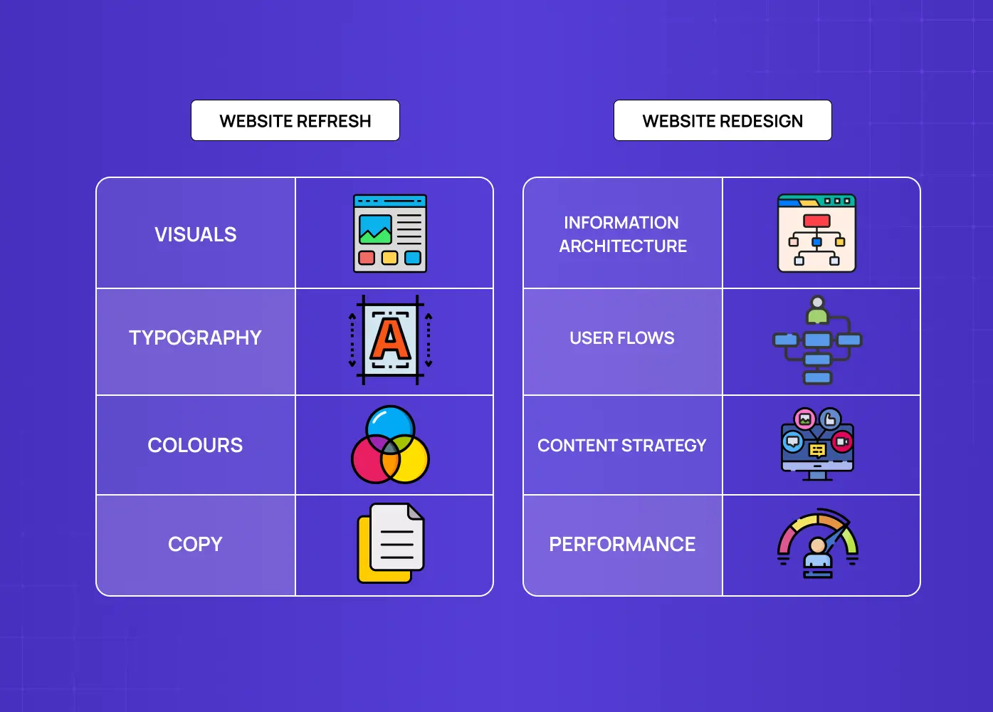
This is the question most teams skip — and it's what separates a focused, budgeted project from a sprawling rebuild that takes twice as long.
A website refresh updates visuals, copy, and small UX details without changing the underlying structure or platform. It fixes how a site looks.
A website redesign rebuilds information architecture, user flows, content strategy, and often the tech stack. It fixes how a site works.
How to tell which one you need:
Choose a refresh if your UX performs well, conversion rates are healthy, and only the visual layer or messaging feels dated.
Choose a redesign if your conversion rate has flatlined, the CMS limits your marketing motion, or the site architecture no longer maps to how users think about your product.
Don't confuse the two — a refresh applied to a structurally broken site reproduces the same problems on a newer skin.
The distinction matters because the process, cost, and timeline are completely different.
7 Signs It's Time to Redesign Your Website
Before jumping in, be sure the problem is with the site itself. Rushing into a rebuild without identifying clear issues leads to wasted budget and minimal results. A thorough user experience audit is always the right starting point — learn more about how to do a UX audit to
Your conversion rate has flatlined
When a well-trafficked page stops generating leads or sales for 6+ months with no external explanation, the issue is almost always structural:
CTAs buried below the fold or competing with each other
Weak social proof placement that doesn't land at the right moment in the journey
A value proposition that isn't matched to the right page or user intent
Form friction that kills momentum at the final step.
Bounce rate is climbing on revenue pages
A rising bounce rate on product or service pages signals that users are arriving with intent but leaving before they find what they need. That's a UX and content architecture problem, not a marketing one.
Mobile performance is failing Core Web Vitals
Poor mobile responsiveness directly affects search rankings. Key indicators to watch:
Mobile CWV scores in red on Google Search Console
Mobile conversion rate significantly below desktop
Load times above 3 seconds on mobile networks
Layout shifts or broken elements on smaller viewports
For &Circus, over 80% of users were on mobile — yet the experience was clearly built for desktop, which is exactly where conversions were being lost.
Your brand or positioning has changed
If your messaging, product offering, or market segment has evolved but the site still reflects where you were two years ago, the gap between brand promise and site reality erodes trust. Signs this is happening:
Sales teams are supplementing the site with decks because the site doesn't explain the product clearly
Your homepage hero still describes a feature you've since pivoted away from
New product lines don't fit naturally into the existing navigation
Your CMS can't support your marketing motion
If adding a landing page requires a developer, or if your CMS limits your ability to run campaigns, update content, or integrate new tools — the site is costing you velocity.
Sales and support keep flagging the same UX issues
When your own team regularly hears "I couldn't find it" or "I gave up at the form" — that's a signal the site is creating friction in your sales process. Signs your SaaS site needs rebuilding covers more patterns specific to SaaS products, where feature growth and positioning drift create their own set of warning signals.
Competitors have caught up visually and structurally
If prospects are comparing your site against a competitor's and the gap is visible at a glance, the site is actively losing you deals before a conversation starts. Run a quick competitive check:
Do competitors' pages load faster?
Is their navigation more intuitive?
Does their homepage communicate the value proposition more clearly in the first scroll?
When multiple indicators align, a full website redesign becomes less of a risk and more of a growth opportunity.
How Long Does a Website Redesign Take?
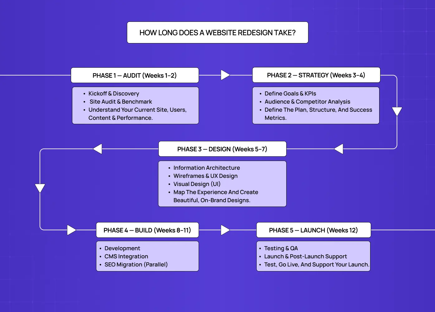
For most agency-led projects, a standard website redesign runs 8–12 weeks across five sequential phases. Here's how those weeks typically break down:
Weeks 1–2 — Audit: User experience audit, SEO inventory, analytics review, competitor benchmarking
Weeks 3–4 — Strategy: Goal setting, sitemap restructure, content strategy, brand system definition
Weeks 5–7 — Design: Wireframes, prototyping, user testing, visual design
Weeks 6–8 — Build (parallel): Development begins while final design screens are completed; SEO migration mapping runs in parallel throughout this phase
Weeks 9–10 — Pre-launch: QA, redirect verification, performance testing, accessibility checks
Week 11–12 — Launch + handoff: Go-live, Search Console monitoring, post-launch iteration brief
Note that SEO migration runs as a parallel track from Week 3 onward — not a final step. Teams that treat it as a launch-day task are the ones that lose rankings.
What changes the timeline:
Template-based refresh: 3–4 weeks
Mid-market with custom development: 12–16 weeks
Enterprise rebuild with content migration: 4–8 months
The single biggest cause of timeline overrun isn't design or development — it's content creation and stakeholder review cycles starting later than planned.
How Much Does a Website Redesign Cost in 2026?
Understanding the investment required helps you budget appropriately and set realistic expectations. For SaaS companies specifically, a SaaS website redesign cost breakdown covers the additional variables unique to that context — including UX audit scope, design system work, and handoff requirements that standard estimates routinely exclude.
Small business websites ($5,000–$15,000)
Basic sites of 5–10 pages with responsive design, standard CMS integration, and basic SEO setup. Suited to local businesses, consultants, or simple service providers.
Mid-market websites ($15,000–$50,000)
15–30 pages with custom functionality, e-commerce capabilities, or advanced integrations. Includes UX optimization, custom design systems, and a comprehensive SEO strategy.
Enterprise and SaaS websites ($75,000–$250,000+)
Large-scale sites with multiple user types, complex integrations, enterprise security requirements, and full content migration. Custom development, user research, and ongoing optimization all factor in.
What drives cost up or down
Factors that increase scope and therefore cost:
Number of unique page templates required
Custom interactive features (calculators, portals, configurators)
E-commerce complexity including payment processing and inventory
SEO migration scope — more high-ranking pages means more preservation work
Content creation and copywriting (typically adds 20–40% on top of design fees)
Third-party integrations with CRM, marketing automation, or analytics tools
Compliance requirements (government, healthcare, financial)
Learn more about website redesign cost for detailed pricing breakdowns.
DIY vs. freelancer vs. website redesign agency
Aspects | DIY | Freelancer | Agency |
Best for | Under 20 pages, brand-led sites | Defined, contained scope | Revenue-critical, complex, or SEO-sensitive sites |
Typical cost | $0–$500 (tools only) | $3,000–$20,000 | $15,000–$250,000+ |
Timeline | 2–6 weeks | 4–12 weeks | 8–24 weeks |
SEO protection | Low — easy to miss | Medium — depends on skill | High — structured into process |
Strategy included | No | Rarely | Yes |
Risk | Low budget, low ceiling | Moderate | Lowest execution risk |
Hire a website redesign agency when revenue depends on the site, custom integrations are required, SEO traffic is at risk, or you don't have product-design capacity internally — the same calculus that leads most owners toward dedicated small business website redesign rather than a DIY rebuild. The cost of a poorly executed self-managed redesign — lost rankings, failed conversions, delayed launch — routinely exceeds the agency fee.
How to Redesign a Website in 12 Steps
1. Align Stakeholders Before You Open Figma
Every redesign project should begin with a shared understanding of what needs to change and why — including a shared redesign timeline everyone agrees on before kickoff. Key questions to answer before kickoff:
What are the primary business goals this redesign needs to hit?
Which teams have input — and who has final sign-off?
Are we building custom, or are we working within a no-code platform? (No-code website design agency timelines and handoffs differ significantly from custom builds)
What does success look like 90 days post-launch?
2. Audit What's Already Working Before You Remove It
Redesign doesn't mean burn it all down. Track what's working with Google Analytics, Hotjar, or Search Console before removing anything. Specifically:
Which pages drive the most organic traffic? (Protect these in the SEO migration)
Which CTAs or forms have the highest conversion rate?
Which blog posts generate backlinks or leads?
Which internal links drive meaningful page depth?
Make a list of pages to keep, pages to update, and pages to remove. This is also your starting map for the SEO migration plan.
3. Set Measurable Goals That Drive Design Decisions
Design for business outcomes, not opinions. Define goals before any design decisions are made. Examples:
Increase demo request submissions by 30% within 90 days of launch
Reduce homepage bounce rate from 68% to under 50%
Improve mobile Core Web Vitals scores to green across all metrics
Cut average time-to-CTA from 45 seconds to under 20 seconds
If your goal is more signups, form placement, CTA clarity, and user flow all need to serve that. If your goal is stronger SEO visibility, structure and content come first. Goals drive the roadmap.
4. Research Your Users and Your Competitors
User journeys reveal where people fall off, hesitate, or get stuck. Run heatmaps, clickmaps, or user testing on your current site. Ask:
Where are users getting confused or stuck?
Which buttons go unclicked despite high traffic to the page?
Where do people bounce — and what's on that page when they leave?
Competitor research belongs here too — and most teams skip it entirely as part of their website redesign process:
Map how top competitors structure their navigation
Note what their top-converting pages include (social proof, CTAs, pricing transparency)
Identify where you can take a genuinely different position rather than copying what's already out there
Learn more about user journey vs user flow to understand these mapping techniques.
5. Map the UX Gaps in Your Current Experience
Turn the research into a prioritized list of problems. Flag:
Flows with the highest drop-off rates
Navigation paths that create dead ends or circular loops
Pages with strong intent signals but weak content to meet them
Mobile-specific friction that doesn't appear on desktop
This step converts data into design direction. Without it, redesign decisions are based on preference — which is how you end up with a beautiful site that doesn't perform.
6. Define Your Brand System, Messaging, and Visual Language
Before any design work begins, lock down:
Core messaging hierarchy: headline, subheadline, supporting proof points
Brand system: colors, typography, tone of voice, imagery direction
Page-by-page value proposition — what does each key page need to communicate, and in what order?
CTA language and placement logic
Designing without this in place means the visual work will be redone once the messaging is clarified. Anchor the design to the brand system, not the other way around.
7. Lead With Content Strategy, Not Layout
Content is what users are coming for — don't design around it as an afterthought. Start with what you need to say, not how you want it to look. Build a content map that defines:
What goes on each page, in order
What the homepage hero, subheadline, and first CTA say
Whether the site needs a splash page to gate content or qualify visitors
What search intent each page is written to satisfy
This content map is what gives the design team clarity to build layouts that serve the message — not squeeze it in after the fact.
8. Build Your SEO Migration Plan Before Anything Goes Live
Redesigns often wreck organic performance — not because the SEO is bad, but because it's forgotten. Your SEO migration plan should include:
A full URL inventory of every indexed page and its current ranking
A redirect map: every old URL → new URL, 301 verified before launch
Preservation of title tags and H1 keyword targeting on all high-traffic pages
XML sitemap updated and resubmitted post-launch
Internal linking structure carried across from old to new architecture — including the website footer design, which quietly carries much of a site's internal linking
Search Console monitored daily for 90 days post-launch
Strong website redesign best practices always treat SEO preservation as a hard requirement — not a nice-to-have.
9. Re-Architect the Sitemap Around User Intent
Your new sitemap is the foundation of the site architecture redesign. Getting it right means understanding website structure at a deeper level — how hierarchical, sequential, and matrix models each serve different content types, and how the wrong structure choice creates navigation problems no amount of visual design can fix.
Sitemap principles to apply:
Every important page reachable within two clicks from the homepage
Navigation labels written in user language, not internal company language
Mobile navigation hierarchy decided at this stage — not retrofitted later
Conversion paths (demo, contact, pricing) visible at all levels of the structure
Applying responsive web design best practices at the sitemap stage ensures navigation decisions made for desktop don't create buried menus or dead ends on mobile.
10. Wireframe and Prototype Based on Real User Behaviour
Wireframes are where flow decisions happen. Before color or typography, wire out your core pages. Prioritize:
Where CTAs appear relative to scroll depth
How content blocks are sequenced to build trust before asking for action
Where social proof lands relative to conversion moments
How mobile and desktop layouts differ structurally — not just visually
For the homepage specifically, designing a high-converting homepage covers the structural principles that determine what users need to see in the first scroll to stay engaged. Learn more about high-fidelity wireframes for advanced wireframing strategies.
Use tools like Maze, Useberry, or clickable Figma prototypes to test with real users before anything goes into development. Fixing a flow in Figma takes minutes. Fixing it in live code takes weeks.
11. Design for Performance, Mobile-First
Modern design is about more than how it looks — it's how it loads, adapts, and scales. Design mobile-first, which means:
Mobile is the primary canvas — not an adaptation of desktop
Images compressed and sized for mobile viewports before desktop
Touch targets sized correctly (minimum 44×44px)
Core Web Vitals targets set during design, not added as a post-launch fix
Accessibility standards (WCAG 2.1 AA minimum) baked in from the start
Browsing website redesign inspiration examples shows how leading brands balance visual quality with performance before finalizing design direction.
12. Launch With a Performance and SEO Checklist
Before you push live, audit everything. Pre-launch checklist:
All 301 redirects verified and live
XML sitemap submitted to Search Console
Analytics and conversion tracking confirmed working
Speed and Core Web Vitals tested on real devices
Accessibility checked with a screen reader and automated tool
All forms tested end-to-end, including confirmation emails
Rollback plan documented and ready
Have a rollback plan and monitor user behaviour immediately post-launch. Treat launch day as the start of optimization, not the end of the project. Building a structured approach to post-launch website maintenance is what keeps a redesigned site performing over time.
5 Website Redesign Examples: What It Looks Like in Practice
The difference between a redesign that performs and one that doesn't usually comes down to whether it was driven by data or driven by aesthetics. Here's what the data-first approach produces.
Meydan FZ — Freezone Business Website (Dubai)
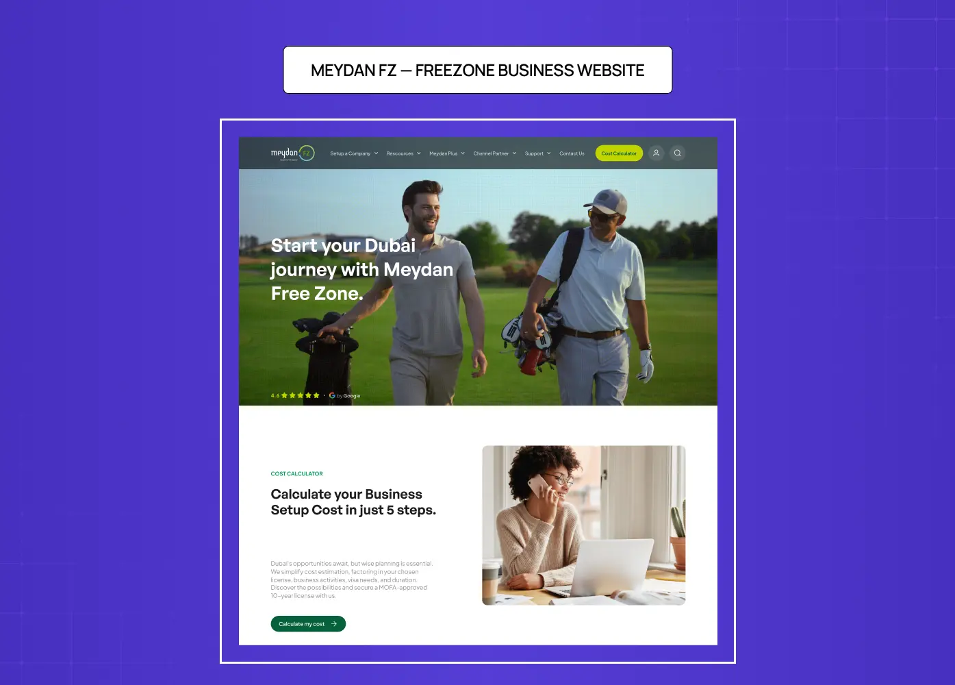
The problem: Meydan FZ was experiencing high bounce rates on the homepage. A user experience audit revealed that nearly 62% of users weren't scrolling past the second section — unclickable areas and excessive scroll length were pushing users away before they reached the core value proposition or cost calculator.
What changed:
Information hierarchy rebuilt so the cost calculator became a standout feature rather than buried functionality
Navigation restructured to remove false affordance elements that confused users
Page architecture shortened to keep users within the conversion funnel
Full design and development handled end-to-end, including government compliance review
The outcome: A high-performance, compliant website that communicates freezone benefits clearly to a global entrepreneurial audience. Read the full case study.
&Circus — E-Commerce Website Redesign
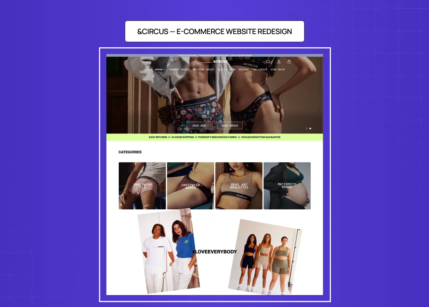
The problem: &Circus, India's first body-positive underwear brand, had 95K+ social media followers and consistent traffic — but low conversions. Over 80% of visitors were on mobile, yet the experience was built for desktop. Users were arriving and leaving before checkout.
What changed:
Rebuilt mobile-first — mobile was the primary design canvas, not an afterthought
Navigation cleaned up and checkout flow overhauled based on session recording data
Landing page restructured to surface key products faster and reduce steps to purchase
Brand system — bold colors, confident typography, playful visuals — finally extended into the website experience
The outcome: Conversions saw a significant boost, abandonment rates dropped, and the site finally matched the energy of the brand's social presence. Read the full case study.
PolicyBazaar — Insurance Platform UX Redesign
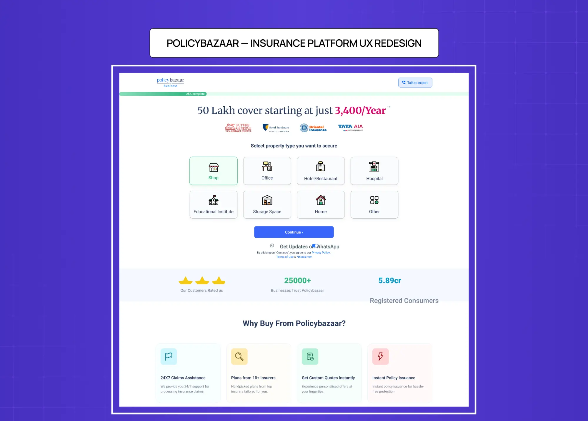
The problem: PolicyBazaar's home insurance purchase flow wasn't converting. Users were getting lost in the journey and abandoning before completing sign-ups. The platform had significant traffic but a broken path from intent to conversion.
What changed:
Conducted in-depth user research including interviews and behavioral analysis to map real drop-off points
Rebuilt the mobile experience from scratch — most users were accessing the platform from phones, so mobile came first
Extensive prototype testing with real users before finalizing any screen
Once mobile was validated, extended the redesigned experience to desktop — ensuring consistency across both surfaces
The outcome: A redesigned insurance shopping flow that reduced drop-offs, improved sign-up rates, and made a complex product category feel effortless to navigate. Read the full case study.
Airbnb — Trust-Led Brand Redesign
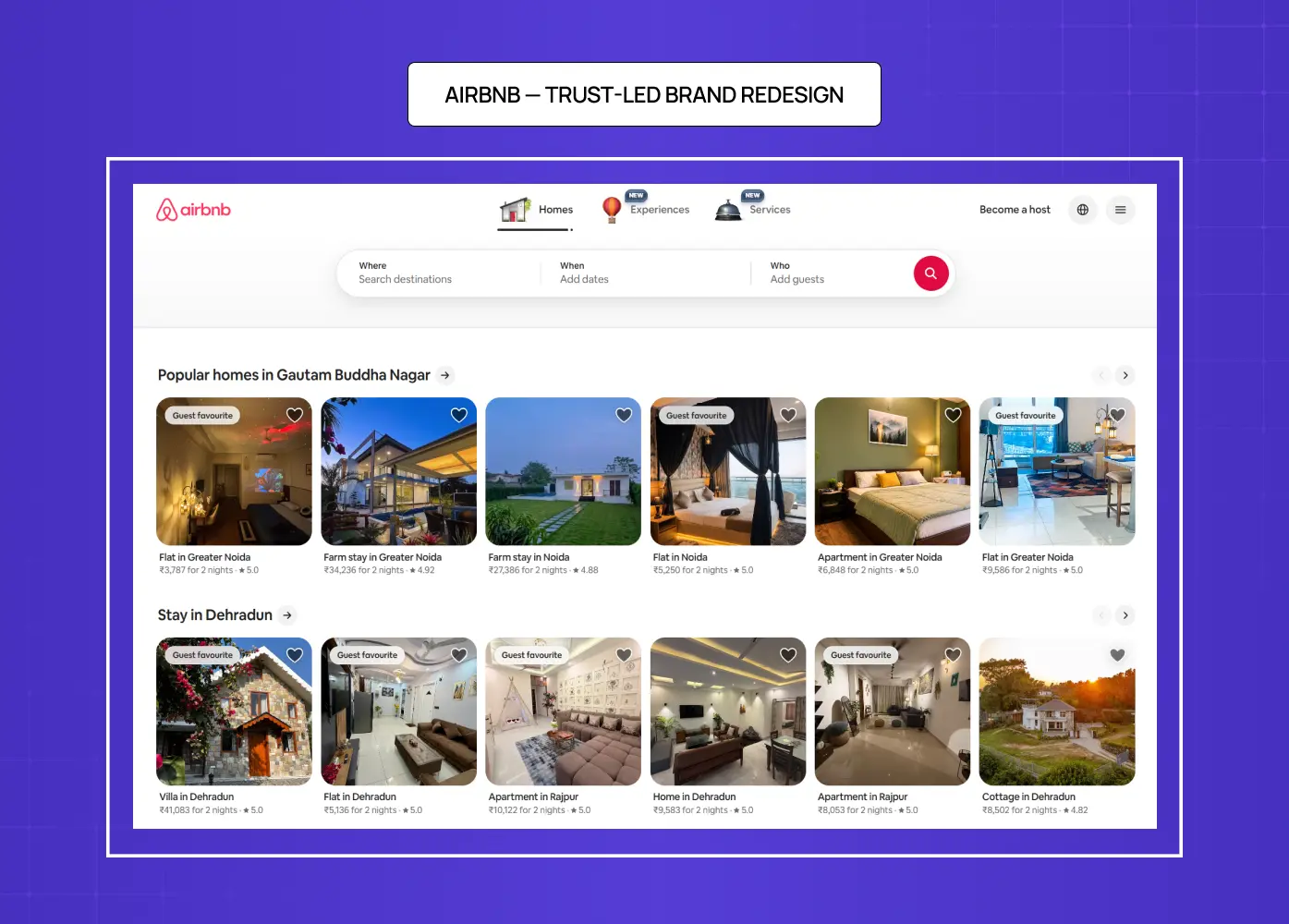
The problem: Airbnb's early design was functional but didn't communicate the core emotional promise of the product — belonging somewhere, not just staying somewhere. The site architecture prioritized listings over the human experience of travel.
What changed: Rather than iterating on existing pages, they restructured the entire brand around the concept of belonging — introducing the "Bélo" symbol and rebuilding the site architecture around host and guest trust signals. Visual and content decisions flowed from the strategic repositioning, not the other way around.
The outcome: A redesign that became a case study in brand-driven UX. The lesson: redesigns that define a new positioning before designing the interface consistently outperform redesigns that just update the visual layer.
Dropbox — Simplification as Strategy
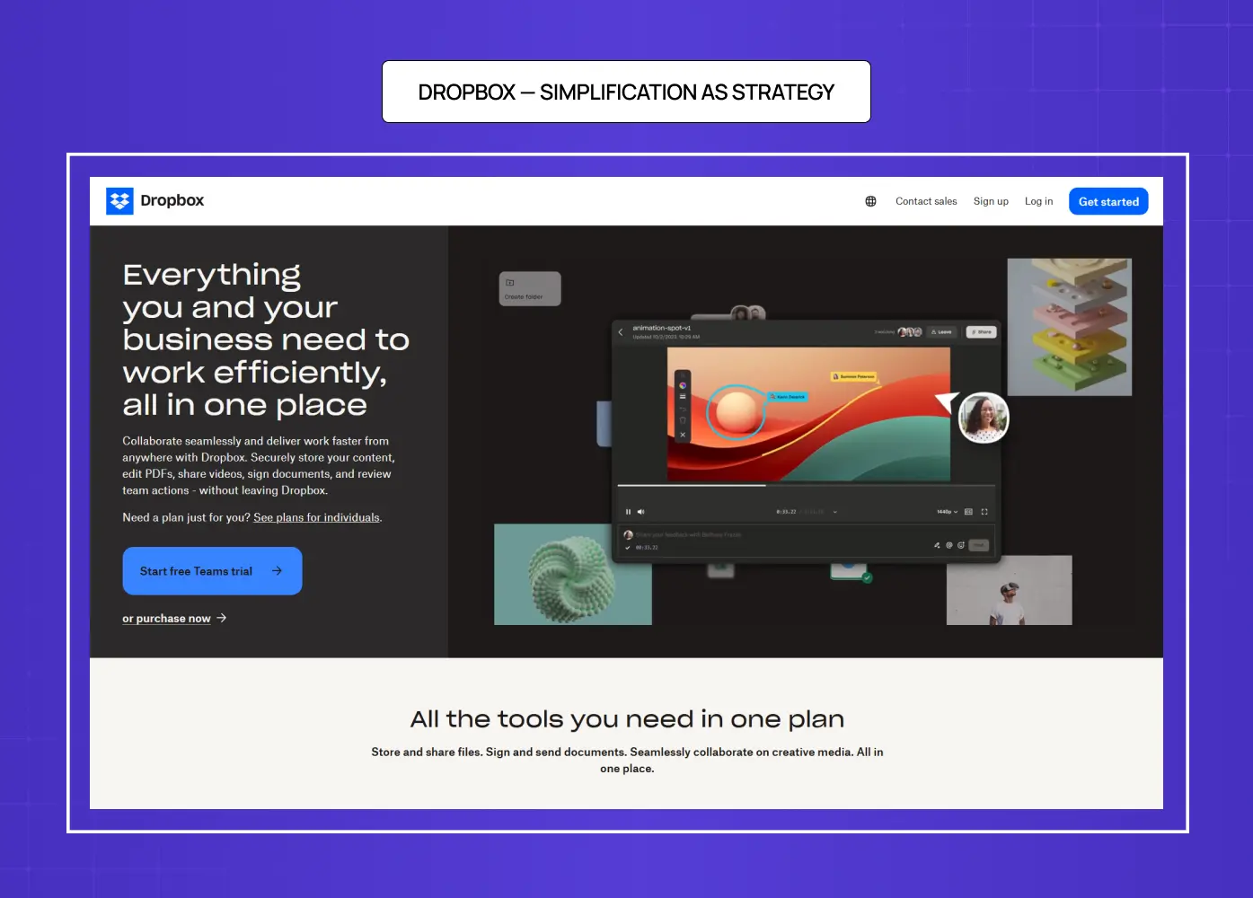
The problem: Dropbox's homepage had grown cluttered — too many CTAs, too much feature detail, not enough clarity on what the product actually did and for whom.
What changed: They moved away from a feature-list homepage and rebuilt around a single bold visual identity with dramatically simplified navigation. Fewer CTAs, fewer pages visible from the homepage, and a cleaner path to the one action they wanted users to take.
The outcome: A homepage that converted better with less content — a strong counter-example for SaaS teams who assume more information produces more conversions. For most SaaS products dealing with homepage clutter, Dropbox's discipline around reduction is the right model.
How AI Is Changing Website Redesign in 2026
AI tools have meaningfully changed what's possible in the early and mid stages of a redesign — but they haven't replaced the strategic and executional core of the process.
Where AI genuinely accelerates redesign workflows:
Wireframing and layout ideation — tools like Relume and Framer AI generate sitemaps and initial layouts from a brief, compressing early exploration from days to hours
Copy drafting — AI produces first-pass homepage copy, value propositions, and microcopy variations for testing across pages
Image generation — custom visuals and hero imagery without stock photo budgets or photographer scheduling
Code scaffolding — for Framer or Webflow builds, AI-assisted code generation speeds up component development significantly
Where AI consistently falls short:
Brand judgment — AI generates design options but can't evaluate which fits the brand's positioning or competitive context
Conversion strategy — decisions about what goes where on a page, and why, require UX thinking grounded in actual user research
SEO migration — redirect mapping, URL strategy, and ranking preservation require deliberate human oversight
Stakeholder alignment — navigating competing priorities, managing revision cycles, and getting organizational sign-off is irreducibly human work
The agencies winning redesign briefs in 2026 use AI as an accelerator inside a structured process — not as a shortcut around it.
Common Website Redesign Mistakes That Kill SEO and Conversions
Most website redesign mistakes are predictable. These are the patterns we see repeatedly:
Deleting high-performing content without checking whether it ranks or converts — one of the most common ways redesigns tank organic traffic overnight
Skipping the SEO migration plan — if old URLs return 404s post-launch, every backlink and ranking signal the site built goes with them
Designing before defining the message — visual decisions made before the content hierarchy is settled get reworked at every stage of the project
Building desktop-first and adapting to mobile — creating layout compromises that harm conversion on the device where most users actually are
Treating launch as the finish line — a redesign without a post-launch measurement and iteration plan drifts back toward underperformance within months
Adding scope mid-project — features or pages added during the build extend timelines, strain budgets, and degrade the quality of the original brief
Ignoring the user experience audit findings — commissioning an audit and then not acting on its prioritized recommendations is the most expensive mistake of all
Post-Launch: How to Measure, A/B Test, and Iterate
Once your new site is live, the work begins again. Track the same KPIs you defined at the start. Specifically:
Conversion rate on key pages — is it moving in the right direction within 30 days?
Bounce rate on previously underperforming pages — are users staying longer?
Core Web Vitals — monitor for any performance regressions introduced during the build
Search Console — watch for ranking fluctuations tied to the redesign, especially on redirected URLs
A/B testing priorities post-launch:
CTA copy and button placement on the homepage and top conversion pages
Hero headline variants — especially if the new positioning is untested
Form length — test shorter versions against the current to identify friction points
Social proof placement — above vs. below the fold on key landing pages
Use session recordings to surface new friction points that weren't visible in prototypes. Build a monthly review cadence that feeds findings back into the next iteration cycle.
How We Approach Website Redesigns for SaaS and AI Companies
We exist to cut through the noise of bloated websites, vague redesigns, and trend-chasing. We're a full-stack design and website redesign agency that builds sites around real user behaviour, sharp content, and scalable systems. If you're tired of pretty sites that don't convert or vague promises with no metrics — you're exactly who we build for.
We help SaaS teams, internal platforms, and modern brands rebuild with precision. We start with user experience audits, map performance issues, and architect a content-first structure. Then we design and test each piece like it matters — because it does.
Whether you're launching a new brand, replacing a bloated CMS, or rebuilding an outdated experience, we bring craft, clarity, and a proven process built for measurable results. Before you commit to any agency, finding the right redesign partner gives you a practical checklist to evaluate any team's process, portfolio, and accountability standards.
Most redesigns fail because they start with design instead of diagnosis. We start with your data — traffic drop-offs, conversion blockers, SEO gaps — and build a site that fixes the actual problem. If your site has the impressions but not the clicks, let's talk.
Key Takeaways
Align the redesign around business and user goals before any design work begins
Run a thorough user experience audit — protect what's already performing before removing anything
Build the SEO migration plan before a single page changes URL
Define the brand system and messaging hierarchy before designing layouts
Design mobile-first, wireframe early, and test with real users in Figma — not in production
Treat launch as a starting point, not a finish line — post-launch iteration is what makes a redesign pay off


