

Most rebrands fail not because the new logo is wrong, but because the design decisions were made before the strategic ones. This guide covers what company rebranding actually involves, how to approach it in the right order, and what separates the rebrands that stick from the ones that get reversed within days.
A rebrand is a strategic decision. The design layer is where it lands.

A rebrand is not a logo change. It is a signal — to your market, your team, and yourself — that something meaningful has shifted about who you are and what you stand for.
Done well, it creates a step-change in how your business is perceived. Done poorly, it erodes the brand equity you spent years building. The difference between those two outcomes is almost always found in the design decisions: not just what the new brand looks like, but how strategically those visual choices were made, and how consistently they are applied across every touchpoint.
This guide covers what company rebranding actually involves, the design layer that determines whether it succeeds, real examples worth studying, and a practical process for approaching it the right way.
What Is Company Rebranding?
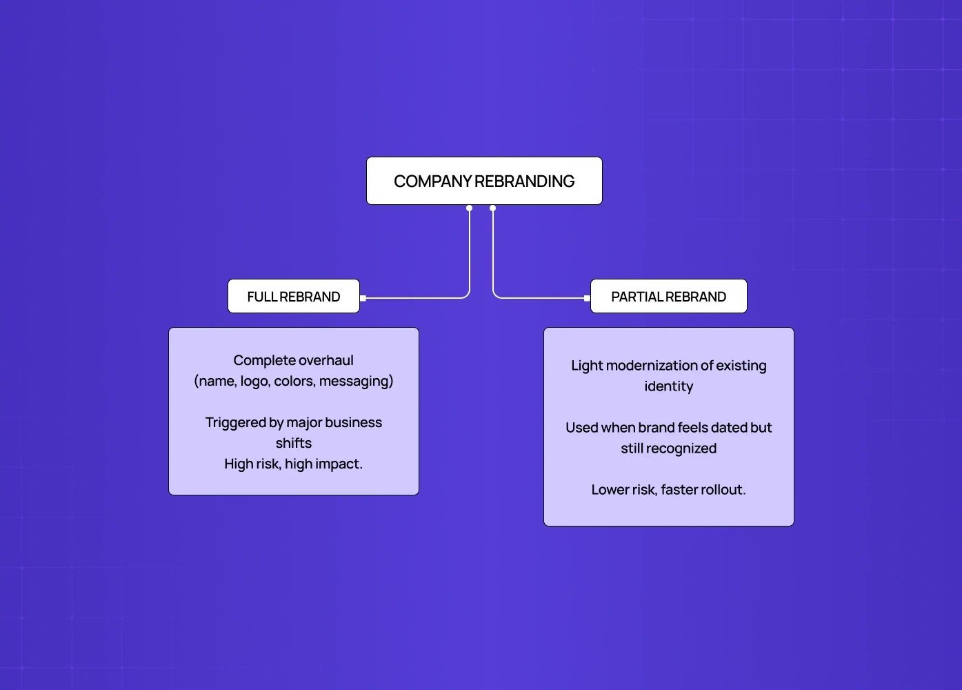
Company rebranding is the process of updating, refreshing, or overhauling an organisation's identity and positioning — and for SaaS companies specifically, the complete guide to SaaS UX design shows how brand and UX decisions are inseparable, making rebranding a product decision as much as a marketing one. It can range from a full rebrand — new name, new visual identity, new messaging, new brand strategy — to a partial rebrand or brand refresh that modernises specific elements while preserving the core equity.
There are two distinct types:
Full Rebrand
A comprehensive overhaul of name, logo, colour palette, typography, messaging, and brand strategy.
Typically driven by major business change: a merger, a pivot, a reputation issue, or a fundamental shift in audience or positioning.
Higher risk, higher impact — requires complete implementation across every touchpoint.
Partial Rebrand / Brand Refresh
A lighter update that modernises or clarifies the existing identity without altering its core essence.
Common when a brand feels dated but retains strong equity and audience recognition.
Lower risk, faster execution — but still requires strategic intent and consistent rollout.
The right level of change depends on the gap between where the brand currently sits and where it needs to be. Design is what closes that gap.
5 Signs Your SaaS Company Needs a Rebrand
Understanding what drives a rebranding strategy — the purpose of a rebrand beneath the visual change — is what separates purposeful change from change for its own sake.
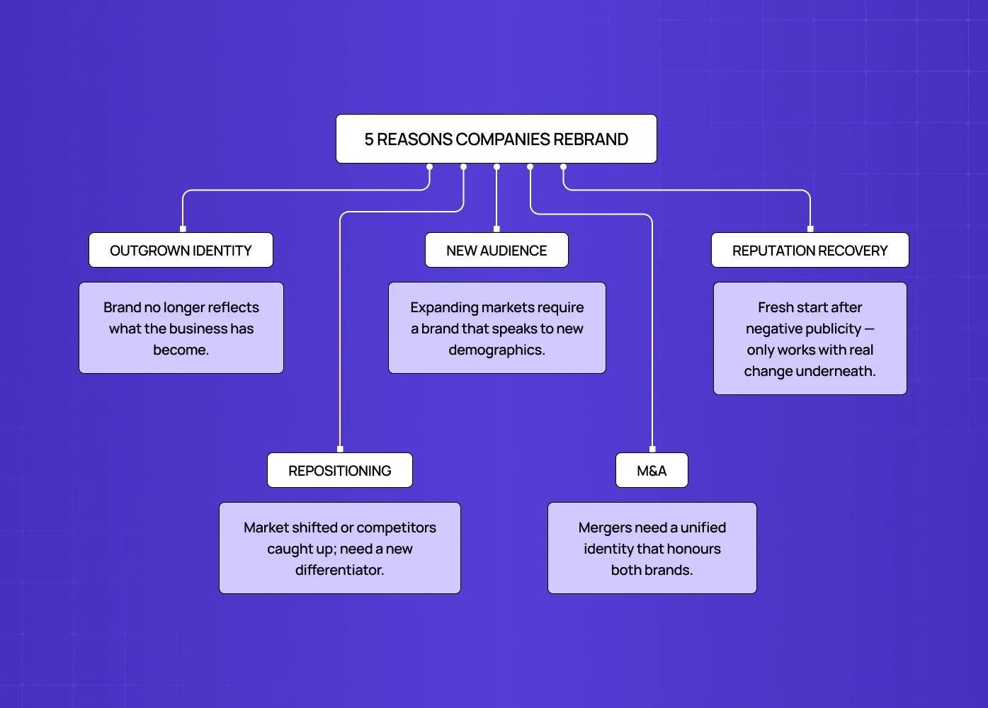
1. The Brand Has Outgrown Its Identity
The company has evolved but the visual identity and messaging have not kept pace
A brand that no longer reflects what the business actually does creates confusion internally and externally.
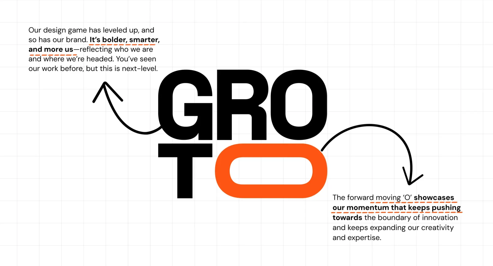
This was true for Groto: when we rebranded in 2024, we had grown from an execution-focused UX studio into a full-service design agency. Our original black-and-white logo was built for speed, not for where we were headed. The rebrand was not about aesthetics — it was about honest representation.
2. Market Positioning Needs to Shift
Competitors have caught up, the market has changed, or the brand's differentiator has become generic.
A rebrand repositions the business relative to the competitive landscape — and aligning that repositioning with a clear SaaS go-to-market strategy ensures the new brand identity is built into how the business acquires and retains customers from day one, not retrofitted after the visual work is done.
Slack's rebrand shifted its positioning from "team chat tool" to "workflow integration platform" — a strategic necessity as Microsoft Teams intensified competition.
3. Targeting a New Audience
Expanding into new markets, new geographies, or new demographics requires a brand that resonates with those audiences.
Airbnb's 2014 rebrand extended the brand from "cheap accommodation" to "belonging anywhere" — a repositioning that opened the door to a global, aspirational audience.
The creative direction, tone, and visual language all need to speak to the new audience as if meeting them for the first time, which is exactly the kind of translation work identity execution specialists are built for once the strategic positioning has been defined.
4. Mergers and Acquisitions
When two companies merge, harmonising their identities under a coherent new brand is both a practical necessity and a strategic opportunity.
United and Continental Airlines kept the United name, combined the Continental globe, and created an identity that felt like both without being neither.
The design challenge: synthesise without erasing — find the elements with the most equity in each brand and give them a new shared home.
5. Reputation Recovery
A brand tarnished by negative publicity sometimes needs a fresh start to rebuild trust.
The most effective reputation rebrands are accompanied by genuine operational change — the design is the signal, not the solution. This dynamic is especially pronounced when examining brand trust in regulated industries, where a rebrand without operational credibility behind it fails faster and more visibly than in most other sectors. Without real change underneath, a reputation rebrand backfires and the new identity becomes associated with the same old problems.
What to Consider Before Starting
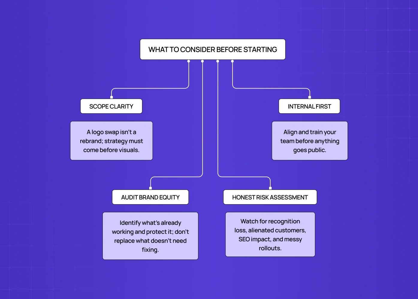
Understand What You Are Actually Changing
A logo change is not a rebrand — it is a logo change.
A true rebrand touches positioning, messaging, visual identity, and the product or service experience that delivers on the brand promise — and building that foundation starts with a clear SaaS branding strategy that defines what the brand stands for before any visual work begins.
Starting with the visual layer before defining the strategic layer is the most common and expensive mistake in rebranding.
Audit Your Existing Brand Equity
What elements of the current brand do customers recognise, value, and associate with positive experiences?
Those elements have equity — they are worth preserving or evolving rather than replacing.
Gap discarded 20 years of brand equity with a logo change that solved no real problem; customers rejected it within days.
The rule is: change what needs to change, protect what is working.
Assess the Risk Honestly
Loss of brand recognition if the new identity is too far from the existing one.
Alienating loyal customers if the brand shifts in a direction that no longer reflects their values — a risk that's often lower when a rebrand moves toward restrained linework identity, since simplifying an existing mark tends to preserve more recognisable equity than replacing it outright.
SEO and domain authority loss if names or URLs change without careful redirection planning.
Inconsistent rollout that creates a period where the old and new brand coexist in confusing ways.
Internal Alignment Precedes External Launch
Employees are the first audience of any rebrand — if they do not understand or believe in it, customers will feel that.
Internal announcement, updated brand guidelines, and team training should happen before the first external communication goes out.
The Rebranding Process: From Strategy to Rollout
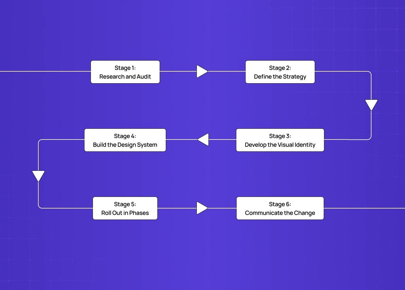
Stage 1: Research and Audit
Gather customer feedback on the current brand — what they associate with it, what they value, what feels misaligned.
Conduct a competitor audit to understand how your brand sits in the market and where the whitespace for differentiation is.
Audit all existing brand assets across every touchpoint: website, product UI, marketing materials, social profiles, email templates, sales collateral.
Stage 2: Define the Strategy
Clarify the positioning: what the brand stands for, who it is for, and what makes it distinctively different.
Define the emotional territory — what should someone feel after every interaction with the brand? This is brand experience design in its most foundational form: the deliberate shaping of how people feel at every touchpoint, from the marketing site to the product UI to a support reply.
Write the brief before opening any design tool — the creative work is only as strong as the strategic thinking that precedes it.
Stage 3: Develop the Visual Identity
This is where the design work begins — and where the quality of the execution determines whether the strategy lands.
Core Elements to Develop
Logo — the mark, wordmark, and their variations across contexts and sizes
Colour palette — primary, secondary, and functional colours with defined roles and accessibility compliance; understanding color palette structure for brands and types of color palettes available helps teams make the structural colour decision — monochromatic, complementary, triadic — before moving into specific shade selection
Typography — type families, hierarchy, and usage rules for digital and print.
Iconography and illustration style — the visual language that extends beyond the logo.
Motion and animation principles — increasingly important for digital-first brands.
Brand voice and tone — the verbal identity that governs how every word communicates.
Design Quality Is Not Optional
A rebrand executed with average visual craft signals that the company does not take its own brand seriously.
Accessibility is not a secondary consideration — colour contrast ratios, legible type sizes, and clear visual hierarchy are baseline requirements for any digital brand, and grounding those decisions in the principles of design gives teams the shared vocabulary to evaluate every visual choice against functional criteria rather than aesthetic preference.
Test the new identity in real contexts before launch: how does it perform on mobile? In dark mode? At small sizes? In black and white?
Stage 4: Build the Design System
A brand that exists only in a PDF guidelines document will not be applied consistently.
Build component libraries, templates, and a design system that makes it easy for every team to use the new brand correctly — design systems for SaaS products covers how to structure that component architecture so the brand scales without fracturing when new designers join or new features ship.
The design system is the infrastructure that lets the brand scale without fracturing.
For SaaS and product companies, the brand design system and the product design system should reference each other — visual decisions made for the marketing site have implications for the product UI and vice versa.
Stage 5: Roll Out in Phases
Update the highest-visibility touchpoints first: website, primary social profiles, email signatures, sales decks.
Set a hard deadline for retiring old assets — without a cutover date, the old and new brand coexist indefinitely, and without a scalable component system in place before that deadline, teams default to recreating assets from scratch rather than drawing from a shared source of truth.
Internal launch precedes external launch — employees should never learn about the rebrand at the same time as the public.
Stage 6: Communicate the Change
Every rebrand needs a communication plan: internal announcement, external press release or blog post, social media rollout, email to the customer base.
The story behind the rebrand matters as much as the new visuals — explain why, not just what, and brand storytelling visuals like a before-and-after comparison graphic or a strategic timeline often communicate that "why" faster than a written announcement alone.
When we launched Groto's rebrand, we published the story behind it: where we started, what changed about our vision, and how the new brand reflects who we have become as a studio. That transparency built trust rather than confusion.
Company Rebranding Examples Worth Studying
What Worked
Groto (2024)
For a real-world rebranding example closer to home — Groto's own 2024 rebrand is documented in full, covering the strategic triggers, the design decisions, and the rollout.
Semrush (2020)
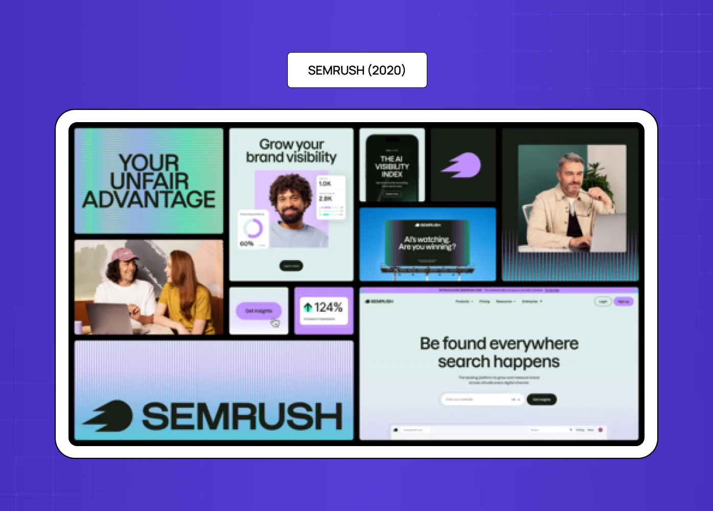
Semrush (2020) settled the long-running pronunciation debate while launching a bold new visual identity.
The rebrand was accompanied by clear communication, video content explaining the changes, and a cohesive rollout across all channels.
Result: increased brand awareness and a sharper, more confident market position.
Wise (TransferWise)
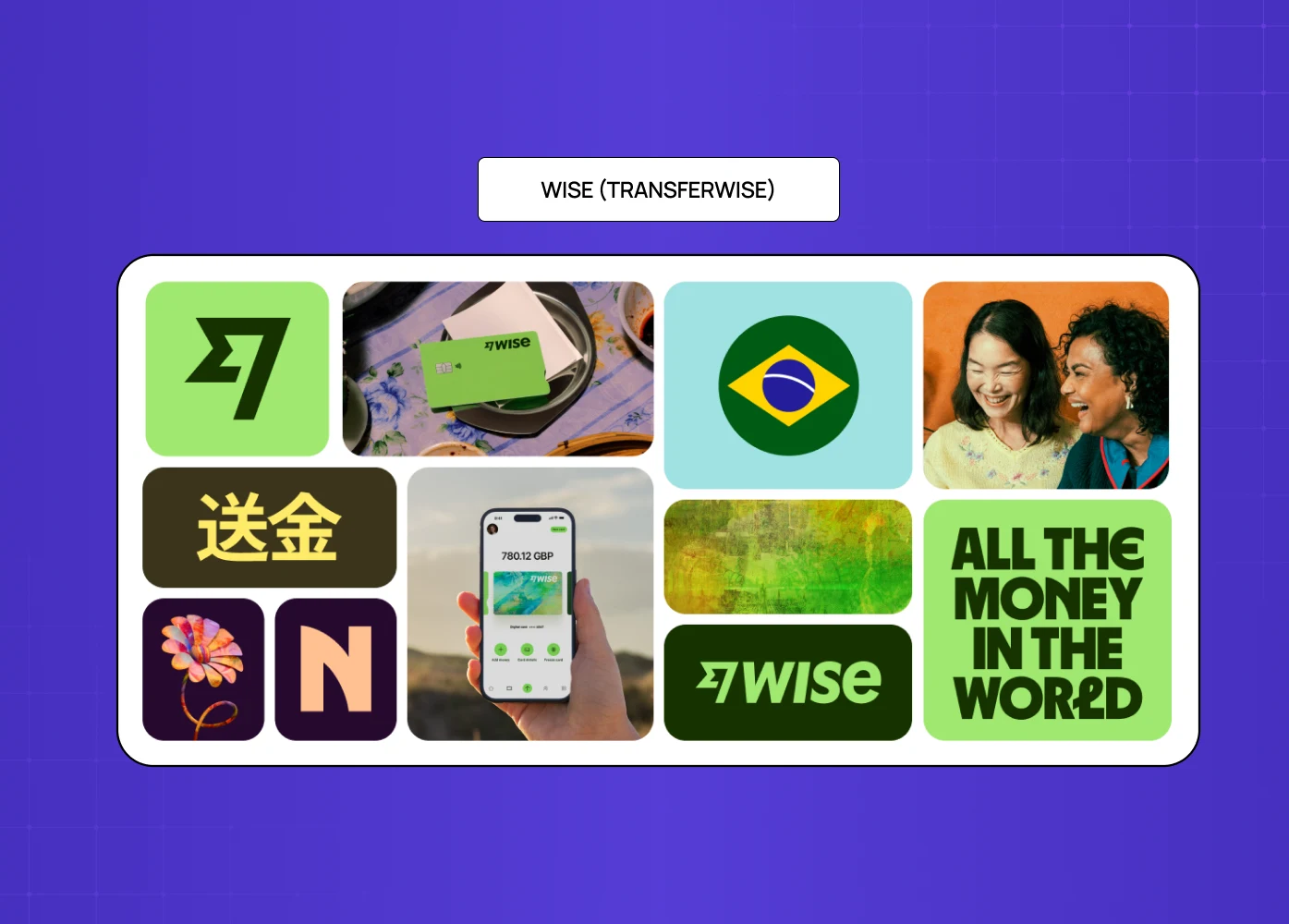
Recognised that "people needed more than just money transfers" and that the old name was limiting its product expansion.
The rebrand was strategic before it was visual — the name change came from a positioning decision, not an aesthetic one.
Result: diversified product offering, multi-currency accounts, and significantly expanded market positioning.
Tupperware
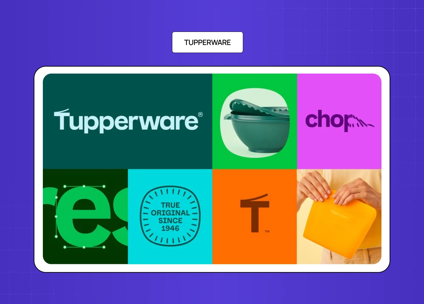
Updated a brand with a dated reputation (Tupperware parties of the 70s and 80s) with bright, dynamic, vibrant new branding to reach younger audiences.
The visual shift was dramatic — from suburban domesticity to bold, high-energy retail design.
Result: renewed relevance in a category that was losing a generation of potential customers.
What Did Not Work
Gap (2010)
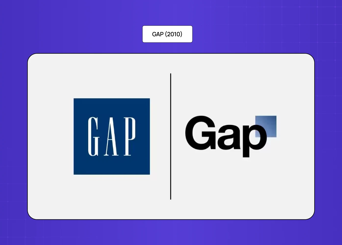
Replaced a 20-year-old logo with a new design that solved no real problem — proof that even flawless work from logo design specialists fails without a strategic reason behind it.
No clear strategic reason for the change, no audience research to support it, no story to explain it.
Result: immediate, vocal customer rejection; reverted to the original logo within days.
Lesson: a rebrand needs a reason. Visual change for its own sake erodes trust.
Google Workspace icons (2020)
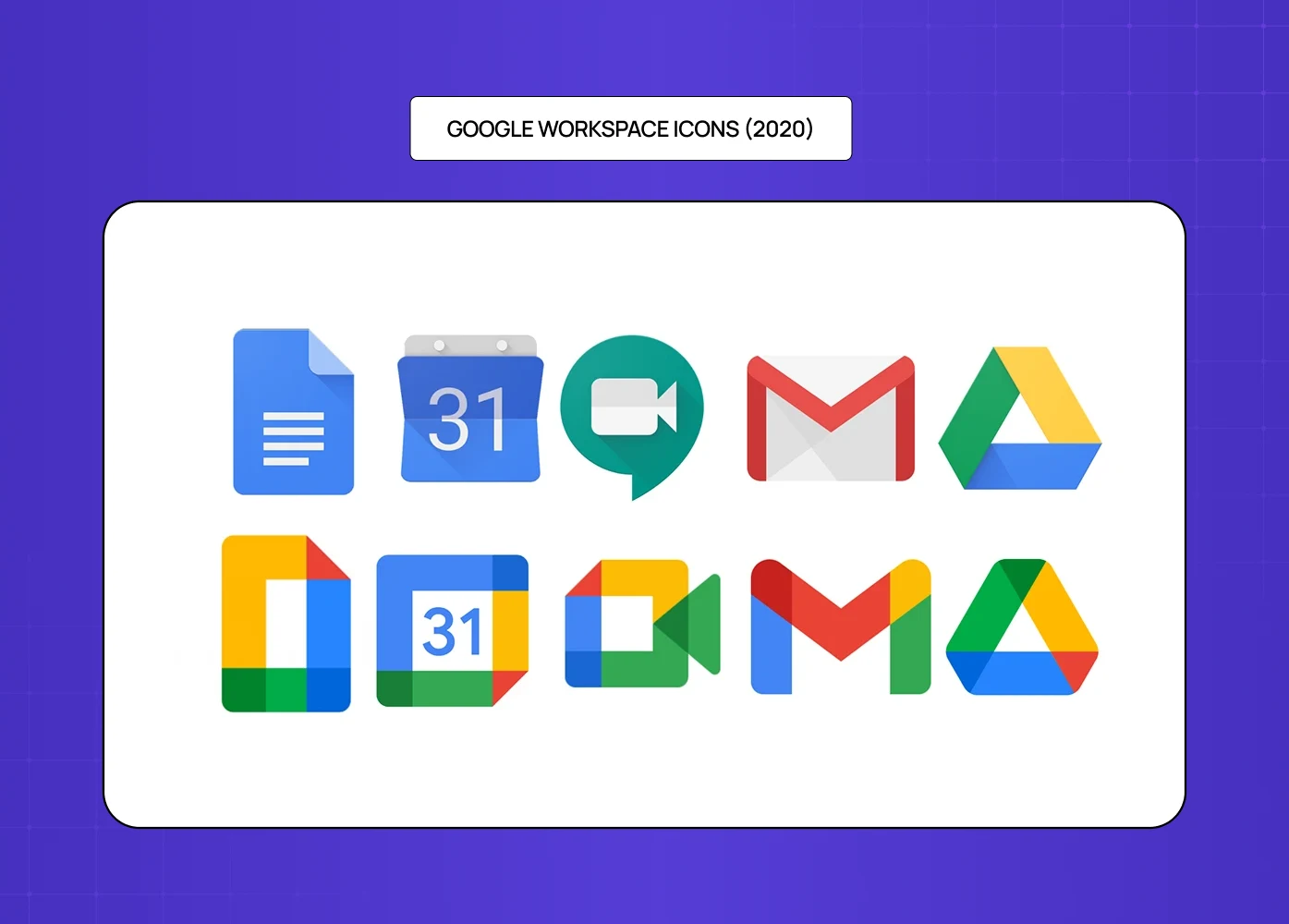
New icons for Gmail, Calendar, Drive, and Docs looked too similar, making it difficult for users to distinguish between applications at a glance.
The design prioritised aesthetic uniformity over functional differentiation — the wrong trade-off for an application suite.
Result: significant user frustration, accessibility concerns, and public criticism about the usability of the redesign.
Rebrand ROI: What a Successful Rebrand Actually Delivers
A rebrand is a significant investment. Understanding what it is supposed to return — and how to measure it — is what separates a strategic rebrand from a vanity project.
What good rebrands measurably deliver:
Increased Brand Awareness
A rebrand generates a short-term spike in branded search, direct traffic, and social conversation that no paid campaign can replicate at the same cost.
Jaguar's 2024 rebrand made it the most talked-about brand on social media globally for three consecutive days — regardless of divided opinion, that is awareness at scale.
For smaller companies the dynamic is the same — a well-executed small business rebranding produces a sharper, more coherent brand that gets referred more easily, described more clearly, and remembered longer after a first encounter.
Stronger Competitive Positioning
A modernised identity makes it harder for competitors to be confused with you and easier for the right customers to choose you with confidence.
88% of CMOs say investing in brand-building is key to building a resilient brand during economic uncertainty — a rebrand is often the clearest signal that investment is being made.
Wise's rebrand from TransferWise unlocked product expansion that the old brand was structurally preventing — the name and identity had become a ceiling on the business.
Improved Customer Trust and Retention
Customers who feel the brand authentically reflects their values stay longer, spend more, and refer more readily.
Burberry's return to its creative roots in 2023 produced measurable improvements in brand clarity scores and customer engagement after a period of repositioning drift.
For SaaS and subscription businesses, brand trust correlates directly with renewal rates — a brand that feels dated or misaligned increases churn risk before a single product decision is made.
Business Growth and Investment Outcomes
The brands that invest in design — across product, identity, and experience — consistently outperform those that treat it as a cost rather than a capability.
Across the 140+ products we have designed and redesigned at Groto, our clients have collectively raised $8M+ post-engagement — not because a logo changed, but because a coherent, credible brand gave investors and customers a reason to commit.
A rebrand is not a guarantee of growth, but a brand that does not reflect the reality of the business is a consistent drag on the growth that is otherwise possible.
How to Measure It
Short-Term Signals (0-3 months post-launch)
Branded search volume increase.
Website direct traffic uplift.
Social media follower growth and engagement rate.
Press coverage and earned media.
Medium-Term Signals (3-12 months)
Lead quality and sales conversion rate changes.
Customer NPS and sentiment scores.
Time-to-close in the sales process.
Reduction in "who are you?" questions in sales conversations.
Long-Term Signals (12+ months)
Revenue growth relative to pre-rebrand baseline.
Customer lifetime value and retention rate.
Brand recall in market research.
Talent acquisition quality and time-to-hire.
The most important ROI signal is often the one that is hardest to quantify: whether the people who encounter the brand now feel something different about it than they did before. That feeling is what drives every measurable outcome downstream — and the ROI of UX design gives you the frameworks and metrics to translate that feeling into numbers your stakeholders can act on.
The Rebranding Checklist: Design Layer
Before launch, every rebranding checklist should verify the following design-specific items — and if you're scoping external design support for this stage, understanding UX audit cost upfront helps you plan the investment before committing to full execution:
Logo works at all sizes — from favicon to billboard.
Colour palette passes WCAG 2.1 AA contrast requirements across all usage combinations.
Typography is legible across desktop, tablet, and mobile.
Brand guidelines document covers every core element with do and don't examples.
Design system components are built and accessible to all teams.
All legacy assets have been identified and scheduled for retirement.
Product UI and marketing brand have been reviewed for coherence.
Motion and animation principles are defined for digital touchpoints.
Email templates, social profiles, and sales materials are all updated.
Conclusion
A rebrand is not a logo change — it is a strategic repositioning made visible through design.
The visual layer is where strategy becomes perception: the design quality determines whether the strategic intent lands with the audience.
The most common rebrand failures share a pattern: visual change without strategic foundation, or strategic intent without design quality.
Before changing anything, audit what has equity and protect it — change what needs to change, not everything.
Internal alignment, a phased rollout, and a clear communication story are as important as the new visual identity itself.
The design system built to support the new brand is what determines whether it stays consistent at scale — without it, the brand fractures as the company grows.
A rebrand is not an event. It is the start of an ongoing commitment to expressing who you are, consistently, across every surface.
Planning a rebrand and want design thinking in the room from day one? At Groto, we approach rebranding as a design problem first — from positioning and visual identity through to design systems and product UI coherence. We have been through our own rebrand and we have helped clients through theirs.


