

There are more voice assistants active today than people on the planet — yet most fail on the first try. The problem isn't recognition. It's the design of the conversation, the silence, and the trust that either holds or doesn't.
Most voice interfaces fail not from bad tech, but from broken design.

By 2026, there are more than 8.4 billion active voice assistants in the world — that's more than the number of people on the planet. And yet, fewer than 35% of voice interactions complete successfully on the first try.
The problem isn't the technology. It's the design.
Most teams spend their energy on what the user says and what the system replies. The real failure happens in the gap between those two things — the moment where the system has heard the user but hasn't yet shown it understood them. Miss that moment, and users stop trying.
This guide is for product leaders, design heads, and founders building voice into real products. We'll break down where voice user interface design goes wrong, what principles actually make it work, and how to approach it the right way — from conversation design to multimodal feedback. Voice doesn't sit in isolation: it's one of the sharpest edges of the broader shift toward AI-driven UX practices reshaping product design in 2026.
What Is Voice User Interface Design?
A voice user interface (VUI) is any system a user interacts with through spoken commands, rather than taps or clicks. Think Siri, Alexa, Google Assistant — but also in-app voice features, voice-enabled SaaS products, and AI assistants embedded in everything from cars to smart TVs.
Voice user interface design is the practice of shaping how those conversations work— a specialist branch of UI/UX design that applies when the interface has no screen to fall back on. It covers:
How the system listens and recognises what a user said
How it interprets what the user meant
How it responds — in audio, on screen, or both
How it handles mistakes, misunderstandings, and multi-step tasks
How trust is built (or broken) across the interaction
Unlike screen-based interfaces, VUIs have no visual affordances. There's no button to guide the user, no menu to fall back on. The design is the conversation — which is why VUI ranks among the harder UX disciplines to get right, and why most teams underestimate how much design work it actually requires.
Why Most Voice Interfaces Fail
The Gap Between Hearing and Trust
Forrester's 2025 voice-product benchmark found that 71% of voice abandonment happens after a successful transcription — meaning the system heard the user correctly, but the user still left. The issue isn't recognition. It's what happens next.
When a user speaks, there's a brief window — sometimes just half a second — where the system has received input but hasn't responded yet. During that window, the user is asking themselves one silent question: did it understand me?
If the interface gives no signal — no sound, no visual cue, no acknowledgment — users assume the worst. They repeat themselves, get frustrated, or give up entirely.
The fix isn't faster processing. It's filling that silence with something that shows the system is working. A soft audio cue, a pulsing visual indicator, or even a simple "Got it, give me a moment" keeps the user inside the conversation. Without it, even a technically correct system feels broken.
Designing Commands Instead of Conversations
For years, voice interfaces were built around a single-turn model: the user says a command, the system responds, the interaction ends. That worked for simple tasks like setting a timer or playing a song.
But users have changed — voice has gained ground steadily across the UI/UX trends reshaping how people expect to interact with products. They now expect voice to handle multi-step, contextual tasks — booking a trip, managing a payment, navigating a complex product.
Context doesn't carry forward between turns
The user has to repeat information they already provided
The system treats every input as if it's the first one
The shift that good voice user interface design needs to make: stop designing commands and start designing conversations. It's the same structural failure that explains why copilot UX feels broken in most AI products that treat natural language as a command layer rather than a context-aware conversation.
6 Core Principles of Voice User Interface Design
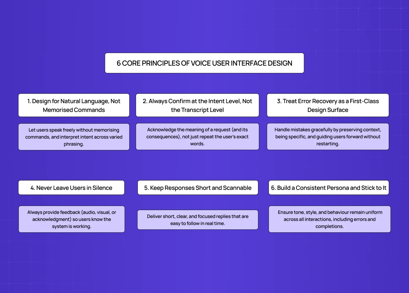
1. Design for Natural Language, Not Memorised Commands
The strongest voice interfaces let users speak the way they actually talk — not the way a developer scripted them to. It's one of the clearest applications of digital product design principles built around reducing cognitive load: the more natural the interaction model, the less users need to learn before they can succeed.
In practice, this means:
Don't require users to remember specific phrases or triggers
Accept variations — "remind me to call Sarah," "set a reminder for Sarah," and "call Sarah at 4" should all work
Avoid error messages that punish users for phrasing things "wrong"
Amazon Alexa is a useful benchmark here. It's been designed to understand the same request expressed in many different ways, and it responds based on intent rather than exact wording. That flexibility is what makes it feel conversational rather than robotic.
2. Always Confirm at the Intent Level, Not the Transcript Level
This is one of the highest-impact changes any voice product can make — and most teams haven't made it.
When a user says "book a flight to Mumbai on Friday,"
there are two ways to confirm:
Transcript echo: "You said 'book a flight to Mumbai on Friday' — confirm?"
Intent echo: "Looking up Mumbai flights for Friday — does that sound right?"
Transcript echo makes the system sound mechanical. It forces users to listen to their own words played back at them, which adds friction without adding clarity. Intent echo shows the system understood the meaning, not just the audio — and that's what builds trust.
For higher-stakes actions (payments, bookings, deletions), confirmation should also surface the consequence: "Booking the 6pm IndiGo flight to Mumbai, ₹8,400, Friday — confirm?" That way, the user knows exactly what they're approving before the system acts.
3. Treat Error Recovery as a First-Class Design Surface
Errors in voice interfaces aren't edge cases — they're common, especially in real-world conditions with background noise, accents, and casual speech. How a system handles those errors is often the difference between a user who stays and one who leaves.
The most common mistake: resetting the user to zero after every failure. Hearing "Sorry, I didn't understand. Please try again." is demoralising — it throws away everything the user already said.
Better error handling preserves partial state. If a user said "book a flight to Mumbai for Friday" and the system caught everything except the date, the recovery prompt should be "What date did you want to fly?" — not "Can you start over?"
Other recovery design principles worth following, per Smashing Magazine:
Be specific about what went wrong. "I couldn't catch the date" is more helpful than "I didn't understand you."
Offer alternatives when the system can't complete a task. "I can't book that directly, but I can search for available flights."
Accept corrections naturally. If a user says "No, I said Friday, not Thursday" — the system should update, not restart.
4. Never Leave Users in Silence
Silence is the fastest way to lose a user's trust in a voice interface.
When a system needs time to process — even just one or two seconds — it should signal that it's working. This is especially important for agentic tasks where the system is doing something on the user's behalf (sending a message, making a payment, searching a database).
Options for filling the silence:
An audio cue ("On it…" or a soft processing tone)
A visual progress indicator on screen
An interim acknowledgment before the full response
As the Smashing Magazine guide points out: when users don't hear or see feedback, they assume the system has stopped working — even when it hasn't. The solution is simple: show the work, don't just do it.
5. Keep Responses Short and Scannable
Voice responses are heard, not read. Users can't skim an audio reply the way they would a screen full of text. That means every word in a voice response needs to earn its place.
Practical guidelines:
Design responses you can say at a conversational pace in a single breath
Limit options to three or fewer when presenting choices
Lead with the most relevant option first
Avoid long preambles — get to the point quickly
When a longer response is unavoidable, pair it with a visual display. The user reads the detail on screen while hearing the summary out loud. That division of labour — voice for input, screen for output — is a core principle of multimodal design.
6. Build a Consistent Persona and Stick to It
A voice interface has a personality whether the team intentionally designs one or not — and as products move toward designing for AI agents that act autonomously on behalf of users, persona consistency becomes even more critical because the same principles govern how trust is built across multi-turn, goal-directed interactions. The question is whether that personality is consistent.
Inconsistency reads as untrustworthy. A system that sounds warm and helpful in normal flow but cold and robotic in error states feels like two different products. Users notice — and they lose confidence.
Before writing any prompts or responses, define the system's persona:
What's its tone? (Conversational, professional, friendly, neutral?)
What does it say in error states?
What does it say when it completes a task?
What does it not say? (Overly promotional language, jargon, filler phrases?)
Every piece of dialogue — including the recovery lines that nobody thinks about — should run through that persona filter. The voice interfaces that feel coherent almost always have an explicit persona document behind them. The ones that feel fragmented don't.
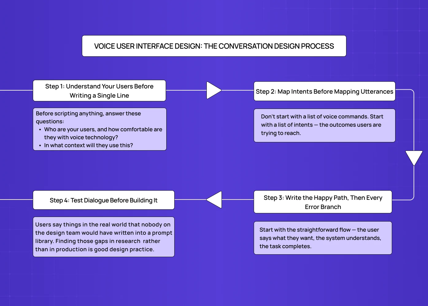
Voice User Interface Design: The Conversation Design Process
Good conversation design doesn't start with what the system will say. It starts with understanding the user and the problem they're trying to solve — the same user-first principle that anchors any structured UX design process, applied here to dialogue rather than screens.
Step 1: Understand Your Users Before Writing a Single Line
The biggest mistake in voice UX design is jumping straight to dialogue. Before scripting anything, answer these questions:
Who are your users, and how comfortable are they with voice technology?
In what context will they use this? (Hands-free while driving? At a desk? In a noisy environment?)
What are the top five to ten things they actually want to accomplish?
How do they phrase those goals in their own words?
This last point matters more than teams realise. User research for voice products needs to capture how people actually speak, not how they think they speak. People over-articulate in surveys and user interviews. Recording users attempting real tasks gives you far more accurate language data.
Step 2: Map Intents Before Mapping Utterances
Don't start with a list of voice commands. Start with a list of intents — the outcomes users are trying to reach.
The same intent can be expressed in dozens of ways. "Book a meeting with Priya," "Schedule time with Priya," "Set up a call with Priya tomorrow" — these are all the same intent, phrased differently. Building around the intent (rather than any specific phrasing) makes the system far more robust in the field.
Once intents are mapped, then list the most common utterances for each one. The Pareto principle applies here: around 20% of possible phrases account for 80% of how users will actually express each intent. Design for those first.
Step 3: Write the Happy Path, Then Every Error Branch
Start with the straightforward flow — the user says what they want, the system understands, the task completes. Then script what happens when things go wrong:
What if the system mishears part of the input?
What if the user changes their mind mid-task?
What if there are multiple possible interpretations?
What if the user is in a noisy environment?
Recovering gracefully from these situations isn't a nice-to-have. It's what separates a voice product with 30% completion from one with 70%.
Step 4: Test Dialogue Before Building It
The most efficient way to test voice dialogue is a method called Wizard of Oz — a designer plays the role of the system live, responding in real time while the user speaks normally. No code, no engineering, no prototype required.
This method surfaces problems that scripted flows miss entirely. Users say things in the real world that nobody on the design team would have written into a prompt library. Finding those gaps in research (where fixing them costs nothing) rather than in production (where fixing them costs everything) is good design practice.
As Smashing Magazine recommends: have participants sit back to back so they can't use non-verbal cues. Voice interfaces have to function without body language, so testing should simulate that.
Multimodal Design: Voice + Screen + Feedback
Pure voice interfaces — audio only, no screen — are increasingly the exception. Most devices that use voice today also have a screen: smart speakers with displays, cars, phones, smart TVs. That means voice user interface design is also multimodal design.
Why Multimodal Matters
According to McKinsey's 2025 voice product research, multimodal voice interfaces complete tasks 38% faster than voice-only ones. The reason is simple: different channels do different things better.
Voice is faster for input. Speaking is quicker than typing.
Screens are faster for output. Reading is quicker than listening to a long audio response.
Haptics work best for confirmation. A quick vibration tells the user "done" without requiring them to look or listen.
The best multimodal voice interfaces let each channel do what it's best at — and they keep all channels in agreement. This channel-specialisation principle is where AI UX diverges most sharply from traditional UX: conventional interfaces optimise a single surface, while AI-native ones orchestrate multiple input and output channels simultaneously.
Keeping Voice and Visual In Sync
One of the most common multimodal design failures: the screen says one thing, and the voice says something slightly different. Even when both are technically correct, the disagreement creates confusion and erodes trust.
Every multimodal interface needs a single source of truth for what was heard, what was understood, and what was done. Every channel — audio, visual, haptic — should render from that same source.
Designing for the Moment, Not Just the Device
A user driving a car has a screen, but their primary mode is voice. A user at a desk has a microphone, but they probably prefer typing. Good voice user interface design accounts for the context of use, not just the features of the device.
The same user may want to interact by voice at 8am in the kitchen and by screen at 3pm at their desk. Designing for that flexibility — letting the user switch modes naturally — is what separates thoughtful multimodal design from a rigid "voice feature" bolted onto a product.
Privacy, Latency, and Trust
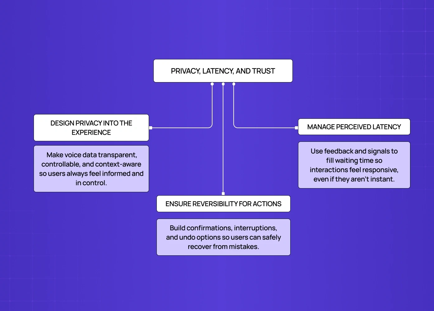
Privacy Has to Be Part of the Design, Not Just the Policy
Voice data is sensitive. Users know this, even if they don't say it — which is why they mute smart devices, avoid certain commands, and distrust products that feel like they're always listening.
Good voice UX design surfaces privacy information at the moment it matters — not buried in settings. This includes:
Showing what was transcribed immediately after capture
Making it easy to delete recordings in one tap
Being clear about where data is stored and for how long
Never verbalising sensitive information in shared spaces
Amazon's Alexa lets users review and delete voice recordings directly from the app, and even ask "Alexa, tell me what you heard." That kind of transparency isn't just good ethics — it's good product design.
On Latency: Fill the Silence Before Optimising the Speed
The conventional wisdom is "go faster." But latency in voice interfaces is a perception problem as much as a technical one.
A useful benchmark: under 800ms feels conversational, 800ms to 2 seconds feels deliberate, above 2 seconds feels broken. But a two-second response with a clear processing signal can feel faster than a 600ms response with no signal at all.
The priority should be: fill the silence with intent first, optimise speed second.
Design for Reversibility, Especially in High-Stakes Actions
When voice interfaces take action on a user's behalf — sending a message, making a payment, submitting a form — mistakes aren't just annoying. They're consequential.
Every high-stakes voice action should have at least one of these:
A confirmation step before the action executes
An interruption window while the action is in progress
A clear undo after the action completes
Users trust interfaces that make mistakes recoverable — not interfaces that promise they'll never make mistakes. That trust difference is quantifiable: the ROI of UX design decisions like reversibility shows up directly in task completion rates, support volume, and churn in voice-heavy products.
Real Products Getting This Right
A few public examples worth studying for how they've approached specific VUI design challenges:
Amazon Alexa
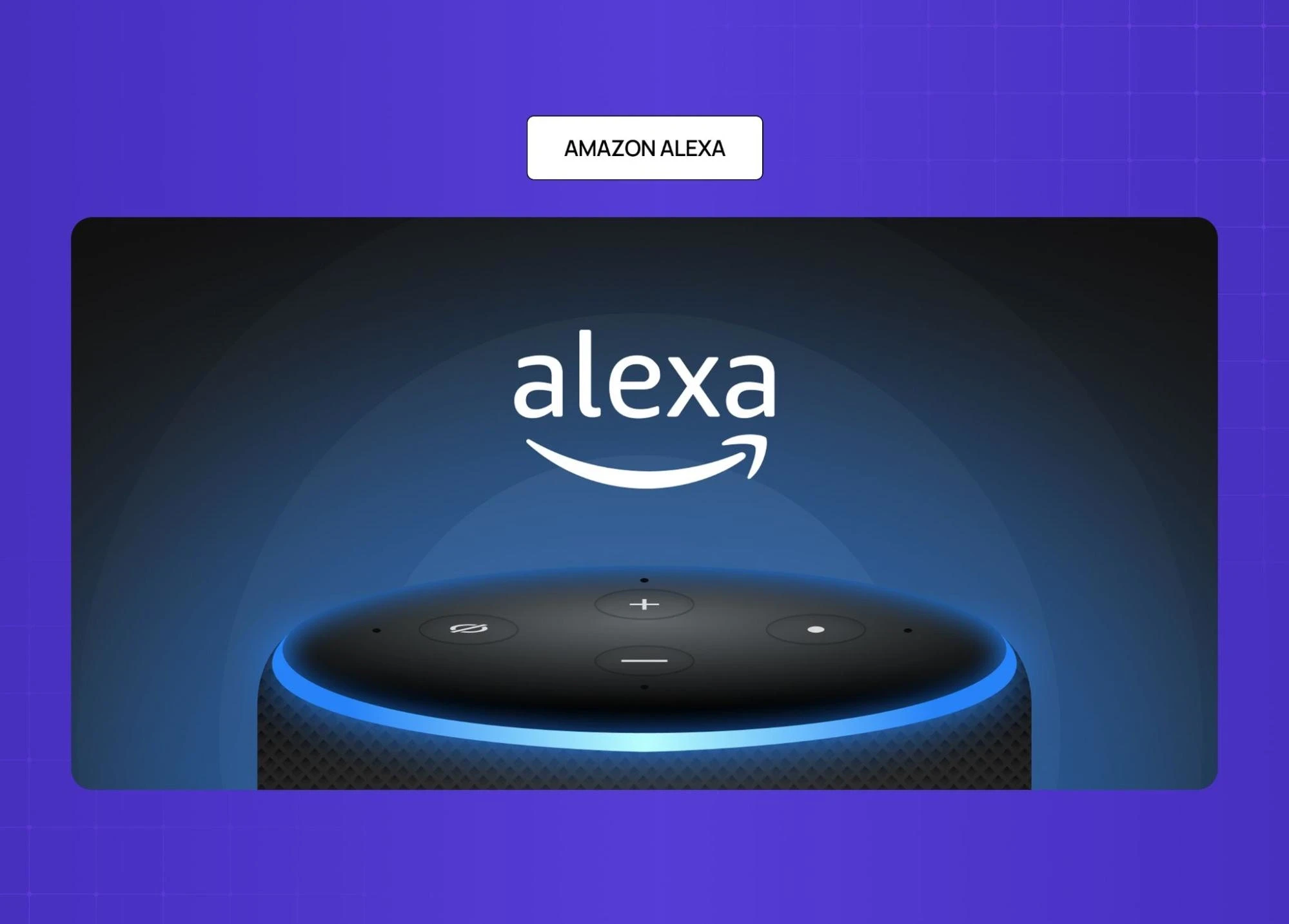
An early and enduring example of intent-flexible design. Users can phrase the same request in many ways, and the system adapts. Its privacy controls (delete recordings via voice or app) also set a standard for transparent data handling.
Apple Siri
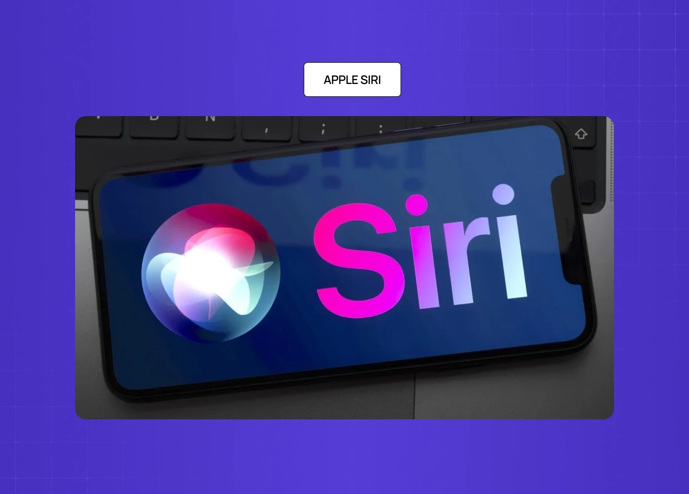
The 2025 rebuild introduced a visible "thinking" state and front-loaded acknowledgment within 200ms of recognition. Same backend latency as before, but the trust scores improved significantly because the silence was designed. It illustrates one of the defining shifts in mobile app UX design trends for 2026: faster voice recognition, visible processing states, and smarter feedback loops replacing silent waits.
Microsoft Cortana

Handles ambiguous inputs gracefully by surfacing clarifying questions ("Did you mean...?") rather than failing outright. A good reference for error-state dialogue design, and one that maps closely to the patterns in mastering AI copilot design — where handling ambiguous inputs without breaking the flow is the defining challenge.
Duolingo's speaking practice feature
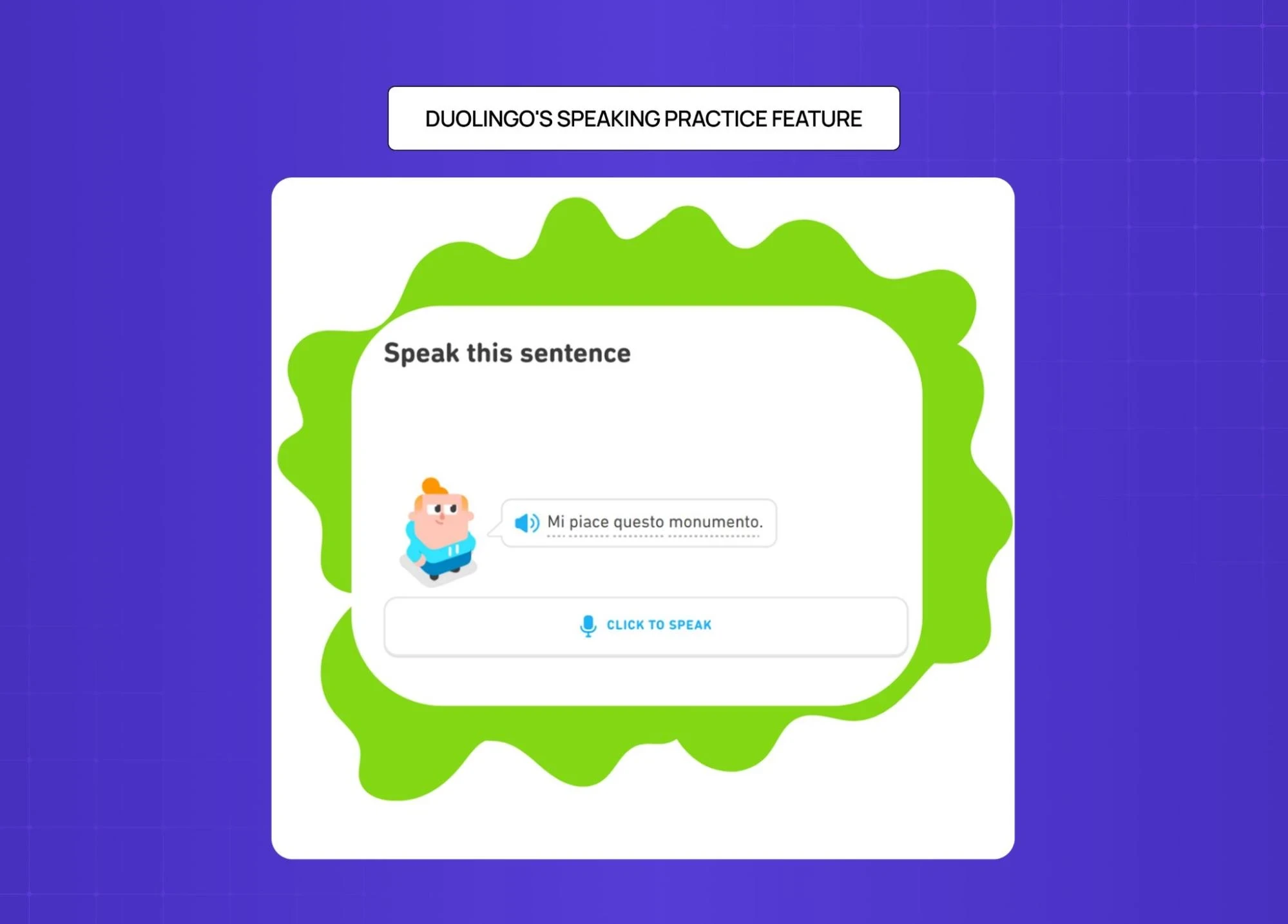
When the system mishears a user, it shows exactly what it caught and lets them re-attempt only the part that was missed. Recovery is treated as a feature, not a fallback.
Domino's voice ordering
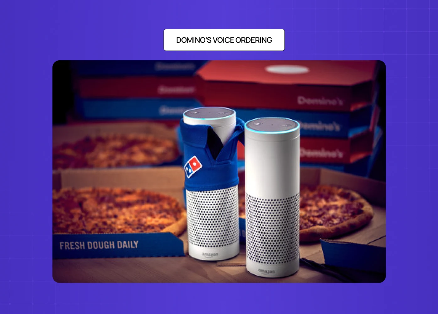
Lets users order with casual, natural phrasing ("Order my usual") rather than structured commands. A good example of designing around intent rather than scripted triggers.
Conclusion
Voice user interface design is one of the most underinvested areas in product design today — and one of the highest-leverage ones. Most voice products fail not because the technology is poor, but because the design doesn't account for how people actually speak, what they need in moments of uncertainty, and how trust is built across a conversation. Understanding where AI voice interfaces are heading makes clear why building this design competency now matters: voice is moving from feature to primary paradigm in more product categories every year.
Here's what to carry into your next voice project:
Start with intent mapping, not utterance scripting. Know what users want to accomplish before deciding how they'll ask.
Confirm at the intent level. Echo meaning, not transcription.
Design recovery before you design the happy path. Error states are where users make decisions about whether to stay.
Fill the silence. Every moment without feedback is a moment users spend doubting the system.
Keep voice and visual in sync. In multimodal products, disagreement between channels breaks trust.
Build reversibility into every consequential action. Users trust interfaces that let them fix mistakes.
Define your persona and apply it everywhere — especially in error states, where it breaks first.
If you're building a voice product — or rethinking one that isn't performing — we'd be glad to take a look. Book a discovery call with our team at Groto.


