Accessibility in UX Design: What to Check, What to Annotate, What to Hand Off

Accessibility in UX Design: What to Check, What to Annotate, What to Hand Off

Accessibility in UX design fails at handoff, not in principle. Learn the component-level checks, the WCAG 2.2 numbers worth knowing, and what to annotate for engineering.

Accessibility in UX Design: What to Check, What to Annotate, What to Hand Off

Accessibility in UX Design: What to Check, What to Annotate, What to Hand Off

Accessibility in UX design fails at handoff, not in principle. Learn the component-level checks, the WCAG 2.2 numbers worth knowing, and what to annotate for engineering.

Most teams know the accessibility principles and still ship products that lock people out. This guide covers what accessibility in UX design means in practice, the component-level checks that matter, and what to hand engineering so it survives the build.

Your team knows the principles. The handoff is where accessibility gets lost.

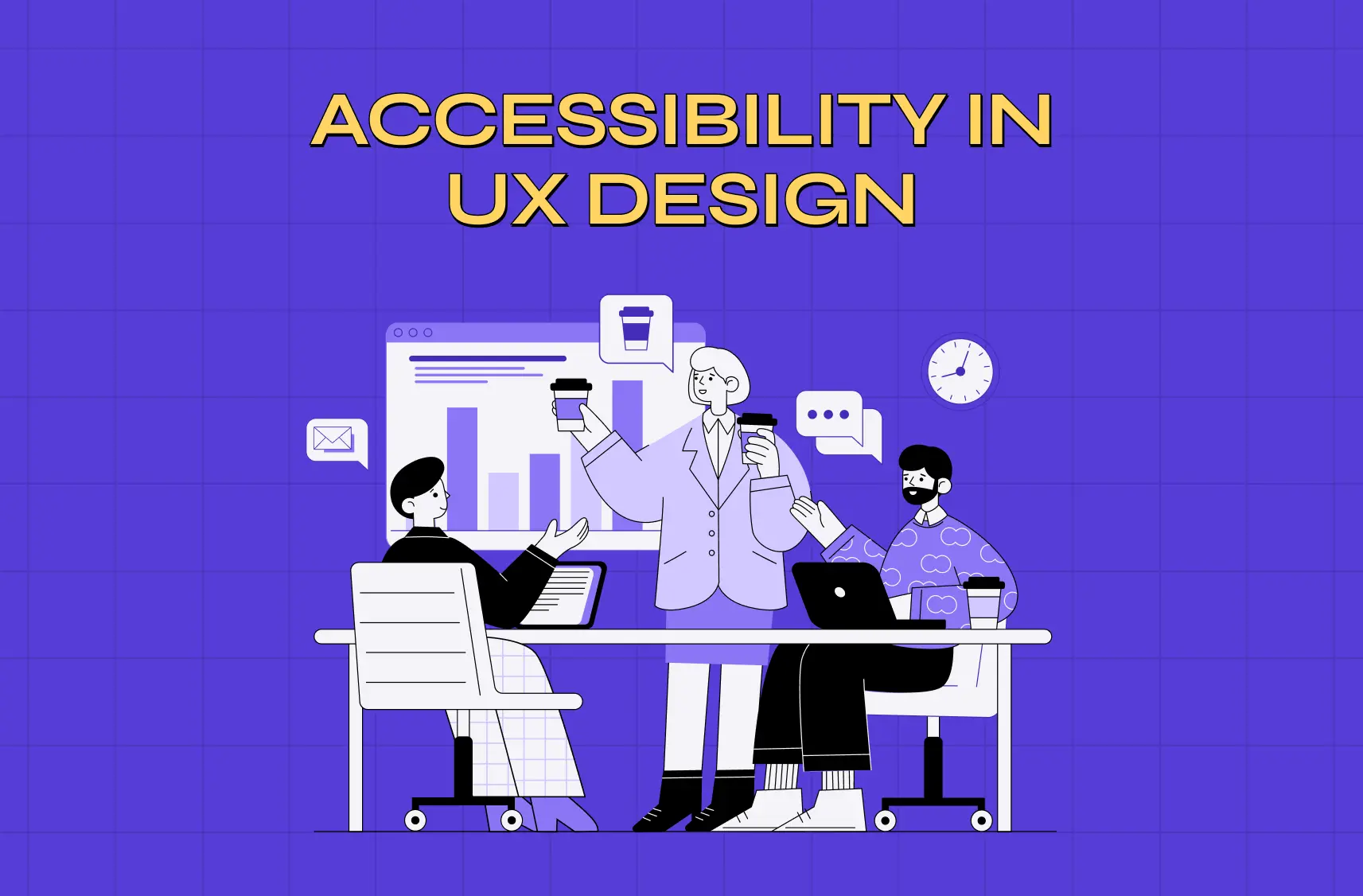
Illustration of a design team reviewing a bar chart together at a shared desk, with laptops, coffee cups and chat icons on a purple background.

Most design teams already know the principles. They can name contrast ratios, they know alt text matters, and somebody on the team has read the WCAG docs. And they still ship products that lock people out.

The gap isn't knowledge. It's that accessibility knowledge usually lives in a blog post or a designer's head, and never makes it into the file that goes to engineering. Nobody annotated the focus order. Nobody wrote the alt text. The ticket said "build this screen" and said nothing about how it should behave with a keyboard.

This guide is about closing that gap. It covers what accessibility means in practice at the component level, what you check while you're designing, and what you hand over so the work survives the build. It's the design practice side. If you need the business, legal and compliance case, that's a separate piece: accessibility-first UX: what businesses need to know in 2026 covers the European Accessibility Act, the revenue argument and the executive version.

The scale, for context. An estimated 1.3 billion people – or 1 in 6 people worldwide experience significant disability. That's the permanent population. Add temporary and situational impairment and the number stops being a segment and starts being everyone, eventually.

What accessibility in UX design means

Accessibility in UX design is the practice of making sure a product can be perceived, operated and understood by people regardless of ability, including people using screen readers, keyboards, voice control, magnification or switch devices. In practice it covers four things: what you can perceive, what you can operate, what you can understand, and whether it works reliably with assistive technology.

It isn't a stage at the end. Roughly half the decisions that make a product inaccessible are made in the first week: the colour palette, the type scale, the component library, the interaction patterns. By the time there's something to audit, those decisions are expensive to reverse.

Accessibility and usability are not the same thing

They overlap and they're not interchangeable. Usability asks whether a product is easy to use for the people who can already use it. Accessibility asks who can use it at all.

A checkout flow can score well in usability testing with sighted mouse users and still be completely unusable with a keyboard. That's not a usability problem, it's an access problem, and no amount of polish on the happy path fixes it.

The distinction matters more as products get more capable, because accessibility work increasingly means designing for a different mode of interaction rather than a simpler version of the same one. We've written about where that line sits in AX vs UX design.

The principles behind the rules
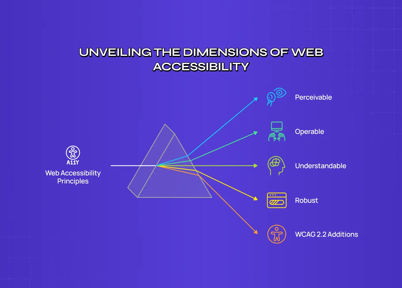
Prism diagram showing web accessibility principles split into perceivable, operable, understandable, robust, and WCAG 2.2 additions.

Before the checklists, the four principles everything else hangs off. The W3C's POUR principles are the structure behind every WCAG success criterion, and they're worth knowing as questions rather than categories.

  • Perceivable. Can someone receive this information through more than one sense? If the only signal is colour, or the only content is inside an image, the answer is no.

  • Operable. Can someone use this without a mouse, without precise motor control, and without a time limit they can't extend?

  • Understandable. Is the language plain, is the behaviour predictable, and when something goes wrong, does the error say what to do about it?

  • Robust. Will it still work in six months, on a screen reader nobody on your team has tested, in a browser you didn't plan for?

WCAG 2.2, and the numbers worth memorising

WCAG 2.2 has been the current W3C Recommendation since October 2023. If your team is still working to 2.1, you're one version behind, and the new criteria are mostly design decisions rather than engineering ones.

The numbers that come up most often in design review:

Requirement

Level AA

Body text contrast

4.5:1 against its background

Large text (18pt, or 14pt bold)

3:1

UI components and graphical objects

3:1

Minimum target size

24 by 24 CSS pixels

That third row is the one most teams miss. Contrast isn't only about text. Input borders, icon buttons, toggle states, chart lines and focus indicators all need to be distinguishable too, and a pale grey outline on white fails even when the label above it passes.

The 2.2 additions worth knowing as a designer: target size minimum, focus not obscured (a sticky header that covers the focused element is now a failure), dragging movements (any drag interaction needs a single-pointer alternative), consistent help (support links stay in the same place across pages), redundant entry (don't make someone type the same information twice in one flow), and accessible authentication (no puzzle, no transcription, no memory test as the only way in).

For the broader design fundamentals these sit inside, our 13 principles of design covers the visual side in more depth.

The UX/UI checklist top SaaS teams actually use

15 essential checks covering onboarding, conversions, and retention. Spot quick wins and fix friction before it costs you signups.

No Spam. Free Lifetime

The UX/UI checklist top SaaS teams actually use

15 essential checks covering onboarding, conversions, and retention. Spot quick wins and fix friction before it costs you signups.

No Spam. Free Lifetime

Who you're designing for

The mistake is picturing a permanent, total impairment and designing an edge case for it. The useful model is three columns.

Ability

Permanent

Temporary

Situational

Vision

Blindness, low vision

Eye surgery recovery

Bright sunlight on a phone

Hearing

Deafness

Ear infection

Open-plan office, no headphones

Motor

Limb difference, tremor

Broken arm

Holding a child, on a moving train

Cognitive

Learning disability

Concussion, severe fatigue

Stress, distraction, deadline

Speech

Non-verbal

Laryngitis

Library, quiet carriage

Read across any row and the same design fix serves all three columns. Captions serve deaf users, someone with an ear infection, and the person watching without sound on a commute. That's the whole argument for people-centered design in one table, and it's the version that lands with stakeholders who think accessibility is a minority concern.

Accessibility at the component level
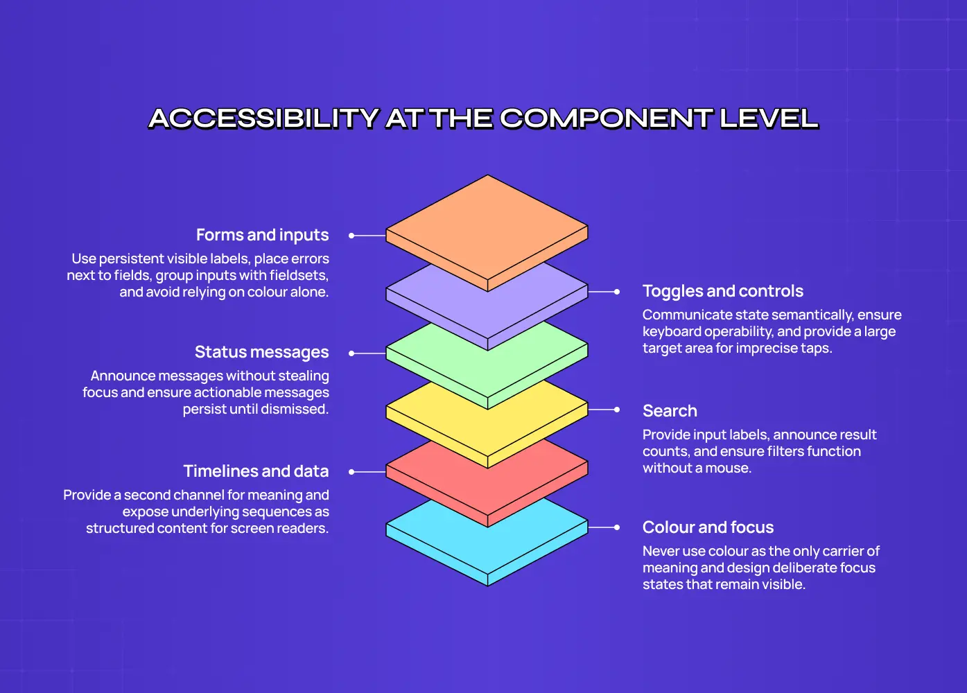
Stacked layer diagram of component-level accessibility covering forms and inputs, toggles and controls, status messages, search, timelines and data, and colour and focus.

Principles are easy to agree with and hard to apply. This is where the work actually happens: specific components, specific failure modes.

Forms and inputs. Every field needs a persistent visible label, not a placeholder that disappears the moment someone types. Errors go next to the field that caused them, in text, saying what to fix. Group related inputs with a fieldset and a legend. And never rely on colour alone to mark an invalid field, since the person who most needs that signal may not see it.

Toggles and controls. A toggle has to communicate its state to someone who can't see it, which means the on and off states need a real semantic difference rather than only a visual one. It also needs to be operable with a keyboard and hittable with an imprecise tap. We've broken the pattern down properly in toggle accessibility.

Status messages and snackbars. This is the most commonly broken pattern we see. A message that appears, announces nothing to a screen reader, and vanishes after four seconds is invisible to a large group of users and unreadable to anyone who needs longer. Status messages need to be announced without stealing focus, and anything carrying an action needs to persist until it's dismissed. More on the specifics in snackbar accessibility.

Search. Search is often the accessibility escape hatch for people who find navigation difficult, which makes it worse when it's the least accessible thing on the page. The input needs a label, the results need to announce how many were found, and filters need to work without a mouse. Accessible search design goes through it in detail.

Timelines and data displays. Anything that encodes meaning in position, length or colour needs a second channel. A timeline that only reads as a shape is unreadable to a screen reader unless the underlying sequence is exposed as structured content. Our guide to timeline widget design covers how to build one that degrades properly.

Colour and focus states. Two rules. Never use colour as the only carrier of meaning, so a red border needs an icon or text beside it. And design the focus state deliberately rather than letting the browser default survive by accident, because on a dark or branded background the default outline often disappears entirely. A quick test: turn your design greyscale. Anything that stops making sense was relying on colour alone.

Designing for input beyond the mouse

Most designs are validated by someone moving a cursor. That's one input method out of several.

Keyboard. Tab through your own design in prototype or in build. Does focus move in the order the page reads? Can you reach every control? Can you get out of a modal? Is the focused element always visible, or does a sticky header eat it? This takes five minutes and finds more than most tools do.

Screen reader. The question isn't whether the content is there, it's whether it makes sense linearly. Headings have to form a real outline, not a set of font sizes. Images need alt text written by whoever knows what the image is for. Buttons need labels that describe the action, because "click here" read out of context tells nobody anything.

Voice. Voice control users navigate by speaking the visible label of a control, so a button whose accessible name doesn't match its visible text is unreachable by voice even though it looks fine. The wider set of considerations is in voice interface accessibility design.

Everything at once. Real use is mixed: touch and voice, keyboard and switch, screen reader and magnification together. Designing for one modality at a time produces products that break at the seams. Multimodal input covers how to think about the combinations.

Reducing cognitive load

Accessibility conversations skew heavily toward sensory and motor impairment, and cognitive accessibility gets a sentence about "plain language" and then nothing.

The practical moves are unglamorous. Cut the number of decisions on any one screen. Keep navigation in the same place. Don't impose time limits, and where you must, make them extendable. Write errors that name the problem and the fix. Break long flows into steps with visible progress. Say the same thing the same way throughout, because synonyms that read as variety to a copywriter read as different concepts to someone who is struggling.

None of this only helps people with a diagnosed condition. It helps anyone tired, distracted or under pressure, which is most people most of the time. Our guide to cognitive demands goes deeper on the measurement side.

What you hand to engineering
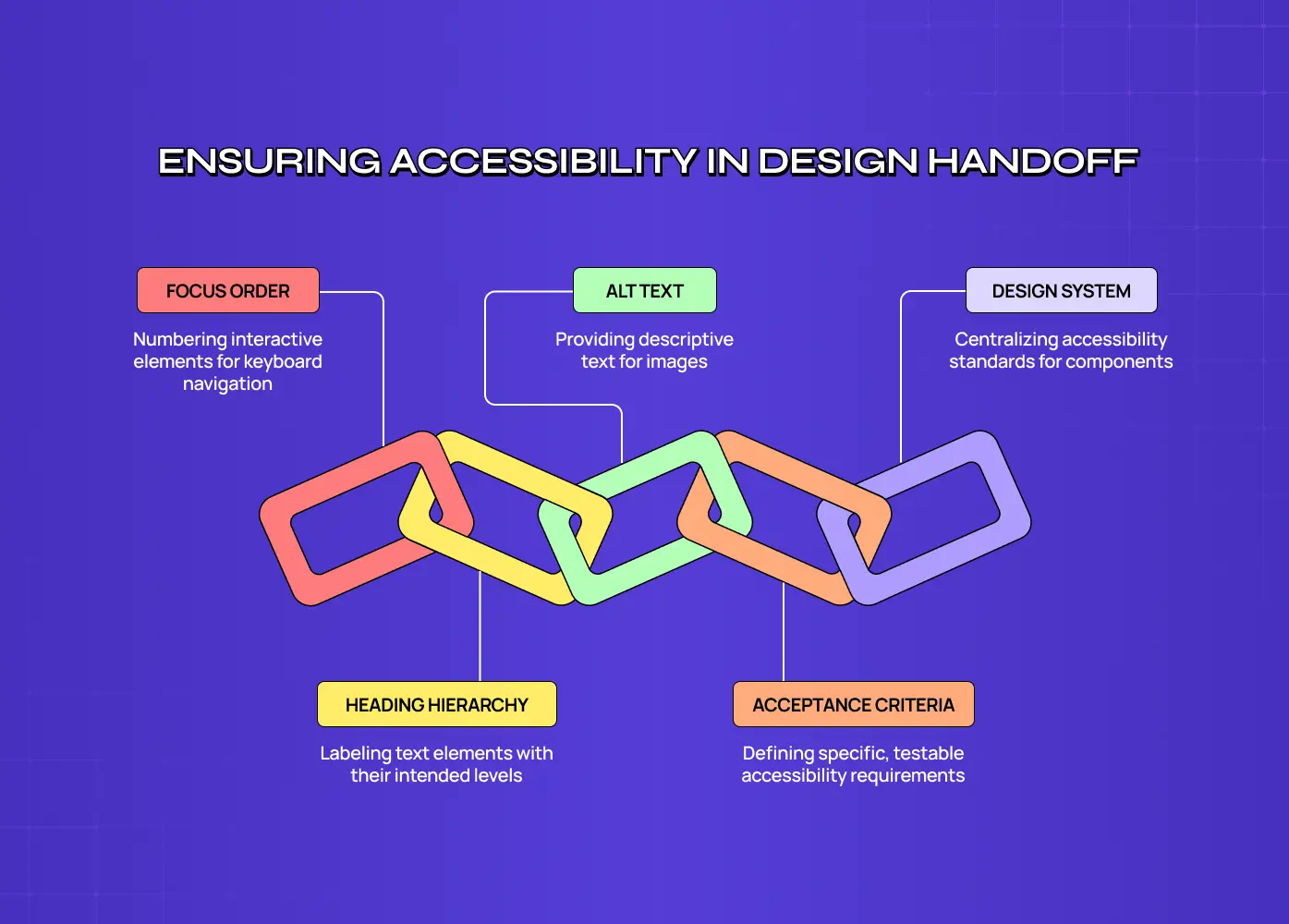
Chain-link diagram of accessibility design handoff showing focus order, alt text, design system, heading hierarchy, and acceptance criteria.

This is the part that decides whether any of the above survives, and it's the part almost nobody writes about.

A design file that looks accessible isn't accessible. Contrast can pass in Figma and fail in build. Focus order follows the DOM, not your layer order. Alt text doesn't exist until somebody writes it. If the handoff doesn't carry the accessibility decisions, engineering will make them by default, and the defaults are usually wrong.

Four things to put in the file or the ticket, every time.

  • Focus order, annotated. Number the interactive elements in the order focus should move. Where it differs from visual order, say so and say why.

  • Heading hierarchy, marked. Label each text element with its intended level. A designer who marks an H2 as an H2 prevents an engineer from choosing a div that looks right and reads as nothing.

  • Alt text, written by you. Not "add alt text here." The actual sentence. You know what the image is doing in the layout; the developer doesn't.

  • Accessibility acceptance criteria in the ticket. Not a generic "must be accessible." Specific, testable lines: reachable by keyboard, announced by screen reader, meets 4.5:1, target at least 24 by 24, focus visible against this background.

The last one does the most work of anything on this list. It moves accessibility from a thing someone checks afterwards to a thing that has to be true for the ticket to close.

If you run a design system, put the work there instead of repeating it. An accessible component built once, with its states, focus behaviour and semantics specified, is accessibility you don't have to re-argue on every screen.

Where this fits in the design process

Accessibility isn't a phase. It shows up in research (who did you recruit?), in information architecture (does the heading structure make sense linearly?), in visual design (contrast, focus, target size), in prototyping (keyboard paths), and in handoff (the annotations above).

If you want the full sequence to slot these checks into, our UX design process: 8-step guide lays out the stages.

Testing beyond the automated scan

Run WAVE, axe or Lighthouse. They're fast, free, and they'll catch missing alt attributes, contrast failures and unlabelled inputs.

Then stop treating a green result as a pass. Automated tools find what's machine-detectable, which is a minority of what actually blocks people. No scanner can tell you that your alt text is technically present and describes nothing useful, that your focus order jumps around, that your error message is polite and unhelpful, or that your modal traps a keyboard user.

What catches the rest:

  • A keyboard-only walkthrough. Unplug the mouse and complete your core flow. The fastest high-value test there is.

  • A screen reader pass. NVDA on Windows and VoiceOver on Mac are free and already installed. You'll be bad at it for the first hour and useful after that.

  • Greyscale review. Removes colour as a crutch and exposes everything that relied on it.

  • Real participants. Nothing substitutes for watching someone who uses assistive technology daily attempt your flow. If your research panel has no disabled participants, your research is telling you about a population you don't actually serve.

Plenty of what surfaces in these passes overlaps with ordinary bad design, which is why our collection of bad UX design examples and how to fix them reads as an accessibility document about half the time.

One thing that's newly broken in 2026

AI-generated UI has quietly become an accessibility problem, and it's the one nobody in this space is writing about yet.

When a model generates a component or a screen, it optimises for looking right. It will produce a div that behaves like a button, a colour pair that looks tasteful and fails contrast, an icon-only control with no accessible name, and a layout whose DOM order doesn't match its visual order. None of that is visible in a screenshot, and it ships.

Two practical responses. Treat generated markup as a draft that has to pass the same keyboard and screen reader checks as anything else, because the speed gain is real but it's upstream of the review, not a replacement for it. And keep your design system as the source of truth for components, so generated screens assemble from parts that were made accessible once rather than re-inventing them each time.

Making the case internally

If you're the person arguing for this budget rather than spending it, two things help. The commercial framing is on the companion piece linked at the top of this guide, and the general method for putting numbers to design work is in Calculating the ROI of UX design

If you'd rather see the specifics for your own product first, we offer free UX audits and accessibility is part of what we look at.

Most teams know the accessibility principles and still ship products that lock people out. This guide covers what accessibility in UX design means in practice, the component-level checks that matter, and what to hand engineering so it survives the build.

Your team knows the principles. The handoff is where accessibility gets lost.

Illustration of a design team reviewing a bar chart together at a shared desk, with laptops, coffee cups and chat icons on a purple background.

Most design teams already know the principles. They can name contrast ratios, they know alt text matters, and somebody on the team has read the WCAG docs. And they still ship products that lock people out.

The gap isn't knowledge. It's that accessibility knowledge usually lives in a blog post or a designer's head, and never makes it into the file that goes to engineering. Nobody annotated the focus order. Nobody wrote the alt text. The ticket said "build this screen" and said nothing about how it should behave with a keyboard.

This guide is about closing that gap. It covers what accessibility means in practice at the component level, what you check while you're designing, and what you hand over so the work survives the build. It's the design practice side. If you need the business, legal and compliance case, that's a separate piece: accessibility-first UX: what businesses need to know in 2026 covers the European Accessibility Act, the revenue argument and the executive version.

The scale, for context. An estimated 1.3 billion people – or 1 in 6 people worldwide experience significant disability. That's the permanent population. Add temporary and situational impairment and the number stops being a segment and starts being everyone, eventually.

What accessibility in UX design means

Accessibility in UX design is the practice of making sure a product can be perceived, operated and understood by people regardless of ability, including people using screen readers, keyboards, voice control, magnification or switch devices. In practice it covers four things: what you can perceive, what you can operate, what you can understand, and whether it works reliably with assistive technology.

It isn't a stage at the end. Roughly half the decisions that make a product inaccessible are made in the first week: the colour palette, the type scale, the component library, the interaction patterns. By the time there's something to audit, those decisions are expensive to reverse.

Accessibility and usability are not the same thing

They overlap and they're not interchangeable. Usability asks whether a product is easy to use for the people who can already use it. Accessibility asks who can use it at all.

A checkout flow can score well in usability testing with sighted mouse users and still be completely unusable with a keyboard. That's not a usability problem, it's an access problem, and no amount of polish on the happy path fixes it.

The distinction matters more as products get more capable, because accessibility work increasingly means designing for a different mode of interaction rather than a simpler version of the same one. We've written about where that line sits in AX vs UX design.

The principles behind the rules

Prism diagram showing web accessibility principles split into perceivable, operable, understandable, robust, and WCAG 2.2 additions.

Before the checklists, the four principles everything else hangs off. The W3C's POUR principles are the structure behind every WCAG success criterion, and they're worth knowing as questions rather than categories.

  • Perceivable. Can someone receive this information through more than one sense? If the only signal is colour, or the only content is inside an image, the answer is no.

  • Operable. Can someone use this without a mouse, without precise motor control, and without a time limit they can't extend?

  • Understandable. Is the language plain, is the behaviour predictable, and when something goes wrong, does the error say what to do about it?

  • Robust. Will it still work in six months, on a screen reader nobody on your team has tested, in a browser you didn't plan for?

WCAG 2.2, and the numbers worth memorising

WCAG 2.2 has been the current W3C Recommendation since October 2023. If your team is still working to 2.1, you're one version behind, and the new criteria are mostly design decisions rather than engineering ones.

The numbers that come up most often in design review:

Requirement

Level AA

Body text contrast

4.5:1 against its background

Large text (18pt, or 14pt bold)

3:1

UI components and graphical objects

3:1

Minimum target size

24 by 24 CSS pixels

That third row is the one most teams miss. Contrast isn't only about text. Input borders, icon buttons, toggle states, chart lines and focus indicators all need to be distinguishable too, and a pale grey outline on white fails even when the label above it passes.

The 2.2 additions worth knowing as a designer: target size minimum, focus not obscured (a sticky header that covers the focused element is now a failure), dragging movements (any drag interaction needs a single-pointer alternative), consistent help (support links stay in the same place across pages), redundant entry (don't make someone type the same information twice in one flow), and accessible authentication (no puzzle, no transcription, no memory test as the only way in).

For the broader design fundamentals these sit inside, our 13 principles of design covers the visual side in more depth.

The UX/UI checklist top SaaS teams actually use

15 essential checks covering onboarding, conversions, and retention. Spot quick wins and fix friction before it costs you signups.

No Spam. Free Lifetime

Who you're designing for

The mistake is picturing a permanent, total impairment and designing an edge case for it. The useful model is three columns.

Ability

Permanent

Temporary

Situational

Vision

Blindness, low vision

Eye surgery recovery

Bright sunlight on a phone

Hearing

Deafness

Ear infection

Open-plan office, no headphones

Motor

Limb difference, tremor

Broken arm

Holding a child, on a moving train

Cognitive

Learning disability

Concussion, severe fatigue

Stress, distraction, deadline

Speech

Non-verbal

Laryngitis

Library, quiet carriage

Read across any row and the same design fix serves all three columns. Captions serve deaf users, someone with an ear infection, and the person watching without sound on a commute. That's the whole argument for people-centered design in one table, and it's the version that lands with stakeholders who think accessibility is a minority concern.

Accessibility at the component level

Stacked layer diagram of component-level accessibility covering forms and inputs, toggles and controls, status messages, search, timelines and data, and colour and focus.

Principles are easy to agree with and hard to apply. This is where the work actually happens: specific components, specific failure modes.

Forms and inputs. Every field needs a persistent visible label, not a placeholder that disappears the moment someone types. Errors go next to the field that caused them, in text, saying what to fix. Group related inputs with a fieldset and a legend. And never rely on colour alone to mark an invalid field, since the person who most needs that signal may not see it.

Toggles and controls. A toggle has to communicate its state to someone who can't see it, which means the on and off states need a real semantic difference rather than only a visual one. It also needs to be operable with a keyboard and hittable with an imprecise tap. We've broken the pattern down properly in toggle accessibility.

Status messages and snackbars. This is the most commonly broken pattern we see. A message that appears, announces nothing to a screen reader, and vanishes after four seconds is invisible to a large group of users and unreadable to anyone who needs longer. Status messages need to be announced without stealing focus, and anything carrying an action needs to persist until it's dismissed. More on the specifics in snackbar accessibility.

Search. Search is often the accessibility escape hatch for people who find navigation difficult, which makes it worse when it's the least accessible thing on the page. The input needs a label, the results need to announce how many were found, and filters need to work without a mouse. Accessible search design goes through it in detail.

Timelines and data displays. Anything that encodes meaning in position, length or colour needs a second channel. A timeline that only reads as a shape is unreadable to a screen reader unless the underlying sequence is exposed as structured content. Our guide to timeline widget design covers how to build one that degrades properly.

Colour and focus states. Two rules. Never use colour as the only carrier of meaning, so a red border needs an icon or text beside it. And design the focus state deliberately rather than letting the browser default survive by accident, because on a dark or branded background the default outline often disappears entirely. A quick test: turn your design greyscale. Anything that stops making sense was relying on colour alone.

Designing for input beyond the mouse

Most designs are validated by someone moving a cursor. That's one input method out of several.

Keyboard. Tab through your own design in prototype or in build. Does focus move in the order the page reads? Can you reach every control? Can you get out of a modal? Is the focused element always visible, or does a sticky header eat it? This takes five minutes and finds more than most tools do.

Screen reader. The question isn't whether the content is there, it's whether it makes sense linearly. Headings have to form a real outline, not a set of font sizes. Images need alt text written by whoever knows what the image is for. Buttons need labels that describe the action, because "click here" read out of context tells nobody anything.

Voice. Voice control users navigate by speaking the visible label of a control, so a button whose accessible name doesn't match its visible text is unreachable by voice even though it looks fine. The wider set of considerations is in voice interface accessibility design.

Everything at once. Real use is mixed: touch and voice, keyboard and switch, screen reader and magnification together. Designing for one modality at a time produces products that break at the seams. Multimodal input covers how to think about the combinations.

Reducing cognitive load

Accessibility conversations skew heavily toward sensory and motor impairment, and cognitive accessibility gets a sentence about "plain language" and then nothing.

The practical moves are unglamorous. Cut the number of decisions on any one screen. Keep navigation in the same place. Don't impose time limits, and where you must, make them extendable. Write errors that name the problem and the fix. Break long flows into steps with visible progress. Say the same thing the same way throughout, because synonyms that read as variety to a copywriter read as different concepts to someone who is struggling.

None of this only helps people with a diagnosed condition. It helps anyone tired, distracted or under pressure, which is most people most of the time. Our guide to cognitive demands goes deeper on the measurement side.

What you hand to engineering

Chain-link diagram of accessibility design handoff showing focus order, alt text, design system, heading hierarchy, and acceptance criteria.

This is the part that decides whether any of the above survives, and it's the part almost nobody writes about.

A design file that looks accessible isn't accessible. Contrast can pass in Figma and fail in build. Focus order follows the DOM, not your layer order. Alt text doesn't exist until somebody writes it. If the handoff doesn't carry the accessibility decisions, engineering will make them by default, and the defaults are usually wrong.

Four things to put in the file or the ticket, every time.

  • Focus order, annotated. Number the interactive elements in the order focus should move. Where it differs from visual order, say so and say why.

  • Heading hierarchy, marked. Label each text element with its intended level. A designer who marks an H2 as an H2 prevents an engineer from choosing a div that looks right and reads as nothing.

  • Alt text, written by you. Not "add alt text here." The actual sentence. You know what the image is doing in the layout; the developer doesn't.

  • Accessibility acceptance criteria in the ticket. Not a generic "must be accessible." Specific, testable lines: reachable by keyboard, announced by screen reader, meets 4.5:1, target at least 24 by 24, focus visible against this background.

The last one does the most work of anything on this list. It moves accessibility from a thing someone checks afterwards to a thing that has to be true for the ticket to close.

If you run a design system, put the work there instead of repeating it. An accessible component built once, with its states, focus behaviour and semantics specified, is accessibility you don't have to re-argue on every screen.

Where this fits in the design process

Accessibility isn't a phase. It shows up in research (who did you recruit?), in information architecture (does the heading structure make sense linearly?), in visual design (contrast, focus, target size), in prototyping (keyboard paths), and in handoff (the annotations above).

If you want the full sequence to slot these checks into, our UX design process: 8-step guide lays out the stages.

Testing beyond the automated scan

Run WAVE, axe or Lighthouse. They're fast, free, and they'll catch missing alt attributes, contrast failures and unlabelled inputs.

Then stop treating a green result as a pass. Automated tools find what's machine-detectable, which is a minority of what actually blocks people. No scanner can tell you that your alt text is technically present and describes nothing useful, that your focus order jumps around, that your error message is polite and unhelpful, or that your modal traps a keyboard user.

What catches the rest:

  • A keyboard-only walkthrough. Unplug the mouse and complete your core flow. The fastest high-value test there is.

  • A screen reader pass. NVDA on Windows and VoiceOver on Mac are free and already installed. You'll be bad at it for the first hour and useful after that.

  • Greyscale review. Removes colour as a crutch and exposes everything that relied on it.

  • Real participants. Nothing substitutes for watching someone who uses assistive technology daily attempt your flow. If your research panel has no disabled participants, your research is telling you about a population you don't actually serve.

Plenty of what surfaces in these passes overlaps with ordinary bad design, which is why our collection of bad UX design examples and how to fix them reads as an accessibility document about half the time.

One thing that's newly broken in 2026

AI-generated UI has quietly become an accessibility problem, and it's the one nobody in this space is writing about yet.

When a model generates a component or a screen, it optimises for looking right. It will produce a div that behaves like a button, a colour pair that looks tasteful and fails contrast, an icon-only control with no accessible name, and a layout whose DOM order doesn't match its visual order. None of that is visible in a screenshot, and it ships.

Two practical responses. Treat generated markup as a draft that has to pass the same keyboard and screen reader checks as anything else, because the speed gain is real but it's upstream of the review, not a replacement for it. And keep your design system as the source of truth for components, so generated screens assemble from parts that were made accessible once rather than re-inventing them each time.

Making the case internally

If you're the person arguing for this budget rather than spending it, two things help. The commercial framing is on the companion piece linked at the top of this guide, and the general method for putting numbers to design work is in Calculating the ROI of UX design

If you'd rather see the specifics for your own product first, we offer free UX audits and accessibility is part of what we look at.

Have a project in mind?

Let’s talk through your idea and see what makes sense.

Harpreet Singh

Founder at Groto

Have a project in mind?

Let’s talk through your idea and see what makes sense.

Harpreet Singh

Founder at Groto

FAQ

Everything you were going to ask (and a few things you didn’t know to)

Is WCAG 2.2 AA enough, or do we need AAA?

AA is the standard nearly all legislation references and the right target for almost every product. AAA includes criteria that are impossible to meet across a whole site, and the W3C says as much. Hit AA properly and then adopt individual AAA criteria where they genuinely help your users, rather than chasing the level.

Whose job is accessibility, design or engineering?

Both, and the split is cleaner than most teams assume. Design owns anything decided before the build: contrast, target size, focus order, heading hierarchy, alt text, error copy, interaction patterns. Engineering owns the implementation: semantics, ARIA, keyboard behaviour, testing with assistive technology. Most failures happen because design made none of those decisions explicitly and engineering inherited the defaults.

How do I write alt text for a decorative image versus an informative one?

Decorative images get an empty alt attribute so screen readers skip them. Informative images get a sentence describing what the image contributes, not what it contains. A photo of a team beside a careers pitch might be decorative. The same photo in a story about that team is informative. Ask what a reader loses if the image doesn't load, and describe that.

Can an automated accessibility scan tell me if we're compliant?

No. Scanners verify machine-checkable criteria, which is a minority of WCAG. Plenty of failures are judgment calls a tool can't make: whether alt text is meaningful, whether focus order is logical, whether an error message is actually actionable. A clean scan means you've cleared the easy tier, not that you're compliant.
How do you test with screen reader users if you don't have any in your research panel?

Start by testing with a screen reader yourself, which finds the obvious breaks and costs nothing. Then recruit properly through disability organisations, accessibility communities and specialist panels, and pay participants at your standard rate. If recruitment keeps not happening, the honest read is that it isn't a recruitment problem, it's a priority problem.
Does accessible design limit creative freedom?

It limits some choices and not the ones people expect. You lose pale grey on white, colour as the only signal, and tiny tap targets. You keep everything else. The constraint works the way a grid does, ruling out the options that were making the work worse anyway. The most restrictive thing on any project is a retrofit six weeks before launch, which is what happens when this gets deferred.

Is WCAG 2.2 AA enough, or do we need AAA?

AA is the standard nearly all legislation references and the right target for almost every product. AAA includes criteria that are impossible to meet across a whole site, and the W3C says as much. Hit AA properly and then adopt individual AAA criteria where they genuinely help your users, rather than chasing the level.

Whose job is accessibility, design or engineering?

Both, and the split is cleaner than most teams assume. Design owns anything decided before the build: contrast, target size, focus order, heading hierarchy, alt text, error copy, interaction patterns. Engineering owns the implementation: semantics, ARIA, keyboard behaviour, testing with assistive technology. Most failures happen because design made none of those decisions explicitly and engineering inherited the defaults.

How do I write alt text for a decorative image versus an informative one?

Decorative images get an empty alt attribute so screen readers skip them. Informative images get a sentence describing what the image contributes, not what it contains. A photo of a team beside a careers pitch might be decorative. The same photo in a story about that team is informative. Ask what a reader loses if the image doesn't load, and describe that.
Can an automated accessibility scan tell me if we're compliant?

No. Scanners verify machine-checkable criteria, which is a minority of WCAG. Plenty of failures are judgment calls a tool can't make: whether alt text is meaningful, whether focus order is logical, whether an error message is actually actionable. A clean scan means you've cleared the easy tier, not that you're compliant.

How do you test with screen reader users if you don't have any in your research panel?

Start by testing with a screen reader yourself, which finds the obvious breaks and costs nothing. Then recruit properly through disability organisations, accessibility communities and specialist panels, and pay participants at your standard rate. If recruitment keeps not happening, the honest read is that it isn't a recruitment problem, it's a priority problem.
Does accessible design limit creative freedom?

It limits some choices and not the ones people expect. You lose pale grey on white, colour as the only signal, and tiny tap targets. You keep everything else. The constraint works the way a grid does, ruling out the options that were making the work worse anyway. The most restrictive thing on any project is a retrofit six weeks before launch, which is what happens when this gets deferred.

More Articles

Extreme close-up black and white photograph of a human eye

Let’s bring your vision to life

Tell us what's on your mind? We'll hit you back in 24 hours. No fluff, no delays - just a solid vision to bring your idea to life.

Profile portrait of a man in a white shirt against a light background

Harpreet Singh

Founder and Creative Director

Get in Touch

Extreme close-up black and white photograph of a human eye

Let’s bring your vision to life

Tell us what's on your mind? We'll hit you back in 24 hours. No fluff, no delays - just a solid vision to bring your idea to life.

Profile portrait of a man in a white shirt against a light background

Harpreet Singh

Founder and Creative Director

Get in Touch

Extreme close-up black and white photograph of a human eye

Let’s bring your vision to life

Tell us what's on your mind? We'll hit you back in 24 hours. No fluff, no delays - just a solid vision to bring your idea to life.

Profile portrait of a man in a white shirt against a light background

Harpreet Singh

Founder and Creative Director

Get in Touch