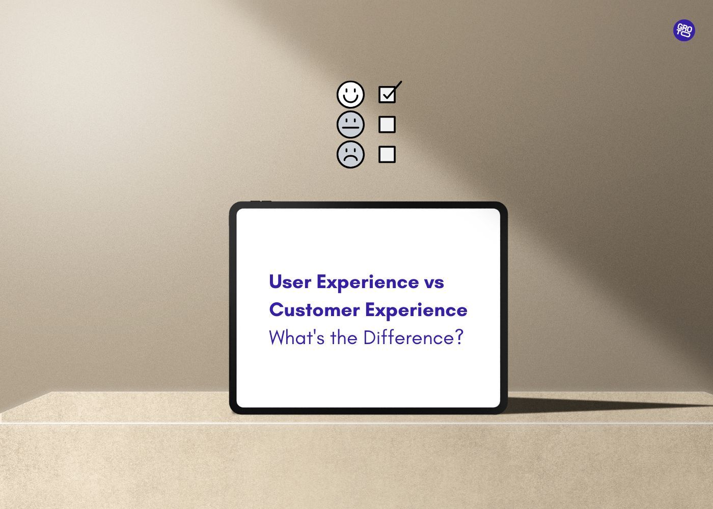
Explore what responsive web design means in 2025 and why it's critical for SEO, user experience, and conversions. Discover tools, best practices, and real examples to help you build websites that adapt effortlessly to any screen size.
Design responsive websites that work seamlessly across desktops, tablets, and mobile devices.

The advent of the mobile internet has drastically changed the way users interact with websites. According to recent data, over 54% of global web traffic comes from mobile devices. This trend is expected to continue rising, making it more important than ever for businesses to ensure that their websites work flawlessly across a variety of devices. This is where responsive website design (RWD) comes in.
Responsive web design is the approach that ensures your website adjusts and provides an optimal user experience (UX) regardless of the device used—whether it’s a desktop, tablet, or smartphone. But what does responsive design really entail? How do you create a responsive website that performs well on every screen size? What tools should you use, and what are the key elements to keep in mind while designing?
In this comprehensive, in-depth guide, we will answer these questions and more. We’ll explore responsive design from the ground up, offering detailed insights into its principles, best practices, key considerations, and tools. Additionally, we’ll provide real-world examples, use cases, and actionable advice to help you successfully implement responsive design.
What is Responsive Web Design?
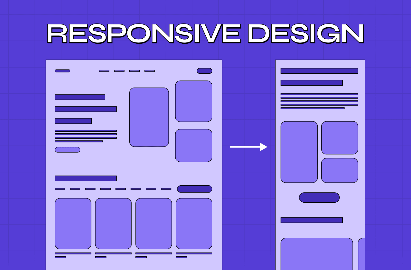
Responsive web design (RWD) is a design approach that ensures your website adapts to various devices, whether viewed on a desktop, tablet, or mobile device. The key to responsive design lies in flexibility. Fluid layouts, flexible media, and CSS media queries that ensure the site adjusts its layout, content, and behavior to fit any screen size.
Why is Responsive Web Design Critical in 2025?
Mobile-First Indexing by Google
In 2025, Google’s mobile-first indexing means that the mobile version of a website is considered the primary version for ranking in search engines. If your website isn’t responsive and optimized for mobile, you may lose out on significant SEO benefits, which could impact your site's visibility and rankings.Improved User Experience (UX)
The goal of responsive design is to ensure that users can easily navigate and interact with your website, no matter the device. A responsive website improves usability by resizing elements, changing layouts, and optimizing images for different screen sizes.Cost-Effective Maintenance
Having a single codebase that adapts to all screen sizes is much easier to maintain than creating separate versions for mobile and desktop. This cuts down development time and maintenance costs significantly. In addition, it helps avoid issues like duplicate content (which can harm SEO).Better Conversion Rates
A responsive design ensures that users have an easy, pleasant experience regardless of the device they use. When users have a smooth browsing experience, they are more likely to stay longer on the site, engage with content, and convert into customers.
How Does Responsive Web Design Work?
Responsive web design relies on three core principles that make the website adapt to different screen sizes and device types:
1. Fluid Layouts and Grids
At the heart of responsive web design is the fluid layout, which uses relative units of measurement (like percentages) instead of fixed units (like pixels). This allows the layout to adjust based on the screen size.
In a two-column layout, on a large screen, the content might span 70% of the width of the screen, while the sidebar takes up 30%. On a smaller screen (like a mobile phone), these columns will resize proportionally. The content might take up 100% of the screen, with the sidebar either stacking beneath the content or being hidden.
2. Flexible Media (Images and Videos)
In a responsive design, media like images and videos also need to adapt to different screen sizes. By using flexible imagesthat scale proportionally with the layout, we ensure that images do not stretch or appear pixelated on smaller screens.
A product image on an e-commerce website might appear as 800px on a desktop screen, but on a smartphone, it would adjust to fit the screen width while maintaining the same aspect ratio. This ensures that images are sharp and correctly sized, providing a better user experience.
3. CSS Media Queries
CSS media queries are used to apply different styles depending on device characteristics such as width, height, orientation, or resolution. Media queries are the core of responsive design as they enable you to create breakpoints at various screen sizes.
Example:
css
Copy
/* Default styling for desktop */ body { font-size: 16px; background-color: #fff; } /* Tablet-specific styling */ @media (max-width: 768px) { body { font-size: 14px; background-color: #f0f0f0; } } /* Mobile-specific styling */ @media (max-width: 480px) { body { font-size: 12px; background-color: #e0e0e0; } }
In this example, the font size and background color of the body change based on the screen width. For a mobile device (less than 480px wide), the font size is reduced to make the text more readable.
4. Single Codebase
One of the biggest advantages of responsive design is the single codebase approach. Unlike traditional websites that require separate versions for desktop and mobile — leading to duplicate content and complex management — a responsive website uses one set of HTML and CSS to adapt to various screen sizes, meaning entry-point pages like a splash page also need to be built responsively from the start rather than treated as a separate, device-specific layer.
This works best when the underlying website structure is well-organised from the start: a clear content hierarchy, consistent URL logic, and logical page groupings make responsive implementation significantly cleaner and easier to maintain at scale.
Why Should You Implement Responsive Design?
Responsive web design is critical for businesses and websites in 2025 for several reasons:
1. Better Mobile Experience = More Conversions
With the rise in mobile traffic, users increasingly expect websites to work seamlessly on mobile devices. A non-responsive website can be difficult to navigate on smaller screens, leading to higher bounce rates and fewer conversions. A responsive design ensures that visitors can access your site with ease, increasing the likelihood of engagement and conversion.
A restaurant website with a responsive design allows users to view the menu, make reservations, and even order food directly from their phone, ensuring a smooth process whether they're at home or on the go. Responsive requirements vary significantly across types of websites — from e-commerce and SaaS products to portfolios and service sites — each with different layout priorities and conversion goals.
2. SEO Benefits with Mobile-First Indexing
As mentioned, Google now uses mobile-first indexing, meaning it prioritizes the mobile version of a site for indexing and ranking. A responsive web design ensures your website is mobile-friendly and optimized for Google’s search algorithms, which boosts SEO performance.
A local business website that is mobile-optimized will likely rank higher on Google searches from mobile devices, driving more organic traffic and improving online visibility.
3. Simplified Analytics and Reporting
With a responsive design, all website traffic flows through a single version of the site, making it easier to track and analyze performance data. If you were to maintain separate websites for desktop and mobile, you would need to aggregate data from multiple sources, leading to potential inconsistencies in reporting.
A content blog with a responsive design can track all visitors (from desktop and mobile) under one unified Google Analytics account, allowing for more streamlined reporting and insights.
4. Lower Bounce Rates
A responsive website improves user experience (UX) across devices, leading to a smoother browsing experience and lower bounce rates. Users are more likely to stay longer on your site if the content adjusts properly to their screen size, improving interaction and engagement.
Real-World Examples of Responsive Web Design
Here are three outstanding examples of websites that utilize responsive web design effectively:
1. Airbnb
Airbnb’s website automatically adapts to different screen sizes. Whether you’re using a desktop to browse vacation homes or a smartphone to book a last-minute stay, the website adjusts to provide an optimal experience. On mobile devices, the search filters and booking interface are designed to fit perfectly on small screens, while still allowing full functionality.
2. Apple
Apple’s website is known for its clean and user-friendly design. Whether you’re looking at the latest iPhone on a desktop or browsing their product line on a mobile device, the layout adjusts seamlessly, keeping the design visually stunning and functional. Apple’s responsive design ensures that its premium products are showcased beautifully on any device.
3. Amazon
Amazon uses a responsive design to provide a seamless shopping experience across all devices. From browsing products to adding them to the cart, the user experience remains consistent. On smaller screens, the navigation bar collapses into a more compact, mobile-friendly version, while still giving access to all key functionalities.
How to Implement Responsive Web Design
1. Mobile-First Approach
A mobile-first approach means designing the mobile version of the website first, then scaling up to larger screen sizes. This method ensures that the website is optimized for mobile devices, where screen space is limited and user interaction is touch-based.
Steps
Start with mobile and create layouts and elements that are easy to use on a small screen.
Add flexibility to make sure content scales proportionally.
Use CSS media queries to progressively enhance the design for tablets, laptops, and desktops.
2. Use a Framework or Grid System
Responsive web design frameworks like Bootstrap or Foundation make it easy to design fluid grids and layouts. These tools provide pre-defined grid systems and components that automatically adjust based on the device’s screen size.
Bootstrap’s 12-column grid system allows developers to create layouts that adjust dynamically, ensuring that the website adapts beautifully from mobile to desktop.
3. Optimize Images for Different Screen Sizes
To improve website performance, ensure that images are optimized for various screen sizes and resolutions. Use the srcset attribute or picture elements to serve different image sizes depending on the device.
For a product image, a small screen would load a lower-resolution version, while a high-resolution monitor would display a larger image without affecting performance.
Responsive Design Tools Comparison
Tool | Best For | Key Features | Price Range |
Grid-based responsive design | 12-column grid, mobile-first approach, pre-built components | Free | |
Responsive layouts & components | Mobile-first, customizable UI, and responsive forms | Free | |
CMS for responsive websites | Mobile-friendly themes, responsive plugins, and widgets | Free to Premium | |
Visual web design platform | Drag-and-drop interface, responsive breakpoints, design flexibility | $12–$35/month | |
DIY website builder | Responsive templates, mobile editing tools | Free to $30/month |
Key Takeaways
➔ Responsive design is a crucial element in modern web development, ensuring your site is optimized for all devices and providing a seamless user experience.
➔ Fluid layouts, flexible media, and CSS media queries are the core principles of responsive design that allow websites to adapt to any screen size.
➔ A mobile-first approach is a best practice for ensuring that your website performs well on mobile devices before scaling it up for larger screens.
➔ Responsive design tools, such as Bootstrap and Webflow, help simplify the process of creating responsive websites by offering pre-built components and grid systems.
➔ Real-world examples like Airbnb, Apple, and Amazon demonstrate the power of responsive web design in delivering consistent and effective user experiences.
How Groto Can Help with Your Responsive Web Design
At Groto, we specialize in creating responsive, user-friendly websites that not only look great but also deliver exceptional performance across all devices. Whether you're building a new website from scratch or optimizing an existing one, our responsive web design services provide end-to-end solutions tailored to your needs.
Our team of expert designers and developers ensures that your website not only adapts to various screen sizes but also enhances the overall user experience (UX). We implement mobile-first strategies, ensure seamless functionality across devices, and integrate modern design trends to keep your site fresh and engaging.
We can help you build a responsive website that drives user engagement and boosts your digital presence.
(+91) 8920-527-329
hello@letsgroto.com
Read More:
Top 10 AI Web Design Tools You Need to Know in 2025
Understanding UX Strategy: A Practical Guide to Building Products That Work
Figma vs Sketch vs Adobe XD: Best UI Design Tool Compared 2025
Integrating AI into SaaS UX - Best Practices and Strategies
FAQ
Q. What are the three basic things required for responsive web design?
- Fluid grids that adjust layout proportions based on screen size.
- Flexible media, where images scale proportionally.
- CSS media queries, which apply different styles based on the device’s characteristics.
Q. What is the difference between responsive and nonresponsive websites?
A responsive website adapts to any screen size and device, while a nonresponsive website has a fixed layout that doesn’t adjust to smaller screens, leading to a poor user experience on mobile devices.
Q. What are the five golden rules of web designing?
- Simplicity in design and layout.
- Consistency across all pages and devices.
- Usability by making navigation easy and intuitive.
- Mobile-first design for optimizing user experience on mobile devices.
- Accessibility to make your website usable for all users, including those with disabilities.
Q. How do I know if my website is responsive?
Resize your browser window and observe how your website adjusts. Alternatively, use Google’s Mobile-Friendly Test to check responsiveness.
Q. Is it hard to make a website responsive?
Responsive design can be challenging, especially for complex websites. However, using frameworks like Bootstrap or hiring experts can simplify the process.
Q. What is an alternative to responsive design?
Adaptive design uses multiple fixed layouts for specific screen sizes. Unlike responsive design, it does not dynamically adjust the layout and instead relies on different versions of the website for mobile, tablet, and desktop devices.
Q. Do you offer professional web design services in multiple cities?
Yes. Groto provides professional web design services across multiple locations, including Web Design Services in San Diego | Web Design Services in San Francisco | Web Design Services in Tampa | Web Design Services in Washington | Web Design Services in West Virginia | Web Design Services in York