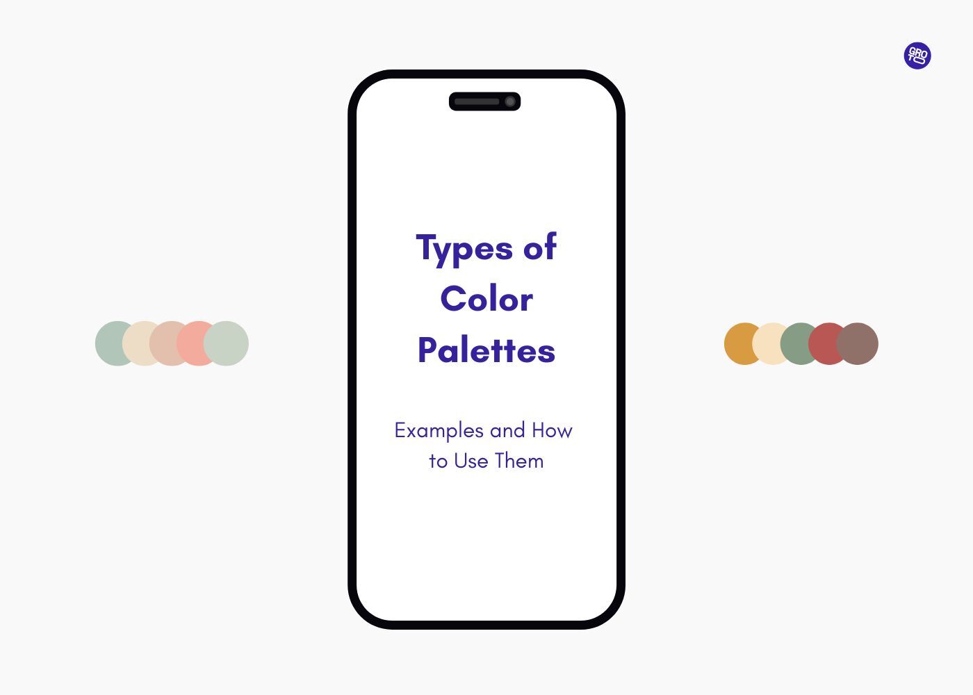
In the world of design, colors hold immense power in communicating brand identity, evoking emotions, and improving user experience. Knowing the types of color palettes is essential to creating designs that resonate with your audience. This article explores color palette examples, from monochromatic to complementary palettes, and how they can be applied effectively.
Understanding different color palettes can elevate your design process and create more engaging visuals.

Color is one of the most powerful tools available to designers. It influences how users perceive and interact with a product or service, conveying emotions, establishing brand identity, and guiding user behavior.
For designers, selecting the right color palette is essential for creating visually appealing, functional, and meaningful designs. Whether you're designing a website, mobile app, or marketing material, understanding the types of color palettes and how to use them effectively is a key skill that will help you elevate your design projects.
In this article, we explore six types of color palettes, discuss their characteristics, applications, and examples, and provide contextual use cases that will guide you in selecting the most suitable palette for your design. To further support your understanding, we’ll also include a detailed chart summarizing the palettes and their use cases.
What is a Color Palette?
A color palette is a curated selection of colors used within a design to create a visual identity, maintain harmony, and evoke specific emotional responses. In design, these palettes are typically divided into several key colors — usually a dominant color, one or two complementary or secondary colors, and accent colors. The combination and proportion of these colors play a significant role in the overall aesthetics, user experience, and functionality of the design — and the 60 30 10 color rule gives designers a concrete ratio for distributing those weights before a single screen is built.
For example:
Red is often associated with urgency, making it ideal for call-to-action buttons and special offers.
Blue evokes trust and professionalism, which is why it's commonly used in corporate branding.
Green is linked to health, nature, and growth. These associations are foundational to color and brand experience — how consistent color choices across every touchpoint reinforce the same emotional impression users carry about a brand over time.
Choosing the right palette is crucial in guiding how users perceive your content and helping them navigate through your design intuitively.
The 6 Types of Color Palettes
There are six main types of color palettes commonly used in design, each with its own unique characteristics and benefits. Understanding the attributes of each palette will help you apply them in the right contexts to achieve the desired emotional and visual effect.
1. Monochromatic Color Palettes
A monochromatic color palette consists of variations of a single color, including its lighter (tints) and darker (shades) versions. This type of palette is one of the simplest and most harmonious, making it an ideal choice for clean, minimalist designs. The monochromatic approach ensures consistency and subtle visual appeal, perfect for designs where you want to create a sense of calm, simplicity, and unity.
Characteristics:
Harmonious: Uses a single hue with varying shades and tints to maintain unity.
Subtle contrast: The contrast is achieved through different saturations and lightness levels rather than through a stark juxtaposition of colors.
Clean, minimalist feel: Perfect for simple and elegant designs.
Best for: Professional, corporate websites, mobile apps for banking, healthcare dashboards, and education platforms.
Example Use Case:
A financial app could use a monochromatic palette of blue shades, from deep navy for the background to soft blue accents for buttons and icons. This creates a calm, secure, and reliable atmosphere — the same logic that underpins color strategy in healthcare design, where monochromatic palettes are used to signal institutional trust and reduce cognitive load in high-stakes environments.
How to use: Since monochromatic schemes rely on a single color, the key to making them visually interesting is in the variations of lightness, saturation, and the inclusion of textures and shapes to break up the uniformity — explore how a monochromatic color scheme works across real UI contexts, from tint-to-shade ratios to accessible contrast decisions.
2. Analogous Color Palettes
Analogous colors are those that sit next to each other on the color wheel. These palettes are often harmonious and soothing, creating a natural and cohesive feel. By using analogous colors, you can create a unified color scheme that is easy on the eyes and flows well together. This is a great choice for designs that want to convey calmness, serenity, and a sense of unity.
Characteristics:
Cohesive: Colors are next to each other on the color wheel, which ensures they blend well.
Soothing: Analogous colors often evoke calmness and balance.
Moderate contrast: These palettes offer gentle contrast without being visually overwhelming.
Best for: Wellness apps, lifestyle brands, eco-friendly product designs, and websites for spas or natural products.
Example Use Case:
A spa website could use an analogous palette of soft greens, blues, and teals. These colors are associated with tranquility, nature, and relaxation, which are perfect for a spa or wellness brand seeking to create a peaceful atmosphere for their users.
How to use: Analogous palettes work best when one color is dominant, with the others used as accents. The dominant color should be applied to backgrounds and large sections, while the accent colors can be used for buttons, icons, and other interactive elements.
3. Complementary Color Palettes
Complementary colors are opposites on the color wheel. When used together, they create high contrast, which can make designs more striking and attention-grabbing. Complementary color schemes are ideal for creating visual interest and emphasizing important elements within a design. However, too much complementary contrast can be overwhelming, so it’s essential to use these palettes carefully.
Characteristics:
High contrast: Colors that are opposite each other on the color wheel, providing maximum contrast and visual excitement.
Bold and energetic: Perfect for designs that need to draw attention to specific elements, like call-to-action buttons.
Eye-catching: Creates vibrant designs that stand out and demand attention.
Best for: Calls-to-action, promotional banners, logos, and websites or apps designed to grab attention.
Example Use Case:
An e-commerce website might use a red and green complementary palette. Red could be used for sale banners or discount buttons, while green can highlight positive actions such as confirming a purchase or a successful login. This contrast creates urgency while also providing visual appeal.
How to use: Use one color as the dominant background color and the other as an accent. The accent color should be used sparingly to highlight key interactions or features — and understanding emphasis and contrast in design shows how deliberate use of weight and focal points determines whether that accent draws attention or simply adds noise.
4. Split-Complementary Color Palettes
The split-complementary palette is a variation of the complementary color scheme. Instead of using the direct opposite color on the color wheel, the split-complementary scheme uses two adjacent colors to the complementary color. This creates a less intense contrast while still maintaining a vibrant, engaging design.
Characteristics:
Balanced contrast: Provides more balance than a standard complementary palette.
Dynamic: Offers a dynamic contrast without being as overwhelming as complementary schemes.
Flexible: Allows for a wider range of colors while keeping the design cohesive.
Best for: Creative projects, children’s apps, gaming websites, and any design requiring vibrancy without too much visual aggression.
Example Use Case:
A children’s educational app might use a split-complementary color scheme with blue as the base color and orange and yellow as accent colors. This palette creates a playful and engaging atmosphere while still offering a visually balanced experience.
How to use: Choose one color as the dominant color (often the coolest tone) and use the other two colors as accents to provide depth and visual interest — a deeper breakdown of the split complementary scheme covers saturation testing, real UI examples, and contrast ratios that help designers apply this balance confidently.
5. Triadic Color Palettes
A triadic color palette consists of three colors that are evenly spaced around the color wheel. This palette offers a high level of contrast and variety, providing a vibrant and balanced look. Triadic schemes are often playful and energetic, making them perfect for creative and engaging designs.
Characteristics:
Equal contrast: Three colors provide equal contrast, making the palette highly dynamic.
Vibrant and energetic: Ideal for designs that need to feel lively and engaging.
Balance: Despite the high contrast, the palette can be balanced if used thoughtfully.
Best for: Creative apps, children’s platforms, gaming websites, or any design aiming to evoke fun, excitement, or youthfulness.
Example Use Case:
A creative design tool website might use a triadic palette with red, yellow, and blue to create an engaging and colorful user interface. This palette is bold, playful, and dynamic, appealing to creative users.
How to use: Choose one of the colors as the dominant color and use the other two as accents. This will help maintain a sense of balance while allowing each color to shine.
6. Tetradic (Double-Complementary) Color Palettes
A tetradic color palette, also known as a double-complementary color palette, uses two complementary pairs of colors. This palette offers a lot of variety and complexity, making it ideal for designs that require rich, diverse color combinations. The challenge with tetradic palettes is balancing the colors without overwhelming the design.
Characteristics:
Maximum contrast and variety: With four colors, this palette can create vibrant and dynamic designs.
Complexity: The large number of colors can create a complex visual experience, which requires careful balancing.
Rich and diverse: Offers a wide range of possibilities for designers.
Best for: High-end fashion websites, creative agencies, branding, or any design requiring a bold, diverse color palette.
Example Use Case:
A luxury fashion brand might use a tetradic palette consisting of deep maroon, gold, teal, and light pink. These colors create a rich and sophisticated visual experience while maintaining balance and vibrancy.
How to use: Use one or two colors as dominant, with the remaining colors used as accents. Make sure to adjust the saturation and brightness to avoid visual overload.
Comprehensive Chart of Color Palettes and Use Cases
Palette Type | Description | Best For | Example Use Case | Colors Used |
Monochromatic | Different shades, tints, and tones of a single color. | Corporate, healthcare, minimalist designs | Healthcare apps, banking websites | Light Blue, Dark Blue, Navy |
Analogous | Colors next to each other on the color wheel. | Wellness, food industry, nature-related brands | Spa websites, eco-friendly brands | Green, Teal, Blue |
Complementary | Opposite colors on the color wheel. | E-commerce, ads, calls-to-action | Sale banners, event promotions | Red and Green, Blue and Orange |
Split-Complementary | One base color + two adjacent complementary colors. | Creative platforms, children’s apps, education | Creative agencies, educational platforms | Blue, Yellow-Green, Yellow-Orange |
Triadic | Three equally spaced colors on the color wheel. | Youthful, energetic designs, gaming, apps | Gaming platforms, digital art tools | Red, Yellow, Blue |
Tetradic | Two complementary color pairs. | Complex designs, high-end retail | Fashion websites, art platforms | Purple, Yellow-Green, Orange, Teal |
How to Choose the Right Color Palette for Your Project
Step 1: Understand Your Brand Identity
Consider the values, mission, and personality of your brand — decisions like these sit at the intersection of strategy and visual design principles, which inform not just color but every structural and aesthetic choice that shapes how users read and trust your product. For instance, a financial institution may benefit from a monochromatic blue palette to communicate trust and professionalism, while a children's toy store may opt for a triadic palette with bright colors to convey energy and excitement.
Step 2: Target Audience
Who is the design for? Are you designing for adults in a corporate environment, or is your audience primarily young children? The audience will heavily influence the color palette you choose. Bright, bold colors often appeal to younger demographics, while muted tones and neutral colors tend to be more fitting for corporate or professional audiences.
Step 3: Context and Industry
Different industries have standard color associations. For instance, green is often associated with health and nature, making it a natural choice for health-related apps or environmental brands. Red often symbolizes urgency, making it ideal for e-commerce websites or limited-time offers.
Step 4: Experiment and Get Feedback
After selecting your palette, create prototypes or wireframes and gather feedback. A/B testing color choices can help determine which combinations perform best with your target audience.
Conclusion
Selecting the right color palette is essential to crafting a user experience that is visually appealing, emotionally engaging, and aligned with your brand's identity. Each of the six color palettes discussed here has distinct advantages and applications depending on your design's needs. Whether you are going for simplicity, vibrancy, or contrast, choosing the right palette can make all the difference in how users interact with your design.
Key Takeaways
Monochromatic palettes offer simplicity and harmony, ideal for clean and professional designs.
Analogous palettes are perfect for soothing, balanced designs, making them ideal for wellness and nature-based projects.
Complementary palettes are bold and energetic, ideal for grabbing attention and creating excitement.
Split-complementary palettes provide a balanced contrast, great for designs that require dynamic colors with harmony.
Triadic palettes are vibrant and balanced, perfect for playful, engaging designs.
Tetradic palettes offer rich variety and complexity, best used in designs that need to create a bold, dynamic visual experience.
How Groto Helps with Color Palette Design
At Groto, we specialize in creating user-centric design solutions that help elevate digital experiences. Whether you're in the SaaS or AI sector, we understand how color plays a pivotal role in user experience, brand recognition, and emotional resonance. We work closely with you to define and implement color palettes that align with your brand identity and business goals, ensuring that every color decision serves a strategic purpose.
🔗 Start your project with Groto
Read More:
Top 10 AI Web Design Tools You Need to Know in 2025
Understanding UX Strategy: A Practical Guide to Building Products That Work
Figma vs Sketch vs Adobe XD: Best UI Design Tool Compared 2025
Integrating AI into SaaS UX - Best Practices and Strategies
FAQ
Q. How many different color palettes are there?
There are several types of color palettes commonly used in design, including monochromatic, analogous, complementary, split-complementary, triadic, and tetradic palettes.
Q. What is a color palette in design?
A color palette is a set of colors chosen for a specific design project, helping to create harmony and convey the desired emotional impact.
Q. What is the 60/30/10 rule in design?
The 60/30/10 rule suggests using 60% of one dominant color, 30% of a secondary color, and 10% of an accent color for balance.
Q. What is the Golden Ratio rule in design?
The Golden Ratio applies to proportion and balance, ensuring designs feel naturally harmonious and visually appealing.
Q. What makes a good color palette?
A good color palette resonates with the brand, evokes the intended emotions, and ensures visual harmony and accessibility.