

Redesigns kill timelines and drain budgets. This guide shows how to improve conversion rates using fast, surgical CRO tactics that fix clarity, reduce friction, and increase revenue—without touching your layout, engineering, or UI.
Stop redesigning. Start optimizing the conversion layers already leaking

Let’s be honest: Your "low conversion rate" isn’t a design problem. It’s a clarity and friction problem.
Most founders and marketing leads look at a flatlining conversion graph and immediately scream, "We need a redesign!"
That is a $50,000 mistake.
A full redesign takes 3-6 months. It freezes your engineering team. And statistically, 50% of redesigns actually lower conversion rates because you change too many variables at once.
You don’t need a new website. You need to improve website conversion rate by fixing the "Conversion Layer"—the strategic messaging and logic that sits on top of your design.
This guide is for leaders who need to increase website sales now, not in Q4. Here is the exact playbook we use as a conversion rate optimization agency to turn existing traffic into revenue without touching the codebase.
Why "Redesign First" is a Revenue Trap
Before we fix the site, we need to fix the mindset. Why does website CRO (Conversion Rate Optimization) consistently outperform redesigns?
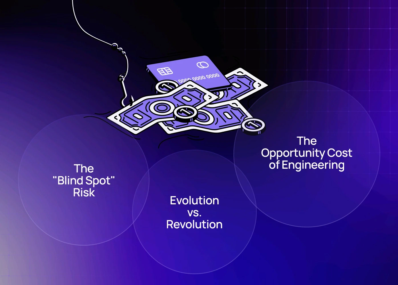
1. The "Blind Spot" Risk
When you redesign everything at once—new layout, new copy, new colors—you lose your baseline. If conversions go up, you don’t know why. If they go down, you don’t know what broke. Optimization is scientific. It isolates variables (e.g., "What happens if we only change the headline?"), giving you repeatable revenue wins.
2. The Opportunity Cost of Engineering
Every hour your developers spend rebuilding a footer or CSS framework for a redesign is an hour they aren't building your core product features. Landing page optimization requires minimal code. It protects your engineering resources for high-value product work while marketing fixes the funnel.
3. Evolution vs. Revolution
Look at Amazon, Booking.com, or Linear. They almost never do full redesigns. They evolve. Radical redesigns shock existing users (often causing churn). Iterative conversion optimization improves the experience invisibly, reducing friction without breaking user habits.
To understand how UX impacts user behaviour at a structural level, you can also read our analysis on UI/UX differences that affect SaaS product success.
Phase 1 — Conversion Diagnosis (Before Changing Anything)
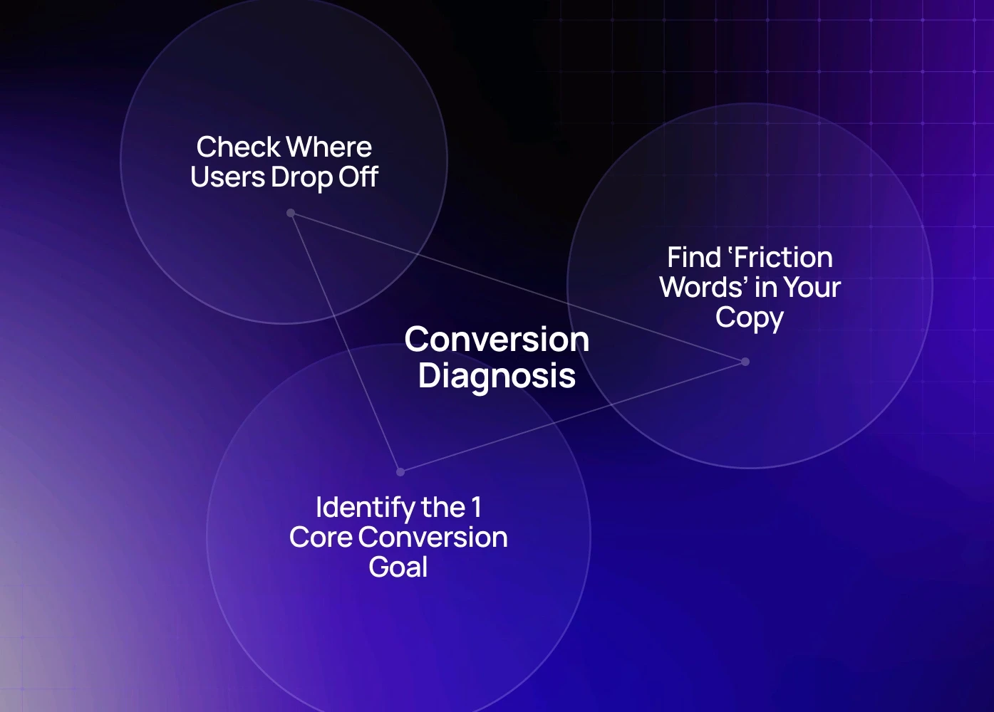
You don’t start with ideas—you start with evidence. Here’s our CRO audit sequence:
1. Check Where Users Drop Off (Behaviour Tools)
Use (any one): Hotjar, Clarity, Smartlook
Look for:
Rage clicks / dead zones
Scroll-stuck sections
Hover without click
“U-turn behaviour” (scroll up → hesitate → leave)
If you’re new to behavioural UX analysis, our beginner-friendly guide on user flows in UX breaks down how to interpret real user behaviour.
2. Identify the 1 Core Conversion Goal
Most pages leak conversions because they try to do everything at once.
Every high-performing page answers one question instantly:
“What is the ONE action we want users to take here?”
If your user has to choose between 3–5 actions = conversion rate drops.
Getting this right once isn't enough — it requires a behavior-driven refinement cycle that retests the core action as traffic sources, user intent, and page content evolve over time.
3. Find ‘Friction Words’ in Your Copy
Replacing weak CTA copy alone has improved conversion rate 10–22% across multiple CRO projects — and fixing weak CTA copy goes deeper on the psychological triggers behind word choice, showing exactly why 'Submit' kills intent while 'Get My Free Audit' accelerates it.
What We See Across 40+ CRO Audits
Over the last 24 months, our team has run 40+ high-intent CRO audits across SaaS, eCommerce, fintech, and B2B service websites. The patterns that repeat most — covered in depth in UX mistakes that lower conversion — show up regardless of industry, budget, or how polished the design looks.
20–35% lift in retention within the first 30–45 days
18–40% improvement in conversion rate on core landing pages
30–40% faster engineering delivery because CRO isolates UI issues instead of forcing redesigns
15–25% decrease in support tickets by fixing confusing microcopy and dead-end UX moments
These aren’t redesign results. These lifts came from small, focused CRO improvements made on the existing site — exactly the playbook this guide outlines.
Phase 2 — UX Changes That Lift Conversions Without Redesigning
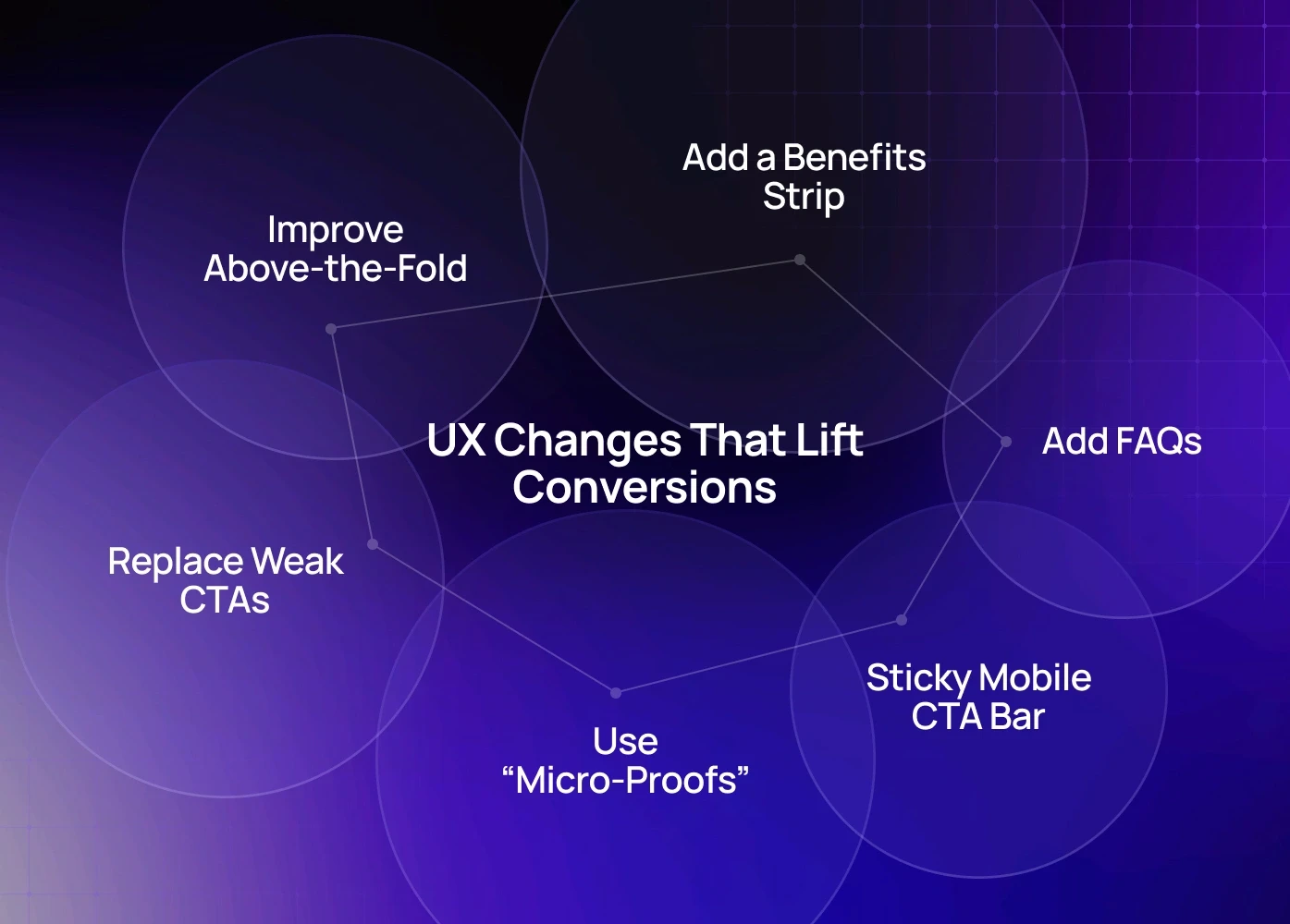
1. Improve Above-the-Fold – Without Touching Layout
Users decide in 5–8 seconds whether they stay — and for campaigns or product launches, splash page design gives you a controlled entry point to land that first impression before the homepage even loads. Small but proven changes: Rewrite headline to clarify outcome, Make CTA visually dominant, Add trust indicator under CTA
Small but proven changes:
High-Impact Tweaks | Result |
Rewrite headline to clarify outcome | Reduces bounce rate |
Make CTA visually dominant | Increases conversion certainty |
Add trust indicator under CTA | Lowers hesitation |
Running your page against a full landing page conversion checklist ensures you're not fixing one section while leaking conversions elsewhere.
Example tweak that works:
From: “Start Now”
To: “Get My Free Audit” → improves clarity & intent.
We covered more on how mobile behaviour shapes conversions in our guide on mobile-first responsive design best practices — a major CRO lever often ignored by desktop-focused teams.
2. Add a Benefits Strip (Not Feature List)
Right after hero section, insert a value-focused section:
Right after the hero section, insert a value-focused section: "Save 4+ hours/week using X", "No setup needed — start today", "Used by 2,500+ businesses". This works because users don't read your site — they evaluate it, and product page design that converts shows how layout hierarchy and benefit sequencing on high-intent pages determine whether that evaluation ends in a click or a bounce.
3. Replace Weak CTAs With Intent-Based CTAs
These CTA upgrades have shown measurable conversion lift — but what happens after the click matters equally. Form fields that kill conversions covers the specific input patterns that create drop-off right at the commitment moment, undoing the CTA work you just fixed.
4. Use “Micro-Proofs” Instead of Long Testimonials
Instead of paragraphs, try:
Rating + Value (“Saved 120+ hrs per month”)
Quote + Company logo
Short line + Role (“Implemented in one sprint” — Head of Product)
These formats drastically increase readability—and trust.
5. Add a Sticky Mobile CTA Bar
Mobile users scroll 3–5× more than desktop users.
A floating CTA bar has improved tap-through rates 20–35% in multiple CRO sprints.
6. Add FAQs Just Before the Final CTA
Placement matters. Don’t hide FAQs at the bottom.
Place above the last CTA → it answers hesitation right before decision.
Questions to include:
How fast can I get started?
Is this risk-free?
Can I talk to someone first?
What if it doesn’t work for us?
Phase 3 — Conversion Boosters (Optional but Powerful)
A/B Test These First (High Return, Low Effort)
Test First | Why |
Headline variations | Fastest conversion lift |
CTA copy / color | Change perception of commitment |
Order of sections | Users follow logic, not layout. If yours feels off, ensuring responsive web design for conversions is handled correctly first removes the device-level inconsistencies that make section sequencing problems look like copy or hierarchy issues when they're actually rendering failures on mobile. |
Social proof position | Timing affects trust perception |
These are the highest-return tests to run first — and if you want a structured framework for running them on a SaaS product specifically, A/B testing your SaaS funnel covers test sequencing, statistical significance, and how to avoid the common mistake of running too many variables at once.
Implement a CRO Loop
Change small UX cluster
Track metrics for 7–14 days
Keep only what improves numbers
Repeat → this compounds ROI over time — and pairing this loop with ongoing site maintenance and CRO ensures the technical layer stays clean enough that optimisation results aren't masked by speed issues, broken elements, or accumulating site debt.
Stop Guessing, Start Tuning
A redesign is a gamble. Conversion optimization is a science.
You don't need to burn 6 months building a new site to see growth. You need to remove the friction from the site you have.
Align your message.
Kill the anxiety.
Simplify the inputs.
Hack the speed.
Want to Find Your Hidden Revenue?
We don't just guess. We audit.
If you're evaluating agencies, our breakdown of the top UX strategy providers gives clarity on what separates average teams from true CRO-led UX execution.
As a specialized conversion rate optimization agency, we can look at your current site and point out exactly where you are losing money—and how to fix it in days, not months.
Book a 20-minute discovery call with our Creative Director (Top 3% globally in design strategy)
FAQ
1. What is the core difference between CRO and a Redesign?
A Redesign is a visual overhaul focused on aesthetics and technology. CRO is a scientific process focused on human behavior, using data (heatmaps, analytics) to systematically remove friction and anxiety to drive a specific business action. CRO seeks certainty; a redesign seeks a new look.
2. How quickly can I expect to see results from these changes?
The "low-hanging fruit" changes discussed (like headline fixes, form field reduction, and contextual anxiety killers) can show measurable lifts in conversion within 7 to 14 days of deployment, especially on high-traffic landing page optimization tests.
3. Does this apply to both B2B (SaaS) and B2C (Ecommerce)?
Absolutely. While B2B focuses on lead form conversion and B2C focuses on checkout completion, the underlying principle is the same: minimizing cognitive load. The Breadcrumb Form Strategy is for B2B lead generation, and the Defensive Design (returns/shipping anxiety) is critical for ecommerce conversion optimization.
4. What is the typical ROI on targeted CRO compared to a redesign?
Targeted CRO has a far higher ROI and lower risk. A redesign costs $30k-$100k+ and has a 50% chance of lowering conversions. A strategic CRO campaign costs less and often generates a 3x to 10x ROI because you're improving the efficiency of existing ad spend and traffic, directly lowering your cost per acquisition (CPA).
5. Do I need a full-time CRO specialist to implement this?
No. You need strategic guidance and a skilled implementer. Most companies partner with a conversion rate optimization agency for a few months to identify the 5-10 highest-impact tests, implement them, and build the internal testing muscle. This provides maximum lift without adding permanent headcount.
6. How much does CRO cost?CRO engagements typically range from $3,000 to $15,000/month, depending on traffic volume, number of tests, and required UX rewrites. But the real cost isn’t the fee — it’s the revenue lost every month your site underperforms. For most teams, a single winning test pays for the entire quarter of CRO.


