

Landing pages don't fail because of bad design — they fail because of misaligned intent, weak above-the-fold positioning, and zero CRO thinking. These 30 real-world landing page ideas show you how to fix all three.
30 landing page ideas. Real examples. What works and what to test.

TL;DR: Most landing pages fail not because of bad design — but because of misaligned intent, weak above-the-fold positioning, and zero CRO thinking. This post breaks down 30 real landing page ideas across SaaS, ecommerce, and B2B, grouped by goal, with what works and what to A/B test on each.
In 2026, the gap between a landing page that converts and one that wastes ad spend comes down to a handful of decisions: your headline, your CTA, what you show above the fold, and how much friction you leave in the path to conversion. This post breaks down 30 real-world landing page ideas — from B2B SaaS to ecommerce — and pulls out what actually makes each one work, so you can borrow the thinking, not just the aesthetic.
What Is a Landing Page — and Why It's Not Your Homepage
A landing page is a standalone web page built for a single campaign goal: getting someone to take one specific action. Unlike your main website, which serves multiple purposes and audiences, a landing page eliminates everything that doesn't serve that one objective.
The psychology here is deliberate. By presenting visitors with a single, clear choice rather than a navigation full of options, landing pages reduce cognitive load and decision fatigue — which is why they significantly outperform sending traffic to your homepage. But what happens after a visitor lands on your page is what ultimately determines whether that goal is met.
The difference between a landing page and a homepage in practice:
A homepage introduces your full business, supports multiple user journeys, and links to everything — About, Services, Blog, Contact.
A landing page strips all of that away. No navigation menu. One offer. One audience. One CTA.
Homepages educate. Landing pages convert. If you're running paid ads or campaigns and sending traffic to your homepage, that's likely the first place to fix. Learn more about homepage design principles and how the distinction shapes layout decisions across page types.
4 Types of Landing Pages You Should Know
Not all landing pages serve the same purpose. Before drawing inspiration from examples, understand which type fits your campaign goal.
Lead-Generation Landing Pages
These pages capture contact information — typically name and email — in exchange for something of value: a guide, a checklist, a free audit. The form is the CTA. Keep fields minimal; every extra field costs you conversions. Best for: SaaS trials, content downloads, webinar registrations.
Click-Through Landing Pages
No form. Just a bridge between an ad and a final action (usually a checkout or signup). These warm up traffic before commitment is asked. Used heavily in ecommerce and free-trial flows. The goal is to get one click to the next step.
Product and Sales Landing Pages
Built to drive a purchase decision. These are longer, packed with social proof, benefit-led copy, objection handling, and multiple strategically placed CTAs. Used for high-consideration offers where the visitor needs convincing before buying.
Event-Registration Landing Pages
Dedicated to a single event — webinar, conference, launch. These pages lean hard on scarcity, date/time urgency, speaker authority, and a frictionless registration form. Conversion window is finite, so every element creates momentum toward sign-up.
What Makes a Landing Page Convert in 2026
The fundamentals haven't changed, but the standards have risen. Here's what separates a high-converting landing page from a forgettable one in 2026:
Element | Description | Impact on Conversion |
Clear Value Proposition | Communicates what you offer and why it matters - immediately | Up to 90% improvement in clarity |
Single Call-to-Action | One primary action that stands out visually | 371% increase in clicks |
Social Proof | Reviews, testimonials, user counts, or trust badges | 34% boost in conversion rates |
Mobile Optimization | Responsive design that works on all devices | 61% of users won’t return to a mobile-unfriendly page |
Fast Load Speed | Page loads in under 3 seconds | 1-second delay reduces conversions by 7% |
Scannable Layout | Clear headings, bullets, and white space | 79% of users scan rather than read |
Compelling Headlines | Benefit-focused, not feature-focused | 73% of companies see improved results |
Trust Signals | Security badges, client logos, certifications | 42% increase in perceived credibility |
Six principles the best pages in 2026 follow: one clear CTA and nothing competing with it; visuals that serve a purpose, not just fill space; thumb-first, scroll-optimized layouts; social proof treated as non-negotiable; transparent pricing and contact info; and a laser focus on solving one problem better than anyone else. Product page design that converts covers how these same principles apply when layout hierarchy and sequencing determine whether a visitor moves toward commitment or leaves.
30 Landing Page Ideas with Real Examples and CRO Breakdowns
These 30 landing page ideas span SaaS, ecommerce, B2B, and consumer. For each, we've broken down what the design gets right and what's worth testing on your own page.
1. Calm — SaaS · Health & Wellness
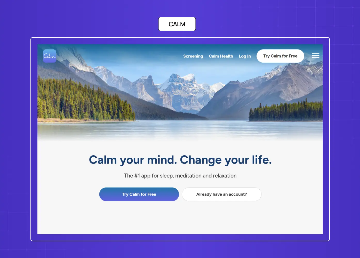
Calm's page is serenity in web form. The layout, color palette, and copy all deliver on the brand promise — Calm your mind. Change your life. — before a single scroll.
What they did well: Perfect alignment between product promise, visual aesthetic, and UX. The CTA "Try Calm for Free" removes price risk instantly.
What to A/B test: Try a hero video against the static image. Wellness brands often see lift with motion that demonstrates the product's calming effect.
Why this idea works: For subscription SaaS, emotional resonance at first glance — before the user even processes features — dramatically lowers bounce rate.
2. Zola — Ecommerce · Wedding Services
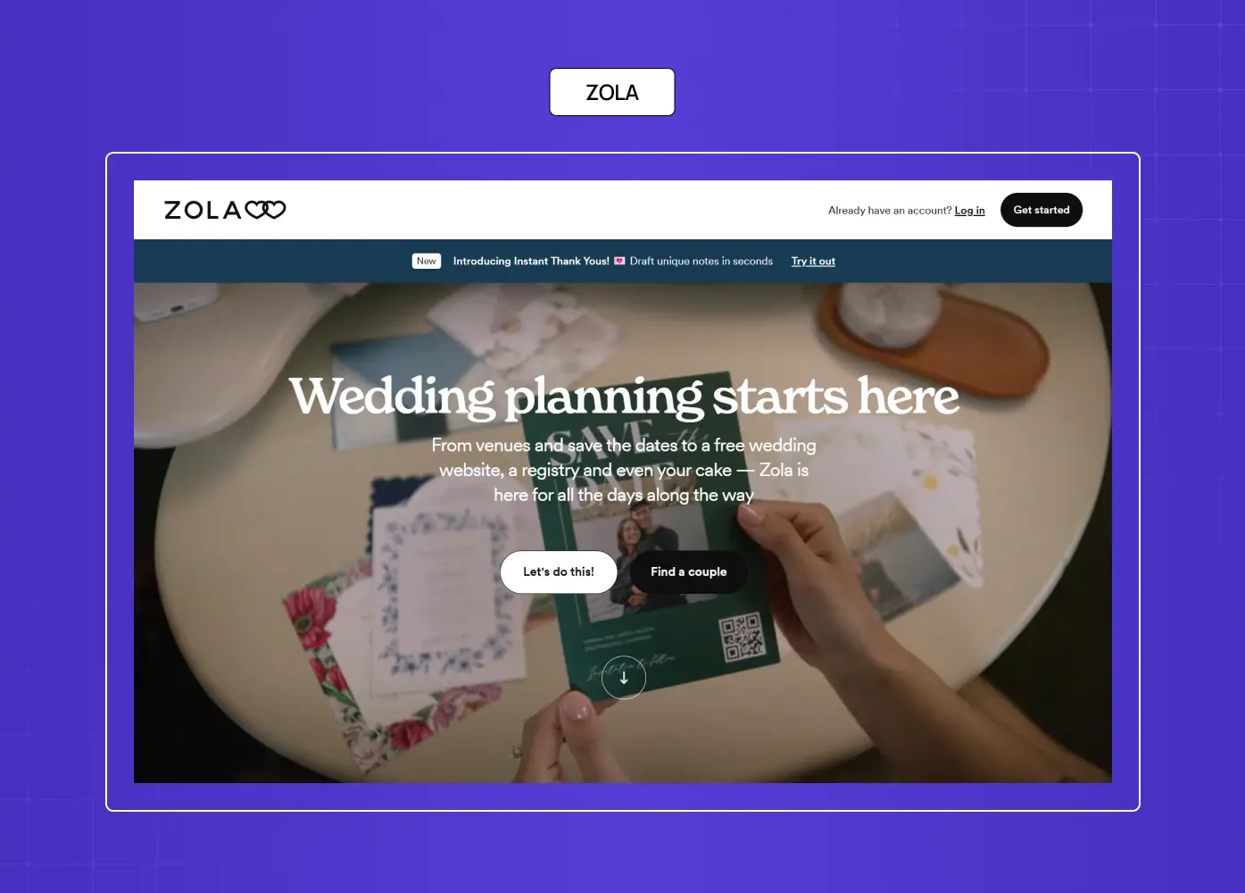
Zola simplifies wedding planning with a modern layout, intuitive flow, and emotionally charged CTAs. It positions itself as the trusted companion for one of life's biggest events.
What they did well: Emotional resonance meets conversion-optimized UX. The copy speaks to relief, not features.
What to A/B test: Test category-specific entry points ("Plan your registry" vs "Explore invites") against the unified hero CTA.
Why this idea works: High-consideration, high-emotion purchases need empathy-first positioning before they need product specs.
3. CD Baby — SaaS · Music Distribution
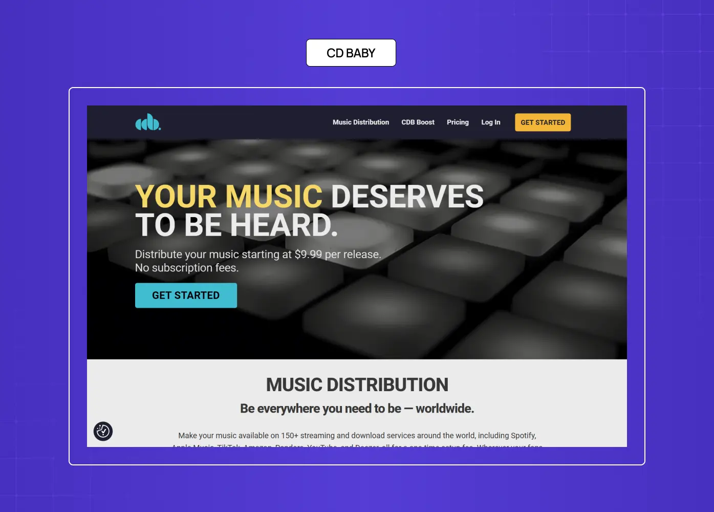
CD Baby speaks directly to indie musicians: "Get your music out there." Trust logos from Spotify and Apple Music appear immediately. The form is frictionless.
What they did well: Zero jargon, 100% audience alignment. The page makes the user feel understood before they read a single feature.
What to A/B test: Try replacing static platform logos with a short animated reel of artist success stories.
Why this idea works: Niche audiences convert harder when they feel the page was written specifically for them.
4. Netflix — Subscription · Entertainment
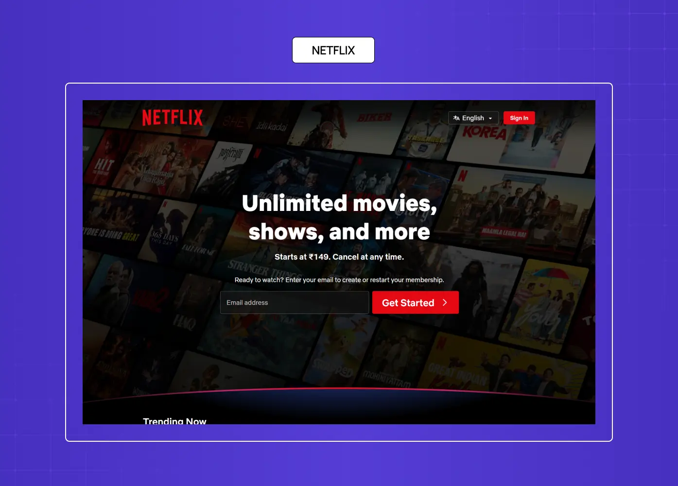
Netflix's signup page is the gold standard of high-trust, low-friction UX. One bold headline. One email field. No distractions.
What they did well: The brand trust does the heavy lifting. All they had to do was remove every possible reason to hesitate.
What to A/B test: Test a softer CTA ("See what's on" vs "Get started") for cold traffic from non-branded search.
Why this idea works: When your brand is already trusted, the page's job is friction removal — not persuasion.
5. LinkedIn Premium — SaaS · Professional Services
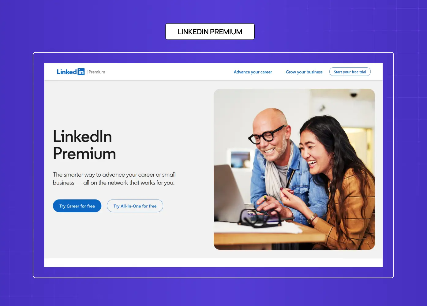
LinkedIn Premium doesn't sell a tool — it sells a transformation. Career acceleration, networking, opportunity. The 300M+ user count appears as early social proof.
What they did well: Benefits-first over features. The positioning is aspirational, not functional.
What to A/B test: Test a segment-specific hero (job seeker vs sales professional vs recruiter) against the unified page.
Why this idea works: Transformation-led messaging outperforms feature lists for professional services with an existing user base.
6. Goby — Ecommerce · Personal Care
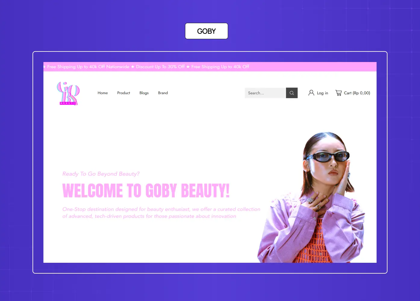
Goby's dental care page uses energetic color psychology while staying premium. The "Subscribe & Save" CTA creates urgency without pressure.
What they did well: Color and copy work together — the palette signals vitality; the messaging signals value.
What to A/B test: Test a side-by-side comparison (one-time vs subscription pricing) against the current single-CTA approach.
Why this idea works: Subscription ecommerce converts better when the savings benefit is made concrete and immediate.
7. DoorDash Driver Signup — SaaS · Food Delivery
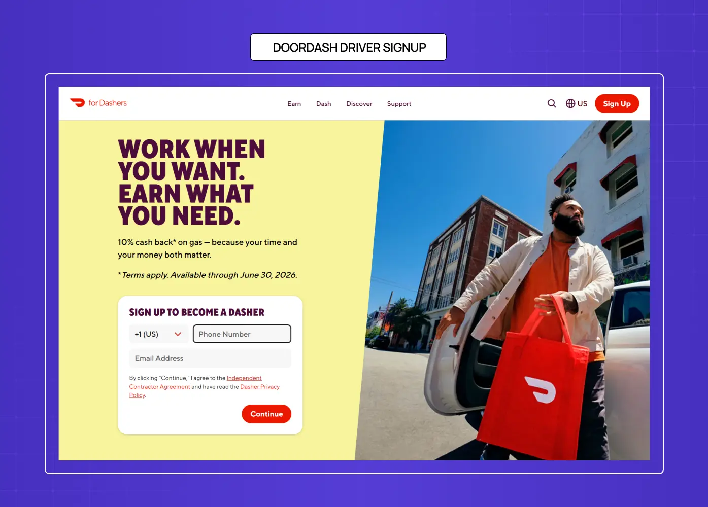
DoorDash's driver signup page is built for one purpose: convert drivers. Testimonials, earnings visuals, and a minimal form together remove the two biggest hesitations — doubt and complexity.
What they did well: Persona-targeted with precision. Every element speaks to the driver audience, not a generic user.
What to A/B test: Test earnings-based headlines ("Earn up to $X/hr in [City]") dynamically populated by location.
Why this idea works: When the audience is niche and motivated, specificity outperforms broad appeal every time.
8. SEMrush — SaaS · Marketing Analytics
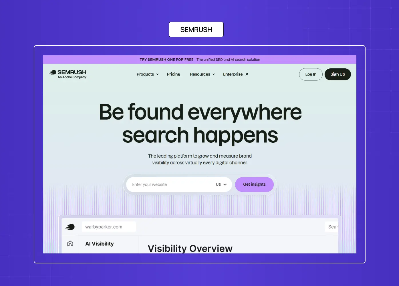
SEMrush doesn't pitch features — it invites users to "spy on the competition." Use-case carousels and UI previews make the value feel tangible and immediate.
What they did well: Use-case storytelling over technical spec. The framing makes the product feel exciting, not complex.
What to A/B test: Test a tool-preview widget (live domain analysis above the fold) against the current static carousel.
Why this idea works: For analytical SaaS, showing the product doing something useful converts better than describing what it can do.
9. Coco Village — Ecommerce · Kids Furniture
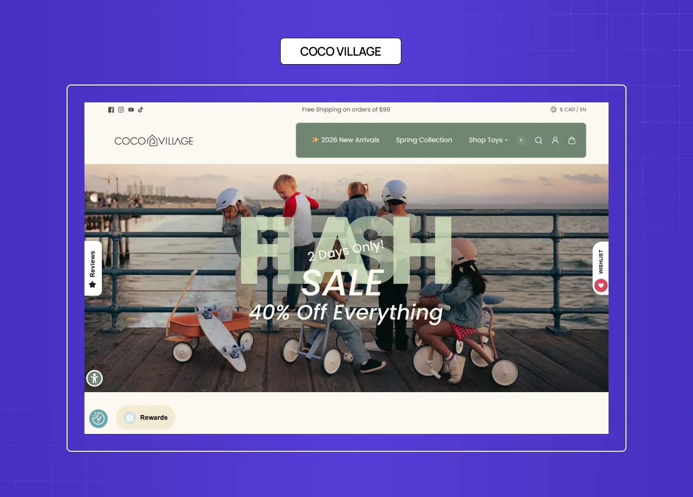
Coco Village uses pastel palettes, charming photography, and emotion-first UX. The layout breathes. CTAs are soft but assertive — designed for parents making considered purchases.
What they did well: Visual hierarchy guides toward purchase without feeling pushy. The imagery does the emotional work.
What to A/B test: Try lifestyle-first imagery (children in the room) against product-first shots.
Why this idea works: Parent-targeted ecommerce converts on aspiration and safety signals, not price.
10. Grass Roots — Ecommerce · Food & Nutrition
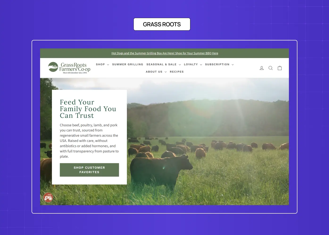
Grass Roots' farm-to-table storytelling is anchored by founder video, sourcing transparency, and testimonials. The page earns trust before it asks for a purchase.
What they did well: Education as a conversion tool. The visitor feels informed, not sold to.
What to A/B test: Test a sourcing-transparency module above the fold against the current hero-first layout.
Why this idea works: For premium food products with a values-led positioning, trust infrastructure converts better than discounts.
11. Amazon App Download — Ecommerce · Marketplace
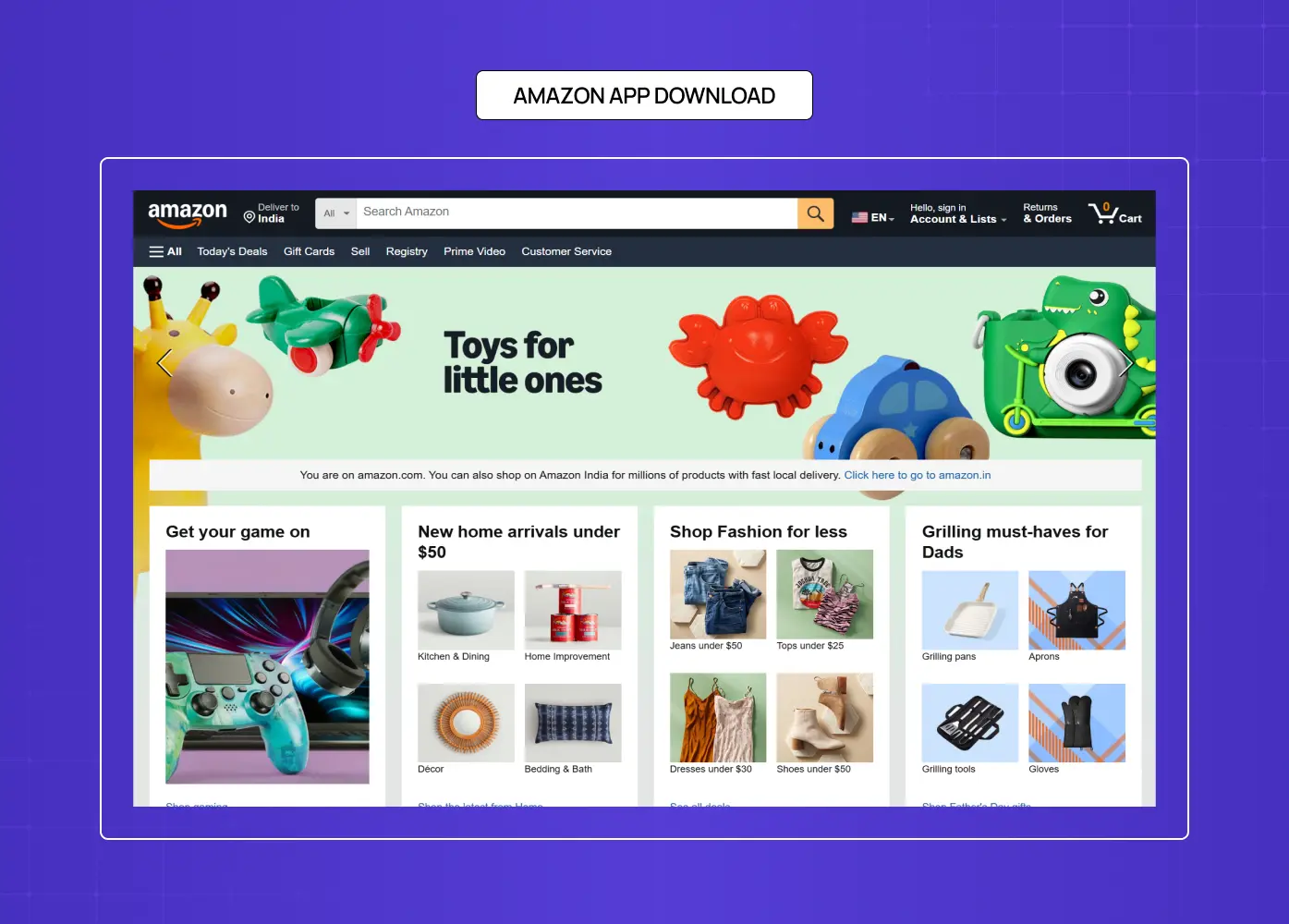
Amazon's app download page is distraction-free. App ratings, icon trust signals, and OS-specific CTAs remove every decision except the one that matters.
What they did well: Focused intent. The page assumes the visitor already wants the app — its only job is to make the download effortless.
What to A/B test: Test a features-forward layout (one key capability per scroll section) against the current minimal approach.
Why this idea works: App download pages perform best when they assume intent and remove barriers rather than build the case.
12. Branch Furniture — Ecommerce · Workspaces

Branch Furniture leads with the value proposition — "Office furniture, without the markup" — and backs it immediately with product images, pricing, and delivery information.
What they did well: Solves the objection ("furniture is overpriced") in the headline itself. Transparency does the trust-building.
What to A/B test: Test a bundle-builder CTA ("Build your workspace") against the current category-browse approach.
Why this idea works: When the primary purchase barrier is price, leading with price transparency — not hiding it — accelerates conversion.
13. Western Rise — Ecommerce · Apparel
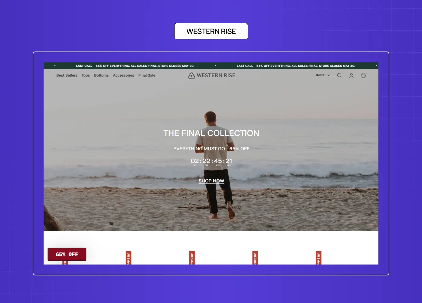
Western Rise's page is a masterclass in mobile UX. Lifestyle imagery, fast-loading design, and scroll-friendly navigation are built for thumb-first browsing.
What they did well: Mobile-first meets aspirational positioning. The page feels as premium on a phone as it does on desktop.
What to A/B test: Test a product-story video (material tech demonstration) against lifestyle imagery in the hero.
Why this idea works: Functional fashion converts on lifestyle aspiration — but mobile experience quality determines whether the user reaches the CTA.
14. Athabasca University — Education · Online Learning
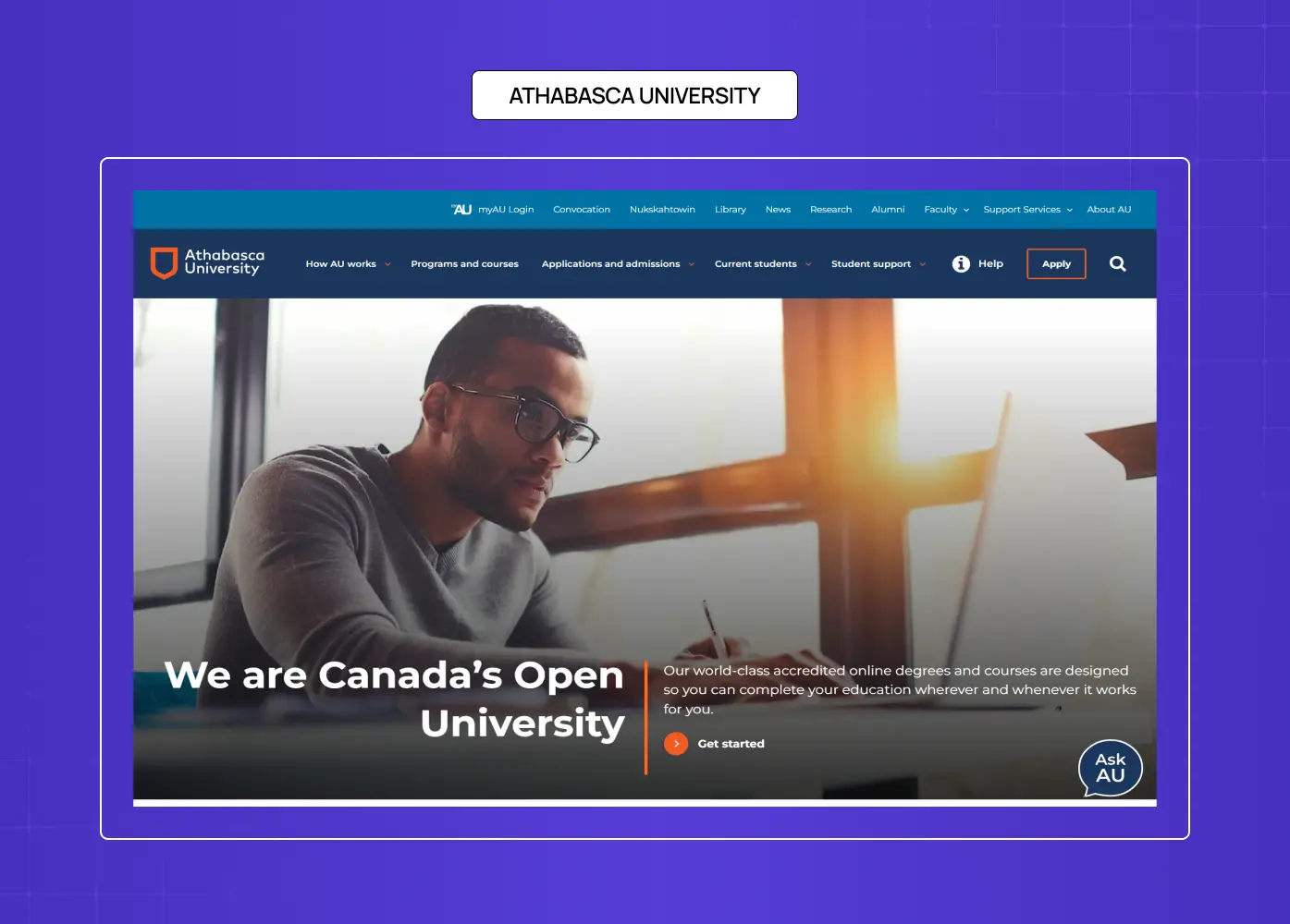
Athabasca University's page combines accreditation proof, testimonials from working professionals, and benefit-led headlines to de-risk a significant commitment.
What they did well: Trust through clarity and third-party proof. Accreditation is foregrounded, not buried in the footer.
What to A/B test: Test a flexible-schedule-first headline ("Study around your life") against the current credentials-first framing.
Why this idea works: Online education buyers need to overcome skepticism before they'll share contact details — so proof comes before the ask.
15. Blow LTD. — Beauty · Mobile Services
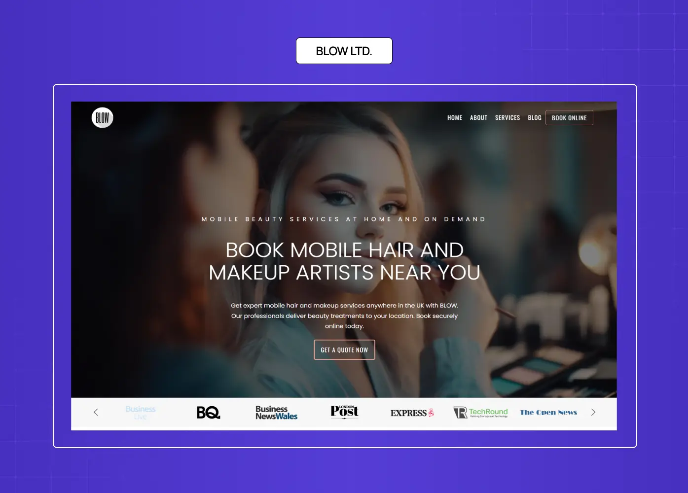
Blow LTD.'s page leads with real customer transformation photos that dominate the visual hierarchy. The booking flow takes two clicks.
What they did well: Social proof through authenticity, not stock photography. The before/after model builds confidence faster than copy.
What to A/B test: Test a live availability widget (show nearby slots) above the fold to add urgency.
Why this idea works: Service booking pages convert on proof of outcome + ease of commitment. This page nails both.
16. Ritual — Ecommerce · Wellness & Supplements

Ritual's landing page leads with radical ingredient transparency — every supplement is traceable to its source, and the page makes that the hero argument before any product benefit is named.
What they did well: Transparency as a conversion mechanism. In a category saturated with vague health claims, showing exactly what's in the product and why builds trust faster than any testimonial.
What to A/B test: Test a quiz-led entry ("Find the right formula for you") against the current product-first hero to see whether personalization lifts conversion for first-time visitors.
Why this idea works: For health and wellness ecommerce, skepticism is the primary purchase barrier. A page that leads with proof of ingredient quality de-risks the decision before the CTA is even in view.
17. Camb.ai — AI SaaS · Dubbing & Localization (Groto)
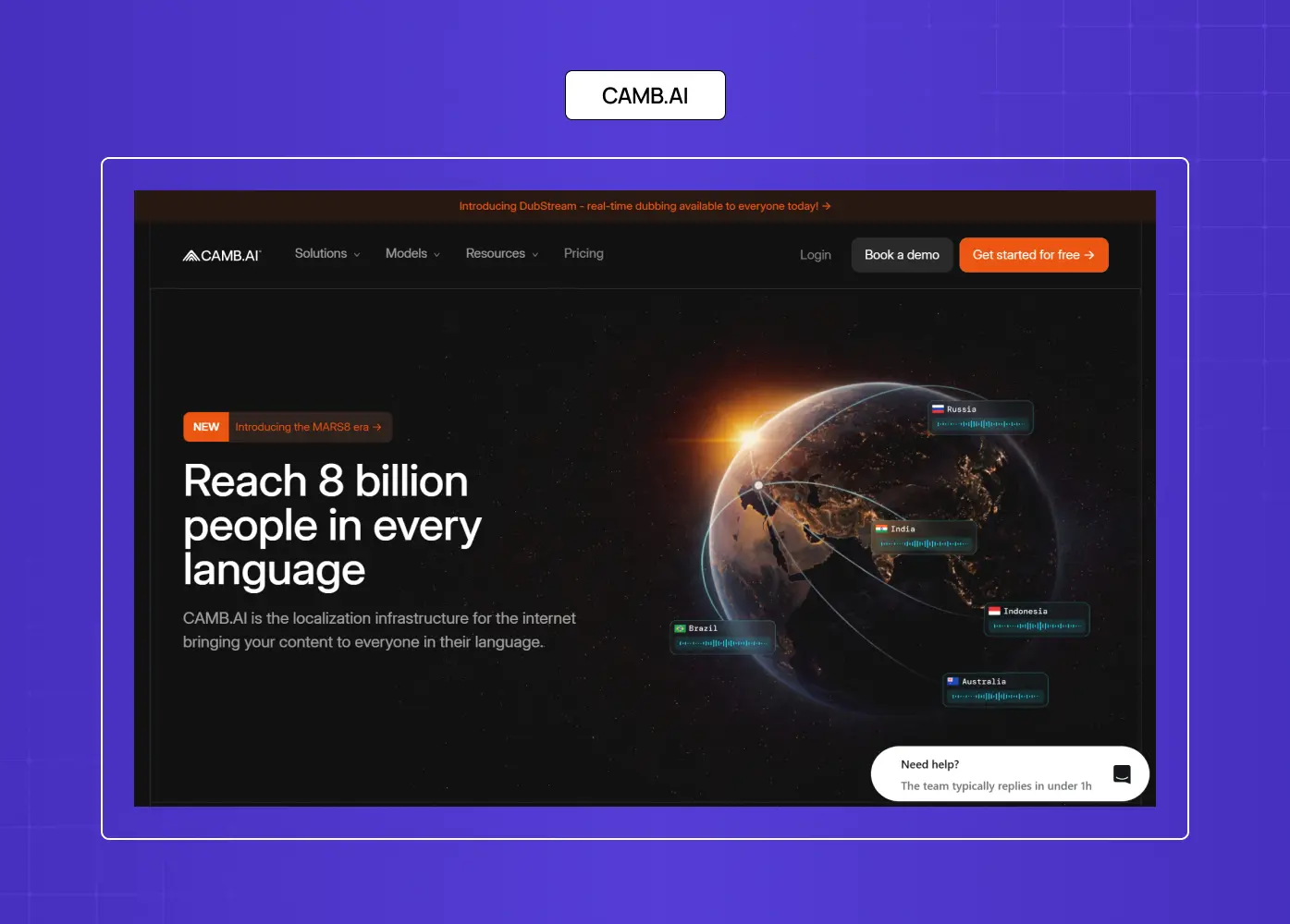
The Camb.ai landing page presented a specific challenge: communicating a technically complex AI product — real-time dubbing across 140+ languages — to a global audience with varied levels of technical familiarity.
What worked well: The above-the-fold experience was restructured to lead with the outcome rather than the technology itself. The hero section focuses on the transformation — helping content reach global audiences instantly — before introducing any features. Social proof and language-scale credibility signals were also surfaced earlier in the journey to establish trust before the CTA.
What to A/B test: A strong experiment would be testing a language-selector interaction above the fold, allowing users to input a target language and instantly preview a demo snippet, versus the current static hero. Interactive demos can significantly reduce the cognitive gap between landing and conversion for AI products.
Why this works: For AI SaaS products, the biggest conversion barrier is uncertainty — “Will this actually work for my use case?” Demonstrating output and real-world transformation upfront tends to reduce hesitation far more effectively than feature-heavy messaging.
18. Border Buddy — SaaS · Customs & Shipping
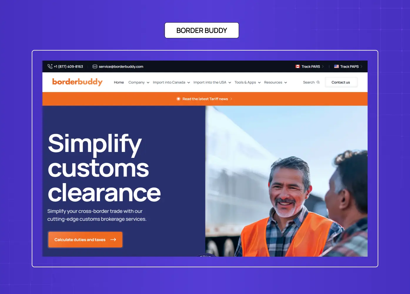
Border Buddy's explainer video, friendly tone, and live chat widget demystify a complex subject. Authority and simplicity coexist without either compromising the other.
What they did well: Takes a technically complex service and makes it feel approachable. Friendly UX for a topic users approach with anxiety.
What to A/B test: Test a cost-calculator widget (how much could you save?) against the current explainer-video lead.
Why this idea works: Complex B2B services need to reduce anxiety before they can convert. This page earns calm before it earns commitment.
19. Blue Apron — Ecommerce · Meal Kit Delivery
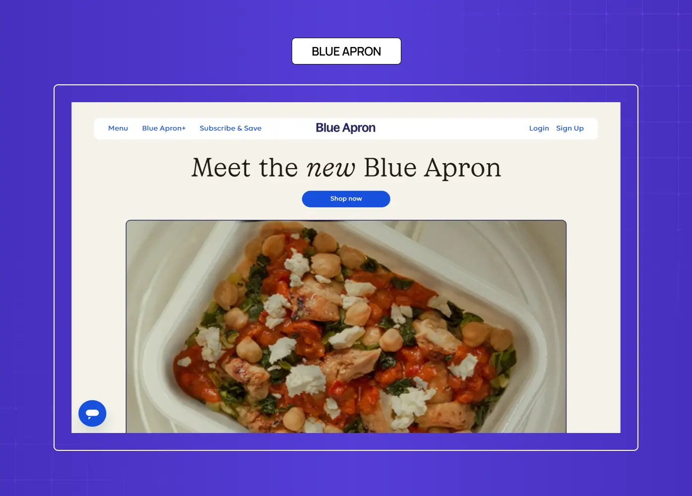
Blue Apron's page focuses on food photography, simplicity, and subscription CTA consistency. Fewer sections means clearer decisions.
What they did well: Visual appetite appeal at every scroll position. Copy is minimal because the imagery does the conversion work.
What to A/B test: Test a meal-customization preview against the current photography-led approach.
Why this idea works: For food subscriptions, the purchase trigger is desire — great imagery converts faster than any headline.
20. Campaign Monitor — SaaS · Email Marketing

Campaign Monitor doesn't say "email marketing" — it says "grow your audience." Template previews appear immediately, making the product feel usable before sign-up.
What they did well: Outcome-led language. The product demo at the top of the page removes imagination friction.
What to A/B test: Test a live template builder (drag-and-drop above the fold) against the static preview carousel.
Why this idea works: For SaaS tools, showing the product in action above the fold reduces the cognitive distance between "looking" and "signing up."
21. HelloFresh — Ecommerce · Meal Kit Delivery
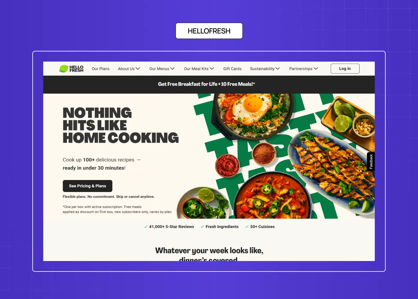
HelloFresh's landing page leads with a discount offer and a meal plan selector above the fold, collapsing the consideration cycle into a single interaction before the visitor has scrolled once.
What they did well: The page treats the first decision — choosing a meal plan — as the conversion event itself, not a step after it. By the time the visitor has selected a preference, they're already in the funnel.
What to A/B test: Test a recipe-gallery hero (show the food first, plan selector second) against the current offer-first layout to see which entry point drives higher plan completion.
Why this idea works: For subscription food services, the fastest path to conversion is getting the visitor to make one small choice early. Self-selection creates commitment before purchase is explicitly asked.
22. Snackpass — Ecommerce · Food Tech
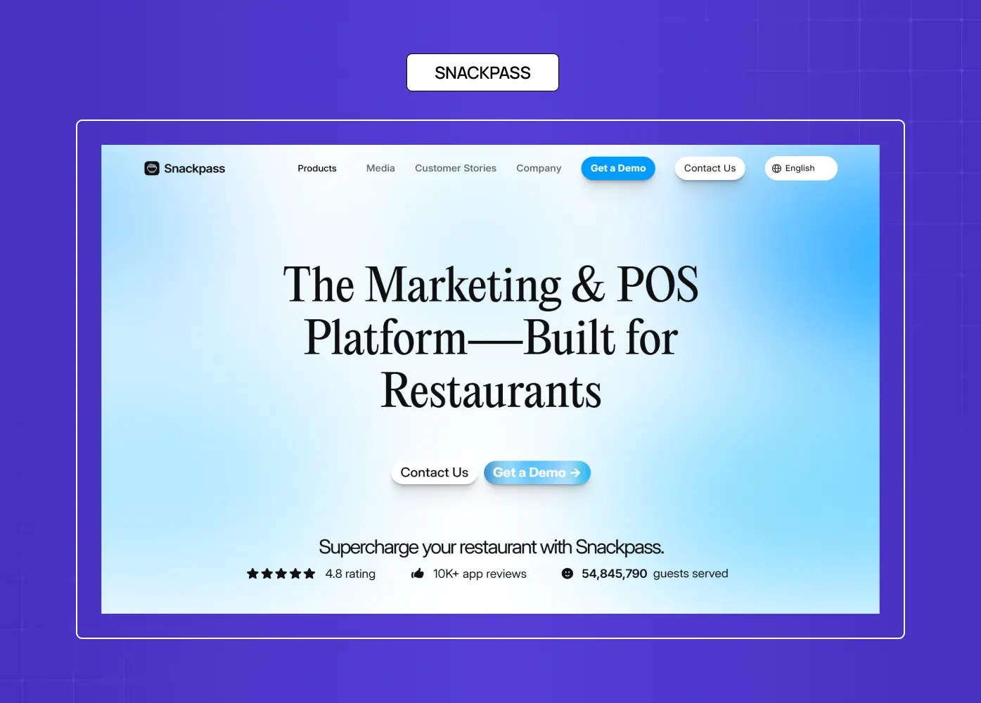
Snackpass uses social-native design for a Gen Z audience. TikTok embeds, influencer visuals, and scroll-friendly carousels target the platform behaviour patterns of its exact user.
What they did well: Audience-medium alignment. The page feels like the feeds the audience already spends time in.
What to A/B test: Test UGC (user-generated social content) against branded influencer content in the hero carousel.
Why this idea works: For social-native products, the page itself should feel native to the platform culture of the user.
23. Stripe — B2B SaaS · Payments Infrastructure
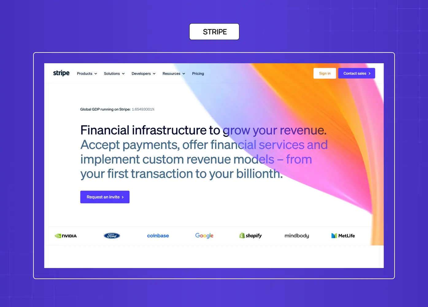
Stripe's clean, developer-first design places a live code snippet above the fold. It converts not with emotion, but with immediate proof of technical capability.
What they did well: The code example is the value proposition. No copy needed when the product speaks directly.
What to A/B test: Test a segment-specific hero (startup vs enterprise vs marketplace) against the unified developer page.
Why this idea works: Developer-led SaaS converts when the page demonstrates technical credibility, not when it explains it.
24. Intercom — B2B SaaS · Customer Messaging

Intercom's page foregrounds product screenshots and calls out AI-first positioning in the headline. Social proof from recognizable logos is immediately visible.
What they did well: The shift to AI-led messaging is reflected in both copy and visual — no gap between what they say and what they show.
What to A/B test: Test a live chat demo widget against the static product screenshot.
Why this idea works: For customer-facing SaaS, showing the product in use on the page it's meant to convert creates a meta-proof loop.
25. Monday.com — B2B SaaS · Project Management
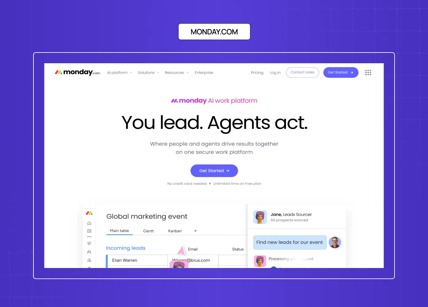
Monday.com offers role-specific entry points — Marketing, Engineering, HR — so visitors self-select immediately. The page adapts its proof and use cases based on the path chosen.
What they did well: Segmentation without friction. The visitor feels like the product was built for them because the page responds to who they are.
What to A/B test: Test a template gallery (browse by role) against the current animated product demo.
Why this idea works: For horizontal SaaS with multiple ICPs, a self-selection mechanism above the fold lifts relevance and conversion for all segments simultaneously.
26. Asana — B2B SaaS · Work Management
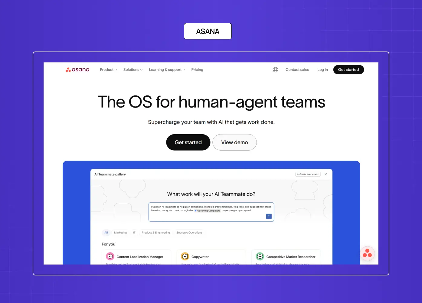
Asana leads with outcome ("Your team's work, coordinated") rather than feature names. The hero is clean and the product preview is immediate.
What they did well: The page passes the "what do you do and why should I care?" test in under five seconds.
What to A/B test: Test a workflow-builder preview (animated demo) vs static product screenshot in the hero.
Why this idea works: Clarity of outcome — not feature depth — is what converts first-time visitors who arrive unsure.
27. ClickUp — B2B SaaS · Work OS
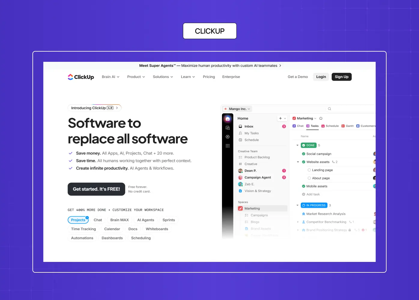
ClickUp's page leads with aggressive social proof: user count, G2 ratings, and recognizable logos before the first scroll. The CTA is repeated three times in the hero section.
What they did well: Proof-first architecture. The visitor sees credibility signals before they read the headline.
What to A/B test: Test a "replace your current tool" framing against the current category-creation framing.
Why this idea works: In a crowded category, social volume proof differentiates before copy does.
28. Buffer — B2B SaaS · Social Media Management
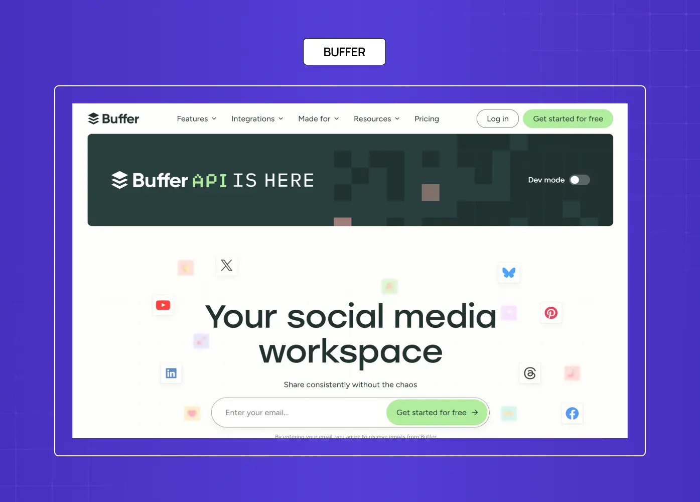
Buffer's landing page shows transparent pricing upfront. No "Contact Sales" gates for SMB plans. Simplicity and honesty as a conversion mechanism.
What they did well: Pricing transparency on the landing page itself removes the biggest B2B hesitation — what does this actually cost?
What to A/B test: Test a plan comparison table above the fold against the current hero-first, pricing-below layout.
Why this idea works: For SMB SaaS, hiding pricing delays conversion. Showing it confidently signals that the value justifies the cost.
29. Ramp — B2B SaaS · Financial Operations
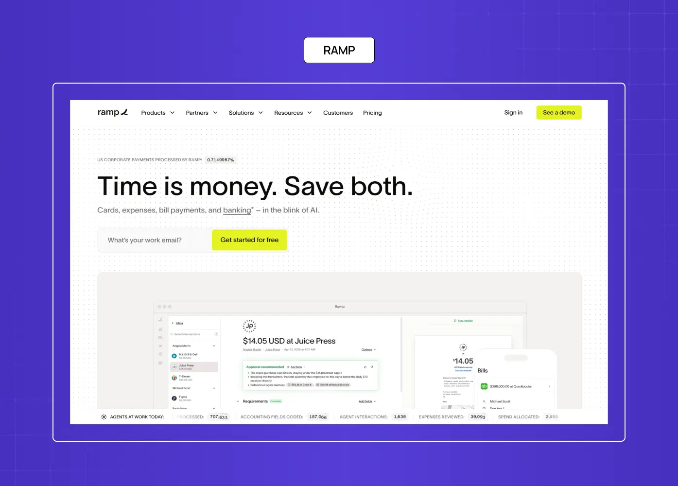
Ramp's page surfaces enterprise-grade trust signals immediately: security certifications, SOC 2 compliance, and logos of recognizable clients. The CTA is "Get started" — not "Request a demo," which lowers the commitment threshold.
What they did well: Compliance and security infrastructure is surfaced immediately because for fintech, these are table-stakes conversion requirements.
What to A/B test: Test a savings calculator (how much could you save vs your current card?) against the current static hero.
Why this idea works: For financial SaaS, proving security before asking for any information is non-negotiable. This page does it without making it feel like a compliance checklist.
30. Linear — B2B SaaS · Developer Tools
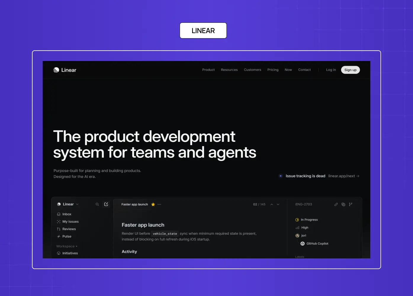
Linear's speed-focused positioning, opinionated design philosophy, and developer-native aesthetic make a deliberate statement. No enterprise bloat. No excessive social proof. Just conviction.
What they did well: Conviction-led positioning. The page doesn't try to appeal to everyone — which is exactly why it resonates strongly with its ICP.
What to A/B test: Test a speed benchmark comparison (Linear vs Jira load time) as a proof element above the fold.
Why this idea works: Developer-led SaaS that has a strong design POV can afford to be polarizing. Conviction in copy and aesthetic self-selects for the right buyer.
Landing Page Ideas Grouped by Goal
Not every landing page idea applies to every situation. Here's how to match the right approach to your conversion goal.
Best ideas for lead generation
Lead with a high-value content offer (audit, guide, checklist) in the hero — make the exchange feel worth it before asking for an email
Keep form fields to a maximum of two (name + email) unless the lead quality benefit of additional fields is proven
Use a confirmation mechanism (what happens after they submit?) to reduce form anxiety
Athabasca University, DoorDash Driver Signup, and CD Baby are all strong lead-gen models from this list
Best ideas for free-trial signups
Remove the credit card requirement from the CTA — state it explicitly ("No credit card required")
Place a product preview or animated demo above the fold; let the user see before they commit
Use social proof from companies similar to the visitor's industry to reduce "is this right for me?" doubt
SEMrush, Intercom, Monday, and Asana from this list all execute the free-trial flow well
Best ideas for ecommerce conversions
Product imagery should be aspirational, not just accurate — show the product in use, in context
Surface reviews and ratings before the CTA, not after it
Create a clear primary CTA and a secondary path (wishlist, product quiz) for visitors not ready to buy
Branch Furniture, Goby, Coco Village, and Blue Apron demonstrate ecommerce conversion patterns worth adapting
Best ideas for event and webinar registration
Use a countdown timer for time-bound scarcity — it's genuine urgency, not manufactured
Surface speaker credentials and a clear agenda above the fold
Keep the form to a single field (email) when possible; add fields only when follow-up qualification is worth the conversion cost
The event page for a high-profile industry webinar should function like a product page: proof, agenda, outcome, CTA
Common Landing Page Design Mistakes That Kill Conversions
The best landing page ideas don't matter if the execution falls into predictable traps. These six mistakes are responsible for the majority of wasted spend on high-traffic pages.
Vague or feature-led headlines. If your hero says what the product is rather than what the visitor gets, you've already lost the skim-reader. Fix: lead with outcome, not label.
Too many CTAs competing for attention. When you ask users to do five things, they do none. Every page should have one primary CTA and, if needed, one secondary escape valve — nothing else.
Ignoring mobile above the fold. On mobile, your above-the-fold space is roughly 600px of vertical height. If your value proposition, CTA, and a supporting visual don't fit in that space, you're asking mobile visitors to work for conversion.
Slow load times above 3 seconds. A one-second delay reduces conversions by 7%. A three-second load increases bounce rate by 32%. Use WebP image formats, minimize scripts, and implement a CDN. The best AI web design tools can automate much of this optimization.
Weak or missing social proof. Reviews, testimonials, and client logos are conversion fuel, not decorative. Pages without them are asking visitors to take more risk than they need to.
Using your homepage navigation on a landing page. Every nav link is an exit route. Landing pages should remove the navigation entirely. Keeping it is one of the most common — and most expensive — conversion mistakes.
How AI Is Changing Landing Page Design in 2026
AI is no longer a future consideration in landing page design — it's already embedded in how high-performing pages are built, tested, and personalized.
The most significant shift is in personalization at scale. AI tools can now serve different hero copy, imagery, and CTA variants based on the visitor's traffic source, industry, company size, or browsing behaviour — without requiring separate page builds for each segment. What Monday.com does manually through role-based segmentation, AI-enabled pages can do dynamically, in real time.
On the testing side, AI has shortened the A/B testing cycle considerably. Rather than waiting for statistical significance on a single variable over weeks, AI-powered tools run multivariate tests simultaneously, identify winning combinations faster, and surface which elements are driving lift — not just which page variant won.
Copy generation is the third area where AI has meaningful impact. AI tools can generate dozens of headline and CTA variants in minutes, which teams then filter and test against live traffic. The output is only as good as the strategic brief behind it — but the volume of testable variants has expanded significantly.
What AI doesn't replace: positioning strategy, conversion judgment, and genuine brand voice. The best 2026 workflow uses AI to build faster and test more, with human direction on the offer, the audience, and the hierarchy of proof.
Landing Page Conversion Benchmarks — What Good Looks Like
Understanding what a good conversion rate means for your page type prevents both false confidence and unnecessary overhaul. Here's where the industry sits in 2026:
Median conversion rate across industries: 5–6%
Top performers (across categories): above 11%
SaaS average: 3–5% (free trial pages tend to run higher than demo request pages)
Ecommerce average: 2–4%
Lead-generation pages: 8–12% (especially for high-value content offers)
The benchmark that matters most is your traffic source, not your category. Paid traffic that arrives with high commercial intent should convert higher than organic traffic from informational queries. If your paid landing page is converting at 2% while your category average is 4%, that's a design and positioning problem. If your organic informational page is converting at 3%, that may actually be strong.
For context: when we redesigned the landing page flow for Meydan FZ, the focus was on reducing friction in a high-stakes decision environment — streamlining UX, adding a standout cost calculator, and ensuring full compliance clarity — all of which directly addressed the conversion barriers specific to their audience.
How to Design Your Own High-Converting Landing Page
The principles behind every strong example in this list reduce to eight decisions:
Lead with the outcome, not the product. Your headline should answer "what's in it for me?" in under ten words.
Create clear visual hierarchy. The CTA button should be the most visually dominant element on the page. If it's competing with anything, it's losing.
Minimize form fields. Every additional field reduces conversion by approximately 11%. Ask only for what you need.
Use legitimate urgency. Scarcity and time limits work — when they're real. Manufactured urgency damages trust.
Optimize the above-the-fold zone. Your value proposition, key benefit, and primary CTA should all be visible without scrolling. This zone gets 84% more attention than below-the-fold content.
Layer your social proof. Combine testimonials, client logos, user counts, and security badges. No single proof type is enough alone.
A/B test continuously. Companies that test landing pages consistently see 30–40% higher conversion rates. Even small changes compound. See how to promote your website for the channel strategies that determine what kind of visitor arrives before page design can do its job.
Match the page to the traffic source. The message, design, and offer should align directly with the ad, email, or link that brought the visitor there. Misalignment between source and page is one of the leading causes of high bounce rates on otherwise well-designed pages.
How We Design Landing Pages for SaaS and AI Companies
We're a global, AI-first full-stack design studio that helps SaaS and AI teams build digital experiences that convert. From startup MVPs to enterprise platforms, we combine research-backed UX and visual strategy to deliver landing pages that are purpose-built for performance — not just presentation.
Our work spans landing page design for CRO, UX strategy aligned to business goals, scalable UI systems for SaaS teams, and branding and motion for digital platforms. Our clients include Colgate, ABInBev, Camb.ai, and YC-backed startups. Our Creative Director ranks in the top 3% of UX designers globally, and we offer a free UX audit and 3-day design sprint trial to show you exactly what we bring before any engagement begins.
Reach out for a tailored UX audit or consult.
Key Takeaways
The intent gap between "ideas" and "examples" is what most landing pages miss — design for the action you want, not just the aesthetic you like.
Every element on a high-converting landing page serves one conversion goal. Anything that doesn't serve it should be removed.
Pages focused on a single CTA consistently outperform those with multiple competing actions.
B2B SaaS pages convert on proof of technical credibility; ecommerce pages convert on desire and social proof; lead-gen pages convert on the perceived value of the offer.
A/B testing is not optional — it's the mechanism by which good pages become great ones.
Above-the-fold is the highest-value real estate on any landing page. Optimize it relentlessly.


