Harpreet Singh

Harpreet Singh

Founder and Creative Director\

Homepage Design Principles: Improve UX in 2025

Jun 18, 2025

Improve your homepage design in 2025 with effective UX principles. Learn about homepage design ideas, sample homepage designs, and examples of good homepage design to enhance user engagement.

Groto Cover Image
Harpreet Singh

Harpreet Singh

Founder and Creative Director\

Homepage Design Principles: Improve UX in 2025

Jun 18, 2025

Improve your homepage design in 2025 with effective UX principles. Learn about homepage design ideas, sample homepage designs, and examples of good homepage design to enhance user engagement.

Groto Cover Image

Effective homepage design principles are crucial for improving UX in 2025. This guide will cover everything you need to know. From homepage design ideas to examples of good homepage design, to help you create a homepage that offers clarity, ease of navigation, and a seamless user experience.

In 2025, a well-crafted homepage design is key to user experience (UX). Let’s explore essential design principles that will help you stand out.


Homepage Design Principles

In 2025, websites face a competitive landscape where user expectations for seamless, intuitive, and engaging digital experiences have only grown. Your homepage design is often the first impression visitors have of your brand.

It needs to convey key messages quickly, guide users efficiently, and retain their attention long enough for them to take action. But how can you create a homepage that delivers all this, and more? What are the homepage design principles that will dominate in 2025?

And how can you implement these principles to enhance UX and drive better engagement?

The truth is, the homepage design is the cornerstone of user experience (UX) on a website. It needs to encompass simplicity, user-centered design, navigation, performance optimization, and visual appeal to engage users while ensuring accessibility across devices. But it’s also more than that.

In 2025, users are becoming more savvy, mobile-first, and demanding a personalized, fast, and frictionless web experience. Let’s dive deep into the homepage design principles, explore the key elements of a good homepage, and answer some of the crucial questions around homepage design ideas, examples of good homepage design, and the latest strategies for improving your homepage UX.

Homepage Design Principles to Improve UX

A homepage design is more than just how your website looks—it’s how it functions. From navigating through the site to interacting with content, every element has a role in improving user experience. Understanding the core homepage design principles will help you craft a homepage that’s functional, visually appealing, and aligned with users’ expectations. But how do you design a homepage that works in the fast-paced, mobile-first world of 2025?

Why is Homepage Design So Important?

Let’s begin by asking: Why is homepage design so critical? It’s simple. Your homepage is often the first point of contactwith your users. It represents your brand, guides users through their journey, and serves as the foundation of your website's structure. If users don’t immediately understand what your site offers or how to use it, they’ll leave—quickly.

Research shows that users decide within seconds whether to stay or leave a website based on first impressions. So, your homepage design must capture their attention instantly. The goal is to create an experience that’s engaging, informative, and, most importantly, easy to navigate.

Key Principles of Homepage Design

1. Simplicity and Clarity

Ask yourself, what do users want when they land on your homepage? Most likely, they want clear, easily digestible information. The key to achieving this is simplicity.

Simplicity is not just about removing clutter—it’s about presenting only the most essential information upfront, allowing users to easily understand your value proposition.

A simple homepage design is visually appealing because it doesn’t overwhelm visitors with excessive content or complex navigation. It’s easy to follow, and the information is concise and targeted.

Key Points for Simplicity:

  • Minimalist Layout: The homepage should feature large headlines, short descriptions, and minimal distractions.

  • Whitespace: Effective use of whitespace (or negative space) allows for better focus on key elements like CTAs.

  • Clear Value Proposition: Users should instantly understand what your brand offers and why they should care.

Example Use Case:

A tech startup might use a single, bold headline like “Build Better Products with AI” at the top of their homepage, followed by a simple call-to-action (CTA), like “Get Started.” The design is clean, with no unnecessary information that could overwhelm visitors.

2. Navigation: Simple, Intuitive, and Easy

Navigation is essential for any homepage design. The last thing users want is to get lost on your site, so it’s crucial that your homepage navigation is intuitive and easy to follow.

What do you want users to do first?

That’s the key to structuring your navigation.

The homepage must guide visitors to their next steps—whether that’s learning more about your product, signing up for a service, or exploring content. A clear navigation structure helps users find information quickly and keeps them engaged.

Key Navigation Principles:

  • Sticky Menus: Use a sticky navigation bar that stays visible as users scroll, making it easy for them to access key sections.

  • Logical Flow: Arrange links or categories in a way that makes sense to the user, ensuring that important pages are at the top of the hierarchy.

  • Search Bar: A search bar is a must-have, especially for content-heavy websites. It enables users to quickly find what they need.

Example Use Case:

A news website would have navigation categories such as Home, Politics, Entertainment, Sports, and Search. This allows users to quickly jump to the section they’re most interested in, rather than wandering through multiple clicks.

3. User-Centric Design: Accessibility and Usability First

Is your website accessible? Can everyone—regardless of ability or device—navigate it without frustration?

By focusing on user-centric design, you ensure that your homepage accommodates a wide range of users. This includes designing with accessibility in mind, testing for usability, and ensuring that content is easy to consume on any device.

What makes a design user-centric?

It’s about understanding your target audience

What do they need? 

What are their pain points?

User-centric design starts with accessibility: ensuring keyboard navigation, screen reader compatibility, and color contrast for visually impaired users. It also involves creating designs that prioritize usability, ensuring that users can quickly figure out how to interact with the site.

Key User-Centric Principles:

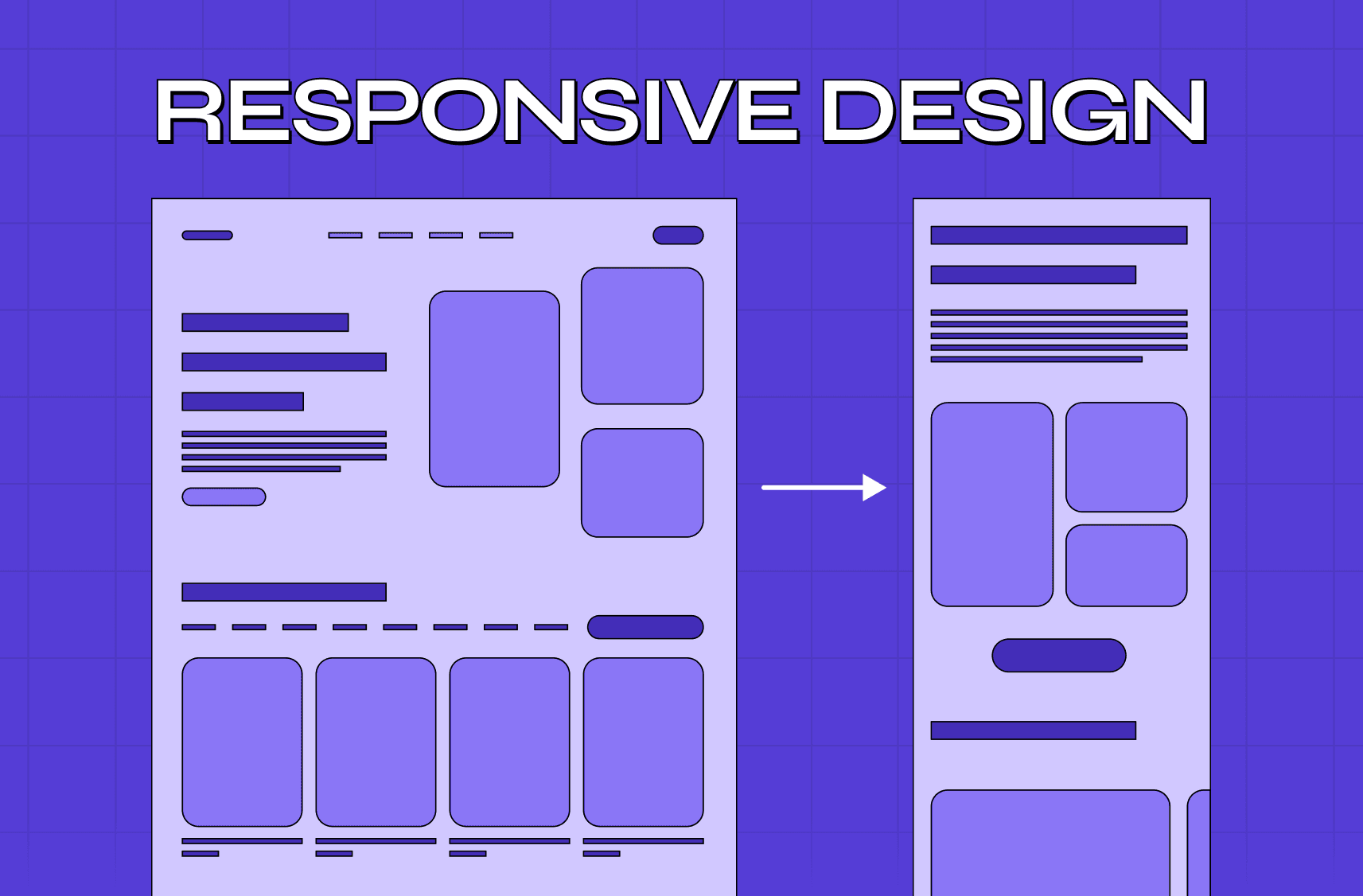
  • Responsive Design: Ensure your homepage looks great on mobile, tablet, and desktop.

  • Fast Load Time: Users are likely to abandon slow-loading pages, so speed is a vital factor in user-centric design.

  • Clear Typography: Choose fonts that are readable across devices and provide adequate contrast.

Example Use Case:

A university website could feature a clean, responsive homepage where the content is legible on both small screens (for prospective students on mobile) and large screens (for staff using desktop). It should also be accessible to users with disabilities, with keyboard navigation and text-to-speech options.

4. Visual Design: Engaging with Purpose

Visual design is where creativity meets functionality. However, it’s important to remember that visuals on your homepage must serve a purpose. They should help users understand your product or service while driving engagement.

But how do visuals affect user experience?

When used strategically, images and graphics enhance your homepage's message. Whether it's an image of a product or an engaging background graphic, visuals can guide the user’s focus and highlight important information.

Key Visual Design Principles:

  • Consistent Branding: Use colors, typography, and imagery that align with your brand’s identity.

  • Strategic Image Placement: Ensure that images reinforce the content and guide user interaction.

  • Contrast and Accessibility: Make sure text is legible against the background. Pay attention to color contrast, especially for users with color blindness.

Example Use Case:

An online store might use large, high-quality images of products in a minimalist layout. The homepage could include images of new arrivals or sales promotions, with strategically placed CTA buttons like “Shop Now” or “View Collection”.

5. Performance: Speed and Responsiveness

Performance is crucial for homepage design—especially in 2025. A slow-loading homepage is a turn-off for users. In fact, studies have shown that 40% of users abandon a website if it takes more than 3 seconds to load. Google also uses page speed as a ranking factor, meaning performance directly impacts your SEO.

But how can you improve homepage performance?

Start by optimizing images (compress them without sacrificing quality), minimizing HTTP requests, and utilizing browser caching to reduce load time. Make sure your homepage is responsive to ensure that it looks great and loads efficiently on all devices.

Key Performance Principles:

  • Optimize images and videos for fast loading.

  • Use content delivery networks (CDNs) to speed up delivery.

  • Test performance regularly to ensure everything works at optimal speed.

Example Use Case:

A travel website might feature large images of destinations, but they should be compressed and optimized for fast loading to ensure that users don’t bounce due to slow speed.

Comprehensive Chart of Homepage Design Principles

Design Principle

Best Practices

Common Mistakes

Impact on UX

Simplicity and Clarity

Focus on concise content, clear value proposition, and minimalism.

Overloading the homepage with too much text or clutter.

Helps users immediately understand your brand’s value.

Navigation

Use intuitive, sticky menus and clear paths to content.

Complex, hard-to-find menus with unclear labels.

Enables users to find their way around easily.

User-Centric Design

Ensure accessibility, mobile responsiveness, and usability.

Ignoring mobile users or accessibility issues.

Enhances usability and user retention.

Visual Design

Use consistent color schemes, clear fonts, and purposeful images.

Disjointed styles or unnecessary graphics that confuse the user.

Provides visual guidance and engagement.

Performance

Optimize images and ensure fast load time with caching.

Using large, uncompressed images or slow scripts.

Reduces bounce rates and keeps users engaged.

Content Priority

Highlight key information and CTAs, keep content focused.

Overloading the homepage with unnecessary details.

Improves clarity and directs the user’s attention to important actions.

Designing a homepage that stands out in 2025 requires a deep understanding of homepage design principles. Simplicity, clear navigation, user-centered design, visual appeal, performance, and content prioritization are the key pillars for success. By prioritizing these elements, you ensure that your homepage design not only captures attention but also drives engagement and conversions.

Key Takeaways

  • Simple and clear design ensures users understand the website’s value quickly.

  • Effective navigation helps users find information with ease.

  • User-centric design prioritizes accessibility and usability.

  • Strategic visual design enhances engagement and guides user behavior.

  • Fast loading times and performance optimization are crucial for user retention.

Your homepage design is the face of your brand. With the right principles and execution, it can turn first-time visitors into loyal customers.

Why is Groto uniquely positioned to help?

We combine expert UX research with elite visual design to create homepage designs that are not only aesthetically engaging but also functional. Whether you want to improve navigation, enhance visual appeal, or streamline user flow, Groto’s team can help bring your vision to life—fast.

Our process integrates deep insights into user behavior with cutting-edge design practices, ensuring that your homepage is optimized for both performance and user satisfaction. We understand that time is valuable, which is why we go from strategy to execution in weeks—not months.

The Groto Difference:

  • We specialize in SaaS and AI-focused products, meaning we know how to design homepages that clearly communicate technical offerings to both niche and general audiences.

  • We help startups and global brands alike turn complex products into easy-to-understand, user-validated designs.

  • Our UX research-driven approach makes sure that every design choice is rooted in real-world user feedback, not just aesthetic trends.

Let us help you make a homepage that works, not just looks good.

Let's talk →

(+91) 8920-527-329
hello@letsgroto.com

Read More:

Top 10 AI Web Design Tools You Need to Know in 2025

Understanding UX Strategy: A Practical Guide to Building Products That Work

Figma vs Sketch vs Adobe XD: Best UI Design Tool Compared 2025

Integrating AI into SaaS UX - Best Practices and Strategies

FAQ

Q. What makes a good homepage design?
A good homepage design is simple, user-centric, and clearly communicates the brand’s value. It should have intuitive navigation, strategic visuals, and fast loading times.

Q. What are the five golden rules of a well-designed web page?
The five golden rules are simplicity, clarity, consistency, responsiveness, and usability.

Q. What makes a poorly designed website?
A poorly designed website suffers from slow performance, unclear navigation, excessive content, and poor user interface, leading to high bounce rates.

Q. What are the 5 major components of a Web page?
The major components are header, navigation, main content, footer, and sidebar (if applicable).

Q. What is the best grid for website design?
The best grid for website design is typically the 12-column grid, offering flexibility across different screen sizes.

Q. What is the best layout for a website?
The best layout combines a clean header, organized navigation, clear content hierarchy, and a functional footer, ensuring accessibility and a smooth user experience.

Extreme close-up black and white photograph of a human eye

Let’s bring your vision to life

Tell us what's on your mind? We'll hit you back in 24 hours. No fluff, no delays - just a solid vision to bring your idea to life.

Profile portrait of a man in a white shirt against a light background

Harpreet Singh

Founder and Creative Director

Get in Touch

Harpreet Singh
Harpreet Singh

Harpreet Singh

Founder and Creative Director\

Homepage Design Principles: Improve UX in 2025

Jun 18, 2025

Improve your homepage design in 2025 with effective UX principles. Learn about homepage design ideas, sample homepage designs, and examples of good homepage design to enhance user engagement.

Groto Cover Image
Groto Cover Image

Effective homepage design principles are crucial for improving UX in 2025. This guide will cover everything you need to know. From homepage design ideas to examples of good homepage design, to help you create a homepage that offers clarity, ease of navigation, and a seamless user experience.

In 2025, a well-crafted homepage design is key to user experience (UX). Let’s explore essential design principles that will help you stand out.


Homepage Design Principles

In 2025, websites face a competitive landscape where user expectations for seamless, intuitive, and engaging digital experiences have only grown. Your homepage design is often the first impression visitors have of your brand.

It needs to convey key messages quickly, guide users efficiently, and retain their attention long enough for them to take action. But how can you create a homepage that delivers all this, and more? What are the homepage design principles that will dominate in 2025?

And how can you implement these principles to enhance UX and drive better engagement?

The truth is, the homepage design is the cornerstone of user experience (UX) on a website. It needs to encompass simplicity, user-centered design, navigation, performance optimization, and visual appeal to engage users while ensuring accessibility across devices. But it’s also more than that.

In 2025, users are becoming more savvy, mobile-first, and demanding a personalized, fast, and frictionless web experience. Let’s dive deep into the homepage design principles, explore the key elements of a good homepage, and answer some of the crucial questions around homepage design ideas, examples of good homepage design, and the latest strategies for improving your homepage UX.

Homepage Design Principles to Improve UX

A homepage design is more than just how your website looks—it’s how it functions. From navigating through the site to interacting with content, every element has a role in improving user experience. Understanding the core homepage design principles will help you craft a homepage that’s functional, visually appealing, and aligned with users’ expectations. But how do you design a homepage that works in the fast-paced, mobile-first world of 2025?

Why is Homepage Design So Important?

Let’s begin by asking: Why is homepage design so critical? It’s simple. Your homepage is often the first point of contactwith your users. It represents your brand, guides users through their journey, and serves as the foundation of your website's structure. If users don’t immediately understand what your site offers or how to use it, they’ll leave—quickly.

Research shows that users decide within seconds whether to stay or leave a website based on first impressions. So, your homepage design must capture their attention instantly. The goal is to create an experience that’s engaging, informative, and, most importantly, easy to navigate.

Key Principles of Homepage Design

1. Simplicity and Clarity

Ask yourself, what do users want when they land on your homepage? Most likely, they want clear, easily digestible information. The key to achieving this is simplicity.

Simplicity is not just about removing clutter—it’s about presenting only the most essential information upfront, allowing users to easily understand your value proposition.

A simple homepage design is visually appealing because it doesn’t overwhelm visitors with excessive content or complex navigation. It’s easy to follow, and the information is concise and targeted.

Key Points for Simplicity:

  • Minimalist Layout: The homepage should feature large headlines, short descriptions, and minimal distractions.

  • Whitespace: Effective use of whitespace (or negative space) allows for better focus on key elements like CTAs.

  • Clear Value Proposition: Users should instantly understand what your brand offers and why they should care.

Example Use Case:

A tech startup might use a single, bold headline like “Build Better Products with AI” at the top of their homepage, followed by a simple call-to-action (CTA), like “Get Started.” The design is clean, with no unnecessary information that could overwhelm visitors.

2. Navigation: Simple, Intuitive, and Easy

Navigation is essential for any homepage design. The last thing users want is to get lost on your site, so it’s crucial that your homepage navigation is intuitive and easy to follow.

What do you want users to do first?

That’s the key to structuring your navigation.

The homepage must guide visitors to their next steps—whether that’s learning more about your product, signing up for a service, or exploring content. A clear navigation structure helps users find information quickly and keeps them engaged.

Key Navigation Principles:

  • Sticky Menus: Use a sticky navigation bar that stays visible as users scroll, making it easy for them to access key sections.

  • Logical Flow: Arrange links or categories in a way that makes sense to the user, ensuring that important pages are at the top of the hierarchy.

  • Search Bar: A search bar is a must-have, especially for content-heavy websites. It enables users to quickly find what they need.

Example Use Case:

A news website would have navigation categories such as Home, Politics, Entertainment, Sports, and Search. This allows users to quickly jump to the section they’re most interested in, rather than wandering through multiple clicks.

3. User-Centric Design: Accessibility and Usability First

Is your website accessible? Can everyone—regardless of ability or device—navigate it without frustration?

By focusing on user-centric design, you ensure that your homepage accommodates a wide range of users. This includes designing with accessibility in mind, testing for usability, and ensuring that content is easy to consume on any device.

What makes a design user-centric?

It’s about understanding your target audience

What do they need? 

What are their pain points?

User-centric design starts with accessibility: ensuring keyboard navigation, screen reader compatibility, and color contrast for visually impaired users. It also involves creating designs that prioritize usability, ensuring that users can quickly figure out how to interact with the site.

Key User-Centric Principles:

  • Responsive Design: Ensure your homepage looks great on mobile, tablet, and desktop.

  • Fast Load Time: Users are likely to abandon slow-loading pages, so speed is a vital factor in user-centric design.

  • Clear Typography: Choose fonts that are readable across devices and provide adequate contrast.

Example Use Case:

A university website could feature a clean, responsive homepage where the content is legible on both small screens (for prospective students on mobile) and large screens (for staff using desktop). It should also be accessible to users with disabilities, with keyboard navigation and text-to-speech options.

4. Visual Design: Engaging with Purpose

Visual design is where creativity meets functionality. However, it’s important to remember that visuals on your homepage must serve a purpose. They should help users understand your product or service while driving engagement.

But how do visuals affect user experience?

When used strategically, images and graphics enhance your homepage's message. Whether it's an image of a product or an engaging background graphic, visuals can guide the user’s focus and highlight important information.

Key Visual Design Principles:

  • Consistent Branding: Use colors, typography, and imagery that align with your brand’s identity.

  • Strategic Image Placement: Ensure that images reinforce the content and guide user interaction.

  • Contrast and Accessibility: Make sure text is legible against the background. Pay attention to color contrast, especially for users with color blindness.

Example Use Case:

An online store might use large, high-quality images of products in a minimalist layout. The homepage could include images of new arrivals or sales promotions, with strategically placed CTA buttons like “Shop Now” or “View Collection”.

5. Performance: Speed and Responsiveness

Performance is crucial for homepage design—especially in 2025. A slow-loading homepage is a turn-off for users. In fact, studies have shown that 40% of users abandon a website if it takes more than 3 seconds to load. Google also uses page speed as a ranking factor, meaning performance directly impacts your SEO.

But how can you improve homepage performance?

Start by optimizing images (compress them without sacrificing quality), minimizing HTTP requests, and utilizing browser caching to reduce load time. Make sure your homepage is responsive to ensure that it looks great and loads efficiently on all devices.

Key Performance Principles:

  • Optimize images and videos for fast loading.

  • Use content delivery networks (CDNs) to speed up delivery.

  • Test performance regularly to ensure everything works at optimal speed.

Example Use Case:

A travel website might feature large images of destinations, but they should be compressed and optimized for fast loading to ensure that users don’t bounce due to slow speed.

Comprehensive Chart of Homepage Design Principles

Design Principle

Best Practices

Common Mistakes

Impact on UX

Simplicity and Clarity

Focus on concise content, clear value proposition, and minimalism.

Overloading the homepage with too much text or clutter.

Helps users immediately understand your brand’s value.

Navigation

Use intuitive, sticky menus and clear paths to content.

Complex, hard-to-find menus with unclear labels.

Enables users to find their way around easily.

User-Centric Design

Ensure accessibility, mobile responsiveness, and usability.

Ignoring mobile users or accessibility issues.

Enhances usability and user retention.

Visual Design

Use consistent color schemes, clear fonts, and purposeful images.

Disjointed styles or unnecessary graphics that confuse the user.

Provides visual guidance and engagement.

Performance

Optimize images and ensure fast load time with caching.

Using large, uncompressed images or slow scripts.

Reduces bounce rates and keeps users engaged.

Content Priority

Highlight key information and CTAs, keep content focused.

Overloading the homepage with unnecessary details.

Improves clarity and directs the user’s attention to important actions.

Designing a homepage that stands out in 2025 requires a deep understanding of homepage design principles. Simplicity, clear navigation, user-centered design, visual appeal, performance, and content prioritization are the key pillars for success. By prioritizing these elements, you ensure that your homepage design not only captures attention but also drives engagement and conversions.

Key Takeaways

  • Simple and clear design ensures users understand the website’s value quickly.

  • Effective navigation helps users find information with ease.

  • User-centric design prioritizes accessibility and usability.

  • Strategic visual design enhances engagement and guides user behavior.

  • Fast loading times and performance optimization are crucial for user retention.

Your homepage design is the face of your brand. With the right principles and execution, it can turn first-time visitors into loyal customers.

Why is Groto uniquely positioned to help?

We combine expert UX research with elite visual design to create homepage designs that are not only aesthetically engaging but also functional. Whether you want to improve navigation, enhance visual appeal, or streamline user flow, Groto’s team can help bring your vision to life—fast.

Our process integrates deep insights into user behavior with cutting-edge design practices, ensuring that your homepage is optimized for both performance and user satisfaction. We understand that time is valuable, which is why we go from strategy to execution in weeks—not months.

The Groto Difference:

  • We specialize in SaaS and AI-focused products, meaning we know how to design homepages that clearly communicate technical offerings to both niche and general audiences.

  • We help startups and global brands alike turn complex products into easy-to-understand, user-validated designs.

  • Our UX research-driven approach makes sure that every design choice is rooted in real-world user feedback, not just aesthetic trends.

Let us help you make a homepage that works, not just looks good.

Let's talk →

(+91) 8920-527-329
hello@letsgroto.com

Read More:

Top 10 AI Web Design Tools You Need to Know in 2025

Understanding UX Strategy: A Practical Guide to Building Products That Work

Figma vs Sketch vs Adobe XD: Best UI Design Tool Compared 2025

Integrating AI into SaaS UX - Best Practices and Strategies

FAQ

Q. What makes a good homepage design?
A good homepage design is simple, user-centric, and clearly communicates the brand’s value. It should have intuitive navigation, strategic visuals, and fast loading times.

Q. What are the five golden rules of a well-designed web page?
The five golden rules are simplicity, clarity, consistency, responsiveness, and usability.

Q. What makes a poorly designed website?
A poorly designed website suffers from slow performance, unclear navigation, excessive content, and poor user interface, leading to high bounce rates.

Q. What are the 5 major components of a Web page?
The major components are header, navigation, main content, footer, and sidebar (if applicable).

Q. What is the best grid for website design?
The best grid for website design is typically the 12-column grid, offering flexibility across different screen sizes.

Q. What is the best layout for a website?
The best layout combines a clean header, organized navigation, clear content hierarchy, and a functional footer, ensuring accessibility and a smooth user experience.

Extreme close-up black and white photograph of a human eye

Let’s bring your vision to life

Tell us what's on your mind? We'll hit you back in 24 hours. No fluff, no delays - just a solid vision to bring your idea to life.

Profile portrait of a man in a white shirt against a light background

Harpreet Singh

Founder and Creative Director

Get in Touch

Extreme close-up black and white photograph of a human eye

Let’s bring your vision to life

Tell us what's on your mind? We'll hit you back in 24 hours. No fluff, no delays - just a solid vision to bring your idea to life.

Profile portrait of a man in a white shirt against a light background

Harpreet Singh

Founder and Creative Director

Get in Touch