

Most SaaS teams fix UX flows but ignore the words guiding users through them. This guide breaks down how strategic microcopy reduces friction, increases conversions, and strengthens product trust across onboarding, buttons, errors, and empty states.
Microcopy drives conversions. Here’s how to write UX copy that actually increases user action.

When optimizing a SaaS product, leaders often focus on the main UX flows. But is great flow enough to guarantee conversion? The answer is no.
The most powerful words in your SaaS product aren't in your marketing copy-they're in your buttons, error messages, and empty screens — surfaces where graphic design typography determines whether those few words actually get read.
For high-growth SaaS and B2B products, the difference between a high-converting experience and a frustrated churn event often comes down to four words in a button copy UX scenario. UX writing isn't about style; it's a strategic, conversion-focused discipline that guides the user through your product without friction.
This definitive UX writing guide will help designers, PMs, developers, and anyone trying to crack their conversions create copy that drives action, reduces support tickets, and boosts conversion rates.
What is UX Writing and Why It's Critical for SaaS
UX writing is the practice of crafting all the words that a user sees and hears while interacting with a digital product. It includes labels, error messages, notifications, instructional text, and placeholders. Unlike marketing copywriting, which aims to sell the product, product UX writing aims to help the user use the product. It’s the invisible conversation that builds trust and clarity. For SaaS microcopy, clarity equals conversion. If a user can’t understand what happens next, they stop. If you're already investing in UX design services, strengthening your product’s UX writing ensures that every screen, flow, and interaction reinforces clarity, trust, and conversion.
UX writing is not a standalone discipline — it sits inside your broader UX strategy. If your product flows aren’t clear, even perfect microcopy can’t save them. For a deeper view, explore our complete guide to SaaS UX design.
The Business Impact of Intentional Microcopy
Investing in a precise UX content strategy is a high-leverage move that pays clear, measurable dividends—it’s not a soft design choice; it's an ROI driver.
Reduced Support Load: Clear error messages and proactive instructions drastically reduce the need for users to contact support. Fewer tickets equal lower operational costs.
Higher Feature Adoption: Strategic and concise onboarding UX copy ensures users complete their setup and explore new capabilities without friction — and for AI-powered features specifically, AI onboarding copy must do additional work explaining probabilistic outputs and model behaviour before users will trust the feature enough to adopt it.
Improved Conversion Rates (CRO): Optimized microcopy on key transactional buttons can increase click-through rates dramatically — and it works best when paired with conversion-focused page elements that reinforce the same clarity and intent across the full page, not just the button.
Improved microcopy becomes even more powerful when paired with strong SaaS UX best practices that remove friction from the product experience.
If you want to understand how top SaaS products execute microcopy at scale, study how leading UX design companies for SaaS structure their product messaging frameworks.
The 3 Pillars of Effective UX Tone of Voice
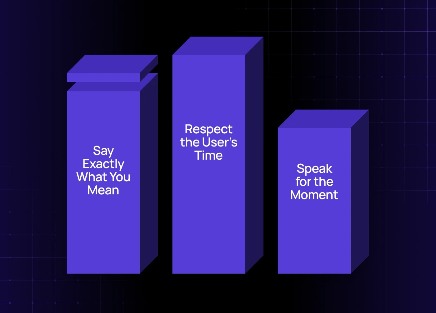
Before you write a single word, define your UX tone of voice. This isn't just personality; it's a set of rules ensuring consistency across your entire application. Great UX content should be:
1. Clear: Say Exactly What You Mean
Clarity trumps cleverness every time. A user scanning a screen doesn’t want to decipher meaning; they want to know the direct next step or the nature of an error.
Bad: "System synchronization failure. Please consult documentation for troubleshooting."
Good: "We couldn't save your settings. Check your network connection and try again."
Fintech microcopy standards set the highest bar for this principle — banking products must communicate errors and state changes in plain language that eliminates user doubt instantly, because ambiguity in a financial context creates immediate distrust.
2. Concise: Respect the User’s Time
Be brief, especially on mobile and in high-friction moments like error states. Every unnecessary word is a moment of hesitation — and even well-written copy can feel heavy if the visual presentation works against it. Getting microcopy length right is rarely a one-time fix; it's part of the ongoing UX refinement cycle teams run as user behavior and product complexity evolve.
Understanding typography tracking and readability shows how letter spacing directly affects how quickly users process short-form UI text.
3. Contextual: Speak for the Moment
The same message can be helpful or frustrating depending on where the user is in the flow. Are they a first-time user, or a power user? Is the tone for an error message (apologetic/helpful) different from a confirmation message (calm/affirmative)?
If your product uses AI or automated workflows, your microcopy must guide the user through unfamiliar states. We broke down the difference in our AI UX vs traditional UX analysis.
Microcopy Examples: High-Stakes Touchpoints
A strong UX writing guide must provide concrete microcopy examples for the parts of the product where users are most likely to drop off or get confused.
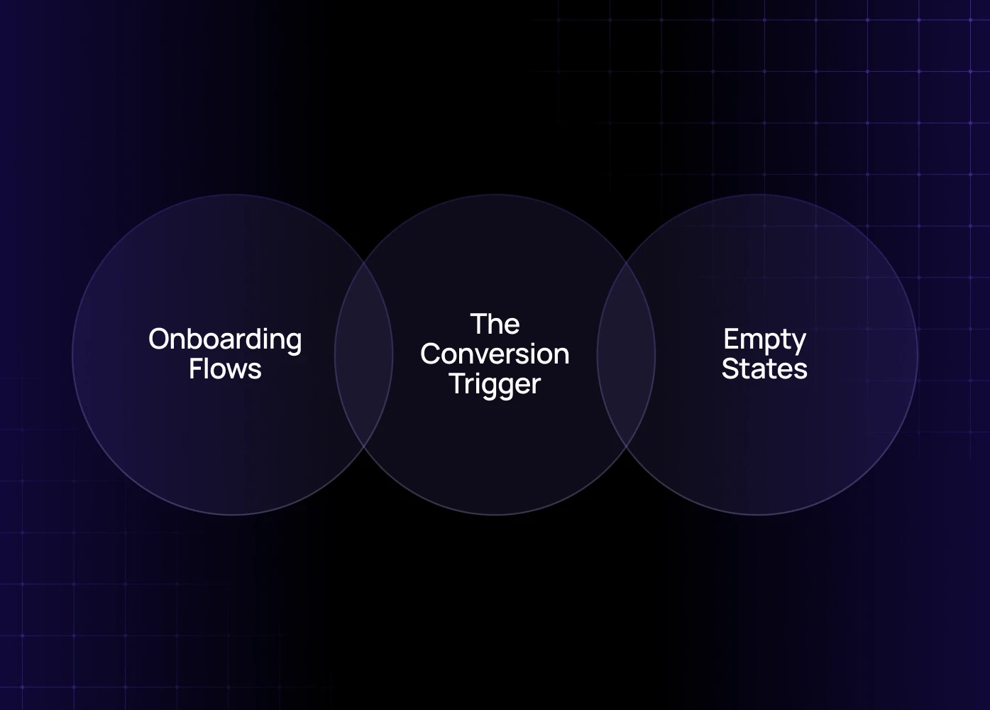
1. Button Copy: The Conversion Trigger (Button Copy UX)
Buttons represent commitment. Your button copy UX should tell the user what they get — not just what they do, and studying product page design examples shows how high-converting products frame these micro-decisions across the full page context.
Context | Weak Button Copy | Strong Button Copy | Reasoning |
Checkout | Submit | Pay Securely | Highlights benefit (security) and lowers perceived risk. |
Form Completion | Next | Review & Launch | Manages expectation; tells user the next screen is a review. |
Account Creation | Sign Up | Get Started Free | Focuses on the immediate benefit, addressing the common SaaS microcopy barrier of cost. |
2. Onboarding Flows: Reducing Day 0 Friction (Onboarding UX Copy)
Effective onboarding UX copy guides users through setup without overwhelming them — but language alone isn't enough if the underlying flow has structural drop-off points. Reducing onboarding abandonment in SaaS covers the UX-level fixes that give your copy the right context to actually work.
Avoid: "Step 3/5: Configure Settings"
Use: "Unlock full team visibility. You're almost done!" (Focus on the benefit of completing the step).
Use tooltips and contextual hints only when necessary, keeping them brief. Remember, this is one of the most critical parts of your product UX writing strategy to drive initial adoption.
3. Empty States: Turning Confusion into Guidance (Empty States Writing)
Empty states writing refers to the messages displayed when a screen has no content (e.g., an empty inbox, a new analytics dashboard). These are opportunities, not failures.
Context | Problematic Empty State | Effective Empty State |
Analytics Dashboard | No Data Found. | Get started by connecting your first campaign. We'll show you performance metrics here. |
Search Results | 0 Results. | We couldn't find "sales funnel." Try searching for "sales report" or [View All Reports]. |
An effective empty states writing message gives context, explains why the screen is empty, and provides a clear next action — the same principles that make SaaS signup microcopy effective: every word either reduces hesitation or adds to it.
Avoiding Common UX Writing Mistakes
Even experienced teams make small, high-impact UX writing mistakes — and these rarely exist in isolation. Common product UX errors that hurt activation shows how language issues compound with structural UX problems to create the drop-offs most teams misdiagnose as design failures:
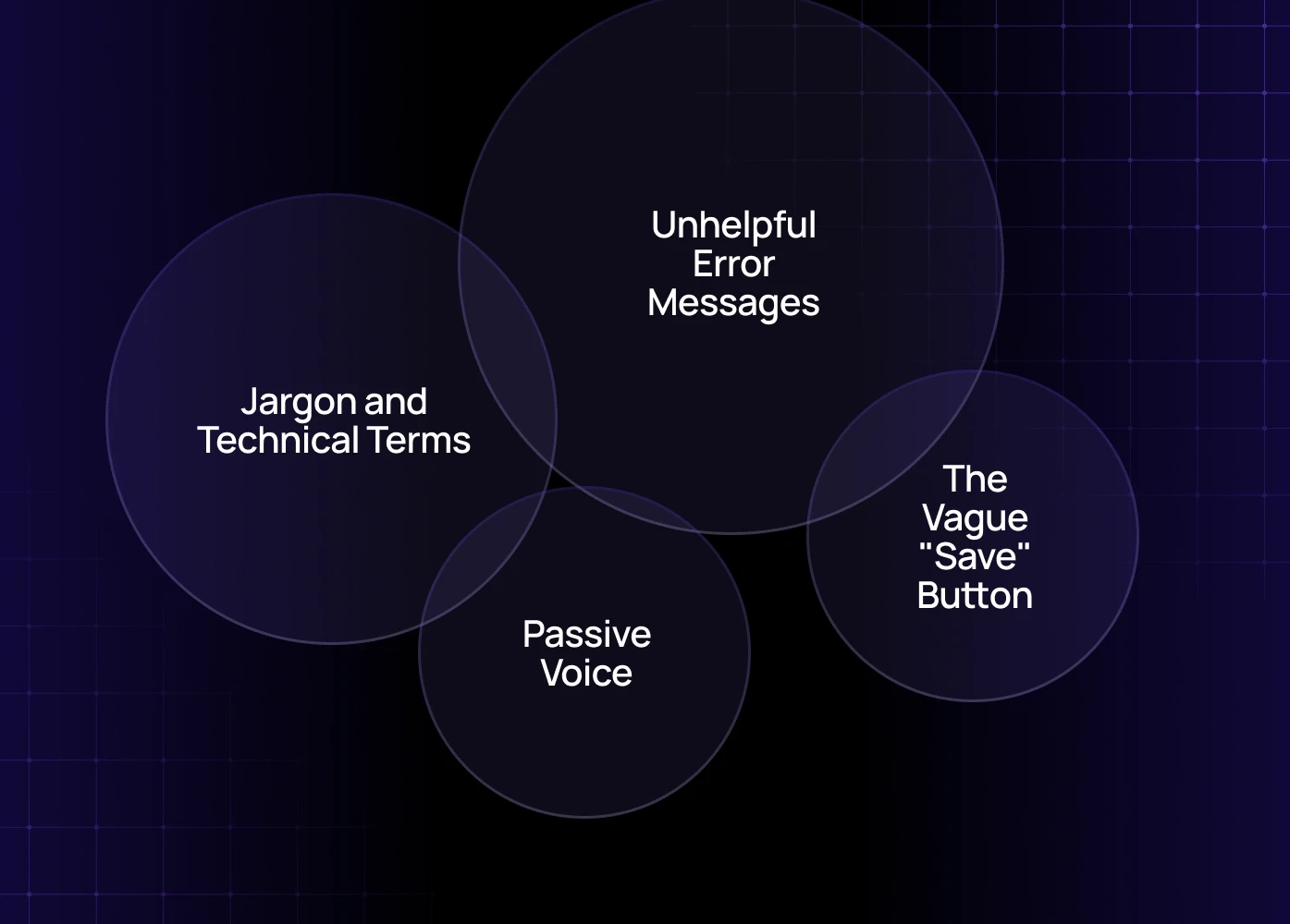
Jargon and Technical Terms: Never use internal company language or technical terms like "Syncing" or "Schema Update." Use plain language: "Updating Data" or "Your changes are being saved."
Passive Voice: Passive voice is confusing and longer. Instead of "The dashboard can now be edited by you," use "You can now edit the dashboard."
The Vague "Save" Button: Simply saying "Save" doesn't give context. If the action has a major consequence, include it: "Save & Publish," "Save Draft," or "Save Changes (Applies immediately)."
Unhelpful Error Messages: The worst mistake is a message that provides no actionable path forward (e.g., "Error: 404"). Always explain what happened and what the user can do to fix it.
Building Your Long-Term UX Content Strategy
A UX content strategy is how you maintain consistency and quality as your product scales — and when combined with broader optimization thinking around turning existing traffic into conversions, it becomes one of the highest-ROI moves a SaaS team can make without touching the underlying design.
Create a Content Style Guide: Document the specific UX tone of voice rules (e.g., "We use sentence case for all headings," "We never use exclamation points in error messages").
Establish a Glossary: Define standard terms for product concepts (e.g., Is it a "Client," a "Customer," or a "User"?). This consistency is vital for scaling SaaS microcopy — and it extends to interface components too. UI selection copy on segmented controls must use the same terminology as every other part of the product, or users learn one label in one context and encounter a different one in another.
Integrate Writing into Design: UX writing should happen during the wireframing stage, not after design is complete. This is part of modern UX design services, treating words as a core design element. (Source: The UX Design Institute emphasizes that content strategy must be integrated into the product development lifecycle from the start.)
As your product scales, microcopy must scale too. This is only possible when your UX writing is part of a structured design system. We explain this in our design systems for SaaS products guide.
For a large-scale product, consider partnering with a specialized digital product design agency to audit and define a unified content system.
Conclusion
The quality of your microcopy is a direct reflection of your product's maturity. Clear, concise, and helpful words are the most effective tool you have to improve microcopy for higher conversions and build enduring user trust.
Don't let poor UX writing mistakes turn your powerful product into a confusing user experience. Start with your most frustrating touchpoints—your error states and onboarding UX copy—and optimize the conversation one word at a time.
Ready to Audit Your Product's Conversation?
If your SaaS product is experiencing high drop-off rates on key flows, your content strategy might be the bottleneck.
Book a UX audit with our team to identify high-friction points and refine your product UX writing for immediate conversion gains.


