Your SaaS product's colour choices are making decisions your team never agreed to. The 60–30–10 rule is the framework that fixes that — from dashboard hierarchy to dark mode to WCAG compliance.
The colour rule that quietly controls where your users go next.

Your product has a colour problem — and the users are absorbing the cost of it.
Not just an aesthetic cost. A cognitive one. Every time a user opens your dashboard and gets hit by four competing accent colours, three shades of your brand blue, and a sidebar that fights your main content for visual priority, they spend mental energy resolving that conflict. Energy that should go toward using your product goes toward parsing it instead.
The 60–30–10 rule is one of the oldest and most reliable frameworks in visual design principles — borrowed from interior design, applied to print, adopted in digital, and debated in every design review from here to Silicon Valley. Most content about it stops at the definition. This guide goes further: how to apply it to a real SaaS product, how to scale it across light and dark modes, when to deliberately break it, and what it actually does for your activation and retention numbers.
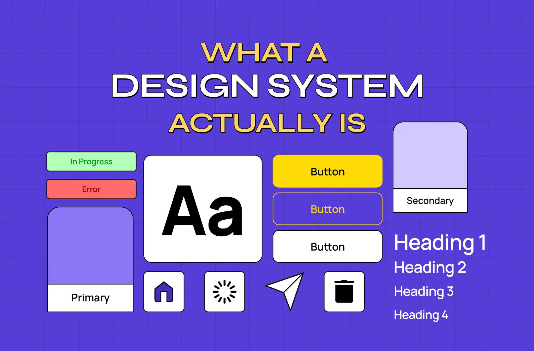
What the 60–30–10 Rule Actually Is
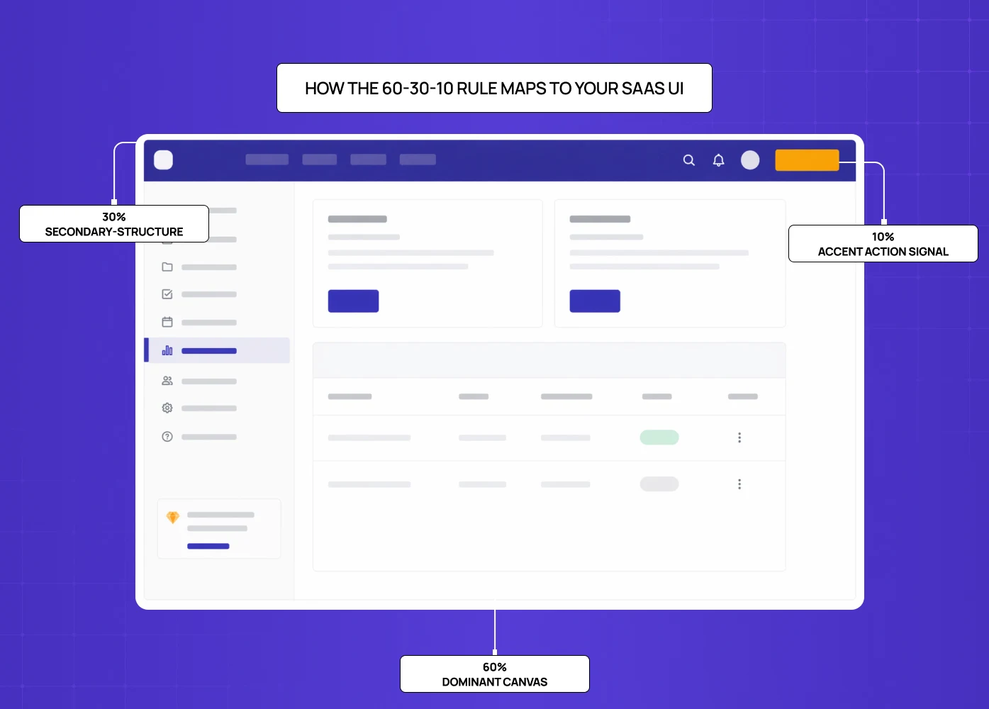
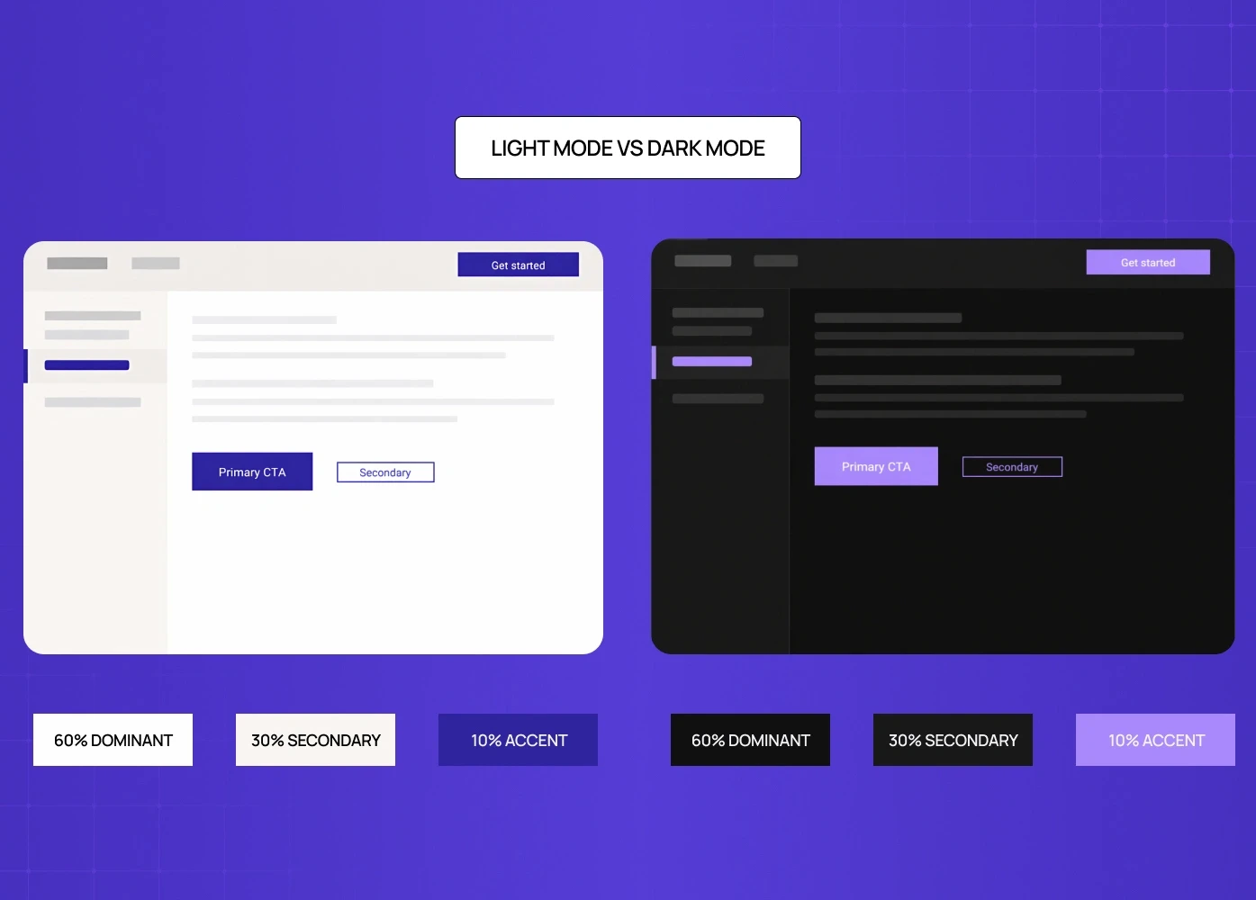
The rule divides any visual composition into three proportional zones: 60% dominant, 30% secondary, 20% accent. The numbers aren't magic — they're a tested ratio that creates visual balance without monotony, and like most design principles, their value lies in what following them prevents rather than what they prescribe.
The rule originated in interior design, where it was used to govern room colour: 60% walls, 30% furniture and upholstery, 10% accessories and accents. It entered graphic design through print layout and advertising, then migrated into UI and UX as screens became the dominant medium.
In a SaaS product UI, the three zones map onto:
The dominant (60%)
This is your background layer — the canvas everything else sits on. For most SaaS products, this is white, off-white, or a very light neutral. In dark mode, it's a dark neutral, not pure black. This colour sets the visual temperature of the entire product and should be the most restful of the three.
The secondary (30%)
This is your structure layer — navigation, sidebars, card surfaces, secondary containers. This colour creates the internal hierarchy of the interface, separating interactive zones from content zones without shouting about it. It should be clearly different from the dominant but not competing with it.
The accent (10%)
This is your signal layer — primary CTAs, active states, alerts, progress indicators, the elements that need to pull user attention. This is typically where your brand colour lives, and it's the most important call: if you use your brand colour as your dominant or secondary, you've spent all your attention budget before a user has even looked for the button they need to click.
That last point is the one most SaaS product teams get wrong, and it's the one that matters most.
Why SaaS Products Get This Wrong (And What It Costs)
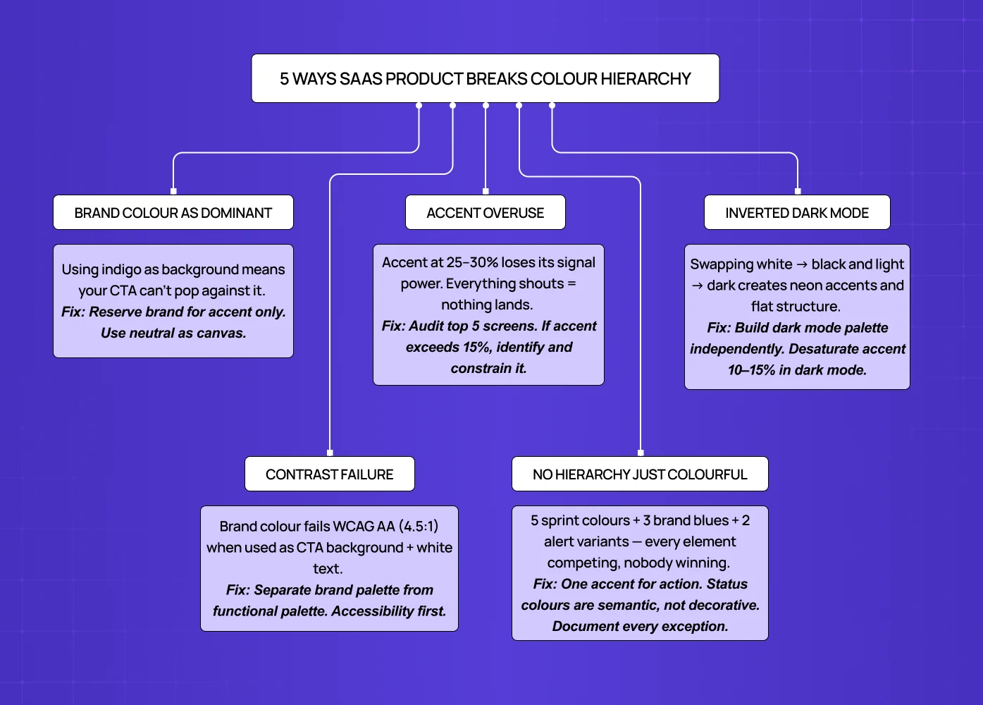
The typical failure mode isn't ignoring the 60–30–10 rule. It's violating it by default, without a framework to point to.
Brand colour bleeds into backgrounds because the marketing team built the product landing page— where SaaS branding logic governs — and the product team inherited the palette without questioning the proportions.
Five states — default, hover, active, disabled, error — each get their own colour because no one established a hierarchy. The dashboard gets built feature by feature and ends up with four different accent colours from four different sprints.
The result is an interface where every element is competing for attention equally — which is cognitively equivalent to no hierarchy at all, and directly contradicts the perceptual principles behind colour hierarchy that govern how the brain separates figure from ground and assigns visual priority before conscious thought kicks in. Users can't identify the primary action on a screen without scanning the entire page. Support tickets accumulate around UI confusion. Activation metrics plateau.
Measuring the cost of this is difficult, but the pattern is consistent: when UX teams audit SaaS products with poor colour hierarchy and fix it, first-session task completion rates improve. The mechanism is attention direction — a well-applied 60–30–10 ratio guides the eye to the next action in the intended sequence.
How to Apply the 60–30–10 Rule to Your SaaS Product
Step 1: Identify Your Dominant (60%)
Start by asking: what occupies the majority of the screen real estate in your core use case? For most SaaS products, it's a content canvas — the area where the actual work happens. Document editor, spreadsheet, dashboard body, feed.
This surface should be your neutral. White (#FFFFFF), off-white (#FAFAFA, #F8F9FA), or for warmer products, a very light warm neutral (#FAF7F4 works well). In dark mode, this is typically a very dark charcoal — #1A1A1A or #0F0F0F — not pure black, which creates too much contrast at scale. The choice here also anchors which types of color palettes work for the secondary and accent tiers — whether you're building analogous, complementary, or neutrals-only.
The mistake: using your brand colour (even a very light tint of it) as the dominant. If your brand is indigo, an indigo-tinted background doesn't create a calm canvas — it creates a continuous low-level saturation signal that makes your accent indistinguishable.
Step 2: Define Your Secondary (30%)
Your secondary colour structures the navigation, sidebar, modals, card backgrounds, and container surfaces. It creates the visual "rooms" inside your product — areas the user can understand as distinct without reading a label.
The simplest starting point is to treat the secondary zone as a monochromatic color scheme in miniature — pulling the 30% colour from the same hue family as the dominant but stepped down in lightness: light gray #E8E8E8 against a white dominant, or a slightly more saturated cool gray against a warm neutral. In dark mode, a lighter shade of your dominant — #2A2A2A or #242424 — works well as a secondary for exactly the same reason.
The mistake: making the secondary so close to the dominant that it disappears (invisible structure) or so distinct that it competes with your accent (lost hierarchy).
Step 3: Choose Your Accent (10%)
This is where most of the brand and functional energy lives. Your accent drives primary CTAs, active navigation states, selected tabs, progress bars, key data callouts, and primary alerts.
Most SaaS products should have one primary accent colour with functional variants — a destructive red for errors, a success green for confirmations — but only one colour that drives primary action; teams needing more expressive range without losing hierarchy often find the split complementary contrast model a disciplined way to extend beyond a single accent. If you're using three different colours for three types of primary CTA because "they're different features," you've created visual noise at the point where you need clarity most.
The 10% constraint is more important than it sounds. When an accent colour occupies 10% of a screen, it pops. At 20%, it starts to feel aggressive. At 30%, it competes with your secondary. Audit your current screens: what percentage of each screen is your primary brand colour? If it's above 15%, you have an accent saturation problem.
Step 4: Measure What You've Built
Most teams apply these proportions intuitively and inconsistently. Figma has coverage plugins (Dominant Color, Color Blind) that let you measure approximate percentage distribution of colours across any frame. Running this on your five most-used screens will give you an honest read of where you actually are versus where you think you are.
You don't need pixel-perfect 60/30/10 on every screen. A range of 55–65% dominant, 25–35% secondary, 8–15% accent is functionally equivalent. What matters is consistency across screens, creating visual unity that lets users develop a reliable visual model of where to look for different types of information.
Applying the 60–30–10 Rule Across Light and Dark Modes
Dark mode is where the rule most commonly breaks down — and it breaks down in a specific, predictable way.
The mistake is treating dark mode as an inversion: swap your white for black, your light gray for dark gray, your accent stays the same.
This creates two problems:
First, pure white reversed to pure black produces extreme contrast that's fatiguing for extended use.
Second, the accent colour that worked on a light background often appears neon or harsh on a dark background — the perceived saturation changes because the surrounding value has changed.
Dark mode requires its own 60–30–10 palette, not an inverted one.
For dark mode:
The dominant should be a dark neutral in the #111–
#1E1E1Erange — dark enough to feel "dark" but not so dark that it flattens.The secondary can move to
#242424–#2E2E2E, creating visible separation from the dominant.The accent is the most sensitive choice: vibrant brand colours often need to be desaturated 10–15% in dark mode to avoid the "neon" effect.
A brand blue that works at full saturation on white (#2E27A0) might need to shift to a slightly lighter, slightly less saturated version (#4840C0) in dark mode to maintain the same perceived weight.
A well-structured design system for SaaS products makes this manageable — rather than hardcoding hex values in components, define semantic tokens: color-surface-primary, color-surface-secondary, color-interactive-primary. Each token has a light-mode and dark-mode value. The 60–30–10 proportions remain constant; the specific hex values change per mode. This is how Figma, Linear, and GitHub handle it — and it's why their dark modes feel like a coherent design decision rather than an afterthought.
Accessibility Constraints: Where the 60–30–10 Rule Meets WCAG
The most underexplored tension in applying the 60–30–10 rule is the accessibility requirement. WCAG AA requires 4.5:1 contrast ratio for normal text, 3:1 for large text and UI components.
This creates a direct conflict for many products: the brand accent colour you want to use at 10% may not meet contrast requirements against your 60% dominant.
This happens constantly with pastel and mid-range brand colours. A purple that's your brand identity may work beautifully at 10% on a white background — right up until you put 14px white text on it and check the contrast ratio.
The resolution:
Separate brand colours from functional colours.
Your accent in the 60–30–10 framework is a functional colour — it drives CTAs, active states, alerts.
Brand colours — and the broader brand experience design decisions behind them — inform the palette, but the functional token should be the accessible version of the brand colour, even if that means a slightly darker or more saturated shade.
Example:
Google's Material Design 3 and IBM's Carbon design system both codify this distinction. They define "on-primary" and "on-secondary" tokens explicitly — the text colour that must be used on top of each surface, and therefore implicitly test whether the surface colour can carry text at all.
One practical rule: never use a brand colour as a CTA background before running it through a contrast checker with the intended text colour on top. The 8% of men with colour deficiency and the users in bright-sunlight environments will thank you.
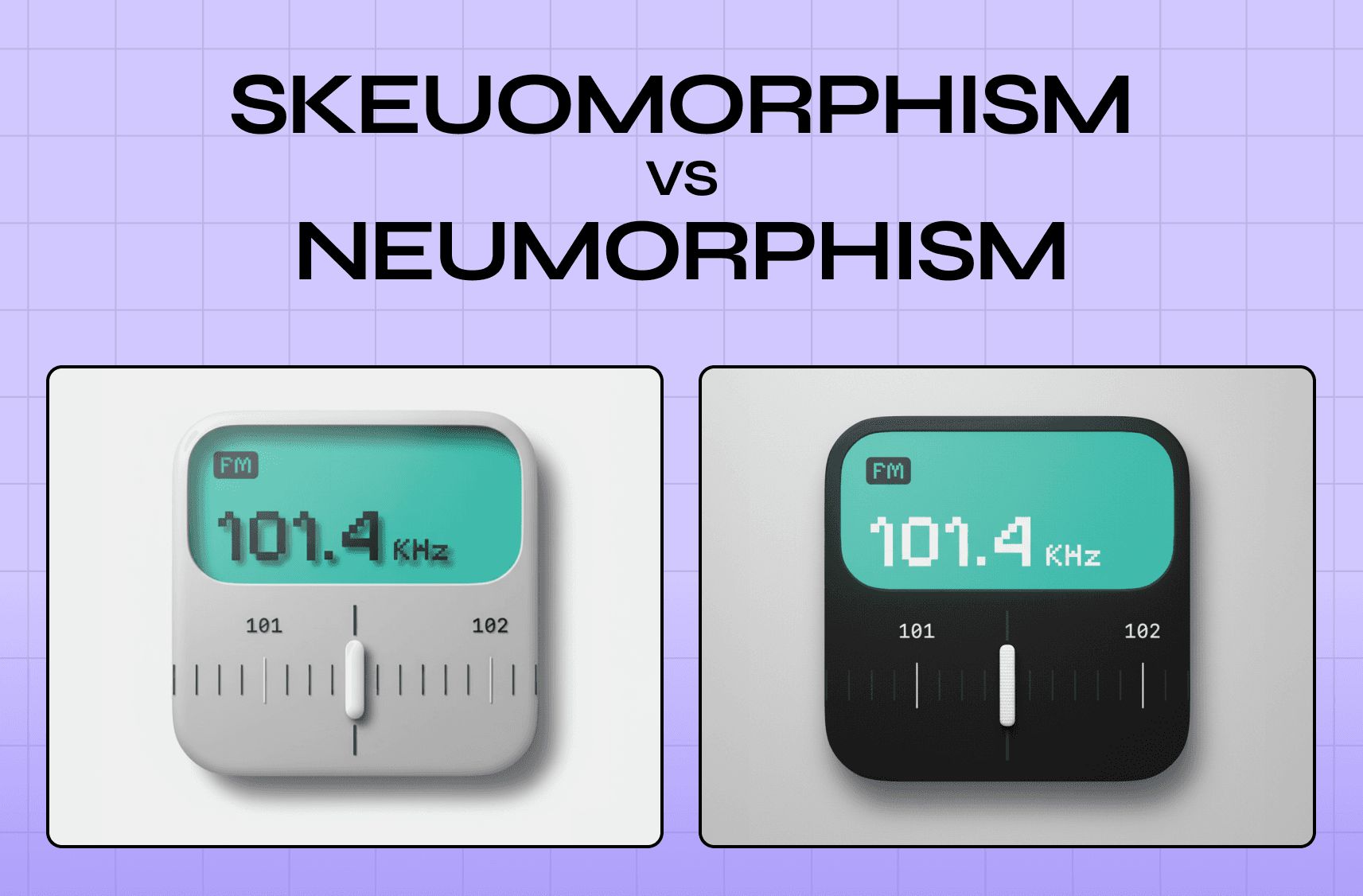
When to Break the 60–30–10 Rule
The rule is a default, not a law. Three situations justify intentional deviation.
Data-dense dashboards
Analytics products, BI tools, and monitoring platforms often need five or more distinct data colours — not for aesthetics, but for categorical differentiation (red line vs. blue line vs. green line in a multi-series chart). The solution isn't abandoning hierarchy; it's creating a localised exception.
The chart component is treated as a contained system with its own palette, while the surrounding UI (chrome, navigation, CTAs) maintains the 60–30–10 framework.
Data colours operate within the chart; they don't leak into the navigation or surface colour logic.
Multi-tenant SaaS with client branding
If you're building a white-label product or one that accepts client colour configuration, you cannot enforce a single 60–30–10 palette across all tenants.
The framework should be applied at the token level — clients configure their accent colour, and the system applies it to the functional token.
The proportions remain stable even when the specific colours change.
Intentional design directions
Design styles like skeuomorphism and neumorphism, alongside neobrutalism and high-contrast editorial design, and certain marketing contexts deliberately use colour at non-standard proportions for expressive effect.
This is valid in marketing sites and campaign-specific landing pages.
In product UIs, where the user spends extended time, expressive colour at high proportions typically trades off cognitive ease for visual interest — a trade most SaaS products shouldn't make.
The framework for deviation: follow 60–30–10 by default, deviate with a specific reason, document the exception in your design system — this is what separates a rule from a design philosophy that actually scales products.
Real SaaS Products and How They Apply the Rule
Looking at how established B2B SaaS products use the rule in practice — alongside broader website design examples across sectors — is more instructive than any abstract example.
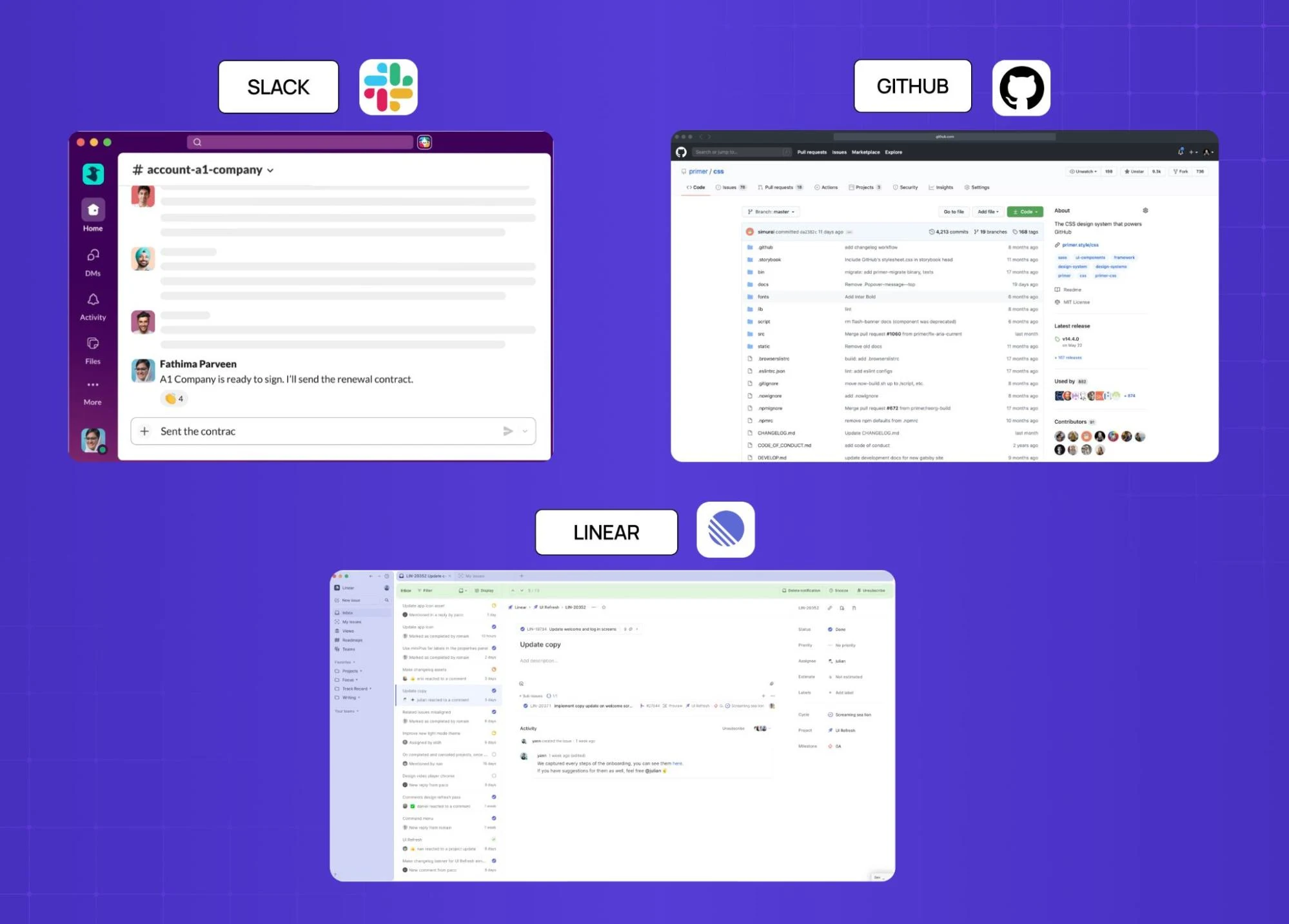
Slack
Slack’s web client uses a white canvas (60%) for the message area, a deep aubergine/dark purple navigation sidebar (30%), and a much smaller set of blue interactive elements and green online indicators (10%). The aubergine doesn't fight the white — it's dark enough to read as structural — and the accent colours are reserved almost entirely for active states and notifications.
GitHub
It uses a very light gray as its dominant (#F6F8FA), white card surfaces as secondary, and blue exclusively for interactive elements (links, buttons, selected states). The result is a dense information environment — code, metadata, comments — that remains navigable because the colour hierarchy directs the eye to what's actionable versus what's content.
Linear
It is a project management tool popular with technical teams, uses a near-black dominant in dark mode, a slightly lighter sidebar structure, and a very restrained use of accent colour — primarily purple, used only for selected states and the single primary CTA. The rest of the interface uses semantic colours (red for overdue, green for done) that function as status signals, not decorative accents.
None of these products hit exactly 60/30/10 in every screen measurement. But all of them have a clear dominant, a clear secondary, and a disciplined accent — which is what the rule is actually asking for.
The 60–30–10 Checklist for SaaS Product Teams
Run this before any major UI build or design system overhaul.
First, confirm your dominant colour is a true neutral — not a tinted brand colour, not a colour that will tire the eye at extended exposure.
Second, confirm your secondary colour creates visible structure without competing with your accent — if you squint at a key screen and the sidebar fights the primary CTA for attention, the secondary is too saturated.
Third, confirm your accent colour passes WCAG AA contrast requirements against both the dominant and secondary surfaces where it appears.
Fourth, confirm your accent is used for one type of action — if primary actions, secondary actions, and alerts all use different brand colours, you don't have a hierarchy, you have a rainbow.
Fifth, confirm your dark mode palette is built independently, not inverted from your light mode.
Sixth, audit your top five screens for percentage coverage using a Figma plugin or manual estimation — if your accent exceeds 15% on any screen, identify what's pulling it up and apply the constraint.
Conclusion: Colour Hierarchy Is a Product Decision, Not a Design Preference
The 60–30–10 rule isn't aesthetic theory for aesthetics' sake. It's a framework for directing user attention in complex interfaces — and in a SaaS product where users make dozens of navigation decisions per session, that direction compounds.
The founders and PMs who treat colour as a brand question rather than a product question end up with activation problems they can't attribute. The ones who ground it in digital product design principles — where should the eye go, in what sequence, on every screen — build products that are demonstrably easier to use without a tutorial.
At Groto, we audit SaaS product UIs — including those undergoing a company rebrand — against exactly this kind of framework: not to make them prettier, but to identify where visual hierarchy is breaking user flow and where a calibrated fix will recover activation or reduce support load.
Book a discovery call → We'll assess your current colour hierarchy and tell you exactly what it's costing you.