

Most products don't fail because of bad ideas — they fail because no one tested them against real users. Here's everything you need to run UX testing that actually changes how you design.
Stop building on assumptions. Learn how to test what users actually need.

Good products don't happen by accident. They're shaped by understanding how real people actually use them — where they get confused, where they drop off, and what makes them stay. That's exactly what UX testing is built for.
Whether you're launching a new feature or working through a structured UX audit of an existing product, the right usability testing method can be the difference between a product people love and one they quietly abandon.
What Is UX Testing?
UX testing is the process of evaluating how real users interact with a product, interface, or prototype. The goal is to surface friction, validate design decisions, and uncover what's working before it becomes expensive to fix.
It's not just a QA step at the end of a project. Done right, user testing is a continuous loop embedded across every phase of the UX design process — from early wireframes all the way through post-launch iterations.
At Groto, this mindset is embedded in every project. When redesigning Nicotex Begin's mobile app, the team didn't just polish the UI — they interrogated the existing flows to understand exactly where users were dropping off in the onboarding journey. That kind of testing-informed design led to measurable improvements in sign-ups and retention.
Why UX Testing Matters: The ROI Case
The business case for UX testing is unusually well-documented for a design practice.
According to Forrester Research, every $1 invested in UX returns $100 — making it one of the highest-ROI investments a product team can make. The cost argument is equally stark: fixing a usability issue during the design phase costs roughly $1. The same fix in production costs up to 100x more — and calculating the ROI of UX design across the full product lifecycle makes this case in measurable terms.
The implication is clear. UX testing isn't a budget line — it's a cost-avoidance strategy. And the teams that treat it as a continuous practice, rather than a one-time gate, are the ones that ship products users actually stay with.
Quantitative vs. Qualitative UX Testing
Before choosing a method, it helps to understand the two fundamental types of data UX research produces — because most methods lean toward one or the other, and both sit within the broader landscape of UX design methodologies that frame how teams approach research and build.
Qualitative UX Testing
Qualitative testing focuses on the why. It captures behavior, emotions, and reasoning through direct observation. Session recordings, think-aloud protocols, and user interviews are all qualitative in nature. The data is rich but harder to scale.
Best for: understanding confusion, uncovering pain points, exploring motivations.
Output: observations, patterns, user quotes, behavioral insights.For a structured reference on what UX research methods to use and when, the full breakdown covers qualitative approaches across every stage.
Quantitative UX Testing
Quantitative testing focuses on the what. It collects measurable data — task completion rates, time on task, click-through rates, drop-off percentages — through analytics tools and structured testing. It scales well but doesn't explain the reasoning behind numbers.
Best for: validating hypotheses, measuring performance, comparing design versions.
Output: metrics, percentages, statistical comparisons.
Neither approach is complete on its own. The strongest ui/ux testing strategies combine both — qualitative methods to understand the problem, quantitative methods to measure the impact of the solution.
Benefits of UX Testing
Testing isn't just about finding what's broken. Done consistently, it creates compounding value across the entire product lifecycle:
Reduces risk before launch — identifying usability issues at the design stage costs significantly less than fixing them post-release. (IBM research found that fixing a usability issue post-launch costs up to 100x more than catching it during the design phase.)
Grounds decisions in evidence — removes guesswork from design choices and aligns teams around what users actually need.
Improves conversion and retention — products that are intuitive and frictionless keep users coming back, while the UI/UX mistakes that hurt conversions are often exactly what usability testing surfaces first.
Surfaces unexpected behavior — users often interact with products in ways designers don't anticipate; testing reveals these gaps early, before they compound into bad UX design patterns that are harder to fix.
Saves development time — catching navigation or flow issues in prototypes avoids costly rebuilds in code.
Builds cross-team alignment — watching real users struggle with a flow is far more persuasive than a design recommendation in a slide deck.
Supports continuous improvement — regular usability testing creates a feedback loop that keeps the product evolving with its users.
Moderated vs. Unmoderated — and Remote vs. In-Person
Before choosing a testing method, two structural decisions need to be made.
Moderated vs. Unmoderated
Moderated testing involves a facilitator — typically a UX researcher — guiding participants through tasks, asking follow-up questions, and probing for reasoning. It yields richer qualitative data.
Unmoderated testing lets participants complete tasks independently, without guidance. It's faster, scales better, and captures more natural behavior.
Remote vs. In-Person
Remote testing expands your participant pool geographically and is often more cost-efficient. Tools like Maze, Lyssna, and Lookback make it easy to run at scale — they sit within a broader UX design toolset worth mapping if you're building out a full research and design stack.
In-person testing offers greater control and is better suited for sessions that involve physical prototypes or require close observation.
Neither combination is universally superior. Your choice should follow your research objective, timeline, and the stage of the product.
6 UX Testing Methods — and When to Use Each
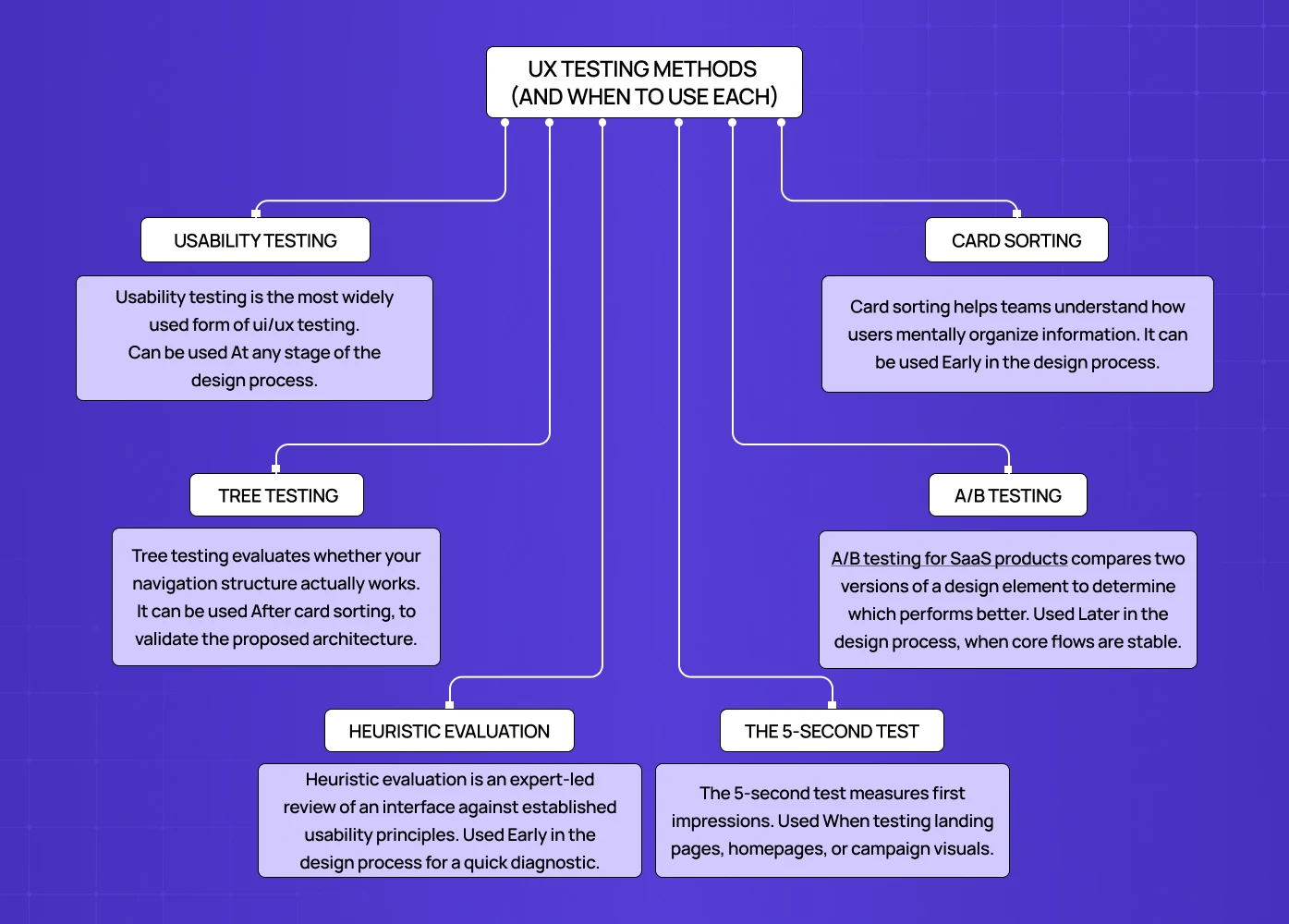
1. Usability Testing
Usability testing is the most widely used form of ui/ux testing — applied across static mockups, interactive UX prototypes, and live products alike. Participants are asked to complete realistic tasks while a researcher observes — noting where they hesitate, where they fail, and what they say while doing it.
When to use it:
At any stage of the design process.
When you need to validate whether an interface is intuitive.
When navigation or task flows feel uncertain.
How it works:
Define specific tasks tied to your product's core user goals.
Prepare a test script for consistency across sessions.
Encourage participants to think aloud as they work.
Record sessions and analyze for recurring pain points.
For the PolicyBazaar project, Groto used flow-level analysis to identify where users were abandoning insurance forms — findings that directly shaped the redesigned experience.
2. Card Sorting
Card sorting helps teams understand how users mentally organize information. Participants sort content or features into groups, revealing the logic behind how they expect things to be structured.
When to use it:
Early in the design process.
When building or restructuring navigation or information architecture.
Before finalizing menu hierarchies or content categories.
How it works:
Open card sorting — participants create their own groupings and label them.
Closed card sorting — participants sort cards into predefined categories.
Patterns across participants reveal how users think about your content.
This method is especially valuable for content-heavy platforms and SaaS products where findability is central to the experience.
3. Tree Testing
Tree testing evaluates whether your navigation structure actually works. Participants are shown a text-based hierarchy of your product — without any visual design — and asked to find specific items within it.
When to use it:
After card sorting, to validate the proposed architecture.
When redesigning navigation on a large website or app.
Before visual design begins, so structural fixes are still inexpensive.
How it works:
Build a simplified tree of your site or app hierarchy.
Give participants goal-based tasks ("Find where to upgrade your plan").
Measure success rates, time on task, and navigation paths.
The absence of visual design during tree testing is intentional — it ensures you're evaluating structure, not aesthetics.
4. A/B Testing
A/B testing for SaaS products compares two versions of a design element to determine which performs better. It's a quantitative usability testing method best suited to optimization, not exploration.
When to use it:
Later in the design process, when core flows are stable.
When testing specific elements: CTAs, headlines, button placement, form layouts.
Post-launch, to continuously improve performance.
How it works:
Define one variable to test — change only that element between versions.
Randomly split users between Version A and Version B.
Measure a defined success metric: click-through rate, completion rate, or conversion.
Run the test long enough for statistical significance.
For Camb.ai, Groto's redesign work involved comparing interface configurations to maximize engagement on the dubbing platform — exactly the kind of decision A/B testing is built to support.
5. Heuristic Evaluation
Heuristic evaluation is an expert-led review of an interface against established usability principles. Rather than involving end users, trained evaluators assess the design for violations of best practices.
When to use it:
Early in the design process for a quick diagnostic.
When user recruitment isn't feasible on a tight timeline.
As a complement to user-led testing, not a replacement for it.
How it works:
Select a heuristics framework — Nielsen Norman's 10 Usability Heuristics is the most widely referenced.
Have one or more evaluators review the interface systematically.
Document violations and assign severity ratings.
Use findings to prioritize design fixes before user testing begins.
Heuristic evaluation is fast, low-cost, and surfaces issues that might otherwise be missed in brief user sessions — making it a useful complement to self-auditing your website before formal testing begins, especially for founders working without a dedicated research team.
6. The 5-Second Test
The 5-second test measures first impressions. Participants view a design for exactly five seconds, then answer questions about what they saw, understood, and remembered.
When to use it:
When testing landing pages, homepages, or campaign visuals.
When clarity of messaging and visual hierarchy is in question.
Early in the design process, before detailed iteration begins.
How it works:
Show participants the design for five seconds — no longer.
Ask: What was the page about? What stood out most? What do you remember?
Analyze whether key messages are landing and what's competing for attention.
Data from UserZoom shows that users who click correctly on their first attempt complete the full task 87% of the time — making first-impression clarity a strong predictor of overall task success.
Popular UX Testing Tools
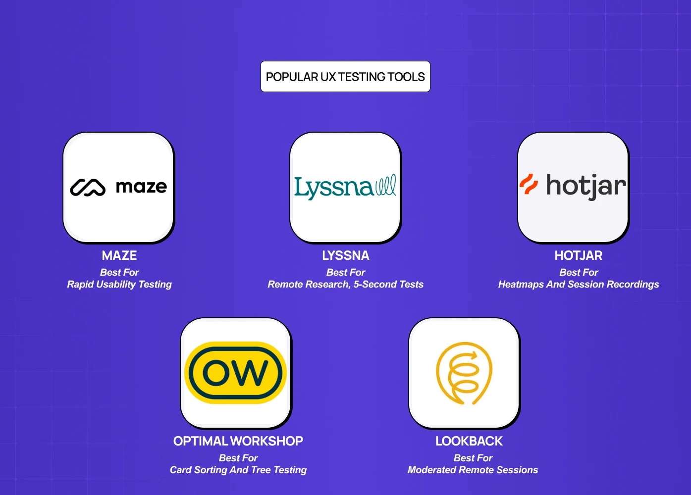
Tool | Best For | Pricing |
Maze | Rapid usability testing and prototype testing | Free plan; paid from $99/month |
Lyssna | Remote research, 5-second tests | Free for short tests; paid from $75/month |
Hotjar | Heatmaps and session recordings | From $32/month |
Optimal Workshop | Card sorting and tree testing | Free plan; paid from $129/user/month |
Lookback | Moderated remote sessions | 60-day trial; paid from $149/month |
Best Practices for Effective UX Testing
Set clear objectives before you start. Know what question you're trying to answer. Testing without a defined goal produces noise, not insight.
Recruit participants who match your actual users. The closer participants are to your real audience, the more reliable your findings.
Test early and test often. Finding an issue at the wireframe or prototype stage costs a fraction of what it costs in development.
Keep sessions focused. Fewer, well-defined tasks yield better data than broad, open-ended sessions.
Combine methods. No single method captures everything. Pair qualitative usability testing with quantitative tools like heatmaps or A/B tests for a fuller picture — and layering in a principles-based UX audit adds the expert diagnostic dimension that neither behavioral data nor user sessions reliably surface on their own.
Close the loop. Test, document findings, make design changes, and test again. The value compounds with each iteration.
4 UX Testing Mistakes That Waste Research Budget
1. Testing too late
Running usability tests on production code that can't be changed without a new sprint is theater, not research. If the team can't act on the findings within the current development cycle, the test timing is wrong.
2. Testing with internal users
Colleagues know the product too well to represent real users. They complete tasks through product knowledge, not interface clarity — which systematically underreports real-world usability failures, one of the UX research fundamentals teams most often get wrong.
3. Asking leading questions
"Was it easy to complete the checkout?" produces confirmation bias. "Walk me through what you just did" produces insight. Task-based protocols consistently outperform opinion-based surveys for identifying actual friction.
4. Testing without defined success metrics
A usability test that produces "users seemed a bit confused on the dashboard" is not actionable. Define what task completion looks like, set a target completion rate before testing, and report against it.
UX Testing for AI Products
Standard usability testing methods don't fully translate to AI-powered products. When an interface includes a chatbot, a recommendation engine, or an AI-generated output, users are evaluating not just usability but trustworthiness — and AI product onboarding UX is where that trust evaluation begins, making it the highest-stakes flow to test before any other AI interaction gets in front of users.
According to Nielsen Norman Group, users abandon AI tools 3x faster when they can't understand model reasoning — making explainability a core testing dimension, not an optional one.
Testing AI product UX requires additional dimensions beyond standard usability:
Trust calibration — Do users trust the AI's output at the right level, neither blindly nor dismissively?
Error and fallback states — How do users behave when the AI is wrong or uncertain?
Explainability — Can users understand why the AI made a specific recommendation, and does that understanding increase adoption?
Step-by-Step: Plan Your First UX Test
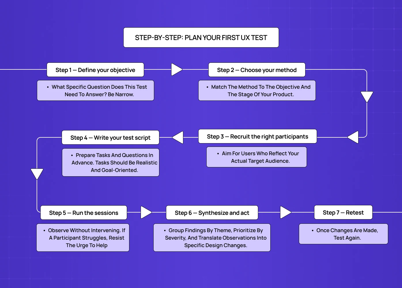
If you're running usability testing for the first time, this sequence will get you started without overcomplicating it.
Step 1 — Define your objective
What specific question does this test need to answer? Be narrow. "Is our checkout flow easy to complete?" is a testable objective. "Is our product good?" is not.
Step 2 — Choose your method
Match the method to the objective and the stage of your product. Early-stage exploration calls for card sorting or qualitative usability testing. A stable post-launch product is better served by A/B testing or heatmap analysis.
Step 3 — Recruit the right participants
Aim for users who reflect your actual target audience. Research from Nielsen Norman Group confirms that five users reveal approximately 85% of a product's usability issues — so you don't need a large panel to get meaningful signal. Use screener questions to filter for fit.
Step 4 — Write your test script
Prepare tasks and questions in advance. Tasks should be realistic and goal-oriented — never leading. Consistency in how you run sessions makes your data comparable across participants.
Step 5 — Run the sessions
Observe without intervening. If a participant struggles, resist the urge to help — that struggle is the data. Encourage thinking aloud and take detailed notes.
Step 6 — Synthesize and act
Group findings by theme, prioritize by severity, and translate observations into specific design changes. Share results with your full team — developers, product managers, and stakeholders — so changes are grounded in shared evidence.
Step 7 — Retest
Once changes are made, test again. A single round of testing tells you what's broken. Repeated rounds tell you whether your fixes actually work — the same logic that underpins sustained UX performance tracking, where the goal isn't a single fix but a standing discipline of measuring and refining the experience over time.
Conclusion
The best UX decisions aren't made on instinct — they're made on evidence. Whether you're validating a navigation structure or optimizing a landing page, the right usability testing method gives you that evidence.
Start testing early — problems found at the wireframe stage cost a fraction of what th in ey cost later.
Match your method to your objective — exploration, assessment, and comparison each call for different approaches.
Combine qualitative and quantitative methods for a complete picture.
Use tools that fit your workflow and your team's capacity.
Treat testing as a continuous practice, not a one-time checkpoint.
The design that ships should reflect what real users actually need — not just what seemed right in a meeting. That user-first, evidence-led loop is exactly what design thinking is built to sustain.


