
A banking app can pass every usability test and still lose users after the first session. The reason is almost never the interface — it's the trust architecture underneath it. Here's the framework that explains why, and what to design instead.
Most banking apps look good. The ones that retain users are built on trust.
Banking apps sit at an unusual intersection: they need to feel effortless to use, yet serious enough to trust with your life savings. Designing for that tension is what separates financial products that retain users from those that lose them after the first session. The apps that navigate it best — Revolut, Monzo, Chime — appear consistently in best app design roundups because they treat trust and usability as complementary goals rather than competing constraints.This blog breaks down why banking app design demands a different mental model entirely — and introduces a structured framework for getting it right.
TL;DR
Banking app design is a trust problem, not a visual problem
Most fintech products fail across five specific trust layers: access, data, action, recovery, and ambient
The Fintech Trust Stack is a framework that maps what to design at each layer and what failure looks like
Neobanks must build trust from zero; established banks must rebuild it without disrupting existing users
Onboarding fails most at KYC framing, account funding timing, and notification permission context
A banking app design partner needs product experience, fintech-specific knowledge, and metric-anchored engagements
Most banking app design guides cover the same checklist: use biometrics, support dark mode, make navigation simple, add transaction confirmations. The guidance is not wrong. It's just insufficient in a way that explains why well-designed-looking fintech products still have 60–70% drop-off rates in onboarding, and why users abandon banking apps after a single bad experience even when the app is technically functional. The full onboarding-to-retention arc that UI/UX design for SaaS products from onboarding to retention maps is the same arc banking products must navigate — with the trust dimension making every stage more consequential.
The problem is that most banking app design advice treats the challenge as a visual or usability problem. It isn't. Banking app design is fundamentally a trust architecture problem. Every design decision in a financial product is either building user trust or spending it. A transfer confirmation screen that creates a half-second of doubt will cost more users than a poorly chosen typeface. An error state that reads like a system message rather than a human explanation will drive more support tickets than a navigation structure that's slightly suboptimal.
The Fintech Trust Stack is a five-layer framework for designing banking apps, a vertical SaaS segment where trust is the primary design requirement — not aesthetics, not feature parity, and not UX consistency. Each layer represents a distinct category of user trust, with specific design requirements and failure modes. For fintech founders and product teams building neobank products, challenger bank apps, and financial SaaS tools, this framework maps out what to design and why at every stage of the product experience.
Why Banking App Design Is Different From Other Product Design
Consumer SaaS products and banking apps share a lot of surface-level UX requirements: clear onboarding, legible dashboards, accessible navigation, responsive feedback — requirements that mobile app UI/UX design trends for 2026 address across product categories. But banking apps differ in a fundamental way that changes almost every design decision within that shared foundation.
In a consumer SaaS product, a design failure costs the user time and frustration — and the complete guide to SaaS UX design covers the foundational principles that apply across both contexts. In a banking app, a design failure costs the user money — or at least creates the possibility that it might. That single difference changes how users read every ambiguous moment in the product. That perception changes how users read ambiguity. Where a SaaS user encountering an unclear UI will click around to figure it out, a banking user encountering an unclear UI will stop and second-guess whether they're about to do something irreversible with their funds.
This changes the design calculus in three specific ways:
Confirmation and reversibility are design requirements, not UX enhancements. Every high-stakes action needs a clear confirmation state, a visible success state, and a recovery path. The user needs to know the action succeeded, the amount was correct, and what happens if they need to undo it. This isn't feedback for the sake of good UX — it's the mechanism through which the product earns the user's willingness to act again.
Visual clarity is a trust signal, not a style preference. A cluttered dashboard isn't just aesthetically suboptimal — it creates doubt about whether the user is reading their balance correctly. Typography legibility, number formatting, and data hierarchy are trust decisions.A balance displayed at insufficient contrast, or transaction amounts that don't immediately parse as credits vs. debits, makes users uncertain about what they're looking at. Uncertainty in a banking context converts to doubt, then to churn. These aren't only usability concerns — they're accessibility requirements with regulatory implications; accessibility-first UX covers the contrast, readability, and interaction standards that banking products must meet by design principle and by compliance obligation.
Onboarding is a trust-building exercise, not just a conversion funnel. In SaaS, onboarding optimisation is typically about reducing friction and getting users to their first value moment faster. In banking apps, onboarding must simultaneously reduce friction and establish trust — and these goals are in tension. The fastest possible onboarding may be too fast to communicate that the product takes security seriously. The trust-building version adds steps but establishes the relationship on different terms.
The Fintech Trust Stack: Five Layers Every Banking App Must Get Right
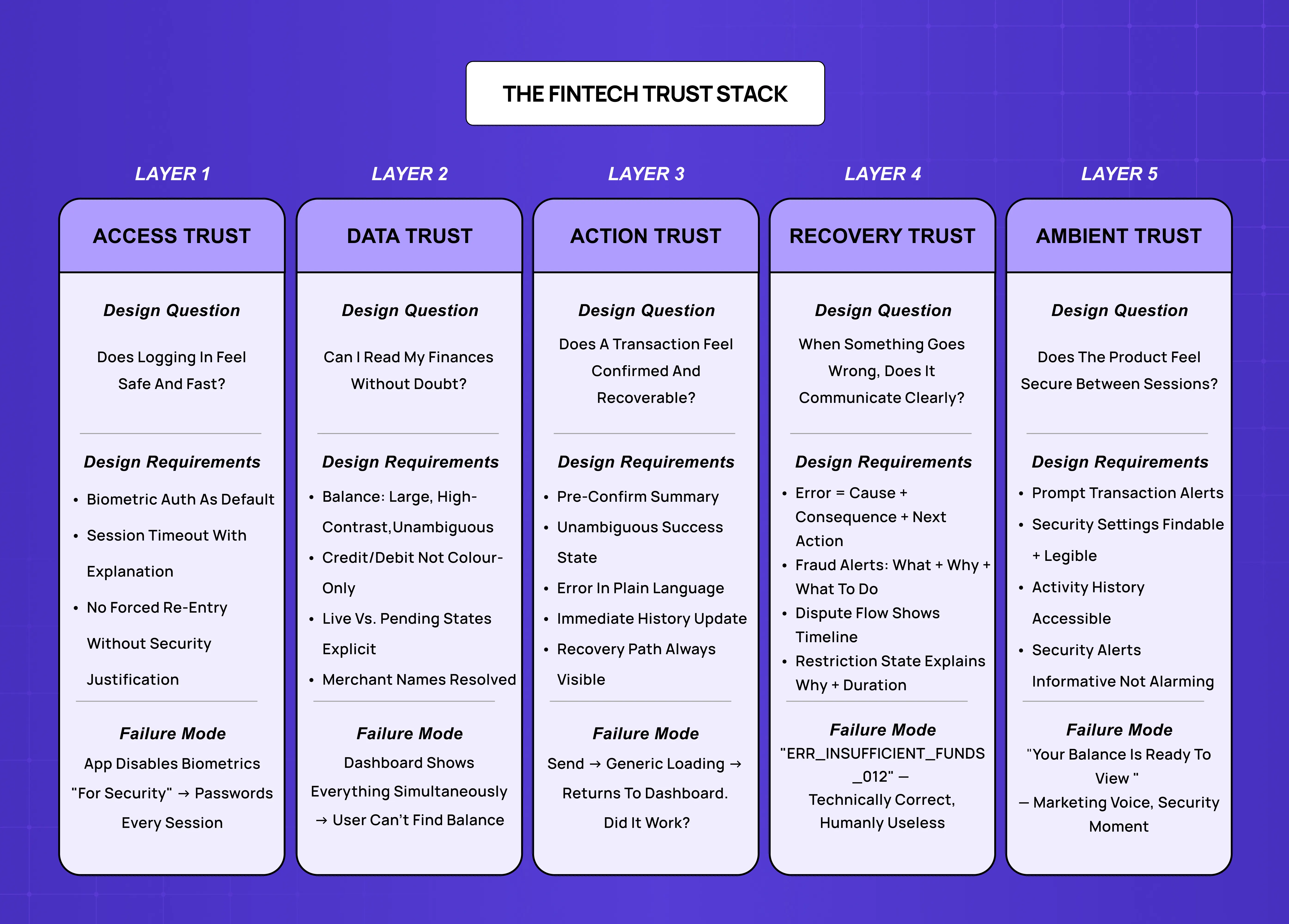
The Fintech Trust Stack maps the five layers of trust that banking app design must address, in sequence. Each layer has a primary design question, specific design requirements, and a failure mode that describes what happens when the layer is poorly executed.
Layer 1: Access Trust
Design question: Does logging in feel safe and fast?
Access trust is built in the first three seconds of every session. The user authenticates, and in that moment the product communicates either "this is secure and smooth" or "this is complicated and uncertain." The two goals — secure and smooth — are what most authentication design gets wrong by treating them as opposites.
Design requirements:
Biometric authentication (Face ID, fingerprint) as the default path, not the optional upgrade
A backup method that is clearly less convenient but equally trustworthy
No forced password re-entry for routine sessions without a security-justified reason
Session timeout handling that explains why it happened rather than dropping the user at a login screen without context
Failure mode: Authentication flows that are either too fast (no security signal, feels insecure) or too slow (unnecessary steps that make users wonder if the product is difficult to use by design). The worst version: apps that disable biometrics for "security reasons" and force password entry for every transaction — the inverse of what users experience makes them more confident.
Layer 2: Data Trust
Design question: Can the user confidently read what's true about their finances?
Data trust is about legibility, accuracy signalling, and the design of financial information. Users looking at a balance, a transaction list, or a spending summary are asking a constant question: is this right? The design job is to answer that question before it becomes doubt.
Design requirements:
Balance figures formatted for instant parse — large, high-contrast, unambiguous
Transaction amounts with clear credit/debit signalling that doesn't rely on colour alone
Transaction merchant names that resolve to something recognisable, not raw processor strings
Data refresh states that communicate currency — the user needs to know if they're looking at a live balance or a 20-minute-old one
Pending vs. settled states that are explicit and consistent
Failure mode: Dashboards that display too much information at once — balance, spending breakdown, upcoming bills, card details, savings progress, investment snapshot, simultaneously. The cognitive load of parsing this in a high-stakes context produces doubt, not insight. More data in a single view does not equal more trust. The information hierarchy principles that prevent this failure are covered in depth in the guide to designing dashboards users actually understand — the same principles apply in banking, with the consequence of getting them wrong being churn rather than confusion.
Layer 3: Action Trust
Design question: Does performing a transaction feel confirmed and recoverable?
Action trust is built through the complete flow of any financial operation: initiating, reviewing, confirming, executing, and receiving feedback. This is where most banking app UX research focuses, and correctly so — it's where the highest-stakes moments of trust are either created or destroyed. Understanding the difference between a user journey and a user flow is useful grounding here — transfer flows, KYC sequences, and dispute paths are each user flows embedded within a broader journey, and that distinction shapes how you design and evaluate them separately.
Design requirements:
A pre-confirmation summary screen that shows all relevant parameters before the irreversible step
A confirmation state that is visually unambiguous — the user should not need to re-read the screen to understand whether the action completed
A success state with just enough information to verify: amount, recipient, time, reference
A clearly accessible transaction history that immediately reflects the completed action
Error states that say what went wrong in human terms, not error codes
Failure mode: "Zero feedback" moments — the user hits Send and the screen freezes, goes blank, or shows a generic loading state with no confirmation. In a banking context, this prompts users to wonder if the transaction went through, attempt to repeat it, and end up with duplicates — followed by a support interaction that costs acquisition economics to fix. The micro UX design patterns that prevent this — outcome-signalling loading states, confirmation animations, and haptic feedback on completion — are among the most underused tools in action trust design.
Layer 4: Recovery Trust
Design question: When something goes wrong, does the product communicate clearly?
Recovery trust is the trust layer built by how a product handles exceptions, errors, and disputes. Most fintech products invest heavily in the happy path and treat error states as edge cases. In banking, errors are not edge cases — failed transactions, declined cards, fraud alerts, and account issues happen to every user eventually. The design of these moments determines whether a user trusts the product more or less after the exception.
Design requirements:
Error messages that explain the cause, state the consequence, and name the next action — in that order
Fraud alert notifications that are clear about what triggered the alert and what the user needs to do
Dispute flows that communicate process and timeline, not just "we're looking into it"
Account restriction states that explain why, for how long, and what the user can and cannot do in the meantime
Failure mode: Error messages written by engineers for engineers. "Transaction failed: ERR_INSUFFICIENT_FUNDS_012" is technically accurate and functionally useless for a user who doesn't know if their card was declined... The failure mode is not the error itself — it's the design communication of the error state. The UX writing guide for improving microcopy covers how error message copy, confirmation language, and recovery CTAs each affect user trust — with banking being the context where every word in an error state carries the highest stakes.
Layer 5: Ambient Trust
Design question: Does the product feel secure between sessions?
Ambient trust is the background confidence a user maintains about the product's security when they're not actively using it. It's built through notification design, security settings accessibility, and the ongoing signals the product sends about account health and activity. As fraud detection models increasingly drive these signals, AI fraud detection UX design becomes part of ambient trust, since users need to understand why an alert fired without being overwhelmed by model internals. This is the most under-designed trust layer in most fintech products — and increasingly, the layer where AI-powered features like spending anomaly detection, fraud pattern recognition, and proactive security nudges are applied. Integrating AI into SaaS UX covers the design approach for these features, where the AI's output needs to be trusted enough to act on — which is exactly the bar ambient trust sets.
Design requirements:
Transaction notifications that arrive promptly and confirm expected activity rather than alarm users about their own spending
Security settings that are findable and legible to non-technical users
An account activity or login history view that users can check when uncertain
Proactive security alerts — new device login, large transfer, password change — that are informative rather than alarming
Failure mode: Notification designs that feel like marketing rather than security signals. Push notifications with "Your balance is ready to view 👀" create the wrong ambient signal — the product is treating a security-relationship touchpoint as an engagement lever. Users calibrate ambient trust partly by how the product communicates between sessions. Marketing-voice security notifications make the whole product feel less serious.
The Most Common Banking App Design Failures (and Which Trust Layer They Break)
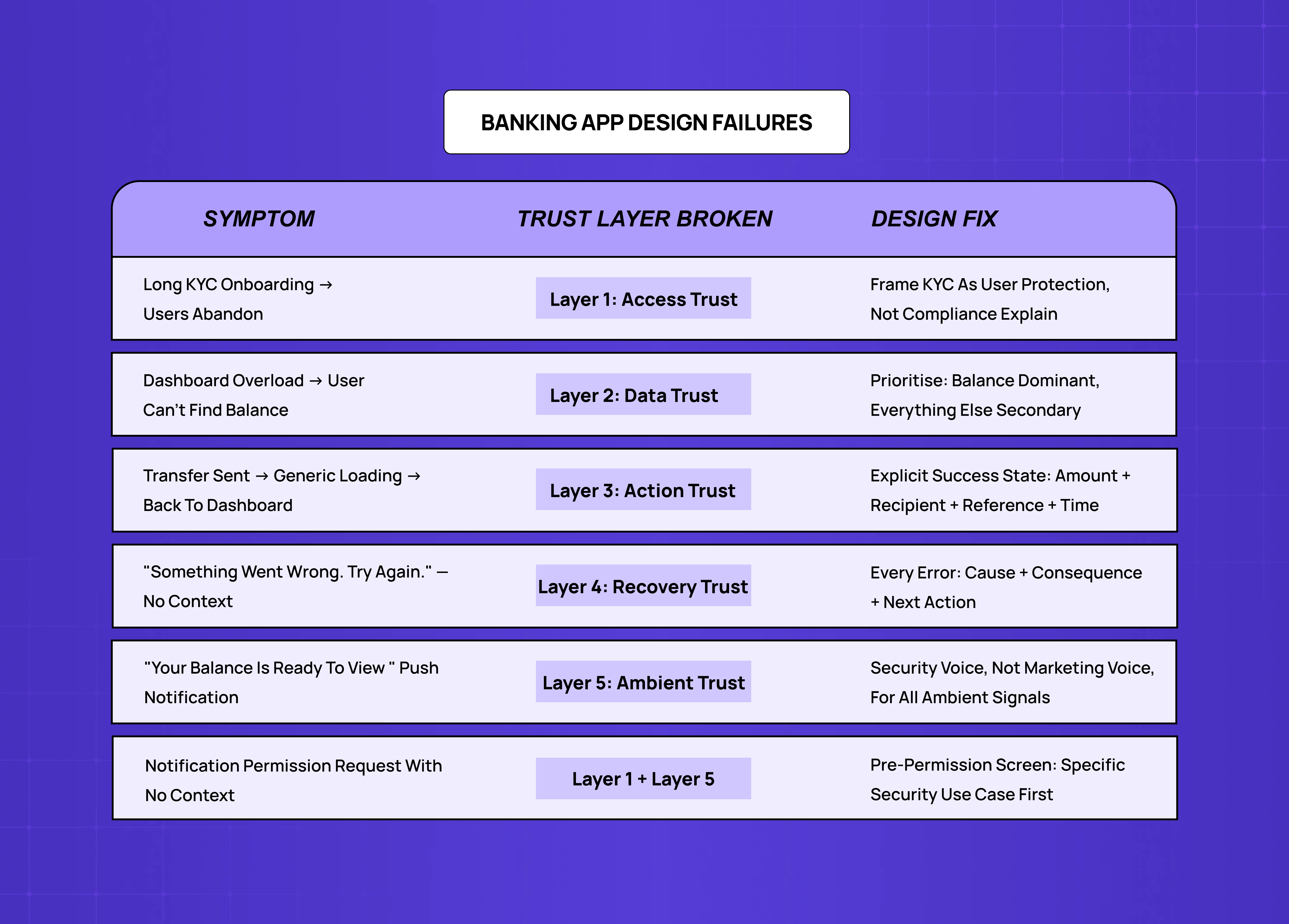
Understanding the Fintech Trust Stack makes it possible to diagnose banking app design failures by the specific trust layer they damage — and many of these patterns appear in the broader set of UI/UX mistakes that hurt conversions, with the stakes in a banking context making each one significantly more costly to user retention and acquisition economics.
Long, complicated onboarding flows — breaks Layer 1 (Access Trust). An 18-screen KYC flow with unclear progress indicators and no explanation of why each piece of information is needed signals either low design investment or disregard for the user's time — neither of which builds access trust.
Balance dashboards that show everything at once — breaks Layer 2 (Data Trust). Data trust requires prioritisation: what does the user need to be certain about right now, and how do we make that number impossible to misread?
Transaction confirmations without clear success states — breaks Layer 3 (Action Trust). The transfer button triggers a loading state, then returns the user to the dashboard with no explicit confirmation. Technically it worked. From the user's perspective, they don't know if it did. This is the most common cause of duplicate transfer support tickets in fintech products.
Generic error messages — breaks Layer 4 (Recovery Trust). "Something went wrong. Please try again." is the error message equivalent of a shrug. In a banking context, users receiving this message do not try again — they stop trusting the product and open a support ticket or abandon the action entirely.
Marketing-voice push notifications — breaks Layer 5 (Ambient Trust). Every push notification is either reinforcing the user's sense that the product is vigilant and reliable, or eroding it.
Banking App Design for Neobanks vs. Established Banks
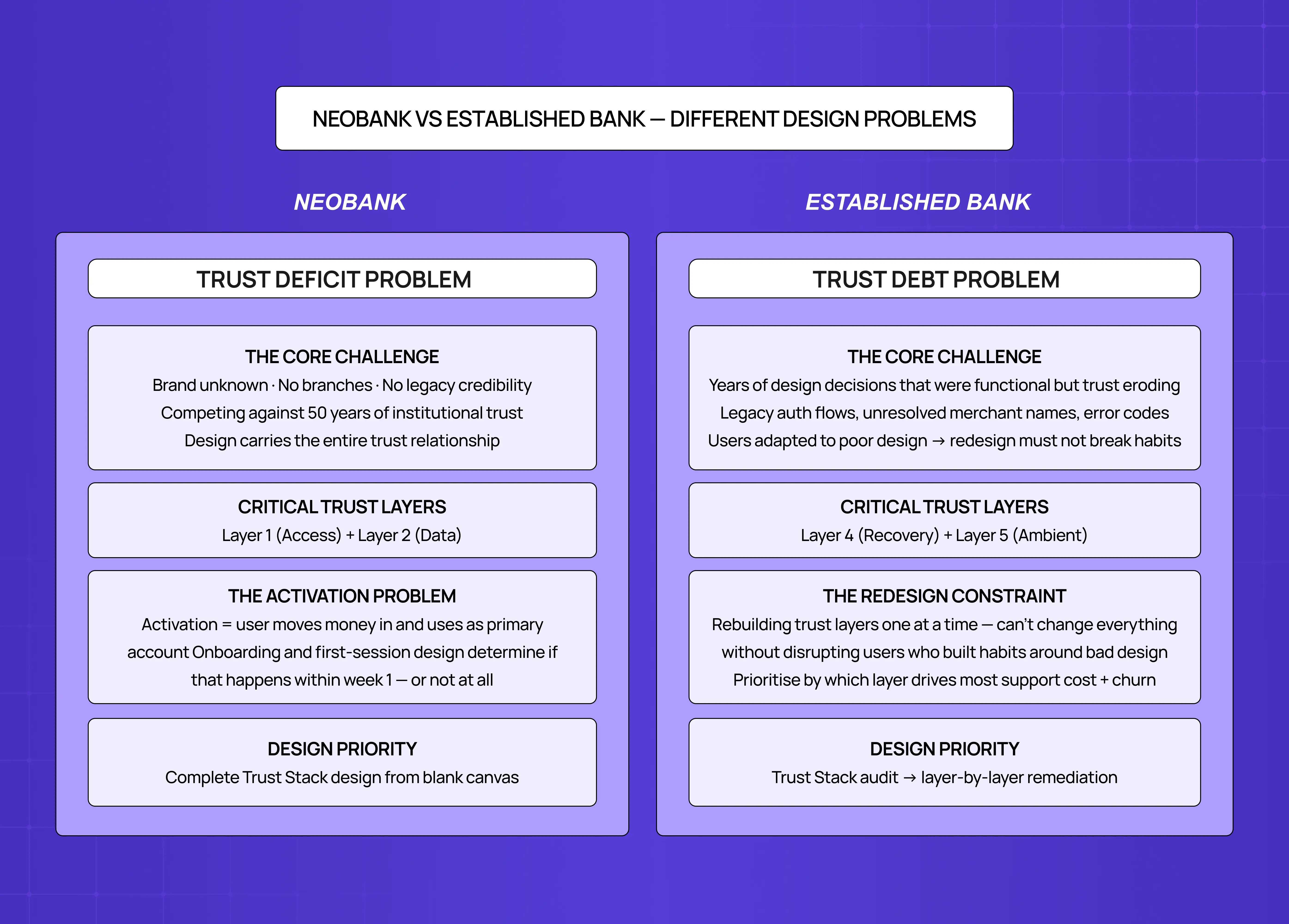
The Fintech Trust Stack applies to both neobanks building from scratch and established banks redesigning legacy mobile products — but the dominant challenge is different.
Aspects | Neobanks & Fintech Challengers | Established Banks & Legacy Redesigns |
Core design problem | Trust deficit at launch | Trust debt from years of poor design decisions |
Brand credibility | None — must be built entirely through design | Decades of accumulated credibility, but eroded by legacy UX |
Most critical trust layers | Layer 1 (Access) and Layer 2 (Data) | Layer 3 (Action) and Layer 4 (Recovery) |
Primary design challenge | Building the full Trust Stack from a blank canvas | Rebuilding each trust layer without disrupting existing users |
Activation challenge | Getting users to move enough money in to use it as a primary account | Migrating users from habits formed around a broken but familiar experience |
Error state risk | First bad experience = permanent churn, no brand goodwill to absorb it | Users tolerate more, but repeated failures accelerate switching |
Onboarding stakes | Determines whether activation happens in week one or not at all | Usually less of a problem — users are already onboarded |
Biggest design mistake | Over-optimising for speed at the cost of trust signals | Treating redesign as a visual refresh instead of a trust layer rebuild |
The Onboarding Problem in Banking App Design
Banking app onboarding is where the Fintech Trust Stack either gets established correctly or starts with a deficit it never fully recovers from.The research is consistent: approximately 60% of users who download a fintech app abandon onboarding before completing it. The design problem is not primarily about length — it's about the trust-friction balance at each step. The mechanics that produce this drop-off in fintech closely parallel those in SaaS products; fixing SaaS onboarding drop-offs with UX covers the structural causes — with the stakes in banking making each friction point more consequential and each abandonment less recoverable.
Most banking app onboarding fails in three specific places:
Identity verification step. KYC is a regulatory requirement, not a design choice, but how it's presented is entirely within the product team's control. The failure pattern: presenting ID verification as a bureaucratic obstacle rather than a security step that protects the user. The design solution is to frame KYC as trust infrastructure ("We verify every account to keep your money safe") rather than compliance process ("Please complete the required identity check to continue").
Account funding step. First deposit or card linking is where neobanks most commonly lose users who completed KYC successfully. The failure pattern: asking for payment information before the user has experienced any product value. The design solution is to reach a product value moment — any moment where the app demonstrates it knows what the user's finances look like — before asking for commitment.
Notification permission step. Push notification permission requests in banking apps are often identical to those in e-commerce or social apps: a generic iOS/Android permission dialog with no context. The failure pattern: users declining notification permissions because they anticipate marketing messages, then missing genuine security alerts. The design solution is to precede the permission request with a specific value explanation: "We'll send you an alert if we see unusual activity on your account" is significantly more likely to convert than a generic permission request.
What to Look for in a Banking App Design Partner
Not every product design agency is equipped to design financial products — and for teams specifically building mobile-first banking products, working with a mobile UX agency with fintech product experience is a meaningfully different brief than hiring a generalist web design firm. The requirements are specific enough that generalist agencies — even good ones — frequently miss the trust layer of banking app design and produce work that looks excellent but performs poorly on activation and retention.
SaaS product design experience, not marketing design experience. Banking app design is product design — interaction architecture, user flows, design systems, component libraries. The breakdown of design systems for SaaS products explains why the component library infrastructure underlying a banking app is as critical as the visual design — and why agencies without this discipline can't deliver the consistency that trust-layer design requires. Agencies primarily focused on marketing design approach financial product design as an aesthetics problem rather than a trust architecture problem.
Activation and retention metric anchoring. A banking app design engagement should be measured by activation rate, D7/D30 retention, and support ticket volume reduction — not by deliverable count. Agencies that scope engagements by number of screens rather than by product outcome aren't the right fit for fintech products where trust is the primary metric. For teams building the business case for this investment, calculating the ROI of UX design covers the methods and metrics that translate design decisions into measurable financial outcomes — which is the conversation fintech founders need to have with both their board and their design partner.
Experience with fintech-specific UX requirements. KYC flows, biometric authentication patterns, transaction confirmation states, dispute flows, and notification design are fintech-specific design problems with specific solutions. Generalist agencies encounter these for the first time during the engagement; app design specialists have solved them multiple times and know which approaches fail at scale.
Sprint-based engagement structure. Banking app design is most effective when structured as sprint-based engagements anchored to specific trust layers: an onboarding sprint (Layers 1 and 3), a data trust sprint (Layer 2), or a complete Trust Stack audit for products that are already live and losing users at a specific point in the funnel. Comparing a financial UX specialists list against this structure quickly reveals which agencies actually scope engagements this way versus those still pricing by deliverable count.
Groto works with SaaS and fintech companies at the Seed to Series A stage on product design engagements anchored to activation and retention outcomes. For banking and fintech products specifically, engagements are structured around the Fintech Trust Stack — identifying which trust layer is the primary failure point and delivering designed flows that address it with engineering-ready handoff.
Key Takeaways
Banking app design is a trust architecture problem, not a visual design problem. Every design decision either builds or spends user trust across five specific layers: access, data, action, recovery, and ambient.
The Fintech Trust Stack maps the five trust layers with specific design requirements and failure modes for each. Diagnosing which layer is failing explains almost every banking app churn and abandon pattern.
The most under-designed trust layers in most fintech products are Layer 4 (recovery trust — error and exception design) and Layer 5 (ambient trust — notification and security settings design).
Neobanks face a trust deficit problem: building access and data trust from zero, with no brand credibility to borrow against. Onboarding is the trust-building exercise, not just a conversion funnel.
Banking app onboarding fails most often at identity verification framing, account funding timing, and notification permission context — three design problems with specific solutions.
A banking app design partner needs product design experience, fintech-specific knowledge, metric-anchored engagements, and sprint-based structure.