Visual design principles are not aesthetic preferences — they are observations about how human perception works. Understanding them is what separates interfaces that feel effortless from ones that quietly frustrate users. This guide covers all seven, grounded in real product decisions and outcomes.
Good design does not feel designed. These are the principles behind that.

Good design doesn't feel designed. That's the goal — and it's considerably harder to achieve than it sounds.
Visual design is the discipline of arranging visual elements so that a product communicates clearly, functions intuitively, and feels right to the people using it. The principles that govern it aren't arbitrary rules — they're observations about how human perception actually works, and applying them consistently is what separates interfaces that feel effortless from ones that quietly frustrate.
This guide covers the 7 core visual design principles, what they mean in practice, and how they show up in real product decisions — not just in textbooks.
What Are Visual Design Principles?
Visual design meaning in the context of digital products: the intentional use of visual elements — colour, typography, space, scale, shape — to guide attention, communicate hierarchy, and create coherent experiences, forming the screen-based design vocabulary every interface ultimately gets built from.
The principles aren't the elements themselves — they're the logic that governs how those elements work together. This guide focuses on 7 foundational ones, but the full set of design principles explained covers all 13, including emphasis, rhythm, unity, and variety that extend the framework beyond what any single article can address.
Understanding visual design elements and principles as a system — not as a checklist — is what allows designers to make decisions that are both aesthetically considered and functionally sound.
The Elements of Visual Design
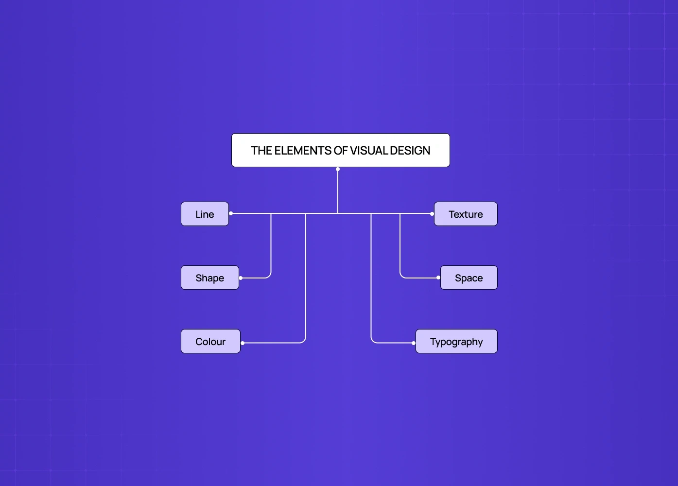
Before principles, there are elements — the raw materials every visual design decision is made from. Understanding visual design elements and principles as a system starts here — and for designers who want to see these elements distilled to their purest form, a stroke-based illustration approach isolates line, shape, and space almost entirely, with no colour or texture to lean on.
Line
Defines edges and boundaries between elements
Creates direction and flow across the interface
Guides user attention and eye movement
Used in dividers, underlines, borders, and implied motion cues
Shape
Represents any enclosed visual area
Geometric shapes (squares, circles) feel structured and intentional
Organic shapes feel natural and approachable
Forms the foundation of icon systems and visual components — the exact vocabulary visual systems specialists work in when building icon families and brand mark systems from scratch.
Colour
Communicates mood and emotional tone
Establishes visual hierarchy and importance
Triggers associations and brand recall
Serves functional roles (e.g., red = error, green = success)
Ensures accessibility and contrast compliance
Texture
Defines the surface quality (real or implied)
Adds depth and richness to flat designs
Appears through gradients, noise, and material-like effects
Enhances visual interest without increasing cognitive load — a balance structured data visuals have to strike too, since texture and visual richness can easily compete with data accuracy if overused.
Space
Includes both occupied and empty areas
Controls layout balance and readability
Negative space acts as an active design element
Helps separate, group, and prioritize content — the same weight distribution logic that governs balance as a full principle, just applied at the element level rather than the composition level.
Typography
Involves selection, sizing, and arrangement of text
Plays a major role in readability and clarity
Establishes hierarchy across headings, body, and labels
Strongly influences brand perception and tone
These six elements are the vocabulary. The principles that follow are the grammar.
The 7 Principles of Visual Design
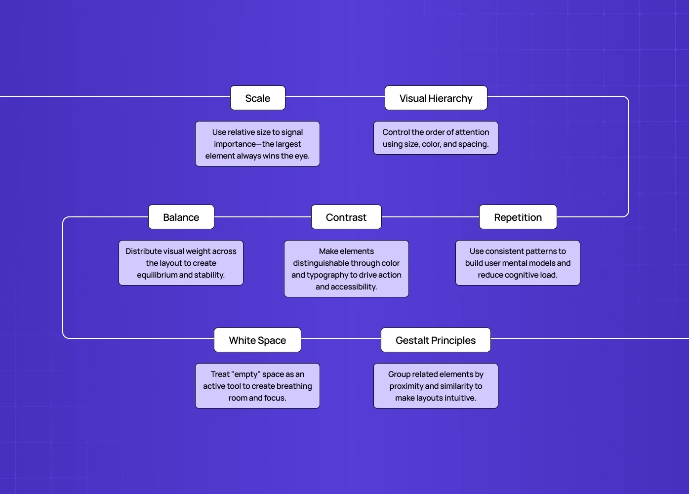
1. Scale
Scale is the use of relative size to signal importance. Bigger elements attract more attention — that's a perceptual fact, not a design convention.
In practice:
The most important element on a screen should be the largest.
A good visual hierarchy typically uses no more than 3 distinct size levels.
Scale differences between elements communicate priority before the user reads a single word.
Visual design examples: A dashboard where the primary metric is displayed at 48px and supporting data sits at 14px. The scale does the navigation work before the labels do. This logic becomes especially important in AI dashboard design, where confidence scores, model outputs, and raw data compete for attention and scale must clearly signal which number the user should trust first.
On mobile specifically, scale decisions carry even more weight — and name some visual design principles for mobile that matter most, scale is consistently at the top because constrained screen space means every size decision is a hierarchy decision.
2. Visual Hierarchy
Hierarchy is what tells the eye where to look first, second, and third. Without it, a screen full of equally weighted elements requires the user to work out the order of importance themselves — which they won't.
In practice:
Use 2-3 typeface sizes to establish content levels.
Bright, high-contrast elements pull focus; muted ones recede.
Spacing can reinforce hierarchy as effectively as size or colour — grouped elements read as related.
The clearest test: cover the labels on a screen and ask whether the hierarchy still communicates itself. If it does, the visual design is working. If it doesn't, the typography and spacing are doing the wrong jobs — and understanding emphasis in visual design shows how deliberate use of weight, contrast, and scale creates the focal points that make hierarchy legible without relying on labels at all.
3. Balance
Balance is the distribution of visual weight across a composition. It doesn't require symmetry — but it does require that no single area of the screen feels so heavy it pulls the eye away from everything else.
Three types:
Symmetrical — elements distributed equally around a central axis. Feels stable, authoritative.
Asymmetrical — elements distributed unequally but in equilibrium. Feels dynamic, modern.
Radial — elements radiating from a centre point. Draws the eye inward.
Spotify's home screen is a good asymmetrical balance reference — the header and playback bar carry different visual weights at the top and bottom, but the content grid between them creates equilibrium. The layout never feels tilted even though nothing is symmetrically centred.
In practice: Most SaaS dashboards benefit from asymmetrical balance — the primary content area carries more visual weight, but supporting elements provide enough counterbalance that the layout feels composed. The structural mechanism that makes that balance possible is the grid, and grid systems behind visual layout design covers the column, modular, and hierarchical grid types that govern how content weight is distributed across layouts.
4. Contrast
Contrast is what makes things distinguishable. Colour contrast, size contrast, typographic contrast — all of them create the visual distinctions that allow users to parse a screen quickly.
In practice:
High contrast between a CTA and its background increases click-through rate — this is documented, not theoretical.
Text contrast ratios are a legal accessibility requirement in many markets (WCAG 2.1 AA minimum: 4.5:1 for body text).
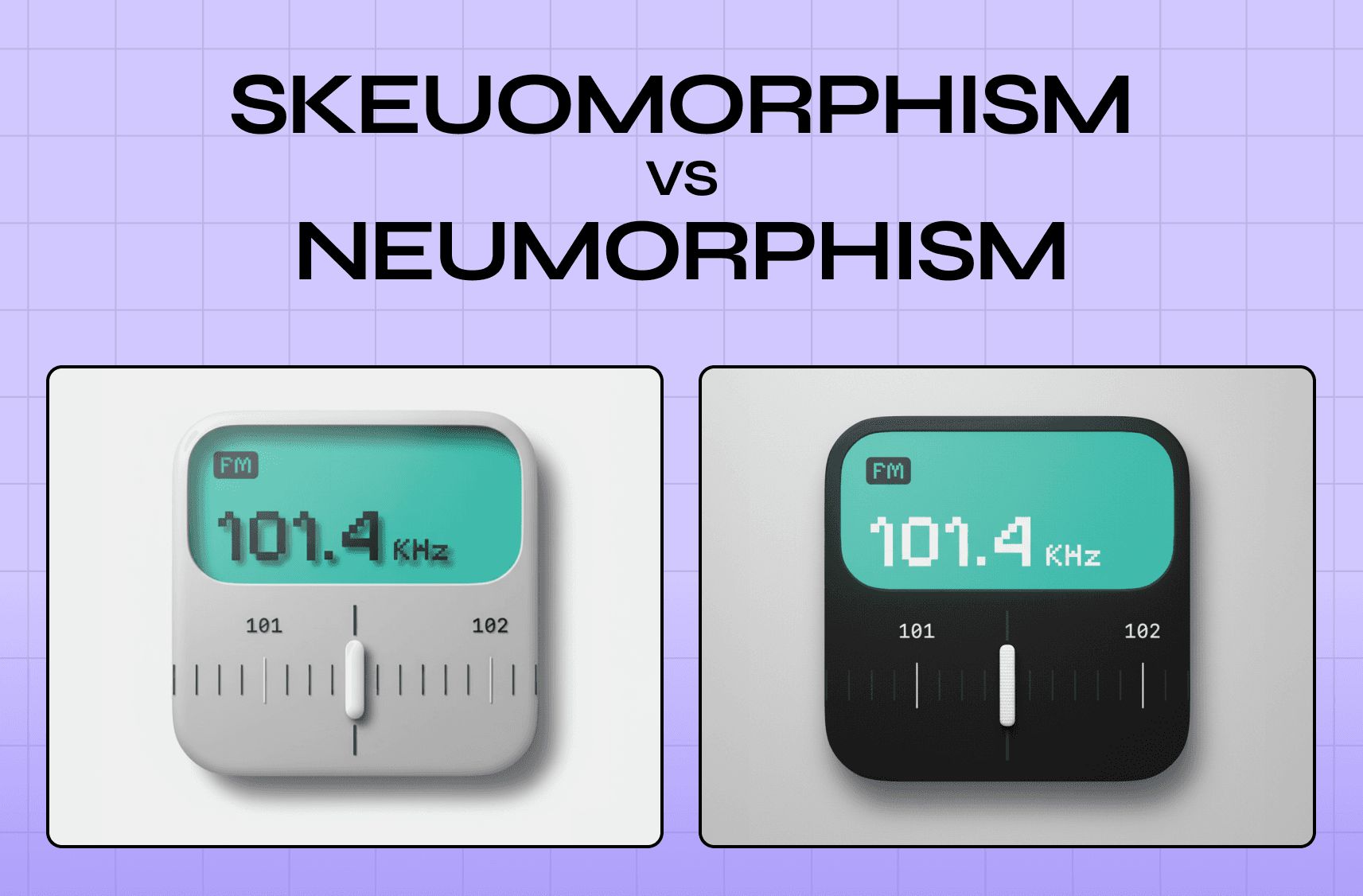
Stripe uses contrast with unusual discipline — near-monochromatic backgrounds with single high-contrast accent elements, so every interactive element stands out without visual noise. How contrast, depth, and texture behave under different design paradigms is exactly what how visual style movements apply principles explores, showing how skeuomorphic and neumorphic approaches each make different tradeoffs with the same contrast and shadow principles.Contrast in typography — pairing a heavy display font with a light body font — creates readability and visual interest simultaneously.
Contrast is also where brand character shows up most clearly in visual design in graphic design work. Applying a structured color proportion in visual design framework ensures that dominant, secondary, and accent hues are weighted deliberately before contrast decisions are made — so the visual signature users associate with the brand holds up consistently across every surface.
5. Repetition and Consistency
Repetition in design is what creates coherence. When the same visual patterns — button styles, spacing increments, colour usage, icon style — repeat across a product, users build a mental model of how the interface works. Every deviation from that pattern requires them to recalibrate.
In practice:
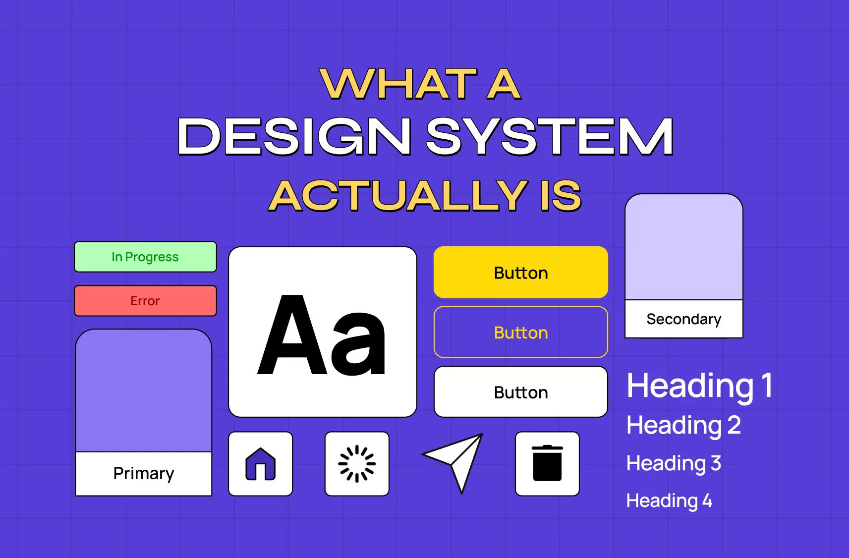
A design system is formalised repetition — it encodes the pattern decisions so they can be applied consistently at scale, and encoded pattern decisions covers how to structure tokens, components, and usage rules so that repetition becomes a governed system rather than an informal convention that breaks as teams grow.
Amazon's product ecosystem — Prime Video, Prime Music, Amazon Shopping — uses repetitive brand colour and unified logo treatment across entirely different applications. Users don't need to relearn each one because the visual language carries across.Consistent use of colour for the same type of action (green for confirmation, red for destructive actions) reduces cognitive load — a standard that becomes especially consequential when examining brand trust through visual consistency, where pattern deviations across touchpoints don't just confuse users but actively erode the institutional credibility the brand depends on.
Repetition is what makes a product feel like it came from one coherent mind rather than several designers working independently — and that coherence doesn't happen by accident.
Turning visual principles into a design philosophy shows how teams formalise the decision rules that make consistent repetition possible at scale, so visual coherence survives team growth and feature expansion.
At Groto, design systems are built into every product engagement — not as a deliverable at the end, but as the structural layer that makes visual consistency possible as the product scales.
6. White Space (Negative Space)
White space is not empty space. It's active space — it creates breathing room, establishes relationships between elements, and signals that a design was made with confidence rather than filled out of anxiety about leaving things out.
In practice:
Generous white space around a CTA increases its visual weight without changing its size.
Tight spacing between related elements signals grouping — this is rooted in Gestalt perception principles that explain why proximity alone creates the impression of relationship before any label or border is needed.
The most common mistake in product design is reducing white space when things feel cluttered. The fix is almost always removing content, not compressing spacing.
Notion's interface is a masterclass in white space — the calm, open canvas is a brand and UX decision simultaneously. It communicates "this tool gets out of your way" without a single word of copy, and that openness only works because the colour restraint supports it; teams ready to introduce more colour range without losing that calm can explore beyond single-hue palettes as a structured next step.
7. Gestalt Principles
Gestalt principles describe how humans perceive visual information as wholes rather than as individual parts. They explain why certain design decisions feel intuitive and others feel off, even when the user can't articulate why.
The most applied Gestalt principles in product design:
Proximity — elements close together are perceived as related. Used in form design, card layouts, and navigation grouping.
Similarity — elements that look alike are perceived as belonging to the same category. Foundation of icon design and component systems.
Continuity — the eye follows lines and curves, even implied ones. Used in scroll direction cues and animation paths.
Closure — the brain completes incomplete shapes. Used in icon design and progress indicators.
Figure/Ground — the relationship between foreground elements and background. Used in modal design, overlays, and depth.
Visual design principles examples in Gestalt: a navigation menu groups items by proximity, uses similarity in visual treatment to signal they're the same type of element, and uses contrast to distinguish the active state from inactive ones. Three Gestalt principles, one navigation component — and how these decisions stack up at the full page level is what screen-level design composition governs, translating individual component logic into coherent layout decisions across an entire viewport.
Why Visual Design Principles Matter Beyond Aesthetics
Every principle here connects to a measurable outcome — not just a visual one.
Scale and hierarchy reduce time-to-action by making the primary path obvious.
Contrast affects accessibility compliance and conversion rates simultaneously.
Consistency and repetition reduce support requests because users encounter fewer surprises.
White space affects perceived quality — products with generous spacing are rated as more premium and trustworthy in user research. These perceptual effects compound across every touchpoint, which is why how visual design principles build brand experience argues that visual decisions aren't just interface choices — they're the building blocks of the emotional impression users carry about a brand over time.
When we applied these principles in the redesign of Camb.ai's platform, the visual design work wasn't about making it look better. It was about making a technically complex product feel navigable — reducing the cognitive load on users who needed to move quickly across a 140+ language platform. The visual hierarchy changes alone reduced task completion time in usability testing.
The same principles applied to the Pathways hiring platform — where we used contrast and spatial hierarchy to help recruiters process large volumes of candidate information without losing context.
These aren't abstract ideas. They're the operational layer of how products get used.
Conclusion
Scale, hierarchy, balance, contrast, repetition, white space, and Gestalt aren't seven separate concerns — they work as a system, each reinforcing the others.
Good visual design is invisible to users — they don't notice the principles, they just feel in control. For teams applying this to digital products specifically, visual principles applied to digital product design shows how scale, hierarchy, contrast, and consistency translate into the product decisions that determine whether users activate, adopt features, and stay.
The gap between a product that looks designed and one that works well is almost always found in how consistently these principles are applied, not how ambitiously.
Every visual decision is also a functional decision — contrast affects accessibility, hierarchy affects conversion, spacing affects perceived quality.
Applying these principles at the component level matters less than applying them consistently across the full product experience.
Want to see these principles applied to a real product? We run focused design audits for product teams — a clear-eyed look at where the visual design is creating friction and what it would take to fix it.