
Great website design isn’t just about good looks. It’s about telling a story, guiding interaction, and making users want to stay longer—and come back often. Whether you're a startup founder or a SaaS product manager, these 13 website design examples are practical references that blend form, function, and brand soul.
Design that inspires and performs? Yes, it’s possible.

Website design has evolved significantly. In 2025, the focus has shifted from pure aesthetics to functional clarity, trust-building, and responsiveness across devices. Businesses are increasingly leveraging AI-driven web design, automation, and modular frameworks to meet modern user expectations.
This article introduces 13 of the best website design examples of 2025. Each demonstrates how UX design strategy contributes directly to usability, speed, and product clarity.
Why is website design important?
Effective website design impacts user behavior and business outcomes. A well-designed homepage provides clarity, improves trust, and accelerates conversion.
Poor design results in confusion, drop-offs, and lower product engagement. In competitive industries like SaaS and AI, users make fast decisions based on first impressions — the same reason a strong small business online presence often decides whether a smaller brand gets a second look at all.
Key reasons why website design is critical:
It shapes user trust and reduces perceived complexity
It guides navigation and supports task completion
It enables responsive, accessible interactions across devices
It reinforces brand identity across digital touchpoints
It helps explain AI, data, or complex services clearly
Key principles of modern web design
Modern web design includes several recurring principles. These practices support both responsive web design and adaptive performance across screen types.
Hierarchy-first layout – Pages are structured to show key actions first, and understanding emphasis and visual hierarchy shows how deliberate use of scale, contrast, and weight determines whether that structure guides attention or forces users to work it out themselves
Modular UI – Components can be reused, rearranged, or scaled
Data-informed interaction – Design reflects what users actually do, not just what looks good
Microinteractions – Small animations help indicate success, loading, or next steps
Accessibility – All content must be usable with screen readers, keyboard navigation, and without relying on color alone
Clarity in copy – Messaging should reduce ambiguity and guide decision-making
13 Best Website Homepage Design Examples
The New York City Ballet homepage employs a poetic grid layout with fluid animations and subtle hover effects, creating a light yet structured experience as images and text gracefully slide into view. Why it works: Soft motion and a clear grid guide attention without overwhelming the user, delivering an elegant brand narrative.

Evian’s homepage features a full-width pastel-toned hero image and fixed navigation, using generous white space and a cohesive color palette to evoke a calming atmosphere. Why it works: Pastel visuals and intuitive nav maintain brand consistency and ease of use.

Outdoorsy opens with a striking photo carousel and a concise “Find what moves you” prompt paired with an embedded booking form, inspiring adventure from the first scroll. Why it works: Emotional imagery and clear CTAs streamline the user journey toward booking.
Revlon’s homepage greets visitors with high-impact photography of diverse models, bold red typography, and a well-organized dropdown menu that simplifies product exploration. Why it works: Dramatic visuals and structured navigation reinforce brand identity and boost discoverability.

Ladurée showcases oversized, pastel-toned macaron imagery against its signature mint and gold palette, weaving tradition into a modern web layout with live Instagram integration.Why it works: Consistent color schemes and real-time social feeds marry heritage and engagement.

FreshBooks's homepage adopts a minimalist beige backdrop, ample whitespace, and contrasting blue and green CTAs to highlight key actions for accounting tasks. Why it works: Clear copy and strategic color contrast drive conversions by emphasizing primary actions — the same conversion logic explored across product page design examples that shows how layout and hierarchy translate from homepages to deeper purchase-intent pages.

CarMax balances buying and selling with dual CTAs and a custom hero image featuring its branded vehicle, enabling two clear user pathways from the outset. Why it works: Immediate access to both services reduces friction for diverse audiences.

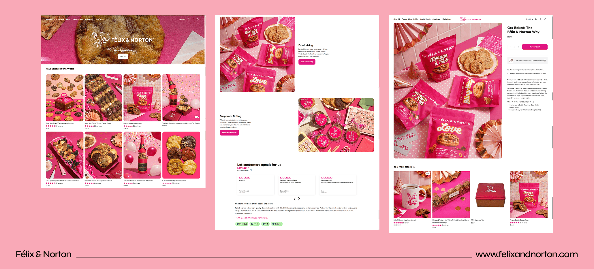
Félix & Norton leverages full-width, high-resolution photos of gourmet cookies alongside a free-shipping banner, prioritizing visual appeal and incentive above the fold. Why it works: Mouthwatering imagery and promotional banners prompt exploration and increase average order value.
Lavender's homepage presents a vibrant purple-and-green theme with floating animations, layered testimonials, and tiered pricing tables to engage users in its email-assistive AI — a strong illustration of intentional color palette in web design, where a structured ratio between dominant, secondary, and accent hues keeps a bold scheme visually grounded. Why it works: Dynamic visuals and clear pricing reinforce value while sustaining interest.

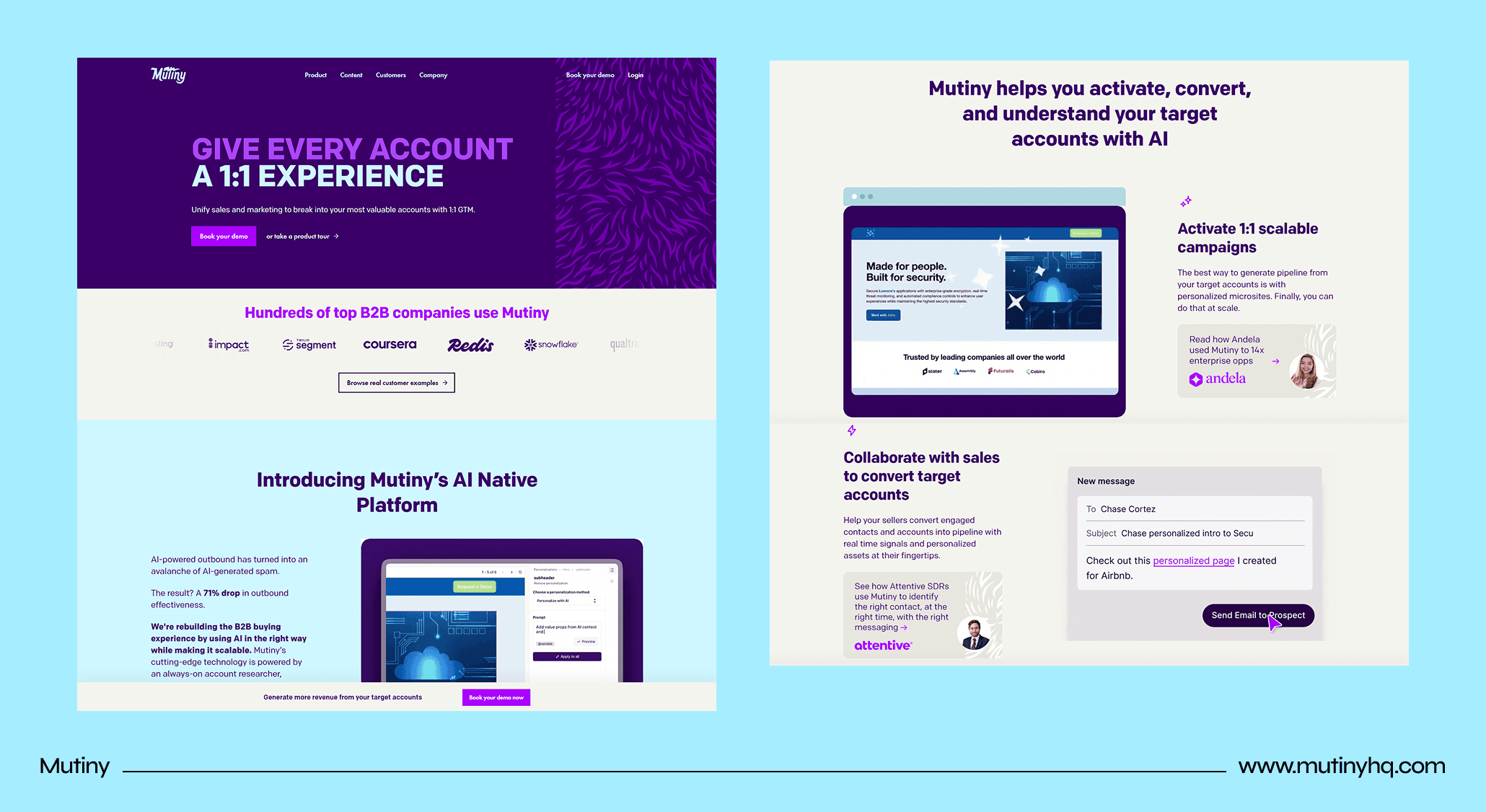
Mutiny features a clean white layout accented by bold blue and purple highlights, interactive GIFs demonstrating personalized campaign flows, and a prominent “Book your Demo” CTA.Why it works: Interactive previews and strategic CTA placement drive demo sign-ups.
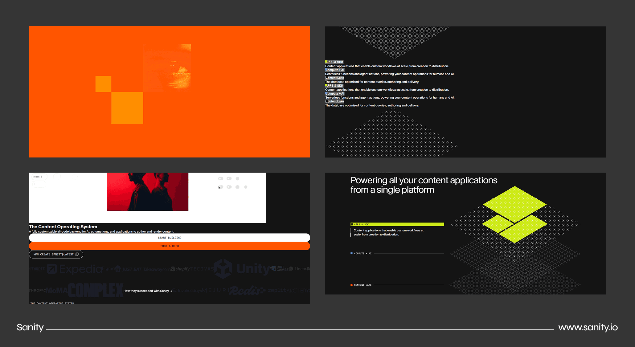
Sanity's modular design uses stark white space, red accents, and interactive sections to communicate its content platform's flexibility and developer-centric tools — a result of disciplined screen layout principles that determine how modularity and whitespace are balanced before any animation or color is applied. Why it works: Engaging animations and concise CTAs facilitate onboarding for technical audiences.
Abetka's interactive typeface showcase assigns each letter to a modern Ukrainian font, weaving cultural storytelling through responsive hover interactions and creator profiles — a visual language that shares DNA with line art design, where expressive outlines and typographic precision carry narrative weight without relying on full illustration or photography. Why it works: Educational narrative and hands-on exploration elevate typography into an engaging cultural experience.

Vital Farms pairs candid farm imagery with traceability tools, B Corp messaging, and bold typography to reinforce its commitment to ethical food production — and brands communicating complex supply chain or ethical data often find infographic design services the most effective way to make that information scannable without disrupting the visual tone. Why it works: Transparent storytelling and easy farm-tracking foster consumer trust and brand authenticity.

These examples demonstrate how thoughtful layout, cohesive visuals, and purposeful interactions can shape memorable and effective homepage experiences.
Key Takeaways
→ Great website design examples share one trait: clarity over complexity.
→ Each site blends storytelling, function, and emotion for a cohesive UX.
→ Typography, motion, and interaction must reflect your brand's identity — treat typography as brand identity, not decoration.
→ Responsive web design isn’t a trend—it’s foundational to trust.
→ Use design to highlight product value, not just look impressive.
→ Benchmark against these leaders to elevate your own digital presence.
How Groto Helps Create Design Like This
At Groto, we’re not just designing pages—we’re solving real problems with UX design strategy that converts. As an AI UX design agency, our team transforms SaaS and tech products into beautifully usable systems that people want to return to.
We specialize in:
End-to-end design systems for AI and SaaS platforms, built for cohesive design unity across every screen
UX architecture tailored for growth-stage products
UI design that balances business goals with emotional impact
Real-world design validation through research-backed decisions
Flexible collaboration—plug us into your product team or let us lead the way. For teams at earlier stages, no-code web design offers a faster path to launch before a full design system engagement makes sense.


