Your users aren't just looking at your interface — their brains are actively organizing it. Gestalt principles explain exactly how that happens, and how great designers use that knowledge to create experiences that feel effortless.
How the brain makes sense of design — and why it matters.
TL;DR
Gestalt principles explain how the brain organizes visual information into patterns and meaning. In design, they separate an interface that feels obvious from one that quietly frustrates people without them ever knowing why.
Have you ever opened an app and just known where to tap? No instructions, no pop-up. Someone made deliberate decisions about spacing, grouping, and contrast — and those decisions were rooted in gestalt principles of perception.
These principles came from psychology, not design school. They describe something fundamental: how the human brain turns visual input into meaning. Learn them once and you start noticing them everywhere.
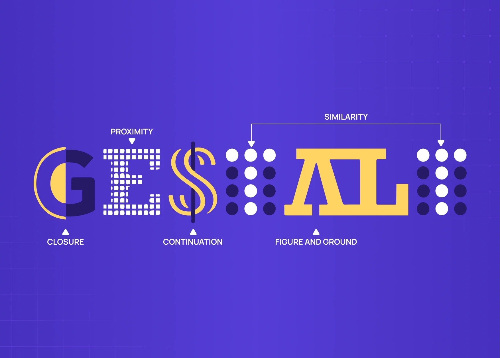
What Are Gestalt Principles?
In the 1920s, Max Wertheimer, Wolfgang Köhler, and Kurt Koffka found that the brain doesn't process things piece by piece. It looks for patterns, groups things, fills in gaps, and makes assumptions before conscious thought kicks in. Their conclusion — the whole is other than the sum of its parts — became the foundation of gestalt principles psychology.
Look at the Olympic logo. Most people see five rings, not curved lines or overlapping shapes. The brain completes the form before the conscious mind processes it. Nobody taught you that. It's just how perception works.
That same process runs every time someone opens a product you've built. Build something that fits those perceptual instincts and the experience clicks. Fight them and users feel a vague discomfort they can't name. Most of the time, they just leave.Gestalt is the perceptual science behind the visual design principles that give form to those instincts in a practical design context.
Why Gestalt Principles Matter in UX and Product Design
Most users will never read your interface. They scan it, get a gut feeling, and decide in seconds whether it makes sense. Gestalt principles of design give you control over those seconds. — they are part of the broader framework of 13 principles of design that experienced designers apply systematically across every layout decision.
Same content, two layouts — one feels clear, one feels cluttered. The difference is almost always perceptual. These principles operate at a level users never consciously notice — they are the perceptual foundation beneath the digital product design principles that shape every screen decision:
Layout and spacing — where elements sit relative to each other
Visual hierarchy — what the eye finds first, second, and last
Grouping and separation — what reads as connected versus separate
Interaction clarity — whether users can tell what's clickable, static, or urgent
Every element on screen is either working with natural perception or working against it. There is no neutral.
The Core Gestalt Principles — and What They Cost When Ignored
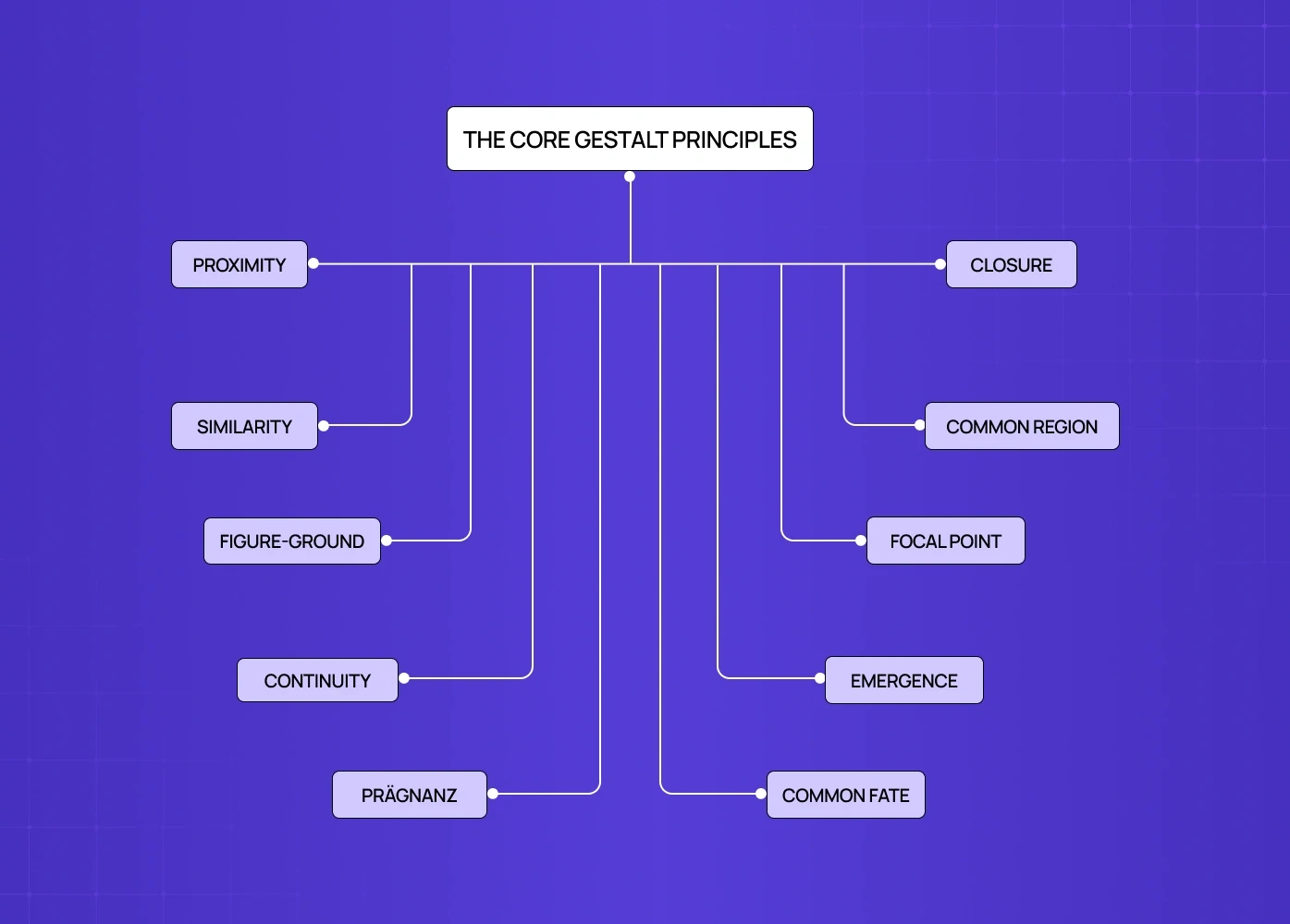
1. Proximity
The principle: Elements placed close together are perceived as related.
Users read spatial relationships before they read words. Poor grouping on a dashboard is almost always what drives the "this feels overwhelming" exit in the first three days. It is not the content. It is the spacing.
How it shows up in design:
Grouping a card's title, description, and CTA tightly so they read as one unit.
Using white space to separate unrelated elements, not just fill gaps.
Keeping navigation items clustered to signal they belong to the same system.
2. Similarity
The principle: Elements that look alike are perceived as belonging to the same group or function.
Once a user learns what a primary button looks like, they find it everywhere without thinking. The problem is when similar-looking elements start behaving differently — that learned trust breaks fast and does not come back easily in the same session. This is why similarity is the gestalt principle most directly connected to brand experience design: visual consistency across every touchpoint depends on it.
Features go undiscovered not because they are hidden, but because everything on screen carries the same visual weight. No hierarchy means no trail to follow.
How it shows up in design:
Consistent button styles across every CTA — a design system for SaaS products is how teams codify the similarity principle so that learned trust does not break as the product scales.
Uniform icon treatment within navigation.
Color used to separate interactive from static elements — the 60-30-10 rule gives designers a practical proportion framework for distributing that color in a way that preserves gestalt figure-ground relationships.
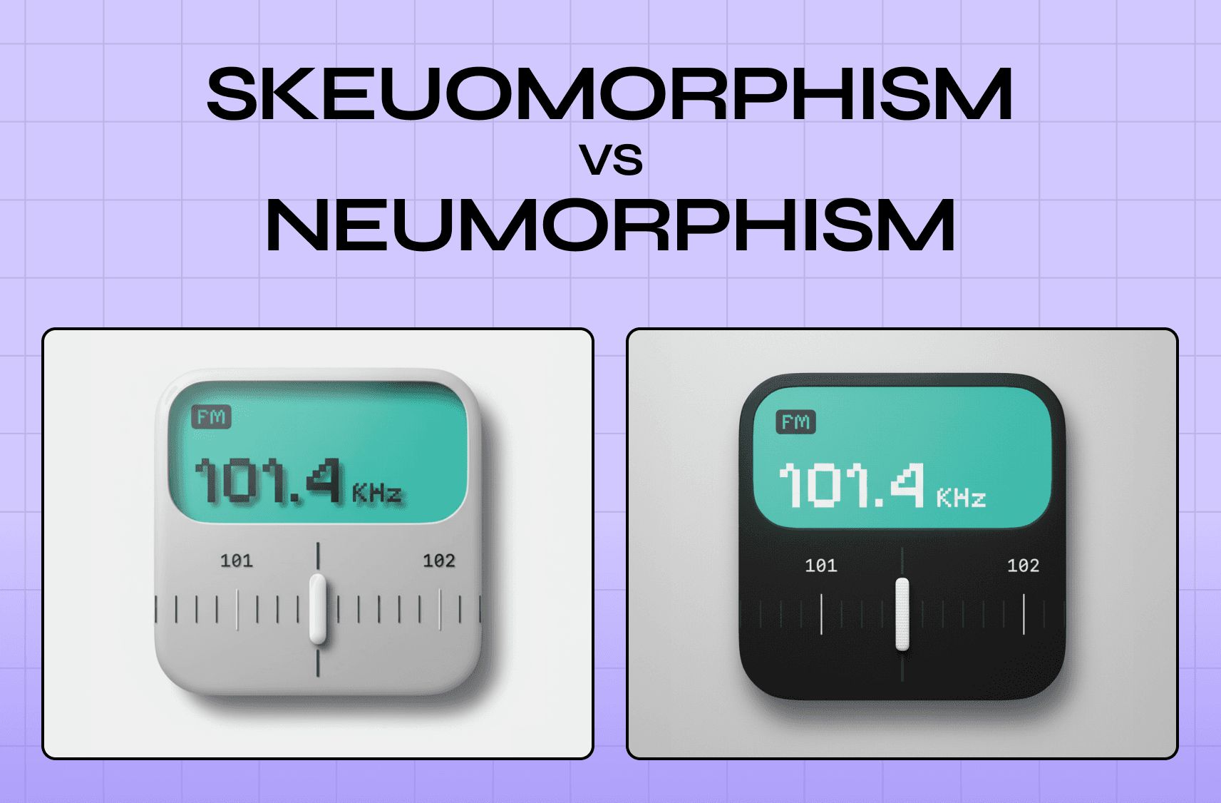
3. Figure-Ground
The principle: The brain separates elements into a subject (figure) and a backdrop (ground).
A modal over a dimmed screen works because the contrast does the communicating before the user reads a word. Remove that contrast and attention scatters. On upgrade prompts specifically, a flat modal on a flat background does not feel important — it feels like more interface, and users close it without reading. This is the gestalt failure at the centre of the skeuomorphism vs. neumorphism debate: both styles made different bets on how much depth cue figure-ground perception requires to function.
How it shows up in design:
Overlay patterns that focus attention during onboarding.
CTAs that stand out against quieter backgrounds.
Hero sections where the headline comes forward and the image falls back.
4. Continuity
The principle: The eye follows aligned paths and assumes elements along that path belong together.
When the flow breaks — a misaligned element, an onboarding step that looks different from the one before — users lose the thread. They are not confused by the content. They have lost visual footing and do not know where to look next.
Three steps along a clear axis feel like a journey. The same three steps in a disjointed layout feel like separate tasks. That gap is where drop-offs happen, and it rarely gets diagnosed correctly.
How it shows up in design:
Progress indicators that move the eye left to right.
Grid layouts with consistent alignment — the guide on types of grids and their importance in modern design covers how grid structure encodes continuity at the layout level.
Onboarding steps that share a visual axis throughout.
5. Closure
The principle: When parts of a shape are missing, the brain fills in the gaps and perceives something complete.
IBM, WWF, NBC — technically incomplete, all instantly recognizable. In product design, a card cropped at the screen edge tells users to scroll. A progress ring halfway filled reads as motion, not failure.
Empty states break closure most often. A blank screen with "no data yet" gives the brain nothing to complete. A partially populated state creates a pull toward setup that an empty box never will.
How it shows up in design:
Cards cropped at the edge to signal more content below.
Icon designs that suggest a shape without completing every line.
Progress indicators that feel whole even mid-fill.
6. Common Region
The principle: Elements enclosed within a shared boundary are perceived as belonging together.
Common region overrides proximity. Two elements that are not particularly close still read as a group inside the same container. On dense settings pages, its absence is what makes users feel lost — every option becomes a standalone row with no logic, and people either misconfigure the product or raise a ticket.
How it shows up in design:
Card layouts containing each unit of related information.
Dashboard panels separated by distinct background colors.
Notification clusters held together by a subtle container.
7. Focal Point
The principle: Whatever stands out visually gets noticed first.
Every screen has a focal point. The question is whether it was placed intentionally. When it is, it guides. When it is accidental, it competes with what actually matters — the full treatment of how to apply this deliberately is covered in the guide on emphasis in design.
How it shows up in design:
A single high-contrast CTA on a quiet screen.
Scale used to make the primary headline unmistakable.
Value proposition placed where the eye lands first.
8. Emergence
The principle: The brain perceives the whole before identifying individual parts.
Before a user reads a single word, they have already formed a structural impression of the page. The Unilever logo registers as a "U" before anyone notices it is assembled from dozens of smaller icons. Strong layout structure communicates the big picture before users engage with any detail.
How it shows up in design:
Dashboards where overall structure is readable at a glance.
Logos built from smaller parts that resolve into one clear form.
Page structures that communicate hierarchy before content is read.
9. Prägnanz
The principle: The brain interprets complex visual information in the simplest way possible.
Also called the law of good figure. The brain defaults to the simplest available read — if none exists, the interface gets flagged as cognitively expensive and users check out. A product can have 30 data points on one screen and still feel clean, if those points sit inside four or five clear visual clusters — and pairing that structural clarity with a colour structure for hierarchy gives each cluster a distinct visual identity that reinforces the simplicity the brain is already looking for.
How it shows up in design:
Simple geometric shapes for UI components.
Consistent layout geometry that gives the eye a stable rhythm.
Dense screens reorganized into clear sections to reduce cognitive load.
10. Common Fate
The principle: Elements moving in the same direction are perceived as a group.
When cards enter the screen together or an accordion opens with items moving the same way, users read it as one action, one context. It is subtle, but it does work that labels sometimes cannot — and it is one of the gestalt principles most directly expressed through micro UX design patterns that improve user experience instantly.
How it shows up in design:
Accordion items that open in the same direction.
Card groups that scroll or shift together.
Onboarding animations where related steps arrive as one.
How These Principles Work Together
Each principle handles a specific perceptual job. Together they build an interface that users move through without stopping to think:
Proximity groups related content into scannable clusters.
Similarity signals which elements share a function.
Common region draws a boundary around those groups.
Continuity guides the eye from one section to the next.
Focal point ensures the most important action always gets found.
When these cues agree, there is no friction — and getting them to agree starts with deliberate screen-level perceptual decisions made before color or content is ever applied. When they conflict, users feel it — they just cannot say why.
When Gestalt Goes Wrong: Silent Churn
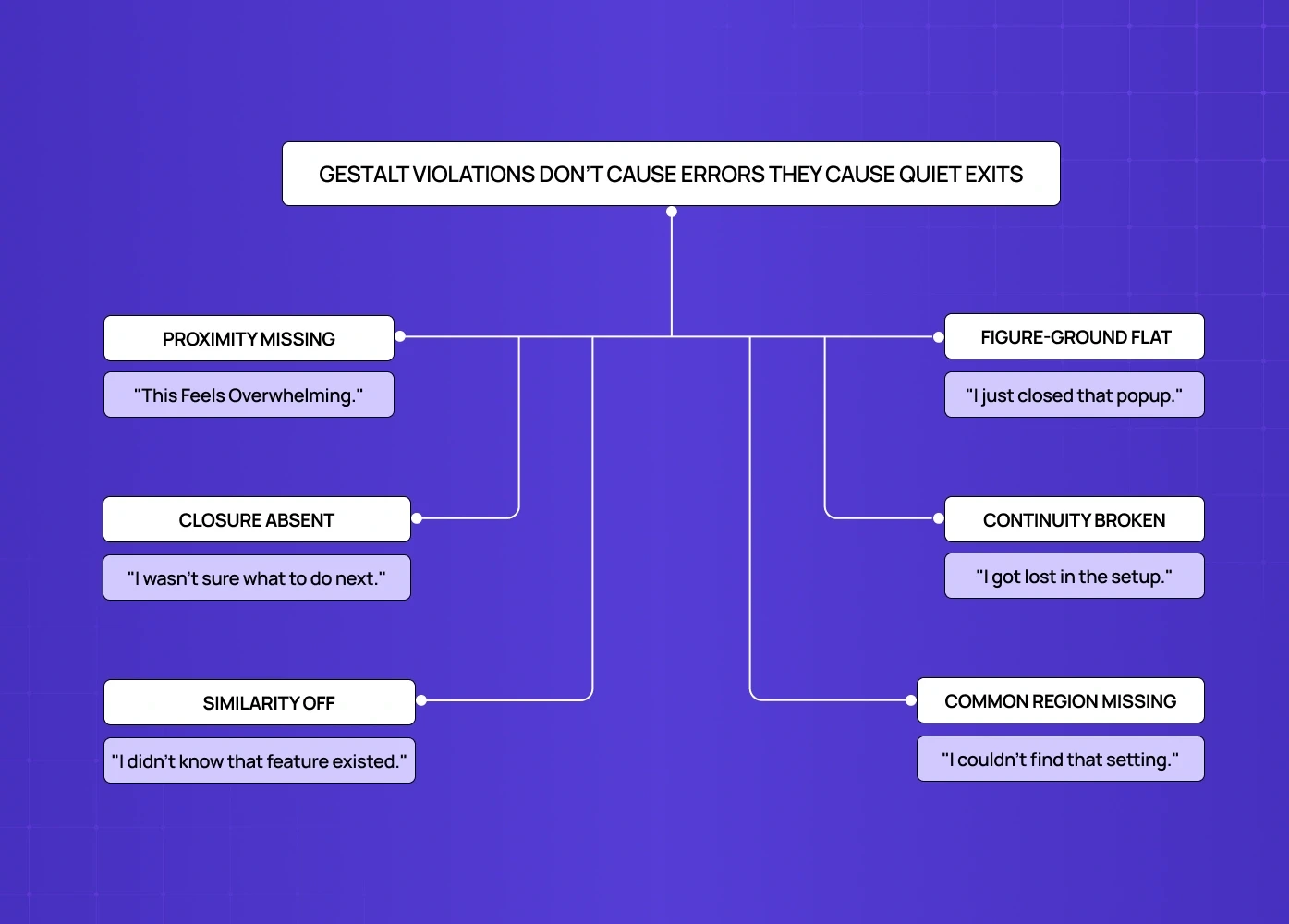
Gestalt violations do not throw errors. They show up as numbers that will not move — and bad UX design examples and how to fix them documents what those violations look like in production interfaces.
"This feels overwhelming." Proximity missing. No clusters on the dashboard. Activation drops days 1 to 3.
"I didn't know that feature existed." Similarity off. No action hierarchy. Feature adoption underperforms.
"I got lost in the setup." Continuity broken. No visual lead between steps. Onboarding completion drops.
"I wasn't sure what to do next." Closure absent. Empty state shows nothing to complete. Time-to-value stretches.
"I just closed that popup." Figure-ground flat. No modal depth. Upgrade conversion stays low.
"I couldn't find that setting." Common region missing. Unstructured settings page. Support volume rises, NPS drops.
None of these look like design problems in a review. That is exactly why they persist.
7 Common Gestalt Mistakes — and How to Fix Them
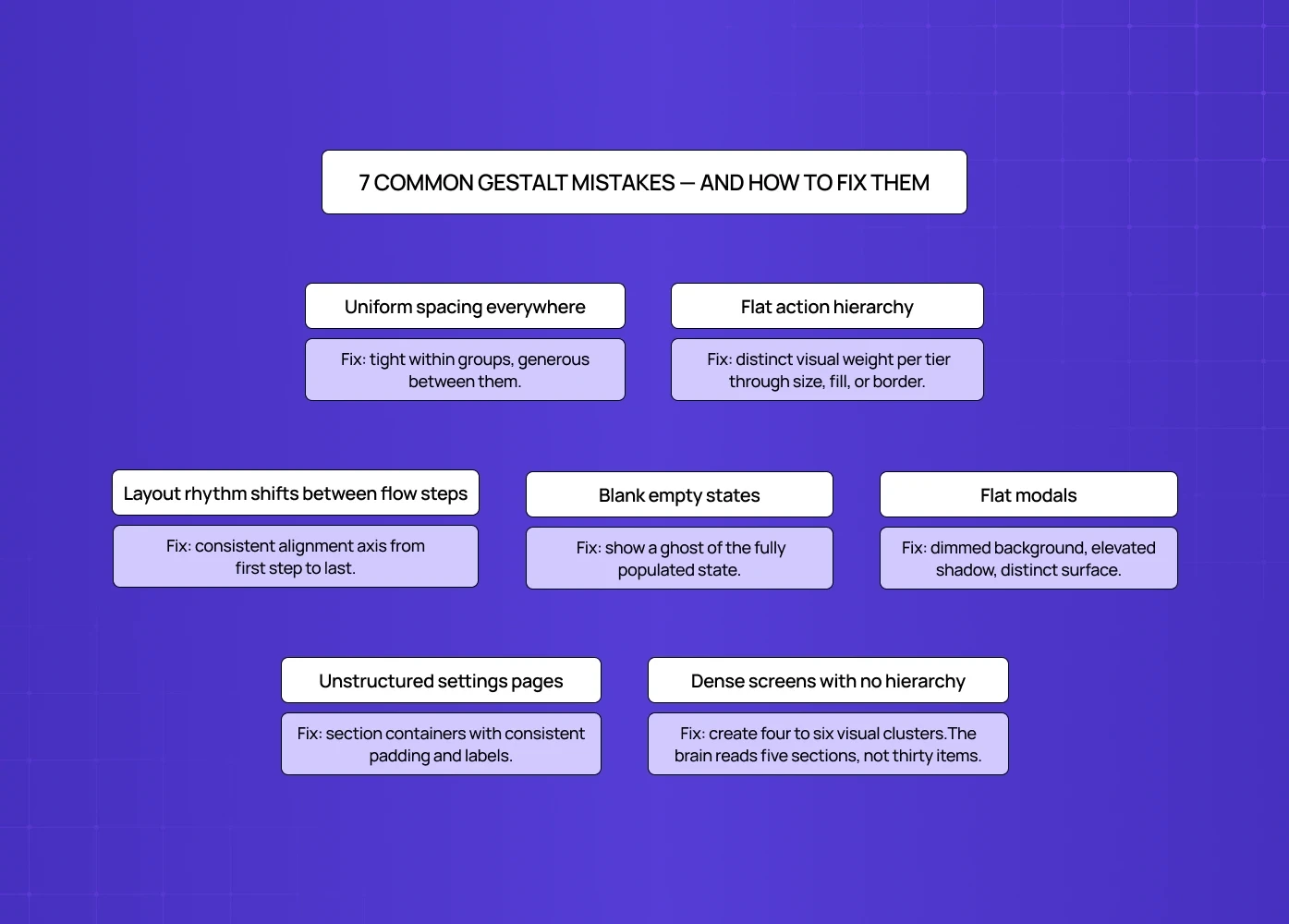
The mistake | The Fix |
Uniform spacing everywhere | Tight within groups, generous between them. |
Flat action hierarchy | Distinct visual weight per tier through size, fill, or border |
Layout rhythm shifts between flow steps | Consistent alignment axis from first step to last |
Blank empty states | Show a ghost of the fully populated state |
Flat modals | Dimmed background, elevated shadow, distinct surface |
Unstructured settings pages | Section containers with consistent padding and labels. |
Dense screens with no hierarchy | Create four to six visual clusters. The brain reads five sections, not thirty items. |
How We Apply Gestalt Principles at Groto
At Groto, perceptual clarity comes before aesthetics on every project — that priority is a direct expression of what a design philosophy looks like when it scales across a product. We ask whether a new user can form a correct mental model of a screen in under five seconds, identify the primary action without reading every label, and understand group relationships without conscious effort. That thinking shapes every layout decision we make, from the first wireframe to the final build.
Conclusion
Gestalt principles give designers a scientific basis for decisions that usually come down to instinct
Proximity, similarity, and common region organize complex layouts
Figure-ground and focal point direct attention deliberately
Closure and continuity let the brain fill in what does not need spelling out
Gestalt violations appear as activation drop-off, low adoption, and unexplained churn
The goal is designing in alignment with how human perception actually works