Most SaaS interfaces don't have a feature problem — they have an emphasis problem. Learn how visual hierarchy, contrast, and focal point design guide user attention and directly improve activation, conversion, and long-term engagement.
The design principle that tells users where to look — and what to do next.

Most SaaS interfaces have a hierarchy problem masquerading as a feature problem.
The dashboard has 14 equally weighted data points. The onboarding flow has four buttons, none of which looks like the next step. The settings page has primary and destructive actions sitting side by side in the same visual weight. Users hesitate, read twice, and occasionally click the wrong thing. The team ships a tooltip. The tooltip doesn't fix it.
The root issue is emphasis — or the absence of it. Emphasis in design is the principle that one element on a screen should be more important than the others, that the interface should communicate its hierarchy visually, and that users should be able to perceive the most important action without reading the screen in full. When emphasis is absent, users work harder. When emphasis is present and well-calibrated, users act faster, complete more, and feel less friction — even if they can't articulate why.
This is not a design student concept. Forrester research puts the return on UX investment at up to $100 for every $1 spent. The products that deliver that return are not the ones with the best visual taste — they're the ones whose interfaces communicate clearly about what matters, what's next, and what can wait. That's the design principle of emphasis, applied.
What Is Emphasis in Design?
Emphasis in design is the visual technique of making one element — or a deliberate hierarchy of elements — more prominent than others on a screen or page. It sits alongside balance, contrast, and rhythm as one of the foundational what the core principles of design cover — but in product interfaces it does the heaviest lifting. It answers the question: where should the user's eye go first, and what should happen next?
Emphasis is created through contrast, scale, colour, whitespace, typography weight, position, and visual cues — the same toolkit covered in depth by the visual design principles that govern hierarchy. It's not about making things beautiful — it's about making the visual communication legible. An interface with good emphasis tells a story: this is the most important thing, this is the next most important, and everything else is secondary context.
In SaaS product design, emphasis operates at two levels. Macro-emphasis is the hierarchy of the entire screen: the primary action, the secondary navigation, the supporting information. Micro-emphasis is the hierarchy within a component: the key data point in a dashboard card, the most important field in a form, the primary vs. secondary state of a button pair.
Both matter. A screen with strong macro-emphasis and weak micro-emphasis sends users to the right place and then loses them inside it. A screen with strong micro-emphasis but weak macro-emphasis has well-designed components sitting inside an interface that doesn't communicate what the user should do.
Why Emphasis in SaaS Requires a Different Approach
Emphasis in design operates differently in SaaS product interfaces than in marketing sites or brand design, for three specific reasons.
Density
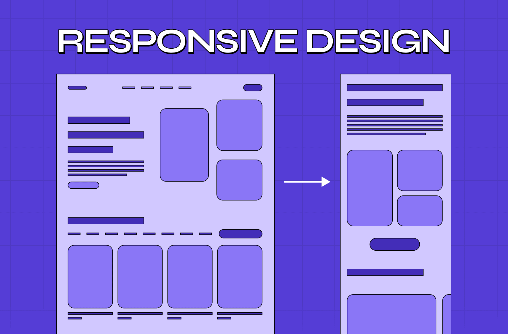
SaaS products carry significantly more information on a single screen than a landing page or editorial design.
A dashboard might have 12 data points, 3 navigation levels, 2 notification states, and a primary CTA — all at once.
Emphasis in this environment isn't about making one thing stand out from nothing. It's about creating a hierarchy that guides attention through density without making the interface feel cluttered or overwhelming — a challenge explored more broadly in the context of digital product design principles applied to UI.
High-stakes actions
Enterprise SaaS interfaces routinely contain actions with real consequences — budget approvals, data exports, account deletions, workflow triggers.
Emphasis is not just a usability tool in these contexts. It's a safety mechanism.
The visual hierarchy should make destructive or irreversible actions unambiguously distinguishable from routine navigation actions.
When a delete button and a save button carry the same visual weight, emphasis has failed — and the consequence isn't poor aesthetics, it's user error.
Recurring use patterns
Marketing site emphasis is designed for a first visit. SaaS product emphasis is designed for the 500th visit.
Users who use a product daily develop visual scanning patterns rooted in gestalt perception principles — they stop reading every element and rely on positional and visual cues to navigate efficiently.
Emphasis that is inconsistently applied across a product breaks those patterns.
Users who trusted the visual hierarchy have to re-read screens they've used dozens of times. This is one of the most common sources of design-related support tickets that never gets attributed to design.
At Groto, we audit emphasis as part of every product design engagement — and it consistently surfaces faster than almost any other design principle. The fix is rarely dramatic. Most emphasis problems in SaaS are the result of components that were designed correctly in isolation and assembled without hierarchy consideration, not products where the design was wrong from the start.
The 5 Emphasis Techniques That Move SaaS Metrics
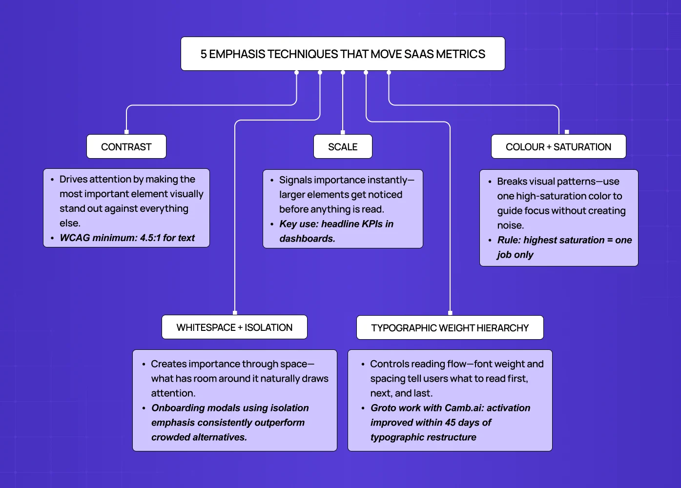
These are the emphasis techniques that have the most direct connection to product outcomes in SaaS interfaces, based on our work with product teams across 140+ five-star projects.
Contrast
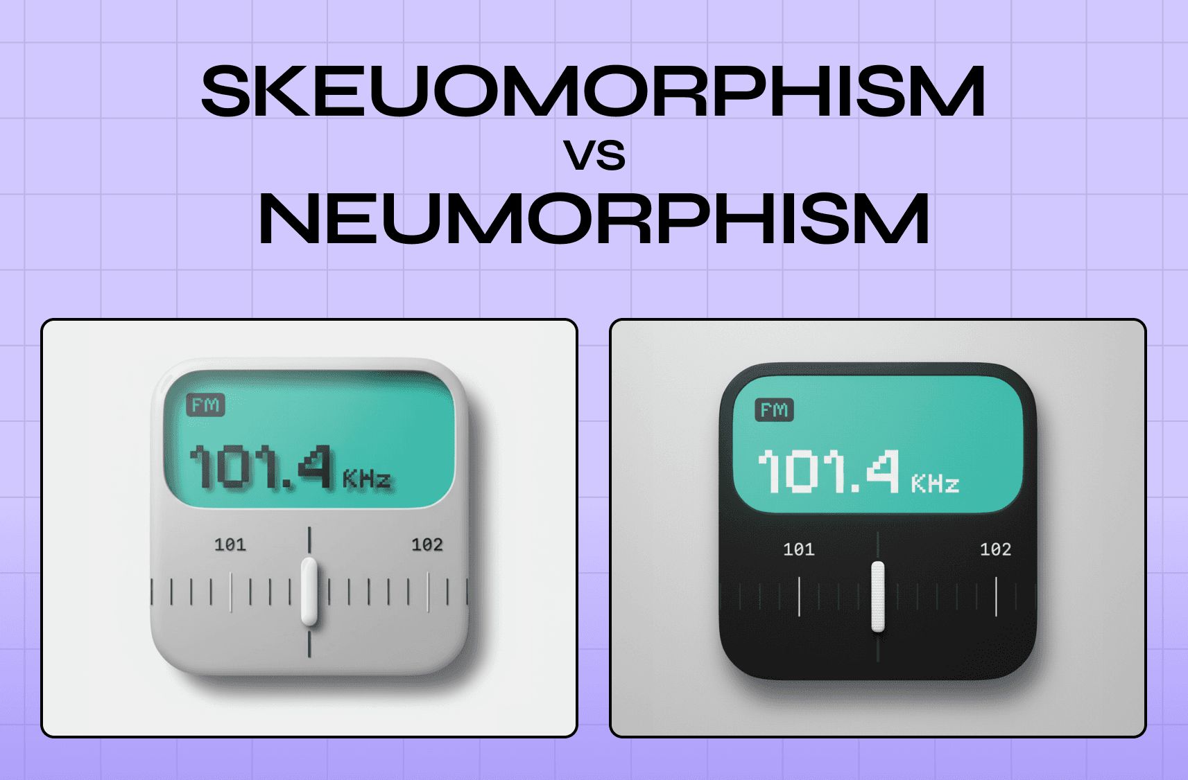
Contrast is the most reliable emphasis technique across all screen environments and user contexts — and the reason it outlasts style cycles is demonstrated by comparing how skeuomorphism and neumorphism handle depth and visual emphasis differently: the styles diverged sharply on shadow and texture but both still depended on contrast to make primary elements legible.
The primary CTA should have the highest contrast ratio on the screen — not just against its background (WCAG requires 4.5:1 for text), but relative to competing interface elements.
A high-contrast primary button on a low-contrast screen commands attention. A high-contrast primary button on a screen full of equally saturated elements disappears into noise.
The contrast principle applies to colour, value (light vs. dark), size, and texture.
In SaaS dashboards, contrast is the primary technique for directing attention to the data point that matters most in a given context — the metric that's off-target, the item requiring action, the threshold that's been breached.
Scale
Scale communicates importance directly and pre-consciously.
Users don't need to read an element to perceive that it's larger than the elements around it — the hierarchy is processed before attention is directed.
In SaaS interfaces, scale is most effective for primary numerical metrics (the headline KPI should be larger than the supporting breakdowns), for primary CTAs in onboarding flows, and for the current step indicator in multi-step processes.
The scale principle is frequently violated in design system drift — when components built at different sizes are assembled without hierarchy review, the resulting screen communicates multiple competing importance levels.
A routine audit question at Groto is: on this screen, what is the largest element, and is it the most important thing? In many SaaS interfaces the answer is no — the answer is "the logo" or "the navigation container."
Colour and Saturation
Colour emphasis operates by breaking a visual pattern.
A saturated accent element on a desaturated screen draws the eye reliably — but only if the saturation contrast is maintained consistently, which is why understanding how colour palettes are structured for visual contrast is a prerequisite for this technique.
In SaaS products where colour is used as a data dimension (status indicators, category labels, alert states), colour emphasis for navigational elements requires careful separation to avoid ambiguity.
The practical rule: reserve your highest-saturation colour for one purpose per screen. If that colour is your primary CTA, don't also use it for a status badge on the same screen. Interfaces built on a tonal system — see what a monochromatic colour scheme relies on for emphasis — handle this naturally because the saturation hierarchy is constrained by the palette itself. If it's an alert state, your CTA needs a different saturation-priority colour. Mixing purposes with the same emphasis colour creates noise, not hierarchy.
Whitespace and Isolation
Isolating an element through surrounding whitespace is one of the most powerful emphasis techniques in data-dense SaaS interfaces — precisely because it's rare. The structural foundation that makes isolation possible is how grid systems control visual weight and layout; without a consistent grid, whitespace reads as inconsistency rather than intentional hierarchy.
In a product where every pixel is competing for space, a component with generous breathing room signals importance through scarcity.
Onboarding modals, primary action prompts, and empty-state CTAs that use isolation emphasis consistently outperform those that compete for space in a busy interface.
Whitespace is also the emphasis technique with the best accessibility properties — it creates hierarchy without relying on colour, which means it works for users with colour vision deficiencies and in high-contrast accessibility modes.
Typography Weight and Hierarchy
In SaaS interfaces where the primary communication medium is data and labels rather than prose, typographic emphasis carries more load than in consumer applications.
The hierarchy of font weights — from the boldest headline to the lightest supporting label — should tell a complete story about what to read in what order. Letter-spacing compounds this: understanding what tracking does to typographic hierarchy explains why tight tracking on body copy and open tracking on labels are not stylistic choices — they're emphasis signals.
When all labels on a screen are the same weight, the interface forces the user to read everything at equal priority — which in a dense SaaS product is cognitively expensive.
At Groto, our work with Camb.ai involved rearchitecting the typographic hierarchy across the interface. Activation metrics improved within 45 days of launch, and qualitative user feedback consistently cited the interface feeling "cleaner" and "easier to scan" — both responses to improved typographic emphasis rather than layout changes.
The Focal Point Stack — Groto's Emphasis Framework for SaaS
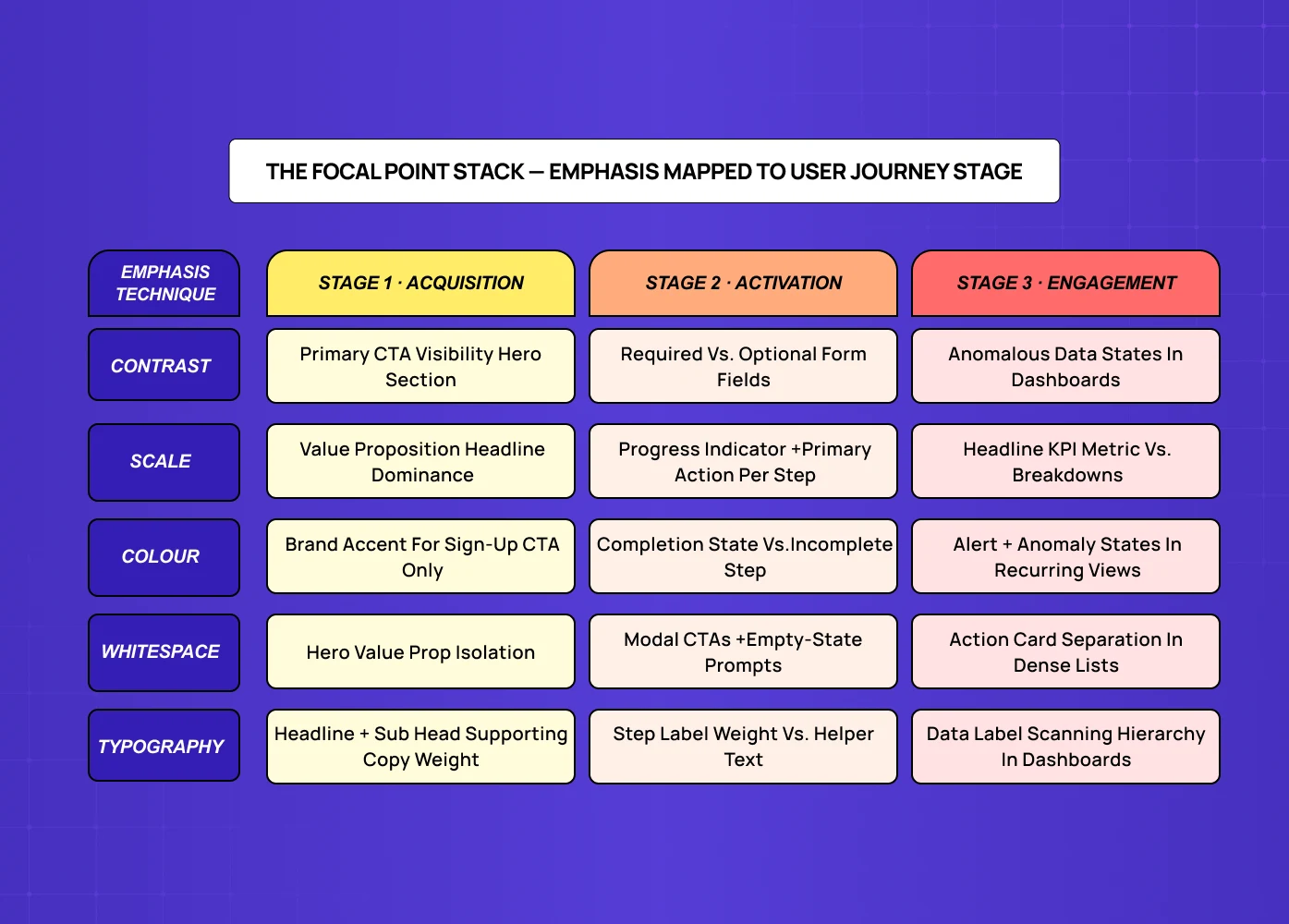
Design principles work in isolation in textbooks and in combination in products. The gap between understanding emphasis and applying it correctly to a SaaS interface is the question of context: which emphasis technique, for which element, at which stage of the user journey? That question is ultimately answered at the system level — see what a design philosophy looks like when it scales across a product for how teams codify these decisions so they don't recalibrate them screen by screen.
At Groto, we map emphasis decisions across three user journey stages, each of which has a different primary goal and therefore a different emphasis priority.
Stage 1 — Acquisition (first visit, sign-up, trial activation)
Primary emphasis goal: communicate value and reduce decision friction.
The hierarchy at this stage should make the primary CTA impossible to miss, the value proposition legible at a scan, and secondary options (login, pricing, learn more) visually subordinate.
Emphasis technique priority: contrast and scale for CTA, whitespace for value proposition, typographic hierarchy for supporting content.
Stage 2 — Activation (onboarding, first meaningful action, setup completion)
Primary emphasis goal: guide the user through a defined sequence of steps and reduce abandonment at each step.
The emphasis hierarchy should make the next required action the most visually prominent element on every screen.
Emphasis technique priority: scale and whitespace for progress indicators and primary actions, contrast for required fields vs. optional fields, colour for completion states.
Stage 3 — Engagement (recurring use, feature discovery, workflow mastery)
Primary emphasis goal: enable efficient scanning and habit formation. At this stage, emphasis serves users who know the product and want to move fast. The hierarchy should support positional consistency (primary actions always in the same visual weight and location), attention to anomalous states (data that has changed, alerts, thresholds breached), and progressive disclosure of advanced features without cluttering the primary interface.
The Focal Point Stack answers the question every product team should ask before any screen design begins: what stage is this screen serving, and what is the single most important emphasis decision for that stage?
Emphasis in Multi-Step Flows and Data-Heavy Dashboards
Two SaaS contexts deserve specific emphasis guidance because generic design principle articles don't address them.
Multi-step flows (onboarding, checkout, approval sequences)
The emphasis challenge in multi-step flows is not within-screen hierarchy — it's across-screen consistency.
Each step should maintain the same emphasis convention for the primary action, the step indicator, and the secondary navigation — consistency that starts with screen design fundamentals applied before interaction logic or copy is ever layered on top.
Users moving through a multi-step flow build a micro-expectation: the blue button in the lower right is always next.
When emphasis is inconsistent across steps, users hesitate — they re-read to confirm the action rather than scanning and proceeding.
Inconsistent emphasis in onboarding flows is one of the most reliable predictors of abandonment in the steps before activation.
Data-heavy dashboards
Dashboard emphasis is fundamentally different from flow emphasis because the primary emphasis objective changes contextually.
A dashboard that is equally visually weighted across all its metrics tells the user that everything is equally important — which is almost never true.
The well-designed SaaS dashboard uses emphasis to answer the first question a user has when they open it: is something wrong, and if so, what?
Anomaly emphasis (data points outside normal range) should be visually distinct before the user reads a single number.
State emphasis (items requiring action, items pending, items overdue) should be separable from state labels at a glance.
Our work with PolicyBazaar involved restructuring dashboard emphasis to surface actionable items immediately. The result was a measurable reduction in time-to-action on key workflows and a reduction in the support volume that had been routing users to documentation to find what they were looking for.
Emphasis and Accessibility: WCAG Requirements and What They Mean for SaaS
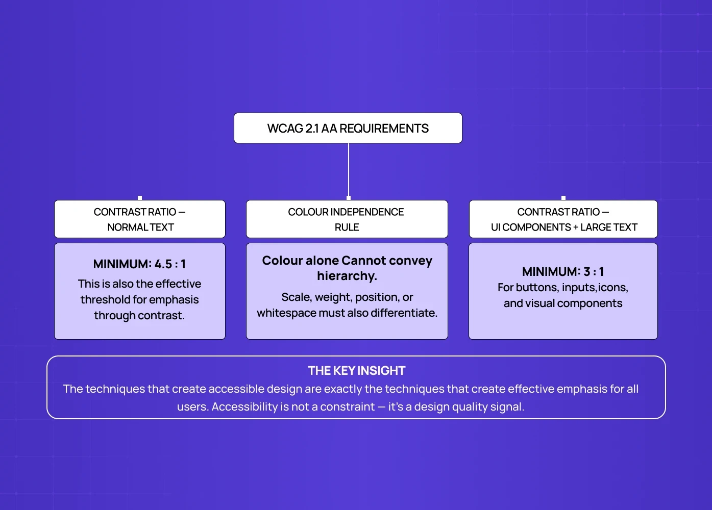
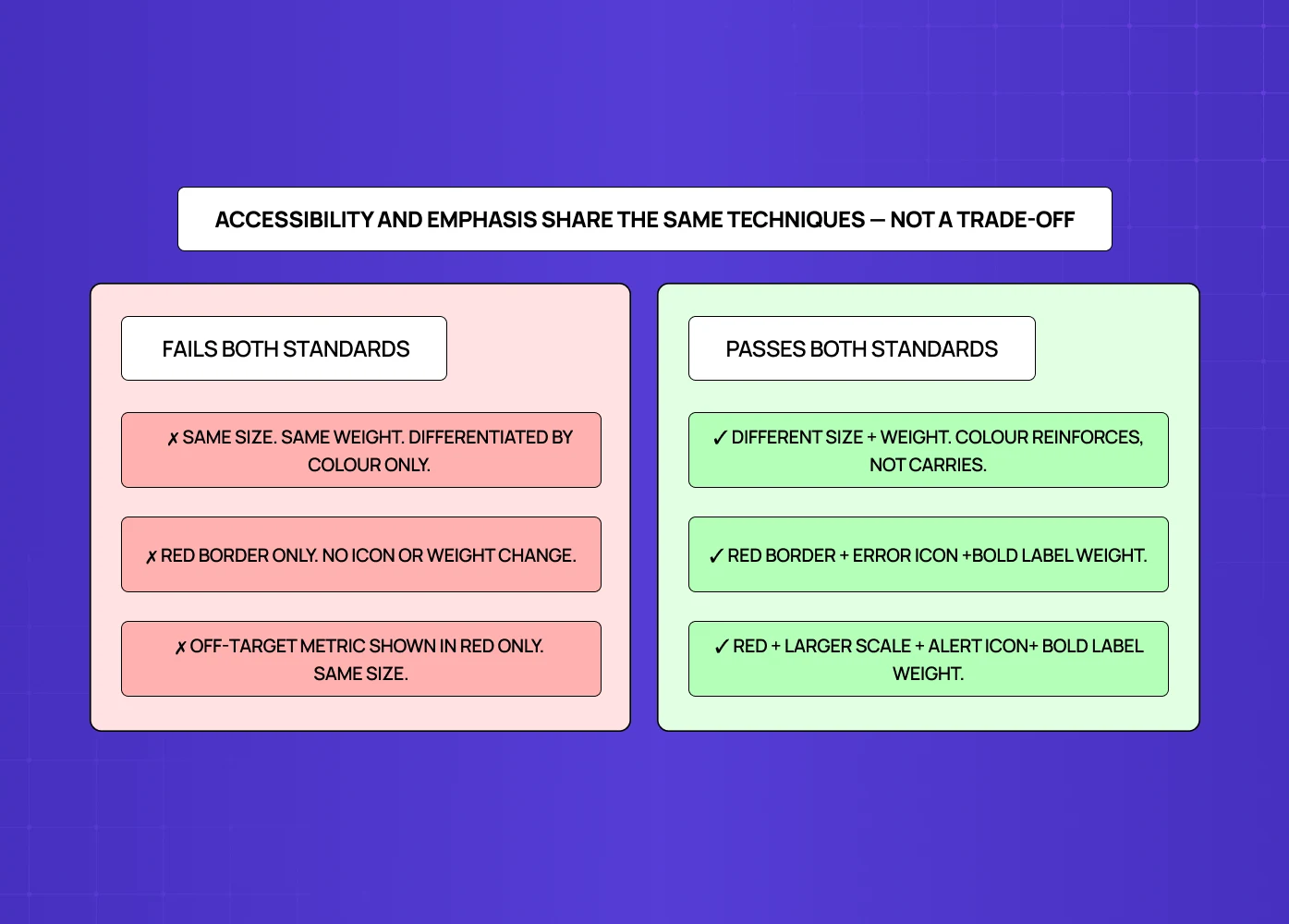
Accessibility and emphasis are frequently treated as competing concerns in product design. They're not — they're complementary, and the WCAG requirements that govern visual emphasis are good design practice regardless of compliance obligation.
WCAG 2.1 Level AA requires a contrast ratio of at least 4.5:1 for normal text and 3:1 for large text and UI components including buttons. This is the minimum for emphasis through contrast — which means the technique that most reliably creates visual hierarchy also has a minimum standard that must be met for the interface to be accessible.
The accessibility-specific emphasis consideration is colour independence: emphasis should not rely on colour alone to communicate hierarchy. This matters for users with colour vision deficiency (affecting approximately 8% of male users globally) and for interfaces viewed in high-contrast accessibility modes. The practices that create accessible emphasis — contrast, scale, whitespace, typographic weight — are exactly the practices that create effective emphasis for all users. Designing for accessibility constraints produces better visual hierarchies, not weaker ones.
The common violation is CTA states. A primary button that is visually distinguished from a secondary button only by colour (same size, same weight, same position pattern) fails both accessibility and emphasis standards. Add scale, weight, or positional differentiation and the hierarchy becomes legible to all users across all display conditions — and for teams extending beyond a single accent, two-hue contrast systems offer a structured way to introduce that range while keeping hierarchy intact.
Conclusion: Emphasis Is a Product Outcome, Not an Aesthetic Choice
Emphasis in design is not a principle about making things look good. It's a principle about making interfaces communicate what matters, what's next, and what can wait — reliably, across every screen, across every user, across every visit.
A few things worth taking away:
Emphasis is a hierarchy problem. The question is not "does this element stand out?" — it's "does the entire screen communicate a clear priority order?"
SaaS interfaces have three distinct emphasis contexts: acquisition (convert), activation (guide), and engagement (enable). The emphasis techniques appropriate to each stage are different.
The Focal Point Stack maps emphasis decisions to user journey stage before screen design begins — it prevents hierarchy drift and keeps product and design teams aligned on what each screen must communicate.
Colour emphasis only works when it's used for one purpose per screen. Mixing emphasis colour across states, categories, and CTAs creates noise, not hierarchy.
WCAG accessibility requirements and effective emphasis share the same techniques — contrast, scale, whitespace, typography weight. Designing for accessibility produces better visual hierarchy, not trade-offs.
Emphasis problems in SaaS are almost always assembly problems, not component problems. Components built correctly in isolation and assembled without hierarchy review produce flat, undifferentiated screens.
If your product team is walking through a screen and nobody can immediately identify the primary action — the emphasis needs work before anything else does. For a concrete reference point before that conversation, the website design examples that demonstrate emphasis in production are a useful baseline for calibrating what "working emphasis" looks like across different product types.