A website that feels easy, works everywhere, and looks trustworthy creates loyal users and lasting business value. The right approach blends website design suggestions and step-by-step UX know-how into a seamless, high-converting online experience.
Every website needs a strategy rooted in real user needs and smart design choices.

A high-impact website is not just visually appealing—it’s a digital experience that shapes how users perceive, trust, and engage with your business. With technology evolving, user expectations are higher than ever. Getting website design right means combining functionality with emotion, aesthetics with performance, and user needs with brand goals. If you're aiming for more conversions, stronger engagement, and a memorable presence — whether you're refining a SaaS platform or investing in small business site design — these five in-depth website design tips will guide your way clearly.
1. Building Navigation that Feels Effortless: Beyond Simple Menus
Intuitive Navigation Is the Cornerstone of Good Website Design
Imagine walking into a store where you can’t find the checkout or aisles aren’t labeled. Frustration rises, trust drops, and most people simply walk out. Your website’s navigation is the digital equivalent. Navigation that’s clear, logical, and easy to use is foundational, especially for new visitors who don’t know your layout.
Navigation is the way users move through your site.
If users can’t figure out where to go, they leave. This is where core website design tips begin: keep users oriented, reduce cognitive load, and always guide them toward their goal.
Step-by-Step: Designing Seamless Navigation
Step 1: Start with User Research
Before you touch a single line of code or design a menu, talk to users or look at analytics. What are visitors actually looking for? Which pages do they frequent?
Example: If your SaaS platform’s analytics show most users visit the “Pricing” and “Features” pages first, make those primary navigation links.
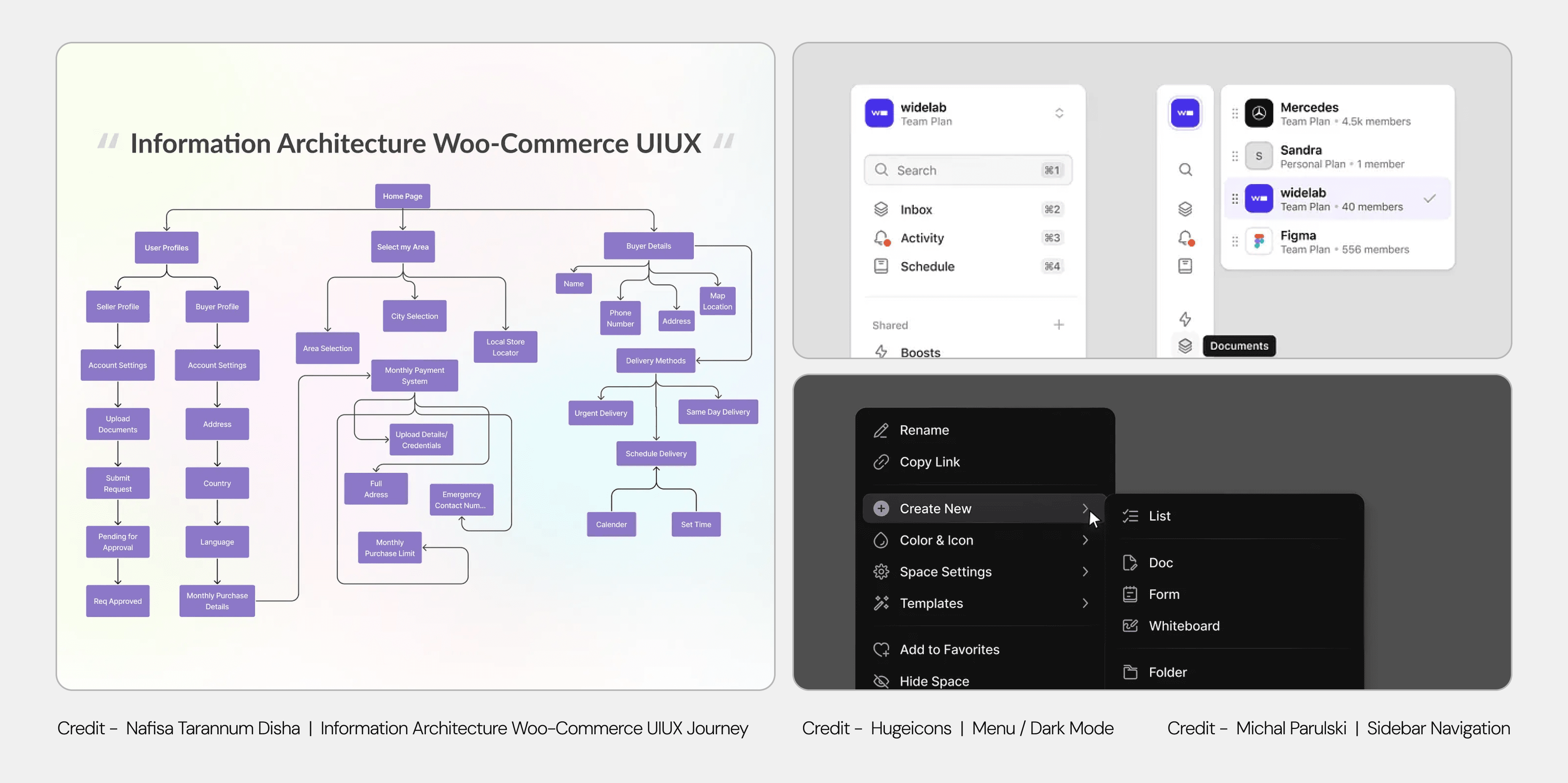
Step 2: Map the Information Architecture (IA)
Lay out your website structure visually — draw a simple map of main pages and how they connect. This is your IA. Getting the hierarchy right at this stage determines how easily users move through the site and how clearly search engines understand your content priorities.
Example:
Home
Features
Pricing
Case Studies
Resources
Blog
Help Center
Contact
Step 3: Keep Top-Level Navigation Limited
Limit top-level navigation to 5-7 items. More than this causes confusion. Use clear, familiar labels (“Pricing,” not “Plans & Investments”).
Tip: Test your menu on real users and ask them to find specific information.
Step 4: Use Secondary Menus for Deeper Content
If you have complex offerings, consider drop-downs or mega menus. Make sure each item is easily tappable/clickable.
Example: E-commerce brands like Amazon use mega menus to show categories, but SaaS companies usually stick to simple drop-downs for “Solutions” or “Resources.”
Step 5: Add a Search Bar for Large Sites
If your website has 20+ pages, a search bar is a must. Place it where users expect it—top right or clearly visible in the header.
Step 6: Incorporate Breadcrumbs for Clarity
Breadcrumbs (e.g., Home > Resources > Blog > Article) are a subtle way to show users where they are, especially on multi-level sites.
Example: For a documentation site, breadcrumbs help users backtrack easily.
Step 7: Prioritize Accessibility
Navigation menus should be keyboard navigable, have clear focus states, and be readable by screen readers.
Accessibility Tip: Use ARIA labels for menu items and logical tab order.
Practical Example: SaaS Dashboard Navigation
Suppose you’re building a SaaS dashboard. Your users log in daily to manage tasks and view analytics.

Use a left-hand sidebar for persistent navigation:
Dashboard
Projects
Reports
Settings
Highlight the active section so users always know where they are.
For mobile, collapse this sidebar into a hamburger menu but keep core links easily accessible.
Common Mistakes & How to Avoid Them
Overcomplicating menus: Don’t nest submenus three or four levels deep.
Unclear labeling: “Solutions” might mean something different to you than to your user. Use terms your audience expects.
Inconsistent placement: Navigation shouldn’t jump from top to side or vanish between pages.
Real-World Case Study: Shopify
Shopify’s admin dashboard is a gold standard for intuitive navigation. Every page is just one or two clicks away from core actions. Consistent navigation across devices means users never get lost, even as their needs grow.
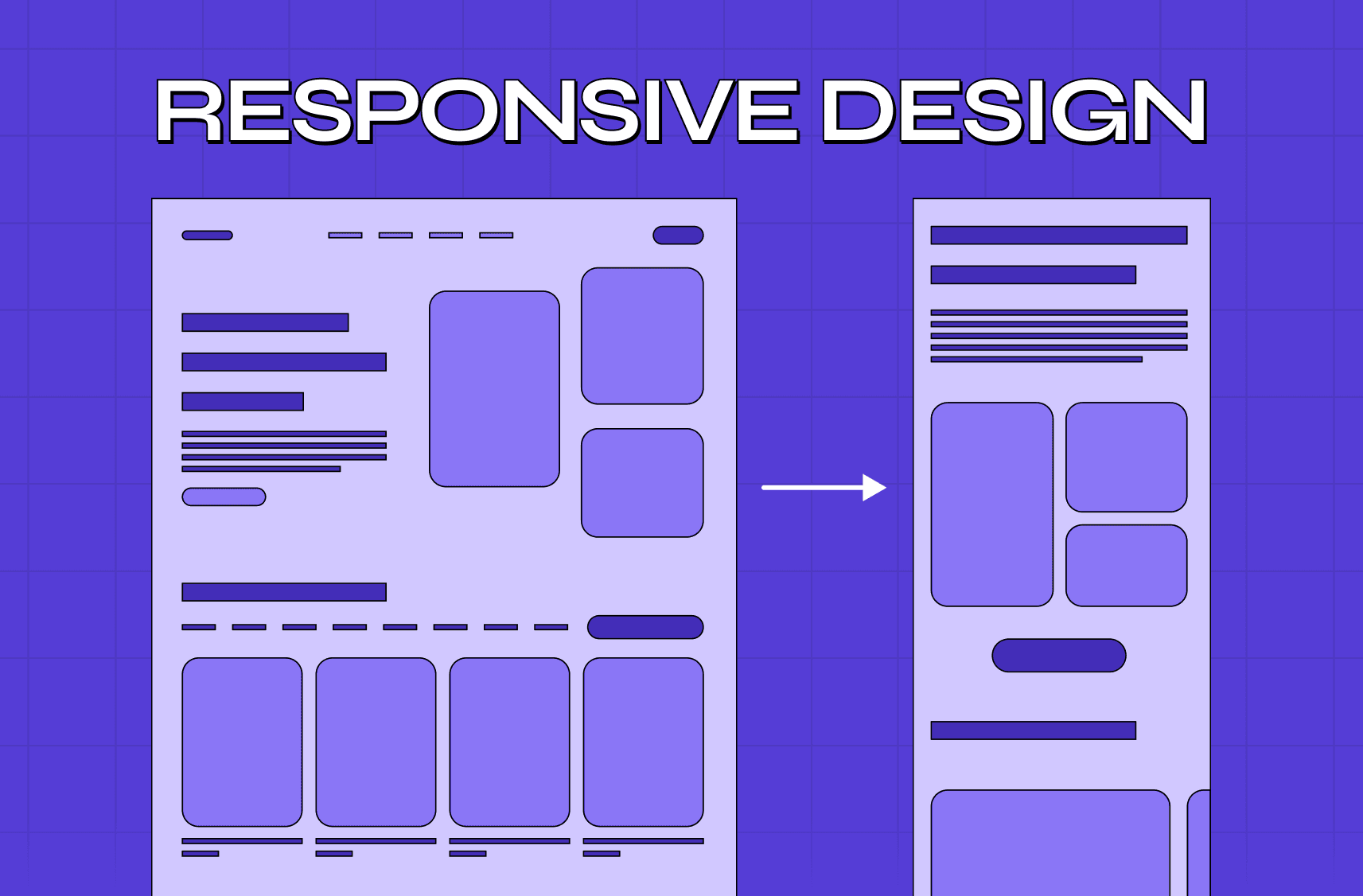
2. Making Your Website Universally Usable: Responsive and Adaptive Design
Why Mobile Responsiveness Is Non-Negotiable
With mobile traffic accounting for more than half of all web visits, a desktop-only mindset is obsolete. People expect flawless experiences, whether on a phone, tablet, or giant monitor. Mobile responsiveness isn’t just about shrinking things down—it’s about ensuring content, navigation, and interactions make sense for every user, everywhere.
Step-by-Step: Creating a Mobile-First Experience
Step 1: Design for the Smallest Screen First
Start with the essentials. If it works on a phone, scaling up is easier than cutting features later.
Example: On mobile, collapse multi-step forms into single columns. Prioritize core CTAs, hide secondary elements in expandable menus.
Step 2: Use Responsive Frameworks and Grids
Adopt frameworks like Bootstrap or CSS Grid to create fluid layouts. Set breakpoints for common device widths:
<600px (mobile)
600–900px (tablet)
900–1200px (small desktop)
1200px+ (large desktop)
Step 3: Test All Interactive Elements
Buttons should be at least 48x48 pixels for easy tapping. Avoid hover-only menus; touchscreens need visible triggers.
Step 4: Optimize Navigation for Mobile
Navigation should become a hamburger menu or bottom tab bar. Make sure menus expand/collapse smoothly and are thumb-friendly.
Step 5: Ensure Media Scales Correctly
Use relative units like percentages or “vw/vh” instead of fixed pixels for images and containers. Set “max-width: 100%” for images so they don’t break layouts.
Step 6: Test on Real Devices
Simulators are helpful, but nothing beats holding the device in your hand. Check for font sizes, button spacing, image cropping, and page load times on actual hardware.
Real-World Example: Airbnb
Airbnb’s mobile site mirrors its app in usability. Search filters, calendar pickers, and booking flows are perfectly touch-optimized. The entire booking experience is as smooth on a phone as it is on a laptop.
Performance Tip: Mobile Page Speed
Compress all images and serve them in WebP or AVIF formats. Lazy-load images below the fold. Avoid auto-playing videos unless muted and tiny. Use server-side rendering or static site generators for lightning-fast load times.
Accessibility Matters
Mobile accessibility isn’t optional. Use high-contrast buttons, readable font sizes (at least 16px), and support for dark mode.
Tip: Test using your device’s accessibility features (screen reader, font size increase) to see where improvements are needed.
3. Visual Hierarchy: Directing Attention and Encouraging Action
Understanding Visual Hierarchy
Visual hierarchy is about organizing information so users see what’s most important first, then naturally follow a path through your content. This is where the art of website design tips meets psychology—good hierarchy increases conversions, retention, and satisfaction.

Step-by-Step: Establishing Visual Hierarchy That Works
Step 1: Define Your Core Actions and Messages
What’s the number one thing users should do on each page? (Sign up, buy, contact, explore.)
Example: On a landing page, the headline and CTA (“Start Free Trial”) must pop.
Step 2: Use Size and Scale
Larger elements catch the eye. Headlines, hero images, and primary buttons should be visually dominant.
Example: Compare Amazon’s “Add to Cart” button with everything else—it always stands out.
Step 3: Play with Color and Contrast
High-contrast colors attract attention. Use your accent color for CTAs, while supporting elements stay neutral.
Tip: Don’t overdo it—too many colors can confuse users.
Step 4: Group Related Items with Proximity
Put related navigation items together. Group product features in one section, testimonials in another.
Step 5: Use Whitespace Intentionally
Whitespace isn’t empty space—it’s the “breathing room” that makes a site feel open and focused.
Example: Apple’s product pages use generous whitespace to make each feature shine.
Step 6: Guide with Imagery and Icons
Illustrations, images, and icons can break up text and clarify meaning.
Example: Dropbox uses icons and visual cues to reinforce actions like uploading or sharing.
Real-World Example: Stripe
Stripe’s website is a masterclass in visual hierarchy. Every page leads with a powerful headline and a single action. Feature lists, code examples, and customer quotes are spaced to avoid overwhelm, with a logical flow that’s easy to scan.

Mistakes to Avoid
Cluttered pages: If everything is bold, nothing stands out.
Inconsistent layouts: Switching visual priorities from page to page confuses users.
Overuse of color: Save your accent color for actions that really matter.
Using Lists and Bullet Points
When you need to explain features or benefits, bullet points work wonders.
For example:
Highlight benefits in a pricing comparison.
List supported integrations on a product page.
Summarize steps in a process, like onboarding.
4. Readable, Digestible Content: Designing for Humans, Not Just Search Engines
Why Content Readability Is a Game-Changer
Users don’t read—they scan. Your content needs to be easy on the eyes, logically structured, and approachable. Dense, jargon-filled text or blocks without breaks will scare users off, no matter how good your product is.
Step-by-Step: Crafting Content That Converts
Step 1: Write Clear, Compelling Headlines
Each page should start with a headline that explains exactly what users get. Avoid vague statements.
Example: Instead of “Next Generation Solutions,” write “Automate Your Invoicing with AI-Powered Tools.”
Step 2: Break Up Text with Subheadings
Divide content into sections with descriptive subheadings. This helps users scan and jump to what matters.
Step 3: Use Short Paragraphs and Sentences
Long walls of text are overwhelming, especially on mobile. Aim for 2-4 lines per paragraph.
Step 4: Choose Fonts for Legibility
Sans-serif fonts like Inter, Helvetica, or Roboto are easy to read on screens. Keep body text at least 16px.
How many fonts for a website? Stick to two—one for headlines, one for body copy.
Step 5: Leverage Contrast and Backgrounds
Dark text on a light background is usually best for readability. High contrast is especially critical for accessibility.
Step 6: Add Visuals to Support, Not Distract
Infographics, screenshots, and icons clarify points. Avoid using visuals just for decoration.
Step 7: Mind the Whitespace
Use padding and line height to space out text and sections.
Spacing rule: Line height should be 1.4–1.6 times the font size for comfortable reading.
Practical Example: SaaS Feature Pages
When explaining features, use a hierarchy:
Start with a clear headline (“Automate Billing in 3 Clicks”)
Add a one-sentence summary.
Bullet out the main benefits.
Show a screenshot or short demo video.
End with a CTA (“Get Started Now”).
Accessibility and Language
Avoid jargon and insider terms—write like you’re explaining to a new team member.
For international audiences, keep sentences simple and consider translation plugins.
Ensure all visuals have alt text for screen readers.
Testing Content Readability
Use tools like Hemingway App or Grammarly to check grade level and sentence complexity. Aim for a reading level that’s easily understood by a broad audience.
Example: Mailchimp

Mailchimp’s website shines with short paragraphs, quirky but clear headlines, and helpful visuals. Their content feels both expert and accessible.
5. Brand Consistency: Creating Trust and Cohesion Across Every Page
Why Consistent Branding Matters
A user should know, within seconds, whose site they’re on—even if they’re on a random blog post or support page. Consistency in design isn’t just about looking good—it signals reliability and builds the foundation for lasting trust.
Step-by-Step: Building and Maintaining a Consistent Brand Aesthetic
Step 1: Define Your Visual Guidelines
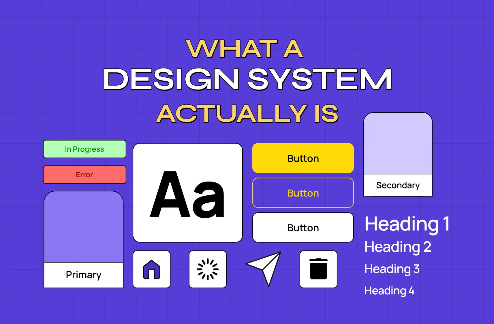
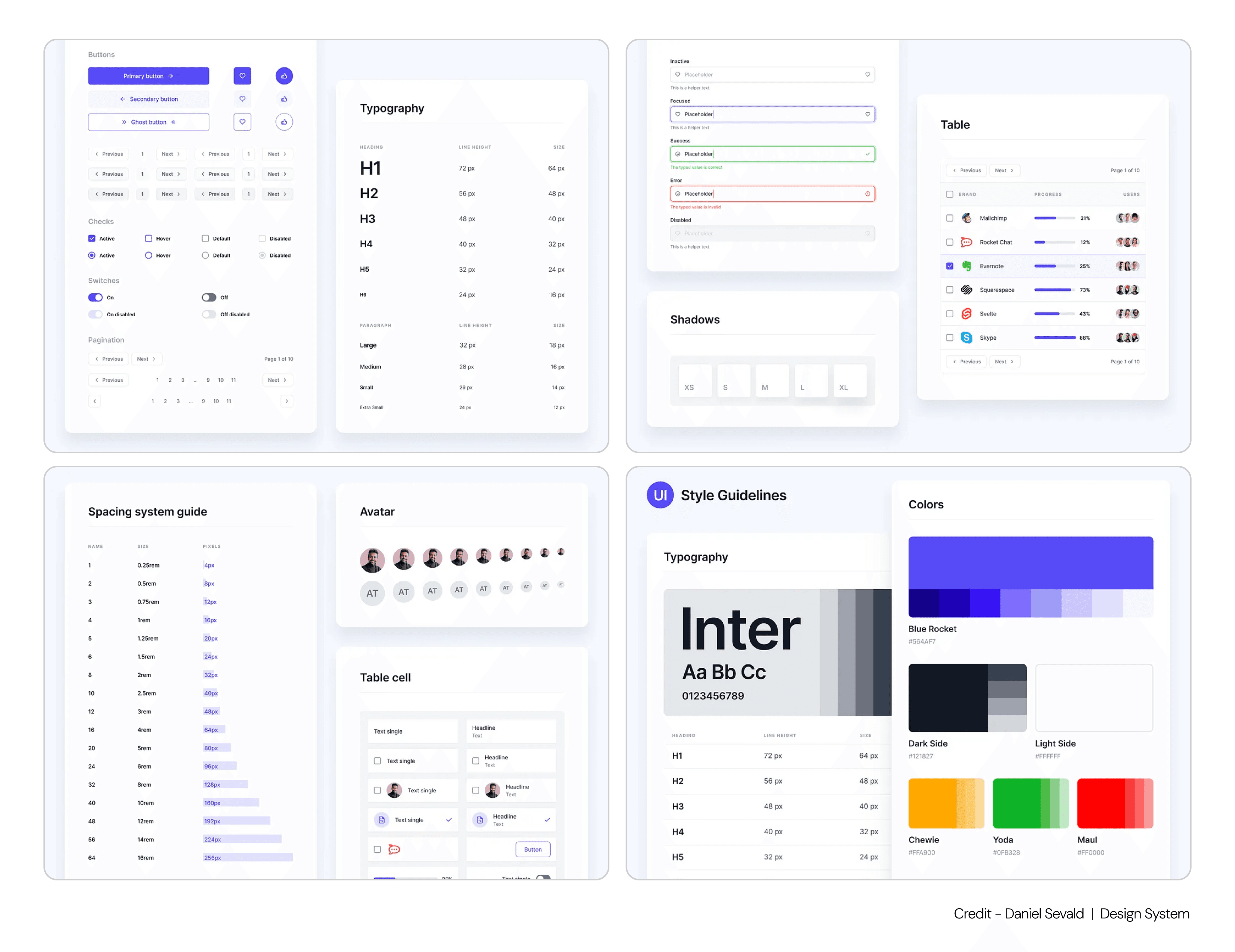
Before designing, outline your brand’s core colors, fonts, button styles, and imagery rules in a brand guide or design system.
Example:
Colors: Main (Blue), Accent (Green), Neutral (White, Light Grey)
Fonts: Headlines (Montserrat Bold), Body (Open Sans Regular)
Step 2: Use Components and Design Systems
Modern web design uses reusable components—like buttons, forms, cards—ensuring consistency site-wide.
Tip: Build your design system in Figma or similar tools for easier updates.
Step 3: Align Tone of Voice Across Content
Every headline, microcopy, and call-to-action should “sound” like your brand. If you’re friendly and casual on your homepage, keep it that way in your support docs.
Step 4: Keep Logos, Icons, and Graphics Uniform
Your logo should always be in the same position (usually top left). Use the same icon style (line, filled, colored) everywhere.
Step 5: Review Consistency Regularly
As your website grows, review pages every quarter — and treating this as part of a broader website maintenance and consistency practice ensures inconsistent buttons, mismatched colors, or off-brand photos get caught before they erode the trust your brand has built.
Real-World Example: Notion
Notion’s website, product, and documentation all use the same color palette, iconography, and tone. Whether a user is in the app or reading a blog post, the experience is unmistakably Notion.
Trust Signals and Brand Cohesion
Display client logos and testimonials on key pages.
Link to social proof—awards, media mentions, case studies.
Show clear privacy and security policies in the footer — where effective footer design keeps trust signals and legal links accessible without clutter.
Make contact information easy to find and always up to date.
Mistakes to Avoid
Mixing visual styles: Don’t switch between illustration styles or button shapes without reason.
Changing brand tone: Keep your language and personality consistent, even in error messages.
Two Lists That Matter for Web Design Mastery
The Top 5 Website Design Tips for Beginners
Always prioritize users’ needs when mapping navigation—don’t bury core actions or information.
Test your designs on multiple devices, not just desktops. Real users are mobile-first.
Make CTAs stand out with bold color and smart placement.
Use only essential fonts and colors—less really is more for trust and clarity.
Check your content’s readability, using short sentences, ample white space, and supporting visuals.
Quick Website Design Suggestions for SaaS and Tech Startups
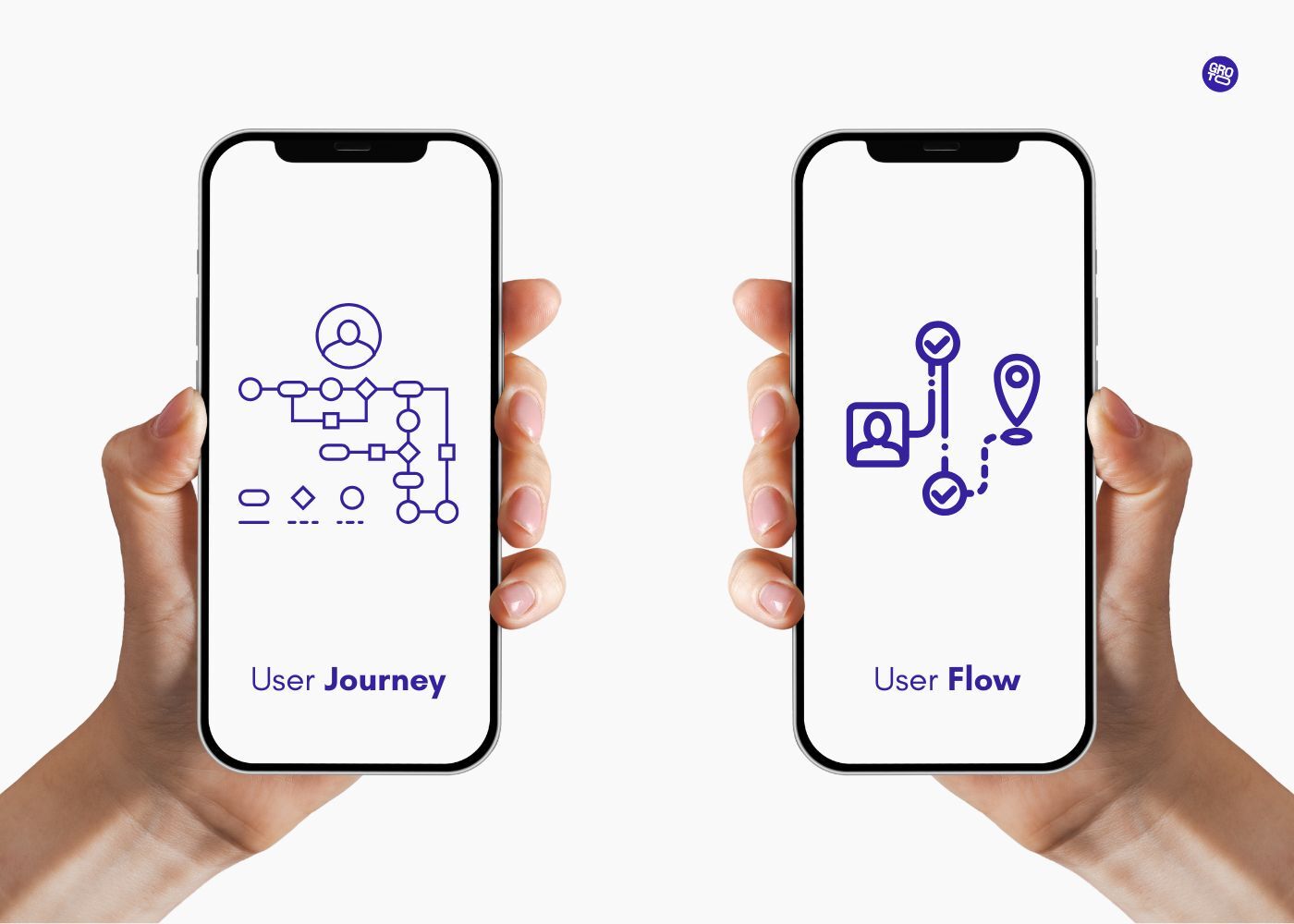
Start every project with a user journey map.
Audit your navigation and cut unnecessary links.
Test mobile versions early and often—don’t wait for launch.
Review your site’s hierarchy: are the most important actions obvious?
Revisit your brand guidelines quarterly to maintain consistency.
Key Takeaways
Intuitive navigation is the backbone of every great site—guide users naturally to their goals.
Mobile responsiveness is non-negotiable—design for the smallest screen first, then scale up.
Visual hierarchy turns passive visitors into active users—put your most important actions front and center.
Readable, accessible content ensures everyone can engage with your site, boosting trust and loyalty.
Consistent branding ties your whole experience together, building credibility and fostering repeat visits.
Why Groto is Uniquely Positioned to Transform Your Website’s UX
Your product might be smart, but if it’s not usable, none of that matters. That’s where Groto comes in.
We’re a full-stack design agency that transforms SaaS and AI experiences into clear, useful, and user-validated products. Whether you’re trying to improve onboarding, launch a GenAI copilot, or just get users to trust your AI insights—we’ve built strategy and design systems for exactly that.
Our approach combines business-focused UX research with elite visual design, helping you go from strategy to execution in weeks—not quarters. You bring the ambition. We bring clarity, craft, and the process to make it real.
We’ve helped global brands and startups alike create products users love to use. Let’s help you do the same.
🔗 Start your project with Groto
Read More
Top 10 AI Web Design Tools You Need to Know in 2025
Understanding UX Strategy: A Practical Guide to Building Products That Work
Figma vs Sketch vs Adobe XD: Best UI Design Tool Compared 2025
Integrating AI into SaaS UX - Best Practices and Strategies
FAQ
Q. What are the 4 C’s of website design and why do they matter for my users?
Clarity, Consistency, Compatibility, and Credibility form the foundation for sites users trust and return to. When your navigation is clear, design is consistent, site works across all devices, and your brand feels credible, users stick around, explore more, and take action—directly impacting conversions and loyalty.
Q. Which type of website design structure works best for a SaaS product?
Most SaaS platforms use a hierarchical structure, making navigation logical and scalable as features grow. For onboarding or trial flows, a sequential structure helps guide users step by step. Choose based on how your customers move through your product and what tasks matter most for them.
Q. What are the top website design rules that actually improve conversions?
Start with simplicity and consistency—use only two or three fonts, keep color choices tight, and ensure content is clear and relevant. Put important CTAs in high-contrast buttons, design mobile-first layouts, and always test changes with real users. Quick wins: simplify forms and make navigation obvious.
Q. How many fonts should I use on my site for best results, and why?
Two fonts are ideal: one for headlines, another for body text. This keeps pages readable and visually unified, reducing bounce rates. More fonts can distract and create a messy look, so keep the typography clean and focused to help users find what they need faster.
Q. How should I handle spacing and layout to keep my site easy to use?
Use consistent padding and margins between elements—too little space feels cramped, too much loses connection. Line height for text should be at least 1.4x font size. Test your pages on both desktop and mobile to see if every element feels balanced, readable, and uncluttered.
Q. What can I do to make my site accessible for everyone, including users with disabilities?
Choose high-contrast colors, make text resizable, and ensure navigation works with keyboard only. Use alt text for all images and descriptive labels for forms. Test your site with screen readers and consider adding skip-to-content links. Accessible design doesn’t just help those with disabilities—it improves UX for everyone, boosting retention and SEO.