The most striking visual identities are often built on a single colour — not one colour with accents, but one hue expressed fully across every surface. This guide breaks down the logic, the terminology, and the practical techniques behind monochromatic design.
One colour. Every shade of it. Here is why that is enough.
Some of the most striking visual identities ever built use exactly one colour. Not one dominant colour with accents — one colour, expressed in its full range of variation, across every surface.
That restraint is not a limitation. It is a design decision with a specific logic behind it, and understanding that logic is what separates a monochromatic color scheme that feels considered from one that just feels flat.
This guide covers the full picture: what monochromatic colour actually means, the terminology that governs it, how to build a palette that works, where it sits relative to other colour approaches, and how it shows up in real product and brand design.
What Is a Monochromatic Color Scheme?
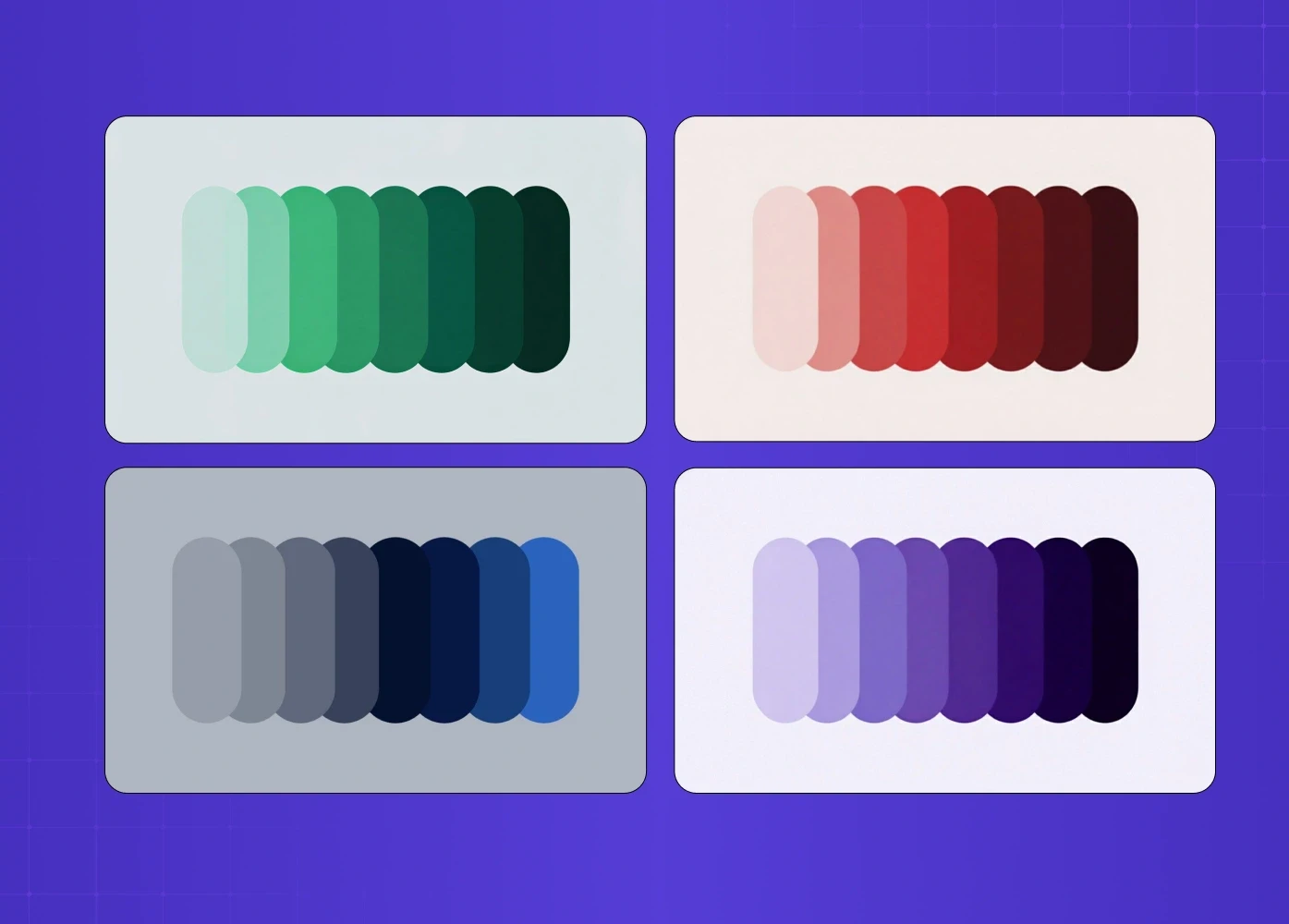
The word breaks down from Greek: monos (one) + khroma (colour). A monochromatic colour scheme uses a single base hue and all its variations — lighter, darker, more saturated, and more muted versions of that same colour.
It is important to be precise here: monochromatic does not mean one shade. It means one hue with an unlimited range of tonal variation. A monochromatic palette built on deep navy can include near-white powder blue at one end and near-black midnight at the other — and everything between.
The Elements: Tints, Shades, and Tones
Before building a palette, the terminology needs to be clear. These three terms are consistently misused, and confusing them leads to muddy palettes.
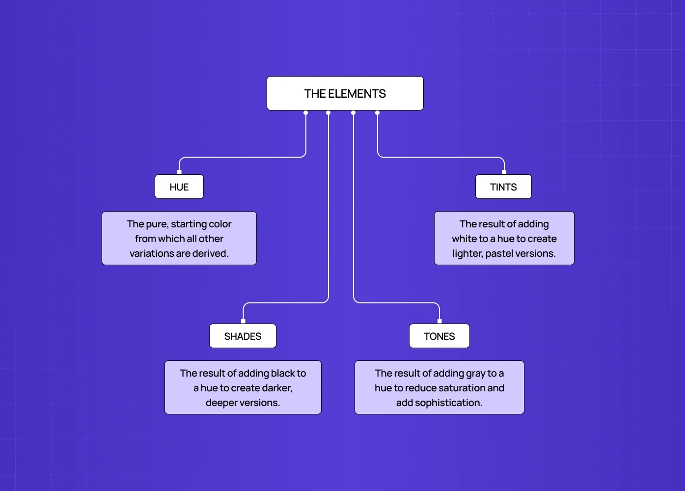
Hue
The base colour itself — the starting point from which everything else is derived.
Choosing the right hue is the most consequential decision in a monochromatic system.
It should reflect the brand's intended emotional territory: green for sustainability, blue for trust, deep purple for creativity and luxury.
Tints
Created by adding white to the base hue.
Tints become progressively lighter and less saturated — pastel colours are tints.
In UI design, tints are commonly used for backgrounds, hover states, and disabled elements.
Shades
Created by adding black to the base hue.
Shades become progressively darker and more intense.
In design systems, shades provide depth — used for pressed states, shadows, borders, and text on light backgrounds.
Tones
Created by adding grey to the base hue.
Tones reduce saturation without dramatically shifting lightness.
They add sophistication and complexity to a palette without changing its essential colour identity.
A functional monochromatic palette typically contains five to seven stops across tints, the base, tones, and shades — enough range to establish clear visual hierarchy without losing coherence.
How to Create a Monochromatic Color Scheme
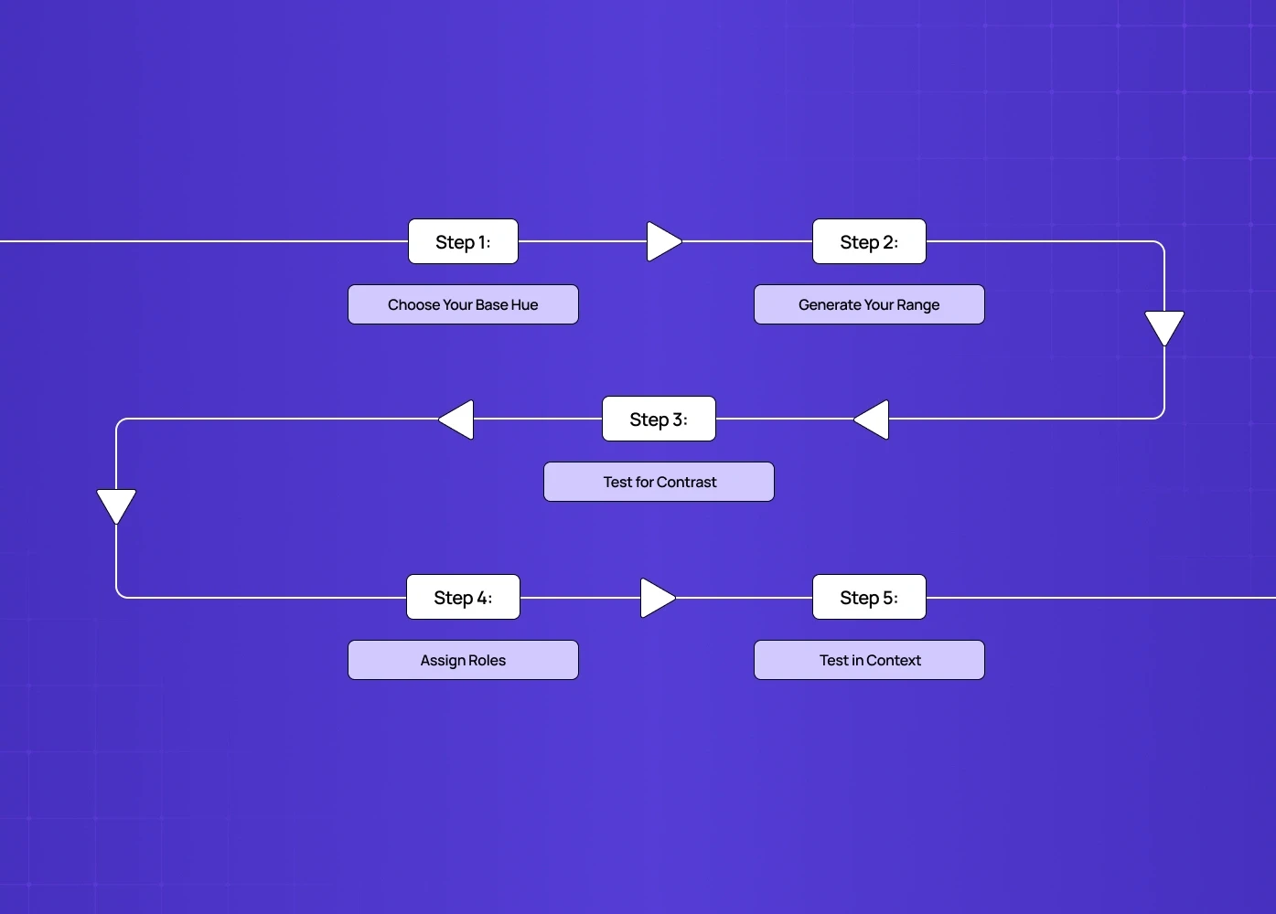
Step 1: Choose Your Base Hue
The base hue should reflect the brand's intended communication objective — this is a strategic decision, not a decorative one.
Monitor colour trends and consider psychological associations: green for health and sustainability, blue for trust and stability, purple for creativity and luxury.
If working with an established brand, the base hue should come from the existing corporate identity.
Colour Psychology: Choosing the Right Hue
Blue — communicates trust, stability, and professionalism. The most widely used hue in fintech, healthcare, and enterprise SaaS for exactly this reason.
Green — signals growth, health, and sustainability. Works well for wellness products, environmental brands, and anything where progress is the core promise.
Purple — conveys luxury, creativity, and sophistication. Common in premium consumer products and creative tools.
Red — expresses energy, urgency, and confidence. Powerful as a base hue but requires careful tonal management to avoid feeling aggressive.
Yellow — signals optimism, warmth, and approachability. Less common as a dominant base hue in digital products but highly effective for brands that want to feel energetic and human.
Step 2: Generate Your Range
Add white incrementally to produce 2-3 tints.
Add grey incrementally to produce 1-2 tones.
Add black incrementally to produce 2-3 shades.
Aim for five to seven total stops — enough for hierarchy, not so many they become indistinguishable.
Step 3: Test for Contrast
Every pair of colours that will appear together needs sufficient contrast.
For digital interfaces, WCAG 2.1 AA requires a minimum contrast ratio of 4.5:1 for body text.
A monochromatic palette that fails accessibility testing is not a functional design system — it is an aesthetic exercise.
Step 4: Assign Roles
Each colour in the palette should have a defined role — background, surface, border, primary text, secondary text, interactive element, disabled state.
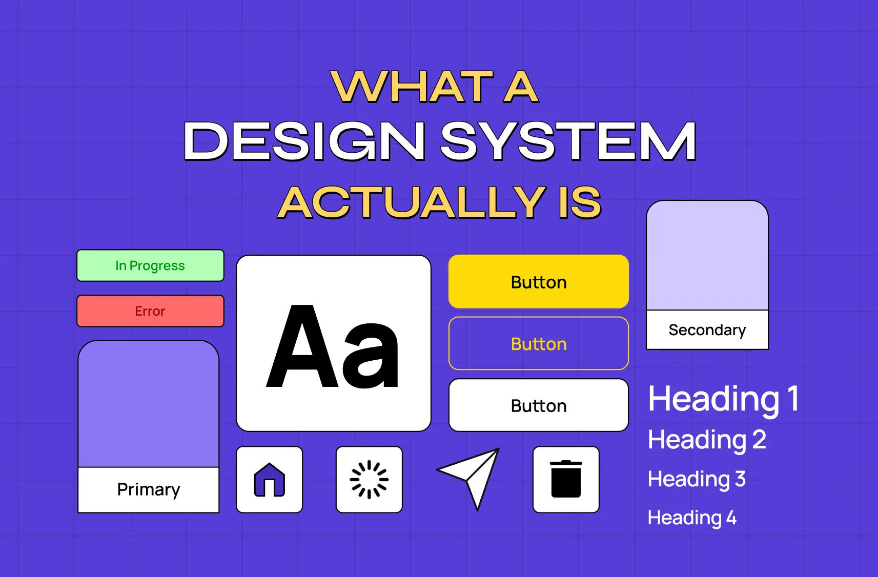
Monochromatic colour in SaaS design systems shows how those role assignments get encoded into a component library and token system that keeps monochromatic application consistent as the product scales across teams and features.
Step 5: Test in Context
A palette that looks harmonious on a swatch board can behave unexpectedly in a real interface.
Test across light and dark backgrounds, different screen sizes, and both high- and low-light environments.
Colour temperature can shift significantly between device calibrations — test on multiple screens.
Monochromatic vs. Other Colour Schemes
Understanding where a monochromatic approach sits relative to alternatives helps clarify when to use it — and where monochromatic sits among colour scheme types covers all six palette structures in depth, including analogous, triadic, split-complementary, and tetradic approaches, so you can evaluate the tradeoffs before committing to any single system.
Scheme | Definition | Best for |
Monochromatic | One hue + its tints, shades, and tones | Brand coherence, premium feel, focused UI |
Analogous color scheme | Hues adjacent on the colour wheel | Natural, harmonious, low-contrast interfaces |
Triadic color scheme | Three hues equally spaced on the colour wheel | Vibrant, high-energy, playful designs |
Split complementary color scheme | A base + two colours adjacent to its complement | High contrast with less tension than full complementary |
Achromatic color scheme | Blacks, whites, and greys only — no hue | Stark minimalism, maximum focus on typography |
The key distinction: monochromatic is the most controlled of all colour approaches. It offers the least variety and the most coherence — which makes it either exactly right or exactly wrong depending on the design goals.
6 Techniques for Designing with Monochromatic Colour
1. Simplify a Busy Layout
When a design needs to fit a lot of information into limited space, a one-colour palette pulls everything together without adding visual noise — a principle infographic design services rely on constantly, since dense data visuals need restraint more than any other format.
Use white or near-white for backgrounds to let the monochromatic elements stand out clearly.
The palette does the organising work, reducing the cognitive load a complex layout would otherwise create.
2. Create Hierarchy Through Value Progression
Lighter tints for backgrounds and supporting content, mid-tones for surfaces, darker shades for primary text and interactive elements.
This is how monochromatic palettes establish visual hierarchy without using multiple hues — and understanding emphasis through value contrast shows how that same tonal progression creates focal points that guide attention as deliberately as any multi-colour system would.
The darker the shade, the more visual weight it carries — use this deliberately, not by accident.
3. Use Colour to Divide Sections
Blocks of colour within a single palette can separate content areas and create an organised, navigable layout.
A common three-colour layout consists of a background colour, a text colour, and an accent stop for interactive elements or graphics.
Sectioning content this way draws directly on visual balance principles, since dividing a layout by colour still has to distribute visual weight correctly across the page.
This technique works particularly well for dashboards and data-heavy interfaces where content zoning is critical.
4. Apply Colour Overlays to Photography
A transparent monochromatic overlay applied to photography — especially black and white photography — creates the impression of colour variation while keeping the palette tight.
The same restraint shows up in line art illustration, where a single stroke weight and colour carry the entire visual load.
The shades of the underlying photograph show through, creating depth within a single hue.
Effective for editorial layouts, campaign imagery, and hero sections where brand colour needs to dominate.
5. Try an Almost-Monochromatic Scheme
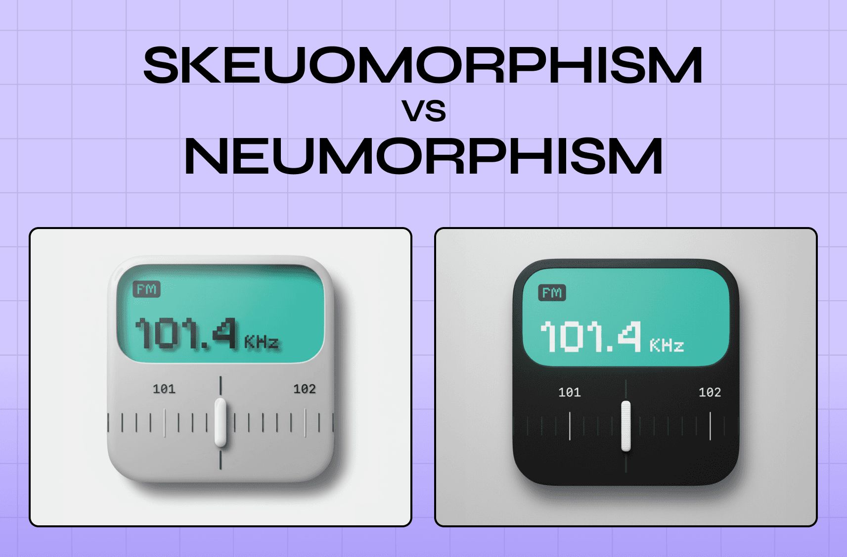
A strictly monochromatic palette is not always practical — adding a single accent colour is a common and effective approach. This is exactly how neumorphic design operates, where near-monochromatic palettes of soft greys and tinted whites create the subtle depth that defines the style, and monochromatic palettes in skeuomorphic and neumorphic design shows how both visual movements use tonal restraint very differently to achieve depth and interaction signals.
The accent should have a specific purpose: highlighting a CTA, marking the active state, or distinguishing a brand mark.
Alternatively, drawing from the same colour family (blues and greens, for example) creates the visual harmony of a monochromatic palette without the strict one-hue constraint.
6. Double the Palette Across Related Designs
Two contrasting monochromatic palettes applied to related designs — a product line, a campaign series, a paired set of interfaces — show difference while maintaining connection.
Complementary base colours (blue and orange, red and green) maximise the contrast between the two palettes while the monochromatic discipline keeps each one internally coherent.
This works well for product variants, seasonal campaigns, and dual-brand systems.
Where a Monochromatic Color Scheme Works in Practice
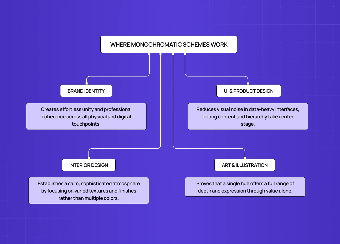
In Brand and Visual Identity
When every touchpoint shares the same base hue, the brand reads as unified without effort — even across wildly different applications. This is monochromatic colour as a brand experience tool in practice: the deliberate shaping of every touchpoint so that the same emotional impression — considered, trustworthy, precise — is reinforced whether the user is looking at the packaging, the website, or the product interface.
Apple's use of silver and space grey across hardware, packaging, and interface design is technically achromatic but monochromatic in discipline and effect.
Aesop uses earthy, desaturated ochres and taupes across every touchpoint — packaging, retail environments, and digital — communicating considered luxury without a single loud decision. That same principle of brand trust through color consistency becomes even more consequential in regulated industries, where a unified palette across every surface signals institutional credibility rather than just aesthetic discipline.
In UI and Product Design
Monochromatic palettes reduce visual noise and allow hierarchy to be established through value contrast alone — particularly effective for data-heavy dashboards and onboarding flows where reduced complexity lowers cognitive load.
Applying monochromatic colour to digital product design covers how this colour restraint connects to the broader product design principles of simplicity, visual hierarchy, and consistency that determine whether an interface feels effortless or effortful.
At Groto, monochromatic or near-monochromatic palettes come up regularly in SaaS product design — particularly where the data or content needs to be the most prominent visual element, not the interface itself.
Linear's dark, near-monochromatic UI with a single accent colour for interactive states is a strong current example: every shade belongs to the same family, and the visual language communicates precision and craft.
In Monochromatic Color Scheme Art and Illustration
Artists working monochromatically demonstrate that the full range of value within a single hue is enough to create complex, luminous compositions.
The perceived limitation of working with one colour is largely psychological — the range of expression within a single hue is wider than most assume.
For designers, studying monochromatic art and drawing is useful for internalising how value contrast does the work that hue variation usually handles — and when a project needs more contrast than one hue can deliver, understanding split complementary contrast shows how to introduce that tension without abandoning colour discipline entirely.
In Monochromatic Color Scheme Interior Design and Fashion
Interiors built on a single hue vary through texture, material, and finish rather than colour — matte versus gloss, rough versus smooth.
Monochromatic outfit dressing works by varying proportion, texture, and finish within a single colour — the same principles that make a monochromatic design system sophisticated rather than repetitive.
Both contexts reinforce the core logic: restriction is not limitation, it is discipline.
When Not to Use One
A monochromatic approach creates problems in specific contexts:
When multiple categories need colour-coding — a monochromatic palette cannot distinguish between data categories that need to be immediately differentiable, and in those cases a structured color ratio for design gives teams a proportional framework for introducing dominant, secondary, and accent hues without losing the coherence a single-hue system provides.
When energy and variety are the goal — monochromatic palettes feel calm and restrained, which works against designs that need to feel dynamic.
When accessibility is already a challenge — establishing sufficient contrast within a single hue range is harder than across multiple hues.
When the brand needs warmth and personality — monochromatic palettes tend toward sophistication; brands that need to feel warm, playful, or energetic often need a broader palette.
Monochromatic Color Scheme Examples Worth Studying
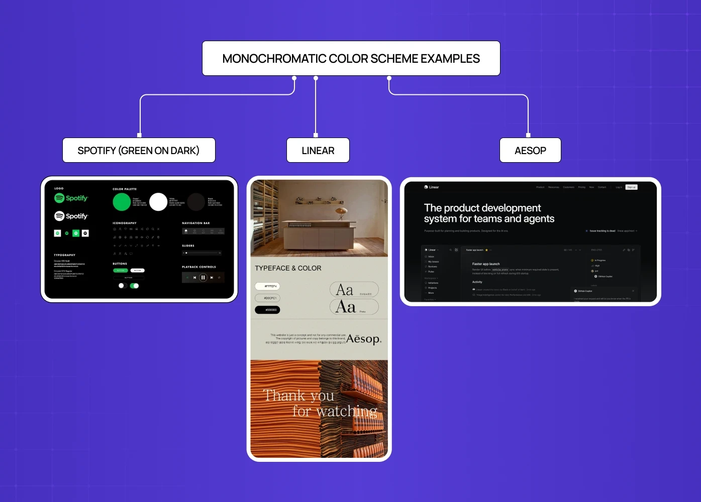
Spotify (green on dark)
Spotify's product UI uses a single brand green across all interactive elements against a near-black background. It is not strictly monochromatic, but the logic is: one accent colour, consistently applied, creates an identity that is immediately recognisable and highly functional without visual noise.
Aesop
The skincare brand's visual identity uses earthy, desaturated ochres and taupes across every touchpoint — packaging, retail environments, and digital. The palette is essentially monochromatic in warmth and saturation level. The result is a brand that communicates considered luxury without a single loud visual decision.
Linear
Linear uses a dark, near-monochromatic UI with precise use of a single accent colour for interactive states — every shade belongs to the same family, and the visual language communicates precision and craft. For a broader set of monochromatic design in real-world website examples, that collection shows how leading brands across categories apply the same colour restraint principles to achieve very different emotional results.
Conclusion
A monochromatic colour system is built on one hue expressed through tints (lighter), shades (darker), and tones (more muted)
The restraint is the point — coherence, sophistication, and clarity are the outcomes of working within a single hue
It works best when the goal is brand unity, reduced visual noise, or creating an interface where content takes precedence over decoration
The practical constraints are accessibility (contrast ratios within a single hue require more care) and the absence of colour-coding capability across distinct categories
The best monochromatic design work does not feel limited — it feels deliberate
Building a palette is only half the work; assigning roles and testing in real context is where the system either holds or breaks down
Working on a brand or product where colour coherence matters? At Groto, we build colour systems and design systems for SaaS, fintech, and consumer products — from palette decisions to full visual identity and component libraries.