When users struggle to navigate, abandon key flows, or ignore new features, it’s not just a hiccup—it’s a warning sign. A strategic UX/UI redesign isn’t a cosmetic fix; it’s a growth lever hiding in plain sight.
Great design isn’t decoration—it’s how your product actually works for real users.

The design of your SaaS product isn’t just about how it looks, it’s about how it works. A well-structured interface improves usability, increases user satisfaction, and supports core business goals like retention and growth. But what if your product no longer feels intuitive, or engagement is stalling? That’s when many product teams start asking whether it’s time for a full SaaS UX design overhaul.
Making that decision isn't just about aesthetics — knowing the SaaS website redesign warning signs that indicate structural failure versus surface-level decay is what separates teams that redesign at the right moment from those that wait until churn forces their hand.This article helps you evaluate when a UX/UI redesign is the right move,and how to approach it in a practical, results-oriented way.
What Is a SaaS UX/UI Redesign?
A SaaS redesign involves updating both the user interface (UI) and user experience (UX) to better serve user needs and meet business objectives. The UI includes visual elements like layout, typography, and spacing, while the UX covers the overall flow, how users interact with the product and whether it supports their goals.
A full redesign goes beyond visual refreshes — and SaaS UX design system thinking is what separates teams that successfully rethink workflows, navigation, and interface logic from those that ship prettier versions of the same broken experience.
The reason most redesigns are needed at all traces back to SaaS development decisions that drive redesign: architectural choices made during the original build that constrained how the interface could evolve as the product scaled, making structural rework eventually inevitable.
Let’s say a product adds a new AI feature. If users struggle to locate or understand it, that’s not a technical issue. It’s a UX gap. If onboarding doesn’t explain what value a feature provides,or worse, if it's buried under complex menus,a redesign might be the only way to make that feature viable.
Evaluating the Need for a SaaS UX/UI Redesign, Step-by-Step.
Step 1: Check If Core User Behavior Has Shifted
A change in user behavior is often the first sign your design no longer fits your product. If more users are abandoning key flows, spending less time on important pages, or misusing features, something’s off.
Tracking these patterns reveals pain points that can't be solved by patchwork updates — which is exactly what a SaaS UX audit process is designed to surface, giving teams the behavioral evidence needed to distinguish between isolated friction and structural UX failure before committing to redesign scope.
Maybe your product was built for small teams and now sells to enterprises. If dashboards haven’t evolved to support higher data complexity, users won’t be able to scale with your product. That’s a SaaS design services issue.
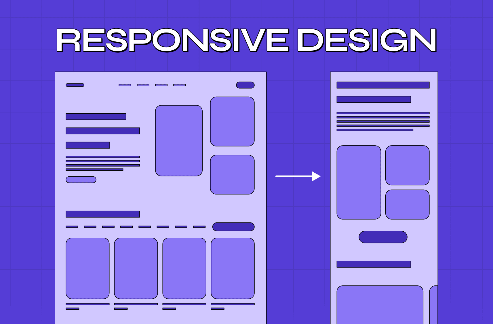
The same applies when mobile usage increases, but your product still performs best on desktop. If users are forced to pinch, zoom, or scroll sideways, that’s a red flag. Your interface is no longer serving the user where they are,and that gap invites churn.
Step 2: Look for Friction in High-Value Moments
Not every usability issue requires a redesign. But if friction exists during moments that matter,like sign-up, onboarding, task completion, or upgrade flows,it deserves a hard look.
Let’s say your new users take too long to complete onboarding, or worse, never complete it. That suggests your UX doesn’t guide them clearly enough. A modern UX design for SaaS growth puts guardrails in place, using tooltips, walkthroughs, and micro-feedback loops to keep users engaged.
Similarly, if your upgrade path or billing interface causes delays or confusion, you're leaking revenue. No user wants to second-guess what a button does when entering payment details. Clarity in those flows is non-negotiable.
Step 3: Align UX with Product Evolution
Adding major features or shifting your value proposition often calls for rethinking how your interface supports those changes.
If your SaaS product introduces machine learning, team collaboration, or analytics, your interface must evolve to support those modules — otherwise you'll have a feature no one uses, not because it isn't valuable, but because it's hard to reach or use. This is also when SaaS brand and product alignment breaks down: when the product evolves but the brand promise doesn't, users feel the gap between what the marketing site said and what the dashboard delivers.
The goal is not to bolt new functionality onto an old shell — and executing that well requires a structured website redesign process that sequences UX architecture changes before visual execution, ensuring new features are discoverable from day one rather than buried under legacy navigation.
Step 4: Measure Visual and Interaction Obsolescence
Design trends evolve. But more importantly, user expectations do. A UI that looked polished in 2019 might feel clunky today, not just visually, but functionally.
If your interface doesn’t support dark mode, adapt responsively, or match modern accessibility standards, it may feel outdated. Worse, it might be excluding users with specific needs. Design isn’t just visual polish, it’s interaction logic, accessibility, and responsiveness. A redesign brings your product in line with modern UI patterns and expectations.
Competitor pressure often makes this clear. When similar products offer cleaner, clearer experiences, users notice. If your interface looks or feels harder in comparison, you’re at a disadvantage even if your feature set is better.
Step 5: Connect UX Performance to Business Metrics
One of the clearest signs that it’s time for a redesign is when your current UX fails to support your growth goals. If signups are up but activation is low, that’s a UX issue. If customer support tickets are increasing around specific features, that points to interaction flaws.
User retention, product stickiness, NPS, and trial-to-paid conversion are all directly impacted by UX. Knowing which SaaS UX metrics to baseline before a redesign ensures the business case is grounded in numbers that predict retention — not just surface activity. A SaaS UX design refresh is not cosmetic. It's about enabling users to succeed, faster and with less friction.
If your business is scaling but your product isn't converting interest into long-term users, the case for redesign becomes financial as much as functional — and measuring UX design ROI in SaaS gives you the framework to quantify exactly what the current interface is costing before presenting the business case for change.
Key Takeaways
→ User behavior shifts are early signs your UX might be falling short.
→ Friction in high-value flows,like onboarding or billing,is reason enough for redesign.
→ New features or changing product positioning should trigger UX reevaluation.
→ Outdated UI patterns can make even great features feel frustrating.
→ Business metrics like churn or low feature adoption tie directly to UX quality.
→ UX design for SaaS growth connects user needs with long-term business success.
How Groto Helps You Redesign with Purpose
Groto is a SaaS design services studio built to simplify complex product challenges. We specialize in making enterprise-level platforms feel intuitive, actionable, and scalable. Whether you're launching a GenAI feature, rethinking how teams collaborate, or simplifying a bloated dashboard, Groto helps you turn friction into flow.
We don’t just change colors and icons. We restructure your interface around actual user behavior, applying tested principles of UX design for SaaS growth to every screen. Our team conducts UX audits, designs modern design systems, and works hand-in-hand with your engineers to implement improvements quickly and accurately.
Start with a free UX audit or get a teardown of your onboarding flow.
View our work → letsgroto.com
Contact us → hello@letsgroto.com
Call us → (+91) 8920-527-329
Let’s build a product your users want to keep using.
FAQ
Q. How often should a SaaS product undergo a UX/UI redesign?
There’s no one-size-fits-all timeline, but most growing SaaS products benefit from a UX/UI refresh every 2–3 years. If you're scaling rapidly, adding major features, or shifting your user base, that timeline shortens. A redesign doesn't always mean starting from scratch, it often involves incremental updates guided by continuous user feedback.
Q. What impact does a redesign have on user retention in SaaS?
A well-executed redesign improves user retention by reducing confusion, increasing satisfaction, and helping users find value faster. It also reduces friction during key moments like onboarding, support requests, and feature discovery. When the interface supports user goals clearly, users are more likely to return, explore, and recommend the product.
Q. What are the common mistakes to avoid when redesigning SaaS UX/UI?
The biggest mistake is redesigning based on internal opinions rather than user data. Others include making too many changes at once, failing to communicate updates to users, ignoring accessibility, or prioritizing aesthetics over usability. A redesign must be rooted in research, tested with users, and rolled out with clarity.
Q. How do I know if my SaaS UX/UI is outdated?
If your product doesn’t support responsive design, lacks accessibility features, looks inconsistent across devices, or requires explanation for basic tasks, it may be outdated. High support queries, low new feature adoption, or a dated visual language are also strong indicators. Comparing your interface to competitors can help highlight gaps in clarity or modernity.
Q. What’s the best way to approach a redesign without disrupting current users?
Start by identifying the riskiest or most painful areas. Redesign them first in smaller rollouts or A/B tests. Keep the core layout familiar wherever possible. Communicate clearly through tooltips, changelogs, or welcome modals. Always gather feedback early and continue testing as changes are released. A smooth rollout builds trust while improving UX incrementally.
Q. Is a full redesign better than small UX updates?
Not always. Continuous UX improvements often deliver more long-term value than a single large redesign. However, when structural issues or major business shifts occur, a full redesign may be the most effective path. The decision should be based on the scale of user pain, business objectives, and development capacity.


