
If your team’s ever built a feature that looked great in theory but fell apart in dev, you’re not alone. High fidelity wireframes close that gap—by showing what the product will really feel like before code gets touched.
Wireframes aren't just sketches—they’re your clearest shot at building usable products faster.

If your team ever built a product that looked perfect in your head but fell apart in testing or dev handoff, this guide is for you. The further you go without clarity on layout, behavior, and visual structure, the more you pay in rework. This is where high fidelity wireframes become your best tool.
They don’t just make things look clean. They make things clear. A solid wireframe doesn’t just help the designer. It gives clarity to the developer, confidence to stakeholders, and direction to product teams. Especially in fast-moving SaaS or AI product environments, wireframes are where real decisions get tested, before code gets written.
This article walks you through exactly what a high fidelity wireframe is, how it compares to simpler ones, when to use it, and how to build one step-by-step, even if you're not a designer.
What Is a High-Fidelity Wireframe?
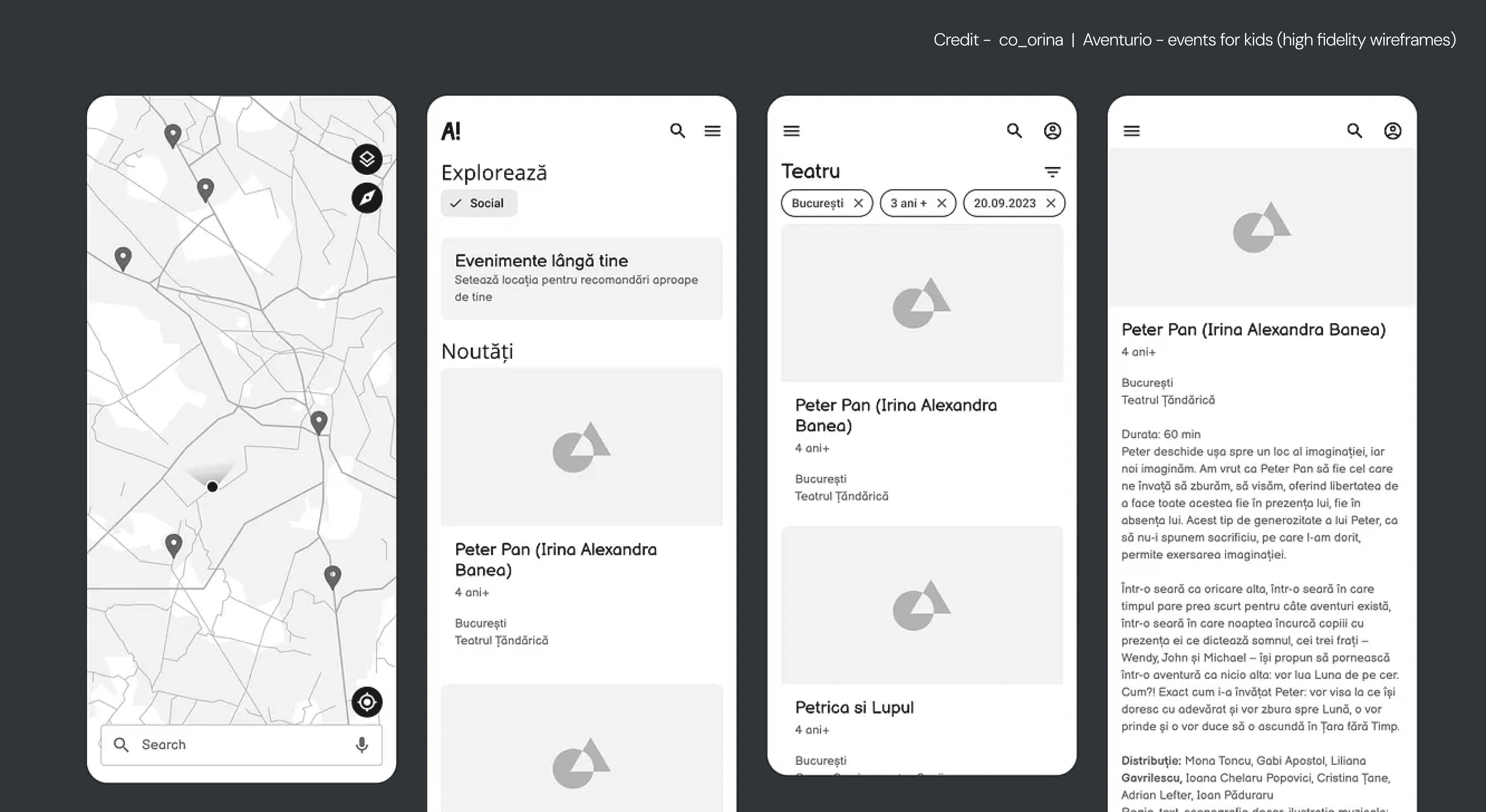
A high fidelity wireframe is a detailed visual draft of a screen that closely resembles the final product. It includes real copy (not lorem ipsum), actual fonts, color schemes, branding, icons, and interaction states like hover, focus, or active.
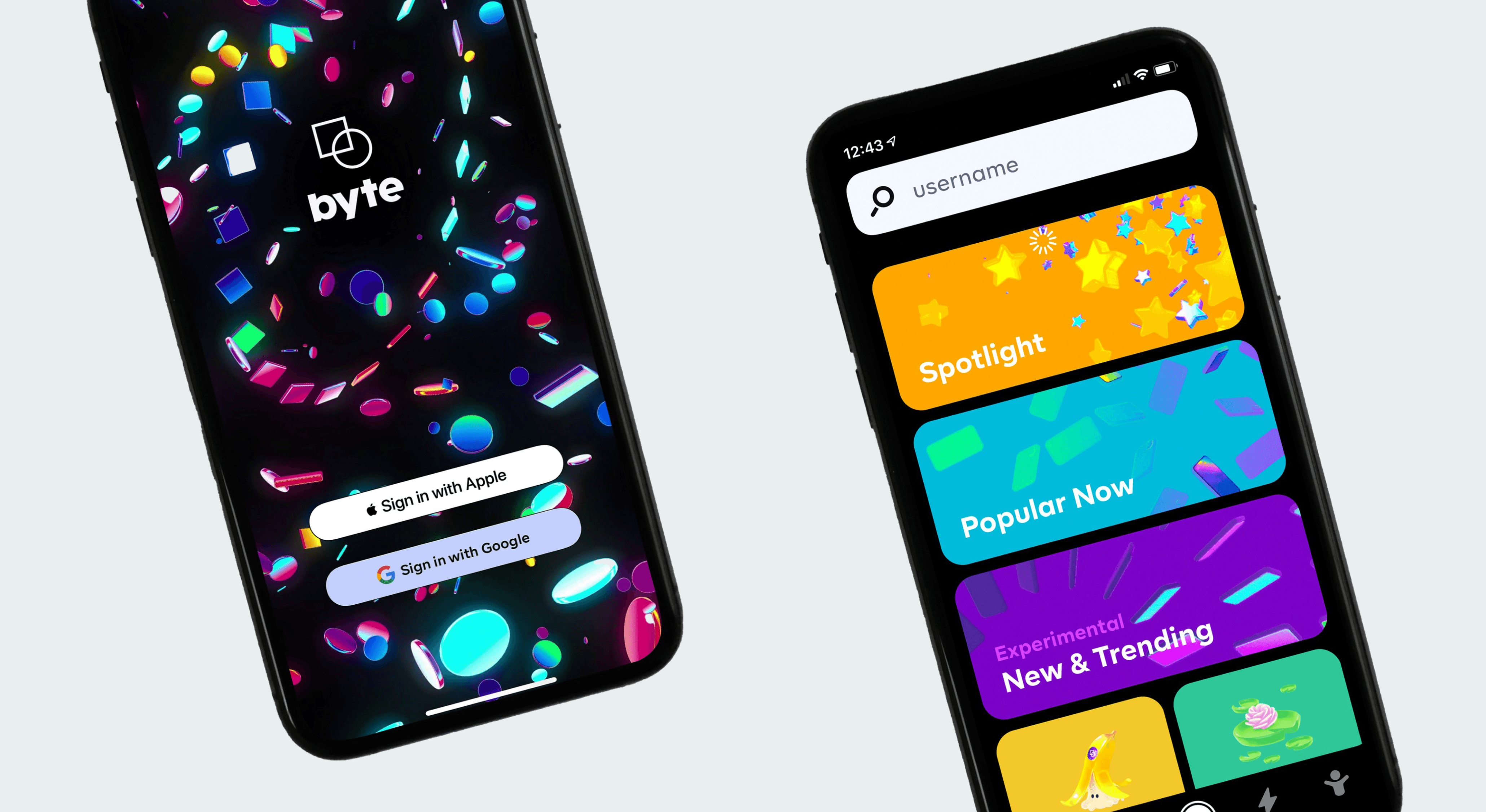
Think of it like a preview of the live product without the code behind it. While a rough sketch might use boxes and dummy text, a high fidelity version shows what users will really see, and how they’ll use it.
If you're creating a sign-up page for an analytics tool, for example, your wireframe would include actual input labels, validation messages, tooltips, and the layout you'd expect on both desktop and mobile. This allows your team to align before committing any engineering time.
Why High-Fidelity Wireframes Are Worth Building
Wireframes reduce confusion, save development time, and speed up product feedback. And the more detailed the wireframe, the more feedback you get before anything goes live.
They help the design team test if the layout really flows. They help developers avoid questions like “What’s the hover state supposed to do?” They help stakeholders give meaningful feedback early, because they can see what the user would see.
And if you're working with a client, a wireframe shows you're not making decisions based on guesswork. You're designing with intention.
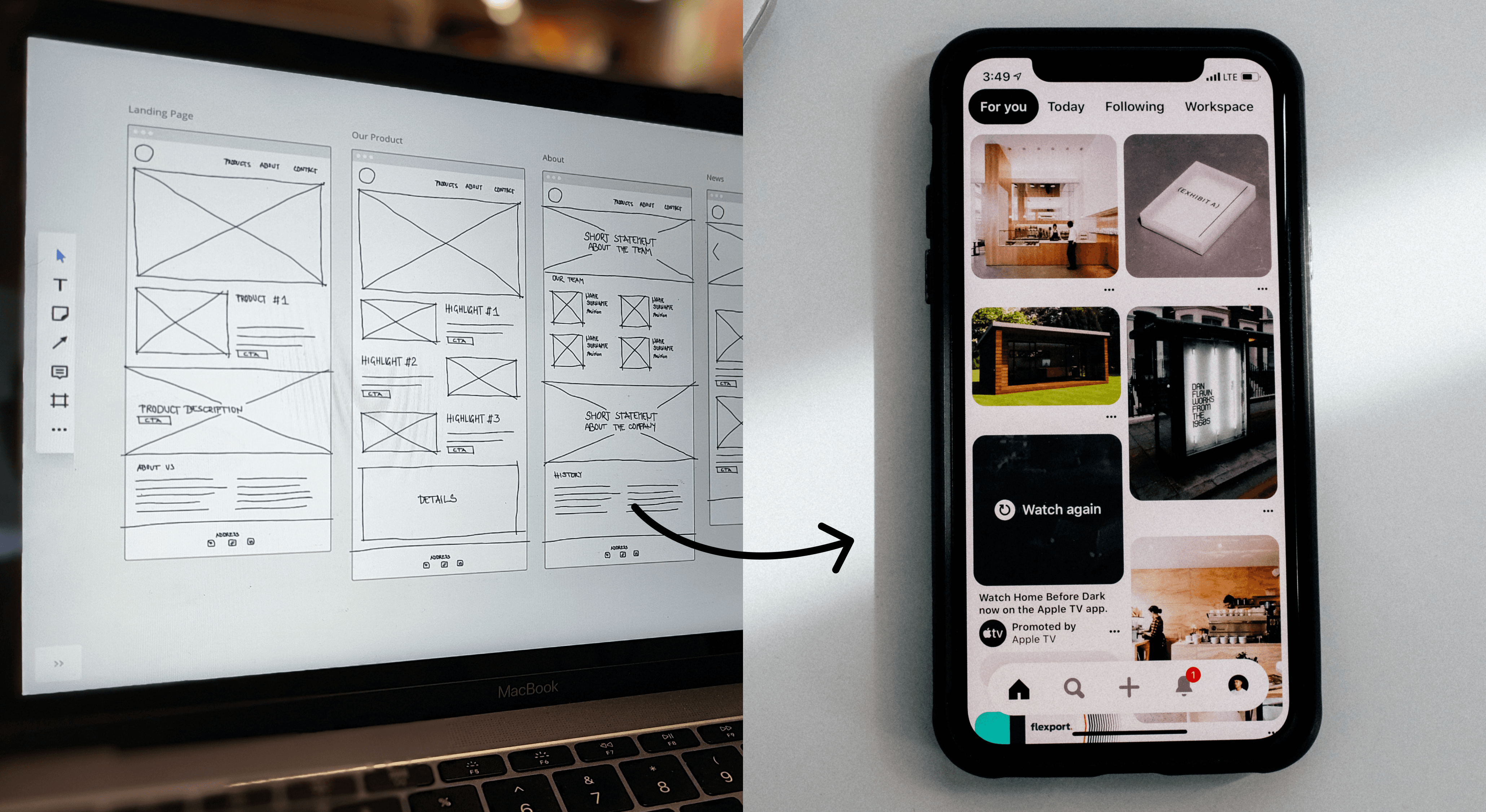
Low Fidelity vs. High Fidelity Wireframes
Both types of wireframes are useful, but for very different things.
A low-fidelity wireframes guide will show you exactly how to map basic structure, flow, and content zones before you move into the detail-heavy work of high fidelity.
A high fidelity wireframe is a visual replica of the final product. Use it to test layout, wording, behavior, and handoff accuracy.
You might start with pencil sketches or a grayscale wireframe to explore layout. But before user testing or developer handoff, you’ll want to build something with pixel-perfect alignment and real-world logic, that’s where high fidelity wins.
When Is the Right Time to Use High-Fidelity Wireframes?
High-fidelity wireframes are not the first thing you should create, but they are a critical tool when your team needs clarity, confidence, and cross-functional alignment. They sit at the intersection of idea validation and execution readiness. Knowing when to introduce them in your design process can save weeks of back-and-forth, prevent miscommunication, and speed up development timelines.
Let’s walk through the real-world signals that tell you it’s time to shift from low fidelity to high fidelity.
1. Your layout and user flow are already validated
High fidelity wireframes are about refinement, not exploration. If you're still figuring out where a button goes or what steps belong in your flow, stay in low fidelity for now. The moment you’ve confirmed your structure (through internal review, early user feedback, or testing), you’re ready to translate that flow into a more realistic and detailed form.
Example: A healthcare SaaS product validates a three-step booking process using sticky notes and basic wireframes. Once the steps make sense and stakeholders approve the structure, it's time to move to high fidelity to show the real input fields, button states, and interaction feedback.
2. You need stakeholder buy-in or cross-team approval
Not everyone on your team thinks in wireframes, and that’s okay. Non-design stakeholders often struggle to understand sketches or wireframes with placeholders. High fidelity wireframes make it easier for sales, legal, marketing, or leadership to give meaningful feedback.
If you’re preparing a stakeholder demo, a pitch deck, or a milestone meeting with decision-makers, high fidelity visuals ensure your work won’t be misunderstood or dismissed for looking “incomplete.”
Example: A product manager is proposing a new dashboard design. Rather than share a grayscale wireframe, the designer presents a high fidelity version that uses real metrics, color-coded states, and interactions to help the leadership team see the experience through the user’s eyes.
3. You’re about to begin development and need to avoid miscommunication
Developer handoffs work better with visual clarity. If your engineering team is about to start building, you don’t want them guessing what a button label says or how a dropdown behaves.
High fidelity wireframes allow you to hand over complete documentation. They show spacing, states, content, and intent, without needing a 40-minute explanation in a Slack thread.
Example: Before starting development on a new onboarding sequence, the design team creates high fidelity wireframes with button text, tooltips, validation states, and spacing tokens. The developers don’t have to ask what each element is supposed to do, they can build with confidence.
4. You're preparing for usability testing that depends on content and context
Users give better feedback when they can see what’s real. Low fidelity wireframes are helpful in early concept testing, but once you're ready to measure how someone understands copy, interacts with fields, or follows instructions, high fidelity is required.
That means real headlines, helpful form labels, confirmation messages, and even subtle design elements like icon cues or hierarchy.
Example: A fintech app is testing its payment flow. With high fidelity wireframes, the team observes where users hesitate, realizing that the “submit” button is too vague. They change it to “Confirm payment and send,” improving clarity and trust.
5. Your product involves complex interactions or data-driven states
The more logic your product has, the more you need high fidelity wireframes. If your screen changes based on user input, account level, data status, or feature flags, a basic wireframe won’t cut it. You need to simulate those changes.
This is especially true in B2B SaaS, AI dashboards, multi-state modals, onboarding flows, and anything involving conditional UI.
Example: An AI productivity tool shows suggested prompts based on past user behavior. The design team builds high fidelity wireframes to represent three versions of the homepage, for new users, active users, and returning inactive users. That way, everyone understands how the interface adapts in context.
6. You need to validate real microcopy, not just layout
Words change meaning, and sometimes change behavior. When you move to high fidelity, you swap out placeholders for actual copy. This helps identify whether users understand your language, feel confident in your flow, or need clarification in key spots.
It’s especially helpful when testing calls-to-action, field labels, tooltips, or multi-step modals.
Example: In a workflow builder app, users repeatedly abandon a step labeled “Configure integration.” After testing with real copy in a high fidelity wireframe, the team renames the step to “Connect your Slack account” and sees immediate improvement in completion rates.
7. You're aligning a design system or launching a new one
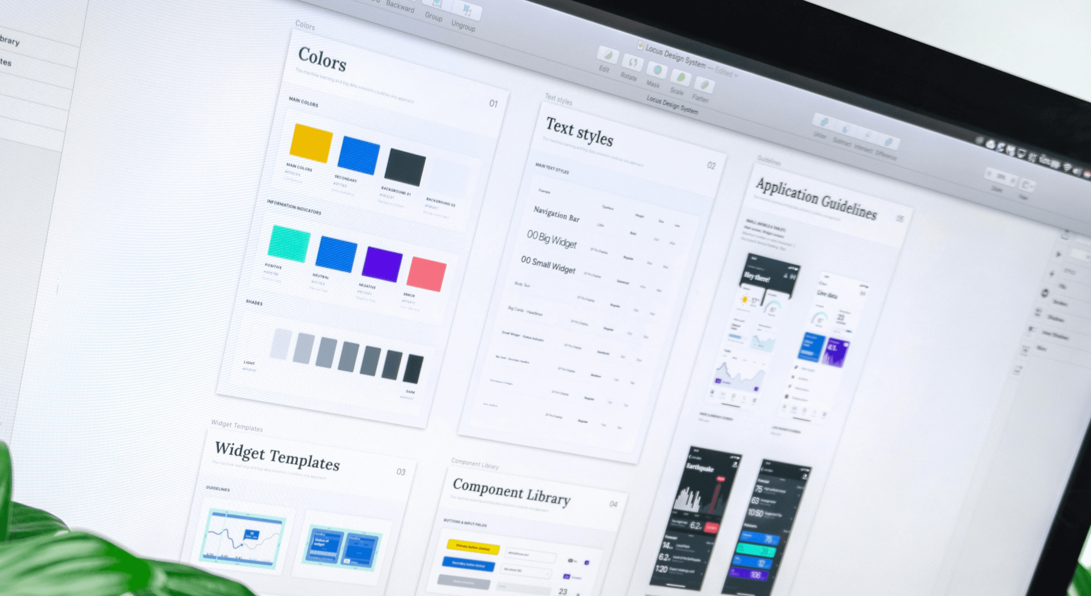
High fidelity wireframes show how components behave in real-world use. If you’re setting up or scaling a design system, these wireframes act as reference screens for layout, spacing, typography, button states, form elements, and alerts.
They’re not just static assets, they’re living examples that shape how future screens are built.
Example: A company rolling out a new design system builds 10 high fidelity wireframes across key templates, home, product, pricing, signup, dashboard, to show designers and developers how the system comes together. This speeds adoption and improves consistency.
The right time to use high fidelity wireframes is when you're transitioning from “what should we build” to “how will this really work?” You’re no longer guessing. You’re refining.
You’ll know it’s time when:
Structure is locked, and details need polishing
Stakeholders ask for visuals they can understand
Developers need specific specs for build
You’re testing language, interactions, or real user behavior
Design consistency across the product matters
Moving to high fidelity too early can slow you down. But waiting too long means you're missing chances to test, align, and improve before it’s expensive to fix.
Real-Life Use Cases (SaaS Dashboard Expansion)
Let's say you're adding a new reporting module to your SaaS product. It'll include filters, graphs, downloadable CSVs, and dynamic KPIs. If any of those KPIs are AI-generated, the wireframe stage is also where smart dashboard design decisions, like confidence indicators or explainability panels, need to be planned before dev picks it up.
At the wireframe stage, you might:
Show how the filter bar interacts with the rest of the layout
Include different empty states (no data yet, filters applied)
Place real labels on download buttons and show icon placement
Highlight hover states for graphs or action menus
Add notes for conditional elements like error flags or loading spinners
Now when dev picks it up, they don’t need a Slack message to ask, “What happens if this graph has no data?”
Benefits of High-Fidelity Wireframes (That Pay Off Later)
You save time, get better feedback, and build smarter. The real benefits of high fidelity wireframes often show up after you’ve used them for a few cycles. Here's what teams often report:
Fewer misunderstandings between design and development
Faster stakeholder approvals because visuals look real
Cleaner handoffs with no ambiguity in states or spacing
More accurate testing when testing with real users
Early feedback that prevents late-stage rework
In teams where timelines are tight and expectations are high, clear wireframes act as guardrails. They catch confusion before it spreads.
How to Design a High-Fidelity Wireframe, Step-by-Step
A high-fidelity wireframe is not just a prettier version of a low-fidelity one, it’s a thinking tool. It's where ideas get tested for clarity, not creativity. If you’re designing for speed, scale, or stakeholder alignment, following a structured approach helps you avoid wasted effort.
This isn’t just about drawing boxes. It’s about solving for user behavior and preparing for build-ready interfaces.
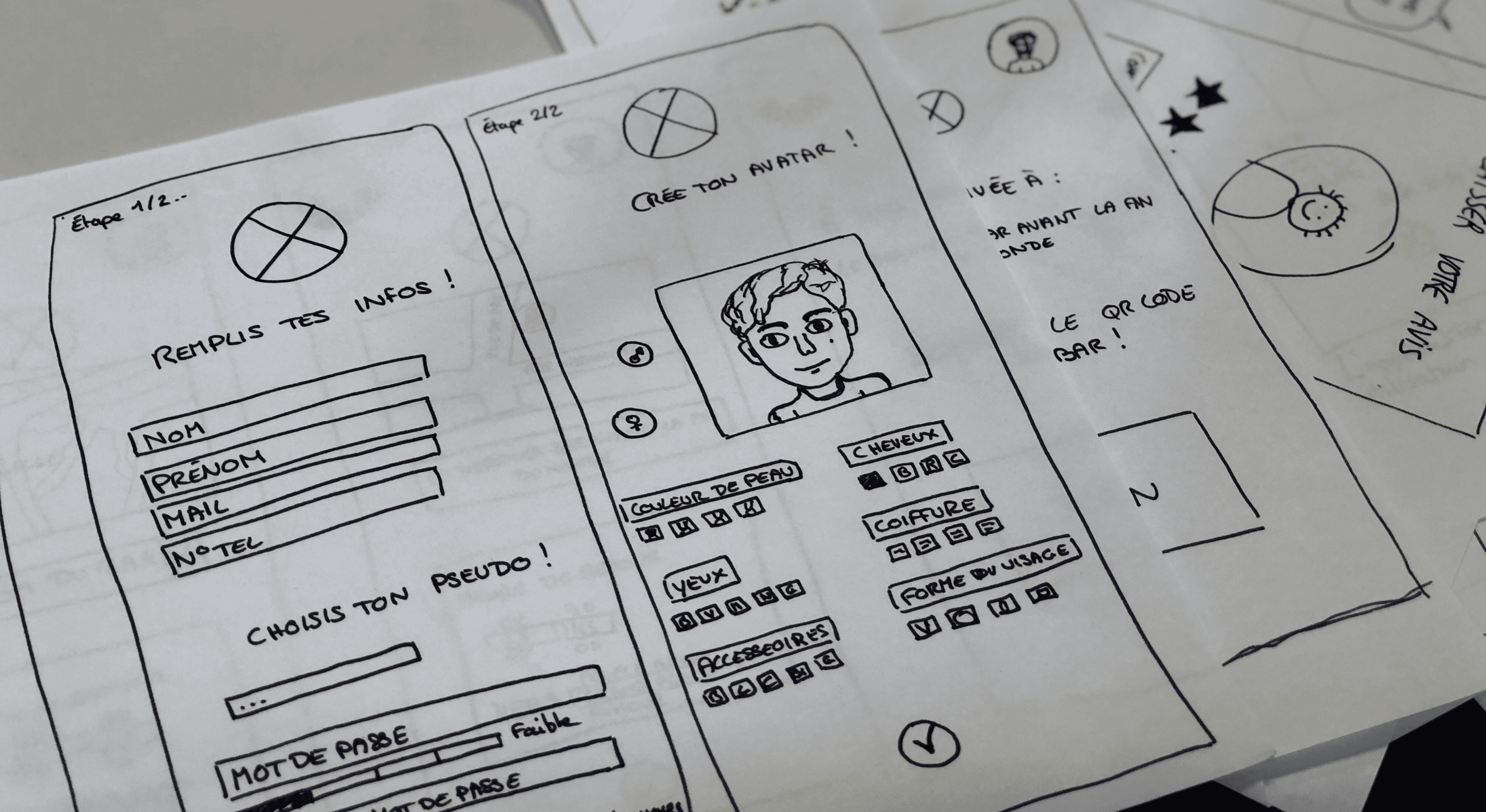
Step 1: Start With a Clean Layout Draft (Use Low-Fidelity First)
You need a skeleton before you dress it up. Begin with a low-fidelity wireframe to map out the layout and flow. Think of this as your functional outline. You’re deciding what information appears where, without worrying about aesthetics.
What to do:
Sketch your page structure using simple blocks
Identify key zones (navigation, content area, call-to-action)
Map user paths, what should happen after a user clicks?
Why it matters: You don’t want to paint a house before you’ve finished building the walls. Start rough, stay flexible.
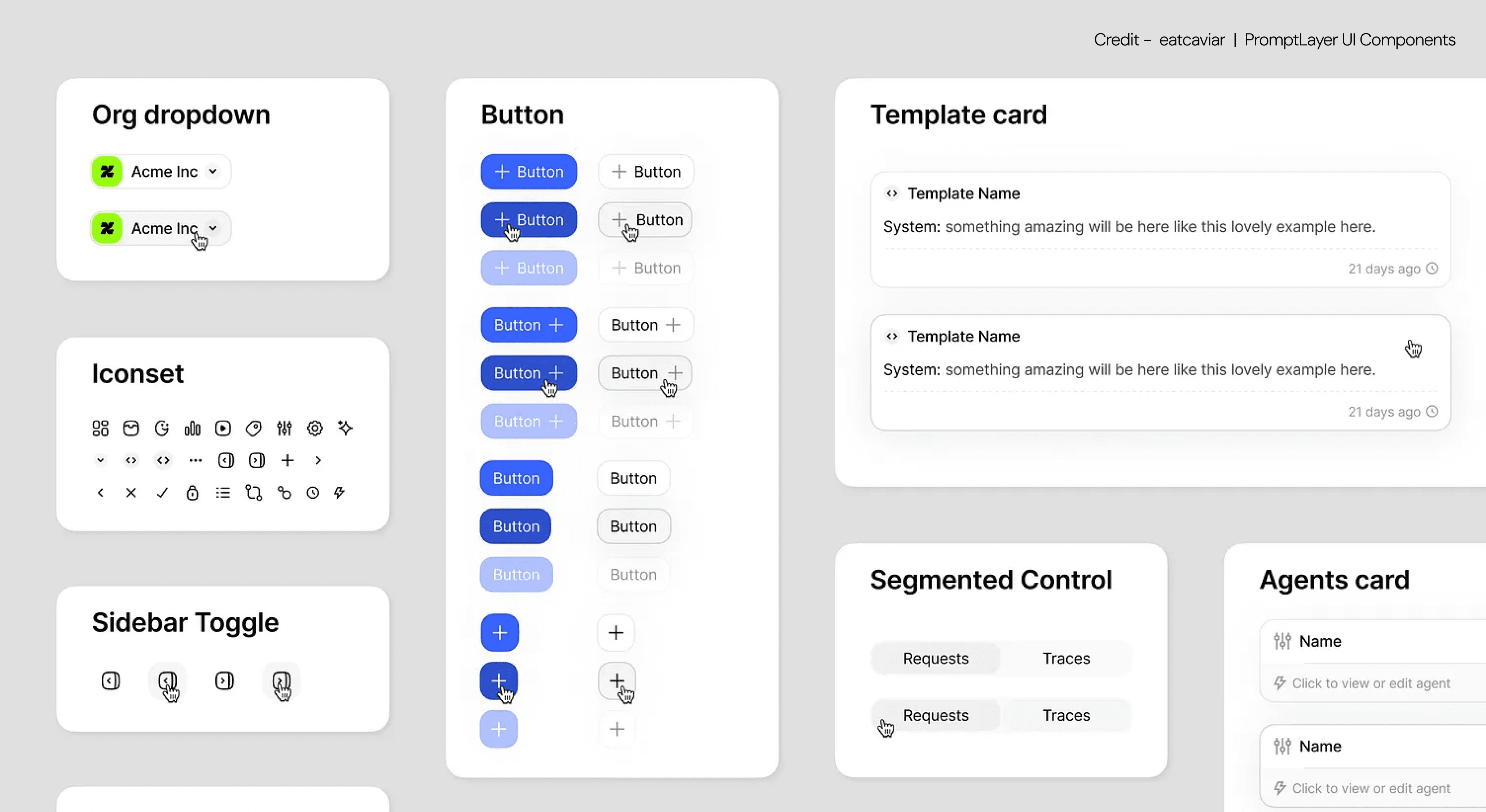
Step 2: Bring in Your Design System or UI Components
This is where the wireframe starts to look like your actual product. Import components from your design system into your layout — if you're building for SaaS, this guide on design systems for SaaS products explains how to structure yours for speed and consistency across screens.
What to do:
Pull in your UI library from Figma, Sketch, or your source of truth — and if your team is still structuring that library, component library setup covers how to organise tokens, components, and usage rules so the system supports wireframing speed rather than slowing it down.
Apply consistent typography, spacing, and visual rhythm
Use color sparingly, only where it adds meaning (e.g. status, actions)
Why it matters: Design systems save time and enforce consistency. You don’t want a red button on one page and a green one on another unless there’s a reason.
Step 3: Replace All Dummy Text With Real Copy
Words change everything, spacing, tone, and clarity. Instead of using “Lorem ipsum,” fill your wireframe with the actual labels, descriptions, button text, error messages, and microcopy your users will see.
What to do:
Use realistic button labels (“Book a demo” instead of “Click here”)
Add field instructions, tooltips, and confirmation messages
Include actual product content when possible (e.g. user names, prices)
Why it matters: Real content makes it easier to spot issues with tone, layout, or length. It also makes stakeholder feedback 10x more useful.
Step 4: Add Interactive and State-Based Elements
Wireframes should show how the interface behaves, not just how it looks. A screen doesn’t just exist in one state. Show what happens on hover, click, error, success, loading, or empty.
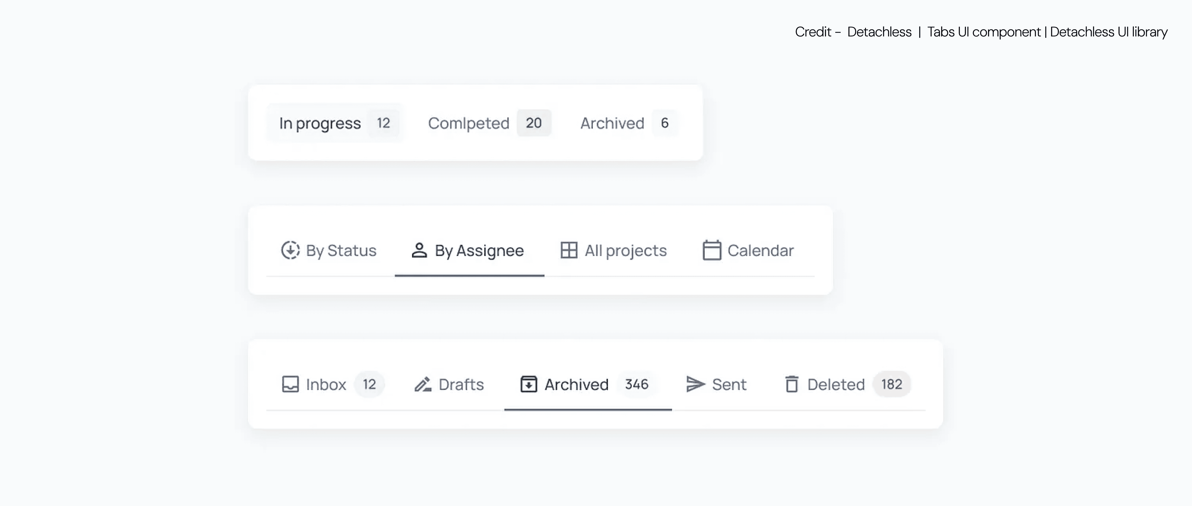
What to do:
Indicate hover and active states for interactive elements
Add examples of loading states or skeleton loaders
Design for error messages, confirmation prompts, and tooltips
Why it matters: Most user frustration comes from poor feedback. A high-fidelity wireframe that doesn't show these states will leave gaps for developers, and users. Components like segmented control UI are a good example — their active, inactive, and disabled states all need to be represented in the wireframe before dev picks them up.
Step 5: Consider Responsive Layouts Early
Designing for one screen size isn’t enough. Users interact on desktop, tablet, and mobile, each with its own constraints. Your wireframe should reflect how content adapts.

What to do:
Create separate views for mobile, tablet, and desktop
Prioritize content hierarchy based on screen size
Consider collapsible menus, accordion sections, and mobile-friendly inputs
Why it matters: A button that looks great on desktop may be impossible to tap on mobile. Planning responsiveness upfront avoids hard decisions later.
Step 6: Build With Accessibility in Mind
A polished interface that’s unusable for some users is still a broken interface. High fidelity means thinking about contrast, legibility, and interaction types.
What to do:
Use color contrast tools to ensure legibility
Keep font sizes readable, especially on mobile
Show keyboard focus states or accessible labels where applicable
Why it matters: Accessibility isn’t an extra feature. It’s a core part of making your product usable and inclusive. Even wireframes should reflect this standard.
Step 7: Walk Through Real User Scenarios
Design isn’t static, it’s the movement of users through tasks. Use your wireframe to simulate real journeys. Click through each step as if you were a new user.

What to do:
Choose 2–3 key tasks (e.g. “Sign up,” “Search and filter,” “Save changes”)
Walk through each screen as if you're using the product
Check for friction, confusion, or unclear actions
Why it matters: What looks perfect in isolation might break when used in sequence. Wireframes are your chance to test before the stakes get higher.
Step 8: Share and Get Feedback, But Frame It Properly
Feedback is only helpful if it’s structured and grounded in goals. Present your wireframe to stakeholders, engineers, or clients, but guide the conversation. You’re not asking “Do you like it?”, you’re asking “Does it solve the problem?”

What to do:
Present user flows, not just screens
Ask reviewers to walk through a task as if they’re a user
Collect feedback on clarity, not just visual polish
Why it matters: Unstructured feedback leads to subjective revisions. You want feedback that helps you improve the wireframe’s purpose, not just its appearance.
Step 9: Annotate for Development Handoff
Even a perfect wireframe becomes a bottleneck if the dev team can’t interpret it. Once finalized, your high fidelity wireframe should include clear annotations, either inline or via tool documentation.
What to do:
Mark padding, spacing, and interaction logic
Use consistent naming for components
Add comments for animations, transitions, or behavior
Why it matters: A handoff without context leads to slowdowns and mistakes. High fidelity means precision, not just prettiness.
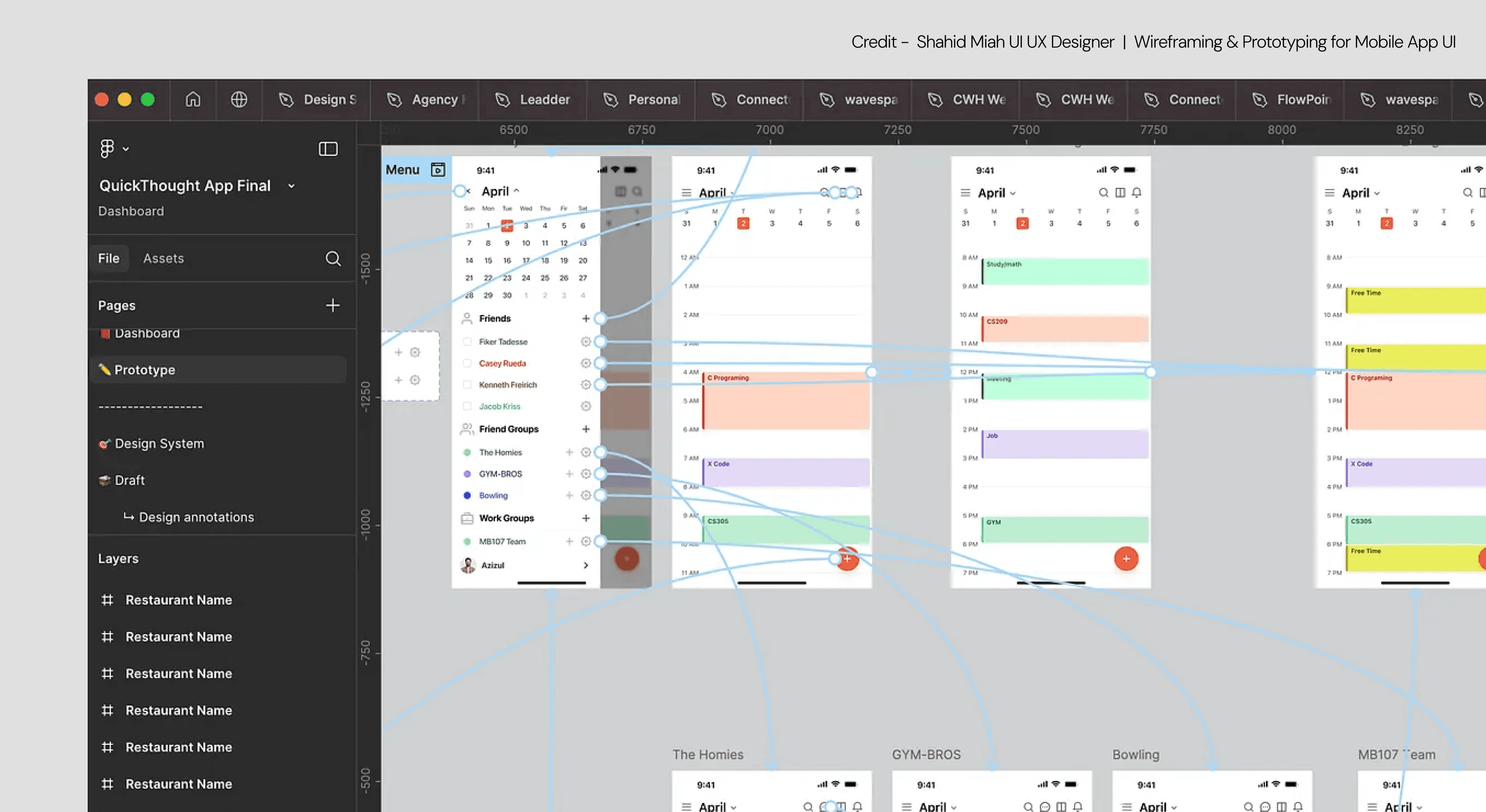
Step 10: Package It for Reuse or Testing
Your high fidelity wireframe is not just a deliverable, it’s a tool. Reuse it as a base for prototypes — and if you need a structured approach, this guide on how to go from wireframe to prototype walks you through the transition step by step.
What to do:
Export assets in a dev-ready format (or share Figma links)
Create a testing flow using tools like Maze or Useberry
Add to your component documentation for future use
Why it matters: The goal isn’t just to build one screen. It’s to create a repeatable, usable asset that reduces effort across the team.
The Best Tools for Creating High-Fidelity Wireframes
Choosing the right tool for wireframing isn't just about preference. If you're deciding between the top three, a direct Figma vs Sketch vs Adobe XD comparison breaks down the trade-offs before we cover the full toolkit below.Some tools are built for collaboration. Others are better for interactivity. Some shine in early-stage design systems, while others are ideal for dev handoff.
Here are 5 wireframing tools that are widely used by modern design teams to create precise, testable, and scalable high fidelity wireframes.
1. Figma
Best for: Real-time collaboration, design systems, and developer handoff
Figma is the most widely used tool for high fidelity wireframing today, and for good reason. It’s browser-based, works across Mac and Windows, and allows multiple designers and stakeholders to view or edit a file in real time.

You can:
Build wireframes and prototypes in one place
Share design libraries with your entire team
Add comments and markups directly on the canvas
Inspect and export assets for development
Figma is a go-to for any ui ux design company that needs scalable, fast, and transparent design workflows.
2. Adobe XD
Best for: Interactive high fidelity mockups with animation
Adobe XD lets you create high fidelity wireframes with detailed transitions and screen flows. Its strength lies in auto-animations and voice-triggered prototypes, making it ideal for testing movement-heavy experiences or voice interfaces.

You can:
Design interactions with timed transitions
Create component states for buttons and modals
Export prototypes or record walkthroughs for stakeholders
It’s best for teams already working in the Adobe ecosystem, and it supports both Mac and Windows.
3. Sketch
Best for: Visual precision and native Mac workflows
Sketch has long been a favorite for static and interactive wireframe design on macOS. Its strength lies in pixel-perfect control and a vast plugin ecosystem. If you're designing for Apple platforms or value strong visual hierarchy in wireframes, Sketch gives you full control.

You can:
Create reusable components and symbols
Export clean design assets in multiple formats
Integrate with prototyping tools like InVision or Marvel
Note: Sketch is Mac-only, and collaboration requires additional plugins or third-party integrations.
4. UXPin
Best for: Conditional logic and real interactions in wireframes
UXPin sits between wireframing and full prototyping. It lets you build high fidelity wireframes with real data, conditional behavior, and interactive forms, all without needing to code.

You can:
Simulate dropdown logic or validation states
Import real data or simulate user profiles
Build from ready-made UI libraries
This tool is ideal for teams working on complex products, forms, or dashboards where static wireframes just aren’t enough.
5. Axure RP
Best for: Complex interaction modeling and enterprise UX
Axure goes beyond typical wireframe design tools. It’s used to build logic-heavy, dynamic wireframes with variables, conditions, and multi-step workflows.
You can:
Simulate application flows like user onboarding
Add show/hide logic and data fields
Create wireframes that behave like real apps
It’s most suitable for enterprise or B2B SaaS teams building products with complex interactions, role-based views, or heavy user logic.
Key Takeaways
→ A high fidelity wireframe looks like the product, without the code
→ It's the fastest way to align design, dev, and stakeholders
→ You should move from low fidelity to high only once structure is locked
→ Tools like Figma and UXPin make this process collaborative
→ Real text and real layout give you better testing feedback
→ It's a crucial step in any ui ux design company workflow
How Groto Builds High-Fidelity Wireframes That Actually Work
Groto is a design studio focused on real-world clarity, not pixel fluff. We build high fidelity wireframes that simulate real product behavior, help teams align faster, and set the stage for scalable design systems.
Our process includes:
Full UX audits before we touch a design tool
Structured flow mapping with actual content and interactions
AI-integrated feature thinking, for predictive UX or smart dashboards
End-to-end testing of wireframes before they move to prototype
Dev-ready assets that speak the language of frontend frameworks
If you’ve outgrown static mockups or you’re launching an AI or SaaS product and need structure, not just screens, we’re your partner.
Reach out → hello@letsgroto.com
Call us → +91 8920-527-329
FAQ
Q. How does a high fidelity wireframe differ from a low fidelity one?
A high fidelity wireframe is detailed, branded, and interaction-aware. It includes real text, layout, and design components. A low fidelity version focuses on layout only, usually in grayscale, with placeholder text. The former is ideal for testing and final reviews. The latter is for brainstorming and exploration.
Q. What are the benefits of using high fidelity wireframes?
You reduce guesswork. Stakeholders can give better feedback. Developers understand behavior clearly. And your team catches usability issues before writing a single line of code. It’s one of the most efficient ways to save time in the product development cycle.
Q. What tools can I use to create high fidelity wireframes?
Figma, Adobe XD, Sketch, UXPin, and Axure are the most common. Figma stands out for its real-time collaboration, developer handoff features, and ability to scale across teams. For more interaction-heavy designs, UXPin and Axure offer logic flows.
Q. How long does it take to make a high fidelity wireframe?
It depends on scope. A single screen might take 1–3 hours. A full user flow (like onboarding) might take 1–3 days depending on complexity, number of states, and copy readiness. Reusing a design system speeds things up dramatically.
Q. Can high fidelity wireframes replace prototypes?
Sometimes. If you're just showing visual structure or testing layout, wireframes may be enough. But for real interaction logic, it helps to first understand what is a UX prototype — the distinction will help you decide which tool fits each stage of your workflow. Many tools let you convert wireframes into prototypes in one step.
Q. Should I always create a high fidelity wireframe?
Not always. For early-stage ideas, rough sketches or low fidelity mockups are faster. But if you're preparing for development, stakeholder reviews, or usability testing, high fidelity wireframes give you better results, faster.


