
Users rarely quit because your product lacks features. They quit because it feels frustrating, unclear, or hard to trust. This article dives deep into bad UX design examples—and how to fix them without confusing your users or starting from scratch.
Great ideas fail when the experience doesn’t make sense to real users.

Users rarely quit because your product lacks features. They quit because it feels frustrating, unclear, or hard to trust. This article dives deep into bad UX design examples and how to fix them without confusing your users or starting from scratch.
Great ideas fail when the experience doesn't make sense to real users.
Most users don’t stop using a product because the idea is bad. They stop because the experience doesn’t feel easy, clear, or helpful. This is exactly where bad UX design examples show up. It's not about broken features. It's about broken flow.
You might have the right functionality. But if someone doesn’t know what to click, where to find what they need, or whether their action even worked, they leave. They may not even complain.
Poor user interface examples cost more than a few frustrated sessions. They cost engagement, retention, and ultimately, business growth.
In this article, we will give you a detailed walkthrough of common UX design issues, explain why they happen, and help you fix them using a real-world, practical UX design strategy. Whether you’re building a SaaS dashboard, an internal enterprise tool, or a consumer-facing platform, the same principles apply. This is your end-to-end guide to understanding, recognizing, and resolving UX pain points without having to start from scratch.
What Does a “Bad” UX Mean for the User?
A bad user experience doesn’t always mean something is broken. It means the product makes people work harder than they should. That could be visually, like when a screen has too much going on,or functionally, like when a form doesn’t give feedback after submission.
From a business point of view, bad UX affects growth in subtle and serious ways — increasing churn, lowering activation rates, damaging trust, and inflating support costs. The cost of ignoring UX design quality goes further, giving you the metrics frameworks and ROI calculations to quantify exactly how much these gaps are worth fixing. If users don't feel confident in your interface, they will hesitate, drop off, or stop using it entirely — and most of these failures trace back to gaps in UI/UX design basics that teams skip when moving too fast to build.
In industries like fintech, healthtech, or AI-driven SaaS, where trust is critical, these small UX issues can become large business liabilities.
The Hidden Cost of How Bad UX Affects Business
The damage of bad UX is often invisible at first. You may notice lower conversions. Fewer people complete signups. There’s an increase in abandoned carts or unread messages. Over time, these issues multiply.
Poor experiences increase cognitive load, bounce rates, and support queries — forcing teams to spend on customer service when the problem could have been solved at the design level. How poor design impacts business revenue puts real numbers behind these patterns, showing exactly where design debt turns into revenue loss.
Common UX Mistakes and How to Avoid Them
Before diving into specific examples, understanding the root causes of ux design problems helps prevent them from occurring. Most UX failures stem from predictable patterns that can be avoided with proper planning and user-centered thinking.
Assuming User Knowledge: Teams often design based on their internal understanding rather than user mental models. What seems obvious to product teams may be completely unclear to first-time users. Avoid this by conducting regular user interviews and testing with people outside your organization.
Skipping User Testing: Many ux design problems could be caught early through simple usability testing. Teams that skip testing launch with invisible friction that drives users away. Implement regular testing cycles, even with small groups of 5-8 users — and before testing begins, aligning your team around a UX design brief ensures everyone is evaluating against the same goals rather than personal assumptions.
Inconsistent Design Patterns: When interfaces use different interaction patterns across screens, users lose confidence and waste time relearning how things work. Establish and maintain design systems that ensure consistency across all touchpoints.
Overcomplicating Simple Tasks: Complex features don't require complex interfaces. The best designs make difficult tasks feel easy, not the reverse. Focus on progressive disclosure and clear information hierarchy.
Ignoring Mobile Experience: With mobile traffic representing over 50% of web usage, poor user interface examples often stem from desktop-first thinking that doesn't translate to mobile devices.
Failing to Provide Feedback: Users need confirmation that their actions worked. Missing loading states, error messages, and success confirmations create uncertainty and frustration.
Learn more about UX design process 8-step guide to understand how proper methodology prevents these common mistakes.
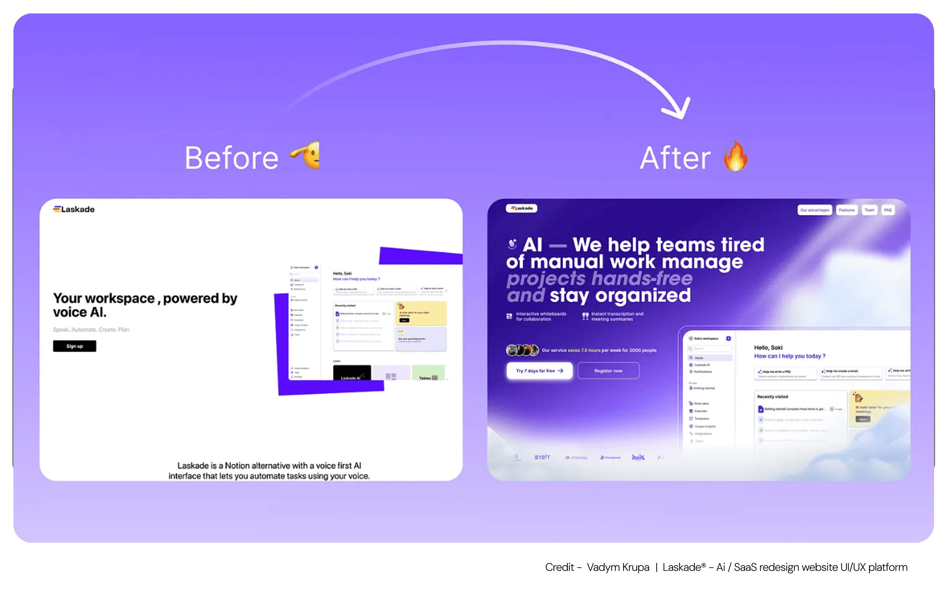
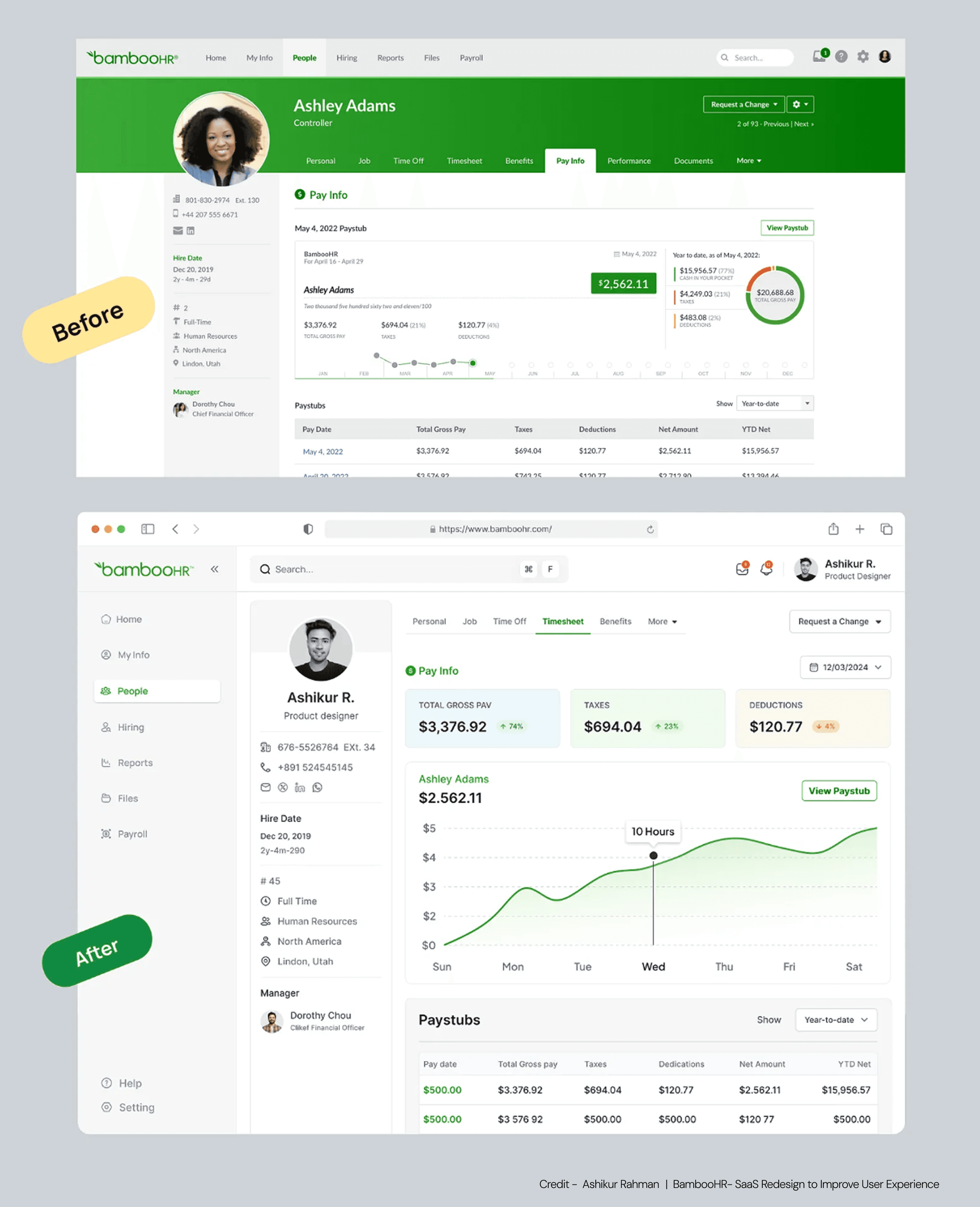
12 Real-World Bad UX Design Examples (and What to Do Instead)
Let’s walk through common friction points one by one, explain why they happen, and show what you can do differently using thoughtful, scalable UX methods.
1. Cluttered Layouts Create Confusion Instead of Clarity
When too many elements compete for attention, buttons, banners, carousels, notifications, users don’t know where to look. This is often seen in dashboards or landing pages trying to show everything at once. The user’s focus is divided. The result is inaction.
The solution is to simplify the layout using a strong hierarchy. Design with one clear action per screen. Let white space do the heavy lifting. Use bold headlines and subtle color differences to guide attention naturally. A well-executed ui ux designing service balances visual impact with decision flow.
2. Inconsistent Design Language Breaks the User’s Trust
Visual inconsistencies, like different button styles, font sizes, or icon treatments across pages, signal unreliability. Users rely on repetition and pattern to feel confident — a response rooted in perception-driven design principles that govern how the brain groups, matches, and trusts visual information before conscious thought kicks in. When those patterns break, they hesitate.
Solving this starts with implementing a design system. Define all visual components, from spacing to interaction states. This is where a high-quality ui ux designing service helps by maintaining visual unity across your app or site.
3. Navigation That Feels Like a Maze Turns Users Away
Menus are meant to guide. But when labels use internal company terms, or categories are hidden under layers, users give up. This is a common issue in complex tools or fast-growing platforms that scale without reorganizing structure.
Rebuilding your information architecture around user goals, not internal logic, is the fix. Use card sorting and tree testing to validate structure. A good UX design strategy maps paths that feel natural to first-time users, not just product managers.
4. No Feedback After Clicking Leaves People Unsure
When a user takes action — clicking a button, submitting a form, confirming a payment — they expect a visible response. This pattern and others like it are exactly what conversion mistakes hiding in your UI catalogs, showing which interface decisions quietly kill conversions without triggering a single support ticket.
The fix is to add clear, immediate feedback. Loaders, confirmation messages, animations, or icon states all provide reassurance. Every action should be acknowledged. This is one of the most overlooked yet impactful bad UX design examples.
5. Non-Responsive Interfaces Cut Mobile Users Out
Despite widespread mobile use, many products still scale down from desktop without real mobile design thinking. Tiny buttons, overlapping elements, or horizontal scrolling make interfaces painful to use on phones — and these friction points often reveal a deeper usability and access gap that affects users with motor or visual constraints most.
Designing mobile-first solves this. Use responsive grids, touch-friendly tap zones, and vertical stacking. A responsive ui ux designing service ensures your product performs smoothly on all screen sizes, not just large monitors.
6. Pop-Ups That Interrupt Instead of Help Reduce Engagement
Pop-ups triggered at the wrong time, like immediately on page load, interrupt the user’s task. They feel aggressive and out of sync with intent.
Use behavior-based triggers instead. Show a pop-up after meaningful engagement, like scrolling halfway or attempting to exit. Always offer a visible, accessible close button. Running an interface friction audit can surface whether your pop-up timing is working against users before it becomes a drop-off pattern. When done right, pop-ups enhance value. When done wrong, they break it.
7. Forms That Feel Like Friction Cause Drop-Off
Long forms asking for unnecessary information are a conversion killer. This happens most often in B2B lead forms, trial signups, and multi-step onboarding flows.
Use progressive disclosure. Start with just the essential fields. Then ask for more details later, after the user has taken the first step. Smart defaults, auto-fill, and real-time validation make forms feel helpful, not heavy. These principles are fundamental in any modern UX design strategy.
8. Content That Tries to Explain Everything Ends Up Overwhelming Users
If everything on a page is bolded, boxed, or fighting for attention, nothing stands out. Many teams overload screens with text, trying to anticipate every question. But users don’t want to read. They want to scan and act.
Refine your content hierarchy. Use headings, short paragraphs, and links to deeper explanations. Focus on what the user needs at that moment. Great content design makes people feel supported without forcing them to read a manual — a standard that requires proactive experience maintenance to uphold, since new features and content additions tend to erode hierarchy clarity if no one is actively watching for it.
9. Icons Without Labels Make People Guess
Icons save space, but without labels they create uncertainty — a star could mean favorite, featured, or bookmarked. The fix starts with labeling, but the words you choose matter just as much as the presence of text. Microcopy fixes for confusing interfaces covers how to write button labels, error messages, and inline cues that eliminate guesswork at every interaction point.
Whenever possible, pair icons with labels, especially for core actions. Avoid obscure custom symbols. Validate comprehension through quick user tests. This helps eliminate one of the most subtle poor user interface examples.
10. Skipping Real Testing Keeps Problems Hidden
Many teams design by assumption, not observation. Internal testing misses how real users behave. A structured UX testing process gives teams the frameworks and session structures to observe real behavior rather than inferring it from analytics alone. As a result, features launch with invisible friction.
Use tools like Hotjar or FullStory to watch real sessions and Maze to test flows before development — but if you want a structured approach to finding all the problems this article covers, auditing your product for UX problems gives you a step-by-step audit framework that goes beyond individual tool usage into systematic evaluation.
11. Slow Loading Times Create Abandonment
Page load speeds beyond 3 seconds cause exponential user abandonment. This ux design problem is particularly damaging because users often don't wait long enough to see your content before leaving.
Optimize images, minimize HTTP requests, use content delivery networks, and implement progressive loading for large datasets. Technical performance is a UX issue that directly impacts user satisfaction and conversion rates — and treating it as part of ongoing site maintenance and UX health ensures performance doesn't degrade silently between major releases. Learn more about best AI web design tools that can automate performance optimizations.
12. Complex Onboarding That Overwhelms New Users
Lengthy onboarding sequences that try to explain every feature upfront create cognitive overload. Users want to experience value quickly, not sit through extensive tutorials.
Design progressive onboarding that introduces features contextually as users need them. Focus on core value demonstration in the first session, then layer additional capabilities over time. When onboarding complexity points to a structural redesign rather than incremental fixes, understanding SaaS UX redesign cost and scope gives teams the budget framework to evaluate the investment before committing to full execution. Empty states should guide users toward their first success, not showcase all possible features.
Learn more about integrating AI into SaaS UX best practices and strategies for modern onboarding approaches.
Why Groto Is Uniquely Positioned to Fix Your UX Challenges
Your product might have every feature the market demands. But if users struggle to understand, trust, or navigate it, those features won’t matter. That’s exactly where Groto comes in.
Groto is a full-stack ui ux designing service trusted by SaaS, AI, and enterprise teams to transform complex products into clean, user-friendly experiences. From onboarding that users actually complete to dashboards that explain themselves, we specialize in solving the same UX problems you’re facing right now.
Our team blends business-driven UX research with top-tier visual design. We don’t just audit. We partner with you to build a clear, actionable UX design strategy — then execute it with precision. Whether you’re launching a Gen AI tool, simplifying an internal system, or trying to reduce drop-offs in your product’s core flow, we’ve done it before. And we’ve done it fast.
You bring the idea. We’ll make it work for the people who use it.
View our work → letsgroto.com
Let’s make your product feel as good as it sounds.
Key Takeaways:
Cluttered screens make users stop instead of act. Simplify and guide.
Inconsistent visuals weaken trust. Stick to one design language.
Hidden or confusing menus lose users. Keep navigation clear and familiar.
No feedback leaves users confused. Show what’s happening, always.
If your site doesn’t work on phones, you lose half your audience. Mobile matters.
Pop-ups should be polite and purposeful. Not loud, not early.
Forms need to feel helpful, not heavy. Less is more.
Break up your content to help people stay. Clarity keeps readers.
Icons should communicate clearly. Label them when in doubt.
Listen to users before you launch. Feedback fixes what assumptions can’t.


