

Most businesses chase more traffic when the real problem is what happens after someone lands. Website conversion is the measure of how well your site turns visitors into action — and in almost every case, the gap between average and excellent comes down to design, not volume.
Visitors are landing. The question is why they are not taking action.

Most businesses obsess over traffic. More visitors, more ads, more clicks. But here's the truth no one wants to say out loud: traffic without conversion is just noise.
What actually moves the needle is what happens after someone lands on your page. Do they take action? Do they trust what they see? Do they feel compelled to go further? That is the domain of website conversion — and more specifically, it is the domain of design.
In this piece, we break down everything you need to know — from the definition to the numbers — and show you exactly how intentional design is the single biggest lever you can pull to improve results.
What Is Website Conversion?
A website conversion happens when a visitor completes a desired action on your site. That action could be making a purchase, filling out a contact form, signing up for a newsletter, booking a demo, or downloading a resource. Each of these is a moment where a passive visitor becomes an active participant in your business.
Every website is built around a goal. Website conversion is simply the measure of how well your site achieves it — and if that measure is lower than it should be, how to improve website conversion rate walks through the exact fixes that move the needle without requiring a full redesign.
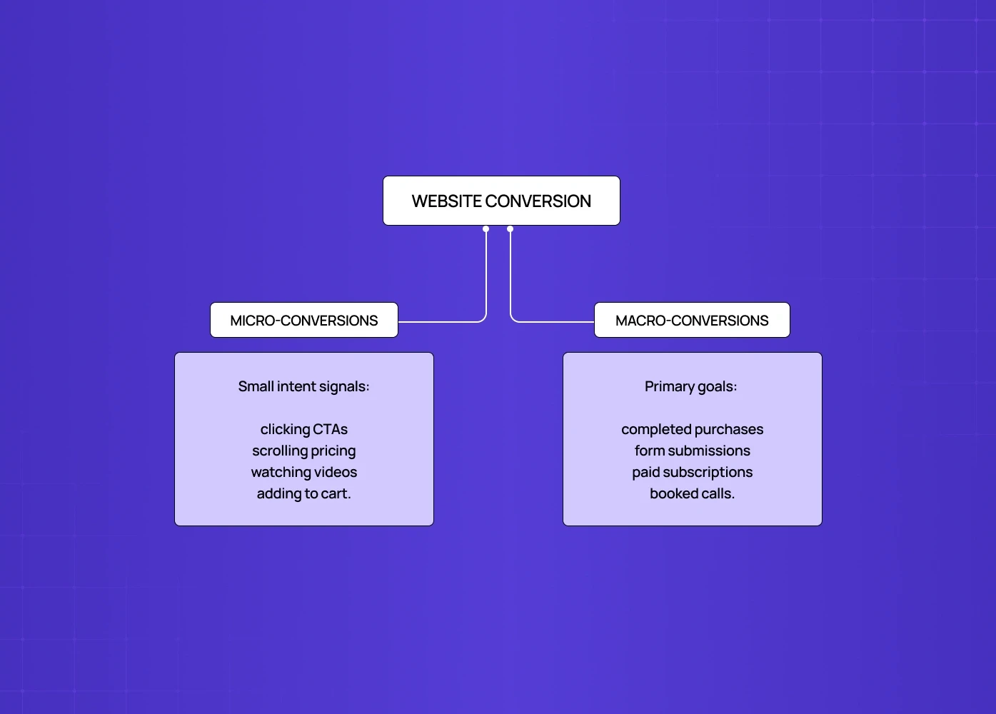
There are two types you need to understand:
Micro-conversions are the smaller steps that signal intent — clicking a CTA, scrolling through a pricing page, watching a product video, or adding an item to a cart.
Macro-conversions are your primary goals — a completed purchase, a submitted inquiry form, a paid subscription, or a booked consultation.
The relationship between the two matters. A visitor who watches your demo video (micro) is far more likely to book a call (macro) than one who bounces in eight seconds. Strong design ensures both pathways feel natural and frictionless.
How to Calculate Your Conversion Rate
The formula is straightforward:
Conversion Rate = (Number of Conversions ÷ Total Visitors) × 100
If 800 people visited your landing page last month and 24 filled out your contact form, your conversion rate is 3%.
Website Conversion Rate by Industry
The average sits around 2–3% across industries, but it varies significantly:
Industry | Average Conversion Rate |
eCommerce | 1.5% - 3% |
SaaS / Software | 3% - 5% |
Professional Services | 5% - 8% |
Finance / Insurance | 5% - 10% |
EdTech | 2% - 4% |
The top 10% of websites consistently convert at 5x the industry average. The difference? It is rarely the product. It is almost always the experience.
Rather than chasing a benchmark, the smarter question is: what is stopping your specific visitors from taking action?
Why Design Is the Answer to Low Conversions
This is where most conversion blogs stop short. They tell you what conversion is, hand you a formula, and leave. But the real question is why visitors don't convert — and the answer, almost always, is a design problem.
Poor visual hierarchy makes it unclear what to do next. A cluttered layout creates cognitive overload. A mismatched CTA button disappears into the background. A form with 11 fields kills the momentum of someone ready to sign up. These are the UI/UX mistakes that hurt conversions most teams don't catch until they show up in drop-off data.
Design is not decoration. It is the architecture of trust, clarity, and action.
We see this play out with every client we work with. When Camb.ai, an AI dubbing platform with 140+ language support, came to us, the core problem was not the product — it was the interface. The layout lacked hierarchy, CTAs were buried, and the user journey felt scattered. After the redesign, with a focused visual flow and clearer conversion touchpoints, the platform saw a measurable lift in user engagement and sign-ups. The product did not change. The design did.
That outcome is not unusual. Our clients have gone on to raise $8M+, improve user flows by 40–60%, and earn 140+ five-star project reviews — and in almost every case, the turning point was a design intervention, not a traffic play. The ROI of UX design gives you the frameworks to quantify those outcomes in terms your stakeholders can act on.
The Conversion Design Framework: 5 Levers That Actually Move the Needle
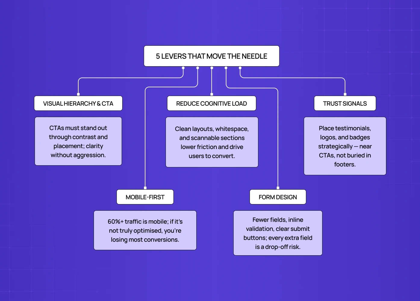
We have run enough redesigns to know that conversion improvement is not random. The same five design decisions come up in nearly every high-impact project. Here is how we think about them.
Here's the content reformatted with bullet points and full stops:
1. Visual Hierarchy and CTA Design
Your call-to-action is the most critical design element on any page.
It needs to stand out through contrast — color, size, whitespace — use action-oriented language ("Start Free Trial," not "Submit"), and sit where the eye naturally travels: above the fold, and repeated contextually as users scroll. UX writing and microcopy goes deeper on the psychological triggers behind CTA word choice and how label decisions alone can shift conversion rates significantly.
A CTA that blends into the background is a conversion killer.
One that disrupts the reading flow is equally damaging.
The goal is clarity without aggression.
2. Layout and Cognitive Load
Dense pages overwhelm users.
When someone has to work hard to understand your offer, they leave.
Good layout design reduces cognitive load by grouping related information, using whitespace as a breathing tool, breaking content into scannable sections, and guiding users through a logical visual journey.
The less friction in the reading experience, the more likely someone is to reach your conversion point.
3. Trust Signals, Placed Strategically
Visitors do not convert if they do not trust you.
Trust is built visually — through testimonials near CTAs, client logos in the right context, security badges on checkout pages, and a design that looks credible and polished — studying product page design examples shows exactly how high-performing brands layer these trust signals in practice.
Placement matters as much as presence.
A testimonial buried in the footer does almost nothing.
The same testimonial placed beside your primary CTA can move the needle significantly.
4. Mobile-First Design
Over 60% of global web traffic comes from mobile devices.
A desktop-first layout that is "responsive" but not truly mobile-optimised creates friction at every touchpoint — small tap targets, misaligned CTAs, slow-loading hero images.
If your mobile experience is not designed with the same care as desktop, you are losing the majority of your potential conversions before they even read your offer — mobile-first responsive design covers the breakpoints, interaction patterns, and performance decisions that determine whether a mobile visitor converts or bounces.
5. Form Design
Forms are the final conversion point — and where most conversions die.
Every unnecessary field is a reason to abandon.
Best practices include limiting fields to what is truly required, using inline validation so errors are caught early, providing progress indicators in multi-step flows, and making the submit button visually prominent and clearly labelled. To improve online form conversion rates specifically, there's a full breakdown of the input patterns and structural decisions that create drop-off right at the commitment moment.
What a High-Converting Website Actually Looks Like
There is no single template, but high-converting websites share consistent design characteristics — and landing page elements that drive conversions covers all 27 of them in detail. Starting with the essentials:
A clear, benefit-led headline visible above the fold.
A singular, unmissable CTA as the primary action.
Minimal distractions — no competing links pulling attention away from the goal.
Strong visual hierarchy that guides the eye from top to bottom.
Social proof placed at the moment of hesitation, near the CTA or pricing.
Fast load times — a one-second delay can reduce conversions by up to 7%.
Consistent design language that builds brand trust across every page.
The goal is not a beautiful website. The goal is a website that is beautiful and effortlessly drives action. When designed well, those are the same thing — and best landing page design examples shows how leading brands execute these principles in practice across different industries and conversion goals.
Conversion Rate Optimization: The Ongoing Process
Improving your conversion rate KPI is not a one-time exercise. Conversion rate optimization is the practice of continuously testing, analysing, and refining your site over time.
The design-first approach to CRO includes:
Heatmaps and scroll maps to see where attention drops off.
A/B testing design variants of CTAs, headlines, and layouts — A/B testing for SaaS covers how to sequence those tests, set statistical significance thresholds, and avoid the common mistake of running too many variables at once.
Session recordings to observe real user behaviour.
Feedback widgets to capture qualitative insight at the point of exit.
Data tells you what is happening. Design tells you how to fix it. The best teams use both — and they treat CRO as a standing agenda item, not a one-time project, the same way iterative experience improvement treats the broader product experience as a continuous discipline rather than a single redesign event.
Conclusion
The best branding agencies treat design as strategy — not decoration. If an agency can't explain why every visual decision was made, that's a red flag.
We lead this list because we're one of the few design-first agencies that consistently connects brand identity to business outcomes — from UX strategy to full visual systems.
The right agency for you depends on your stage, your budget, and how design-mature your brand currently is.
A great visual identity isn't a nice-to-have. In a crowded market, it is often the difference between a brand people remember and one they scroll past.
Whether you're launching a startup, scaling a SaaS product, or repositioning an established company — investing in the right design partner from the start saves time, money, and a rebrand later.
Talk to us if you want a brand built to perform, not just to look good.


