Complementary colors give you contrast. Analogous colors give you harmony. A split complementary color scheme gives you both — a three-color structure built from color theory that balances tension and cohesion across branding, UI, fashion, and beyond.
The most designer-friendly three-color palette — and how to build one.

TL;DR
A split complementary color scheme uses one base color and the two colors flanking its opposite on the color wheel — giving you visual contrast without the harshness of direct complementary pairings. It's one of the most designer-friendly three-color combinations in color theory, and when applied well, it hits the sweet spot between vibrancy and balance.
What Is a Split Complementary Color Scheme?
Most designers learn complementary colors early — red and green, blue and orange, yellow and violet. Place two opposites together, and you get maximum contrast. These sit within the broader framework of types of color palettes, each with different contrast and harmony properties. Place two direct opposites together and you get maximum contrast. But that contrast can quickly tip into tension, especially in UI, branding, or interior spaces where you want harmony rather than a visual argument.
A split complementary color scheme is how you get contrast with control.
Instead of pairing your base color with its direct opposite, you take the two colors sitting on either side of that opposite. So if your base is blue, instead of going straight to orange, you step just left and right to yellow-orange and red-orange. You end up with three colors, a natural sense of depth, and none of the harshness of a pure complementary pairing.
It's a concept rooted in color theory — one that maps to the 13 principles of design around harmony and contrast — and it works across disciplines: digital product design, branding, illustration, fashion, and interior design.
How It Works on the Color Wheel
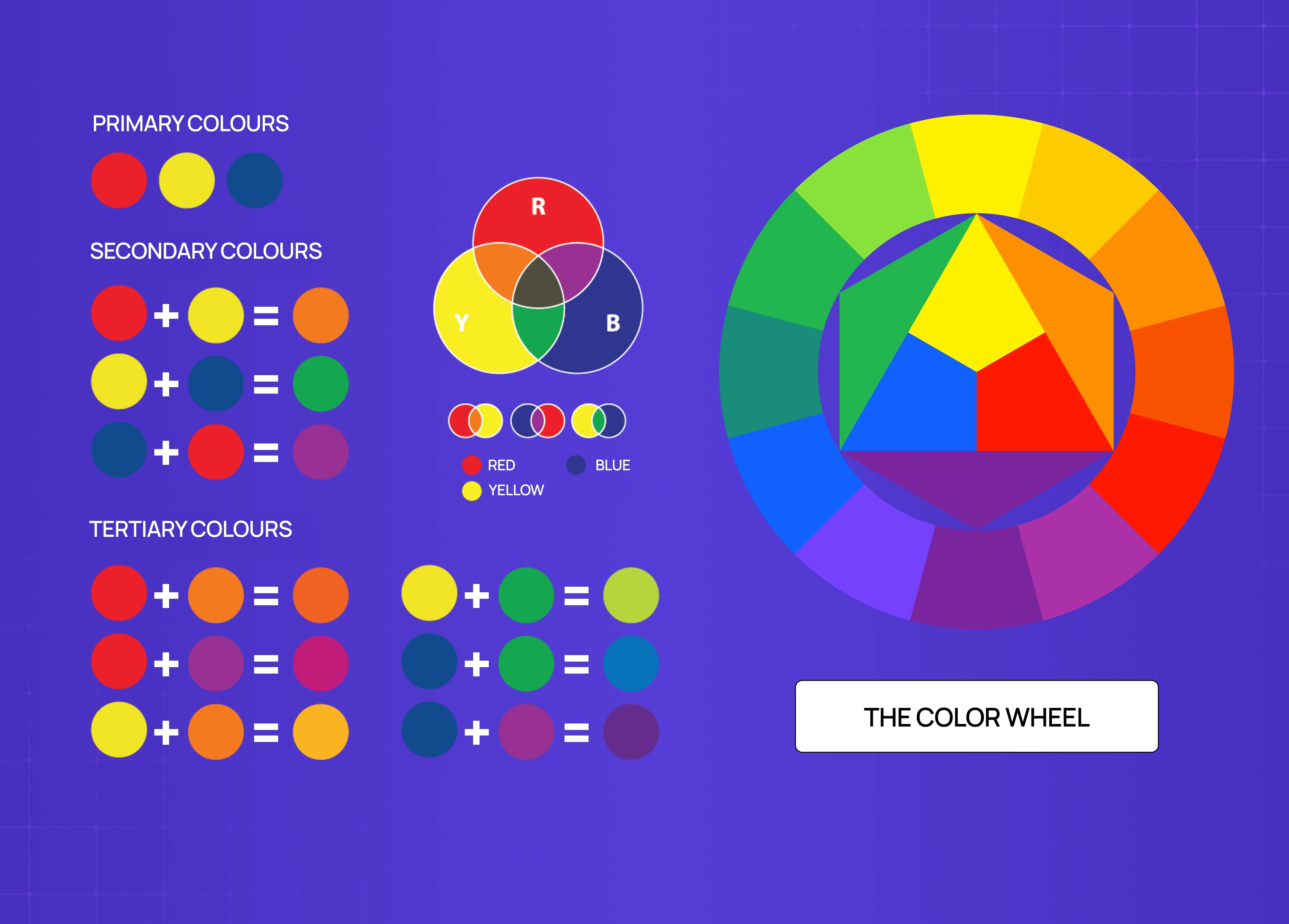
The color wheel is the foundation here. Every color has a direct complement — the one sitting exactly 180 degrees across from it. In a split complementary setup, you skip that direct complement and instead pick the two colors immediately adjacent to it, roughly 30 degrees on each side.
Here are the full 12 classic combinations:
Red → yellow-green + blue-green
Red-orange → blue-green + blue
Orange → blue-green + blue-violet
Yellow-orange → blue + blue-violet
Yellow → red-violet + blue-violet
Yellow-green → red-violet + violet
Green → red-orange + red-violet
Blue-green → red + red-orange
Blue → yellow-orange + red-orange
Blue-violet → yellow-orange + orange
Violet → yellow-green + yellow-orange
Red-violet → yellow + yellow-green
The visual result is consistent across all of them: warmth meets cool, contrast is present but softened, and the palette feels intentional rather than accidental — an outcome rooted in the same perceptual logic that Gestalt principles describe, where the eye resolves nearby differences into a coherent whole.
How to Build a Split-Complementary Palette : 3 Designer Steps
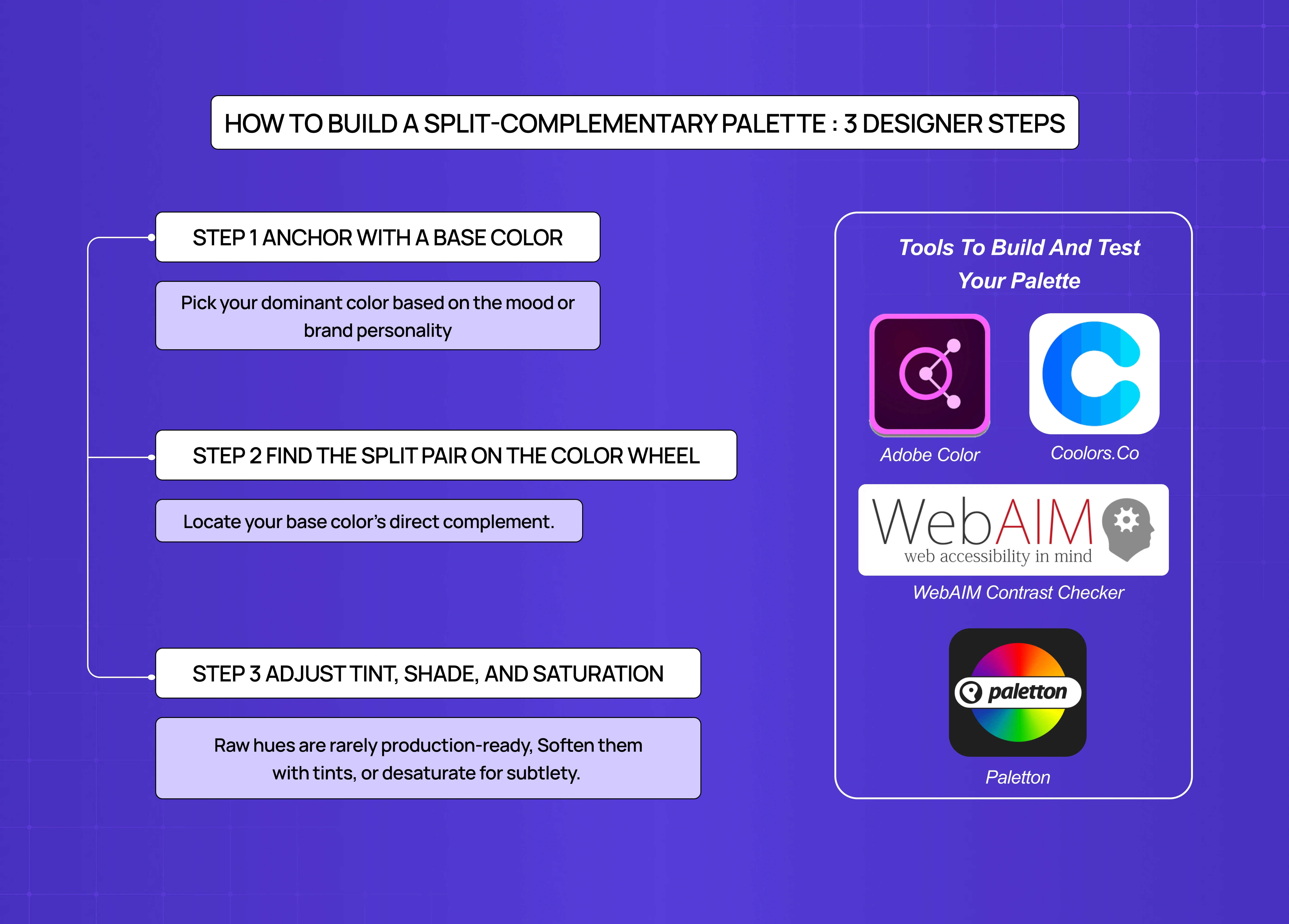
Step 1 — Anchor with a base color
Pick your dominant color based on the mood or brand personality you're designing for.
Blues and greens lean calm and trustworthy. Reds and oranges read energetic and warm.
This color will carry 60% of your palette's visual weight (following the 60-30-10 rule).
Step 2 — Find the split pair on the color wheel
Locate your base color's direct complement.
Move one step left and one step right from that complement.
Those two neighbors are your split pair.
One underused move: after locking in your initial split pair, try nudging each color slightly further from or closer to the base complement. Even a small shift changes the mood of the palette meaningfully — and often surfaces combinations you wouldn't have consciously reached for.
Step 3 — Adjust tint, shade, and saturation
Raw hues are rarely production-ready — this is where screen design discipline takes over from color theory. Soften them with tints (add white), deepen with shades (add black), or desaturate for subtlety.
Not every color in the trio needs to be equally saturated — letting one dominate while the others play supporting roles is what creates visual hierarchy.
Tools to build and test your palette
Adobe Color — best for generating split complementary combinations with a built-in accessibility checker
Coolors.co — fast iteration with a lock functionality for your base color
Paletton — excellent for visualizing split complementary relationships on the wheel — the same tools work well for prototyping chart color systems before locking in the final data category colors for an infographic.
WebAIM Contrast Checker — final WCAG validation before shipping
Why Designers Reach for This Palette
There's a reason this approach is one of the most widely recommended combinations in both design education and practice — it operationalises core visual design principles around contrast and harmony in a single three-color structure. It solves a real problem: how do you use multiple strong colors without the composition falling apart?
A few reasons it works so well:
It's forgiving. Direct complementary pairings can vibrate unpleasantly at full saturation. The split version steps back just enough to prevent that.
It creates visual hierarchy naturally — which connects directly to emphasis in design: with three distinct hues, you can assign dominant, secondary, and accent roles without forcing it.
It's flexible across mediums. Whether it's a SaaS dashboard, a brand identity, a painting, or a fashion lookbook, the three-color structure adapts cleanly.
It keeps things interesting. Unlike analogous colors (which can feel flat) or monochromatic palettes (which can feel limited), split complementary schemes have genuine tension — just enough to stay dynamic.
Using Color Temperature Deliberately
Most split complementary combinations involve one warm hue and one cool hue — giving you natural temperature contrast built into the palette from the start.
Temperature is emotional, and it's worth deciding which temperature should dominate before you assign proportions:
Warm tones (reds, oranges, yellows) → energy, urgency, approachability
Cool tones (blues, greens, violets) → calm, trust, structure
In most UI and SaaS contexts, a cool base with warm accents performs best — the cool dominant creates a restful canvas, and the warm split pair draws attention to interactive elements without visual aggression. This temperature logic is one of the defining decisions in SaaS branding, where the color system has to perform across product, marketing, and documentation simultaneously. In branding and editorial work, the balance shifts depending on the emotional register you're designing toward.
Applying the 60-30-10 Rule
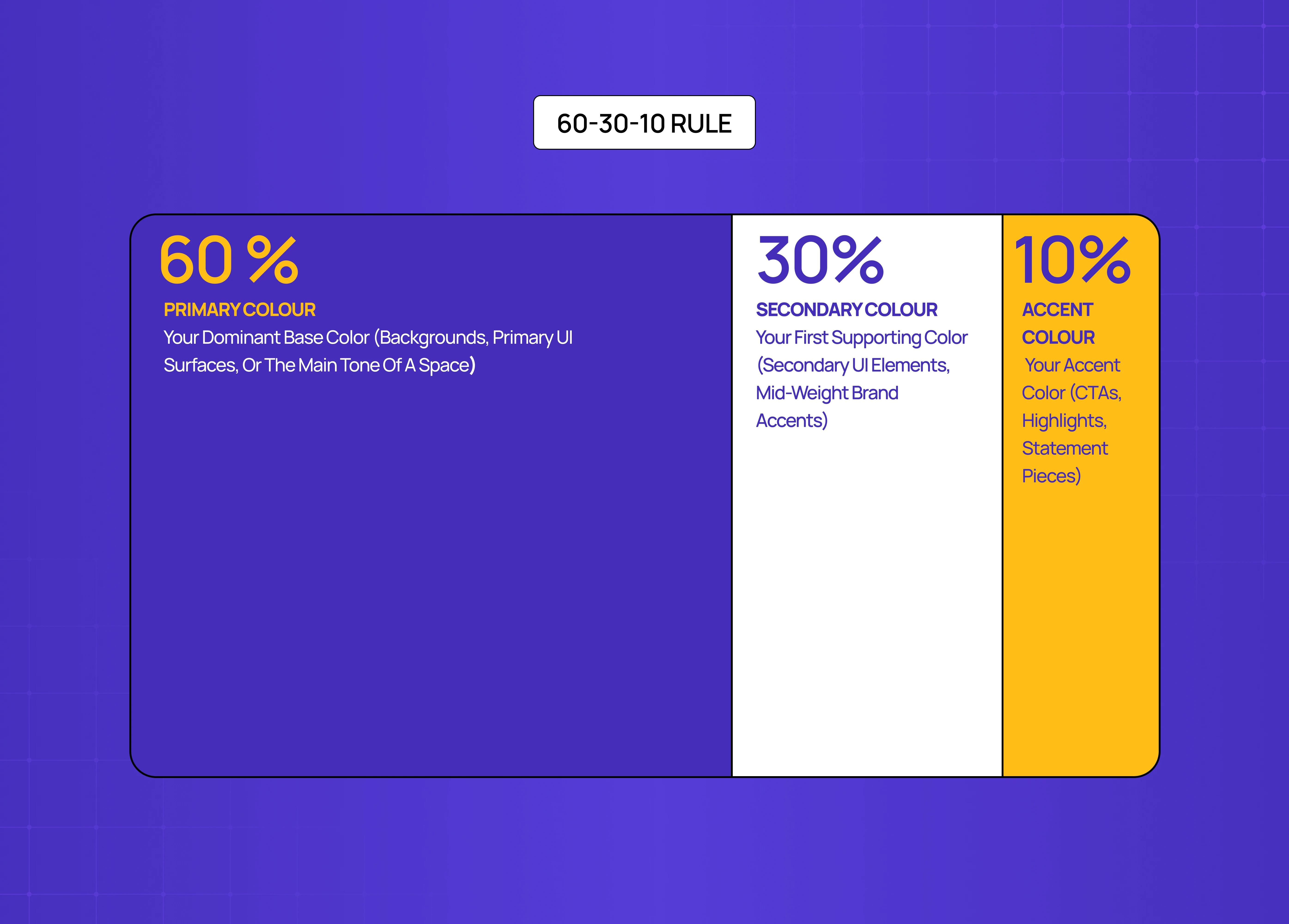
Once you have your three colors, proportion matters as much as the colors themselves. The 60-30-10 rule is the standard starting point.
60% — your dominant base color (backgrounds, primary UI surfaces, or the main tone of a space)
30% — your first supporting color (secondary UI elements, mid-weight brand accents)
10% — your accent color (CTAs, highlights, statement pieces)
This proportion stops the palette from feeling chaotic. When every color is given equal weight, the eye doesn't know where to look. The 60-30-10 breakdown creates a natural visual path.
Neutrals work well as a silent fourth participant. A light beige, off-white, charcoal, or warm grey can ground the palette and give breathing room without disrupting the three-color logic.
Accessibility check before you ship
A palette that looks balanced on your screen may still fail accessibility standards in production. WCAG 2.2 requires a contrast ratio of at least 4.5:1 for normal text and 3:1 for large text and UI components — a standard that's often easier to meet with linework-based palette pairing, since high-contrast strokes against a clean background tend to clear accessibility thresholds more reliably than subtle tonal fills.
Split complementary schemes are particularly worth checking because the warm-cool contrast can feel strong visually while still failing numerical thresholds — especially when you're working with tints or desaturated versions of your hues. A muted blue-orange pairing can look perfectly readable and still fall short of the 4.5:1 minimum for body text.
Run your final palette through WebAIM's Contrast Checker or Stark before finalizing. For color blindness simulation — which affects roughly 8% of men and 0.5% of women — use Adobe Color's accessibility tool. These are non-negotiable steps, not optional finishing touches.
Common Mistakes to Avoid
Even well-chosen palettes break down in execution. The most common failure modes:
Using all three hues at equal saturation. Without a dominant, the palette becomes chaotic. One color should lead; the other two support.
Treating the 60-30-10 proportion as optional. Color relationships only hold when proportion is controlled. Equal distribution turns a split complementary palette into a three-way visual argument.
Skipping the accessibility check. Warm-cool contrast feels strong but doesn't always meet WCAG thresholds. Always validate numerically.
Not testing on real devices and lighting conditions. A palette calibrated on a high-resolution display in a controlled environment will render differently on a mid-range phone in daylight. Test across both before finalizing.
Split Complementary vs. Related Color Schemes
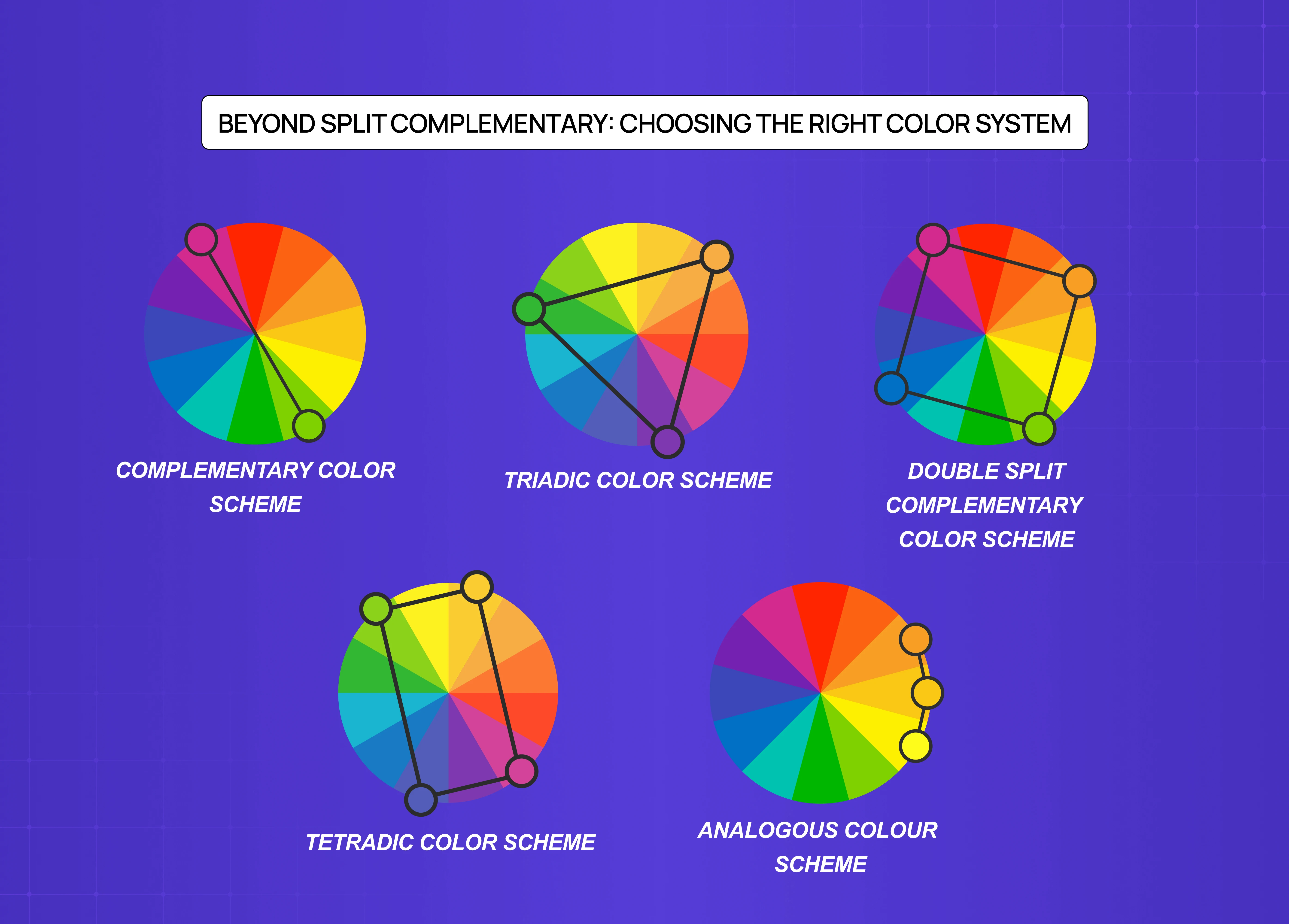
Understanding where this sits relative to other schemes helps you make sharper choices.
Complementary color scheme
Two colors directly opposite each other on the wheel.
Maximum contrast, but can feel aggressive or fatiguing at scale.
Best for bold CTAs or high-impact accents, not full palettes — a constraint rooted in weighted visual proportion, since two colors at equal strength compete rather than cooperate across a full composition.
Triadic color scheme
Three colors equally spaced on the wheel (120 degrees apart).
Vibrant and balanced, but harder to execute because all three hues carry equal weight.
Requires careful tonal management to avoid a primary-colors-on-a-kindergarten-wall effect.
Double split complementary color scheme
Four colors: two pairs of split complements.
More variety, more complexity, and significantly harder to balance.
Use when you need a rich, layered palette — product illustration, editorial design, complex UI systems.
Tetradic color scheme
Four colors in two complementary pairs, forming a rectangle on the wheel.
Maximum color variety, maximum difficulty.
Best reserved for experienced designers who are confident managing color relationships.
Analogous colors
Two to four colors sitting adjacent on the wheel.
Harmonious and easy on the eye, but low on contrast.
Strong for backgrounds, gradients, and brand palettes that need to feel calm.
Real-World Design Applications
Recognizing split complementary logic in the wild — in best website design examples and brand campaigns — is one of the fastest ways to build color intuition.
In branding:
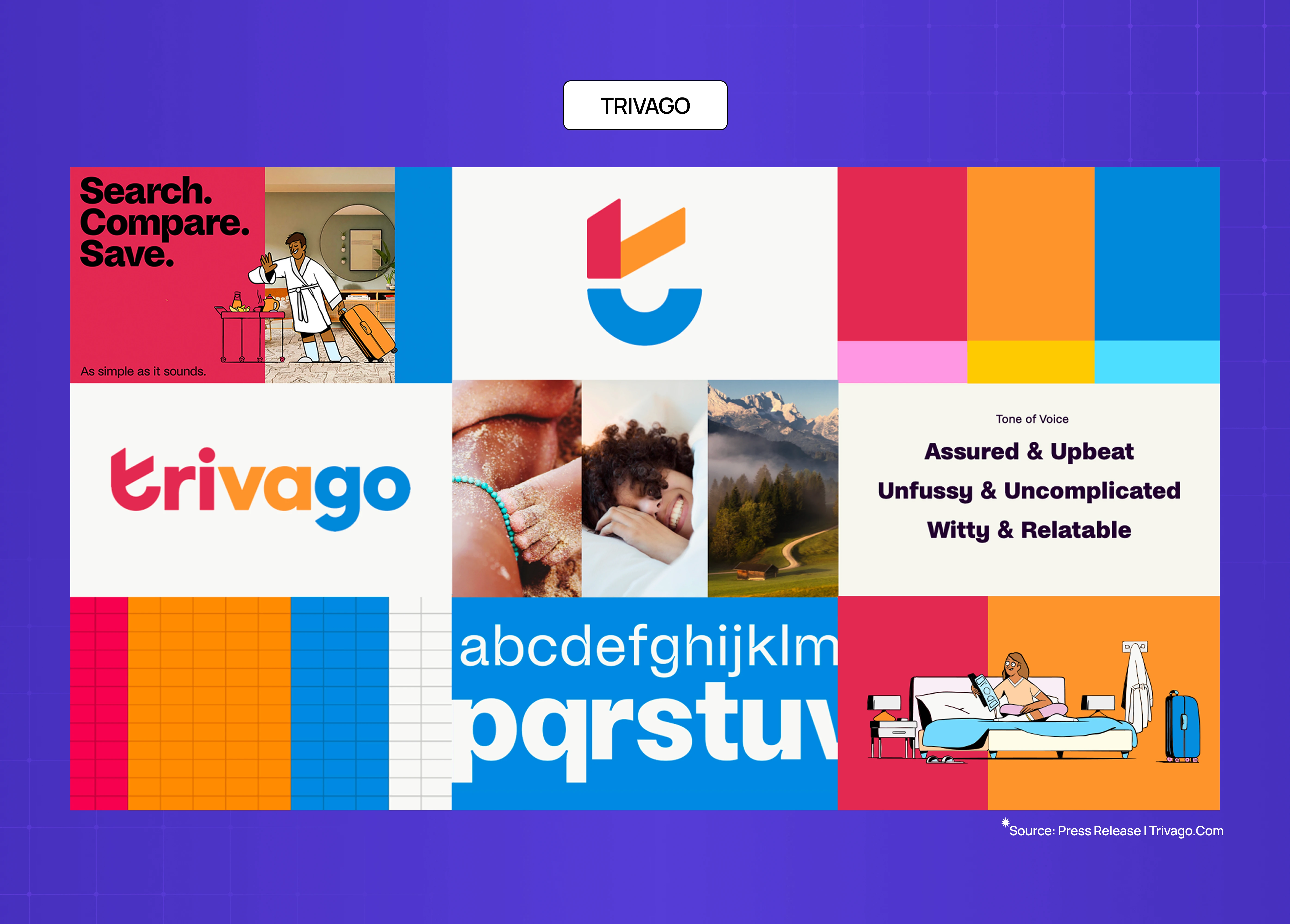
Trivago's visual identity uses a split complementary structure — a restrained base with warm offset tones that reads approachable without aggression.
This is brand experience design applied at the palette level:
Spotify's campaign visuals work the same logic, with a dominant green base and warm-leaning offset accents that feel energetic without veering into visual noise.
In digital product design:

Linear's UI is a strong reference point for anyone applying digital product design principles to color decisions. Their near-violet base in dark mode pairs with carefully offset warm states for destructive and active actions — a textbook application of split complementary thinking in a production SaaS product.
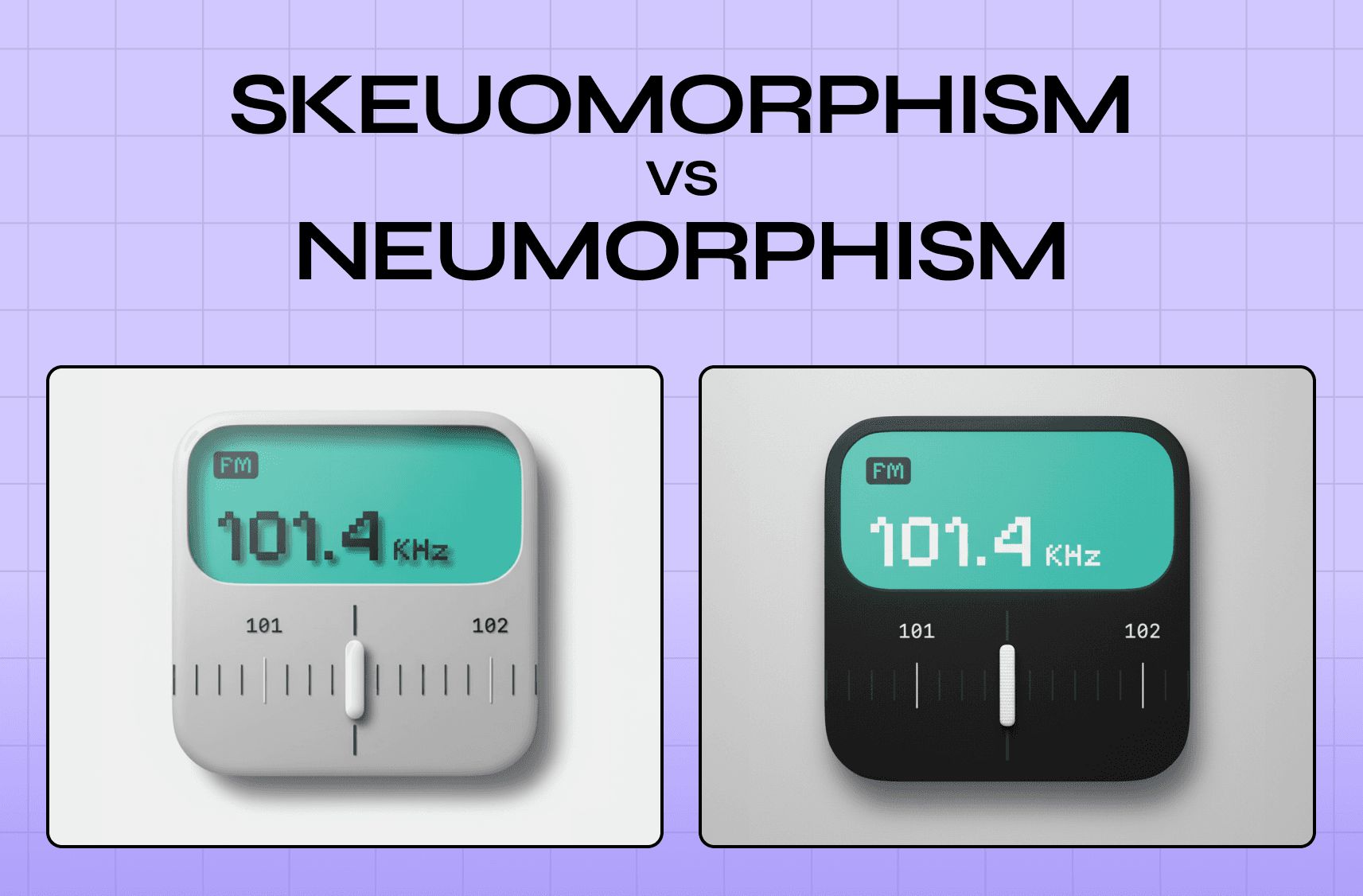
A note on light and dark mode: a palette that works in light mode will not automatically translate to dark. This contrast challenge is especially visible in the skeuomorphism vs neumorphism divide — both styles handle color depth and surface contrast in fundamentally different ways. Full-saturation accents can become overwhelming on dark backgrounds. Always test in both contexts and adjust saturation and lightness as needed.
In art:
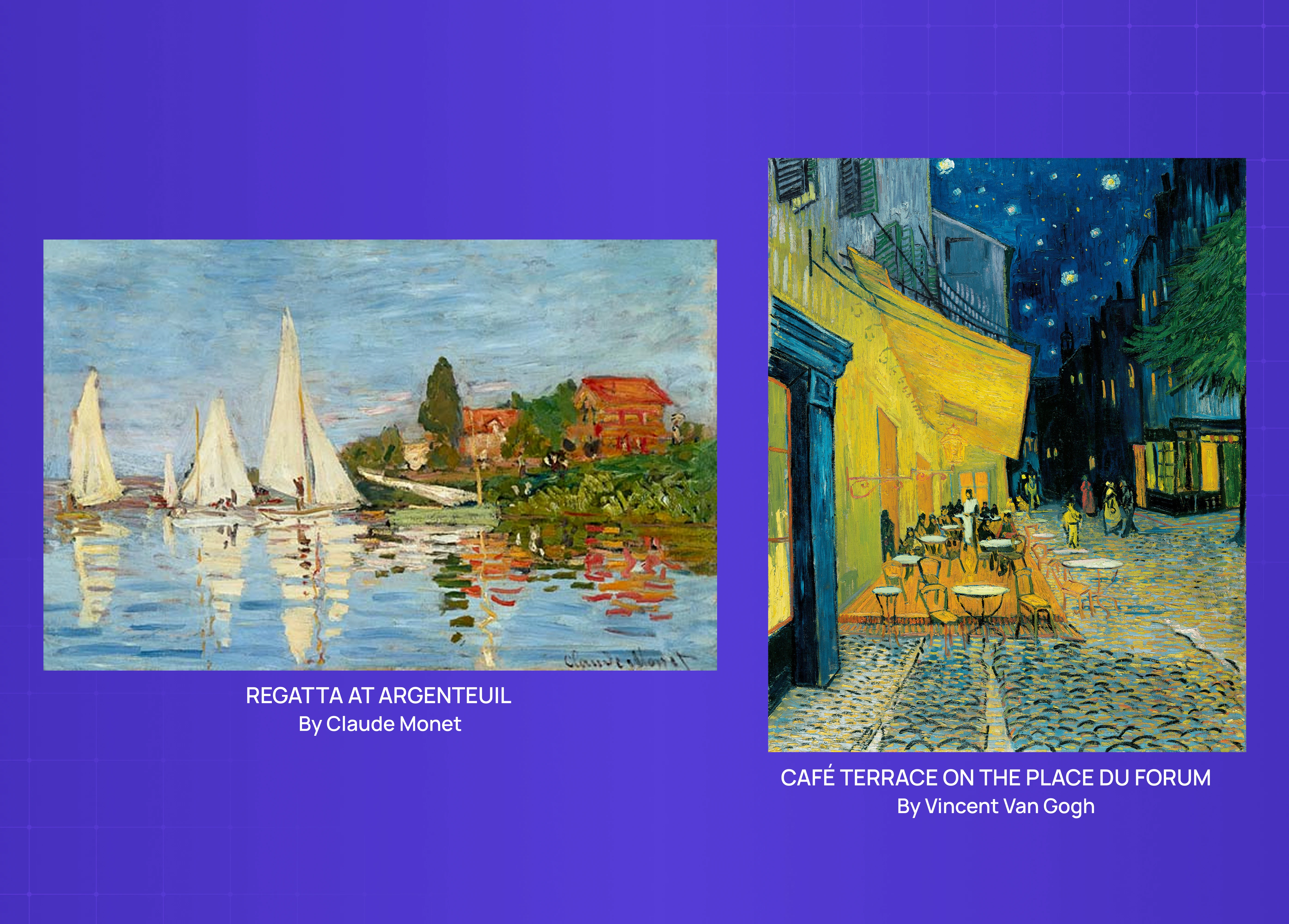
Monet's "Regatta at Argenteuil" is the canonical fine art example. The painting balances red-orange, blue, and green in a split complementary arrangement — holding visual tension without collapsing into chaos. Van Gogh's "Café Terrace on the Place du Forum" demonstrates what happens at the complementary extreme: a striking painting, but one where the warmth-cool tension is deliberately pushed to maximum.
In fashion:
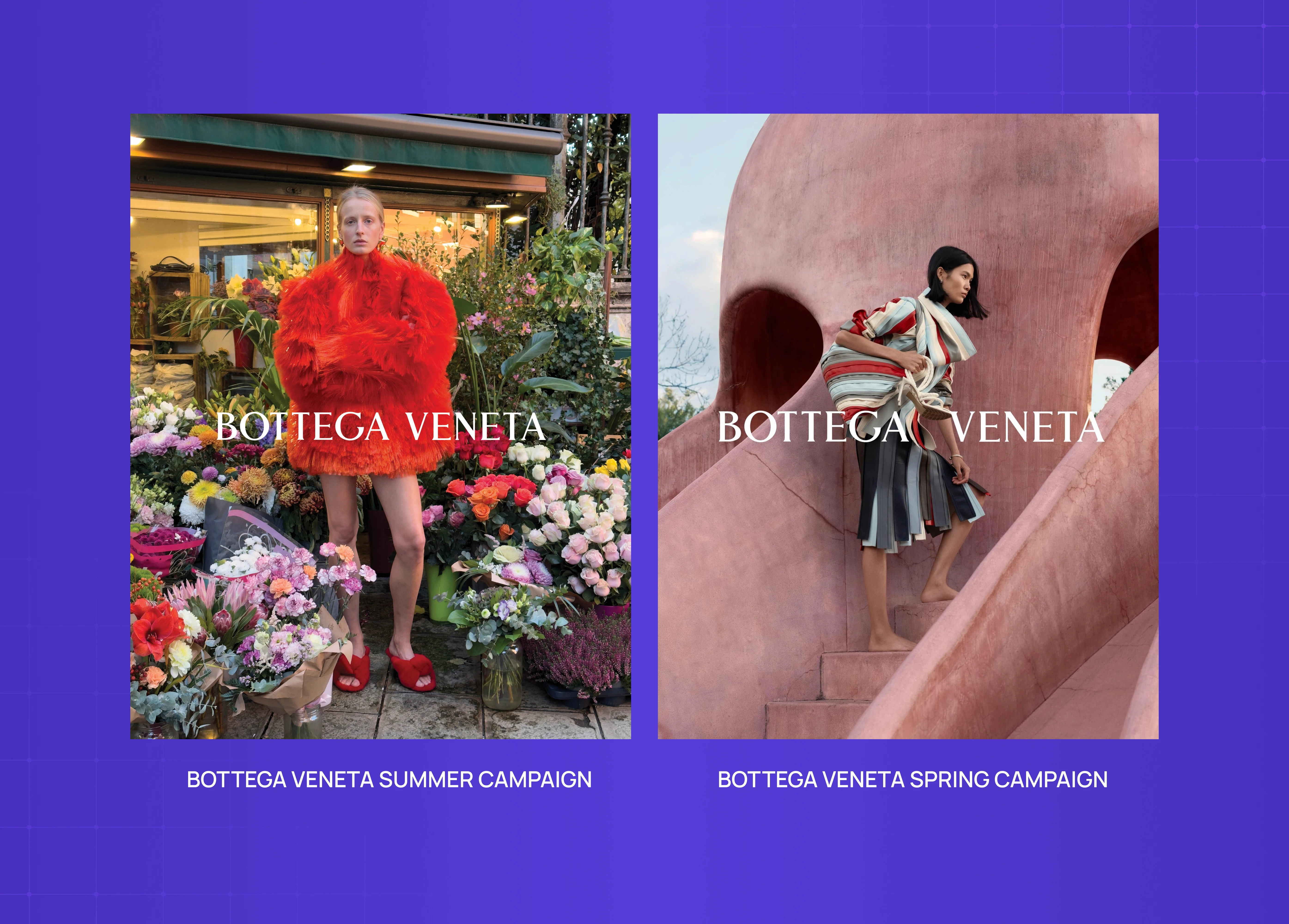
Bottega Veneta's seasonal campaigns consistently use earthy split complementary palettes — a warm ochre or clay base with offset cool tones that feel editorial and considered rather than clashing.
In interior design:
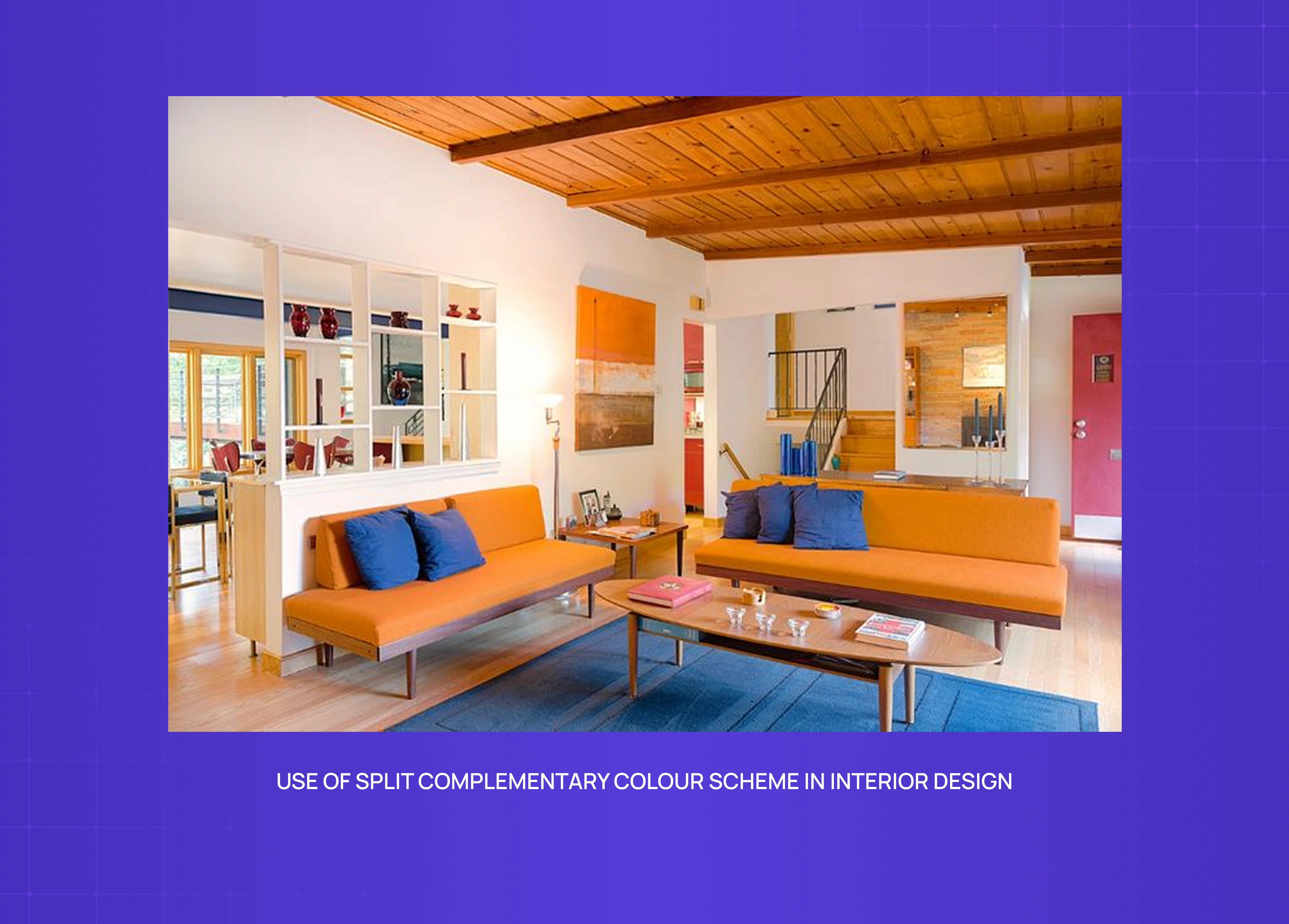
Split complementary logic appears most naturally in spaces where a dominant wall color is offset by furnishings in the split pair. A deep teal wall with rust and mustard accents across soft furnishings is a classic application — the colors feel dynamic together without the room feeling overworked, an outcome that depends on harmonized design coherence holding the room together even as multiple distinct colors compete for attention.
Why Groto
There's a version of color work that's purely aesthetic — picking things that feel nice together and calling it a palette. We don't do that.
When we start a new project, color comes in during strategy, not during visual execution. Before we choose a hue, we're asking what this color is doing: what emotion it needs to carry, what hierarchy it needs to support, what accessibility threshold it needs to meet, and what happens to it when the user opens the product at 11pm on a dim phone screen.
That discipline comes from working across a range of products — AI platforms, SaaS dashboards, e-commerce storefronts, edtech tools — where color errors aren't just aesthetic problems. They're usability problems. A CTA that fails contrast. An accent color deployed at 60% of the screen that competes with everything. A palette that's beautiful in Figma and illegible in production.
Color, applied well, is invisible. The user doesn't notice it. They just know where to go next.
If that's the kind of design thinking you want behind your product, see how we work →
Conclusion
A split complementary color scheme gives you contrast and harmony in the same palette — making it one of the most practical tools in a designer's color toolkit.
It works by selecting a base color and the two colors flanking its complement on the color wheel, rather than the complement itself.
The 60-30-10 rule is the most reliable way to proportion the three colors without the palette feeling chaotic.
Color temperature — warm vs. cool dominance — should be decided before proportions are assigned, not after.
Adjusting saturation and tint is just as important as selecting the right hues. Raw primaries almost never survive into production as-is.
Always validate your final palette against WCAG contrast thresholds. Visual balance and numerical accessibility are not the same thing.
Test across real devices and in both light and dark mode before finalizing.