

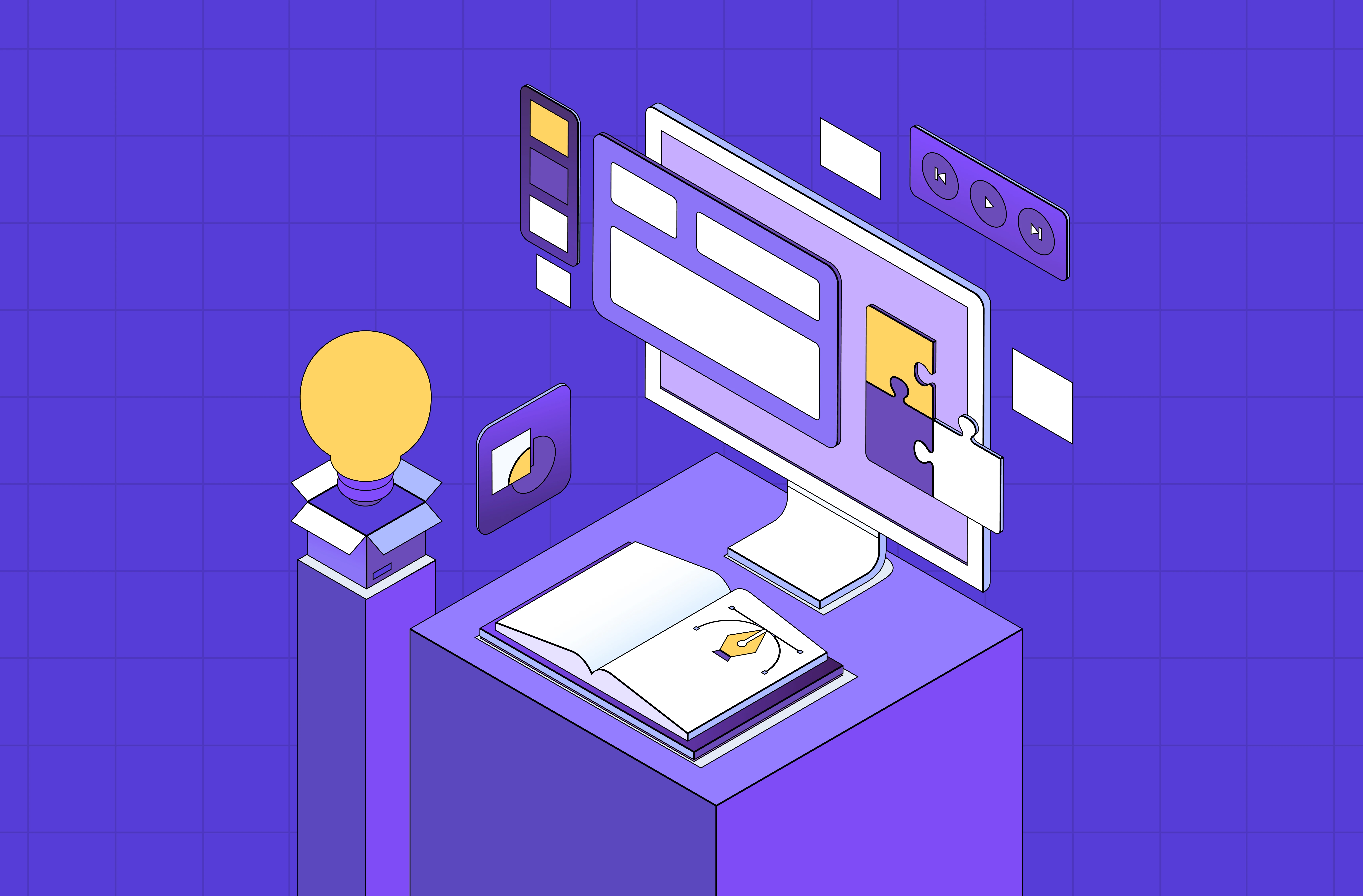
Static pages tell people things. Interactive websites make people feel things. Here are 15 of the best interactive website examples from around the web — and the design principles behind what makes each one genuinely memorable.
The interactive websites worth studying, and what makes each one actually work.
TL;DR
Interactive websites use animations, scroll effects, hover states, and gamification to keep users engaged far beyond a standard browse.
The best examples don't just look good — they make users do something.
Great interactive web design balances creativity with performance, clarity, and purpose.
At Groto, we design experiences like these for SaaS brands, ed-tech platforms, and consumer products.
Static pages tell people things. Interactive websites make people feel things.
That distinction matters more than most teams realize. The moment a user has to do something — hover, scroll, click, explore — they stop being a passive reader and start becoming an active participant. And active participants convert: the landing page elements that drive conversions most reliably are almost all interactive ones.
We've been building digital experiences long enough to know that interaction isn't a feature you bolt on at the end of a project. It's a design philosophy that shapes the entire architecture of a site. From the microinteraction on a button to a full scroll-triggered narrative, every decision either pulls a user deeper or lets them drift away.
So we went hunting — across agencies, studios, SaaS brands, and experimental labs, drawing from the broader pool of best website design examples to inspire — here are 15 interactive website examples that genuinely impressed us, and what you can actually learn from each one.
What Is an Interactive Website?
An interactive website is one that responds to user input — rather than simply displaying information and waiting to be read.
Where a static page is a monologue, an interactive site is a conversation. The user does something — hovers over an element, scrolls past a trigger point, clicks a hotspot, fills in a quiz — and the site responds in a meaningful way. That response could be visual (an animation plays), functional (a product demo loads), navigational (a new section reveals itself), or emotional (a sound effect plays).
The range is wide. At one end, you have subtle microinteractions — the micro UX design patterns that improve user experience instantly: a button that pulses when hovered, a form field that animates on focus. At the other, full scroll-triggered narratives, 3D environments built in WebGL, and sites that function more like games than pages.
What separates well-designed interactivity from gimmickry is purpose — the same test that visual design principles apply to every element: does it serve the user, helping them find something, understand something, or feel something? Or does it just exist to look impressive in a screen recording?
What Makes an Interactive Website Work
Not all interactivity is created equal — it's one of the modern web design principles every business should know, but applying it well requires more than adding animations. Done poorly, it slows sites down, confuses users, and feels gimmicky. Done well, it creates the kind of experience people talk about.
A few principles we stand by at Groto when designing interactive experiences:
Give Every Interaction a Job
Every hover effect, animation, or scroll trigger should serve a purpose — guiding attention, revealing content, or confirming an action — exactly what strong homepage design principles require at the screen that gets the most traffic. Decoration without function is noise.
Key pointers:
Sticky nav menus, hover tooltips, and reveal-on-scroll patterns aid navigation.
Gamification elements like quizzes and progress bars boost time-on-page and return visits. Gamified experiences can boost time on page by up to 200% — which explains why quizzes, progress bars, and interactive challenges consistently outperform static content in session depth.
Interactions that feel surprising but logical are the ones users remember.
Performance Is Part of the Design
Heavy animation libraries and unoptimized assets can tank your Core Web Vitals. Interactive web design that looks amazing but loads slowly is a net negative for both UX and SEO.
The stakes are real: 88% of users say they are unlikely to return to a website after a poor experience, and slow, heavy interactions are one of the leading causes of that friction.
Key pointers:
Lazy-load media and defer non-critical scripts.
Use CSS animations over JavaScript where possible for smoother rendering — it's also why a good no-code website design agency can accelerate interactive builds without sacrificing this performance discipline, since Framer and Webflow default to CSS-based animation layers.
Always test interactions on mobile — many hover-based effects don't translate, and this single constraint shapes most of the practical web design tips for transforming your website into something that works for the majority of your audience.
Make Interactions Discoverable
Users won't interact with elements they can't identify as interactive. Signifiers matter — color contrast, subtle motion, cursor changes, and button depth all communicate "tap me" or "hover here" without a word of copy.
Research shows that 84% of users prefer interfaces with seamless interactions. Smooth, intuitive experiences create a stronger sense of engagement and encourage users to interact more consistently.
Key pointers:
Visual affordance — the screen design fundamentals of shadows, gradients, and outlines — signals clickability.
Micro-animations on load draw the eye to key CTAs.
Don't make users work to figure out what's interactive.
15 Interactive Website Examples Worth Studying
1. Late Checkout Studio
Late Checkout Studio opens with a digital neighborhood map — a replica of a real streetscape where each building represents a service. Hovering over a building surfaces a tooltip; double-clicking lets you drag the map around freely.
It's intuitive without any instruction. The interaction is the navigation. That's the standard worth chasing.
What we'd borrow: Turning navigation itself into the experience, so users explore rather than scroll.
2. Webflow
Webflow's homepage uses scroll-triggered video — clips that play as you scroll and pause when you move past them. Clickable hotspots let you preview localized versions of the product in real time, turning a marketing page into a mini product demo.
The black-and-white foundation with purple and blue accents keeps it legible without sacrificing personality.
What we'd borrow: Letting users experience the product before signing up, not just read about it. If you're deciding between platforms for this kind of interaction, the breakdown of Framer vs Webflow for high-converting sites is worth reading before you commit.
3. Firstwork
When we worked on Firstwork, the challenge was clear — an AI-powered platform built for frontline workforce operations has a lot of technical density to communicate, and it needed to do that without ever feeling heavy.
The hero section leads with a video background that conveys product speed instantly, before a word is read. From there, hover states do the heavy lifting — stat cards animate on cursor entry, the tabbed "Agents in Action" section responds to hover, and industry verticals light up as you move across them. Nothing waits for a scroll. The interactions are immediate, cursor-driven, and purposeful.
Hover-enabled elements can improve conversion rates by 15–25%, which is exactly the kind of purposeful interaction Firstwork's design leans into.
It's a strong example of hover-based interactivity used to sequence information rather than just decorate it.
What we'd borrow: Using hover states to control the pace of information — letting users pull details toward them rather than having everything presented at once.
4. OHZI Interactive Studio
OHZI Interactive Studio blends motion, layered visuals, and spatial audio into one seamless entry experience. You're pulled in by fluid movement and guided through clean navigation that never fights the aesthetic.
Sound-triggered interactions remain rare in web design, which makes OHZI feel genuinely ahead of the curve.
What we'd borrow: The courage to use audio as a design element, not an afterthought.
5. Blobmixer by 14islands
Blobmixer lets users manipulate floating 3D blob shapes in real time using their cursor. The physics feel satisfyingly real. There's no story being told — just playful, tactile interaction that you can't put down.
It's the interactive websites for fun category at its absolute best.
What we'd borrow: Building an experience that doesn't require explanation — just instinct.
6. Obys Agency
Obys uses bold typography contrasts and cursor-triggered motion throughout. Every section has its own visual story, but the transitions between sections feel completely native to the overall flow.
The layered art direction — where visuals interact with each other, not just with the user — sets a benchmark for creative studios.
What we'd borrow: Designing section transitions as intentionally as the sections themselves.
7. Bruno Simon's Portfolio
Bruno Simon built his entire portfolio as a 3D driving game. You navigate a toy car through obstacles to reach his work. Every project is gated behind a physical action in the game world.
It's outrageous and completely memorable — the kind of interactive website design that becomes a case study before it's even finished.
What we'd borrow: The willingness to make the journey to the content as valuable as the content itself.
8. Cartier Watches and Wonders 2024
Cartier Watches and Wonders 2024 blends storytelling, real-time animations, and clickable hotspots to immerse users in the elegance of Cartier's watch collection. Each timepiece is presented inside its own distinct visual universe — scroll through one section and you're in a world of water and reflections; scroll further and the environment shifts entirely.
The hotspots are where it gets genuinely interactive. Click on a watch and the camera pulls in, materials catch light in real time, and contextual information surfaces without ever breaking the visual flow. It's e-commerce built inside an experience — not the other way around.
It won CSS Design Awards Website of the Year 2024 for Best UI, and it's easy to see why. It proves that interactivity works for luxury — and that restraint and spectacle don't have to be opposites.
What we'd borrow: Building distinct interactive environments per product, so each item feels like a world worth exploring rather than a listing worth skimming. The best product page design examples are moving in exactly this direction: immersive presentation first, conversion mechanics second.
9. makemepulse — Nomadic Tribe
Nomadic Tribe by makemepulse is an interactive experience built as a tribute to the artist Moebius. You scroll through four illustrated chapters of a fictional tribe, help flowers grow with your mouse, and watch birds fly faster as you hold the cursor down.
Every mouse movement is a narrative moment. That's what separates experimental interactive websites from everything else.
What we'd borrow: Treating user input as a storytelling device, not just a navigation mechanism.
10. KM Strategic Design
KM Strategic Design greets you with a hummingbird that follows your cursor on entry — a strong example of the kind of interactive entry experience that makes understanding what a splash page is and when to use one relevant context. Text masks, transparent video, and hover-reveal effects layer up as you scroll. Every element is precise without feeling overdone.
It's proof that interactive web design doesn't need to sacrifice legibility for creativity.
What we'd borrow: Leading with one unexpected interaction to set the tone for everything that follows.
11. Active Theory
Active Theory combines real-time particle effects, 3D motion graphics, and smooth interactive previews of client work. The site feels genuinely futuristic without obscuring the portfolio it's meant to showcase.
It shows that technical ambition and commercial clarity don't have to trade off.
What we'd borrow: Using the showreel itself as the interactive element — no separate "case study" clicks needed.
12. Immersive Garden
Immersive Garden is built around progressive discovery — hidden 3D art emerges as you scroll, soft gradients shift, camera movements flow, and subtle sound design builds a world that reveals itself slowly. You keep scrolling because you don't know what you'll find next.
That sense of discovery is one of the most powerful things interactive web design can manufacture.
What we'd borrow: The progressive reveal model, where each scroll rewards the user with something new.
13. Salvatore Casalino's Interactive Resume
Salvatore Casalino built his portfolio as a scroll-controlled 2D world — a character you guide from the Colosseum in Rome to the Statue of Liberty, uncovering career highlights at each landmark.
For interactive websites for students or early-career designers, this is the blueprint for a portfolio that actually gets remembered — though being memorable only works when you've also thought about getting your portfolio discovered by the right people in the first place.
What we'd borrow: Attaching personal information to physical movement in a space, not just a page.
14. Drexler
Drexler keeps things clean and minimal — smooth transitions, color themes that shift between project sections, and thoughtful hover effects that enhance without overwhelming.
It's the quiet achiever of this list. An example of interactive website design done with restraint, which is often harder than spectacle.
What we'd borrow: The discipline to stop adding interactions before you've added too many.
15. Resn
Resn uses motion-triggered text, layered interactive elements, and hidden animations that keep users curious throughout the scroll. Things animate based on what you do — not on a timer.
User-triggered animation always feels more personal than auto-play. Resn builds that in at every layer.
What we'd borrow: Making every animation contingent on user action, so the experience feels responsive rather than scripted.
Why Groto Builds Interactive Experiences That Actually Convert
Most agencies treat interactivity as a visual upgrade. We treat it as a conversion strategy — because website conversion through interactive design is a measurable outcome, not a side effect of aesthetics.
When we worked with Camb.ai, the brief was to communicate a complex AI dubbing product to a non-technical audience. The solution wasn't a feature list — it was an experience that let users intuitively understand the product's speed and accuracy through interaction, not explanation.
When we partnered with LearnSphere, the goal was to increase engagement on an ed-tech platform where users were dropping off mid-flow. We introduced scroll-triggered progress indicators and micro-animations tied to learning milestones — small interactions that made the journey feel rewarding rather than linear.
With &Circus, the creative brief called for a site that felt as bold as the brand's work. We built a portfolio experience with cursor-driven parallax and hover-reveal case studies — the kind of interaction that makes agencies screenshot and share.
Interactive website design isn't a trend for us. It's how we think about digital products by default. See our work.
Conclusion
What this list teaches us:
The best interactive websites treat every user action — a scroll, a hover, a click — as a design moment
Interactivity works across every category: luxury, ed-tech, SaaS, creative studios, portfolios
The strongest examples balance spectacle with function — nothing decorative without purpose
93% of marketers say interactive content is effective for keeping consumers engaged — which means the industry has already made its verdict
Performance, mobile responsiveness, and discoverability are non-negotiable foundations
You don't need a massive budget to build something memorable — Bruno Simon built a game, Drexler used restraint, both made the list


