

Most SaaS signup flows are optimised to increase signups — not to activate users. This is the First Five Minutes Framework: five design decisions that determine whether a new user reaches genuine product value or quietly closes the tab.
The five design decisions that sit between signup and your user's first moment of value.

TL;DR
Most SaaS products lose 60–70% of new users not because the signup form is bad — but because nothing that happens after the form is designed to activate them. The First Five Minutes Framework breaks down the five design decisions that sit between form submission and a user's first moment of genuine product value: the gate (your signup form), intent capture (personalisation), the empty state, the first action, and the return hook. Getting all five right is what activation looks like. Getting even one badly wrong is what creates the silent churn that kills SaaS growth at the source.
Most guides to SaaS signup flow UX are written as if the signup form is the problem. Reduce fields. Add social login. Remove the credit card requirement. Show a progress bar. These things matter at the margin, but they're not the reason most SaaS products lose 60–70% of new users before activation.
The real problem is that most SaaS companies — even those that have invested in SaaS UX design at the marketing layer — design their signup flow as the last step of the marketing funnel rather than the first step of the product experience. The form is optimised to increase signups. Everything that happens after the form — the welcome screen, the empty state, the first action the user is expected to take — is either an afterthought or a grab-bag of onboarding tooltips.
By the time a user clicks "Create my account," they've already decided to try your product. The design question that determines whether they stay is not "how do we get more people through this form?" It's "what happens in the next five minutes, and does it give this person a genuine reason to come back?"
This is what we call the First Five Minutes Framework: five design decisions that sit between the moment a user submits their signup form and the moment they reach their first experience of genuine product value. Each decision has a specific job, a specific failure mode, and specific design criteria. Getting all five right is what the industry calls "activation." Getting even one badly wrong is what creates the silent churn that kills SaaS growth at the source.
What Is SaaS Signup Flow UX?
SaaS signup flow UX refers to the design of the entire sequence a new user goes through from landing on your registration page to completing their first meaningful action inside the product — a distinction that maps closely to the methodological difference between user journey vs user flow in UX design. This includes the signup form itself, any email verification steps, post-signup intent capture screens, the first dashboard or empty state the user sees, and the design of the first action that delivers product value. Most frameworks treat only the form as the "signup flow" — but the UX decisions that most affect activation are in the product experience that follows the form.
Why the Signup Form Is the Wrong Place to Optimise
The standard advice — fewer fields, faster form, social login — solves a real but minor problem. Most tactics for improving website conversion rate without redesigning fall into this category: useful at the margin, but not what closes the activation gap. Yes, reducing a seven-field signup form to two fields will improve completion rate. But if the user who completes that form then lands on a blank dashboard with no clear first action, you haven't improved activation. You've moved the drop-off point one step to the right.
The data on this is consistent: research across SaaS products shows that the majority of free trial churn happens within the first session, not after a week of consideration. The user signs up, stares at the product, can't work out what to do first, and quietly closes the tab. They don't cancel — they just never come back. This is the activation gap, and it lives in the five minutes after the form, not in the form itself.
The design implication is significant. Reducing signup form friction is a marketing optimisation. Designing what happens after the form is a product design problem — the same problem that fixing SaaS onboarding drop-offs with UX addresses in depth — and one that requires UX research, information architecture, empty state design, and onboarding flow thinking that most marketing design services don't offer.
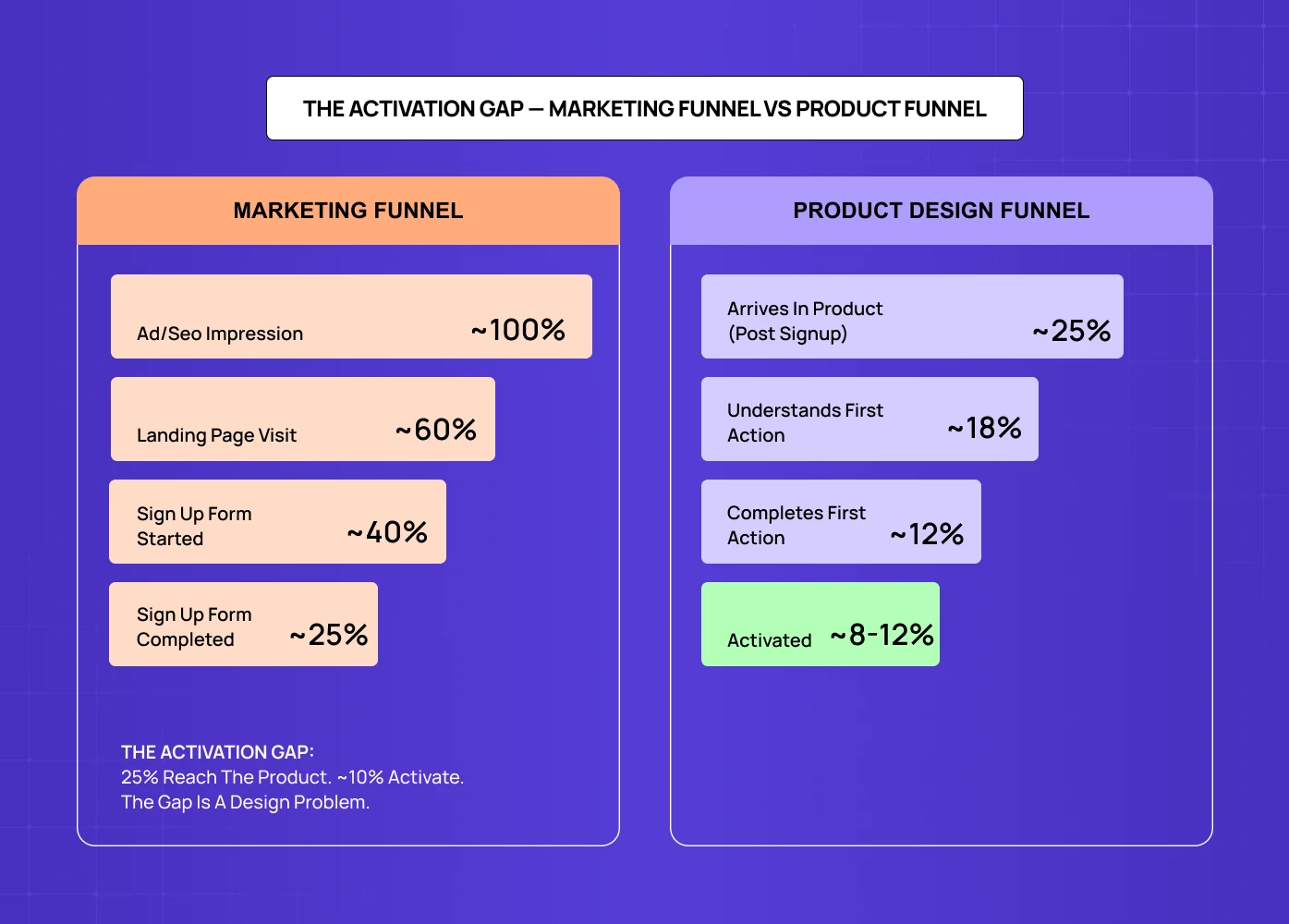
The funnel below makes this concrete. Of every 100 users who see your product, roughly 25 complete the signup form — and most optimisation stops there. But only 8–12 of those 25 ever activate. The drop isn't happening at the form. It's happening in the five minutes after it.
The First Five Minutes Framework
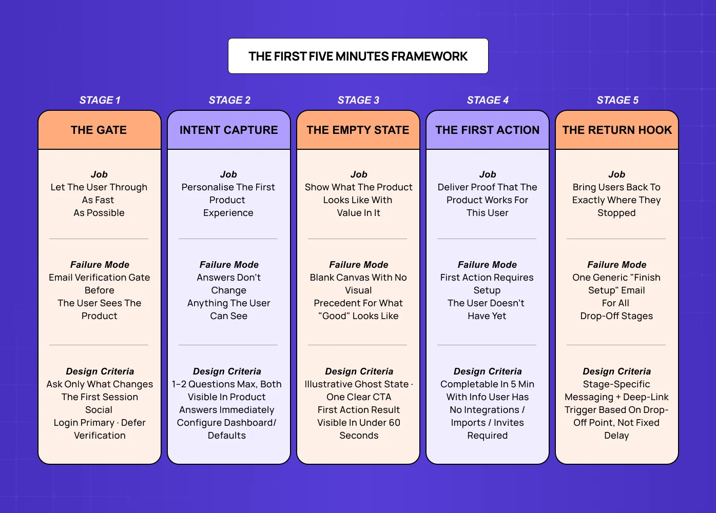
The First Five Minutes Framework maps the five design decisions a SaaS company makes (or fails to make) in the sequence from form submission to first moment of product value. Each stage has one job. Failure at any stage breaks the activation chain.
Stage 1: The Gate — Your Signup Form
The gate is everything the user sees before they get into the product — the signup form itself, any email verification step, and any loading or redirect states between submission and dashboard arrival.
The gate's job is not to collect information. Its job is to let the user through as quickly as possible while collecting only the information you will immediately use to make their first product experience more relevant. This is the key distinction that most signup form optimisation misses. Fewer fields is not the goal — fewer fields that serve no immediate purpose is the goal. If you ask for company size and immediately use that to show a differently configured dashboard, that field is worth the friction. If you ask for it to populate a CRM field that sales will look at in two weeks, it's costing you activations.
Design criteria for the gate: The form should ask only for what the product needs in the first session. Social login should be the primary option, not a secondary one. Email verification should be deferred — the user should land in the product immediately after signup, with verification happening asynchronously. If a loading or redirect state is unavoidable, use it to set expectations about what the user is about to see — one of the micro UX design patterns that improve user experience immediately in high-friction transition moments.
Failure mode: A form that collects data for the sales team rather than for the product experience — or an email verification gate that stops the user before they ever see the product.
Stage 2: The Intent Capture — Welcome and Personalisation
The intent capture is the post-signup moment where you ask the user what they're trying to do. It typically looks like a "Tell us about yourself" or "What brings you here?" screen, and when done well it is the most powerful activation lever in a SaaS product.
Done badly, intent capture is an interrogation — and the UX writing and microcopy principles that apply here are consistently violated. Five questions about company size, role, team size, use case, and prior tool — none of which visibly changes anything about the product experience. The user dutifully answers, clicks through, and arrives at the same generic dashboard everyone else sees. The questions existed to feed a segmentation spreadsheet, not to personalise the product.
Done well, intent capture is a direct exchange: you tell us your primary goal, we show you a product that's already set up to pursue that goal. The questions are minimal (one or two at most), the answers are immediately visible in how the product is configured, and the user feels the product already understands their context.
Design criteria for intent capture: Ask one or two questions maximum. The answers must visibly and immediately change the user's first product experience — pre-populated templates, filtered feature sets, or a different default dashboard view depending on the response. If the answers don't change anything the user can see, don't ask the questions.
Failure mode: Using intent capture as data collection for the marketing team rather than as a product personalisation input. The user answers five questions and then sees the same generic dashboard everyone else gets.
Stage 3: The Empty State — First Dashboard View
The empty state is the most under-designed moment in most SaaS products, and it has an outsized impact on activation. A new user arrives at a blank dashboard with no content, no context, and no clear first action — the exact problem that designing SaaS dashboards users actually understand is built to solve.
The problem is not that the dashboard is empty — it's that the empty state is designed for a product manager who already knows what the product does and what a "project" is. For the new user in their first session, an empty state needs to do three things simultaneously: show them what the product looks like when it has content (so they understand the destination), give them a single first action that is both low-effort and meaningful, and make the outcome of that first action feel immediately rewarding.
Design criteria for the empty state: Show a visual representation of what the populated state looks like — this is often called a "ghost state" or illustrative empty state. Provide exactly one clear first action (not three buttons of equal visual weight). The first action should produce a visible result in under 60 seconds. If the product requires significant setup before it's useful, use a guided setup flow with a progress indicator rather than a bare empty state.
Failure mode: An empty state that explains what the user hasn't done yet rather than showing them what they could have. A blank canvas with no visual precedent for what good looks like.
Stage 4: The First Action — Delivering Proof of Value
The first action is the moment that determines activation. It's the point at which the user does something with the product and receives a response that makes them think "this works, I can see how this helps me." This moment is variously called the "aha moment" or "activation event" — but the design question is always the same: what is the single action that delivers the most convincing demonstration of the product's core value, and is the path to that action obvious?
Most SaaS products fail here in one of two ways. Either the path to the first meaningful action is buried behind setup steps the user doesn't have context for yet (integrations, team invites, configuration that requires information they don't have to hand), or the first action delivers a result that is technically correct but not emotionally convincing. A task tracker that shows an empty "completed" column is not activating. A task tracker that shows the user their first completed task crossed off a list they created in under 90 seconds is activating.
The design job is to identify the minimum version of the core product action that still delivers the essential experience, and then build the entire onboarding flow around that minimum action — removing everything that stands between a new user and that first moment of value.
Design criteria for the first action: The first meaningful action should be completable in under five minutes with information the user already has (no external lookups, no team members required). The result of that action should be visually satisfying and immediately comprehensible. The path to the action should involve no more than three steps from the empty state.
Failure mode: A first action that requires setup prerequisites the new user doesn't have yet — integrations with other tools, team member invites, imported data. Any prerequisite that can't be completed in the first session pushes activation to a second or third session, and most users don't return.
Stage 5: The Return Hook — What Happens If They Leave
The return hook is the design decision that runs in parallel with stages one through four: what mechanism brings the user back if they leave before completing their first session? This is where building narrative UX journeys that boost retention begins — not in the product itself, but in the re-engagement sequence that runs when a user drops off. Most SaaS products handle this with a generic "Get started with [Product]" email sent 24 hours after signup. Most of those emails go unopened.
The return hook problem is not primarily an email copywriting problem. It's a data problem: when a user leaves mid-session, the product rarely knows where they stopped or what would be most relevant to prompt them to return. A user who got through intent capture and the empty state but never completed a first action needs a very different email from a user who never got past the signup form verification step.
Good return hook design requires the product to instrument the activation funnel — to know which stage each user reached, and to send re-engagement communications that reference specifically where they stopped and offer a direct path back to the next step. This is an engineering and product design problem that most early-stage SaaS companies either haven't prioritised or haven't instrumented properly.
Design criteria for the return hook: Return communications should reference the specific stage the user reached, not a generic "you haven't finished setting up." The call to action should be a direct deep-link to the next step in the activation flow, not the homepage or the dashboard root. Timing should be based on session drop-off behaviour, not a fixed 24-hour delay.
Failure mode: A single generic "complete your signup" email with a link to the dashboard home. The user can't remember where they left off, the email doesn't help them remember, and they abandon permanently.
Diagnosing Where Your Signup Flow Is Failing
The First Five Minutes Framework is most useful as a diagnostic tool. If your trial-to-activation rate is below 30% — one of the core UX metrics for SaaS to track alongside session depth and Day 7 retention — one or more of these five stages has a design problem. The question is which one.
How to Run a First Five Minutes Audit
The fastest way to diagnose which stage is breaking activation is to watch real users go through your signup flow — the same observational approach used when mapping user flows in UX design: not analytics in isolation, but actual screen recordings or live sessions. Analytics will tell you where users drop off; screen recordings will tell you why.
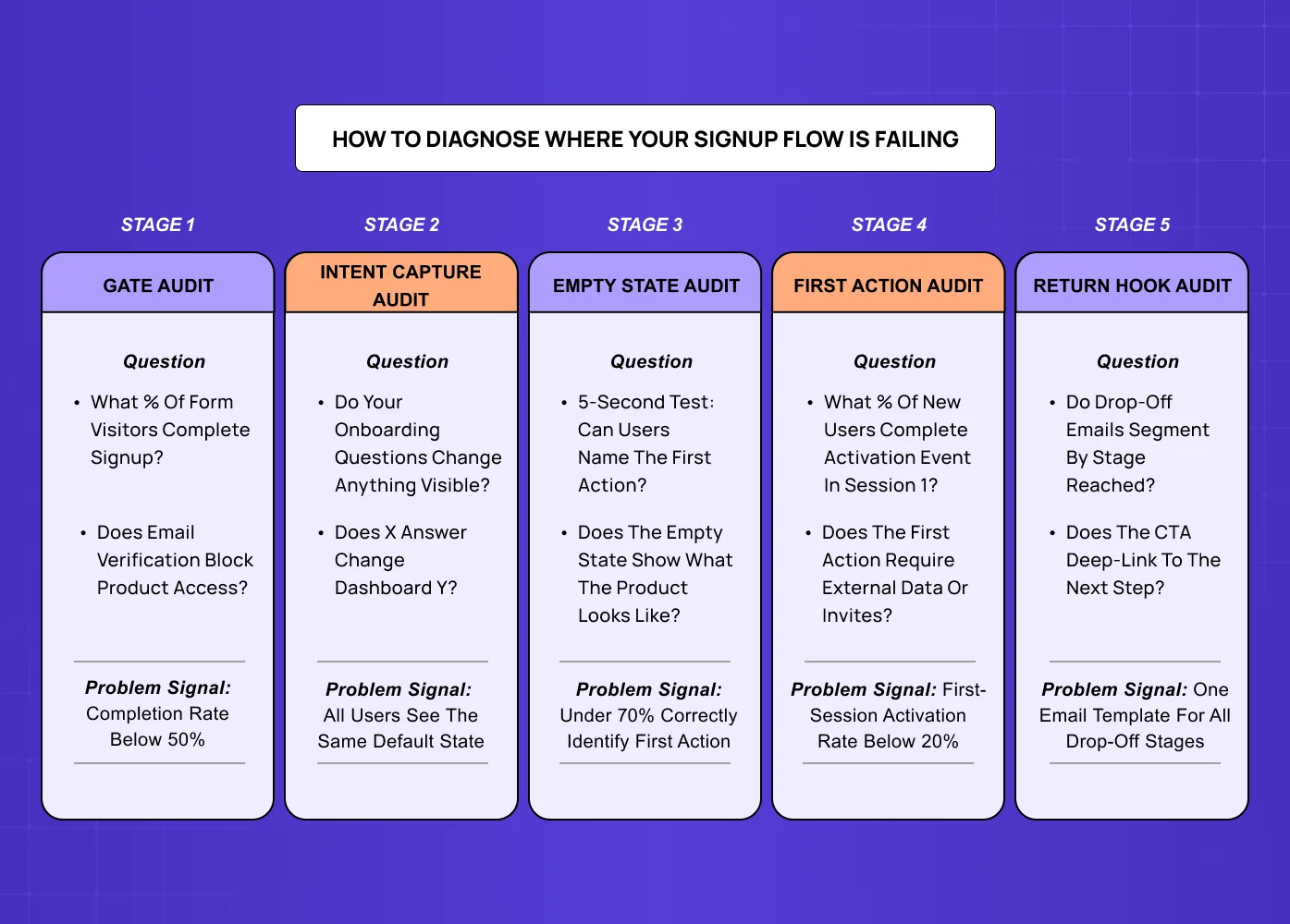
Stage 1 Audit: The Gate
Look at your signup form completion rate relative to landing page visits. If the gap is large (under 30% completion), you have a gate problem.
Check: how many fields, is email verification blocking access, does your form work on mobile without scrolling.
Stage 2 Audit: The Intent Capture
Check whether your intent capture questions are changing anything visible in the product experience.
Ask your engineering team: does user response to question X change anything about the dashboard or default state they see? If the answer is no for any question, that question is costing you activations.
Stage 3 Audit: The Empty State
Run a five-second test with first-time users: what do they think they're supposed to do first?
If fewer than 70% can correctly identify the first action, your empty state has a clarity problem.
Stage 4 Audit: The First Action
Measure the percentage of new users who complete your activation event within the first session.
Industry benchmarks vary by product type, but a first-session activation rate below 20% for a self-serve SaaS product suggests a first-action design problem.
Stage 5 Audit: The Return Hook
Look at open rates and click-through rates on your "complete onboarding" emails segmented by the stage each user had reached when they left.
If all users receive the same email regardless of where they dropped off, you have no return hook personalisation — you're running one message for five different situations.
Common SaaS Signup Flow Mistakes and How to Fix Them
Designing for Your Ideal User Instead of Your Actual First-Time User
The mistake: Building the flow that would delight a user who already deeply understands the product. The form asks sophisticated segmentation questions. The empty state assumes terminology the user has seen in documentation they haven't read yet. The first action is the most powerful feature rather than the most accessible one.
The fix: Watch at least five unmoderated first-session recordings of users who have never seen the product before. The specific moments of confusion, misinterpretation, and abandonment will be consistent across sessions and will identify exactly which design decisions need to change.
Treating Signup Flow Optimisation as a Continuous Improvement Process
The mistake: A/B testing for SaaS companies — button colours, field order, CTA copy produces small, incremental gains. If your activation rate is fundamentally broken (under 20%), no amount of A/B testing will fix it because you're optimising within a broken structure.
The fix: Redesign the first five minutes from scratch using UX research — user interviews, session recordings, and activation funnel data — rather than iterating on the existing flow with tests.
Handing the Signup Flow to the Marketing Team to Optimise
The mistake: The signup form is a marketing touchpoint. Everything that happens after the form is a product design touchpoint. When the same team owns both, the design priorities of the form (maximise signups, collect data) tend to dominate the design priorities of what follows (maximise activation, deliver value fast). The result is a high-converting form attached to a low-activating product experience.
The fix: Treat the signup form completion as a handoff point — from marketing to product design responsibility — and design both sides of that handoff with separate, appropriate briefs.
What Good SaaS Signup Flow UX Actually Looks Like
Good SaaS signup flow UX is not the absence of friction — one of the core SaaS product design best practices that runs counter to the instinct to remove every step. Some friction is intentional: a user who has completed a thoughtful intent capture and seen a product configured for their specific use case is more activated than one who clicked through a frictionless two-field form and arrived at a generic dashboard.
The design standard for a well-functioning first five minutes is:
A new user who has never seen the product should be able to complete a meaningful first action within five minutes of clicking "Create account," without reading documentation, watching a tutorial, or asking for help. The result of that action should clearly demonstrate the core value of the product. And the experience should feel like it was designed with their specific goal in mind, not adapted from a template.
This standard is achievable. Most SaaS products at the Seed to Series A stage are not close to it. The gap is not a marketing problem — it runs through the full arc of UI UX design for SaaS products from onboarding to retention, and closing it requires UX research, information architecture, and activation-focused design thinking.
Key Takeaways
The SaaS signup flow UX problem is not primarily a form design problem — it's a product design problem that starts the moment the form is submitted.
The First Five Minutes Framework identifies five distinct design decisions: the gate (form), the intent capture (personalisation), the empty state, the first action, and the return hook. Each has one job and one failure mode.
Most SaaS activation failures happen in stages 3 and 4 — the empty state and the first action — not in the signup form itself.
Diagnosing which stage is broken requires session recordings and activation funnel data, not A/B tests of button colours.
Fixing a broken signup flow is a product design engagement, not a marketing design task. It requires UX research, information architecture, and a clear definition of your activation event.


