

Before users reach your website, a splash page intercepts them with a single message — an announcement, gate, or prompt. Done right, it sharpens entry and sets context. Done poorly, it creates friction and drives users away.
A splash page appears before your site — guiding or interrupting entry.
You land on a website. Before you reach the homepage, something appears — a full-screen welcome, an age verification prompt, a language selector, or a product announcement. That's a splash page.
It's one of the most misunderstood tools in web design. Used well, it creates an immediate impression and directs users exactly where you want them. Used poorly, it's the friction standing between a visitor and the thing they came for.
This guide covers what a splash page is and how it differs from a landing page and homepage. It also explains when it makes sense to use one — and what good design looks like in practice.
What Is a Splash Page?
A splash page is an introductory screen that appears before a visitor reaches a website's main content. It’s typically full-screen and focused on a single message or action.
It either disappears after a few seconds or requires the user to click through.
Unlike the rest of a website, a splash page has no navigation menu — no browsing, no exploring. Understanding where splash pages fit in site structure helps clarify why: they sit at the entry layer of the hierarchy, before the content architecture begins, which is exactly what makes their single-action logic work rather than feel arbitrary.
The term has roots in print: in splash pages in comics and splash page magazine layouts, a splash page refers to a full-page illustration designed to make an immediate visual impact. The digital version borrows the same idea — maximum impression, minimum distraction.
Splash Page vs. Landing Page vs. Homepage
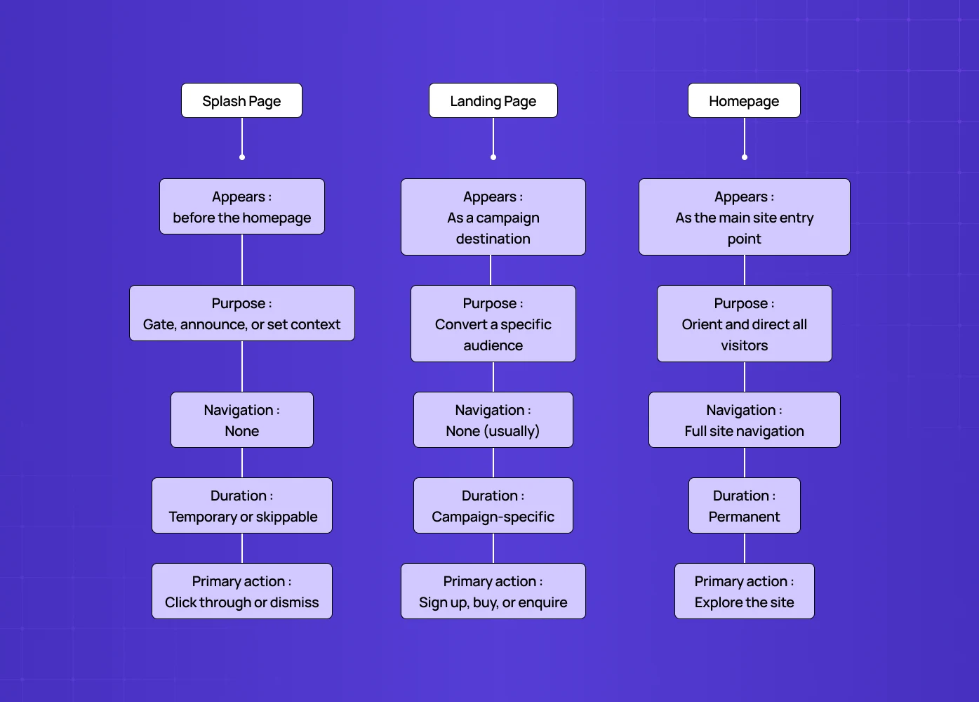
These three terms get confused constantly. They're meaningfully different.
Key Aspects | Splash Page | Landing Page | Homepage |
Appears | Before the homepage | As a campaign destination | As the main site entry point |
Purpose | Gate, announce, or set context | Convert a specific audience | Orient and direct all visitors |
Navigation | None | None (usually) | Full site navigation |
Duration | Temporary or skippable | Campaign-specific | Permanent |
Primary action | Click through or dismiss | Sign up, buy, or enquire | Explore the site |
The clearest way to think about it is intent.
A landing page is designed to convert — it's the destination of a campaign. A splash page is designed to intercept. It’s a deliberate pause before the main experience begins. And the splash page vs home page difference is simpler still: a homepage is the permanent centre of a website, while a splash page is always temporary and always focused on one thing — and what makes a homepage work structurally covers the navigation, hierarchy, and CTA principles that distinguish homepage design from the stripped-back, single-action logic a splash page operates on.
SEO Implications of Splash Pages
Splash pages can create real SEO trade-offs if implemented incorrectly. Search engines crawl and index meaningful content. A poorly structured splash page can block that.
How Google Treats Splash Pages
Search engines like Google don’t inherently penalise splash pages. The issue is what they hide.
If your splash page sits in front of your main content and prevents crawlers from accessing it, your site’s indexable pages may never be fully discovered.
When Splash Pages Hurt SEO
Splash pages become problematic when:
The main content is not accessible without interaction (e.g. click-to-enter walls).
The splash page is the only indexed page, with thin or no content.
JavaScript gates prevent crawlers from reaching deeper pages.
The same splash is repeatedly shown without proper redirects or cookies.
In these cases, Google sees limited value — and rankings suffer.
How to Use Splash Pages Without Damaging SEO
To avoid crawlability issues:
Ensure your main site content is directly accessible via URLs.
Use server-side rendering or static fallbacks where possible.
Allow search engines to bypass the splash page.
Use cookies or session logic to avoid repeat interruptions.
Keep the splash page lightweight and non-blocking.
The key principle:
A splash page should guide users, not block search engines — and understanding how splash pages shape user entry flows helps clarify what "guiding users" actually means at the flow level: defining the entry point, the single decision, and the transition to the main site experience as a deliberate sequence rather than an interruption.
When Does a Splash Page Actually Make Sense?
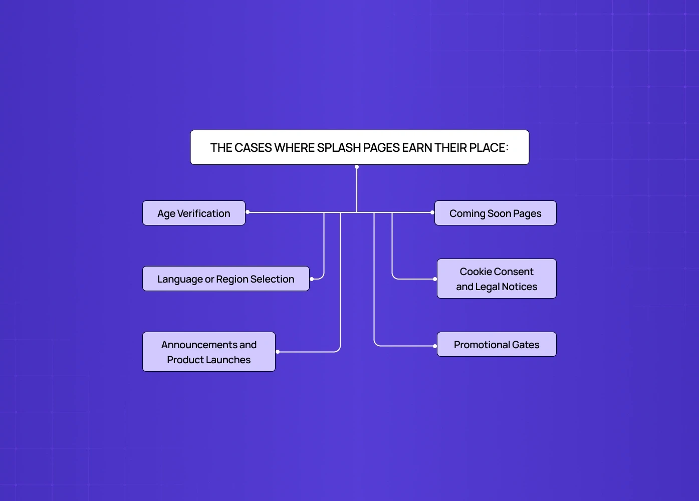
Fashion and luxury brands do this particularly well, using the moment to set visual tone before anything else loads.
Coming Soon Pages
Before a site launches, a splash page captures interest, collects emails, and builds anticipation.
The same principles apply as in splash pages as a conversion rate lever — copy clarity, CTA placement, and friction reduction.
These elements turn passive visitors into leads without requiring a full redesign.
Cookie Consent and Legal Notices
Some jurisdictions and industries require specific disclosures before site access.
A splash page handles this cleanly without burying the notice in a footer or interrupting the main experience.
Promotional Gates
Offer an exclusive discount or early access in exchange for an email address — the splash page captures the lead before the visitor gets to browse.
The conversion elements splash pages share with landing pages overlap significantly here: social proof, urgency signals, and value-first CTAs that work on landing pages apply equally to promotional splash screens.
Splash Page Design: What Good Actually Looks Like
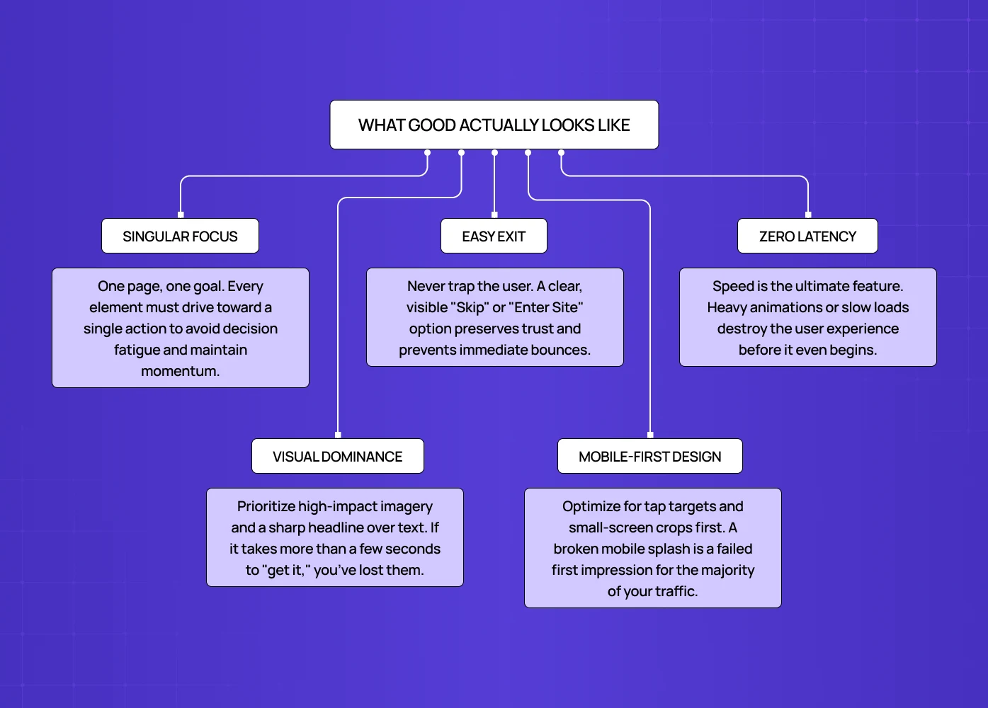
A splash page has very little room to work with and very little time to make its point. The design decisions carry more weight here than on almost any other page.
One Message, One Action
Every element on the page should serve the same goal.
If it's an age gate, that's the only thing on screen — if it's a product launch, the CTA goes to that product.
The moment a splash page tries to do two things, it does neither well — and the copy choices on that single action matter enormously. Copy and CTA writing for splash pages covers the microcopy principles that determine whether a CTA creates momentum or hesitation at exactly the moment visitors are deciding whether to engage.
Visual Impact Over Information Density
This is not the place for paragraph copy.
Strong imagery, a sharp headline, and a single CTA is the standard formula.Visitors decide in seconds whether to engage or close.
Let the visual do the heavy lifting; copy should support it, not compete with it.
A Clear Way Out
Users need to be able to dismiss or skip the splash page quickly.
A trapped visitor is an irritated visitor — the "skip" or "enter site" option should be visible and easy to find.
Never hide the exit in a corner to force engagement — it damages trust before the site has loaded.
Mobile-First Thinking
A splash page that looks striking on desktop and broken on mobile is a common failure mode.
Most web traffic is mobile — the mobile experience is the primary design constraint, not an afterthought.
Tap targets, font sizes, and image crops all need validation on small screens first.
Speed
A splash page that takes longer than a second to load undermines its own purpose — keep it lightweight, fast rendering, no unnecessary animations.
This is one of the clearest applications of web design principles applied to splash screens: performance, trust, and visual hierarchy principles that apply across the web apply here with even less margin for error because there's only one screen to get right.
Every second of load time on a splash page increases the chance the visitor bounces before seeing it.
Real Splash Page Examples Worth Studying
Chanel — Collection Launch Splash Pages
Chanel uses splash pages to introduce new collections with high-impact editorial visuals.
A full-screen image, minimal copy, and a single CTA create a cinematic entry point into the site.
It’s less about information and more about setting an emotional tone before exploration begins.
Burberry — Seasonal Campaign Entry Screens
Burberry’s splash pages often act as campaign gates for seasonal drops.
They use motion, typography, and strong visual hierarchy to immediately communicate direction.
The experience feels intentional — like stepping into a curated world rather than browsing a store.
Johnnie Walker — Age Verification as Brand Experience
Instead of treating age verification as a compliance hurdle, Johnnie Walker turns it into a brand moment.
The splash screen incorporates premium visuals and tone, reinforcing brand identity before entry.
It transforms a legal requirement into an extension of storytelling.
Hendrick’s Gin — Playful, On-Brand Age Gates
Hendrick’s uses its signature quirky aesthetic even on splash screens.
Illustration, tone, and interaction reflect the brand’s personality, making the experience memorable.
This is a strong example of how even functional splash pages can feel delightful rather than transactional.
Coming Soon Pages — Startup Launch Strategy
Early-stage products often rely on splash pages before launch.
A strong visual, a clear value hint, and an email capture CTA can generate thousands of sign-ups.
The best ones don’t just say “coming soon” — they create anticipation and curiosity.
SaaS Product Announcements — Controlled User Entry
In SaaS, splash-style screens are often used to introduce new features before users reach dashboards.
These are not conversion tools — they’re orientation layers.
The goal is to guide attention at the right moment, not interrupt it — and studying product page design examples shows how leading SaaS products handle this transition from splash entry into the core product experience.
How to Create a Splash Page That Works
The design process is simpler than most pages because the scope is deliberately narrow.
Define the single goal first — age gate, lead capture, announcement, or language selection. Everything else follows from that.
Write the headline last — start with the visual and the CTA, then write the headline to support both. Most teams do this backwards.
Use your brand system — a splash page is a brand moment, not a standalone design exercise. Colour, typography, and tone should be consistent with everything else the visitor will see.
Test dismissibility — the most common splash page mistake is making it hard to close — test on mobile specifically, where tap targets are smaller. This and the other friction patterns that erode conversion are covered in UX mistakes that make splash pages hurt conversions, which maps the interface errors that cost you users before they've even reached your main content.
Set a clear expiry — splash pages shown to the same returning user repeatedly become friction. Cookie the visit and suppress the splash after the first view.
Conclusion
A splash page is an interception layer, not a destination.
It should always have one goal and one action.
Strong visuals matter more than heavy content.
Users must have a clear and immediate way to skip.
Poor implementation can hurt SEO and increase bounce rates.
The best splash pages feel like part of the brand, not a barrier to it.
When done right, a splash page doesn’t slow users down — it sharpens their entry into the experience.
Working on a web experience and want the first impression to land? At Groto, we design web and product experiences for SaaS, fintech, and e-commerce teams — from splash screens to full design systems.


