Micro-UX patterns shape how users feel, decide, and progress through a product. This guide breaks down high-impact micro-UX patterns, why they work, and how they’re evolving in modern SaaS and digital products.
Small UX decisions often create the biggest user experience wins.

Most products don’t fail because their core idea is bad.
They fail because the experience feels harder than it should.
Users hesitate.
They second-guess.
They abandon flows that almost worked.
And in most cases, the problem isn’t the big UX decisions. It’s the micro moments.
Micro-UX design patterns are the smallest interactions in your product—but they often decide whether users trust you, finish the task, or leave.
For teams investing in UX design services, this is where the fastest ROI usually comes from. Not full redesigns. Not new features. But fixing the invisible friction that leaks conversions every day.
This guide explains how micro-UX works, why it converts, and how it’s evolving, especially for SaaS, mobile apps, and complex web products.
What Micro-UX Really Means (Beyond Tooltips & Animations)

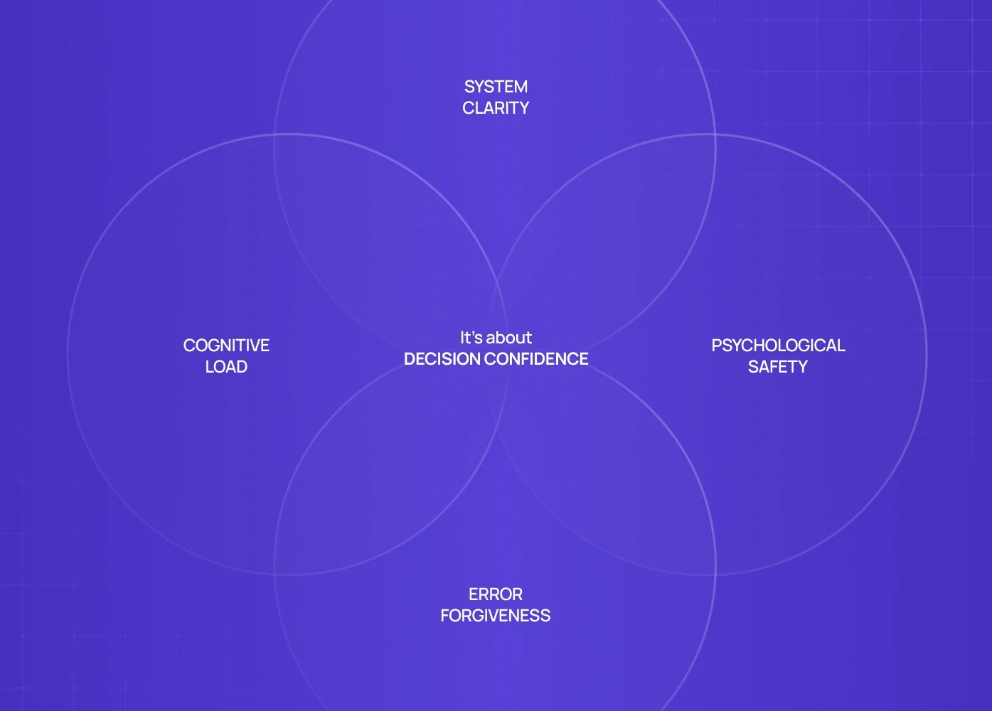
Micro-UX is not about polish. It’s about decision confidence.
Micro-UX design patterns govern:
How users understand what just happened
Whether they feel safe continuing
How much thinking is required at each step
Whether mistakes feel recoverable or costly
In strong products, micro-UX reduces mental effort. In weak products, it quietly increases churn.
This is why modern UX consultants focus on micro-interactions early—because they compound faster than large UI changes.
Why Micro-UX Has Become a Conversion Lever (Not a Design Detail)

In SaaS, B2B tools, and admin-heavy products, users repeat the same flows daily.
Small friction multiplies.
A confusing button label.
A delayed system response.
An unclear error message.
Each one adds cognitive tax.
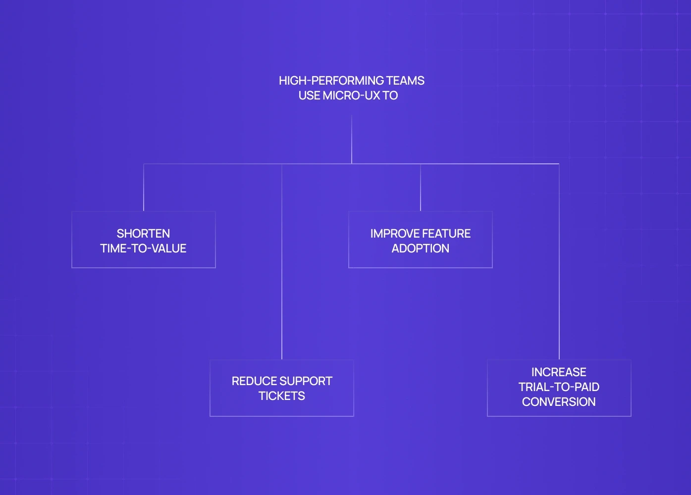
High-performing teams use micro-UX to:
Shorten time-to-value
Reduce support tickets
Improve feature adoption
Increase trial-to-paid conversion
This is where UX design agencies that understand behavior—not just visuals—create measurable impact.
The Micro-UX Patterns That Deliver Immediate Gains

Instead of listing dozens of patterns, let’s focus on where micro-UX actually moves metrics.
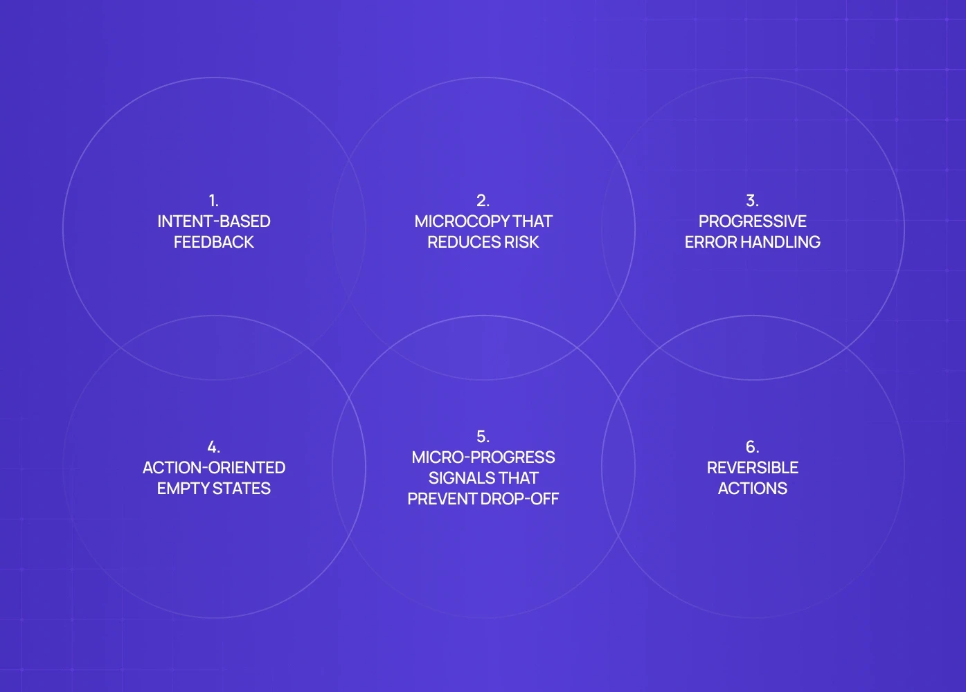
1. Intent-Based Feedback (Not Generic Confirmation)
Most products say: “Saved successfully.”
High-performing products say: “Your dashboard is live. You can now share it with your team.”
This tiny change:
Confirms success
Explains impact
Suggests the next action
In SaaS UI design, intent-based feedback increases flow completion because users don’t pause to interpret what happened.
2. Microcopy That Reduces Risk at the Moment of Commitment
Buttons, form labels, and helper text aren’t instructions.
They’re reassurance.
Compare:
“Submit”
“Create workspace (you can edit this later)”
The second reduces perceived risk instantly.
This is why UI UX design services increasingly treat microcopy as part of the UX system, not an afterthought.
3. Progressive Error Handling (Don’t Punish the User)
Errors are inevitable. Friction is optional.
Strong micro-UX:
Flags issues before submission
Explains why something failed
Shows exactly how to fix it
Weak micro-UX:
Blocks progress
Uses technical language
Forces trial-and-error
In UX web design and UI UX app development, better error handling often reduces abandonment without changing the core flow.
4. Action-Oriented Empty States
Empty states are not failures.
They’re onboarding moments.
Instead of: “No data available.”
Use: “Connect your first data source to see trends here.”
This pattern consistently improves activation—especially in analytics and admin dashboards—because it converts confusion into direction.
5. Micro-Progress Signals That Prevent Drop-Off
Users don’t abandon because flows are long.
They abandon because flows feel endless.
Subtle progress cues:
Step indicators
Inline confirmations
“Almost done” messaging
These signals matter deeply in mobile UI UX design, where attention spans are shorter and interruptions are frequent.
6. Reversible Actions (Psychological Safety by Design)
If users fear irreversible mistakes, they slow down—or leave.
Micro-UX patterns that help:
Undo actions
Soft confirmations
Temporary states (“Saved as draft”)
This principle is critical in saas ui design, fintech, and admin tools where mistakes feel expensive.
Why These Patterns Work (The Behavioral Layer)
Micro-UX works because it aligns with how humans make decisions:
We avoid uncertainty
We fear irreversible loss
We prefer guided progress over open-ended tasks
We trust systems that explain themselves
Great UX design services don’t just design interfaces—they design confidence.
The Future of Micro-UX (What Changes After 2026)

Micro-UX is shifting from reactive to predictive.
Here’s what’s coming next:
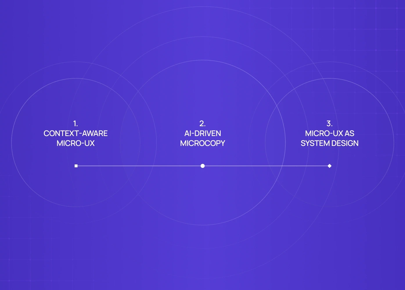
1. Context-Aware Micro-UX
Interfaces will adapt copy, feedback, and guidance based on:
User history
Role
Intent signals
No more one-size-fits-all interactions.
2. AI-Driven Microcopy
Instead of static text, microcopy will adjust dynamically:
Explaining outcomes
Suggesting next steps
Reducing friction in real time
This changes how ux consultant teams approach content strategy.
3. Micro-UX as System Design
Micro-UX patterns will live inside design systems:
Standardized behaviors
Predictable responses
Reusable interaction logic
This is already becoming standard in scalable ui ux design services and enterprise products.
When Micro-UX Fixes Are Enough (And When They Aren’t)
Micro-UX delivers fast wins when:
Users hesitate mid-flow
Features are underused
Support tickets repeat the same questions
Drop-off happens despite “good UI”
But if:
The product logic is unclear
User journeys are broken
Roles and permissions are messy
Then micro-UX alone won’t save it—you need structural UX work.
Strong ux design agencies know when to fix moments—and when to redesign systems.
Ready to Apply These Micro-UX Patterns to Your Product?
Micro-UX patterns work best when they’re applied in context — tied to real user behavior, real drop-offs, and real business goals.
If your product:
Feels mostly good but still leaks users
Has friction hiding in onboarding, forms, dashboards, or edge states
Needs UX improvements without a full redesign
A short UX teardown can surface where small, targeted changes will unlock disproportionate gains.
Book a 20-minute strategy call with our Creative Director to:
Identify high-impact micro-UX opportunities in your product
Understand which patterns will move metrics now, not later
Get a clear, prioritized action plan — not vague design advice
FAQ
1. How fast can micro-UX improvements show results?
Often within weeks. Micro-UX changes target live friction points, so improvements in activation, task completion, and support load usually appear quickly.
2. Is micro-UX relevant for WordPress or marketing sites?
Yes. WordPress UI UX design benefits massively from micro-UX in forms, CTAs, checkout flows, and lead capture—often without a full redesign.
3. Do we need a full UX redesign to improve micro-UX?
No. Many micro-UX gains come from audits and targeted fixes. That’s why they’re often the first step in UX design services engagements.
4. Is micro-UX only for SaaS products?
No. It applies equally to mobile apps, B2B tools, marketplaces, and content-driven sites. Anywhere users make decisions, micro-UX matters.
5. How do you measure micro-UX success?Through behavioral metrics: task completion rate, drop-off points, time-to-value, support tickets, and feature adoption—not just aesthetics.


