Mobile traffic is the majority. Attention spans are short. And a website that breaks on any device is a website that loses business. Here's your guide to the best responsive web design services — and how to choose the right one.
Your website should work everywhere. Here's who's making that happen in 2026.

TL;DR Over 60% of global web traffic is mobile. Google officially completed its switch to mobile-first indexing in July 2024 — meaning your mobile experience now directly determines your search rankings. This guide covers what responsive web design actually means, the criteria that separate average execution from excellent, and the top agencies delivering it in 2026 — with Groto leading the list.
The Real Cost of a Non-Responsive Website
Here's a number worth sitting with: mobile accounts for 62–64% of global web traffic as of mid-2025. Yet a significant chunk of websites still serve a broken or degraded experience the moment someone opens them on a phone — and small business websites are disproportionately the ones built without serious thought for mobile.
Buttons that are too small to tap. Text that runs off the screen. Images that refuse to scale. Navigation that collapses into chaos. This isn't a design problem — it's a revenue problem.
The numbers behind that revenue loss are specific. 73% of users stop engaging with a website that doesn't adapt well to their device. Non-responsive sites see mobile bounce rates up to 50% higher than their responsive equivalents. And businesses that invest in responsive redesigns report an average conversion lift of 11–40% on mobile — with total project costs varying widely depending on scope and partner, as the full breakdown of how much it costs to redesign a website makes clear. The problem isn't invisible — it shows up directly in your analytics, your bounce rate, and your pipeline.
We've seen it happen to brands across categories. A beautifully designed desktop site quietly bleeds conversions because nobody thought seriously about the mobile experience. That's the gap that responsive web design services exist to close — and for teams deciding whether a full refresh is the right move, how to redesign a website covers what that process actually involves from brief through launch. And closing it well requires more than making a layout "fit" a smaller screen. It means designing with intent across every breakpoint, every device, every interaction.
At Groto, we approach this as a strategic challenge — not a technical afterthought.
What Is Responsive Web Design?
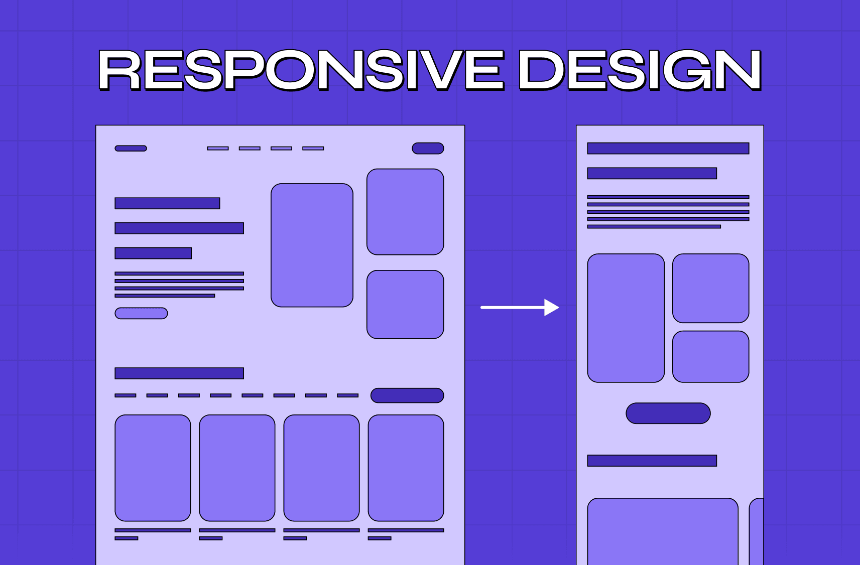
Responsive web design is the practice of building websites that adapt fluidly to any screen size, device, or orientation. Whether a user is on a 27-inch desktop monitor or a 5-inch smartphone, the layout, content, and interactions should feel natural and easy to use.
The three technical pillars that make this work are:
Fluid grid layouts — columns and spacing defined in percentages, not fixed pixels, so the layout breathes and adjusts proportionally
Flexible images and media — visuals that scale within their containers without breaking or distorting
CSS breakpoints and media queries — rules that detect screen dimensions and apply the appropriate layout styles automatically at each threshold
But the technical side is only half the picture. What separates genuinely great responsive web development services from the average is how these principles are applied in service of user experience and business goals — not just code compliance.
A responsive website should guide users clearly, load fast, and convert effectively, regardless of the device they arrive on.
Why Responsive Design Is a Business Decision, Not Just a Design One
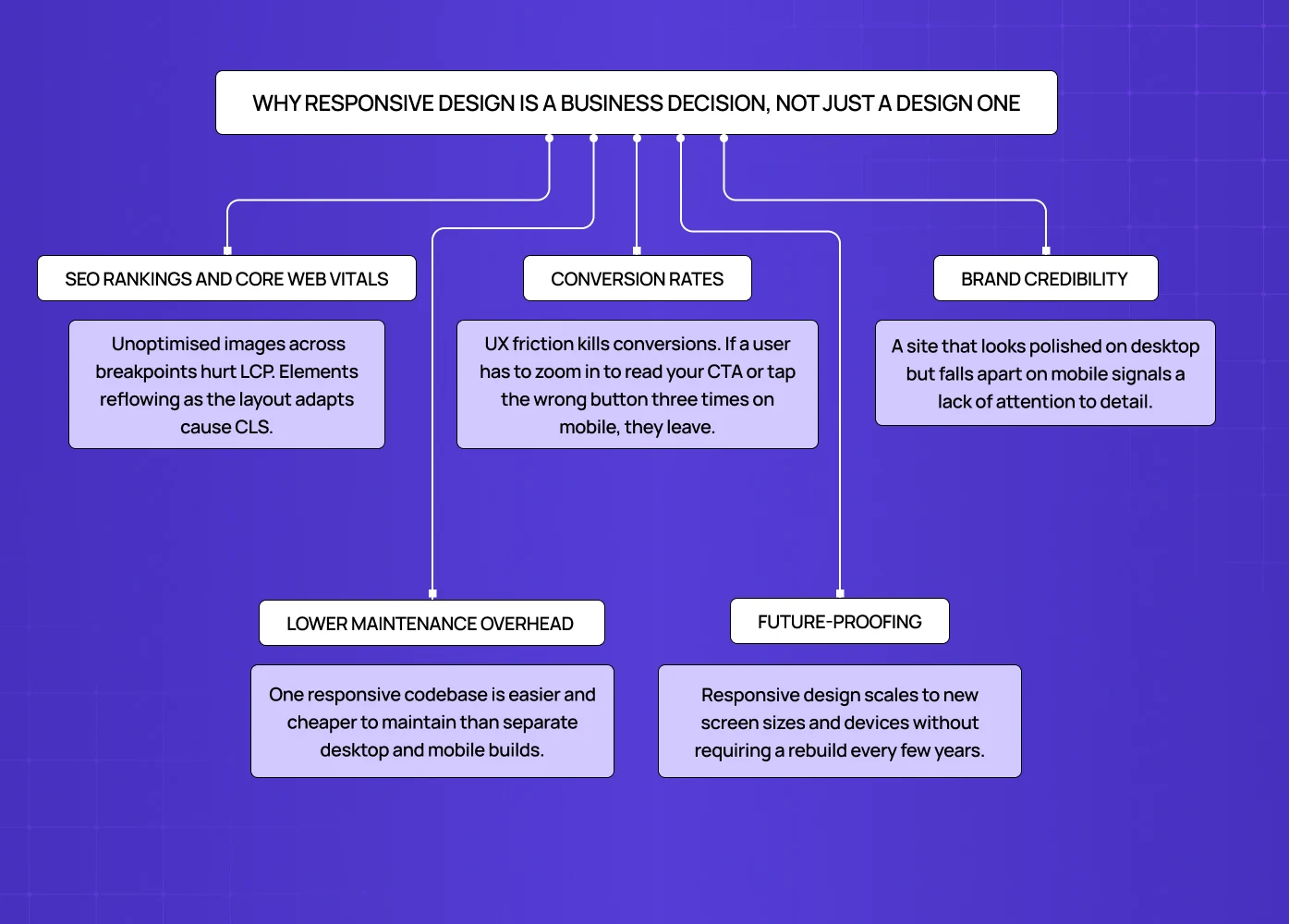
The case for investing in a responsive website design company goes well beyond aesthetics. Here's what's actually at stake:
SEO rankings and Core Web Vitals
Google officially completed its switch to mobile-first indexing in July 2024 — meaning your mobile experience now directly determines your search rankings. But the mechanism behind that is more specific than most people realise. Google's Core Web Vitals — LCP (Largest Contentful Paint), CLS (Cumulative Layout Shift), and INP (Interaction to Next Paint) — are the page experience signals that responsive implementation directly controls. Unoptimised images across breakpoints hurt LCP. Elements reflowing as the layout adapts cause CLS. Slow touch response tanks INP. Poor responsive design doesn't just feel bad — it damages the exact scores Google uses to rank you.
Conversion rates
UX friction kills conversions. If a user has to zoom in to read your CTA or tap the wrong button three times on mobile, they leave. For teams not yet ready for a full responsive redesign, there are ways to improve website conversion rates without redesigning — but responsive friction sets a hard ceiling on how far those gains can go.
Brand credibility
A site that looks polished on desktop but falls apart on mobile signals a lack of attention to detail. Looking at best website design examples across industries shows how high the bar has been set for cross-device experience. That impression carries over to how people perceive your product or service.
Lower maintenance overhead
One responsive codebase is easier and cheaper to maintain than separate desktop and mobile builds — and for teams weighing that architectural decision, the full comparison of responsive web design vs. custom frontend builds covers what scaling products actually need. Updates happen once and apply everywhere.
Future-proofing
Responsive design scales to new screen sizes and devices without requiring a rebuild every few years — though teams evaluating their long-term architecture should also consider whether a no-code website design agency could deliver equivalent flexibility with lower ongoing maintenance overhead before committing to a fully custom responsive build.
What to Look For in a Responsive Design Company
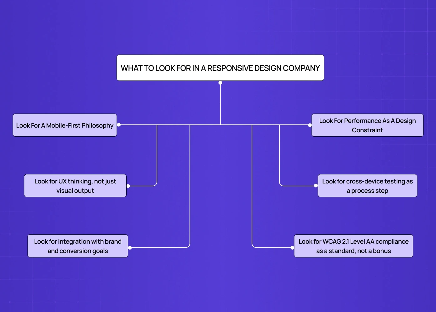
Not every agency that offers responsive web design delivers it with the same depth. For a full decision framework, the practical guide on how to choose the right web design agency covers the checklist in detail — here are the criteria specific to responsive execution that actually matter:
Look for a mobile-first philosophy
The design process should begin with the smallest screen, not end there — mobile-first responsive design best practices define the standard for how this should be executed at every stage of the process.
Agencies that design for desktop first and "adapt for mobile" later consistently produce weaker cross-device experiences
Look for performance as a design constraint
Page speed is part of the design, not separate from it
Compressed assets, lazy-loaded images, minimal render-blocking scripts — these should be defaults, not optional upgrades
Look for cross-device testing as a process step
Testing on actual devices and browsers, not just a browser resize window, should be standard practice
Any agency worth hiring can demonstrate test coverage across breakpoints before launch
Look for UX thinking, not just visual output
Responsive design isn't resizing — it's rethinking navigation, content hierarchy, and interactions for each context, grounded in modern web design principles that apply regardless of screen size.
Hamburger menus, touch-friendly tap targets, thumb-zone navigation — these are craft decisions, not checkbox items
Look for integration with brand and conversion goals
The website should sell, not just display
Responsiveness should serve the conversion funnel, not interrupt it
Look for WCAG 2.1 Level AA compliance as a standard, not a bonus
As of April 2026, WCAG 2.1 Level AA is the federal accessibility compliance standard — not optional guidance
Responsive design and accessibility are directly linked: WCAG requires content to reflow cleanly at 320px, touch targets to meet minimum size standards (44–48px), and colour contrast to meet defined ratios
This is a mandatory buyer concern for clients in healthcare, finance, public sector, and any business with regulatory obligations — ask any agency you're evaluating whether compliance is built into their process or billed as an add-on. It's a question that carries extra weight when you're hiring a DC web design firm for government or public-sector work.
Top Responsive Web Design Services in 2026
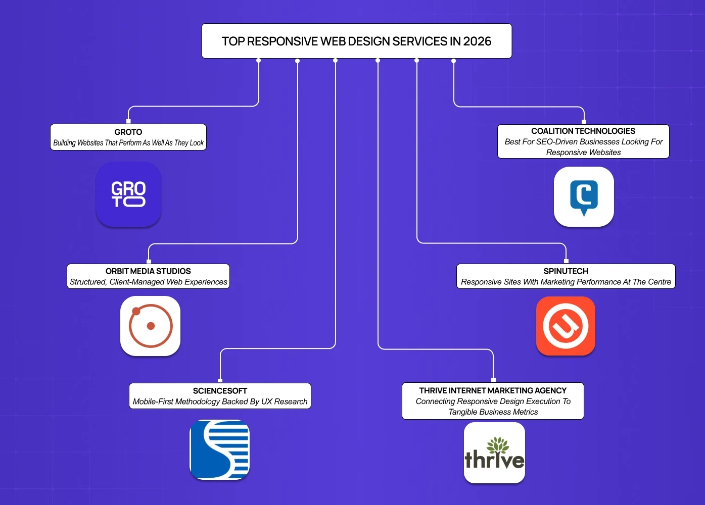
1. Groto
Best for: Design-led brands that need websites built for conversion, credibility, and cross-device consistency
We build websites that perform as well as they look. At Groto, responsive web design sits at the intersection of brand strategy, UX thinking, and development precision. We don't treat mobile as a stripped-down version of desktop — we build each breakpoint as a considered experience in its own right.
Our process begins with understanding what the website needs to do: generate leads, build trust, drive sign-ups, support a sales cycle. Responsiveness is built into the architecture from day one — not retrofitted after the desktop version is signed off.
Camb.ai — As an AI-powered voice dubbing platform operating across 140+ languages and international markets, Camb.ai needed a website that communicated technical sophistication without sacrificing usability. We redesigned their platform experience with cross-device clarity at the centre — maintaining visual confidence and UX fluidity whether users arrived on enterprise desktops or mobile devices on the go. View the Camb.ai project →
PolicyBazaar — High information density on financial products is difficult to execute well at the best of times. On mobile, it becomes genuinely hard. We restructured PolicyBazaar's layouts around progressive disclosure and responsive content hierarchies, reducing drop-offs and making insurance shopping effortless across devices. View the PolicyBazaar project →
Meydan FZ — Meydan required a full website redesign that balanced business prestige with clarity and function — including a standout cost calculator built for entrepreneurs exploring Dubai's freezone. The responsive build ensured the experience translated seamlessly across devices without losing the authority the brand required. View the Meydan FZ project →
&Circus — India's body-positive underwear brand needed a bold, mobile-first ecommerce experience. We delivered a redesign that made browsing and purchasing smoother across all devices, with a playful UI that matched the brand's personality while boosting conversions. View the &Circus project →
2. Coalition Technologies
Best for: SEO-driven businesses looking for responsive websites that rank and convert
Coalition Technologies combines mobile-first design with a strong search visibility focus. Their builds are structured to satisfy both users and search engines — fluid layouts paired with fast load times and clean architecture. They have a broad portfolio across eCommerce and lead-generation clients, with documented conversion improvements to back their approach.
3. Orbit Media Studios
Best for: Businesses that want affordable, thoughtfully designed responsive websites with reliable delivery
Orbit Media has built a reputation for structured, client-managed web experiences. Their mobile-first process has been refined over more than a decade, with a clear workflow from discovery to post-launch support. They're particularly well-suited for professional services and mid-sized businesses looking for quality without enterprise-scale complexity.
4. Spinutech
Best for: Lead-generation focused brands that need responsive design integrated with a broader digital strategy
Spinutech designs responsive sites with marketing performance at the centre. Their team blends custom design and development with data-driven insights, making them a strong fit for businesses where the website is a core acquisition channel. Their responsive builds are structured to adapt as user behaviour evolves.
5. ScienceSoft
Best for: Technical industries and eCommerce businesses requiring rigorous, research-backed responsive design
ScienceSoft's approach is methodical. They use a mobile-first methodology backed by UX research and apply it across B2C, B2B, and eCommerce contexts. Their focus on intuitive navigation, touch-friendly interactions, and performance optimisation makes them a reliable choice for complex digital products.
6. Thrive Internet Marketing Agency
Best for: Small to mid-sized businesses that need responsive design tied directly to SEO and lead generation outcomes
Thrive builds mobile-friendly websites using fluid grids, flexible images, and media queries — but frames everything around marketing outcomes. Their strength is in connecting responsive design execution to tangible business metrics, particularly for businesses in competitive local or national markets.
How Groto Approaches Responsive Web Design
Our process isn't a template. It's built around what each project needs to achieve. But the structure is consistent:
1. Discovery and goals alignment
We begin by understanding your audience, how they access your site, and what the website needs to accomplish — including an audit of the existing website structure to identify what carries over and what needs to be rebuilt for responsive performance. Device behaviour, user intent, and conversion goals all feed into the design brief before anything is sketched.
2. Content architecture and wireframing
Before any visual design, we map content hierarchy across breakpoints using structured Figma grid systems that translate directly into the responsive layout logic. What works above the fold on desktop may need a completely different treatment on mobile. We plan for that from the start, not after the fact.
3. Visual design with responsive intent
Design isn't done once and then adapted. We design for multiple states simultaneously — desktop, tablet, and mobile — applying homepage design principles that ensure the above-the-fold experience converts consistently regardless of the device it's viewed on.
4. Development with performance built in
Our development process prioritises clean code, optimised assets, and load performance. For teams deciding between no-code platforms and custom builds, the comparison of Framer vs Webflow for high-converting sites covers the tradeoffs worth understanding before the build begins. A site that looks great but loads slowly is a site that loses users before they convert.
5. Cross-device testing and QA
We test on real devices across browsers and screen sizes before anything goes live. Edge cases matter. We catch them before your users do.
6. Post-launch support
Responsive design is not a one-time build. As devices evolve and user behaviour shifts, we stay involved to ensure the experience continues to perform.
Why Groto
We're not a generalist agency that offers responsive design as one line item among many. It's a core part of how we think about every website we build — because a site that doesn't work everywhere doesn't work at all.
Here's what working with Groto looks like in practice:
Design and strategy in one team — No handoff friction between designers and strategists. Brand, UX, and conversion thinking are built into the same process.
Proven cross-industry experience — From AI SaaS platforms like Camb.ai to high-traffic consumer products like PolicyBazaar and &Circus, we've built responsive experiences across complexity levels.
Conversion-first thinking — We don't build websites to win design awards. We build them to drive results — sign-ups, leads, sales, and trust.
Transparent process — You're never in the dark. Every milestone is documented, every decision is explained.
If your website isn't performing consistently across devices, the cost of inaction compounds with every user who bounces. Start a conversation with Groto →
Conclusion
Mobile traffic is the majority. But most websites still treat mobile as a secondary concern — something to patch after the desktop version is done. That gap is where conversions are lost, rankings are damaged, and brand trust quietly erodes. Responsive web design, done with genuine intent, closes that gap and turns your website into a consistent growth asset across every device your audience uses. If your site isn't performing everywhere, it isn't performing.
Let's fix that together. → Book your free UX Audit