
A redesign fails on launch week not because the new version is bad, but because the migration to it was designed badly. This guide covers what causes support meltdowns, the phased rollout playbook that prevents them, and what to measure as you go.
Your redesign isn't the risk. How you move people to it is.
TL;DR
A redesign fails on launch week not because the new version is bad, but because the migration to it was handled badly.
The four causes of a support meltdown are forced relearning, a hard cutover, loss aversion, and an unprepared support team.
The fix is a phased, opt-in-first rollout with communication before the change, in-app guidance, preserved continuity, and a temporary way back.
Support teams need training and old-to-new translation guides before the first user moves, not after.
Track support ticket volume, task completion, time-to-productivity, and revert rates so you can slow down if the numbers turn bad.
Product migration UX is the practice of designing how existing users move from one version of a product to another, not just what the new version looks like. It covers the sequencing of the rollout, the communication before and during the change, the in-app guidance that helps people relearn, and the safety nets that keep a confused user calm instead of panicked. Most teams pour months into the new version and treat the move to it as an afterthought, the same blind spot that lets UX debt pile up quietly in the first place. That gap is exactly where support meltdowns and churn spikes come from.
The new version is done. It's faster, cleaner, better organized, and fixes every one of the signs your SaaS site needed a redesign in the first place. So you flip the switch, roll it out to everyone on Monday morning, and by Monday afternoon your support queue is on fire. "Where did my settings go?" "How do I do the thing I did yesterday?" "Please give me the old version back." Your redesign didn't fail because it was bad. It failed because you migrated people to it badly.
This is the paradox of product migration UX: the quality of the new version and the quality of the migration to it are two completely different things, and the second one is what determines whether launch week is a celebration or a meltdown. You can ship a genuinely better product and still spike churn, bury your support team, and generate a wave of angry feedback, purely because of how you moved users across. This guide is for PMs, CTOs, and founders about to migrate users to a new version or redesign: why migrations cause support meltdowns, the change-management-plus-design playbook that prevents them, how to prepare your support team, and what to measure so you know it's working. Treat the migration as a designed experience, not a deployment, and Monday looks very different.
Why migrating to a new version causes a support meltdown

Migrations melt down because a new version forces every existing user to relearn a product they already knew, and when that relearning happens suddenly, without warning, and with no way back, confusion converts directly into support tickets and churn. The new version being better doesn't prevent this. It's not a quality problem, it's a transition problem, and it has four compounding causes:
Forced relearning. Your existing users had working muscle memory. They knew where everything was and how to get their job done without thinking. A redesign breaks all of that at once. Even a strictly better layout means every user now has to stop, look, and re-figure-out tasks they used to do on autopilot. That friction, multiplied across your whole base, is the raw material of a support spike.
The hard cutover. When you migrate everyone simultaneously, you don't just cause confusion, you synchronize it. Every confused user hits your support team in the same forty-eight hours. A gradual trickle of questions is manageable; the entire user base's questions arriving at once is a meltdown by definition, regardless of how good the new version is.
Loss aversion. This is a well-documented behavioral reality: people feel the loss of something familiar more strongly than they value an equivalent gain. Users don't experience a redesign as "new benefits," they experience it as "my thing got taken away." This is why even beloved products face backlash when they change, and why "but it's objectively better" never wins the argument. You're fighting a feeling, not a fact.
An unprepared support team. If your support and success people don't deeply know the new version, and can't translate old workflows into new ones on demand, they can't defuse the wave. Instead of resolving tickets quickly, they're learning the product alongside the angry users, and resolution times balloon exactly when volume peaks.
Put those four together: everyone relearning, all at once, while feeling a loss, with support unable to help fast. The meltdown isn't bad luck. It's the predictable result of treating migration as a switch you flip rather than an experience you design.
The core principle: migration is a design problem, not a deploy

A smooth migration is a UX and change-management challenge, not just an engineering one. How you stage the change, guide relearning, preserve continuity, and communicate is what separates a clean transition from a support meltdown. This reframe is the whole game, and most teams miss it because "the new version" absorbs all their attention while "getting people onto the new version" is treated as an afterthought: a deploy step, an email, a banner. This is also where UX strategy work earns its keep, since the rollout plan is as much a strategic decision as the redesign itself.
But the migration is a product experience. The moment an existing user opens your app and finds it changed, they're in a new user flow they didn't choose, one you either designed deliberately or left to chance. Do they understand what happened? Can they find what they need? Is there guidance where they're stuck? Can they get back if they panic? Every one of those is a design decision, and if you didn't make it deliberately, the default answers, no, no, no, and no, are what generate tickets and churn.
Engineering owns the deployment mechanics: feature flags, rollout infrastructure, rollback capability, and the underlying frontend architecture decision the new version was built on. That's typically where web development work sits. But whether users land softly or crash is decided by design and change-management choices layered on top: the phasing, the communication, the in-app guidance, the escape hatch. Get the engineering right and the experience wrong, and you still melt down. The rest of this guide is that layer.
Types of product migration rollouts

Before you build the playbook, it helps to know the four broad ways a migration can be sequenced. Which one fits depends on your risk tolerance, your infrastructure, and whether the old and new systems can run side by side at all.
Big bang. Everyone moves from the old version to the new one in a single instant changeover. It's the highest-risk option since there's no gradual signal before the whole base is affected, but it's sometimes the only option when the two systems genuinely can't coexist. If you're forced into this, heavy pre-launch testing with a focus group is your only real mitigation.
Incremental. The old and new systems run at the same time, and you gradually shift users across in batches. This gives you a chance to gather real feedback and fix problems before the next batch moves, but it means building and maintaining two live systems for a while, and the transition has to feel seamless for anyone whose workflow spans both.
Parallel. Users can toggle back and forth between the old and new systems until the new one meets your criteria for full cutover, at which point the old one is switched off. This is the lowest-anxiety option for users because they're never trapped, though it can slow adoption since people can simply keep using what they know. Microsoft's "try the new Outlook" toggle, which lets users switch to the redesigned client and switch back at will, is a well-known real-world example of this pattern.
Incremental parallel. A combination of the two: the new system rolls out in phases while the old one stays fully available throughout, rather than being gradually decommissioned as each phase completes. It reduces risk the way an incremental rollout does, while keeping the safety net of a parallel one for users who aren't ready to move.
Most of the playbook below assumes an incremental or incremental-parallel approach — the sequencing most website redesign rollouts should default to — since that's what makes phasing, opt-in, and a temporary path back possible in the first place.
How to migrate users to a new version without a meltdown

The reliable way to migrate users is to stage the change gradually, let people opt in before you force them, communicate before anything visibly changes, guide relearning in-app, preserve continuity where you can, and keep a temporary path back, so confusion never arrives all at once or without help. Here's the playbook.
Roll out in phases, never all at once. The single most important move is to refuse the hard cutover. Migrate lowest-risk users first and expand in stages on a phased rollout timeline, watching your metrics at each step: start with internal accounts, then a small friendly beta cohort, then a single low-usage segment or region, then ramp up in increments. Feature flags make this controllable. Phasing does two things at once: it caps how much confusion (and how many tickets) can hit at any moment, and it gives you real signal to fix problems before they reach your whole base. If something's wrong, you find out at 2% of users, not 100%.
When Groto rebuilt PolicyBazaar's insurance shopping flow, the team didn't push a full redesign live in one move. They researched where users were dropping off, rebuilt the mobile experience first since that's where most traffic came from, tested it, and only extended the same design language to desktop once the mobile version was proven. That's phasing by surface rather than by user segment, but the underlying logic is the same: prove it small before you scale it wide.
Let users opt in before you opt them in. Sequence the transition as opt-in, then default-with-a-way-back, then mandatory, not a single forced flip. First, invite users to try the new version voluntarily ("Try the new experience"). Early adopters explore on their own terms, give you feedback, and generate zero panic because they chose it. Then make the new version the default while leaving a visible "switch back" option, so the cautious majority is nudged forward but not trapped. Only after the new version is proven and adoption is high do you sunset the old one. This sequence directly defuses loss aversion: people tolerate change far better when they feel in control of its timing.
Communicate before anything changes, not after. Surprise is what turns change into anger. Tell users what's changing, why it benefits them, and when it will happen, before they see it. Use email, in-app announcements, changelogs, and previews. When users arrive at the new version already expecting it and understanding the reason, the emotional spike is much smaller and they're primed to adapt rather than react. Silence, by contrast, guarantees that the first time many users learn about your redesign is the moment it disrupts their work. It's also worth widening who you communicate with internally: marketing needs to know when to lean into the change in outreach, and legal or compliance teams need to know what's different if any policy language references the product.
Guide relearning inside the product. Don't assume users will "figure it out." Onboard them to the new version the way you'd onboard a new user, but tuned for people who already know the old one: in-app tours of what changed, tooltips on moved elements, and, the highest-leverage artifact, a "where did it go?" map that points from old locations to new ones, effectively building a narrative UX journey that walks returning users through what's different instead of dropping them into it cold.The top support questions after any redesign are "where is X now?" Answer them in-product, at the moment of confusion, and you deflect the tickets before they're filed. Groto's redesign of Nicotex Begin leaned on exactly this kind of in-app guidance: the mobile UX was restructured to walk users through their tobacco-free journey step by step rather than assuming they'd navigate a changed flow on their own, which is a big part of why drop-offs came down.
Preserve continuity wherever you can. Every familiar anchor you keep is relearning you don't impose. Migrate users' data, settings, and preferences automatically so nothing feels lost. Keep naming, key entry points, and core workflows recognizable even as you improve them. Change what needs to change, but don't gratuitously move things that were working: novelty for its own sake is pure friction with no upside. The goal is evolution users can follow, not a product they no longer recognize. This is where SaaS UX design work matters most, since subscription products, and vertical SaaS tools especially, tend to have deeply embedded daily workflows that punish careless change.
Keep a temporary path back. During the transition, let users revert to the old version. This feels counterintuitive, since you want them on the new thing, but an escape hatch is what prevents panic. A user who can fall back stays calm, keeps working, and gives you feedback instead of filing an angry ticket or churning. And the revert rate becomes one of your most honest metrics: if lots of people flee to the old version, the new one isn't ready, and you've learned that safely rather than catastrophically. If your migration involves moving actual account data or settings in the background, it also helps to show users a simple status indicator so they know the move is in progress and roughly how long it will take, rather than leaving them guessing while something changes behind the scenes. The same instinct — never strand a user in a state they can't exit — is most of what handling AI errors well comes down to in AI products.
Run all six together and confusion is metered out slowly, always accompanied by help, and never without an exit, which is precisely the opposite of the conditions that cause a meltdown.
Prepare your support team before you migrate anyone
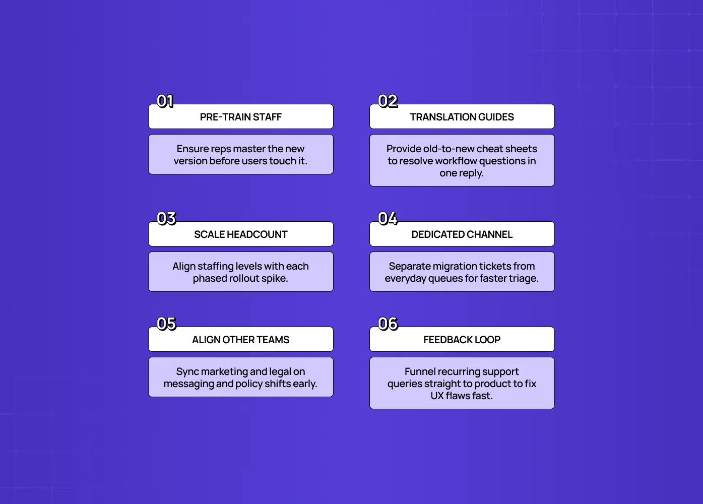
Support and customer success absorb the fallout of any migration, so equip them before the first user moves: train them deeply on the new version, give them old-to-new translation guides, staff up for the spike, and create a dedicated channel for transition help. Even a well-designed migration generates questions; the difference between smooth and painful is whether the people fielding those questions are ready.
Train the team on the new version until they know it cold, ideally before external users touch it. They should be able to answer "how do I do X now?" instantly, without hunting, because during a migration your support staff need to be more fluent in the product than your users are, not less.
Arm them with workflow translation: documented mappings from the old way to the new way for the tasks users perform most. That old-to-new crib sheet is what lets an agent resolve the most common migration ticket, "I used to do it like this, how do I do it now?", in one reply.
Anticipate the volume. If you're phasing the rollout (you should be), your support load, and the staffing side of your redesign cost, scales with each phase, so plan against the ramp rather than getting blindsided.
Stand up a dedicated transition support channel, a clearly labeled path for "help with the new version," so migration questions are triaged by people primed for them and don't clog your normal queue.
Loop in teams beyond support. Marketing needs to know when to double down on promoting the change, and legal or compliance needs to understand what's different so any policy language stays accurate. Migrations tend to be treated as a support-and-engineering problem when they actually touch several teams at once.
Feed what the transition channel hears straight back to the product team. Recurring questions are a live map of where your migration UX is failing, and fixing the in-app guidance at those points shrinks the next phase's ticket load.
What to measure during and after a migration
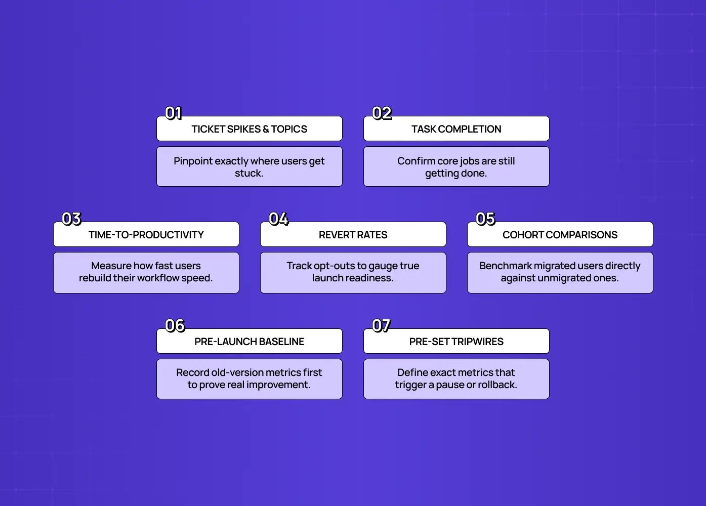
Instrument the migration so you can see whether it's working in real time, drawing on the same UX metrics for SaaS you likely already track: support ticket volume, task completion rates, time-to-productivity, revert rates, and engagement, comparing pre- and post-migration. Phasing only protects you if you're actually watching the signal at each step.
Support ticket volume and themes, your fastest early warning. A spike, and especially a cluster around one feature, points straight at where the new version confuses people.
Task completion rates, to confirm users can still accomplish their core jobs. A drop means the redesign broke a workflow, not just a layout.
Time-to-productivity, how long until a migrated user is working effectively again. This is your core relearning-cost metric; the whole playbook exists to keep it low.
Revert rates, wherever you offer a path back. High reversion is the bluntest possible signal that the new version isn't ready.
Engagement and retention for migrated versus not-yet-migrated cohorts, which phasing conveniently gives you as a built-in control group.
A baseline from the old version before you migrate anyone. It's tempting to only measure the new version once it's live, but without a "before" number, the kind you get when you self-audit your website first, you can't actually prove the redesign improved anything. Set your baseline first, then define what improvement looks like against it.
The point of measuring isn't a post-mortem report, it's live control. Because you rolled out in phases, bad numbers at one stage let you pause, fix the in-app guidance or the design, and only then proceed. Set thresholds in advance for what "bad enough to stop" looks like, and keep the rollback plan genuinely ready, so slowing down or reverting is a calm decision you already prepared for, not an emergency.
Common migration mistakes that guarantee a meltdown
Most migration disasters come from a short list of avoidable mistakes, each of which converts a good new version into one of the bad UX examples teams spend the next quarter apologizing for. Recognize them, because they're easy to commit by default.
The big-bang cutover. Everyone at once is the cardinal sin, synchronizing all confusion into one unmanageable wave. Phasing is the fix.
No advance warning. This blindsides users and maximizes the loss-aversion spike. Communicate before anything changes.
No way back. This turns a confused user into a trapped, panicking one. Keep a temporary revert option.
No in-app guidance. Leaving users to "figure it out" routes every "where did it go?" straight to support. Guide relearning in-product.
An unprepared support team. Questions pile up unresolved exactly when volume peaks. Train and staff before you migrate.
Gratuitous change. Moving and renaming things that were working, just because you were redesigning anyway, imposes relearning cost with no benefit. Preserve continuity wherever the old way was fine.
Every item on this list is a choice, which means every one is avoidable.
Conclusion
A better product and a good migration are not the same achievement, and the gap between them is where support meltdowns and churn spikes live.
You can ship an objectively superior new version and still have a terrible launch week, not because the work was bad, but because you moved people across abruptly, silently, and without a safety net.
The fix is to treat product migration UX as a designed experience: roll out in phases instead of all at once, let users opt in before you force them, and communicate before anything visibly changes.
Guide the relearning inside the product, preserve continuity where you can, and keep a temporary path back.
Prepare your support team, and measure so you can slow down when the numbers say to.
Do that, and the same redesign that would have melted down your support queue lands as the upgrade you actually built it to be.
If you're planning a redesign or a migration to a new version and want the transition designed as carefully as the product itself, phased, guided, and built to protect your support team and your retention, book a discovery call with Groto. We design product migrations and redesigns that move users across without the meltdown. Let's make your next version a smooth landing, not a fire drill.