
MVP UX Scope: How Much Design Does Your MVP Actually Need?

10 min read

10 min read

UX Design

MVP UX Scope: How Much Design Does Your MVP Actually Need?

A practical guide to scoping MVP UX for founders: what to include, what to cut, how much polish is enough, and how to avoid both scoping failure modes.

MVP UX Scope: How Much Design Does Your MVP Actually Need?

10 min read

10 min read

UX Design

MVP UX Scope: How Much Design Does Your MVP Actually Need?

A practical guide to scoping MVP UX for founders: what to include, what to cut, how much polish is enough, and how to avoid both scoping failure modes.

Scoping an MVP's UX wrong in either direction wastes runway. This guide walks founders and PMs through what to include, what to cut, and exactly how much polish an MVP needs to validate an idea without over-building.

How much UX does your MVP really need? A founder's scoping guide.

MVP scoping illustration showing two people collaborating around digital interfaces, charts, and product concepts.

TL;DR

  • MVP UX scope is the deliberate call on how much user experience, how many flows, and how much polish to build into a minimum viable product so it validates the core idea without over-investing.

  • MVPs fail in two opposite directions: over-scoping (feature creep and gold-plating that delays launch) and under-scoping (shipping something so rough users bounce before reaching the value, producing a false negative).

  • The right target is "minimum lovable, not minimum tolerable." Concentrate design effort on the one core flow that proves your value, and let secondary screens stay visibly rough.

  • Decide what's in scope with one filter: does this directly enable the user to complete the core action? If not, it waits.

  • A short written scope document, especially the "what this MVP explicitly does not do" section, is the single most effective defence against scope creep.

If you're searching "mvp ux scope," you're probably staring at a blank product brief trying to figure out how many screens, flows, and polish passes belong in version one. This guide, written for founders and PMs building with limited time and budget, covers what MVP UX scope means, the two failure modes to avoid, what to include, how to decide what's in and out, and exactly how much polish an MVP needs. If you're also exploring the broader practice of MVP UX design for SaaS, this guide will help you understand where UX scoping fits into the process.

What is MVP UX scope?

MVP UX scope is the deliberate decision about how much user experience, how many flows, how much polish, how much design, to build into a minimum viable product so it can validate the core idea without over-investing. It's the design-and-experience side of MVP scoping: not just which features make the cut, but how good the experience around them needs to be for real users to understand, trust, and use the product.

The key word is viable. An MVP isn't the cheapest, ugliest thing you can ship, it's the smallest experience that still delivers the core value convincingly enough to learn from. This is where a lot of teams trip up. Engineering sometimes reads "viable" as "functions and won't break," but that's not enough. It still has to answer the original strategy or pain point, or you've built nothing worth testing. Scope it well and you ship fast, spend little, and get a clean read on whether users want what you built. Scope it wrong in either direction and you either never ship or ship something that can't teach you anything.

The two failure modes of MVP UX scope
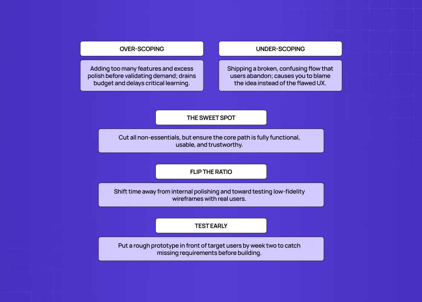
Compares over-scoping and under-scoping, emphasizing a focused, functional core, early testing, and shifting effort toward low-fidelity validation.

Most MVPs fail by scoping the UX either too big or too small, and both waste your runway. Understanding both is the whole discipline:

  • Over-scoping (the common one). You add features and polish before validating anything. This is feature creep and gold-plating: it delays launch, burns budget, and, worst of all, means you've bet big before learning whether anyone wants the product. The fix is ruthless prioritization (below).

  • Under-scoping the UX (the sneaky one). In the rush to be "minimal," you ship something so rough, confusing, or broken that users can't actually experience the value. They hit friction, get lost, and leave, and when adoption is poor, you wrongly conclude the idea failed, when really the experience failed. A "minimum viable product" that isn't viable as an experience doesn't validate anything, it just produces a false negative.

Good MVP UX scope threads the needle: cut everything non-essential, but make the essential path genuinely usable and trustworthy. The goal isn't "minimum," it's "minimum that works."

There's a practical reason under-scoping happens so often, and it isn't a lack of care. It's a lack of testing. Teams routinely spend the bulk of their limited time polishing the first version of a design and only a fraction of it testing or refining that design with real users. Flip that ratio wherever you can. Low fidelity wireframes are the cheapest way to check the scope is right before anyone starts building against it. If you have a month to design and build the core flow, aim to have something in front of actual target users by the second week, not the last few days. Starting lean and testing early surfaces anything genuinely missing far faster than another polish pass ever will.

The UX playbook that takes you from MVP traction to Series A growth

Identify the UX mistakes silently killing your activation rate and the exact fixes to improve conversions without a full product redesign.

No Spam. Free Lifetime

The UX playbook that takes you from MVP traction to Series A growth

Identify the UX mistakes silently killing your activation rate and the exact fixes to improve conversions without a full product redesign.

No Spam. Free Lifetime

What to include in a well-scoped MVP UX

A well-scoped MVP UX includes only what's needed for a user to reach the core value, presented clearly enough to be usable. In practice that's a short, focused list:

  • 3 to 5 core features that solve the single primary problem, nothing that doesn't serve the core action.

  • Basic account essentials, simple auth and profile, only if the core value requires them.

  • A clear, functional core flow, the main path designed to be genuinely usable (this is where your limited design effort should concentrate).

  • Minimal but real UI, clean and consistent enough to be trustworthy, without lavish visual polish everywhere.

  • Essential analytics, enough instrumentation to measure whether users reach value, since your validation depends on it. The standard UX metrics for SaaS are the shortlist to instrument against.

  • A feedback mechanism, a simple way for early users to tell you what's working and what isn't.

Notice what concentrates the effort: the core flow. Spend your scarce design budget making the one path that proves your value feel effortless, and keep everything else deliberately minimal.

How to decide what's in scope
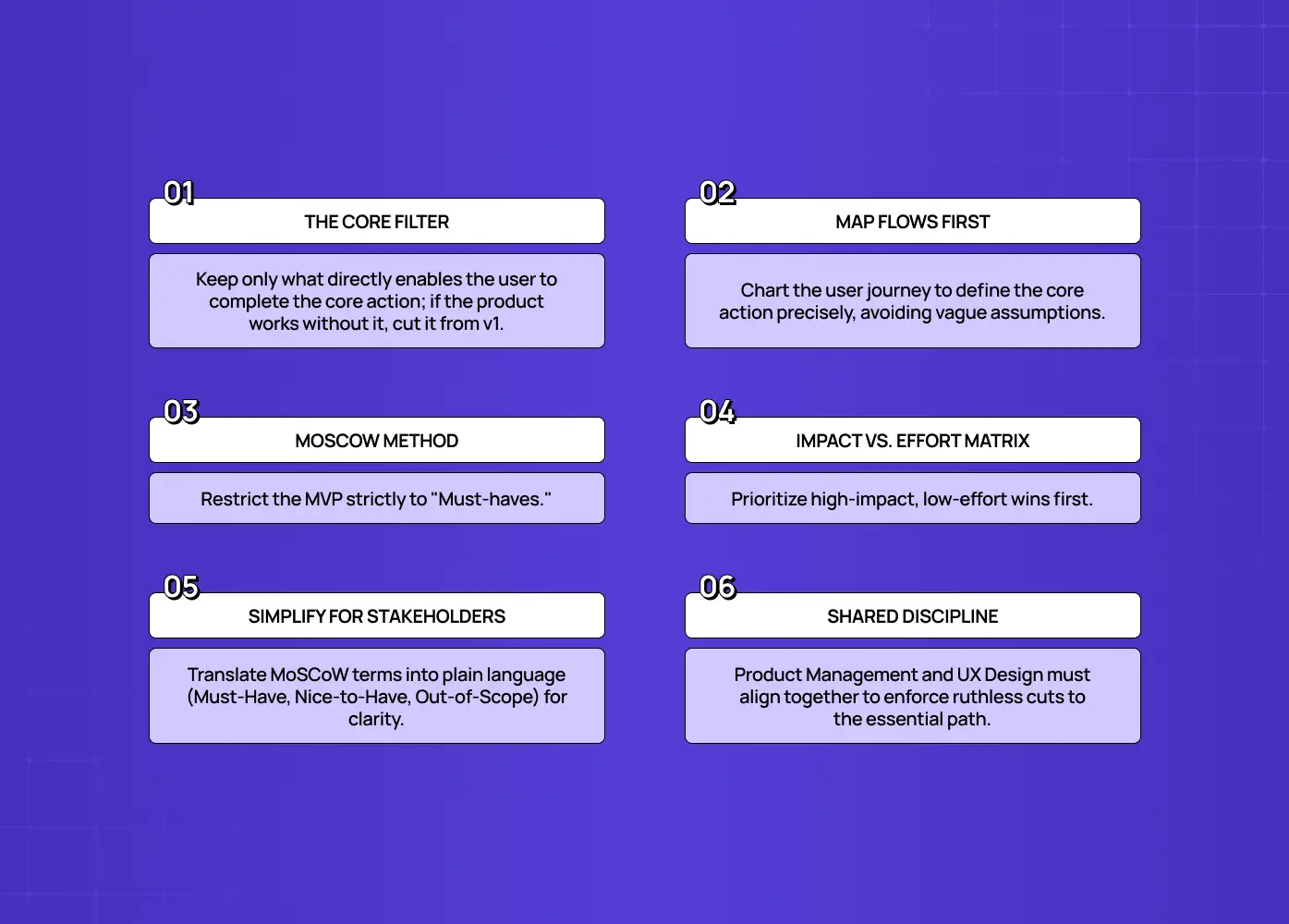
Covers defining the core filter, mapping user flows, using MoSCoW, prioritizing impact versus effort, simplifying stakeholder communication, and maintaining shared discipline.

Decide MVP UX scope with a single ruthless filter, backed by a prioritization framework.

The filter. Apply this to every feature and flow: does this directly enable the user to complete the core action, or reach the core value? Mapping the user flows first is what makes "the core action" a specific, testable thing rather than a slogan everyone interprets differently. If yes, keep it. If no, backlog it.A useful companion test: would the product still deliver its core value without this? If yes, cut it from v1.

The frameworks. Layer a lightweight framework on top of the filter:

  • MoSCoW sorts everything into Must-have, Should-have, Could-have, and Won't-have, and the MVP is only the Must-haves.

  • An impact and effort matrix ranks features by user value versus build difficulty, so you pick the high-impact, low-effort wins first.

One honest caveat on MoSCoW: not everyone finds it intuitive to explain, especially to people outside the core team. "Must" and "Should" can read too close together, and "Won't" is less immediately clear to external stakeholders than a plain "out of scope" label would be. If you're sharing this document with clients or non-technical stakeholders, it's worth translating the labels into must-have, nice-to-have, and out-of-scope so nobody needs a glossary to follow along.

Both approaches push you toward the same discipline: name the single problem and single user, list everything, then aggressively strip it down to the essential path. The hard part isn't knowing the frameworks, it's having the discipline to actually cut, and that discipline sits at the seam between product management and UX design. A scope call rarely holds when only one side of that seam makes it.

What to cut (the usual scope-creep culprits)
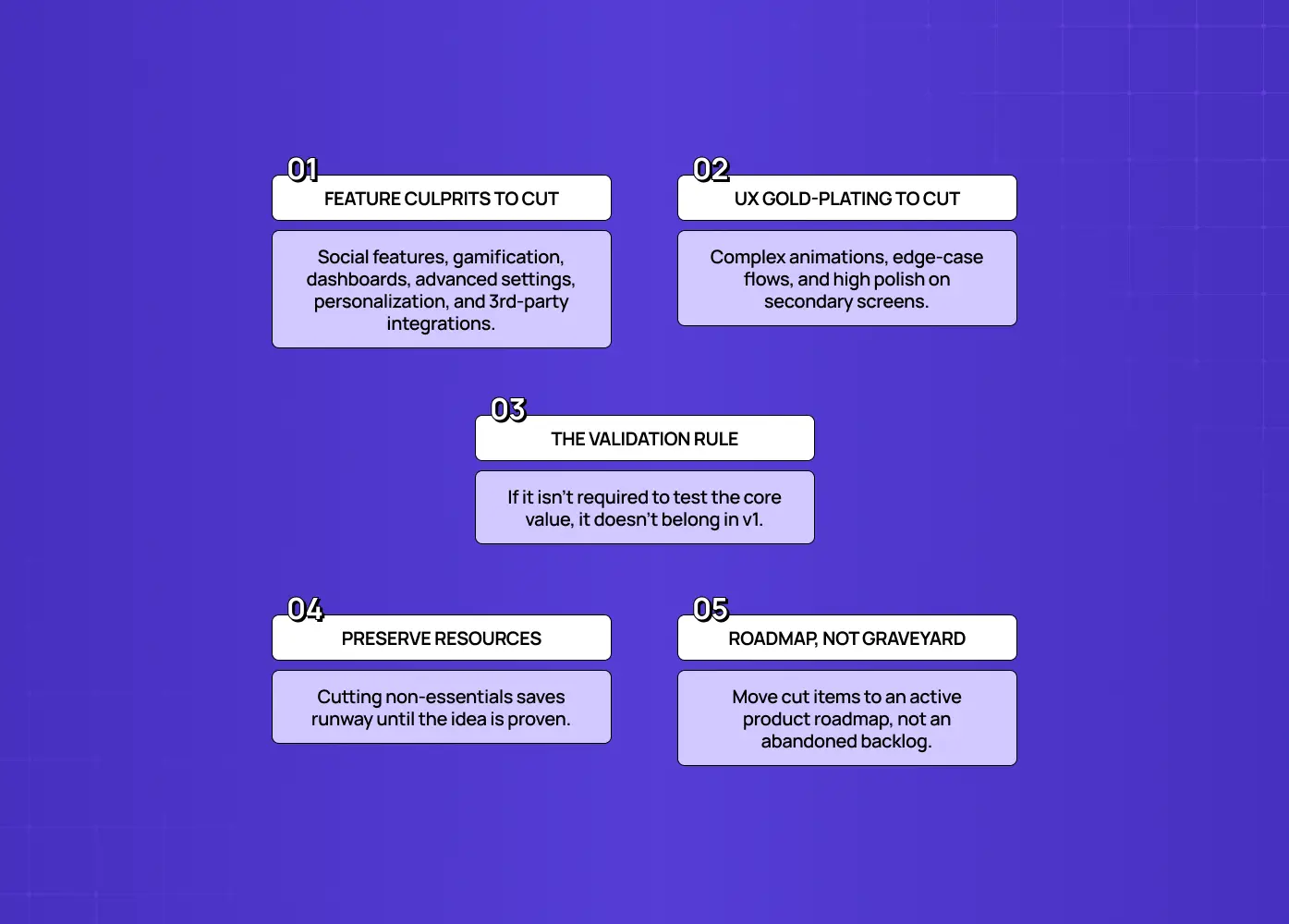
Highlights feature creep, UX gold-plating, the validation rule, preserving resources, and treating the roadmap as an active plan rather than a graveyard.

Cut anything that isn't essential to the core value, and watch for the features that always sneak back in. Scope creep has predictable culprits:

  • Social features

  • Gamification

  • Reporting and dashboards

  • Advanced settings

  • Personalization

  • Third-party integrations

Each feels reasonable ("users will expect it"), but none is needed to validate whether your core idea works, so all belong in the backlog, not v1. The same goes for UX gold-plating:

  • Elaborate animations

  • Edge-case flows

  • Polish on secondary screens

Be equally ruthless with "nice to have" experience touches as with features. Everything you cut is time and money you keep for after you've proven the idea is worth investing in. Cut items still need somewhere to live, and the product design roadmap is that somewhere, not a backlog nobody reopens.

How much polish does an MVP actually need?

An MVP needs enough polish to be usable and trustworthy on its core flow, think "minimum lovable," not "minimum tolerable." This is the nuance that separates a validating MVP from a failed one.

  • Too little polish and users don't trust the product, can't complete the core task, or form a bad first impression and leave, killing your validation.

  • Too much polish and you've over-invested before learning anything.

The right bar: the core path should feel clear, consistent, and reliable, good enough that a real user can reach the "aha" moment without confusion or doubt. Secondary areas can be visibly rough. In other words, polish deeply but narrowly: make the one flow that proves your value genuinely good, and let the rest be obviously unfinished. Users forgive a spartan MVP; they don't forgive one they can't figure out. Aim for the smallest experience that still earns trust and delivers the core value cleanly.

How MVP UX scope drives cost and timeline
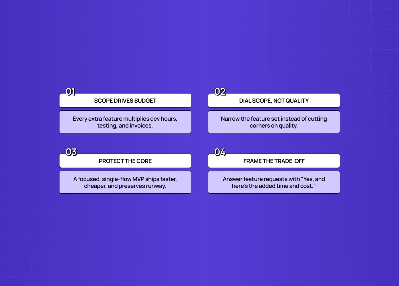
Explains how scope affects budget, why narrowing features is preferable to sacrificing quality, protecting the core experience, and framing trade-offs clearly.

Your MVP UX scope is the single biggest lever on how much the build costs and how long it takes, which is exactly why scoping discipline is a financial decision, not just a design one. Every feature and every extra bit of polish adds design time, build time, testing, and revisions; scope compounds. Most of those hours land on the SaaS application development side of the build, which is where a scope decision turns into an invoice. A tightly scoped MVP focused on one core flow can ship in a fraction of the time and budget of one that quietly grew to a dozen features and full polish everywhere. For a founder working with limited runway, that difference can be the difference between reaching validation (and a fundable milestone) and running out of money first.

The practical implication: treat scope as your budget dial.

  • If time or money is tight, don't lower quality across the board, narrow the scope instead, keeping the core flow genuinely good and cutting everything else.

  • That protects the one thing that has to work while controlling cost.

  • When a stakeholder asks to add something, the honest response isn't "no," it's "yes, and here's the cost in time and money," which usually settles it.

Scope, cost, and timeline are the same conversation; naming that keeps an MVP affordable and on schedule.

Common MVP UX scope mistakes

The recurring MVP UX mistakes are all failures of discipline in one direction or the other:

  • Over-designing and feature creep. Adding "one more thing" and delaying launch is the classic mistake.

  • Under-designing the core flow. Its opposite, shipping something so thin users can't reach value, is just as fatal and far less discussed.

  • Skipping user testing. Teams produce something that looks fine but confuses real users. A UX prototype validates the scope before any engineering time gets committed, which makes it the single fastest way to catch under-scoping before launch rather than after.

  • Ignoring mobile. Despite most traffic being mobile, plenty of MVPs still design desktop-first, alienating the majority of users.

  • No written scope. Without one, scope creep wins by default.

Each of these turns a lean, learn-fast MVP into either a slow, expensive one or a rough one that teaches you nothing.

Lock it down: the MVP scope document

Covers using a one-page scope document, defining key components, maintaining an explicit out-of-scope list, following a clear build rule, and cutting corners strategically.

The single most effective tool against scope creep is a short written scope document that every decision gets checked against. It's the leaner cousin of a full design brief, built for speed rather than completeness. It doesn't need to be elaborate, one page covering:

  • The problem you solve

  • Who you solve it for

  • What the MVP does

  • What it explicitly does not do

  • How you'll measure success

  • Your hard deadline

That "does not do" section is the quiet hero: it turns "can we just add…?" from a debate into a settled question. Once it's written and agreed, the rule is simple: if a feature or flow isn't in the scope doc, it doesn't get built in v1. This is what keeps an MVP an MVP instead of a slow slide into a full product you can't afford to finish.

One thing worth planning for while you write this document: an MVP that works still tends to become the foundation the rest of the product gets built on, whether you meant it to or not. Once it has real users and other systems depending on how it behaves, reworking it radically gets expensive and slow. That doesn't mean over-building v1 to avoid rework later, it means being intentional about which corners you cut, since some technical shortcuts are cheap to unwind later and others aren't.

After the MVP: when to invest more in UX

Once the MVP validates the idea, the scope discipline flips, you deliberately invest in the UX you rightly cut, guided by what you learned. The lean MVP UX was never meant to be permanent; it was meant to be enough to learn. When users are reaching value and the core hypothesis holds, that's the signal to expand:

  • Polish the secondary flows you left rough.

  • Add the "should-have" features from your backlog that users are now asking for.

  • Pay down any UX debt the fast build created.

The difference is that now you're investing based on evidence, real usage data and feedback, rather than assumptions, so the money goes to what actually matters.

This is also where many teams stumble in the opposite direction: they keep running the bare MVP long after it's proven, letting a rough experience cap the growth of a validated product. A scrappy UX that was smart at validation becomes a liability once you're trying to retain and scale. The right rhythm is: scope tight to validate, then invest deliberately to grow. Sequencing that second phase is exactly what a product roadmap is for. Knowing which phase you're in tells you whether to cut or to polish, and getting that sequence right is how lean MVPs become products people love, without wasting a dollar before the idea earned it.

Conclusion

  • MVP UX scope is a discipline of just enough: cut every feature and flourish that isn't essential to the core value, but make the essential path genuinely usable and trustworthy so real users can experience what you built.

  • Avoid both traps: the over-built MVP that never ships and the under-built one that ships but can't validate anything.

  • Get that balance right and you get the whole point of an MVP: a fast, affordable, honest test of whether your idea works.

  • Scope it as "minimum that works," write it down, and protect it.

If you're building your first product and want help scoping an MVP that's lean but actually validates, designed to reach value fast without over-building, book a discovery call with Groto. We help founders scope and design MVPs that ship quickly and prove the idea. Let's build the smallest version that works.

Scoping an MVP's UX wrong in either direction wastes runway. This guide walks founders and PMs through what to include, what to cut, and exactly how much polish an MVP needs to validate an idea without over-building.

How much UX does your MVP really need? A founder's scoping guide.

MVP scoping illustration showing two people collaborating around digital interfaces, charts, and product concepts.

TL;DR

  • MVP UX scope is the deliberate call on how much user experience, how many flows, and how much polish to build into a minimum viable product so it validates the core idea without over-investing.

  • MVPs fail in two opposite directions: over-scoping (feature creep and gold-plating that delays launch) and under-scoping (shipping something so rough users bounce before reaching the value, producing a false negative).

  • The right target is "minimum lovable, not minimum tolerable." Concentrate design effort on the one core flow that proves your value, and let secondary screens stay visibly rough.

  • Decide what's in scope with one filter: does this directly enable the user to complete the core action? If not, it waits.

  • A short written scope document, especially the "what this MVP explicitly does not do" section, is the single most effective defence against scope creep.

If you're searching "mvp ux scope," you're probably staring at a blank product brief trying to figure out how many screens, flows, and polish passes belong in version one. This guide, written for founders and PMs building with limited time and budget, covers what MVP UX scope means, the two failure modes to avoid, what to include, how to decide what's in and out, and exactly how much polish an MVP needs. If you're also exploring the broader practice of MVP UX design for SaaS, this guide will help you understand where UX scoping fits into the process.

What is MVP UX scope?

MVP UX scope is the deliberate decision about how much user experience, how many flows, how much polish, how much design, to build into a minimum viable product so it can validate the core idea without over-investing. It's the design-and-experience side of MVP scoping: not just which features make the cut, but how good the experience around them needs to be for real users to understand, trust, and use the product.

The key word is viable. An MVP isn't the cheapest, ugliest thing you can ship, it's the smallest experience that still delivers the core value convincingly enough to learn from. This is where a lot of teams trip up. Engineering sometimes reads "viable" as "functions and won't break," but that's not enough. It still has to answer the original strategy or pain point, or you've built nothing worth testing. Scope it well and you ship fast, spend little, and get a clean read on whether users want what you built. Scope it wrong in either direction and you either never ship or ship something that can't teach you anything.

The two failure modes of MVP UX scope

Compares over-scoping and under-scoping, emphasizing a focused, functional core, early testing, and shifting effort toward low-fidelity validation.

Most MVPs fail by scoping the UX either too big or too small, and both waste your runway. Understanding both is the whole discipline:

  • Over-scoping (the common one). You add features and polish before validating anything. This is feature creep and gold-plating: it delays launch, burns budget, and, worst of all, means you've bet big before learning whether anyone wants the product. The fix is ruthless prioritization (below).

  • Under-scoping the UX (the sneaky one). In the rush to be "minimal," you ship something so rough, confusing, or broken that users can't actually experience the value. They hit friction, get lost, and leave, and when adoption is poor, you wrongly conclude the idea failed, when really the experience failed. A "minimum viable product" that isn't viable as an experience doesn't validate anything, it just produces a false negative.

Good MVP UX scope threads the needle: cut everything non-essential, but make the essential path genuinely usable and trustworthy. The goal isn't "minimum," it's "minimum that works."

There's a practical reason under-scoping happens so often, and it isn't a lack of care. It's a lack of testing. Teams routinely spend the bulk of their limited time polishing the first version of a design and only a fraction of it testing or refining that design with real users. Flip that ratio wherever you can. Low fidelity wireframes are the cheapest way to check the scope is right before anyone starts building against it. If you have a month to design and build the core flow, aim to have something in front of actual target users by the second week, not the last few days. Starting lean and testing early surfaces anything genuinely missing far faster than another polish pass ever will.

The UX playbook that takes you from MVP traction to Series A growth

Identify the UX mistakes silently killing your activation rate and the exact fixes to improve conversions without a full product redesign.

No Spam. Free Lifetime

What to include in a well-scoped MVP UX

A well-scoped MVP UX includes only what's needed for a user to reach the core value, presented clearly enough to be usable. In practice that's a short, focused list:

  • 3 to 5 core features that solve the single primary problem, nothing that doesn't serve the core action.

  • Basic account essentials, simple auth and profile, only if the core value requires them.

  • A clear, functional core flow, the main path designed to be genuinely usable (this is where your limited design effort should concentrate).

  • Minimal but real UI, clean and consistent enough to be trustworthy, without lavish visual polish everywhere.

  • Essential analytics, enough instrumentation to measure whether users reach value, since your validation depends on it. The standard UX metrics for SaaS are the shortlist to instrument against.

  • A feedback mechanism, a simple way for early users to tell you what's working and what isn't.

Notice what concentrates the effort: the core flow. Spend your scarce design budget making the one path that proves your value feel effortless, and keep everything else deliberately minimal.

How to decide what's in scope

Covers defining the core filter, mapping user flows, using MoSCoW, prioritizing impact versus effort, simplifying stakeholder communication, and maintaining shared discipline.

Decide MVP UX scope with a single ruthless filter, backed by a prioritization framework.

The filter. Apply this to every feature and flow: does this directly enable the user to complete the core action, or reach the core value? Mapping the user flows first is what makes "the core action" a specific, testable thing rather than a slogan everyone interprets differently. If yes, keep it. If no, backlog it.A useful companion test: would the product still deliver its core value without this? If yes, cut it from v1.

The frameworks. Layer a lightweight framework on top of the filter:

  • MoSCoW sorts everything into Must-have, Should-have, Could-have, and Won't-have, and the MVP is only the Must-haves.

  • An impact and effort matrix ranks features by user value versus build difficulty, so you pick the high-impact, low-effort wins first.

One honest caveat on MoSCoW: not everyone finds it intuitive to explain, especially to people outside the core team. "Must" and "Should" can read too close together, and "Won't" is less immediately clear to external stakeholders than a plain "out of scope" label would be. If you're sharing this document with clients or non-technical stakeholders, it's worth translating the labels into must-have, nice-to-have, and out-of-scope so nobody needs a glossary to follow along.

Both approaches push you toward the same discipline: name the single problem and single user, list everything, then aggressively strip it down to the essential path. The hard part isn't knowing the frameworks, it's having the discipline to actually cut, and that discipline sits at the seam between product management and UX design. A scope call rarely holds when only one side of that seam makes it.

What to cut (the usual scope-creep culprits)

Highlights feature creep, UX gold-plating, the validation rule, preserving resources, and treating the roadmap as an active plan rather than a graveyard.

Cut anything that isn't essential to the core value, and watch for the features that always sneak back in. Scope creep has predictable culprits:

  • Social features

  • Gamification

  • Reporting and dashboards

  • Advanced settings

  • Personalization

  • Third-party integrations

Each feels reasonable ("users will expect it"), but none is needed to validate whether your core idea works, so all belong in the backlog, not v1. The same goes for UX gold-plating:

  • Elaborate animations

  • Edge-case flows

  • Polish on secondary screens

Be equally ruthless with "nice to have" experience touches as with features. Everything you cut is time and money you keep for after you've proven the idea is worth investing in. Cut items still need somewhere to live, and the product design roadmap is that somewhere, not a backlog nobody reopens.

How much polish does an MVP actually need?

An MVP needs enough polish to be usable and trustworthy on its core flow, think "minimum lovable," not "minimum tolerable." This is the nuance that separates a validating MVP from a failed one.

  • Too little polish and users don't trust the product, can't complete the core task, or form a bad first impression and leave, killing your validation.

  • Too much polish and you've over-invested before learning anything.

The right bar: the core path should feel clear, consistent, and reliable, good enough that a real user can reach the "aha" moment without confusion or doubt. Secondary areas can be visibly rough. In other words, polish deeply but narrowly: make the one flow that proves your value genuinely good, and let the rest be obviously unfinished. Users forgive a spartan MVP; they don't forgive one they can't figure out. Aim for the smallest experience that still earns trust and delivers the core value cleanly.

How MVP UX scope drives cost and timeline

Explains how scope affects budget, why narrowing features is preferable to sacrificing quality, protecting the core experience, and framing trade-offs clearly.

Your MVP UX scope is the single biggest lever on how much the build costs and how long it takes, which is exactly why scoping discipline is a financial decision, not just a design one. Every feature and every extra bit of polish adds design time, build time, testing, and revisions; scope compounds. Most of those hours land on the SaaS application development side of the build, which is where a scope decision turns into an invoice. A tightly scoped MVP focused on one core flow can ship in a fraction of the time and budget of one that quietly grew to a dozen features and full polish everywhere. For a founder working with limited runway, that difference can be the difference between reaching validation (and a fundable milestone) and running out of money first.

The practical implication: treat scope as your budget dial.

  • If time or money is tight, don't lower quality across the board, narrow the scope instead, keeping the core flow genuinely good and cutting everything else.

  • That protects the one thing that has to work while controlling cost.

  • When a stakeholder asks to add something, the honest response isn't "no," it's "yes, and here's the cost in time and money," which usually settles it.

Scope, cost, and timeline are the same conversation; naming that keeps an MVP affordable and on schedule.

Common MVP UX scope mistakes

The recurring MVP UX mistakes are all failures of discipline in one direction or the other:

  • Over-designing and feature creep. Adding "one more thing" and delaying launch is the classic mistake.

  • Under-designing the core flow. Its opposite, shipping something so thin users can't reach value, is just as fatal and far less discussed.

  • Skipping user testing. Teams produce something that looks fine but confuses real users. A UX prototype validates the scope before any engineering time gets committed, which makes it the single fastest way to catch under-scoping before launch rather than after.

  • Ignoring mobile. Despite most traffic being mobile, plenty of MVPs still design desktop-first, alienating the majority of users.

  • No written scope. Without one, scope creep wins by default.

Each of these turns a lean, learn-fast MVP into either a slow, expensive one or a rough one that teaches you nothing.

Lock it down: the MVP scope document

Covers using a one-page scope document, defining key components, maintaining an explicit out-of-scope list, following a clear build rule, and cutting corners strategically.

The single most effective tool against scope creep is a short written scope document that every decision gets checked against. It's the leaner cousin of a full design brief, built for speed rather than completeness. It doesn't need to be elaborate, one page covering:

  • The problem you solve

  • Who you solve it for

  • What the MVP does

  • What it explicitly does not do

  • How you'll measure success

  • Your hard deadline

That "does not do" section is the quiet hero: it turns "can we just add…?" from a debate into a settled question. Once it's written and agreed, the rule is simple: if a feature or flow isn't in the scope doc, it doesn't get built in v1. This is what keeps an MVP an MVP instead of a slow slide into a full product you can't afford to finish.

One thing worth planning for while you write this document: an MVP that works still tends to become the foundation the rest of the product gets built on, whether you meant it to or not. Once it has real users and other systems depending on how it behaves, reworking it radically gets expensive and slow. That doesn't mean over-building v1 to avoid rework later, it means being intentional about which corners you cut, since some technical shortcuts are cheap to unwind later and others aren't.

After the MVP: when to invest more in UX

Once the MVP validates the idea, the scope discipline flips, you deliberately invest in the UX you rightly cut, guided by what you learned. The lean MVP UX was never meant to be permanent; it was meant to be enough to learn. When users are reaching value and the core hypothesis holds, that's the signal to expand:

  • Polish the secondary flows you left rough.

  • Add the "should-have" features from your backlog that users are now asking for.

  • Pay down any UX debt the fast build created.

The difference is that now you're investing based on evidence, real usage data and feedback, rather than assumptions, so the money goes to what actually matters.

This is also where many teams stumble in the opposite direction: they keep running the bare MVP long after it's proven, letting a rough experience cap the growth of a validated product. A scrappy UX that was smart at validation becomes a liability once you're trying to retain and scale. The right rhythm is: scope tight to validate, then invest deliberately to grow. Sequencing that second phase is exactly what a product roadmap is for. Knowing which phase you're in tells you whether to cut or to polish, and getting that sequence right is how lean MVPs become products people love, without wasting a dollar before the idea earned it.

Conclusion

  • MVP UX scope is a discipline of just enough: cut every feature and flourish that isn't essential to the core value, but make the essential path genuinely usable and trustworthy so real users can experience what you built.

  • Avoid both traps: the over-built MVP that never ships and the under-built one that ships but can't validate anything.

  • Get that balance right and you get the whole point of an MVP: a fast, affordable, honest test of whether your idea works.

  • Scope it as "minimum that works," write it down, and protect it.

If you're building your first product and want help scoping an MVP that's lean but actually validates, designed to reach value fast without over-building, book a discovery call with Groto. We help founders scope and design MVPs that ship quickly and prove the idea. Let's build the smallest version that works.

Have a project in mind?

Let’s talk through your idea and see what makes sense.

Harpreet Singh

Founder at Groto

Have a project in mind?

Let’s talk through your idea and see what makes sense.

Harpreet Singh

Founder at Groto

FAQ

Everything you were going to ask (and a few things you didn’t know to)

How much design does an MVP need?

Enough to make the core flow usable and trustworthy, "minimum lovable," not "minimum tolerable." Concentrate your limited design effort on the one path that proves your value so users can reach the "aha" moment without confusion, and let secondary areas be visibly rough. Too little polish causes users to bounce before they experience the value, which kills your validation.

What should you include in an MVP?

Only what's needed to reach the core value: 3 to 5 core features solving the primary problem, basic auth or profile if required, a clear and functional core flow, minimal but consistent UI, essential analytics to measure success, and a feedback mechanism. Everything else belongs in the backlog.

How do you decide what's in scope for an MVP?

Apply one filter to every feature: does it directly enable the user to complete the core action? Keep it if yes, backlog it if no. Back it with MoSCoW (the MVP is only the Must-haves) or an impact and effort matrix (high impact, low effort first). Name the single problem and user, then aggressively cut to the essential path.

What causes MVP scope creep, and how do you prevent it?

Scope creep usually sneaks in via social features, gamification, reporting, advanced settings, personalization, and integrations. The most effective prevention is a written scope document stating the problem, the user, what the MVP does and explicitly does not do, success metrics, and a hard deadline, then a firm rule that anything not in the doc doesn't get built in v1.


Can an MVP be too minimal?

Yes. If it's so rough or confusing that users can't reach the core value, they'll leave before experiencing it, and poor adoption gets misread as the idea failing when really the experience failed. A "minimum viable product" that isn't viable as an experience produces a false negative and validates nothing. Cut features, but keep the core path genuinely usable.


What is MVP in UX UI design?

In UX UI design, an MVP is the smallest working version of a product's interface built around a single core user flow. It's not a scaled-down "final" design, it's an early, deliberately limited experience built to test whether the underlying idea holds up with real users before more design and development time gets committed to it.

How much design does an MVP need?

Enough to make the core flow usable and trustworthy, "minimum lovable," not "minimum tolerable." Concentrate your limited design effort on the one path that proves your value so users can reach the "aha" moment without confusion, and let secondary areas be visibly rough. Too little polish causes users to bounce before they experience the value, which kills your validation.

What should you include in an MVP?

Only what's needed to reach the core value: 3 to 5 core features solving the primary problem, basic auth or profile if required, a clear and functional core flow, minimal but consistent UI, essential analytics to measure success, and a feedback mechanism. Everything else belongs in the backlog.

How do you decide what's in scope for an MVP?

Apply one filter to every feature: does it directly enable the user to complete the core action? Keep it if yes, backlog it if no. Back it with MoSCoW (the MVP is only the Must-haves) or an impact and effort matrix (high impact, low effort first). Name the single problem and user, then aggressively cut to the essential path.

What causes MVP scope creep, and how do you prevent it?

Scope creep usually sneaks in via social features, gamification, reporting, advanced settings, personalization, and integrations. The most effective prevention is a written scope document stating the problem, the user, what the MVP does and explicitly does not do, success metrics, and a hard deadline, then a firm rule that anything not in the doc doesn't get built in v1.

Can an MVP be too minimal?

Yes. If it's so rough or confusing that users can't reach the core value, they'll leave before experiencing it, and poor adoption gets misread as the idea failing when really the experience failed. A "minimum viable product" that isn't viable as an experience produces a false negative and validates nothing. Cut features, but keep the core path genuinely usable.

What is MVP in UX UI design?

In UX UI design, an MVP is the smallest working version of a product's interface built around a single core user flow. It's not a scaled-down "final" design, it's an early, deliberately limited experience built to test whether the underlying idea holds up with real users before more design and development time gets committed to it.

More Articles

Extreme close-up black and white photograph of a human eye

Let’s bring your vision to life

Tell us what's on your mind? We'll hit you back in 24 hours. No fluff, no delays - just a solid vision to bring your idea to life.

Profile portrait of a man in a white shirt against a light background

Harpreet Singh

Founder and Creative Director

Get in Touch

Extreme close-up black and white photograph of a human eye

Let’s bring your vision to life

Tell us what's on your mind? We'll hit you back in 24 hours. No fluff, no delays - just a solid vision to bring your idea to life.

Profile portrait of a man in a white shirt against a light background

Harpreet Singh

Founder and Creative Director

Get in Touch

Extreme close-up black and white photograph of a human eye

Let’s bring your vision to life

Tell us what's on your mind? We'll hit you back in 24 hours. No fluff, no delays - just a solid vision to bring your idea to life.

Profile portrait of a man in a white shirt against a light background

Harpreet Singh

Founder and Creative Director

Get in Touch