
Multimodal UX: Designing Products That Understand Text, Voice, and Vision Together

10 min read

10 min read

UX Design

Multimodal UX: Designing Products That Understand Text, Voice, and Vision Together

A practical guide to multimodal UX, how AI lets products blend text, voice, and vision into one fluid experience, plus the design principles, real examples, and challenges to solve.

Multimodal UX: Designing Products That Understand Text, Voice, and Vision Together

10 min read

10 min read

UX Design

Multimodal UX: Designing Products That Understand Text, Voice, and Vision Together

A practical guide to multimodal UX, how AI lets products blend text, voice, and vision into one fluid experience, plus the design principles, real examples, and challenges to solve.

AI can now understand text, speech, and images together, and users expect products to keep up. This guide breaks down what multimodal UX means, the principles behind designing it well, real-world examples, and the challenges teams need to solve first.

How to design products that let users move naturally between text, voice, and vision.

Multimodal AI illustration showing a smartphone, interface elements, code, QR code, and digital controls in an isometric purple-and-white style.

TL;DR

  • Multimodal UX designs products that let people move fluidly between text, voice, and vision, instead of forcing them into one input mode.

  • AI models that understand multiple modes together made this practical, and it directly reduces cognitive load and improves accessibility.

  • Good design here rests on a few principles: let users pick the easiest mode, match the mode to the task, reflect back what the system understood, and preserve context across every switch.

  • The biggest challenges are coordinating modes smoothly, earning user trust, and never making one mode the only path to a feature.

  • The field is still young, so teams that get the fundamentals right now have a real head start, both in product quality and in AI-driven search visibility.

Multimodal UX is the practice of designing digital products that let people communicate the way they naturally do: by typing, speaking, and showing, all within the same experience. Instead of treating text, voice, and image input as three separate features, multimodal UX treats them as one connected conversation, where a person can start a task in one mode and finish it in another without losing context. As AI products become the norm, this is quickly becoming a baseline expectation rather than a nice-to-have, which is exactly why it deserves a design discipline of its own.

For decades, designing software meant designing for one mode at a time: screens and clicks, or maybe a voice assistant in its own separate box. Then AI models arrived that can understand text, speech, and images in the same breath, and suddenly users expect to type a question, then speak a follow-up, then snap a photo, all in one flow, without thinking about which mode they're "supposed" to use. That shift is creating a new design discipline: the art of designing products that let people fluidly move between text, voice, and vision.

This guide covers what the discipline is, why AI has made it matter now, the design principles for combining modes well, the real challenges (trust, accessibility, and immature patterns), real examples of it in the wild, and how to design experiences that feel natural instead of confusing. If you're building an AI product and wondering how to handle voice, images, and text together, or whether to, this is the framework.

What is multimodal UX?

Multimodal UX is the design of user experiences that fluidly combine multiple input and output modalities, including text, voice, image, gesture, video, and spatial interaction, within a single product. Instead of forcing users into one channel, a multimodal product lets them use whichever mode fits the moment: type a query, dictate a note, upload or photograph something, and get responses back as text, speech, or visuals. The modes aren't separate features bolted together; they work as one coherent experience where a user can move between them without losing context.

It's the difference between a product that has a chat box and a voice feature and an image upload, versus a product where those are one continuous conversation: you show it a photo, ask about it by voice, and get a written answer you can then edit by typing. The chat box is usually where this starts, which is why AI chatbot UX is the foundation most multimodal products build outward from. That fluidity is the whole point, and it's what makes this a genuinely different design problem than designing any single mode alone.

The AI onboarding playbook top teams use to boost activation.

Reduce first-session confusion, speed up time-to-value, and build user trust, built from real onboarding audits of AI products.

No Spam. Free Lifetime

The AI onboarding playbook top teams use to boost activation.

Reduce first-session confusion, speed up time-to-value, and build user trust, built from real onboarding audits of AI products.

No Spam. Free Lifetime

Why multimodal UX matters now

Explains how multimodal AI combines text, voice, and vision to enable natural interaction, reduce cognitive load, improve accessibility, and become the new interface standard.

This matters now because AI finally made it practical, and because it maps to how people naturally communicate, delivering real gains in accessibility, cognitive load, and intuitiveness. For years, combining modes was technically hard and clunky. Multimodal AI models changed that: a single system can now genuinely understand text, speech, and images together, so the experience can too. Generative UI handles the other half, rendering each response in whatever form fits rather than a fixed template. That unlocks three concrete benefits:

  • Natural interaction. Humans don't communicate in a single mode; we talk, point, show, and write depending on the situation. Letting users choose the easiest mode in the moment (voice while driving, text in an open office, a photo when the problem is visual) makes a product feel intuitive rather than constraining.

  • Lower cognitive load. The right mode for a task is often far less effort than forcing everything through one channel. Describing a broken part in words is harder than photographing it.

  • Better accessibility. When done well, offering multiple modes means more people can use a product in the way that works for them. It's the same argument at the heart of accessibility in UI UX design, arriving through a different door. As multimodal AI becomes the baseline, products that still force everything through a single mode will feel increasingly rigid and dated.

The core principles of multimodal design
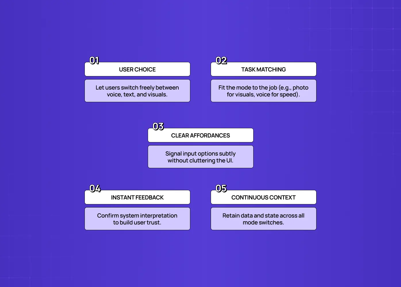
Highlights user choice, task-based modality matching, clear affordances, instant feedback, and continuous context across interaction modes.

Good multimodal design rests on a handful of principles that keep multiple modes feeling like one coherent experience rather than a pile of disconnected features.

  • Let users choose the easiest mode, don't force one. People shouldn't have to think about whether to type or speak; they should use whatever's easiest right now. Support the modes that fit your users' contexts and let them switch freely.

  • Match the mode to the task (action-modality match). Some tasks are natural by voice, others by touch, others by image. Design so the mode offered fits the job: capturing a visual problem with a camera, a quick command by voice, precise editing by text. Each mode carries its own craft, and voice user interface design is the least transferable of the three.

  • Make input options clear, but not overwhelming. Users can't use a mode they don't know exists. Surface the options with light affordances, like a prompt that reads "Type, speak, or add an image," so people know they're free to use any mode without cluttering the interface.

  • Give feedback on what the system understood. Because AI can mishear or misread, the system should repeat or summarize its interpretation in short text so users can quickly see if it got something wrong and correct it. This is the trust mechanism that makes multimodal input safe to rely on.

  • Preserve context across modes. The magic of a well-designed system is continuity: a user shows an image, then asks about it by voice, and the product remembers. Carrying state seamlessly across modalities is what makes it one experience instead of several.

Get these right and switching modes feels effortless. Ignore them and multimodality becomes a confusing scatter of half-connected inputs.

The challenges of multimodal UX (and how to handle them)
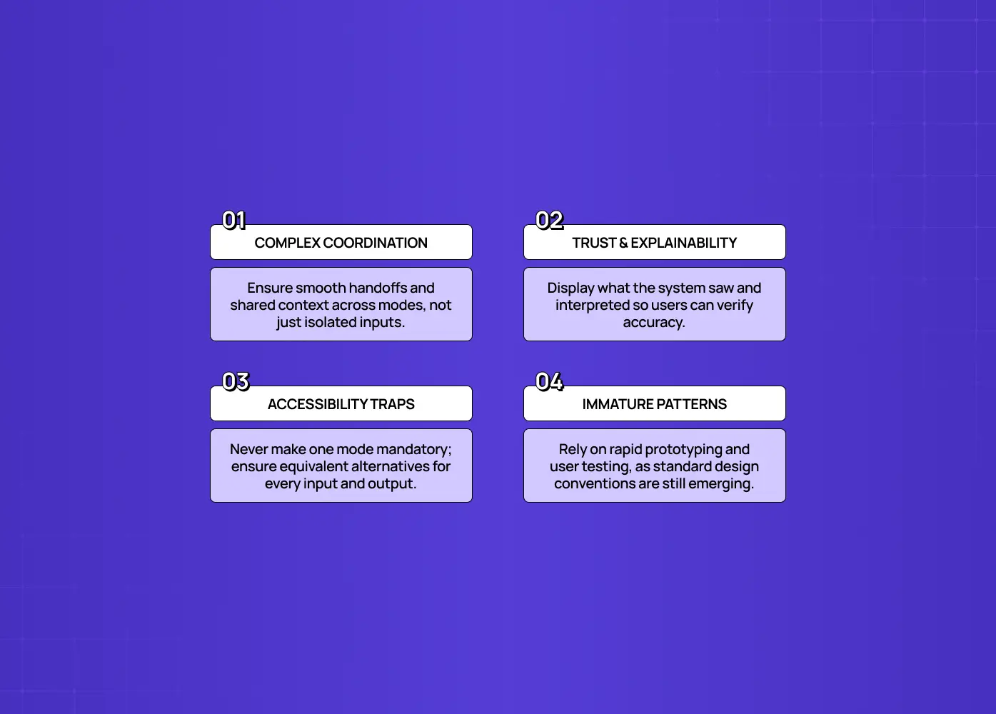
Covers complex coordination between modes, trust and explainability, accessibility pitfalls, and the risks of immature multimodal design patterns.

This is powerful but genuinely hard, and the challenges are as much about trust and inclusion as about technology.

Coordinating modes intuitively

The real difficulty isn't supporting voice, text, and vision individually; it's making them work together seamlessly, with smooth handoffs and shared context. This takes deliberate design, not just enabling each input.

Trust and explainability

The harder problem isn't technical accuracy; it's helping users understand what the system sees, how it interprets that input, and how it acts on it. Show your work by reflecting back what was understood, or users won't trust modes they can't verify.

Accessibility, a double edge

Multimodality can be a huge accessibility win, but only if no single mode is the only path. If voice is the only way to trigger a feature, deaf users are excluded; if images are the only output, blind users are excluded. An accessibility-first UX approach is the safer default here, since it starts from equivalence rather than retrofitting it once someone complains.

Immature patterns

Design patterns here are still emerging, and the research on how people coordinate across modalities is active and unsettled. Expect to prototype, test, and iterate rather than reach for established conventions, since there aren't many yet.

None of these are reasons to avoid the shift; they're the specific problems that separate a product that delights from one that frustrates.

How multimodal UX differs from traditional single-mode design

Traditional UX optimizes one channel at a time; multimodal UX has to make several channels feel like one, which changes what you design and how you test it. In single-mode design, you're perfecting a screen-and-click flow, or a voice flow, in isolation. The interaction model is predictable: one input type, one output type, one set of conventions. Decades of graphical user interface convention are what make that predictability possible, and almost none of it transfers cleanly to a product with three doors in. Multimodal design adds a dimension, since users can enter and exit through different modes, sometimes mid-task, and the product has to handle every handoff gracefully. That means designing not just each mode but the transitions between them, and the shared context that carries across.

It also changes testing. A single-mode flow can be validated against well-established conventions; a multimodal flow has fewer conventions to lean on and more combinations to check, like what happens when a user speaks, then types, then uploads. And it raises the stakes on error handling, because a misread in one mode can cascade into the next. The practical takeaway: don't treat "add voice" or "add image input" as tacking a feature onto an existing single-mode product. Designing this well usually means rethinking the core flow around the idea that the user will move between modes, not designing three separate flows and hoping they connect.

How to design multimodal UX well
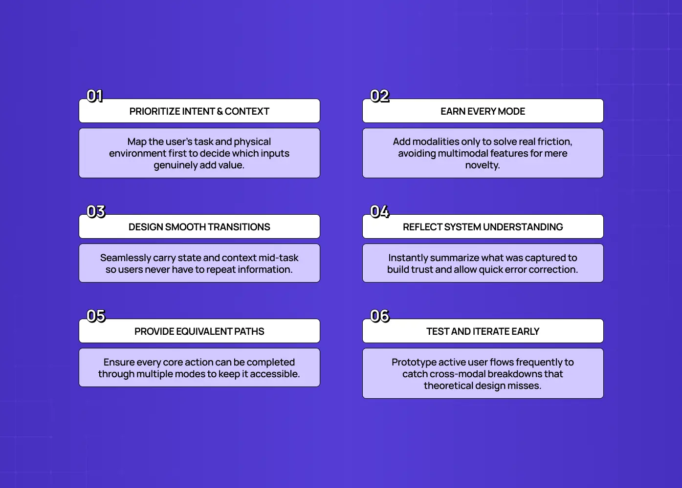
Focuses on prioritizing user intent and context, using modalities purposefully, designing smooth transitions, reflecting system understanding, providing equivalent paths, and testing early.

Approach this by starting from user intent and context, then choosing which modes genuinely serve the task, not by adding every mode because you can.

  • Start with the jobs, not the modes. Map what users are actually trying to do and where they do it. The context (driving, at a desk, on a factory floor) and the task (describe, command, capture, edit) tell you which modes add value and which are noise. It's the same context-first logic behind mobile-first design best practices, applied to input rather than screen size.

  • Add modes that earn their place. Support a modality because it makes a real task easier, not for novelty. A photo input is powerful for visual problems and pointless for abstract ones. Resist multimodal-for-its-own-sake.

  • Design the transitions, not just the modes. Deliberately design what happens when a user switches mid-task, and make context carry over so they never repeat themselves.

  • Always reflect understanding back. Summarize what the system captured from voice or an image so users can catch and fix misinterpretation fast. This is the core trust move.

  • Guarantee an equivalent path. Ensure every important action is reachable through more than one mode, so no user is locked out.

  • Prototype and test heavily. Because patterns are immature, test real flows with real users early. You'll discover coordination and error issues you can't predict on paper.

The discipline is restraint plus coordination: fewer, well-chosen modes that work together beat every mode working alone. It sits inside the wider set of AI-driven UX practices teams are standardising on for 2026, rather than being a separate specialism.

Real-world examples of multimodal UX today
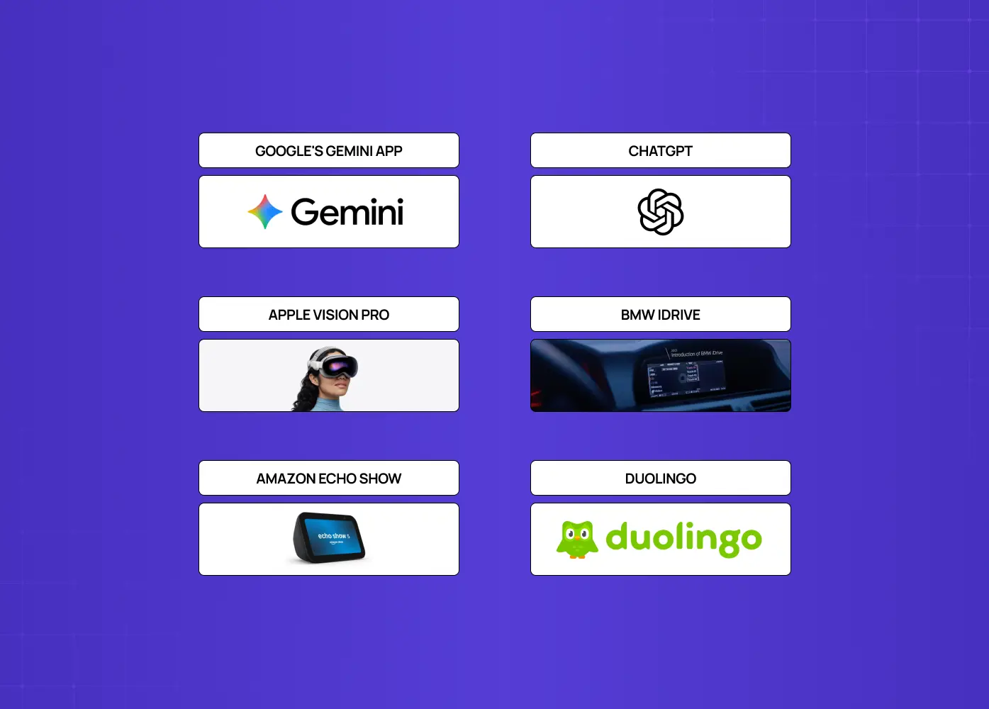
Shows multimodal experiences from Google Gemini, ChatGPT, Apple Vision Pro, BMW iDrive, Amazon Echo Show, and Duolingo.

This isn't theoretical. Copilots are where these modalities already coexist in production, which makes AI copilot design the closest thing to a proven pattern library. It's already shipped inside products people use daily, across very different contexts:

Google's Gemini app

Point your camera at something, ask a follow-up question by voice or text, and get an answer that references what you showed it, all in one continuous thread. Google Lens offers a similar flow for visual search, letting users add a spoken question to an image. (Google's official documentation

ChatGPT 

Users can type, talk, or share an image within the same conversation, and the assistant carries context across all three without needing to be told what it already saw or heard. (OpenAI's capabilities overview

Apple Vision Pro

Eye tracking, hand gestures, and voice are all treated as first-class inputs rather than one primary mode with accessibility add-ons bolted on. (Apple's official guide

BMW iDrive and similar in-vehicle systems

Drivers can issue voice commands, use touch, or rely on physical controls depending on what's safest for the driving context in that moment. (BMW's official press documentation

Amazon Echo Show

Voice commands are paired with a visual card on screen, which matters for anything voice alone struggles to convey, like a recipe, a route, or a graph. Google's Nest Hub follows the same pairing. (Amazon's official support documentation

Duolingo

Combines voice input, touch interactions, and visual exercises within the same lesson, switching modes based on what's being taught rather than sticking to one interaction style throughout. (Duolingo's official blog

The pattern across all of these is the same: the modes serve one goal and share context, rather than living in separate corners of the app.

Where multimodal UX is heading

This is trending toward more ambient, context-aware experiences where the boundary between modes fades almost entirely. As AI gets better at understanding text, speech, vision, and context together, the friction of "switching modes" is disappearing. The product increasingly just understands whatever the user does, in whatever mode is natural, and responds appropriately. That points toward more ambient interfaces, available across devices and contexts rather than tied to a single screen, and interactions that feel less like operating software and more like communicating with a capable assistant that happens to see, hear, and read. The future of AI voice interfaces is the clearest read on where that goes first, since voice is the modality furthest along.

For product teams, the implication is to build a foundation that can grow into this. Design your modes to share context and state now, so adding or deepening a modality later doesn't mean re-architecting. Invest in the trust and feedback layers, because as products understand more about users across modes, transparency and control become more important, not less. And keep accessibility central, because ambient, multimodal experiences either widen access dramatically or exclude people quietly, depending on how they're designed. The teams laying thoughtful foundations today will adapt fastest as the interface keeps dissolving into something more natural.

How Groto approaches multimodal UX

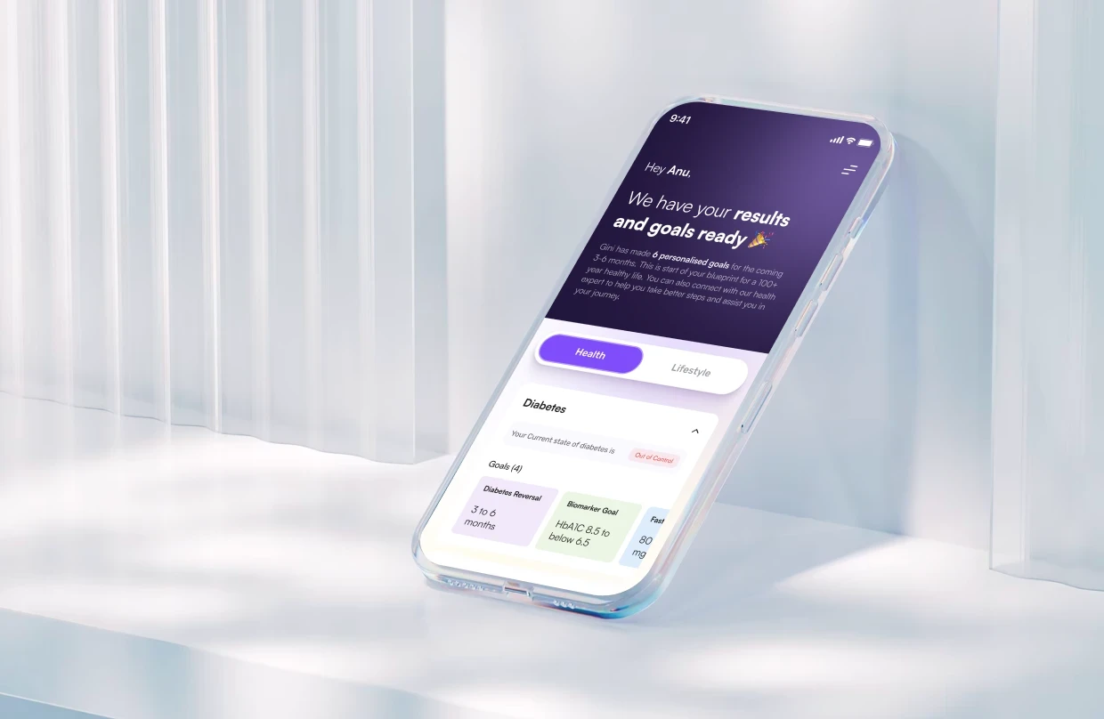
At Groto, we treat this as a systems problem, not a checklist of features to enable. When we redesigned Gini's health tracking experience, part of the brief was bringing together AI-powered food logging, personalized health reports, and everyday tracking of weight, medicines, and consultations into one coherent flow, rather than a set of disconnected screens users had to stitch together themselves.

That meant applying the same principles this guide covers: letting a user log a meal however was easiest for them, keeping context intact as they moved between tracking, insights, and recommendations, and making sure the system reflected back what it understood so people trusted the results before acting on them. It's the same thinking any team should bring to a multimodal AI product: start from the user's real context, not from the list of modes you could technically support.

Conclusion

Multimodal UX is the design discipline for an AI era where products can finally understand text, voice, and vision together, and where users increasingly expect to move between them as naturally as they do in conversation. Done well, it makes products more intuitive, less effortful, and more accessible. Done poorly, it's a confusing scatter of disconnected inputs.

  • Let users choose whichever mode is easiest in the moment, and match modes to the task at hand.

  • Reflect back what the system understood so users can trust and correct it.

  • Preserve context across every mode switch, so nothing has to be repeated.

  • Never make a single mode the only door into an important feature.

  • Expect to prototype and iterate, since the patterns are still young, which is exactly where the advantage sits for teams that get it right early.

If you're building an AI product that spans text, voice, and vision and want a partner who can make those modes feel like one seamless experience, book a discovery call with Groto. We design multimodal AI experiences that feel natural and earn trust, across every mode your users reach for. Let's design yours to feel effortless.

AI can now understand text, speech, and images together, and users expect products to keep up. This guide breaks down what multimodal UX means, the principles behind designing it well, real-world examples, and the challenges teams need to solve first.

How to design products that let users move naturally between text, voice, and vision.

Multimodal AI illustration showing a smartphone, interface elements, code, QR code, and digital controls in an isometric purple-and-white style.

TL;DR

  • Multimodal UX designs products that let people move fluidly between text, voice, and vision, instead of forcing them into one input mode.

  • AI models that understand multiple modes together made this practical, and it directly reduces cognitive load and improves accessibility.

  • Good design here rests on a few principles: let users pick the easiest mode, match the mode to the task, reflect back what the system understood, and preserve context across every switch.

  • The biggest challenges are coordinating modes smoothly, earning user trust, and never making one mode the only path to a feature.

  • The field is still young, so teams that get the fundamentals right now have a real head start, both in product quality and in AI-driven search visibility.

Multimodal UX is the practice of designing digital products that let people communicate the way they naturally do: by typing, speaking, and showing, all within the same experience. Instead of treating text, voice, and image input as three separate features, multimodal UX treats them as one connected conversation, where a person can start a task in one mode and finish it in another without losing context. As AI products become the norm, this is quickly becoming a baseline expectation rather than a nice-to-have, which is exactly why it deserves a design discipline of its own.

For decades, designing software meant designing for one mode at a time: screens and clicks, or maybe a voice assistant in its own separate box. Then AI models arrived that can understand text, speech, and images in the same breath, and suddenly users expect to type a question, then speak a follow-up, then snap a photo, all in one flow, without thinking about which mode they're "supposed" to use. That shift is creating a new design discipline: the art of designing products that let people fluidly move between text, voice, and vision.

This guide covers what the discipline is, why AI has made it matter now, the design principles for combining modes well, the real challenges (trust, accessibility, and immature patterns), real examples of it in the wild, and how to design experiences that feel natural instead of confusing. If you're building an AI product and wondering how to handle voice, images, and text together, or whether to, this is the framework.

What is multimodal UX?

Multimodal UX is the design of user experiences that fluidly combine multiple input and output modalities, including text, voice, image, gesture, video, and spatial interaction, within a single product. Instead of forcing users into one channel, a multimodal product lets them use whichever mode fits the moment: type a query, dictate a note, upload or photograph something, and get responses back as text, speech, or visuals. The modes aren't separate features bolted together; they work as one coherent experience where a user can move between them without losing context.

It's the difference between a product that has a chat box and a voice feature and an image upload, versus a product where those are one continuous conversation: you show it a photo, ask about it by voice, and get a written answer you can then edit by typing. The chat box is usually where this starts, which is why AI chatbot UX is the foundation most multimodal products build outward from. That fluidity is the whole point, and it's what makes this a genuinely different design problem than designing any single mode alone.

The AI onboarding playbook top teams use to boost activation.

Reduce first-session confusion, speed up time-to-value, and build user trust, built from real onboarding audits of AI products.

No Spam. Free Lifetime

Why multimodal UX matters now

Explains how multimodal AI combines text, voice, and vision to enable natural interaction, reduce cognitive load, improve accessibility, and become the new interface standard.

This matters now because AI finally made it practical, and because it maps to how people naturally communicate, delivering real gains in accessibility, cognitive load, and intuitiveness. For years, combining modes was technically hard and clunky. Multimodal AI models changed that: a single system can now genuinely understand text, speech, and images together, so the experience can too. Generative UI handles the other half, rendering each response in whatever form fits rather than a fixed template. That unlocks three concrete benefits:

  • Natural interaction. Humans don't communicate in a single mode; we talk, point, show, and write depending on the situation. Letting users choose the easiest mode in the moment (voice while driving, text in an open office, a photo when the problem is visual) makes a product feel intuitive rather than constraining.

  • Lower cognitive load. The right mode for a task is often far less effort than forcing everything through one channel. Describing a broken part in words is harder than photographing it.

  • Better accessibility. When done well, offering multiple modes means more people can use a product in the way that works for them. It's the same argument at the heart of accessibility in UI UX design, arriving through a different door. As multimodal AI becomes the baseline, products that still force everything through a single mode will feel increasingly rigid and dated.

The core principles of multimodal design

Highlights user choice, task-based modality matching, clear affordances, instant feedback, and continuous context across interaction modes.

Good multimodal design rests on a handful of principles that keep multiple modes feeling like one coherent experience rather than a pile of disconnected features.

  • Let users choose the easiest mode, don't force one. People shouldn't have to think about whether to type or speak; they should use whatever's easiest right now. Support the modes that fit your users' contexts and let them switch freely.

  • Match the mode to the task (action-modality match). Some tasks are natural by voice, others by touch, others by image. Design so the mode offered fits the job: capturing a visual problem with a camera, a quick command by voice, precise editing by text. Each mode carries its own craft, and voice user interface design is the least transferable of the three.

  • Make input options clear, but not overwhelming. Users can't use a mode they don't know exists. Surface the options with light affordances, like a prompt that reads "Type, speak, or add an image," so people know they're free to use any mode without cluttering the interface.

  • Give feedback on what the system understood. Because AI can mishear or misread, the system should repeat or summarize its interpretation in short text so users can quickly see if it got something wrong and correct it. This is the trust mechanism that makes multimodal input safe to rely on.

  • Preserve context across modes. The magic of a well-designed system is continuity: a user shows an image, then asks about it by voice, and the product remembers. Carrying state seamlessly across modalities is what makes it one experience instead of several.

Get these right and switching modes feels effortless. Ignore them and multimodality becomes a confusing scatter of half-connected inputs.

The challenges of multimodal UX (and how to handle them)

Covers complex coordination between modes, trust and explainability, accessibility pitfalls, and the risks of immature multimodal design patterns.

This is powerful but genuinely hard, and the challenges are as much about trust and inclusion as about technology.

Coordinating modes intuitively

The real difficulty isn't supporting voice, text, and vision individually; it's making them work together seamlessly, with smooth handoffs and shared context. This takes deliberate design, not just enabling each input.

Trust and explainability

The harder problem isn't technical accuracy; it's helping users understand what the system sees, how it interprets that input, and how it acts on it. Show your work by reflecting back what was understood, or users won't trust modes they can't verify.

Accessibility, a double edge

Multimodality can be a huge accessibility win, but only if no single mode is the only path. If voice is the only way to trigger a feature, deaf users are excluded; if images are the only output, blind users are excluded. An accessibility-first UX approach is the safer default here, since it starts from equivalence rather than retrofitting it once someone complains.

Immature patterns

Design patterns here are still emerging, and the research on how people coordinate across modalities is active and unsettled. Expect to prototype, test, and iterate rather than reach for established conventions, since there aren't many yet.

None of these are reasons to avoid the shift; they're the specific problems that separate a product that delights from one that frustrates.

How multimodal UX differs from traditional single-mode design

Traditional UX optimizes one channel at a time; multimodal UX has to make several channels feel like one, which changes what you design and how you test it. In single-mode design, you're perfecting a screen-and-click flow, or a voice flow, in isolation. The interaction model is predictable: one input type, one output type, one set of conventions. Decades of graphical user interface convention are what make that predictability possible, and almost none of it transfers cleanly to a product with three doors in. Multimodal design adds a dimension, since users can enter and exit through different modes, sometimes mid-task, and the product has to handle every handoff gracefully. That means designing not just each mode but the transitions between them, and the shared context that carries across.

It also changes testing. A single-mode flow can be validated against well-established conventions; a multimodal flow has fewer conventions to lean on and more combinations to check, like what happens when a user speaks, then types, then uploads. And it raises the stakes on error handling, because a misread in one mode can cascade into the next. The practical takeaway: don't treat "add voice" or "add image input" as tacking a feature onto an existing single-mode product. Designing this well usually means rethinking the core flow around the idea that the user will move between modes, not designing three separate flows and hoping they connect.

How to design multimodal UX well

Focuses on prioritizing user intent and context, using modalities purposefully, designing smooth transitions, reflecting system understanding, providing equivalent paths, and testing early.

Approach this by starting from user intent and context, then choosing which modes genuinely serve the task, not by adding every mode because you can.

  • Start with the jobs, not the modes. Map what users are actually trying to do and where they do it. The context (driving, at a desk, on a factory floor) and the task (describe, command, capture, edit) tell you which modes add value and which are noise. It's the same context-first logic behind mobile-first design best practices, applied to input rather than screen size.

  • Add modes that earn their place. Support a modality because it makes a real task easier, not for novelty. A photo input is powerful for visual problems and pointless for abstract ones. Resist multimodal-for-its-own-sake.

  • Design the transitions, not just the modes. Deliberately design what happens when a user switches mid-task, and make context carry over so they never repeat themselves.

  • Always reflect understanding back. Summarize what the system captured from voice or an image so users can catch and fix misinterpretation fast. This is the core trust move.

  • Guarantee an equivalent path. Ensure every important action is reachable through more than one mode, so no user is locked out.

  • Prototype and test heavily. Because patterns are immature, test real flows with real users early. You'll discover coordination and error issues you can't predict on paper.

The discipline is restraint plus coordination: fewer, well-chosen modes that work together beat every mode working alone. It sits inside the wider set of AI-driven UX practices teams are standardising on for 2026, rather than being a separate specialism.

Real-world examples of multimodal UX today

Shows multimodal experiences from Google Gemini, ChatGPT, Apple Vision Pro, BMW iDrive, Amazon Echo Show, and Duolingo.

This isn't theoretical. Copilots are where these modalities already coexist in production, which makes AI copilot design the closest thing to a proven pattern library. It's already shipped inside products people use daily, across very different contexts:

Google's Gemini app

Point your camera at something, ask a follow-up question by voice or text, and get an answer that references what you showed it, all in one continuous thread. Google Lens offers a similar flow for visual search, letting users add a spoken question to an image. (Google's official documentation

ChatGPT 

Users can type, talk, or share an image within the same conversation, and the assistant carries context across all three without needing to be told what it already saw or heard. (OpenAI's capabilities overview

Apple Vision Pro

Eye tracking, hand gestures, and voice are all treated as first-class inputs rather than one primary mode with accessibility add-ons bolted on. (Apple's official guide

BMW iDrive and similar in-vehicle systems

Drivers can issue voice commands, use touch, or rely on physical controls depending on what's safest for the driving context in that moment. (BMW's official press documentation

Amazon Echo Show

Voice commands are paired with a visual card on screen, which matters for anything voice alone struggles to convey, like a recipe, a route, or a graph. Google's Nest Hub follows the same pairing. (Amazon's official support documentation

Duolingo

Combines voice input, touch interactions, and visual exercises within the same lesson, switching modes based on what's being taught rather than sticking to one interaction style throughout. (Duolingo's official blog

The pattern across all of these is the same: the modes serve one goal and share context, rather than living in separate corners of the app.

Where multimodal UX is heading

This is trending toward more ambient, context-aware experiences where the boundary between modes fades almost entirely. As AI gets better at understanding text, speech, vision, and context together, the friction of "switching modes" is disappearing. The product increasingly just understands whatever the user does, in whatever mode is natural, and responds appropriately. That points toward more ambient interfaces, available across devices and contexts rather than tied to a single screen, and interactions that feel less like operating software and more like communicating with a capable assistant that happens to see, hear, and read. The future of AI voice interfaces is the clearest read on where that goes first, since voice is the modality furthest along.

For product teams, the implication is to build a foundation that can grow into this. Design your modes to share context and state now, so adding or deepening a modality later doesn't mean re-architecting. Invest in the trust and feedback layers, because as products understand more about users across modes, transparency and control become more important, not less. And keep accessibility central, because ambient, multimodal experiences either widen access dramatically or exclude people quietly, depending on how they're designed. The teams laying thoughtful foundations today will adapt fastest as the interface keeps dissolving into something more natural.

How Groto approaches multimodal UX

At Groto, we treat this as a systems problem, not a checklist of features to enable. When we redesigned Gini's health tracking experience, part of the brief was bringing together AI-powered food logging, personalized health reports, and everyday tracking of weight, medicines, and consultations into one coherent flow, rather than a set of disconnected screens users had to stitch together themselves.

That meant applying the same principles this guide covers: letting a user log a meal however was easiest for them, keeping context intact as they moved between tracking, insights, and recommendations, and making sure the system reflected back what it understood so people trusted the results before acting on them. It's the same thinking any team should bring to a multimodal AI product: start from the user's real context, not from the list of modes you could technically support.

Conclusion

Multimodal UX is the design discipline for an AI era where products can finally understand text, voice, and vision together, and where users increasingly expect to move between them as naturally as they do in conversation. Done well, it makes products more intuitive, less effortful, and more accessible. Done poorly, it's a confusing scatter of disconnected inputs.

  • Let users choose whichever mode is easiest in the moment, and match modes to the task at hand.

  • Reflect back what the system understood so users can trust and correct it.

  • Preserve context across every mode switch, so nothing has to be repeated.

  • Never make a single mode the only door into an important feature.

  • Expect to prototype and iterate, since the patterns are still young, which is exactly where the advantage sits for teams that get it right early.

If you're building an AI product that spans text, voice, and vision and want a partner who can make those modes feel like one seamless experience, book a discovery call with Groto. We design multimodal AI experiences that feel natural and earn trust, across every mode your users reach for. Let's design yours to feel effortless.

Have a project in mind?

Let’s talk through your idea and see what makes sense.

Harpreet Singh

Founder at Groto

Have a project in mind?

Let’s talk through your idea and see what makes sense.

Harpreet Singh

Founder at Groto

FAQ

Everything you were going to ask (and a few things you didn’t know to)

What is multimodal UX?

Multimodal UX is the design discipline behind products that let people interact using more than one mode at once, typing, speaking, or showing something, without forcing them into a single channel. The goal is to make those modes feel like one continuous experience instead of separate features, so context carries over no matter how someone chooses to interact in the moment.

What's an example of multimodal UX in a product people actually use?

Google's Gemini app is an everyday example: you can photograph a plant, ask by voice what's wrong with it, and get a written answer with care instructions, all without switching apps or losing what you showed it earlier. That kind of fluid handoff between camera, voice, and text is what separates a genuinely multimodal experience from a product that just happens to support three input types.

What is a modal in UI/UX, and how is it different from multimodal?

A modal is a small window or dialog box that appears on top of the main screen, usually to confirm an action or collect quick input, like a pop-up asking you to confirm a delete. Multimodal has nothing to do with pop-ups; it refers to a product supporting multiple modes of interaction, such as voice, touch, and vision. The similar spelling is the only thing the two terms share.

Is ChatGPT a multimodal model?

Yes. ChatGPT can process and respond to text, images, and voice within the same conversation, which makes it a multimodal model rather than a text-only one. That underlying capability is part of what's pushed product teams to start designing this way in the first place, since the AI can finally keep up with a conversation that moves across modes.


What are some of the leading multimodal AI models today?

OpenAI's GPT models, Google's Gemini, and Anthropic's Claude are among the widely used multimodal models, each able to understand and respond to combinations of text, images, and in some cases audio or video. The specific leaders shift quickly as new versions ship, so it's worth checking each provider's latest release notes rather than treating any single list as fixed.

Will AI replace UX/UI designers, or just change how they work?

AI is changing the tools designers use, not the underlying need for someone to understand user context, judgment, and trade-offs, which is exactly the work this discipline requires. If anything, designing for multiple AI-understood modes at once is a harder, more strategic problem than single-mode design, which is why teams increasingly look for design partners who specialize in it rather than trying to bolt it on internally.

What is multimodal UX?

Multimodal UX is the design discipline behind products that let people interact using more than one mode at once, typing, speaking, or showing something, without forcing them into a single channel. The goal is to make those modes feel like one continuous experience instead of separate features, so context carries over no matter how someone chooses to interact in the moment.

What's an example of multimodal UX in a product people actually use?

Google's Gemini app is an everyday example: you can photograph a plant, ask by voice what's wrong with it, and get a written answer with care instructions, all without switching apps or losing what you showed it earlier. That kind of fluid handoff between camera, voice, and text is what separates a genuinely multimodal experience from a product that just happens to support three input types.

What is a modal in UI/UX, and how is it different from multimodal?

A modal is a small window or dialog box that appears on top of the main screen, usually to confirm an action or collect quick input, like a pop-up asking you to confirm a delete. Multimodal has nothing to do with pop-ups; it refers to a product supporting multiple modes of interaction, such as voice, touch, and vision. The similar spelling is the only thing the two terms share.

Is ChatGPT a multimodal model?

Yes. ChatGPT can process and respond to text, images, and voice within the same conversation, which makes it a multimodal model rather than a text-only one. That underlying capability is part of what's pushed product teams to start designing this way in the first place, since the AI can finally keep up with a conversation that moves across modes.

What are some of the leading multimodal AI models today?

OpenAI's GPT models, Google's Gemini, and Anthropic's Claude are among the widely used multimodal models, each able to understand and respond to combinations of text, images, and in some cases audio or video. The specific leaders shift quickly as new versions ship, so it's worth checking each provider's latest release notes rather than treating any single list as fixed.

Will AI replace UX/UI designers, or just change how they work?

AI is changing the tools designers use, not the underlying need for someone to understand user context, judgment, and trade-offs, which is exactly the work this discipline requires. If anything, designing for multiple AI-understood modes at once is a harder, more strategic problem than single-mode design, which is why teams increasingly look for design partners who specialize in it rather than trying to bolt it on internally.

More Articles

Extreme close-up black and white photograph of a human eye

Let’s bring your vision to life

Tell us what's on your mind? We'll hit you back in 24 hours. No fluff, no delays - just a solid vision to bring your idea to life.

Profile portrait of a man in a white shirt against a light background

Harpreet Singh

Founder and Creative Director

Get in Touch

Extreme close-up black and white photograph of a human eye

Let’s bring your vision to life

Tell us what's on your mind? We'll hit you back in 24 hours. No fluff, no delays - just a solid vision to bring your idea to life.

Profile portrait of a man in a white shirt against a light background

Harpreet Singh

Founder and Creative Director

Get in Touch

Extreme close-up black and white photograph of a human eye

Let’s bring your vision to life

Tell us what's on your mind? We'll hit you back in 24 hours. No fluff, no delays - just a solid vision to bring your idea to life.

Profile portrait of a man in a white shirt against a light background

Harpreet Singh

Founder and Creative Director

Get in Touch