
Every design that feels instantly trustworthy, legible, and resolved has one thing in common: unity. Here is a complete breakdown of the principles of design unity, from the foundational concepts to the specific techniques designers use to achieve it.
The principle that transforms individual design decisions into a coherent whole.

TL;DR
Design unity is the principle that makes all elements in a composition feel like they belong together
It operates through two modes: visual unity (how elements look) and conceptual unity (what they communicate)
The core techniques for achieving unity include repetition, proximity, alignment, color harmony, and considered use of negative space
Unity works alongside balance, harmony, and variety rather than replacing them
Without unity, even well-crafted individual elements can make a design feel scattered or unresolved
What Does Unity Mean in Design?
In design, unity is the quality that makes a composition feel complete. When a viewer looks at something well-designed and immediately understands it, trusts it, or finds it visually satisfying, that response is almost always rooted in unity. Every element appears to belong. Nothing feels out of place or arbitrary.
This is what separates a design that merely contains good elements from one that functions as a coherent whole. A layout might have beautiful typography, strong imagery, and a well-considered color palette. But if those pieces do not reinforce each other, the design reads as cluttered or unresolved rather than confident.
The principles of design unity exist to prevent exactly that. Unity is one of the 13 principles of design: a framework for making decisions that serve the composition as a unified system rather than a collection of independent choices. For us at Groto, this is foundational to how we approach every product we design. Whether we are building a SaaS interface or crafting a brand identity, every element earns its place by contributing to the whole.
Visual Unity vs. Conceptual Unity
Most discussions of visual design principles focus on unity at the visual layer, and for good reason. But there are actually two distinct dimensions worth understanding.
Visual Unity Concerns How a Composition Looks
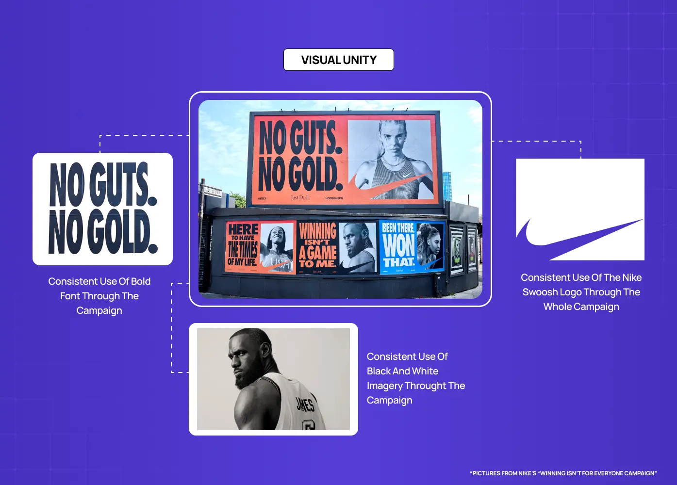
Visual unity is about the physical design elements: color, shape, type, texture, spacing, and how they interact. When these elements share a consistent logic, such as a defined color palette, a repeated shape motif, or a consistent typographic scale, the design achieves visual cohesion. The viewer does not have to mentally stitch pieces together. The composition does the work for them.
Conceptual Unity Concerns What a Composition Communicates
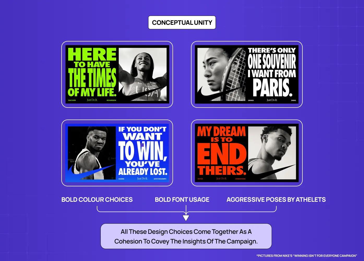
Conceptual unity goes a layer deeper. It is about whether the content and the visual treatment tell the same story. A sustainability brand using aggressive, hard-edged typography and neon color may be visually consistent within itself, but it lacks conceptual unity because the aesthetic contradicts the message. Conceptual unity asks: do the decisions we are making reinforce the purpose of this design? That question sits at the core of any well-formed design philosophy.
In practice, the strongest work achieves both simultaneously. The visual choices amplify the meaning, and the meaning gives the visual decisions a reason to exist.
Why the Principles of Design Unity Matter
Unity is not a decorative concern. It has direct consequences for how design performs in the real world.
It Creates Immediate Legibility
A unified design reduces cognitive load. When elements share a visual language, the viewer spends less effort parsing the layout and more time engaging with the content. This is especially critical in digital product design, where users make rapid judgments about trust and usability.
Research from Lindgaard et al. published in Behaviour and Information Technology found that users form visual impressions of a design in as little as 50 milliseconds. A unified visual language ensures that the impression formed in that window is coherent and trustworthy rather than fragmented.
It Directs Attention Effectively
When a design is unified, contrast becomes meaningful. A single divergent element inside a cohesive system draws the eye precisely because everything else is consistent. Unity is what gives emphasis its power. Without a unified baseline, every element competes equally for attention, and nothing wins.
It Reinforces Brand Identity
In graphic design, unity across touchpoints is what builds recognizable brands. When your website, product interface, onboarding screens, and marketing materials share the same visual logic, they create a brand experience users develop familiarity and trust with. That coherence communicates that the organization behind the design is deliberate and reliable.
It Elevates Professionalism
A fragmented design, even with strong individual components, reads as unfinished or inexperienced. Unity signals craft. It tells the viewer that decisions were made intentionally, not assembled opportunistically.
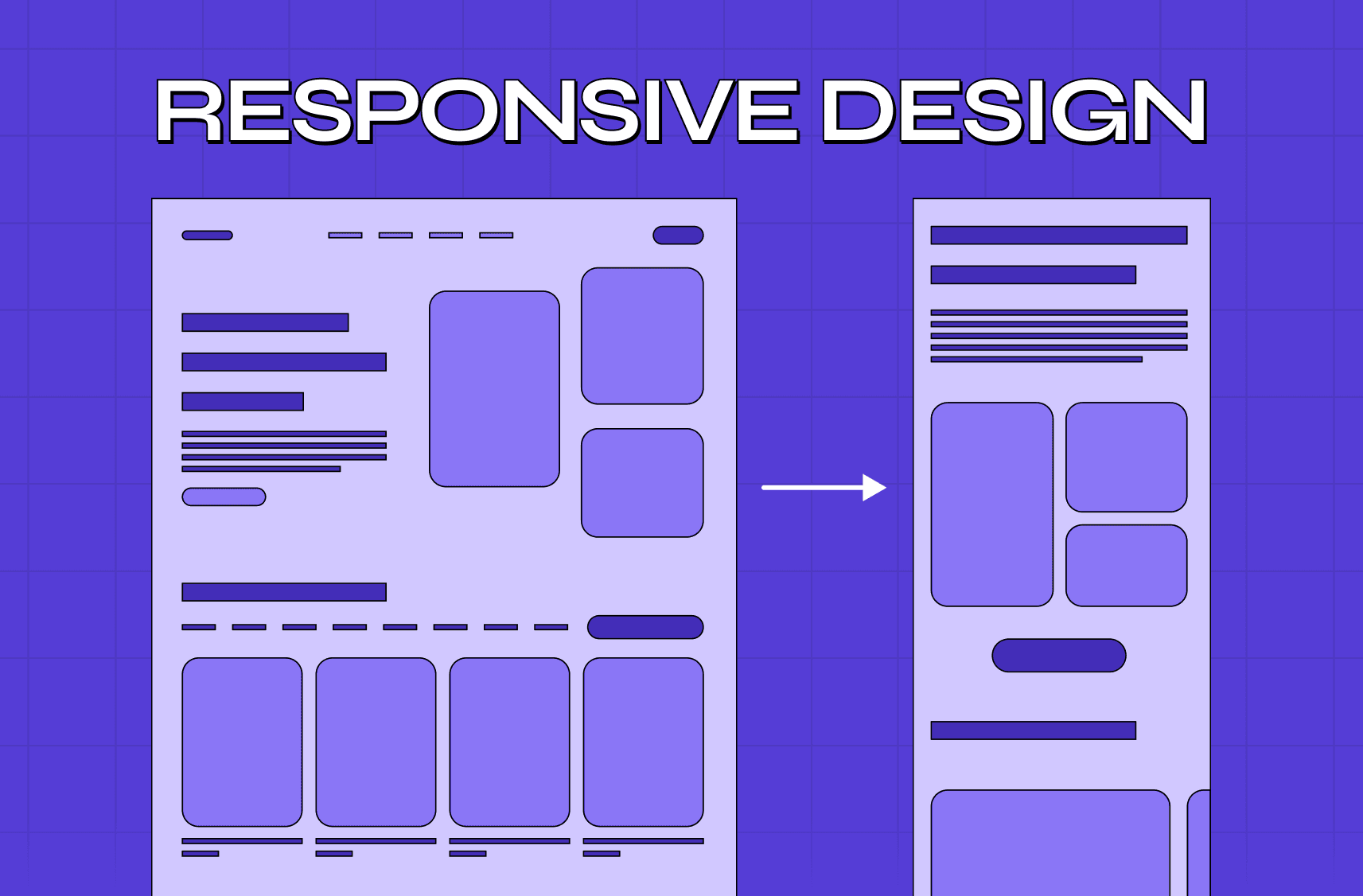
The Core Elements That Create Unity in Design
Unity does not come from a single technique. It emerges from the layered application of several interdependent principles.
Repetition
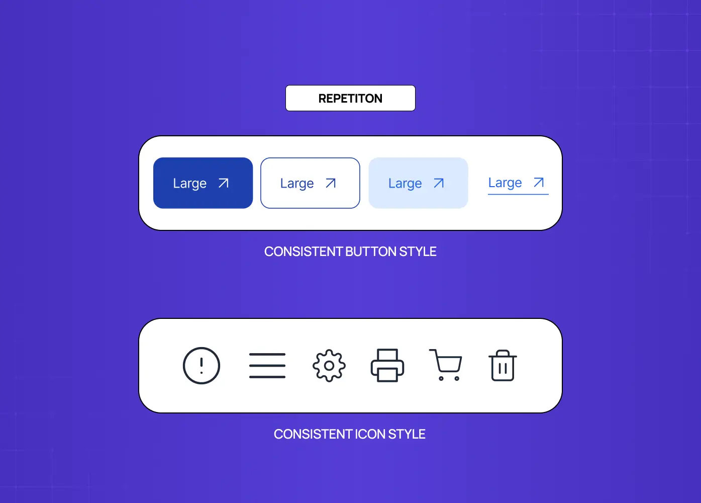
Repetition is one of the most reliable tools for building visual unity in design. When shapes, colors, typographic treatments, or spatial patterns appear consistently across a composition, the viewer begins to read those elements as part of a system. Repetition is how a design communicates structure without stating it explicitly.
In a multi-screen product, repeating a button style, a heading scale, or an icon treatment across every view creates the sense that users are moving through a coherent space rather than a series of disconnected screens. Design systems for SaaS make this repetition systematic rather than relying on individual discipline.
Spotify enforces this at a scale most teams never encounter. Its design guidelines maintain a single typographic treatment across more than 400 million users and dozens of product surfaces. The repetition is so consistent that the product feels like one thing regardless of context or device.
Proximity
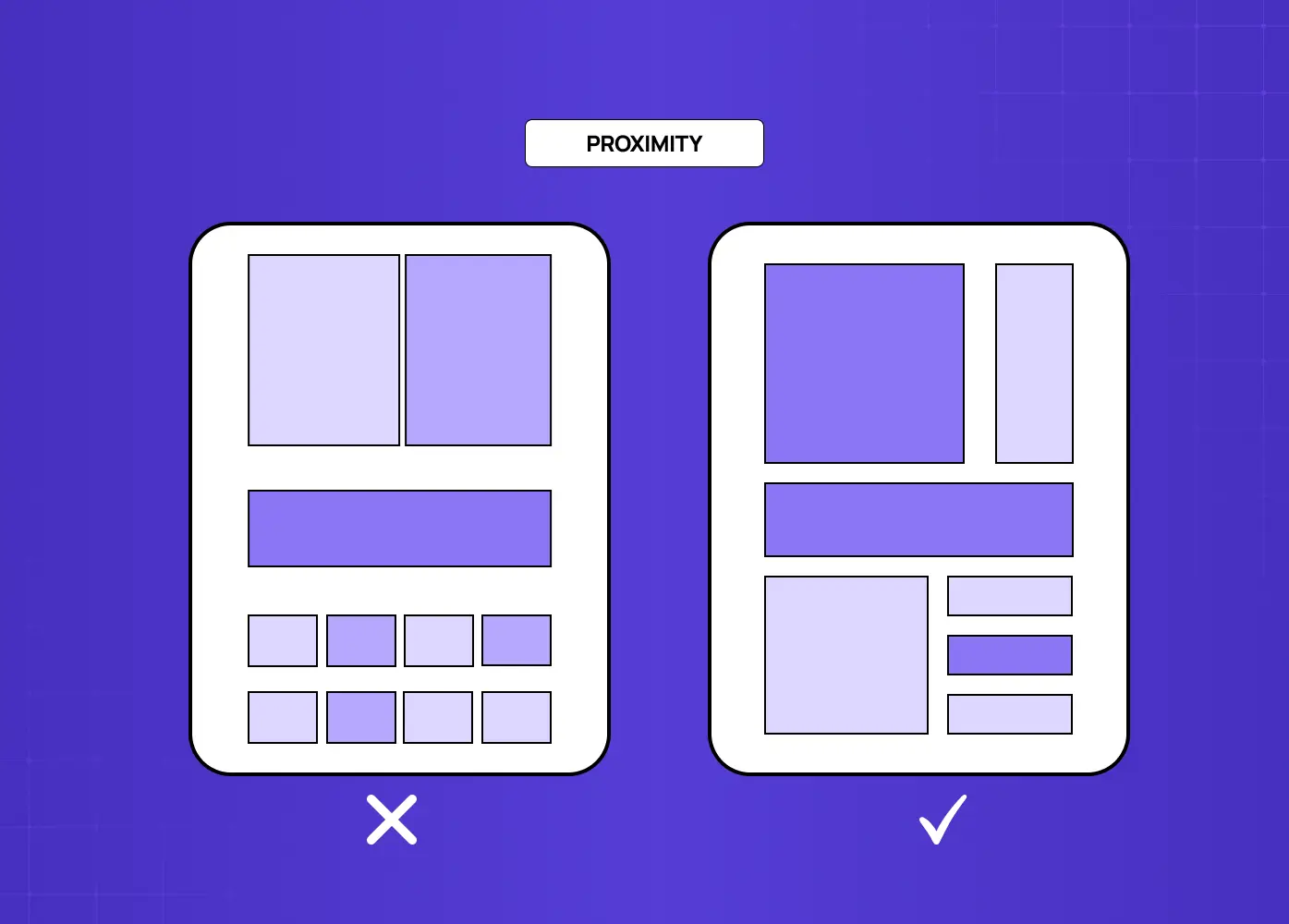
Proximity governs how spatial relationships communicate meaning. Elements placed close together are understood as related. Elements placed apart are understood as distinct. When designers use proximity consistently, they reduce the need for explicit labels or dividers because the layout itself communicates the organization of information.
Poor proximity, where related elements are scattered and unrelated elements share space, is one of the most common causes of a design that feels chaotic even when individual components are well-crafted.
Alignment
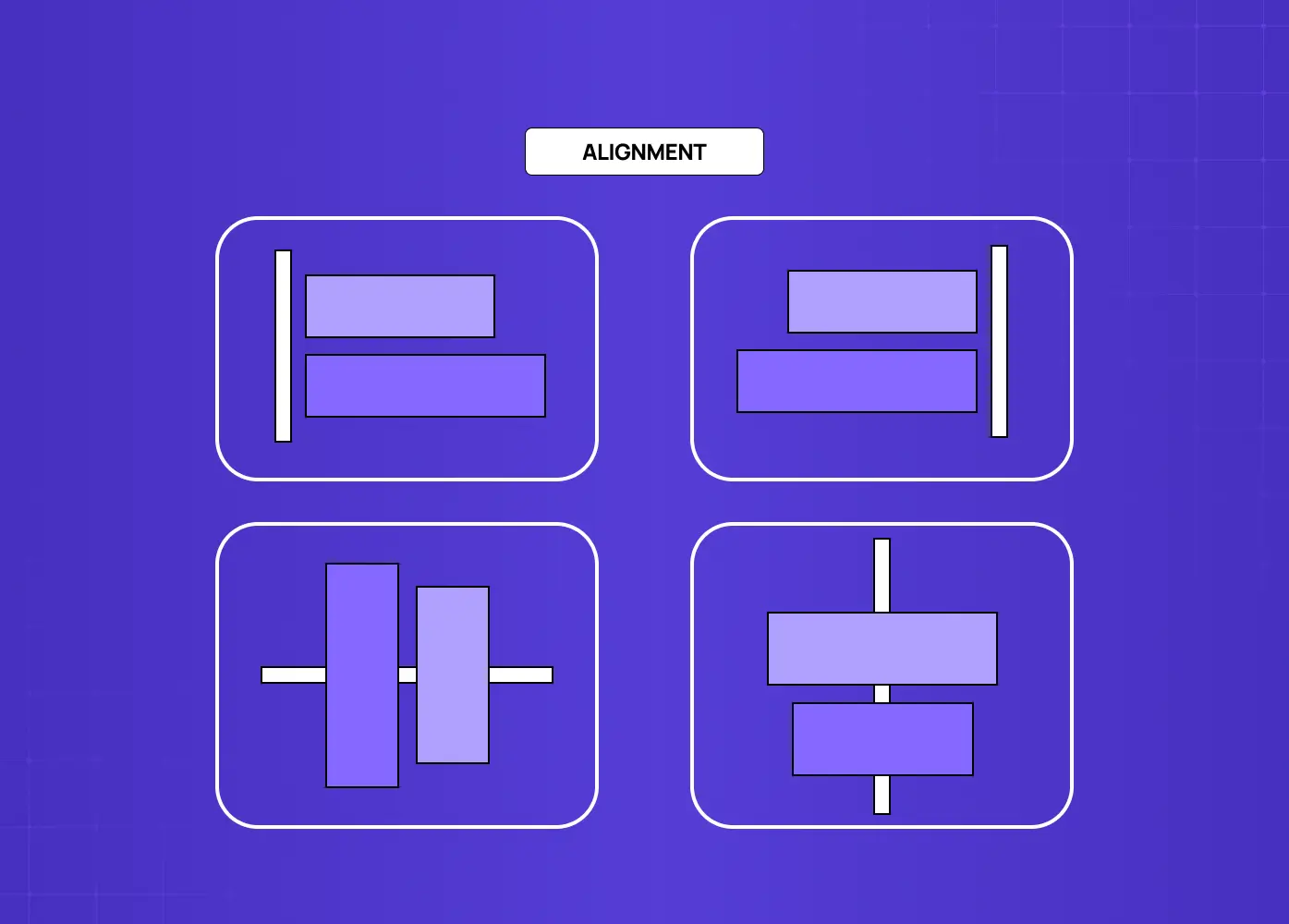
Alignment brings order to a composition by creating invisible structure that the eye follows. When elements align along shared horizontal or vertical axes, the design feels intentional rather than improvised. Alignment also creates visual relationships between elements that are not physically adjacent, which is particularly valuable in complex multi-column layouts.
Consistency of alignment across a composition is a foundational aspect of unity in graphic design. Breaking alignment intentionally, for a pull quote or a hero element, can be highly effective, but only because the established alignment system makes the break feel deliberate.
Color Harmony
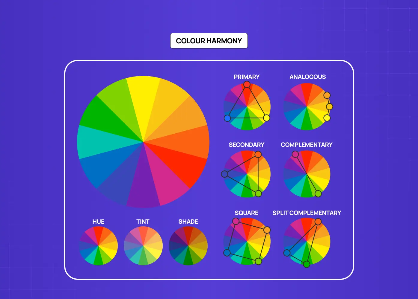
Color is one of the most emotionally immediate dimensions of any design, and color harmony is essential to the principles of design unity. A coherent color palette, whether it draws from a monochromatic palette, complementary, analogous, or triadic relationships, creates a perceptual throughline across a composition.
Color can also reinforce conceptual unity. The palette a brand chooses communicates values, personality, and positioning before a viewer reads a single word. Inconsistency in color, whether between screens, across collateral, or within a single layout, is immediately noticeable and undermines the credibility of the work.
Apple's product pages are a reliable reference point here. The palette stays restrained across hardware, software, and marketing, so the brand reads as unified even as the product range expands. Airbnb applies the same logic across its app, website, and campaign materials, using a consistent coral-to-warm-white relationship that makes the brand immediately identifiable. These kinds of website design examples show how color unity compounds into brand recognition across every touchpoint.
Negative Space
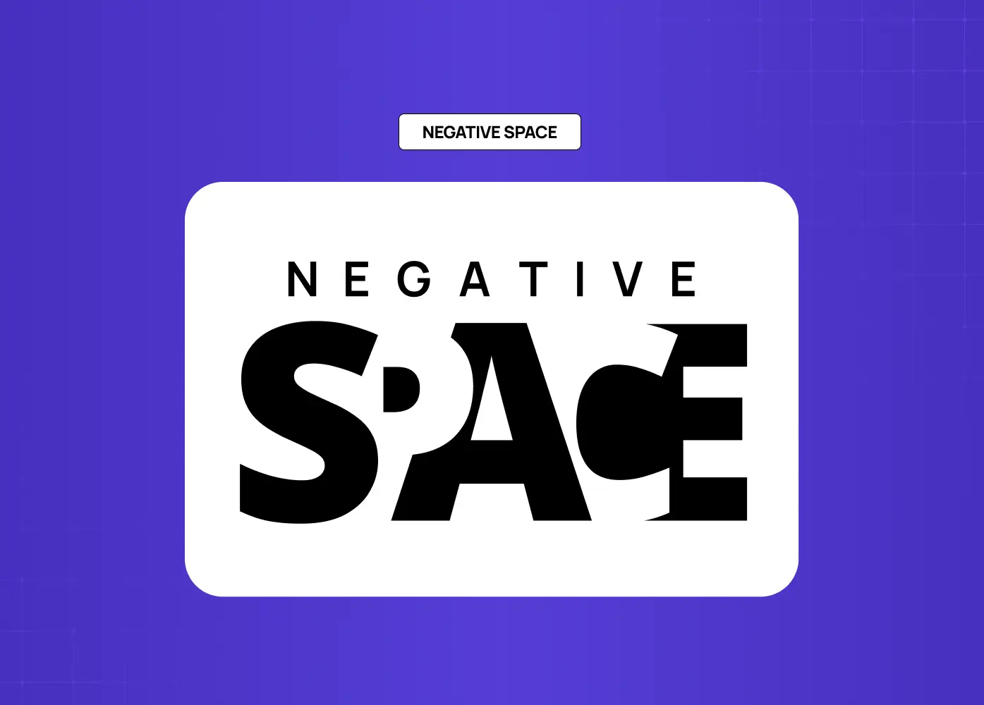
Negative space, or the deliberate absence of visual elements, is as important as the elements themselves in achieving unity. Well-managed negative space allows a composition to breathe. It prevents visual competition between elements and helps the viewer understand what is important.
Designers who treat negative space as leftover emptiness rather than an active compositional tool often end up with designs that feel crowded, regardless of how well each individual element is executed.
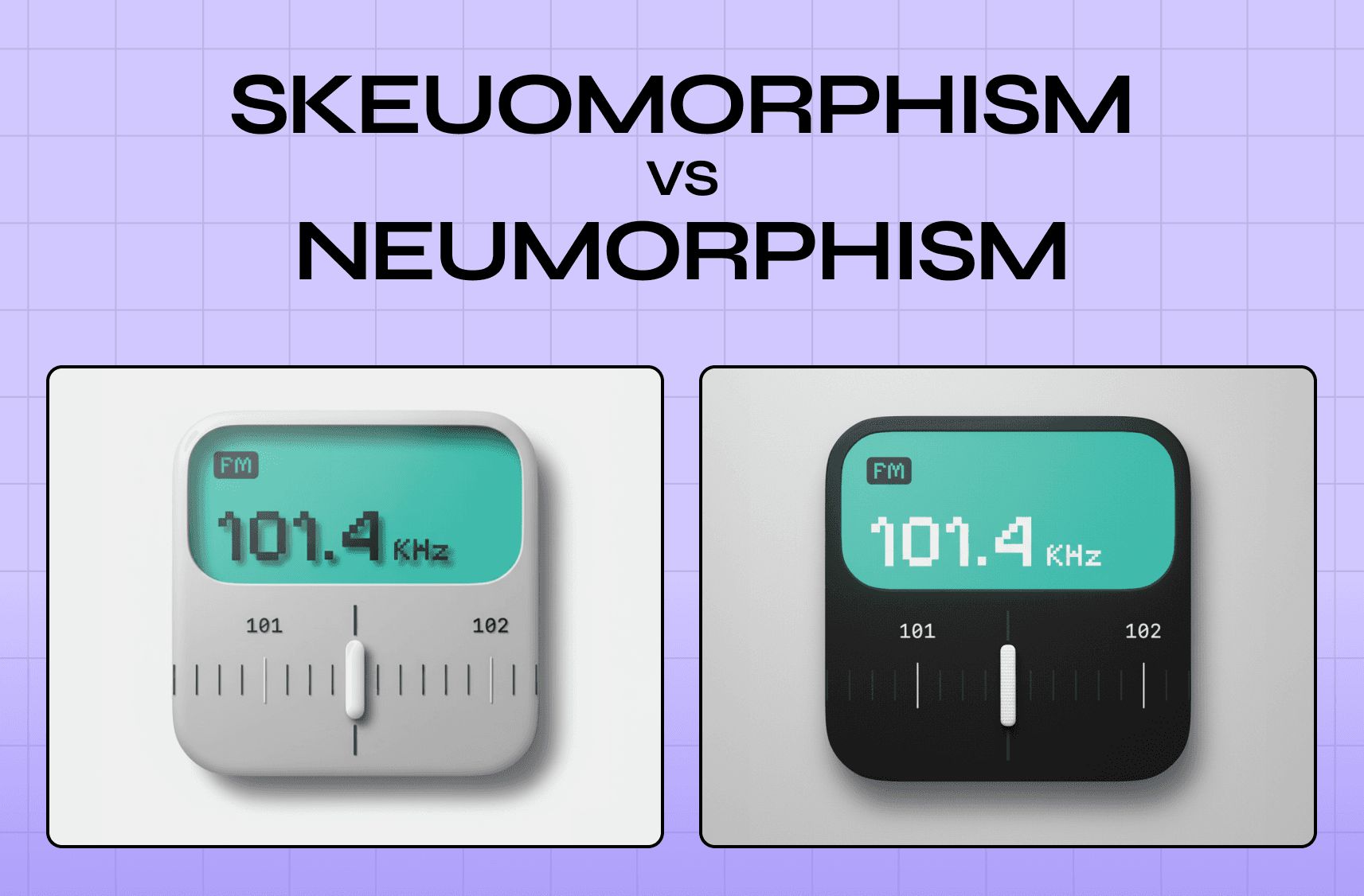
Texture and Surface Quality
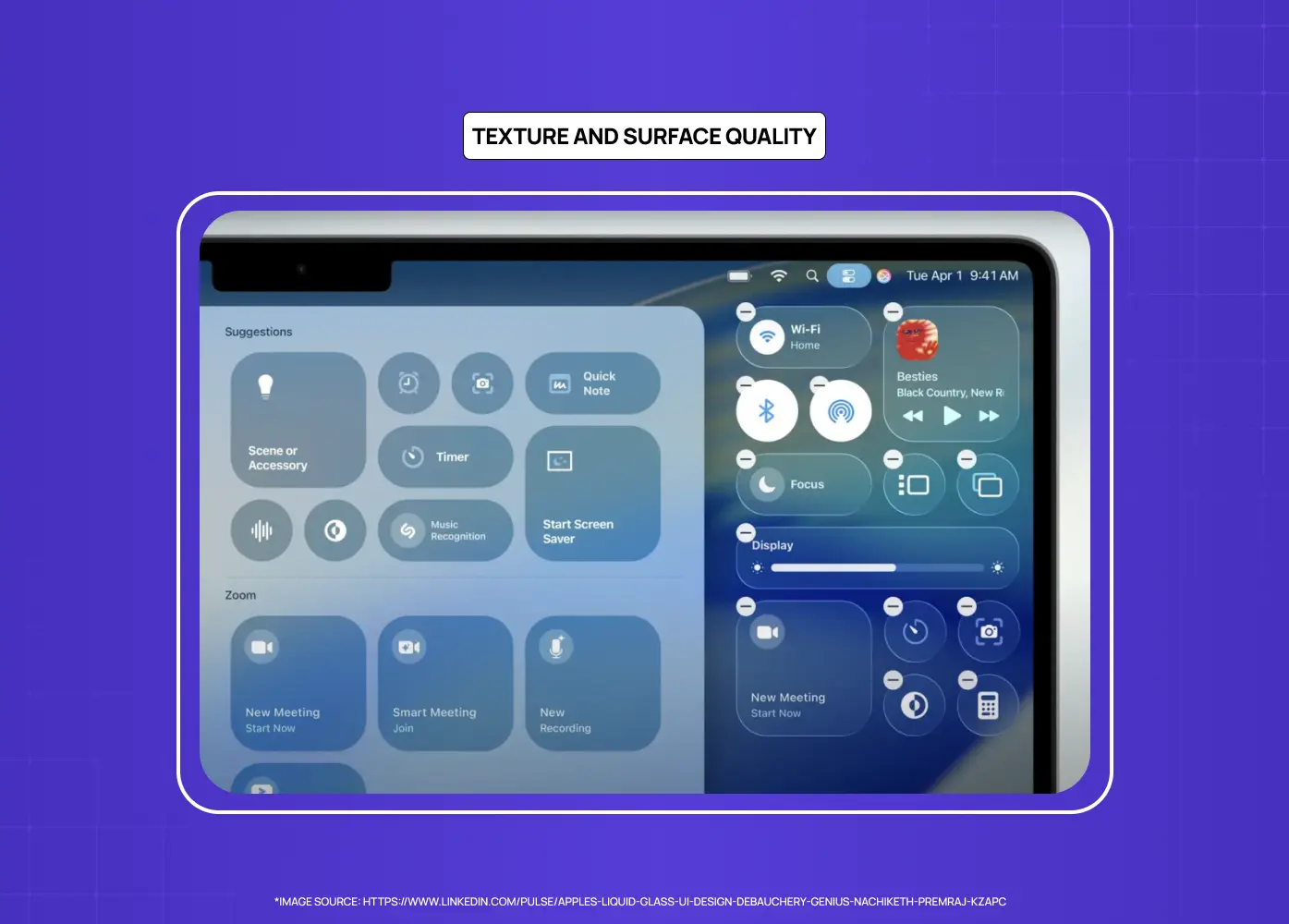
Texture adds depth and tactile dimension to a composition. In digital design, this typically means the visual weight and surface quality of elements rather than physical texture. Consistency in how texture is used, whether flat and minimal or the layered depth associated with skeuomorphism and neumorphism, contributes to the overall unity of a piece. Mismatched surface qualities, such as detailed photographic elements paired with flat UI components without any visual bridging, are a common source of visual dissonance.
Shape Language
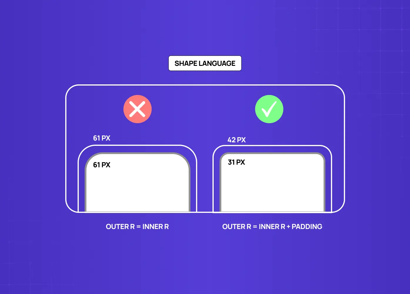
Shape consistency is one of the most underused unity tools in product design. When buttons, cards, image frames, and UI components share the same corner radius or geometric logic, the viewer perceives them as part of a single system even when colors and typography vary across contexts. A brand that uses rounded corners throughout communicates something different from one that uses sharp angles throughout, but what matters for unity is not the choice itself but the consistency with which it is applied. In SaaS interfaces especially, shape language is often the element that either ties a visual system together or quietly undermines it.
Rules Designers Actually Use
Principles describe what to aim for. Rules give you a starting point for how. A few of these come up repeatedly in professional design practice because they solve recurring problems efficiently.
The 60-30-10 rule
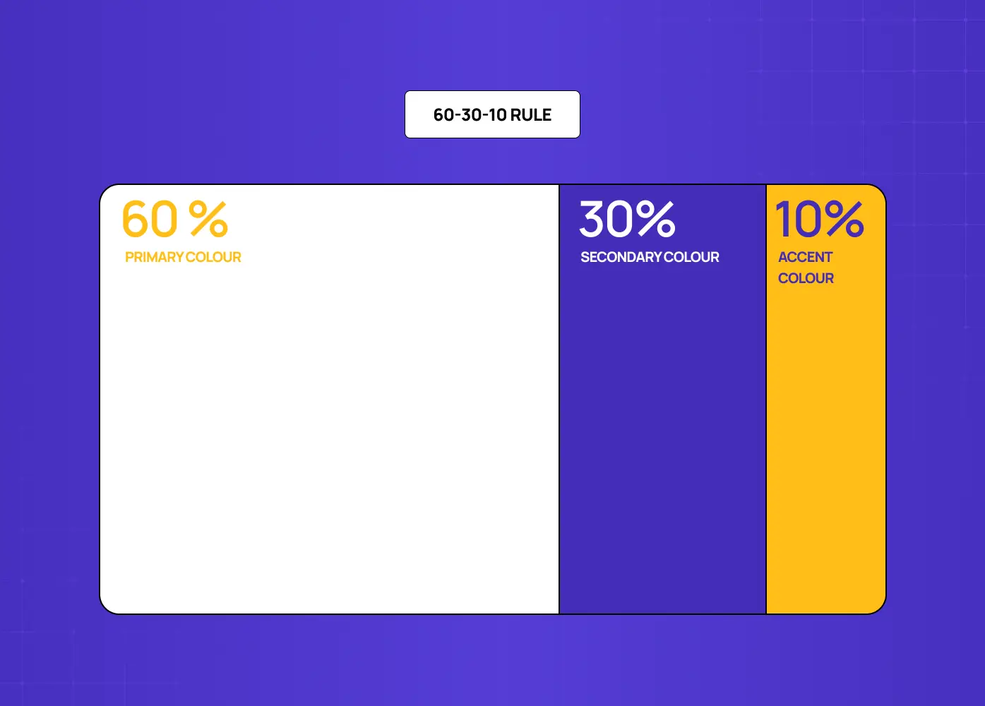
The 60-30-10 rule divides a color palette into proportions: 60% dominant color, typically the background or primary surface, 30% secondary color for supporting elements, and 10% accent for emphasis. The ratio prevents any single color from overwhelming the composition while ensuring enough variety for visual interest. It is not a rigid formula but a useful default when a palette feels imbalanced. The same proportional logic applies when building a split-complementary palette: controlled variety within a unified color relationship.
The two-font rule
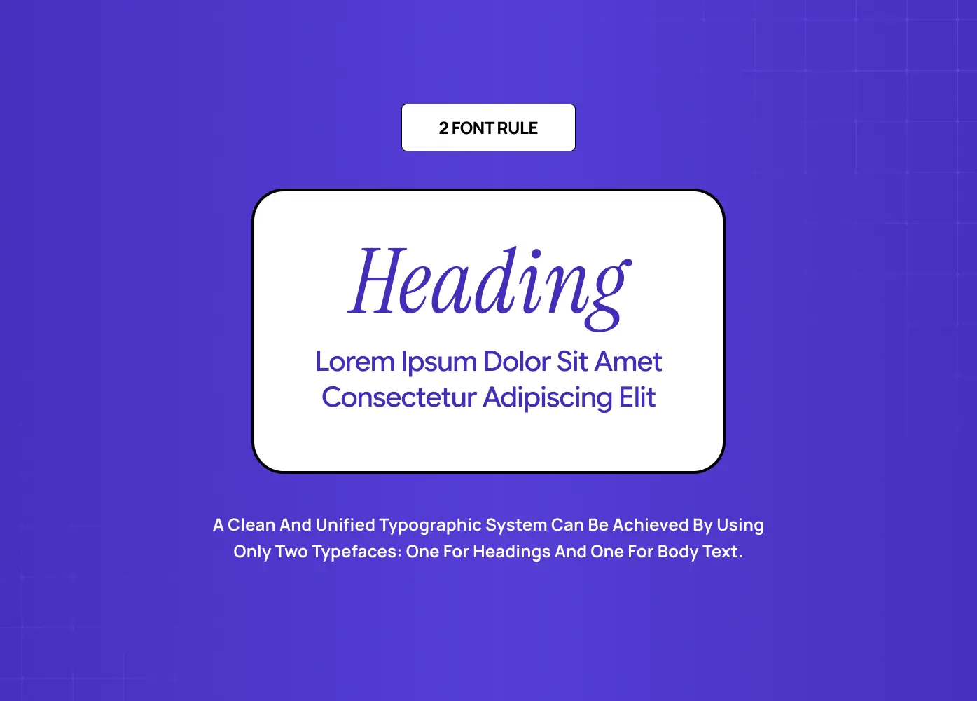
It is a practical application of the unity principle to typography. Using no more than two typefaces in a composition, one for headings and one for body, creates a clean typographic system that does not fragment. A third typeface can work as an accent in specific contexts, but it requires a clear rationale. Beyond three, the system starts to feel uncontrolled.
The 80/20 framework
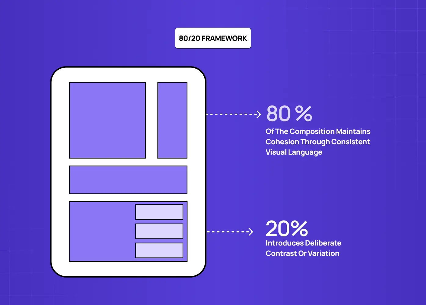
It describes a balance where 80% of a composition maintains cohesion through consistent visual language, and 20% introduces deliberate contrast or variation. The 20% is where emphasis lives. It is where you break the grid, shift the color, or increase the type weight. The 80% is what makes that break feel intentional rather than accidental.
Types of Unity in Design
Unity can be achieved through different strategic approaches, each with distinct visual outcomes.
Gestalt Unity
Gestalt Unity relies on the viewer's perceptual tendency to group elements into wholes. The individual gestalt laws each produce a specific unity effect: proximity creates grouping without explicit framing, so elements placed near each other are read as related without a border or label; similarity creates visual cohesion across non-adjacent elements that share color, shape, or size; continuity creates flow through a composition by guiding the eye along implied lines or curves; closure allows incomplete forms to be read as whole, reducing visual clutter while maintaining clarity; and figure/ground allows negative space to function as an active compositional element rather than empty background. Applying even two or three of these laws deliberately produces a composition that feels resolved without requiring additional visual elements to hold it together.
Grid-Based Unity
It uses an underlying structural grid to align every element in a composition. Even highly varied content feels cohesive when it adheres to a shared spatial logic.
Thematic Unity
It is achieved when every visual decision, from illustration style to typographic personality, reflects a consistent conceptual theme. This is particularly powerful in brand identity work.
Relational Unity
It emerges from how elements interact rather than how each element looks individually. A composition can achieve unity through the consistency of relationships, even if the elements themselves vary.
Motion Unity
In digital product design, unity extends into the time dimension. Consistent animation duration, matched easing curves, and uniform transition logic across screen states are what make a product feel like a single coherent system rather than a collection of independent interactions. When one screen transition uses a fast ease-out and another uses a slow linear fade, the inconsistency is felt even by users who cannot articulate why the product feels disjointed. Motion unity is rarely discussed in design writing but is one of the most immediately perceptible dimensions of a well-built interface.
Unity vs. Variety: Getting the Balance Right
A common misconception about the principles of design variety and unity is that they are opposites. They are not. Variety is actually what prevents a unified design from becoming monotonous.
Unity without variety produces visual boredom. When every element is identical, the composition provides no hierarchy, no emphasis, and no reason for the eye to move. Variety introduces contrast, rhythm, and visual interest. But variety without unity produces chaos.
The relationship between the two is calibration rather than compromise. Designers introduce variety at the points where it serves the content and maintain unity everywhere else. A design system with consistent grid, type scale, and color palette can contain enormous variety in imagery, illustration, and layout while still feeling cohesive.
What Breaks Unity in Practice
Understanding unity principles is useful. Recognizing where they break down in real work is more immediately practical. These are the mistakes that fragment compositions most often.
Too many typefaces. Using four or five typefaces in a single layout is one of the most common ways a design loses visual coherence. Each additional typeface introduces a competing personality that the composition has to resolve. It rarely does.
An undefined color palette. Adding colors opportunistically, without reference to a structured color palette, creates incremental fragmentation that compounds quickly across a multi-page or multi-screen system.
Overusing contrast. Contrast is powerful precisely because it is rare inside a unified system. When every section uses a different background color, every heading is a different size, and every component uses a different corner radius, the contrast loses meaning and the design loses cohesion.
Inconsistent spacing. Spacing that varies without a systematic reason, slightly different padding between sections, inconsistent margins across columns, misaligned component internals, produces a layout that feels unresolved even when every individual element is well-designed.
Misalignment between visual treatment and content. A design can be internally consistent and still lack unity if the visual choices contradict the message. A financial product that uses playful, irregular type and loud color may have internal visual consistency but fails the conceptual unity test.
How We Apply Unity at Groto
The way we build products at Groto reflects a core belief: that functional design and unified design are the same thing. A fragmented visual system does not just look wrong. It creates friction that undermines user trust and brand confidence.
On our project for Gini, a financial platform, the visual system we built relied on strict typographic hierarchy, a restrained palette, and consistent spacing tokens across every screen. The unity of that system was not incidental. It was the foundation that made the interface feel trustworthy and precise, which matters enormously in the context of personal finance.
On the Firstwork project, we approached unity as a thematic question. The product needed to feel energetic and forward-facing without sacrificing usability clarity. The solution was to anchor the design in a consistent grid and type system, then allow variety to enter through illustration and motion, where it served the experience rather than competing with it.
Unity is not a visual style. It is a structural discipline that allows style to function effectively.
Conclusion
Unity in design is what transforms a collection of elements into a coherent composition
It operates across both visual and conceptual dimensions, and the strongest work addresses both
The core techniques, including repetition, proximity, alignment, color harmony, and negative space, all work together rather than independently
Different types of unity, gestalt, grid-based, thematic, and relational, serve different design contexts
Unity and variety are complementary, not competing; variety is what gives a unified composition energy
The purpose of unity is not visual tidiness but communicative clarity and intentional design