
Timelines are everywhere in digital products, from order trackers to CRM feeds, yet most are designed without much thought. This guide breaks down timeline UI design into clear types, eight practical best practices, and the common mistakes worth avoiding.
Everything you need to know about designing clear, scannable timeline UI.

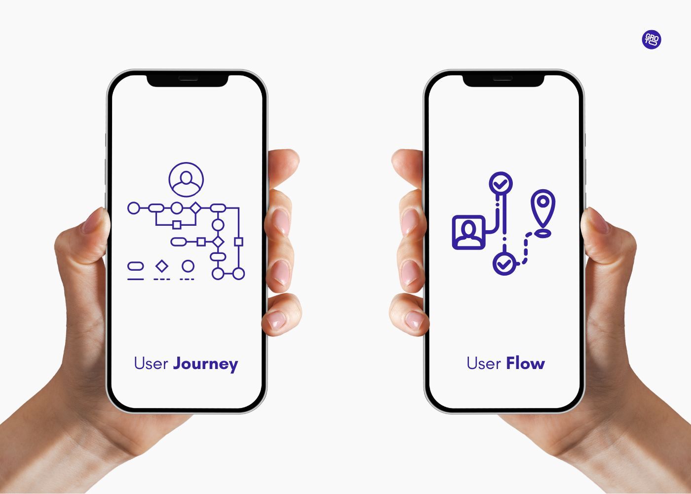
Timeline UI design is the practice of turning a sequence of events, whether that's order status updates, CRM activity, or a product roadmap, into an interface people can follow at a glance.It is the interface-level cousin of mapping a user journey vs user flow, only rendered for the end user rather than the team. It shows up in more products than most teams realize, and because it's so common, it's also easy to get wrong: unclear direction, missing timestamps, or a layout that falls apart the moment there's a lot to show. In this guide, we walk through the main timeline patterns, eight best practices for designing them well, and the mistakes worth avoiding, so you can build a timeline that people actually use rather than puzzle over.
TL;DR
A timeline UI shows a sequence of events along an axis, using markers, timestamps, and connectors to signal order and progression.
The right pattern (vertical, horizontal, activity feed, roadmap, or expandable) depends on your content, audience, and how much detail each event needs.
Good timelines make direction and time unmistakable, use timestamps and visual cues consistently, and disclose detail progressively instead of cramming.
Responsiveness and accessibility are not optional extras, since most timeline content, like feeds and tracking, is consumed on mobile and needs to work for everyone.
Do not forget the empty, loading, and very long states. Most timeline designs only plan for the happy path.
You've used more timelines today than you realize. The order-tracking bar on a delivery, the activity feed in your CRM, the roadmap in your project tool, and the "what's happened on this ticket" history on a support ticket are all timelines. Progress steps in SaaS onboarding UX are the same pattern compressed into a few nodes. It's one of the most common ways to show change over time, and precisely because it's everywhere, it's easy to design badly: a horizontal timeline that breaks on mobile, an activity feed with no timestamps, a roadmap so dense no one can read it. A good timeline makes a sequence instantly scannable. A bad one turns simple chronology into a puzzle.
Good timeline UI design comes down to choosing the right type and applying a handful of clear principles. Below are the main timeline patterns, eight best practices for building them, and the mistakes to avoid, whether you're designing an activity feed, an order tracker, a product roadmap, or a company history. Let's make your timelines effortless to follow.
What is a timeline UI (and where it's used)
A timeline UI is a component that displays a series of events or steps in chronological order along an axis, using markers, timestamps, and connectors to show sequence and progression. It's the go-to pattern whenever the order and timing of things matters. You'll find timelines in project management tools and roadmaps, onboarding and process flows, CRM activity feeds, audit logs, delivery and order tracking, healthcare records, incident-management platforms, and company "our story" pages. In SaaS especially, the activity feed is a core part of dashboard UX, sitting alongside charts and tables rather than off on its own. That range is exactly why one size doesn't fit all: the right design depends on what your timeline is for.
The main types of timeline UI
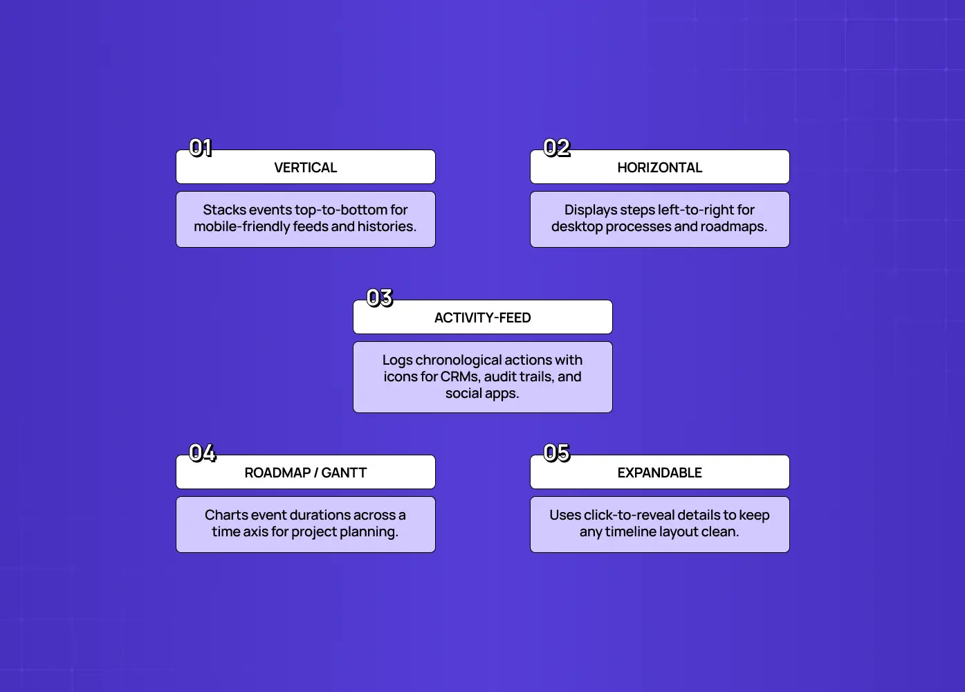
Before the best practices, know your options: choosing the right type is half the battle.
Vertical timeline: events stacked on a vertical axis, read top to bottom. The most flexible and mobile-friendly type, ideal for activity feeds, histories, and anything read on a phone.
Horizontal timeline: steps laid out left to right in sequence. Great for processes, roadmaps, and step trackers on wider screens, but it needs a responsive fallback on mobile.
Activity-feed timeline: a chronological log of actions and events (who did what, when), usually vertical, with icons or avatars per event type. The backbone of CRMs, audit logs, and social apps, and increasingly of AI dashboard design, where agent run histories and reasoning traces render as feeds.
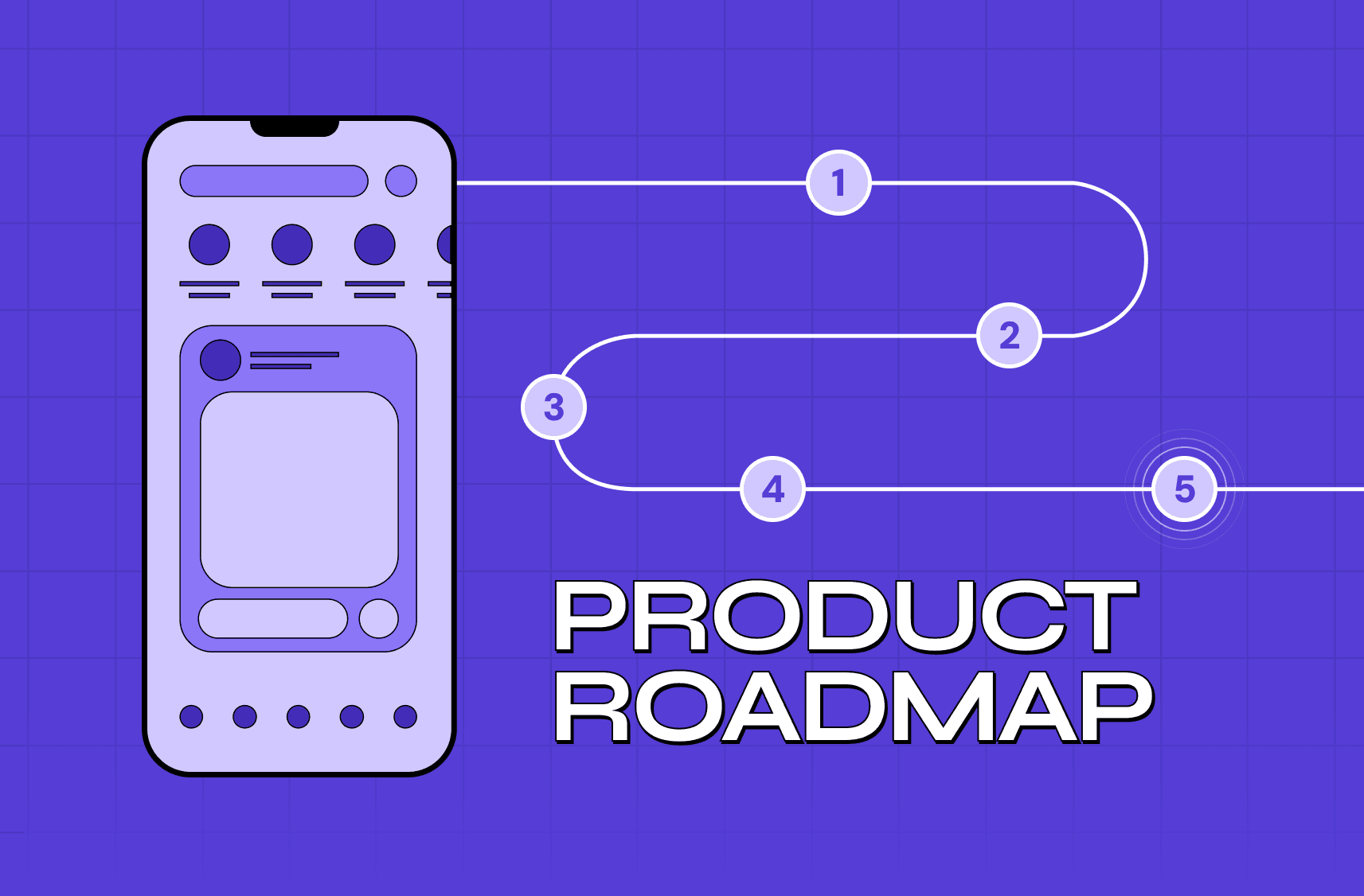
Roadmap or Gantt timeline: shows items with duration across a time axis, not just points. Built for project planning and product roadmaps.
Expandable timeline: any of the above with progressive disclosure, so each item can expand to reveal more detail on demand.
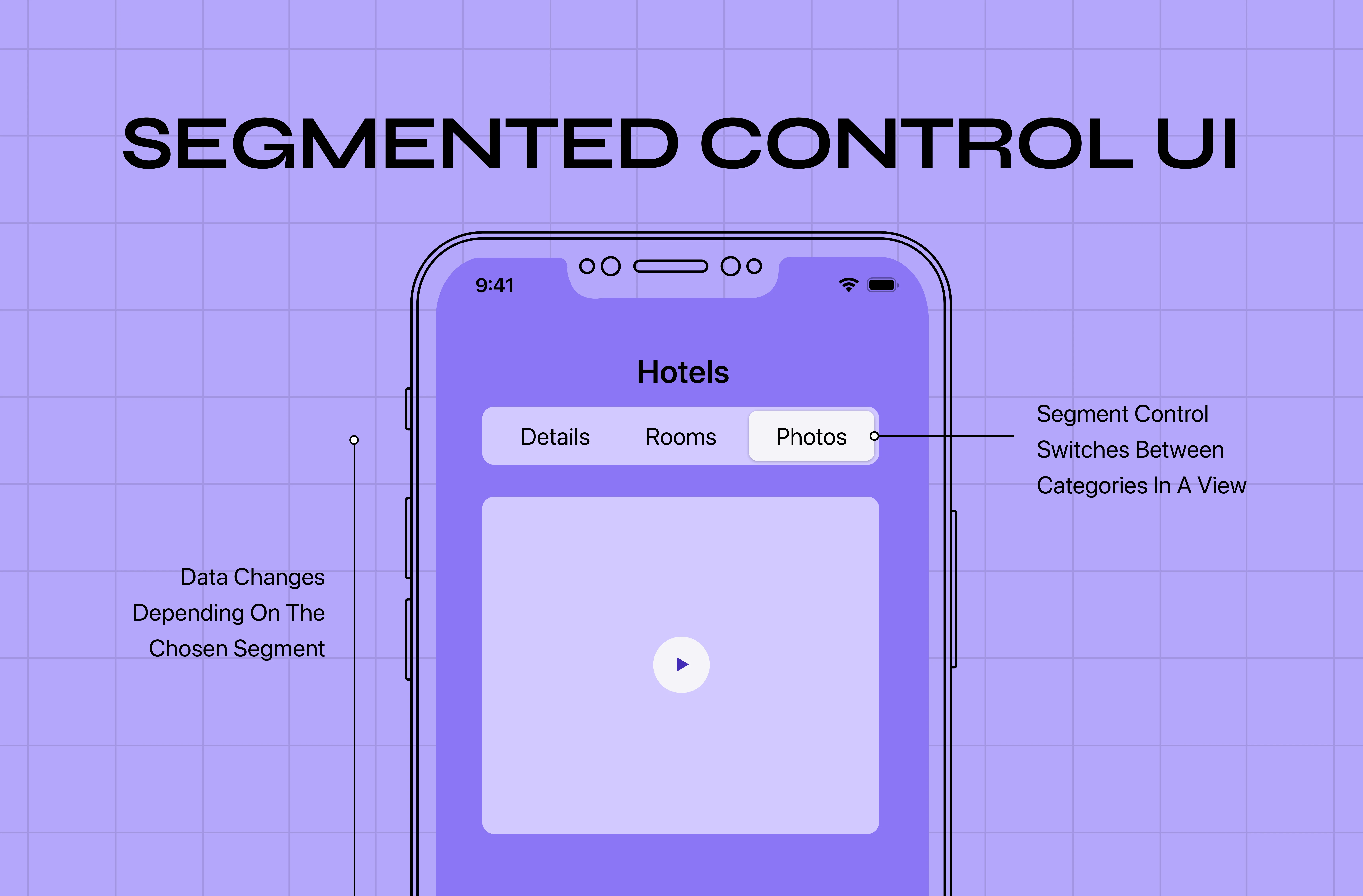
Match the type to your content and audience, and the rest of the decisions get easier. If your product genuinely needs more than one view, a segmented control is the usual way to let users switch between them.
The anatomy of a timeline
Whatever the type, most timelines share the same parts, and naming them helps you design each deliberately:
Axis or connector: the line that links events and signals they're one continuous sequence.
Markers (dots, icons, or avatars): sit on the axis to represent each event and often encode its type or status.
Timestamp: anchors each event in time.
Event content: a title and optional detail that says what happened.
Status or state indicator (optional): shows whether a step is done, current, or upcoming.
Great timeline UI design is these parts working in agreement: the axis carries the eye, the markers differentiate, the timestamps contextualize, and the content pays off the glance. When one is missing or inconsistent, the whole component gets harder to read. Defining each part once in your design system is what keeps them in agreement across screens.
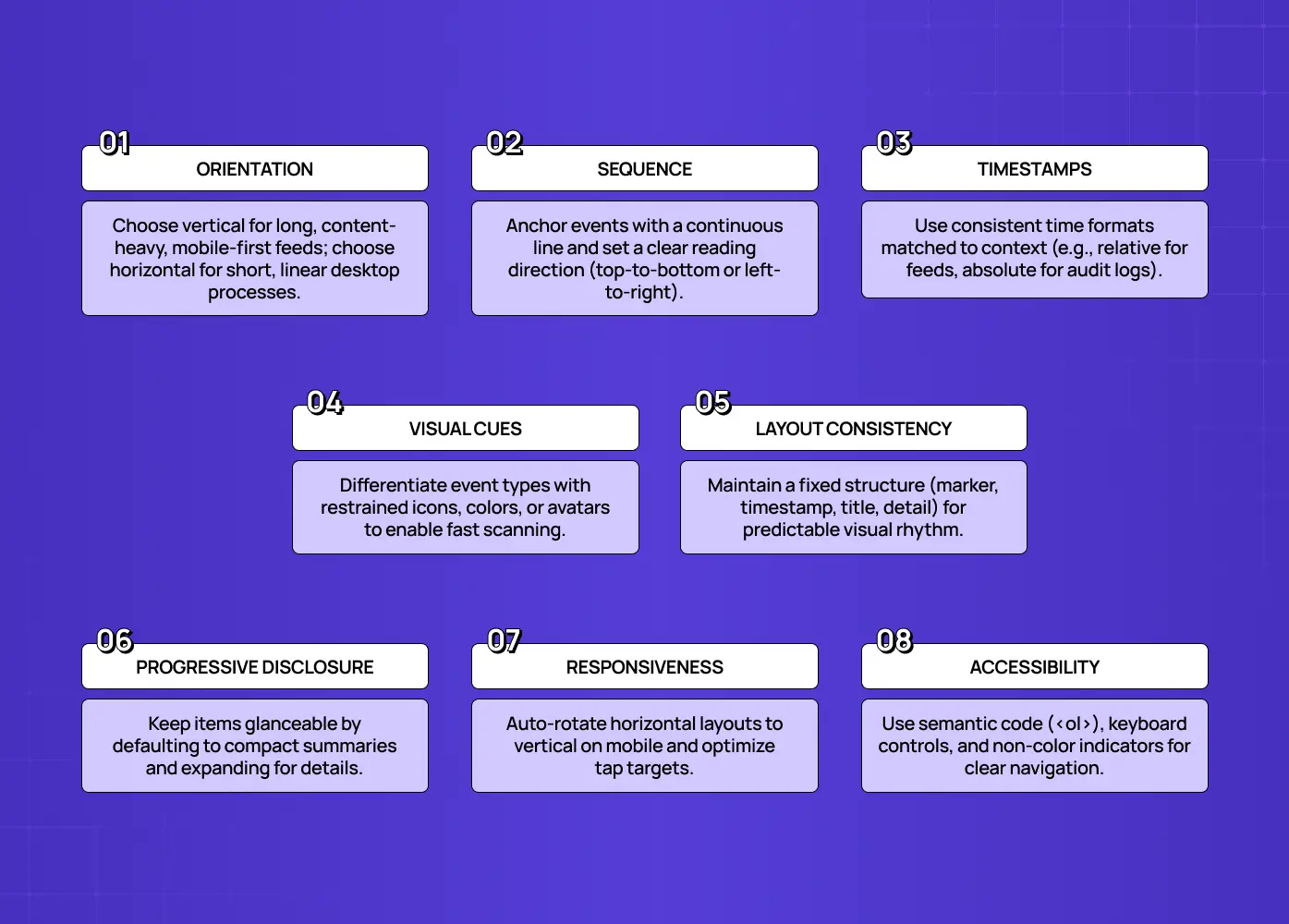
1. Choose the right orientation for the context
The vertical-vs-horizontal choice drives everything else. Use a vertical timeline when items have substantial content, when there are many events, or when mobile is a primary context, since it scrolls naturally and scales to any length. Use a horizontal timeline for a small number of sequential steps or a process where left-to-right progression is intuitive, and where you have the screen width. The rule of thumb: the more content-heavy or mobile-first your timeline, the more vertical wins; the more it's a compact, linear process on desktop, the more horizontal can work. Either way, decide it against the types of grids your layout already uses, not in isolation.
2. Make chronological order and direction unmistakable
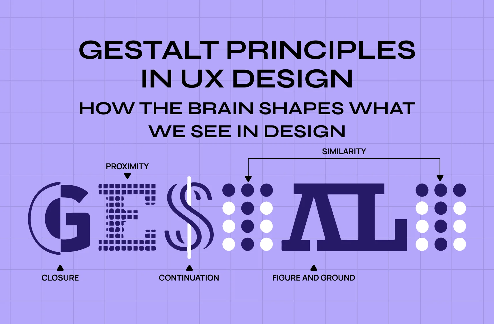
A timeline's whole job is to communicate sequence, so make the direction obvious. Establish a clear reading order, top-to-bottom for vertical and left-to-right for horizontal, and stick to it consistently. Decide deliberately whether newest or oldest comes first (activity feeds usually lead with newest; process and history timelines often run oldest-to-newest) and signal it clearly. A connecting line or axis linking the events reinforces that they belong to one continuous sequence, which is the Gestalt principle of continuity doing the work for you. If users have to work out which way time flows, the timeline has failed at its one job.
3. Show clear, consistent timestamps
Time is the context that makes a timeline meaningful, so every event needs a clear timestamp or date. Keep the format consistent throughout, and match the granularity to the use case: a delivery tracker might show times, a company history shows years. For activity feeds, relative timestamps ("2 hours ago") aid quick scanning, while absolute dates suit records and audit logs; consider showing the exact time on hover. Without legible, consistent timestamps, a timeline is just a list pretending to be chronological.
4. Use visual cues to distinguish event types
When a timeline mixes different kinds of events, help users tell them apart at a glance with icons, colors, or avatars. A comment, a status change, and a payment should look distinct in an activity feed; a completed, current, and upcoming step should read differently in a process tracker. Consistent visual coding lets users scan for the event type they care about without reading every entry. Just keep the system restrained: a rainbow of colors and icons creates noise instead of clarity. Making milestones outrank routine events is an emphasis in design problem, not a color-count problem.
5. Keep the layout consistent and scannable
Timelines are read by scanning, so consistency is what makes them fast. Give every item the same structure: marker, timestamp, title, then optional detail, in the same positions each time, so the eye can move down (or across) without re-learning the pattern. Consistent spacing, alignment, and marker style turn a timeline into a rhythm users can skim, which is the visual design principles playbook applied to one component. The moment items vary in layout, scanning slows and the timeline starts to feel like work.
6. Use progressive disclosure for dense timelines
Real timelines get long and detailed, and cramming everything in creates a wall of content. Use progressive disclosure: show a compact summary for each event, and let users expand items to reveal more detail on demand. Group or collapse older or less relevant sections, offer filtering by event type, where a well-designed toggle UX lets users show or hide whole event categories, and paginate or lazy-load very long feeds. The goal is a timeline that's glanceable by default but as deep as needed on request: compact without hiding what matters.
7. Design for responsiveness
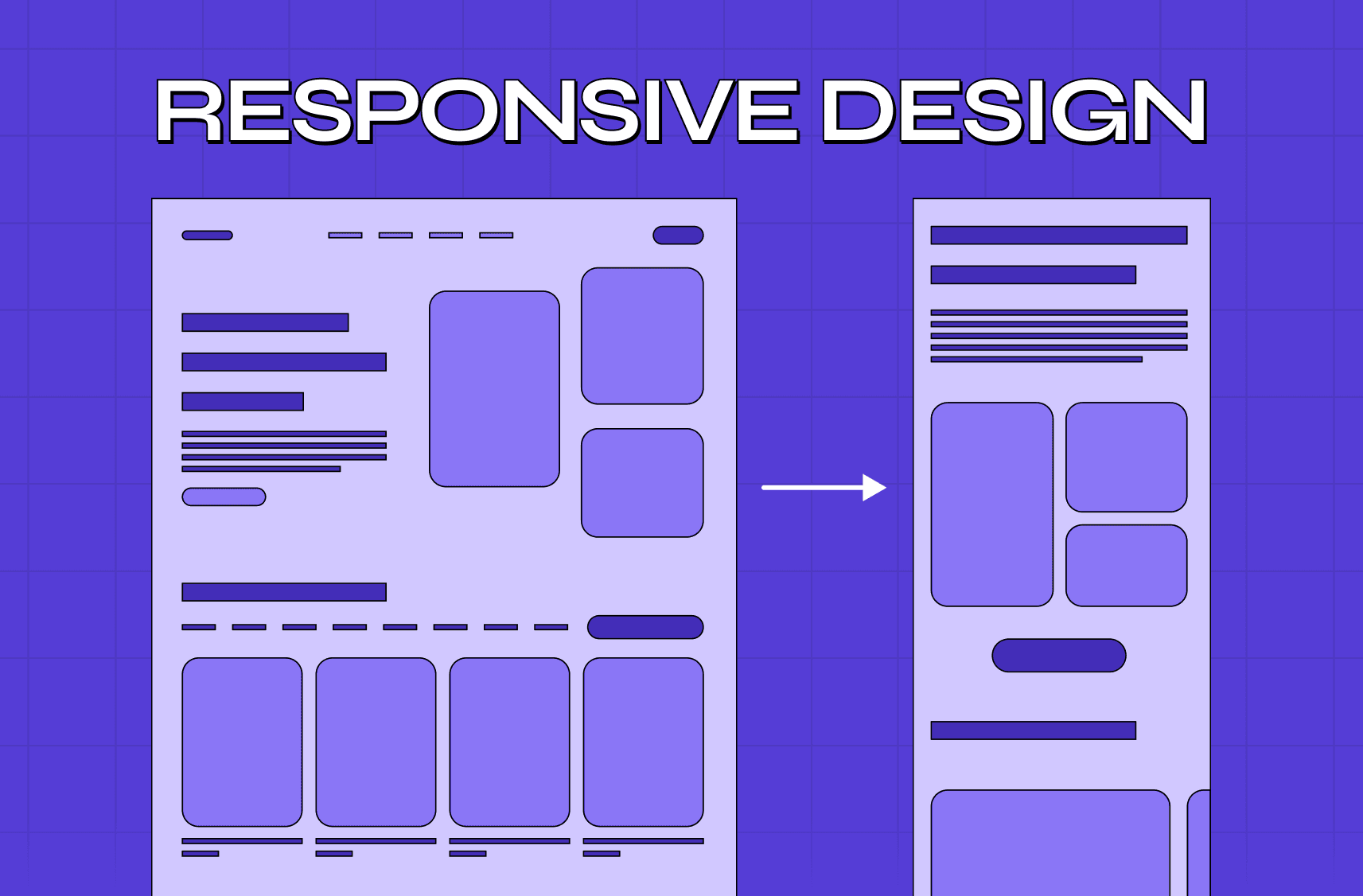
A timeline that looks great on a desktop can fall apart on a phone, horizontal timelines especially. The standard fix is to rotate horizontal layouts into vertical ones below a breakpoint, so the sequence still reads naturally on small screens, and to use techniques like CSS scroll-snap for any horizontal scrolling rather than fiddly slider scripts. Ensure markers, text, and tap targets stay legible and comfortably tappable at every size. Since so much timeline content (feeds, tracking) is consumed on mobile, responsive behavior isn't optional. It's core, and the usual mobile-first design best practices apply here more than most components.
8. Build in accessibility
A timeline is a sequence of information, and everyone needs to follow that sequence. Use semantic markup (an ordered list is often the right underlying structure) so screen readers convey the order correctly, ensure sufficient contrast for text and markers, and don't rely on color alone to distinguish event types. Pair it with icons or labels. Make interactive elements (expandable items, filters) keyboard-accessible and clearly focusable. An accessible timeline is simply a clearer timeline for everyone, which is the whole case for accessibility in UI UX design in miniature.
Matching the timeline type to your use case
Because "timeline" covers so many patterns, it helps to map common jobs to the right type:
CRM or product activity feed: use a vertical activity-feed timeline with icons per event type and relative timestamps, since it's built for scanning frequent, mixed events.
Order or delivery tracking: a horizontal (or vertical-on-mobile) step timeline with a clear current-state indicator works best, since users mainly want to know "where is it now?"
Product roadmap or project plan: a roadmap or Gantt-style timeline showing duration across a time axis fits, because the length of items matters as much as their order.
Company history or "our story" page: an expandable vertical or alternating timeline lets you tell a narrative with room for detail, the same sequencing logic UX storyboards use before anything gets built.
Audit log or incident timeline: a dense vertical feed with strong filtering and consistent, absolute timestamps supports investigation, and at that density search bar design matters as much as the timeline itself.
The pattern behind these choices: ask what the user is trying to do with the sequence, scan recent activity, check current status, plan across time, or read a story, and let that job pick the type. Design the timeline around the question it's meant to answer, not around which layout looks nicest.
Why good timeline design matters
It's tempting to treat a timeline as a decorative flourish, but it's often doing real work:
Order tracker: it answers the single most anxious question a customer has, "where's my stuff?", and a clear one prevents support tickets. It is the persistent record of what a snackbar UI only announces in passing.
CRM feed: it's the shared memory a whole team relies on to know what's happened with an account. If it's hard to scan, decisions get made on stale or missed information.
Roadmap: it aligns stakeholders on what's coming and when.
In each case, a confusing timeline doesn't just look bad. It causes real friction, misreads, and repeated questions. Conversely, a timeline people can follow at a glance quietly removes uncertainty, which is exactly what builds trust in a product. For a component this common, getting it right is a surprisingly high-leverage way to make an entire product feel clearer and more dependable, which is the case for micro UX design patterns in general.
Common timeline UI design mistakes to avoid
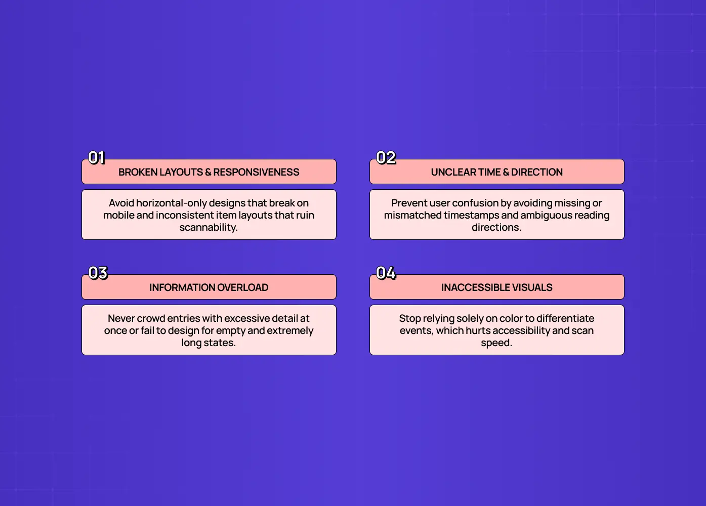
The recurring failures are easy to name:
Using a horizontal timeline with no responsive fallback, so it breaks on mobile
Omitting or inconsistently formatting timestamps
Overloading each entry with detail instead of using progressive disclosure
Relying on color alone to distinguish event types
Inconsistent item layouts that kill scannability
Unclear direction, so users can't tell which way time flows
Ignoring what happens when the timeline is empty or extremely long
Nearly every hard-to-follow timeline is a combination of these, which makes them a quick checklist to run before you ship.
Don't forget the empty and loading states
Most timeline designs show the happy path, a full, tidy sequence of events, and forget what users actually see first:
A brand-new account has an empty activity feed
A just-placed order has a tracker with only one step done
A fresh project has a roadmap with nothing on it yet
Design these states on purpose. An empty timeline should explain what will appear and, ideally, nudge the first action (for example, "Activity will show up as your team makes changes"). A loading state should hint at the timeline's shape, using skeleton markers and lines, rather than a blank space or a jarring spinner, so the layout doesn't jump when data arrives. And for very long or paginated timelines, make the "load more" or infinite-scroll behavior smooth, and clearly signal when the user has reached the end. These edge states are where real products live, and handling them gracefully is what separates a polished timeline from a demo that only looks good when it's full.
Conclusion
A timeline is one of the most useful patterns in interface design precisely because it turns "what happened, and when" into something you can grasp at a glance, but only when it's designed with intent. Getting there comes down to a short list of decisions:
Choose the right type (vertical, horizontal, activity feed, roadmap, or expandable) for your content and context
Make direction and chronological order unmistakable
Use timestamps that are clear, consistent, and matched to the use case
Apply visual cues like icons, colors, or avatars with restraint
Keep the layout consistent so the timeline stays scannable
Disclose detail progressively instead of cramming every entry
Design for responsiveness and accessibility from the start
Plan for empty, loading, and very long states, not just the happy path
Do that, and your timeline becomes invisible in the best way: users just follow the story.
If you want a product design partner who gets the component-level details right, timelines, feeds, trackers, and all, book a discovery call with Groto. We design the small patterns that make complex products feel simple. Let's make every sequence in your product easy to follow.