
From five minute paper sketches to fully coded builds, we broke down 13 prototype formats design teams rely on, organized by fidelity level, so you can match the right example to your project stage instead of guessing.
13 prototype examples design teams actually use, organized by fidelity so you know exactly where to start.

TL;DR
We rounded up 13 prototype examples that design teams actually use, from paper sketches to coded functional builds, organized by fidelity so you know exactly which one fits your project stage. You'll also find a quick framework for choosing the right prototype, a real example from our own work with PathwaysX, and answers to the questions people ask most about prototyping. No fluff, just what you need to pick the right prototype the first time.
What is a prototype
A prototype is any early representation of a product built to test an idea before real development begins. It can be a rough sketch on a napkin, a clickable Figma file, or a working piece of code.
In practice, prototypes exist to:
Test whether a flow or idea makes sense before committing engineering time
Surface usability problems while they're still cheap to fix
Give stakeholders something tangible to react to instead of debating abstractions
Validate technical feasibility before a team commits real budget
Build stakeholder or investor confidence in a direction before it's fully built
In design thinking, prototyping sits right after ideation and right before testing, which is exactly why picking the right example matters so much. Mapping this step to the wider UX design process ensures you do not waste time polishing concepts early. Pick the wrong one and you either waste time polishing something nobody needed yet, or you test with something too rough to reveal real problems.
Matching the format to the stage is the whole game, and it's a decision worth making deliberately rather than defaulting to whatever tool happens to be open.
We've written before about what makes a strong UX prototype and how wireframes differ from prototypes, so we won't repeat that ground here. Instead, this is a practical, design specific look at the actual formats teams reach for, and when each one earns its place in your process.
The tools have changed more than the logic:
Sketches used to be common; now they're just as often a rough frame in Figma, Sketch, or Adobe XD.
Interactive prototypes used to require specialized platforms; now UX design tools like ProtoPie, Framer, and Figma let designers build clickable experiences without writing code.
What hasn't changed is the underlying logic: every prototype exists to answer a specific question, and the format you choose should match the question you're actually asking
The fidelity spectrum at a glance
Fidelity just means how close a prototype looks and behaves to the finished product. Everything below moves left to right, from fastest-and-roughest to slowest-and-closest-to-real.
Type | Fidelity | Best For | Typical Tool |
Paper prototypes | Low | Fast concept testing | Pen, paper, Miro |
Storyboards | Low | Journey and emotion mapping | Sketch, slide deck |
Wireframes | Low to mid | Structure hierarchy | Figma, Balsamiq |
Mockups | Mid to high | Visual sign-off | Figma |
Wizard of Oz | Mid | Demand Validation | Manual backend |
Video prototypes | Mid | Stakeholder pitches | Screen recording |
Clickable prototypes | Mid to high | Usability testing | Figma, Framer |
Proof of concept | Mid to high | Technical feasibility | Code, no-code tools |
AI-generated prototypes | Mid to high | Rapid first drafts | Figma Make, UXPin Forge |
Physical Mockups | Varies | Ergonomics, scale | 3D printing, foamcore |
Functional prototypes | High | Realistic logic and data | UXPin, Axure |
Coded prototypes | High | Production-close testing | Front end code |
MVP | High | Real-world validation | Live product |
13 prototype types you'll actually use in a design process
1. Paper prototypes and sketches
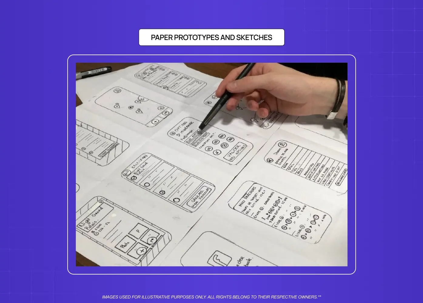
This is the fastest way to get an idea out of your head and in front of someone else. A few boxes, arrows, and labels on paper can tell you whether a flow makes sense before anyone opens a design tool.
Best for: early brainstorming, when you want honest, unfiltered feedback fast
How teams build it: pen, paper, or a quick frame in Figma or Miro
Why it works: costs almost nothing, so you can test three or four ideas in an afternoon
Move on when: the team agrees on a direction and needs to test structure, not just concept
2. Storyboards
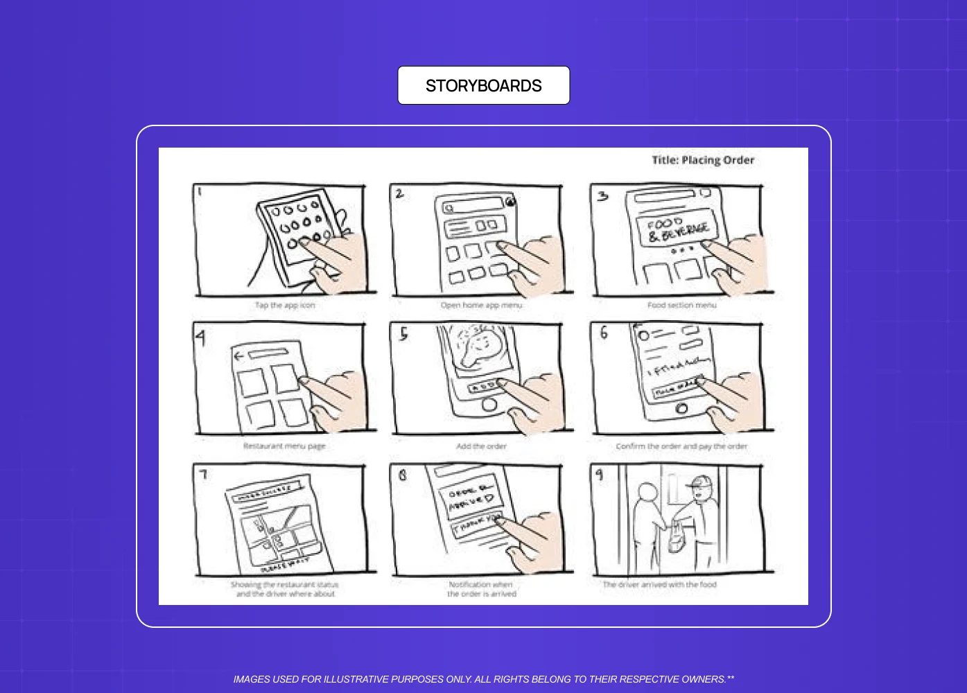
A storyboard maps how a user moves through a product over time, almost like a comic strip. It's less about individual screens and more about context, showing where the user is and why they need your product at that moment.
Best for: onboarding flows or multi step journeys where sequence and emotion matter
How teams build it: simple panels showing user, context, and action, sketched or built in a slide tool
Why it works: gives non designers, like founders or engineers, an easy way to spot gaps
Move on when: the journey is agreed on and individual screens need testing
3. Wireframes
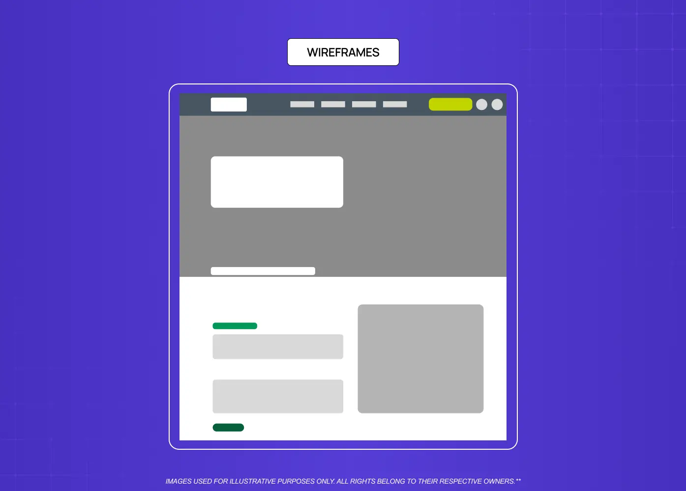
Wireframes strip away color, imagery, and branding to focus purely on structure and hierarchy. They're the backbone of most digital projects because they force a conversation about what goes where.
Best for: agreeing on layout and hierarchy before visual design begins
How teams build it: basic shapes and placeholder text in Figma, walked through screen by screen
Why it works: with no visual polish to react to, structural problems surface early
Move on when: layout is validated and the flow needs to feel and behave like the real thing
For a deeper breakdown, our wireframes versus prototypes guide covers this stage in detail.
4. Mockups
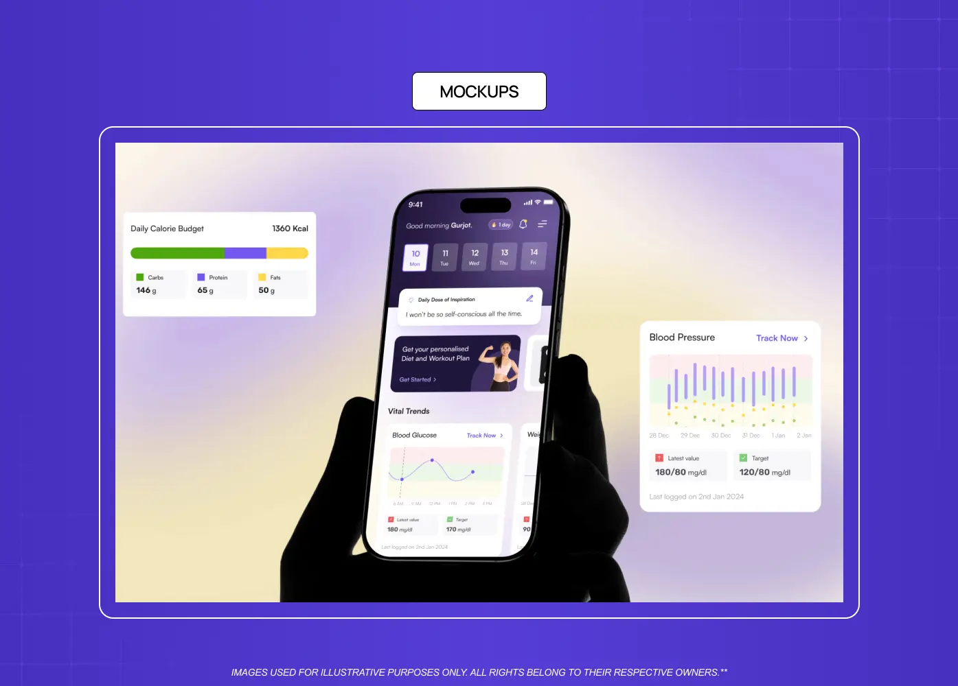
A mockup is a static, full-visual-design version of a screen, with real colors, type, and imagery, but no interaction. It's the stage between "does the layout work" and "can users click through it."
Best for: getting stakeholder sign-off on visual direction before building interaction
How teams build high-fidelity wireframes in Figma, styled with the real design system.
Why it works: separates visual feedback from usability feedback, so people don't confuse the two
Move on when: the look is approved and it's time to test how it actually behaves
5. Wizard of Oz prototypes.
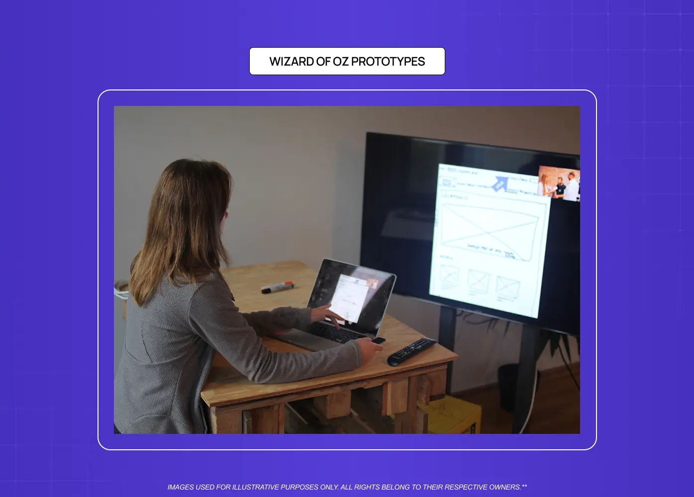
In a Wizard of Oz prototype, a real person manually handles tasks a system will eventually automate, while the user believes they're interacting with a finished feature.
Best for: testing demand for an automated feature before building the automation
How teams build it: a human manually fulfilling requests behind a simple front end
Why it works: early ride hailing apps reportedly used human dispatchers before matching algorithms existed, and Zappos famously validated online shoe demand by having its founder manually buy and ship shoes from local stores before building any inventory system
Move on when: demand is confirmed and it's time to build the real automation, especially useful for AI features where the model isn't ready yet
6. Video prototypes

A video prototype shows how a product will work through a short demo or screen recording rather than a live, clickable file.
Best for: pitching an idea to stakeholders or investors quickly
How teams build it: a narrated walkthrough or screen recording of a mocked up flow
Why it works: Dropbox's early explainer video reportedly helped validate demand for file syncing before the product existed
Move on when: the pitch lands and the team needs a testable, interactive version
7. Clickable and interactive prototypes
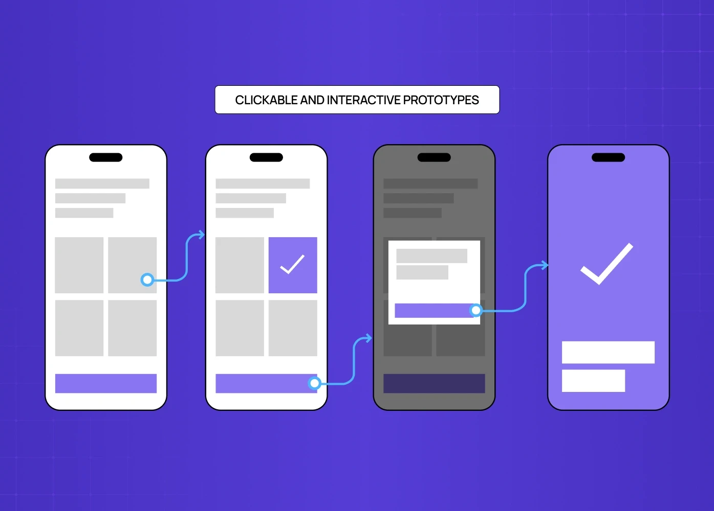
These are the prototypes most designers picture first: linked screens in Figma or a similar tool that users can actually click through.
Best for: usability testing before any development starts
How teams build it: linked frames with real interactions, transitions, and states
Why it works: closely enough that feedback reflects the actual experience, and analyzing modern interactive website examples helps establish standard patterns before building.
From our own work
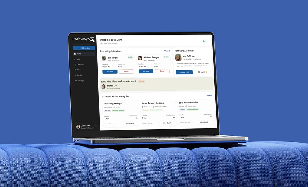
The question we were testing: could one platform serve candidates, startup clients, and internal talent teams without feeling cluttered or confusing to any of them.
Fidelities we moved through: wireframes, then a full UI system, then high fidelity, interactive prototypes covering job creation, candidate assessments, and interview scheduling.
The outcome: flows were validated with stakeholders before a single line of production code was written, and the platform later earned direct praise from the PathwaysX team for how intuitive the finished UX felt.
8. Proof of concept prototypes
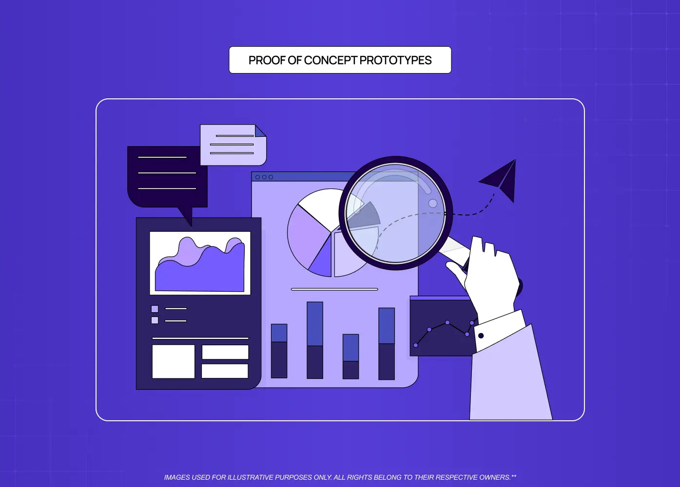
A proof of concept is less about how something looks and more about whether it can work at all. This is a common example of prototype technology in action.
Best for: confirming technical feasibility before committing real budget
How teams build it: engineers build a stripped down version of a feature, often headless or barely styled
Why it works: answers "can we build this" before "should we build this" becomes expensive to walk back
Who's involved: design teams aren't usually leading this stage, but stay looped in so the technical exploration doesn't drift from the user need
9. AI-generated prototypes
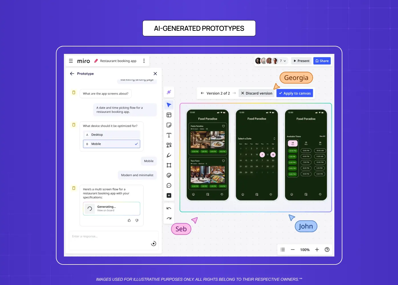
A newer addition to the list. Tools like Figma Make and UXPin Forge — a fast-growing category of AI prototype builders — can turn a text prompt, screenshot, or URL into a rough interactive prototype in minutes, using an existing component library where one's connected.
Best for: getting a rough first draft on screen fast, especially when starting from a blank page
How teams build it: a written prompt or reference image fed into the tool, then refined by a designer
Why it works: removes the blank-canvas problem, though the output still needs design judgment before it's usable
Move on when: the direction feels right and it needs a designer's hand to fix spacing, hierarchy, and edge cases the AI won't catch
10. Physical and 3D mockups
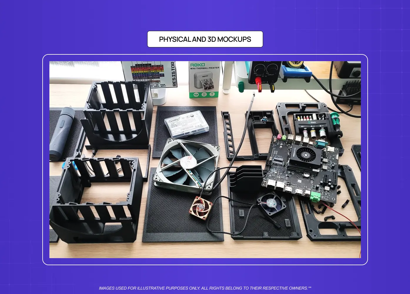
Not every product lives on a screen. For hardware, packaging, or physical touchpoints connected to a digital product, teams build tangible models to test scale and ergonomics.
Best for: testing how something feels in someone's hands, not just how it looks on screen
How teams build it: 3D printed parts, foamcore, or cardboard models
Why it works: a digital mockup alone can't tell you whether a button sits comfortably under a thumb
Common use cases: prototype examples in real life settings show up most in consumer electronics, medical devices, retail packaging, and physical devices that house software, like kiosks or wearables
11. Functional prototypes
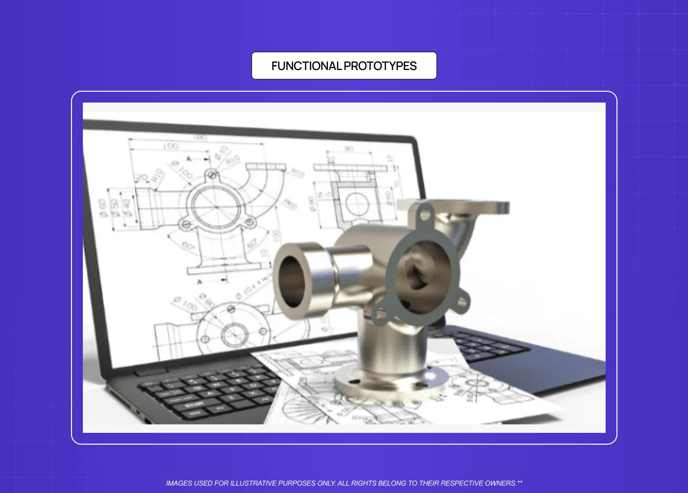
A functional prototype behaves like the real product, including live data and working logic, but it's often built in an advanced no-code tool rather than raw code.
Best for: testing real logic and data flows without a full engineering build
How teams build it: advanced prototyping tools like UXPin or Axure that support conditional logic and live data
Why it works: closer to real behavior than a clickable prototype, without needing a developer
Move on when: the logic is validated and the team needs to test actual production performance
12. Coded prototypes
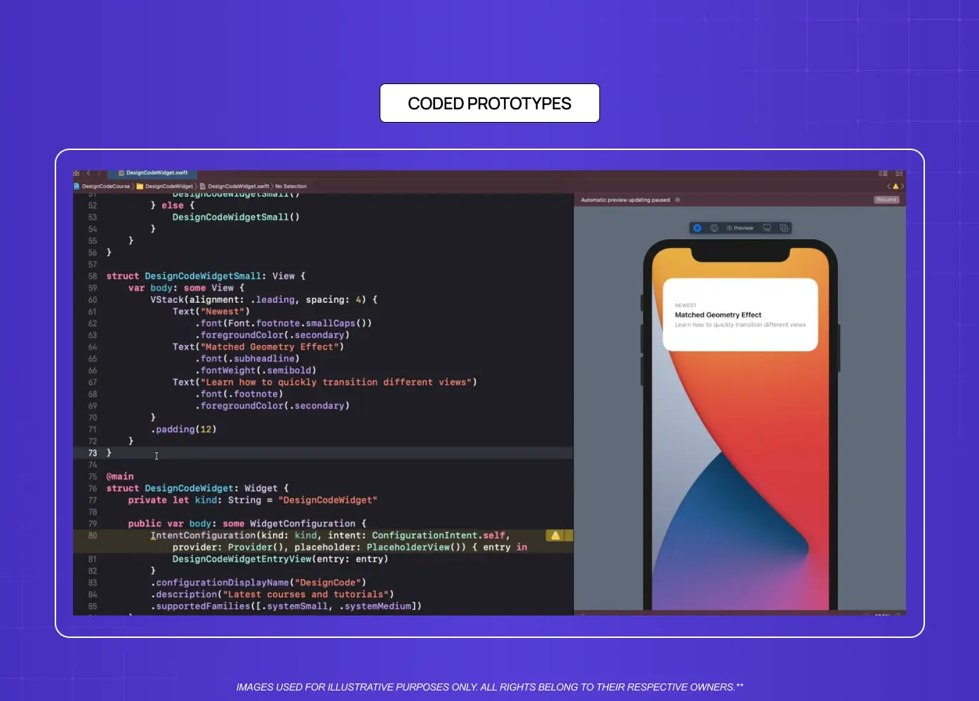
A coded prototype uses real front end code instead of design software, which means it behaves closer to the finished product, including load times, animations, and edge cases.
Best for: testing complex interactions that no-code tools can't fully replicate
How teams build it: real code covering load times, animations, and edge cases
Why it works: parts of the coded prototype can sometimes carry over into the actual build
Who's involved: designers who can work in code, or pair closely with a front end developer, catch inconsistencies a static file can't reveal
13. Minimum viable products
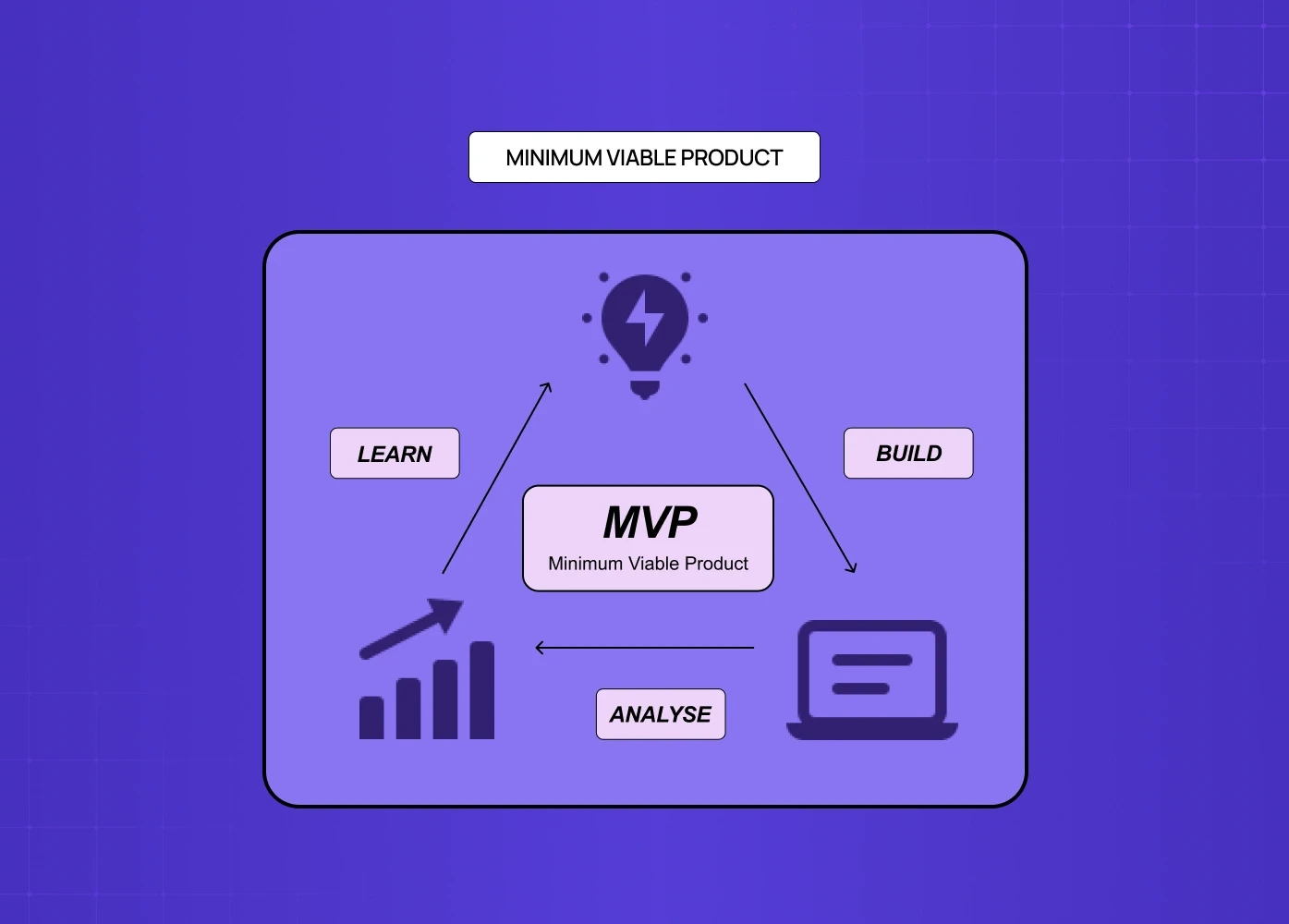
An MVP is technically a live product, not just a prototype, but it belongs on this list because it's still built to test a hypothesis rather than serve every possible user.
Best for: testing a hypothesis with real users and real usage data
How teams build it: the smallest feature set that fully solves one core problem — a disciplined exercise in MVP scoping
Why it works: real world usage reveals things a moderated test never will
Watch out for: it's the riskiest prototype to skip ahead to, since real users won't forgive rough edges
5 prototyping mistakes to avoid
Building high fidelity too early, which hides structural flaws behind good visuals since reviewers react to the finish rather than the logic underneath
Showing a rough sketch too late, which makes stakeholders lose confidence in work that's actually solid, simply because it doesn't look ready
Jumping straight to high fidelity, which skips the structural conversation low fidelity wireframes are built to have.
Testing with a prototype that's too polished to invite honest feedback, since people hesitate to criticize something that looks finished
Skipping user testing entirely once a prototype looks good enough to ship, when looking good and working well aren't the same thing.
How to choose the right prototype for your project stage
None of these formats is inherently better than another. A paper sketch isn't a lesser version of a coded prototype, it's simply built to answer a different question, at a different point in the process, for a different audience.
What are you trying to learn
If you're testing whether a flow makes sense, start low fidelity with sketches or wireframes
If you're testing whether users like the experience, move to clickable prototypes
If you're testing whether something is technically possible, build a proof of concept instead
Who will see it
Internal team reviews can work with rough, low fidelity formats since the goal is alignment, not polish
Stakeholder pitches or investor demos usually need higher fidelity, like video or clickable prototypes
User testing sessions need enough fidelity that people forget they're not using a real product
How much time and budget you have
Early stage or resource constrained teams should default to the lowest fidelity option that still answers the question
Later stage teams preparing for launch can justify coded or near final prototypes, since the cost of getting it wrong is higher
What stage of design thinking you're in
Early ideation favors sketches and storyboards, when the goal is generating and filtering ideas
Mid stage validation favors wireframes and clickable prototypes, once a direction is chosen and needs testing
Late stage testing favors coded prototypes or MVPs, when you're confirming readiness for real users
How to build a prototype in 5 steps
Define the question: get specific about what you're actually trying to learn before picking a format
Pick your fidelity: match the format to the question, not to how impressive you want it to look
Build it: keep the build time proportional to the stage of the project. To smooth the transition from wireframe to prototype, follow our step-by-step blueprint.
Test it: put it in front of the right audience, internal team, stakeholders, or real users, depending on the goal
Decide the next step: use what you learned to either move to a higher fidelity prototype or go back and rethink the idea
Conclusion
These prototype examples cover the full range from a five minute sketch to a fully coded build, and the right one always depends on what you're trying to learn, not how impressive it looks.
Match fidelity to your goal, not your ambition
Start rougher than feels comfortable, since low fidelity prototypes invite more honest feedback
Move to clickable or coded prototypes only once your structure and flow are validated
Use physical mockups when a product has a real world, tactile component
Treat every prototype as a question you're asking users, not a finished answer
If you're weighing which prototype fits your next project, we'd be glad to walk through it with you. Book a call with our team and we'll help you figure out exactly where to start.