Most websites treat the footer as an afterthought. The best ones treat it as a design decision. Here is everything you need to know to build a footer that works as hard as the rest of the page.
Footer design done right builds trust, guides users, and closes the page well.

TL;DR
A footer is the section at the very bottom of every webpage. Done right, it serves as a trust signal, a navigation fallback, and a quiet conversion driver. This blog covers what a well-considered footer design includes, the different structural patterns designers use, the visual principles behind effective footers, and the most common mistakes that make footers fail.
Most designers spend most of their time crafting above-the-fold experiences. The hero section, the navigation, the first scroll, and all the elements of homepage design get enormous attention. The footer? It tends to get whatever time is left. And that is a mistake.
A study by Smart Insights found that sales conversions rose by nearly 24% after implementing a structured footer with organized links.
Users do scroll to the bottom.
They go there specifically when they are looking for something they could not find higher up, whether that is contact information, legal policies, or secondary navigation. Neglecting that section of a page means leaving real intent on the table.
At Groto, footer design is not an afterthought in any project we take on. When we worked on the Meydan FZ website redesign, every section of the page was treated as a deliberate design decision, including the footer, which had to carry compliance information, clear navigation, and a brand-consistent visual language for an international freezone audience. Getting that right required the same level of intention we gave to the hero and the conversion sections.
This blog breaks down what a strong footer design actually involves, from the elements and structural patterns to the visual principles and mistakes worth avoiding.
What Is a Footer in Web Design?
Have you ever reached the bottom of a website looking for a contact email, social media link, or pricing page? Chances are, the first place you checked was the footer.
A website footer is the section that appears at the bottom of every page, below the main content. While it marks the end of a page, its role goes far beyond wrapping things up. It gives visitors quick access to important information, additional navigation, and clear next steps after they've finished exploring.
The idea comes from print design, where footers displayed consistent information across every page of a document. On websites, they've evolved into a practical navigation tool. A well-designed footer helps users find contact details, explore key pages, access legal information, sign up for updates, or continue their journey through the site.
In the past, footers were often treated as an afterthought, containing only the bare essentials or becoming a catch-all for miscellaneous links. Today, they shape the user experience and are a cornerstone of modern web design as a whole. A thoughtfully designed footer reinforces trust, improves navigation, and creates more opportunities for engagement and conversions without interrupting the browsing experience.
Why Users Actually Go to the Footer
Research by the Nielsen Norman Group shows that users usually scroll to the footer for one of two reasons:
The first is that they couldn't find what they were looking for elsewhere on the page. This often includes information like careers, investor relations, press resources, or other secondary pages that aren't featured in the main navigation.
The second reason is even simpler: users expect certain information to be in the footer. Contact details, privacy policies, terms of service, social media links, and copyright information have become standard footer elements after years of consistent web design patterns.
This is why a website footer is much more than extra space at the bottom of a page. By the time someone reaches it, they usually have a specific goal in mind. A clear, organized footer helps them complete that task quickly, creating a smoother user experience while increasing the chances they'll take the next step.
What to Include in a Website Footer
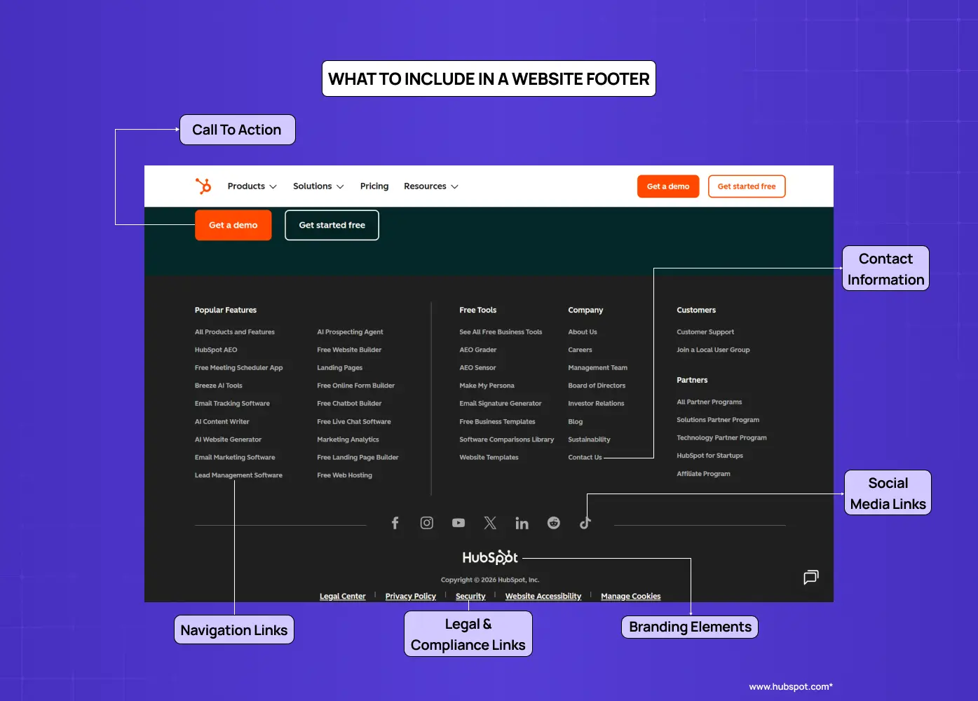
The exact contents of any footer will depend on the type of site and the audience it serves. That said, certain elements are considered standard across nearly all website footer designs.
Contact information
Phone numbers, email addresses, and physical addresses give users immediate access to reach the business. Even for primarily digital products, a visible contact point builds trust.
Navigation links
A condensed version of the global navigation, or a sitemap-style listing of key pages, helps users jump to sections without scrolling back to the top. This is especially useful on long, scroll-heavy pages.
Legal and compliance links
Privacy policy, terms of service, and copyright notices are the baseline expectation. For sites serving EU or California users, the distinction between a cookie-consent banner and a footer cookie-policy link matters: the banner handles active consent, the footer link gives users persistent access to the full policy. GDPR and CCPA compliance obligations are not satisfied by the footer link alone, but omitting it creates a visible gap in transparency. An accessibility statement link is increasingly expected, particularly for public-sector and enterprise-facing sites.
Social media links
Icons linking to active social profiles encourage ongoing engagement beyond the site. The NNGroup recommends only embedding live social feeds for brands that post frequently enough to keep the content fresh.
Call to action
A footer CTA, along with other essential conversion elements, can be a newsletter signup form, a "Book a call" button, or a way to start a free trial. It serves users who have read through the page and are ready to act without requiring them to scroll back up.
On long, scroll-heavy pages, a back-to-top button belongs here too, reducing friction for users who have reached the bottom and want to return without effort. Content-heavy sites and ecommerce stores can also benefit from a footer search field for users who arrive at the bottom still hunting for something specific.
Branding elements
The logo, a short tagline, or a mission line reinforces brand identity at the close of the browsing experience. It ties the footer visually to the rest of the site rather than leaving it feeling detached.
Awards and testimonials
For newer brands or companies with less name recognition, the footer is a low-pressure place to surface credibility signals. A certification badge, a press mention, or a short testimonial can do real work here without cluttering the main content.
Types of Footer Design Patterns
One of the most useful frameworks for footer design comes from NNGroup's categorization of footer patterns. Understanding these helps in choosing the right structure for the site type.
Utility Footer
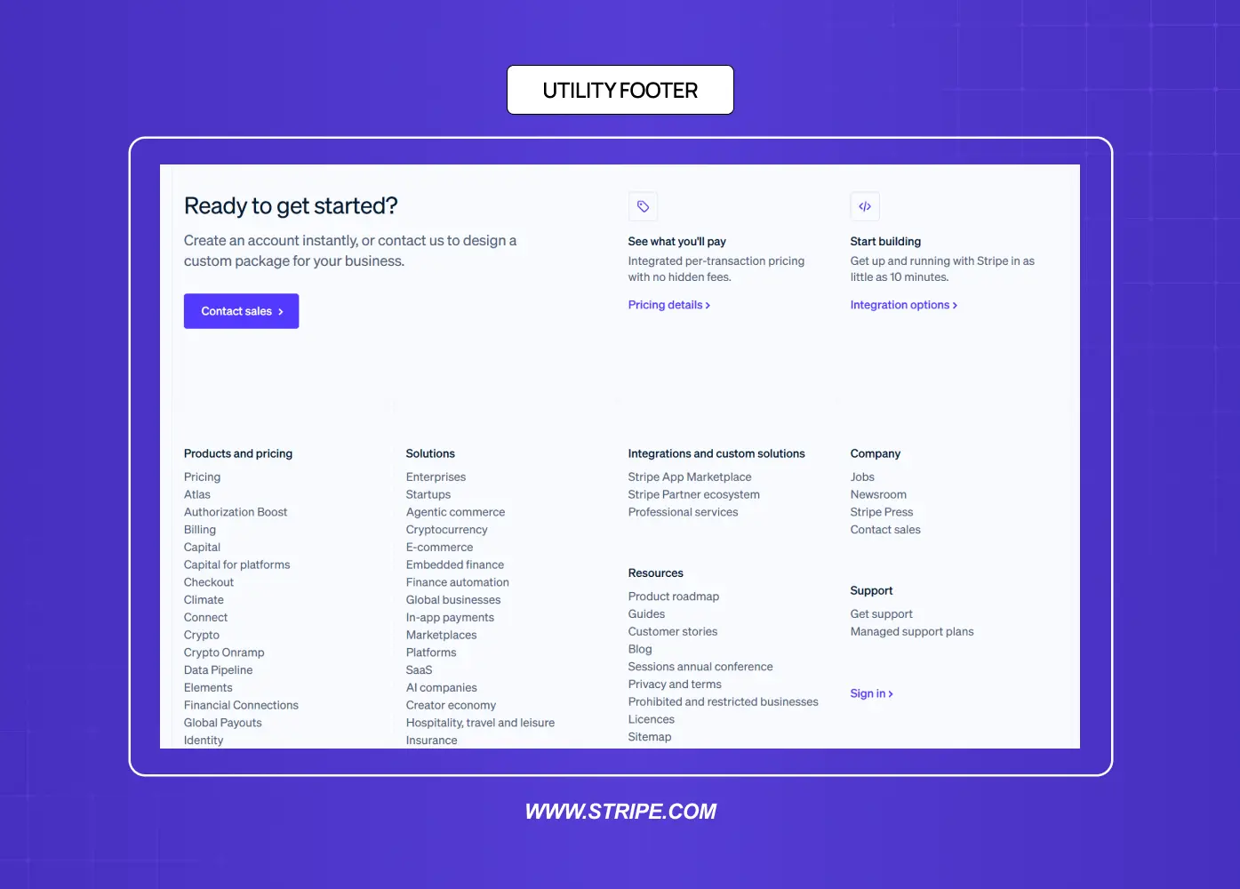
The baseline approach. This includes contact information, privacy policy, terms of use, and social links. It is the minimum expected from any professional site and works across all website types.
Doormat Navigation Footer
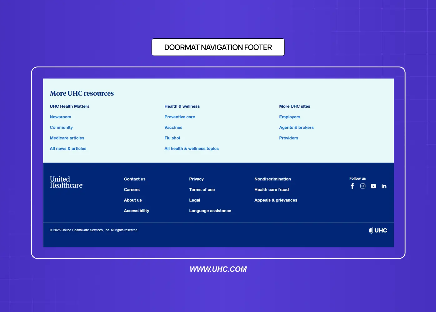
A doormat footer mirrors the primary navigation at the bottom of the page. The same top-level categories appear both in the header and in the footer, giving users a second entry point into the site's structure. This works well on sites with long pages where the global navigation disappears from view.
Sitemap-Style Footer
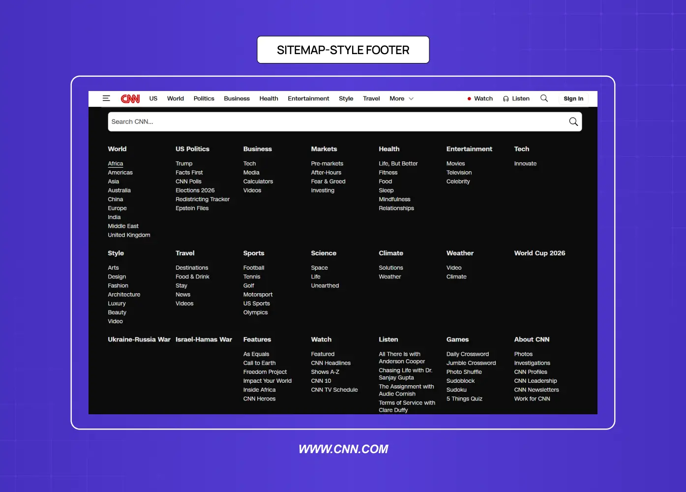
A more expansive version that exposes subcategories within each main section. This is useful for large sites with multiple content tiers. It increases discoverability of deeper pages without changing the header navigation. The risk is overcrowding, so most designers limit it to two levels of hierarchy maximum.
Secondary Task Footer
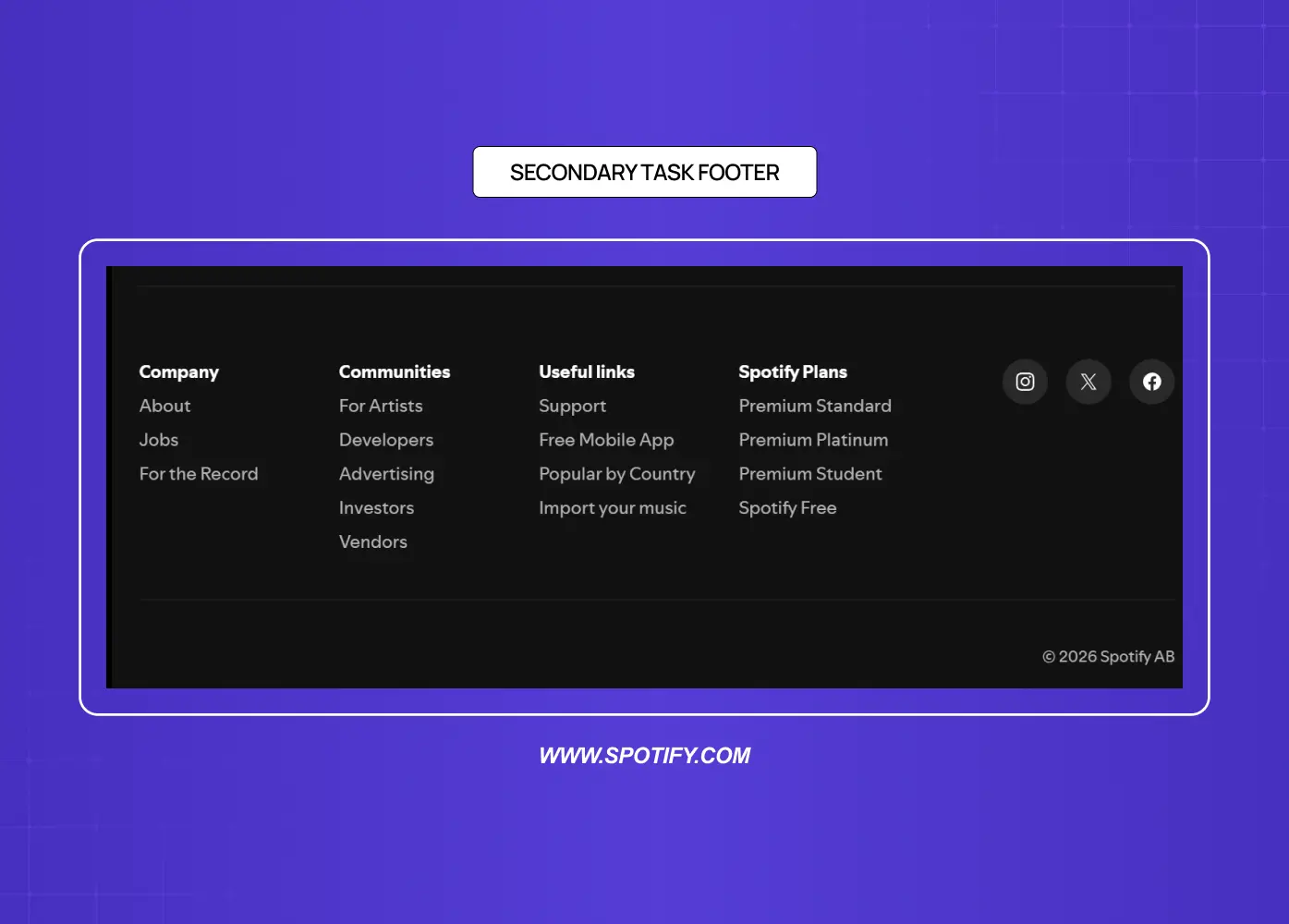
Some footers include links to content that falls outside the primary user journey: career listings, affiliate programs, press information, or content creator tools. These serve secondary audiences without cluttering the main interface.
Customer Engagement Footer
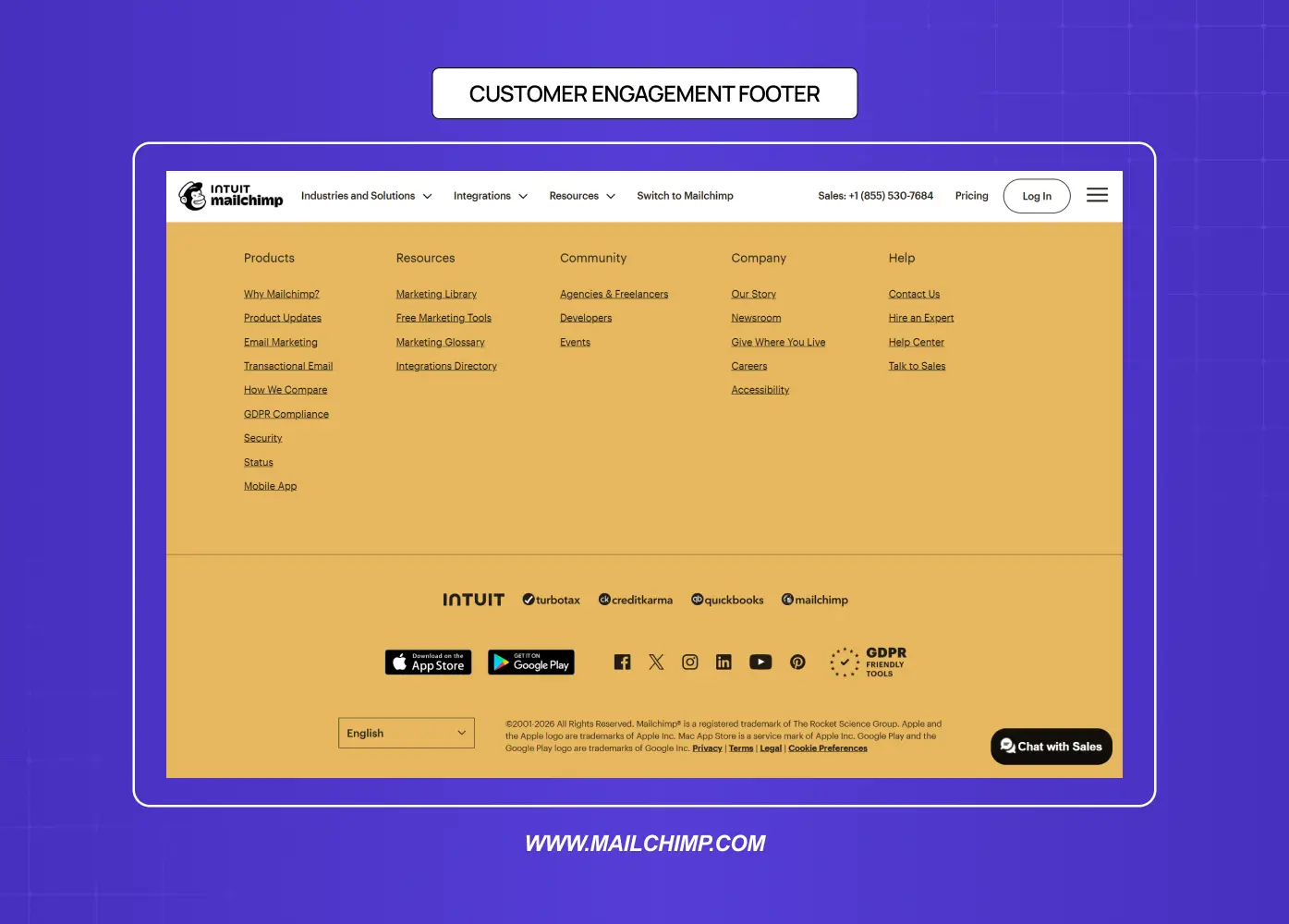
Built around mailing list signups, social media embeds, or promotional offers. Common for lifestyle brands, e-commerce sites, and content-heavy publications. The goal is to keep users connected after they leave the page.
Mini Footer (Infinite Scroll)
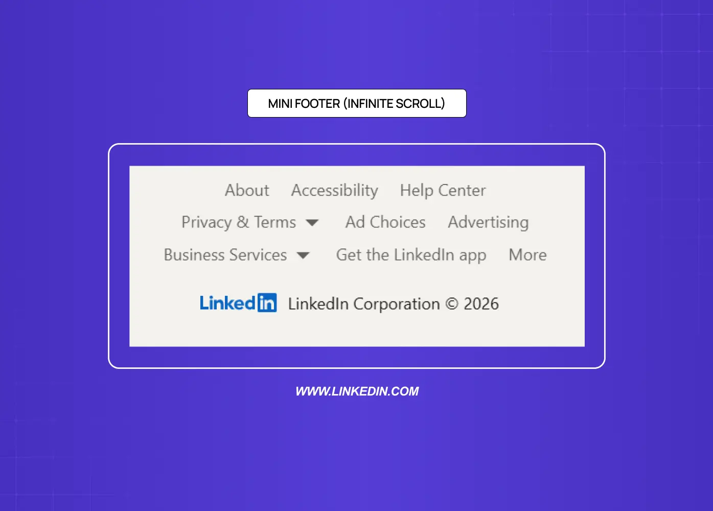
On pages that use infinite scroll, a traditional footer never reaches the user. Designers solve this by placing utility links in a sticky right rail or inside the expanded global navigation. LinkedIn is the most frequently cited example of this pattern.
Footer Design by Site Type
The right footer structure depends entirely on what the site is built to do. A single general model does not transfer cleanly across contexts.
Ecommerce
An ecommerce footer carries more functional weight than almost any other site type. Users arrive here looking for trust signals and operational information before committing to a purchase. Essential elements include: trust badges and payment method icons, shipping and returns policy links, customer service contact and live chat access, order tracking, and a size guide or FAQ link if relevant. The goal is to reduce purchase hesitation at the moment of highest intent.
SaaS and Web Apps
There is an important distinction here between the marketing site footer and the in-app footer. The marketing site footer can be navigation-heavy and conversion-focused. The in-app footer should be minimal: a status page link, documentation, keyboard shortcut reference, security and compliance pages, and legal. Users inside the product are trying to complete a task, not explore the brand.
Marketing and Brand Sites
This is the context where footer design has the most creative latitude. Navigation depth, brand expression, newsletter signups, and social links all belong here. The footer can carry the full weight of the brand's visual identity and still be functional. Our work on the &Circus redesign and the Meydan FZ site both fell into this category, where the footer had to serve compliance and navigation requirements while staying visually consistent with a strong brand system.
Portfolio and Personal Brand Sites
Less is more. A portfolio footer needs a contact link or email address, one clear CTA (whether that is "Available for work" or "Book a call"), relevant social or professional profile links, and minimal legal text. A cluttered portfolio footer competes with the work itself.
Visual Design Principles for Footers
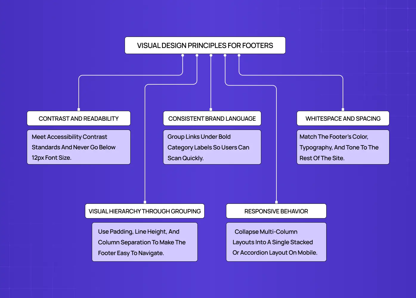
Getting the functional structure right is step one. Making the footer feel intentional from a visual standpoint is where the real design work happens.
Contrast and readability
Footer text needs to be readable. Low-contrast text on a dark background is one of the most common complaints in footer usability testing. Whether the background is dark or light, the text color should meet accessibility contrast standards, and font sizes in the footer should not drop below 16px on mobile.
Beyond contrast, footer accessibility requires a minimum touch target of 44x44px for all mobile links and social icons, keyboard navigability across all footer links, a semantic HTML5 <footer> element so screen readers announce the region correctly, and descriptive link text in place of generic labels like "click here" or "more."
Visual hierarchy through grouping
Links in a footer should be grouped under clear category labels, not listed in a single undifferentiated column. Grouping by "Company," "Legal," "Social," or "Services" helps users scan quickly. Bold or slightly larger type for category headers creates clear visual hierarchy and visual weight.
Consistent brand language
The footer should feel like the same website the user just scrolled through. Matching the color palette, typography, and tone to the rest of the site prevents the jarring experience of a footer that looks like it was designed separately or imported from a template. A simple footer design can still be a branded one.
Whitespace and spacing
Dense footers with no breathing room are harder to navigate and signal a lack of editorial care. Padding between sections, generous line height, and clear separation between columns all improve scanability without requiring more real estate.
Desktop footers most commonly use a 3 to 5 column grid layout, with 4 being the practical standard for mid-size sites. Each category group should contain 4 to 7 links, and column gutters should stay consistent with the spacing system used across the rest of the page.
Responsive behavior
Footer layouts built as multi-column grids need to collapse cleanly to fit a mobile-first responsive design. The most common approach is a single-column stacked layout on small screens, with expandable accordion sections for sites with more content. Testing footer responsiveness is easy to skip and almost always worth doing.
Email Footer Design: A Separate Discipline
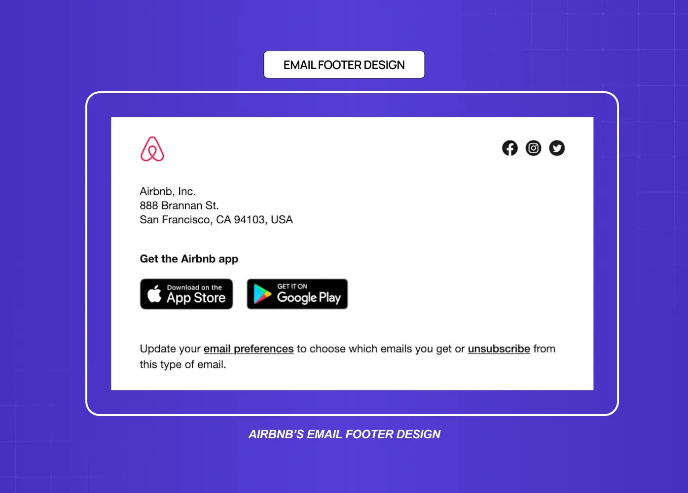
Email footer design follows its own rules and deserves its own attention. While a webpage footer is largely about navigation and trust, an email footer has legal and operational requirements baked in.
Under laws like CAN-SPAM and GDPR, marketing emails must include a physical mailing address, an unsubscribe link, and clear sender identification. These are not optional. The email footer is also where users look when they want to manage preferences, update their contact information, or report spam.
From a visual standpoint, a well-designed email footer is typically minimal. It mirrors the brand's color palette, uses small but legible type, and does not compete with the email's primary call to action. Social media icons are common. A short brand tagline is increasingly used to reinforce identity at the close of the message.
The biggest mistake in email footer design is treating it as purely administrative. A thoughtfully designed email footer, even with required legal text, can still feel on-brand and considered.
Common Footer Design Mistakes to Avoid
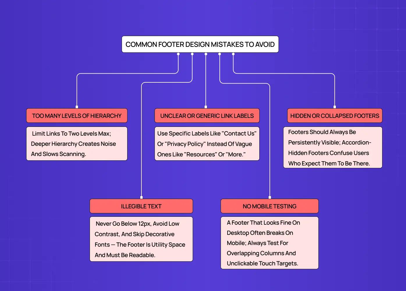
Even experienced design teams make footer mistakes. These are the ones we see most often.
Too many levels of hierarchy
A footer is not the place for the entire sitemap. More than two levels of link hierarchy creates visual noise and slows scanning. Prioritize the top two levels and surface only the specific lower-level pages that genuinely need discoverability.
Unclear or generic link labels
Labels like "Resources" or "More" leave users guessing. Conventional, specific labels, "Contact Us," "Privacy Policy," "Careers," perform significantly better in usability testing. When teams are unsure between two label options, a card sort is a fast way to find the more intuitive choice.
Hidden or collapsed footers
Some sites hide the footer behind an accordion interaction or use an animation that collapses it until triggered. This pattern confuses users who expect the footer to be persistently visible. Unless the design is specifically for a page with infinite scroll, the footer should always be immediately accessible.
Illegible text
Tiny footer type is one of the oldest web design habits and one of the hardest to kill. Font sizes below 12px, low contrast color choices, and decorative fonts all reduce legibility. The footer is utility space, and utility space needs to be usable.
No mobile testing
A footer that looks balanced on desktop often breaks at mobile widths. Overlapping columns, truncated links, and unclickable small touch targets are all common results of untested responsive footer behavior.
Footer SEO: What Actually Helps (and What Does Not)
The footer has a real but limited role in SEO, and misunderstanding that limit causes more harm than good.
Internal links in the footer aid crawlability. Search engine bots follow footer links to discover deep pages that may not be prominently linked elsewhere on the site. Those links also distribute a small amount of link equity. That said, Google weights footer links significantly lower than in-body links and primary navigation links, so the footer should serve genuine user navigation, not keyword strategy.
A few practical rules: use descriptive anchor text rather than generic labels like "click here" or "learn more." Only link to pages that are genuinely useful to a user who has reached the bottom of the page. Avoid site-wide boilerplate footers stuffed with keyword-rich anchor text. Google treats that pattern as a spam signal, and it has been a negative ranking factor for over a decade.
The footer is a secondary linking opportunity, not a primary one. Use it to surface pages your main navigation does not, and leave the SEO heavy lifting to your body content and internal linking structure.
The Footer as a Last Impression
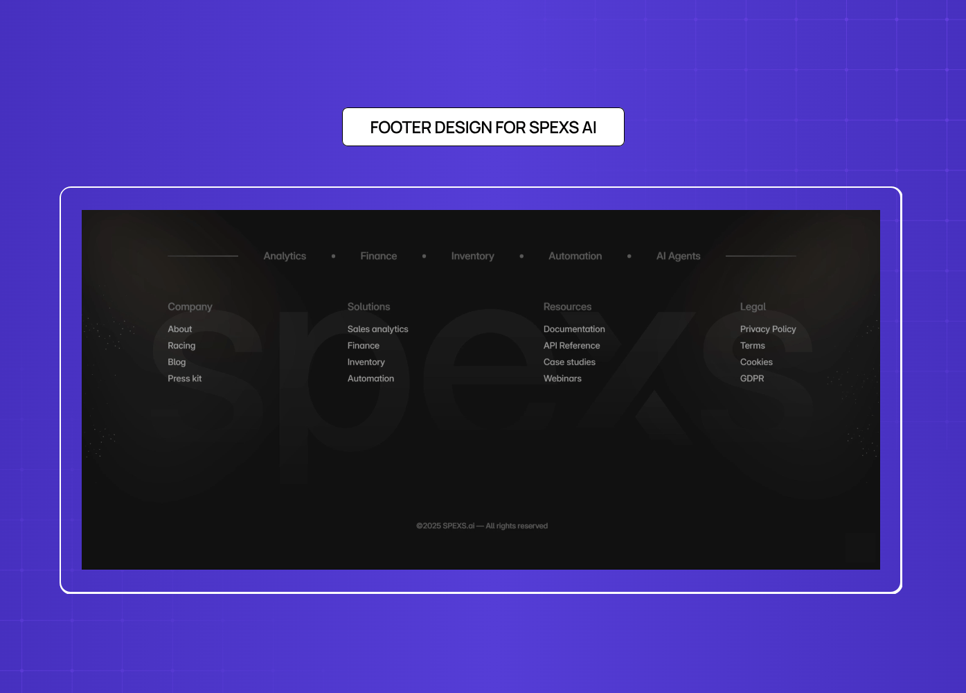
Shown above is an example from one of our projects, Spexs.ai.
The footer is the last thing a considered visitor sees before they leave or convert. That makes it more than just a utility zone, and one of the simpler web design changes that transforms your website's performance. A templated footer quietly signals a templated company. A footer that carries the visual language, the tone, and the intentionality of the rest of the page tells users something about how the brand operates at every level of detail.
When we worked on the &Circus ecommerce redesign, the footer had to continue the playful, inclusive energy of the brand while surfacing shopping categories, policy pages, and social links clearly. The solution used the brand's signature color as the footer background, a structured two-column layout, and typographic choices that felt consistent with the rest of the site rather than imported from a default theme.
The Meydan FZ footer faced a different set of demands: international compliance information, multi-audience navigation, and brand consistency for a freezone operating at scale. Both projects required the footer to close the page with the same level of intention we gave to the hero and conversion sections.
Every section of a page communicates something. The footer should close that communication deliberately.
Footer Copywriting: The Lines Most Teams Write Last
The footer microcopy gets less attention than almost any other part of the page, and it shows. These are the patterns worth having on hand.
Newsletter prompt variants
"New work, new thinking. No spam, ever."
"Get our latest projects and design insights straight to your inbox."
"Join founders and product teams who follow our work."
CTA phrasing
"Let's build something together."
"Ready to start? Book a call."
"See what we've shipped."
Copyright line formats
© 2025 [Brand Name]. All rights reserved.
© [dynamic year] [Brand Name].
Built by [Brand Name] · © [year]
The dynamic year convention (pulling the current year via JavaScript rather than hardcoding it) is a small but worth-doing detail. A footer that still reads "© 2022" in 2026 signals exactly the kind of neglect this article is arguing against.
Social prompt lines
"Follow the work."
"See it in progress."
"We're on [platform]."
Conclusion
A footer is not a dumping ground. It is a functional design zone with its own structural patterns, visual rules, and user expectations.
Utility links, contact information, legal pages, and social icons are the baseline. Beyond that, the footer type should match the site's goals and audience.
Visual principles like contrast, grouping, whitespace, and consistent brand language apply to footers with the same rigor as any other section.
Email footer design operates under its own requirements, including legal mandates around sender identification and unsubscribe mechanisms.
Common mistakes, hidden footers, tiny text, poor mobile behavior, and unclear link labels, are avoidable with a little deliberate testing.
The best footers feel like they were designed alongside the rest of the page, not after it.