
Every interface asks something of a user's limited mental effort. This guide breaks down cognitive load into its three types, the psychology laws behind it, and eight proven ways designers can reduce it to make products feel effortless.
A practical guide to cognitive load: what it is, why it matters, and how to reduce it.
TL;DR
Cognitive load is the total mental effort someone spends using an interface and completing a task. It draws from a working memory that is strictly limited.
There are three types of this mental effort: intrinsic (the task's natural complexity), extraneous (unnecessary effort caused by poor design), and germane (productive effort spent learning). Designers control extraneous load the most.
High mental load leads to hesitation, errors, and abandonment. Low mental load drives faster task completion, better conversion, and stronger retention.
Four psychology laws explain why certain designs feel heavy: Hick's Law, Miller's Law, recognition over recall, and Jakob's Law.
Reducing this burden comes down to eight practical techniques: cutting clutter, limiting choices, chunking information, using progressive disclosure, favoring recognition, following familiar patterns, building visual hierarchy, and minimizing steps.
Cognitive load sits at the center of almost every meaningful design decision, even when nobody in the room says the phrase out loud. It shows up as the pause before someone clicks a button, the second read of a confusing label, and the quiet moment someone gives up on a form halfway through. Anyone building digital products is, whether they realize it or not, constantly negotiating with the limits of the human mind. Understanding this concept, what causes it, how it splits into different types, and how to work with it rather than against it, is what separates products that feel obvious from ones that feel exhausting.
Every time someone uses your product, they're spending a limited resource: mental effort. Human working memory can only juggle a handful of things at once, famously around seven, and by modern estimates often fewer. When an interface demands more than that, users don't just feel a little friction. They hesitate, make mistakes, get frustrated, and leave. That mental effort has a name, cognitive load, and managing it is one of the most powerful things a designer can do to make a product feel effortless.
This guide explains the concept clearly: what it is, the three types (intrinsic, extraneous, and germane), the psychology laws behind it, and, most importantly, practical, proven ways to reduce it in your designs. Whether you're a designer sharpening your craft or a founder wondering why users drop off, understanding this idea is understanding why some products feel effortless and others feel like work.
What is cognitive load?
Cognitive load is the total amount of mental effort required to use an interface and complete a task. It comes from cognitive load theory, which recognizes that our working memory, the mental "workspace" where we hold and process information, is strictly limited. Every element on a screen, every decision, every thing a user has to remember or figure out draws from that limited pool. When the demand exceeds capacity, performance breaks down: people slow down, err, and abandon.
For designers, this reframes the job entirely. Good design isn't about how much you can put on a screen. It's about how little the user has to think to get what they came for. The goal is to spend the user's mental budget wisely, on the task itself rather than on fighting the interface.
The 3 types of cognitive load
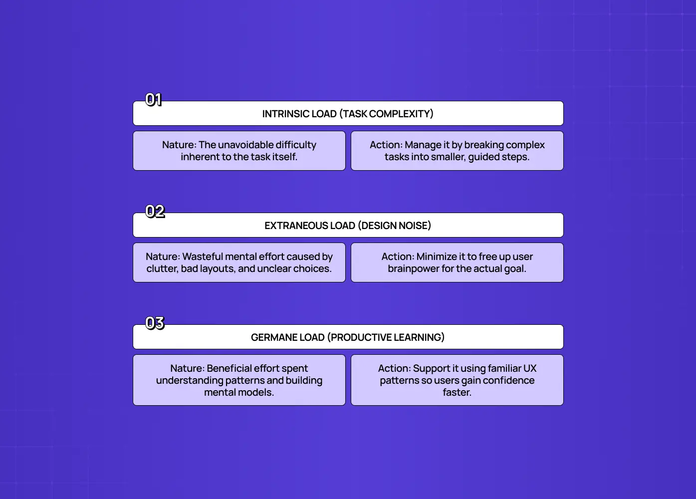
Not all mental effort is equal. The theory identifies three distinct types, and knowing the difference tells you exactly where to focus.
Intrinsic load
This is the mental effort inherent to the task itself, its natural complexity. Filing a tax return is intrinsically harder than reading a headline, regardless of design. You can't eliminate this type of load, but you can manage it by breaking complex tasks into smaller steps and supporting users through them.
Extraneous load
This is the unnecessary effort caused by poor design: clutter, confusing layouts, unclear labels, inconsistent patterns, too many choices. Crucially, this is the type designers control most, because it comes directly from the interface. Every bit of it you remove is a pure win: the user gets that mental capacity back for the actual task. Most of the work of reducing this burden is really about attacking this specific type.
Germane load
This is the productive mental effort users spend learning and building mental models, understanding how your product works so it becomes easier over time. Unlike the other two, this type is beneficial. It's the effort that turns a new process into a mental model, converting a hesitant user into a confident one. How much of it a user will tolerate varies sharply by experience level, which is why UX persona examples are worth building before you set a complexity budget. Good design doesn't eliminate it, it channels effort toward it, by using familiar patterns and clear structure that help users build accurate mental models faster.
The designer's mission, in a sentence:
Manage intrinsic load, since it can't be removed
Minimize extraneous load, since it's pure waste
Support germane load, since it's where real learning happens
Why cognitive load matters in UX
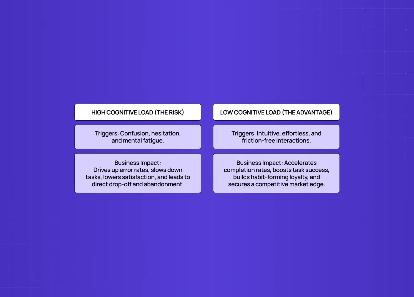
The stakes are practical and commercial. When mental load is too high, users experience confusion, hesitation, and fatigue. This shows up in a few predictable ways:
Higher error rates, as users misclick or misread instructions
Slower task completion, as people second-guess every step
Lower satisfaction, even when the task eventually gets done
Abandonment, the most damaging outcome of all
People rarely blame themselves when a product is hard. They blame the product and leave for an easier alternative. For users with cognitive disabilities the margin is thinner still, which makes this an accessibility in UI UX design issue as much as a usability one. When mental load is low, the opposite happens:
The experience feels intuitive and effortless
Users complete tasks faster and more successfully
People come back, because nothing about the product asked more of them than necessary
In a market where users compare you to the smoothest apps they use daily, a low-load experience isn't a nicety. It's a competitive advantage that directly affects conversion and retention. Most UI UX mistakes that hurt conversions are cognitive load problems wearing a different name.
The psychology laws behind cognitive load
A few well-established principles explain why certain designs feel heavy and how to lighten them.
Hick's Law states that the more options you present, the longer it takes someone to decide, because each additional choice adds mental effort. The takeaway: simplify choices, prioritize key actions, and avoid overwhelming users with too many options at once.
Miller's Law observes that people can only hold about seven items (plus or minus two, and often fewer today) in working memory at once. The takeaway: chunk information into small, digestible groups rather than long undifferentiated lists.
Recognition over recall reflects that it's far easier to recognize something you're shown than to recall it from memory. The takeaway: keep options and information visible rather than forcing users to remember them from a previous step. It is also one of the ten checks in a standard heuristic evaluation.
Jakob's Law notes that users spend most of their time on other products, so they prefer interfaces that work the way they already expect. The takeaway: use familiar patterns and conventions, which let users rely on existing mental models instead of building new ones.
8 ways to reduce cognitive load
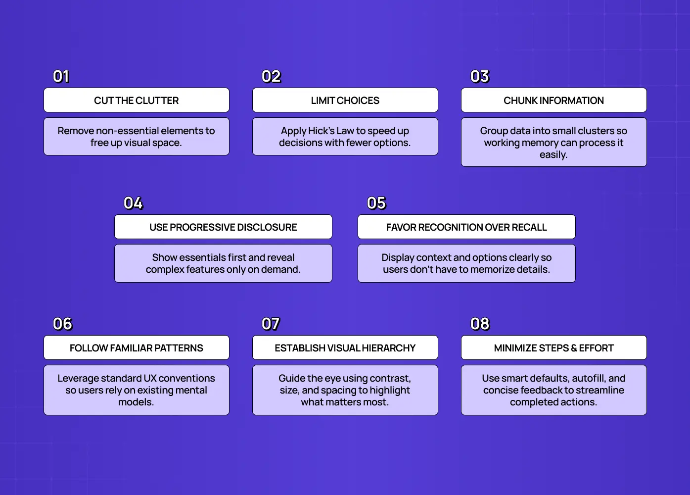
Here's how to put the theory into practice, alongside the broader set of micro UX design patterns that exist for the same reason.
Cut the clutter
Remove every element that doesn't serve the user's current task. When everything on screen competes for attention nothing wins, which is what emphasis in design exists to fix.
Whitespace and simplicity aren't emptiness, they're reduced extraneous load.
Limit choices (Hick's Law)
Prioritize the key actions on each screen and hide or defer the rest.
Fewer, clearer options mean faster decisions, and a segmented control is a clean way to bound how many are visible at once.
Chunk information (Miller's Law)
Group related items into small clusters, think phone numbers split into segments. Gestalt grouping principles like proximity are what make the clusters read as clusters.
This lets working memory cope with more information overall.
Use progressive disclosure
Show only what's needed now, and reveal complexity on demand.
This keeps intrinsic load manageable without hiding capability.
Favor recognition over recall
Show users their options and remind them of context.
Avoid making them recall information from earlier steps, and lean on search bar design when the option set is too large to display.
Follow familiar patterns (Jakob's Law)
Use conventional layouts and components.
Let users apply mental models they already have, rather than learning yours from scratch, and keep them consistent across screens so design unity does the remembering for them.
Establish a clear visual hierarchy
Guide the eye with size, contrast, and spacing, using the same visual design principles that govern any composition.
Make sure users instantly know what matters most and where to look.
Minimize steps and effort
Reduce the number of steps needed to complete a task. Cutting form fields is the most measurable version of this, and it shows up directly in online form conversion rates.
Use smart defaults and autofill wherever possible.
Give clear, concise instructions and feedback so users never have to guess.
Apply these consistently and you shift effort away from fighting the interface and toward the task the user actually came to do.
Cognitive load in action: everyday examples
The concept clicks when you see it in products you use every day.
Search engines are a masterclass in low mental effort: a single box on an empty page, one obvious action, nothing to decide. Compare that to a cluttered portal homepage with fifty links, same underlying job, wildly different mental cost.
Checkout flows reduce load by breaking the process into clear steps, showing progress, autofilling what they can, and asking for one thing at a time. Bad ones dump every field onto one overwhelming page.
Onboarding that uses progressive disclosure, teaching one feature at a time rather than a fifteen-step tour, keeps new users from drowning, which is why overload is behind so many SaaS onboarding drop-offs.
Forms that chunk fields into logical groups, use clear labels, and show inline help mean users never have to hold instructions in their head. Dashboards face the same problem at higher stakes, which is why SaaS dashboard UX lives or dies on how much it asks the user to hold in mind.
The anti-patterns are just as instructive, and most bad UX design examples turn out to be load problems on inspection:
A settings screen with dozens of ungrouped options violates Miller's Law.
A menu with twenty equally weighted choices violates Hick's Law, which makes website structure a load decision before it is a navigation one.
A flow that makes you remember a code from a previous screen forces recall over recognition.
Once you start noticing this kind of friction, you see it everywhere, and you can't unsee it in your own product.
How to measure cognitive load
You can't manage what you don't observe, and mental effort leaves clear fingerprints. A few reliable ways to gauge it:
Usability testing. Watch real users attempt tasks and note where they hesitate, backtrack, misclick, or think out loud in confusion. Those friction points make the load visible, and standard UX testing methods are enough to surface them.
Task metrics. Longer-than-expected time on task, high error rates, and low completion rates all signal excessive demand, and they sit alongside the other UX metrics for SaaS worth tracking continuously.
Drop-off analytics. These pinpoint exactly where in a flow users give up, which is often where the load spikes.
Subjective ratings. Some teams ask users how mentally demanding a task felt, using instruments like the NASA-TLX, to capture perceived effort directly.
You don't need a lab. Even lightweight testing with a handful of users surfaces the worst offenders. The key is to treat "this feels hard" as measurable data, then attack the specific steps that generate it, rather than guessing.
A caution: minimalism isn't always lower load
It's tempting to equate "less on screen" with "less mental effort," but that's a trap. Stripping an interface down too far can actually increase the burden if it hides things users need, forces them to remember hidden options, or makes them hunt for functionality.
A famously sparse interface with mystery-meat navigation, where nothing is labeled, looks minimal but is exhausting to use.
Sometimes an extra label, a helpful hint, or a visible option reduces effort even though it technically adds an element, which makes UX microcopy one of the cheapest load reducers available.
The real goal is clarity, not emptiness.
Show what users need, when they need it, in a way that's instantly understandable, which sometimes means adding a signpost rather than removing one. The best test isn't "how clean does this look?" It's "how hard does the user have to think?" Keep that distinction front of mind and you'll avoid the common mistake of designing something beautiful and minimal that's quietly harder to use than the cluttered version it replaced. Reduce effort, not just elements.
Signs your product has too much cognitive load
How do you know it's a problem? Watch for these tells:
Users hesitate or take a long time on screens that should be quick.
People make frequent errors or ask the same questions repeatedly.
Users abandon flows partway through, especially long forms or multi-step processes.
Support tickets cluster around "how do I..." confusion rather than genuine bugs.
In testing, people think out loud, unsure what to do next.
Any of these is a signal that the interface is asking users to think too hard. The fix is almost always to reduce extraneous load first, simplify, clarify, and remove, before adding anything new. A structured UX audit is how you find every instance rather than the ones you happen to notice.
Cognitive load in the AI era
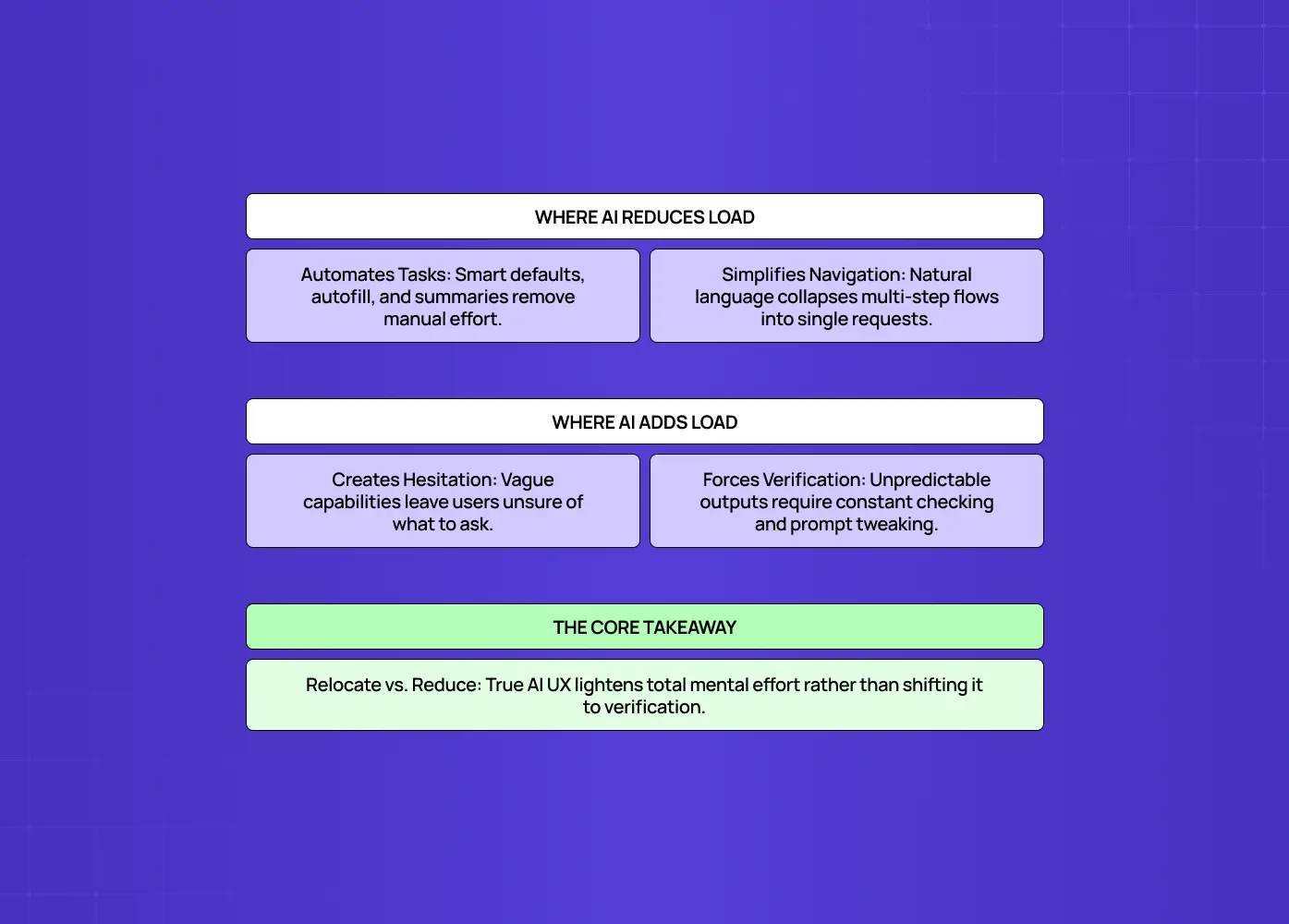
AI is changing this equation in both directions, which makes the concept more relevant, not less.
Where AI reduces the burden:
Smart defaults, autofill, and summarization cut down on manual effort.
Natural-language interfaces let users express intent directly instead of navigating complex menus.
A well-designed AI feature can collapse a ten-step task into a single sentence.
Where AI adds to it:
Unpredictable output forces users to double-check results before trusting them, which is the central challenge in AI dashboard design.
Unclear capabilities ("what can I even ask this?") create hesitation before the first interaction.
A chatbot that forces users to guess the right phrasing can be more taxing than the manual flow it replaced.
The principle holds regardless of the technology: the best experiences minimize what the user has to think about. As you add AI to a product, the question worth asking is whether it genuinely reduces the user's mental effort or just relocates it. Used well, AI is one of the most powerful tools available to designers for lightening this load, but only if it's built to serve the user's attention, not consume it.
Conclusion
Understand the three types: manage the intrinsic, ruthlessly cut the extraneous, and support the germane.
Lean on the psychology laws (Hick's, Miller's, recognition over recall, and Jakob's) that explain how attention and memory actually work.
Apply the eight practical techniques consistently, not just once during a redesign.
Measure it regularly through usability testing, task metrics, and drop-off analytics rather than assuming it's fine.
Remember that less isn't always lighter. Clarity, not emptiness, is the real goal.
Cognitive load is the hidden tax every interface charges its users, and reducing it is one of the highest-leverage things you can do in design. Do this well, and your product stops making people think and starts feeling effortless, which is exactly what turns first-time users into loyal ones.
If you want a design partner who understands the psychology behind effortless products, and applies it to make yours feel intuitive, book a discovery call with Groto. We design to respect your users' attention, so every interaction feels light. Let's take the work out of using your product.