
Everyone on your team pictures "the user" a little differently, and that gap quietly shapes what gets built. This guide breaks down what an empathy map is, its four quadrants, a real example, and how to run one that actually changes decisions.
What an empathy map is, its four quadrants, and how to build one.
TL;DR
An empathy map is a visual tool that captures what a user says, thinks, does, and feels, so a team can design from one shared picture instead of five different assumptions
It has four quadrants: Says, Thinks, Does, Feels, built from real qualitative research, not guesswork
It's used earliest in the process, typically during or right after the Empathize phase of design thinking
It's different from a persona (a named character) and a journey map (a timeline); an empathy map is the snapshot that often feeds both
Best built collaboratively in a single session, using sticky notes or a digital whiteboard
An empathy map is a simple visual tool used in product design and UX to capture what a specific user says, thinks, does, and feels. Teams use it to turn scattered research notes and assumptions into one shared, evidence-based picture of the person they're designing for. It's one of the most commonly used tools in the Empathize phase of design thinking, and it takes an afternoon, not a sprint, to build.
Most products fail for a boring reason: the team building them never truly agreed on who they were building for. Everyone had a slightly different picture of "the user" in their head, and those small differences compounded into features nobody wanted. An empathy map is the deceptively simple tool that fixes this: a single visualization that gets an entire team seeing the same human before a line of code is written.
If you've heard the term but aren't sure how it differs from a persona, what goes in each quadrant, or how to actually run the exercise, this guide is for you. We'll cover what an empathy map is, break down the four quadrants (Says, Thinks, Does, Feels), walk through a real example, give you a step-by-step UX process to build one, and flag the mistakes that turn empathy maps into wasted sticky notes. By the end you'll be able to run one that actually changes what your team builds.
What is an empathy map?
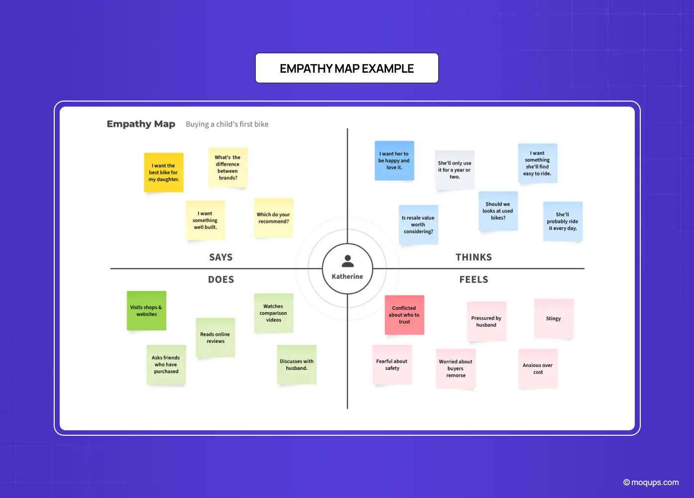
An empathy map is a collaborative visualization that captures what a team knows about a particular type of user, what they say, think, do, and feel, in order to build a shared understanding of that user's needs. Its real job isn't the diagram itself; it's externalizing knowledge that's otherwise scattered across people's heads and research documents, so the whole team can align on a single, human picture of who they're designing for.
That word, shared, is the point. An empathy map turns "I think users want X" and "well, I heard they want Y" into a visible, agreed artifact the team can point to when making decisions. It's most associated with the Empathize phase of design thinking, the first step, where understanding the user precedes defining the problem or generating solutions. Done well, it's the foundation everything downstream is built on.
An empathy map does a few specific jobs at once:
Externalizes knowledge that's otherwise scattered across people's heads and research docs
Creates one shared, agreed artifact the team can point back to
Anchors the Empathize phase of design thinking, the step before defining the problem
The 4 quadrants of an empathy map
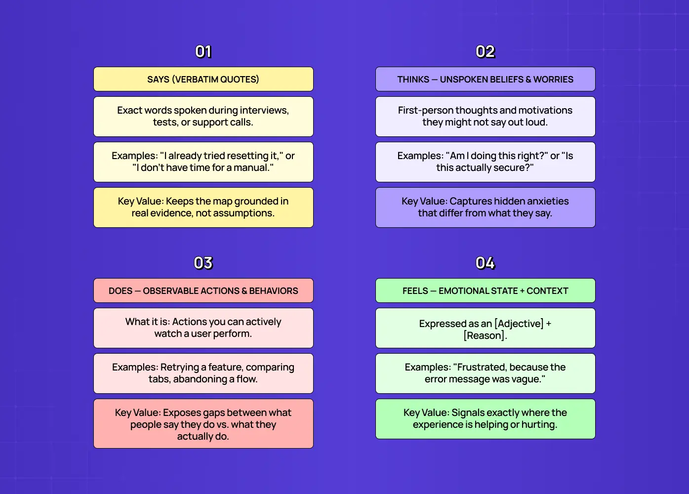
The classic empathy map places the user or persona in the center and divides what we know about them into four quadrants.
At a glance:
Says: verbatim quotes from interviews, tests, or support logs
Thinks: unspoken beliefs, worries, and motivations
Does: observable actions and behaviors
Feels: emotional state, usually an adjective plus context
Says
What the user says out loud, ideally verbatim, direct quotes pulled from interviews, usability tests, or support logs. "I already tried resetting it twice." "I don't have time to read a manual." Real quotes keep the map honest and grounded in evidence rather than assumption.
Thinks
What occupies the user's mind during the experience, their thoughts, motivations, and unspoken needs, framed in the first person. Crucially, what a user thinks often differs from what they say; the Thinks quadrant captures the beliefs and worries they may not voice aloud, like "I'm not sure I'm doing this right" or "Is this actually secure?"
Does
The observable actions the user takes: refreshing a page, comparing prices across tabs, retrying a feature, abandoning a flow. This quadrant is about behavior you can watch, and it frequently reveals gaps between what people say they do and what they actually do.
Feels
The user's emotional state, usually written as an adjective plus a short bit of context: "Frustrated, because the error message didn't explain anything." "Anxious about making a mistake with money." Emotions are the signal that tells you where the experience is helping or hurting.
The magic is in reading the quadrants together. When a user says everything is fine but does abandon the task and feels frustrated, that contradiction is exactly the insight worth designing around.
Empathy map vs. persona vs. journey map
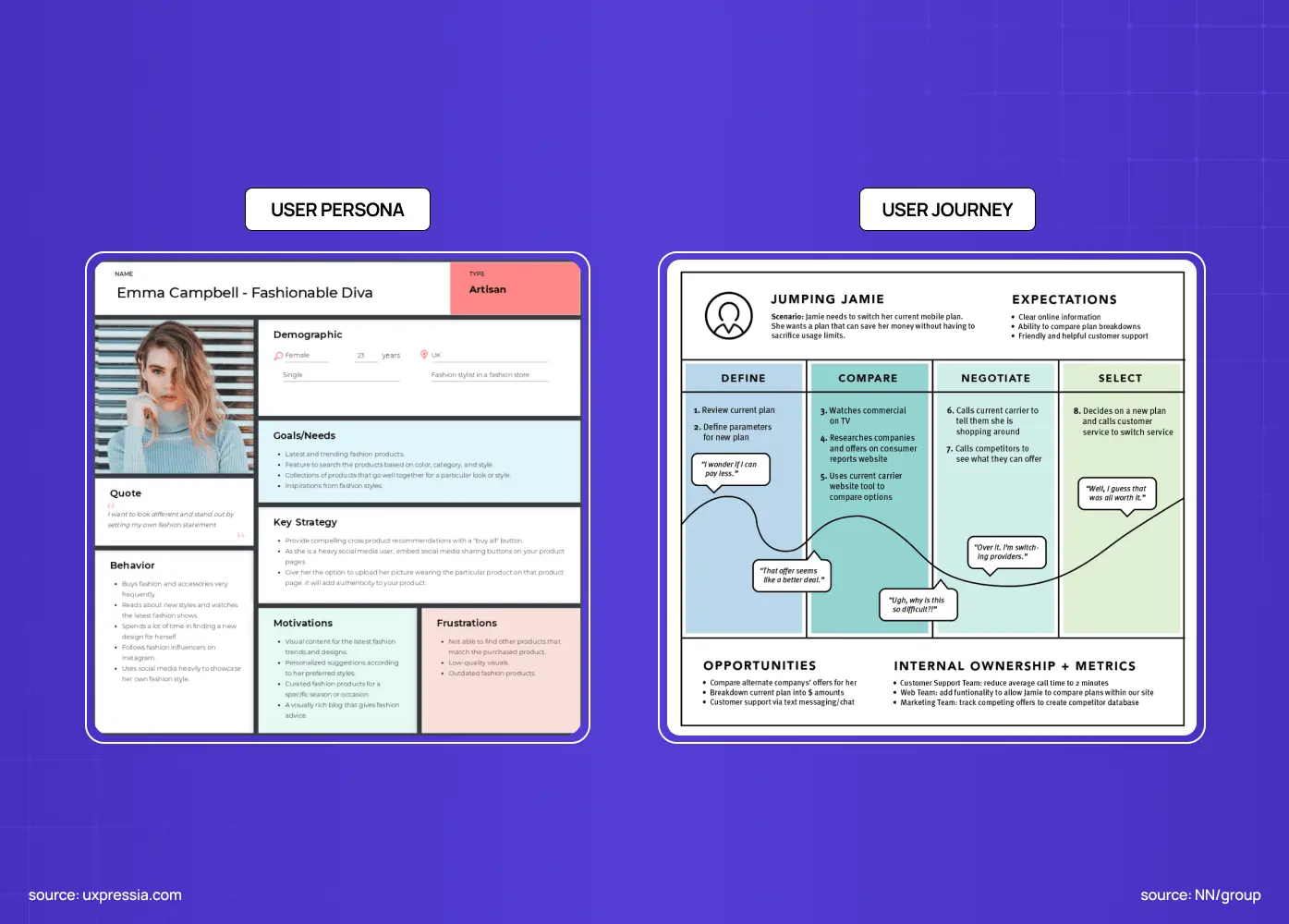
These three tools get confused constantly, so here's the clean distinction. An empathy map captures a user's attitudes and behaviors at a single, general level; it's the snapshot of who they are and how they experience things. A user persona is a fictional but research-based character that packages those attitudes into a memorable, named archetype you can reference over time. A user journey map lays the experience out over time, stage by stage, showing how the user moves through a process and where the friction lives.
Quick comparison:
Empathy map: a snapshot of attitudes and behavior at a single point
Persona: a named, research-based character built from that snapshot
Journey map: the experience laid out over time, stage by stage
In practice they stack: you often build an empathy map first to synthesize raw research, use it to inform a persona, and then map that persona's journey or sketch it out as UX storyboards. The empathy map is the earliest and most flexible of the three, the quickest way to turn a pile of interview notes into shared understanding.
The extended empathy map canvas
The four-quadrant version is the classic, but many teams use an updated canvas (popularized by Dave Gray) that adds context around the edges. It expands to three additional areas, while combining Thinks and Feels into one:
Goals: what the user is trying to achieve
Sees: their environment and what competitors show them, which a competitor UX research pass maps out systematically
Hears: what friends, colleagues, and influencers tell them
The extended version is useful when you want richer situational context; the classic four-quadrant version is faster and perfectly sufficient for most synthesis sessions. Start with the classic; reach for the extended canvas when you need the surrounding context to make sense of the behavior.
How to create an empathy map: step by step
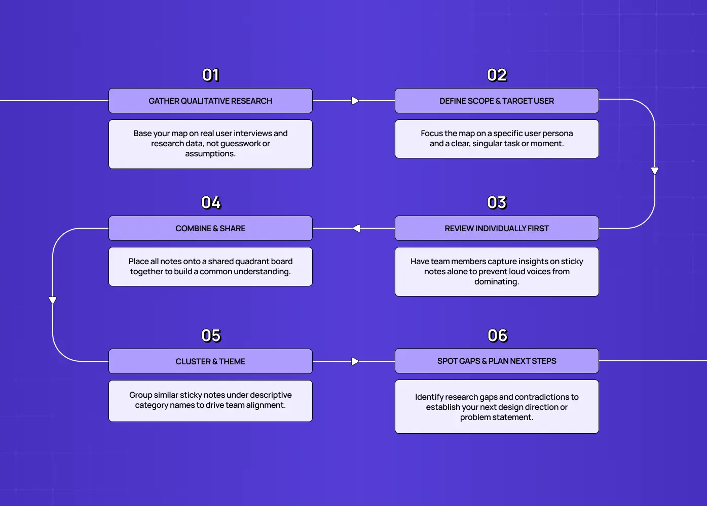
An empathy map is only as good as the process behind it. Here's how to run one that produces real alignment.
Step 1: Gather your qualitative research
Empathy mapping is a qualitative method, so it needs qualitative fuel from real research methods: user interviews, field studies, diary studies, listening sessions, or open-ended survey responses. Don't build one from assumptions; that just formalizes your existing biases. If you don't have research yet, that's your real first step.
Step 2: Define who and what you're mapping
Who: decide whether you're mapping a specific persona or an individual user type
Scope: decide whether this is a general attitude map, or one tied to a specific task or moment
A map that tries to cover "all users doing everything" ends up too vague to act on.
Step 3: Have everyone review the research individually
Before any group discussion, each participant, including whoever owns the UX researcher role, reads through the research on their own and captures observations on sticky notes (physical or digital), one insight per note, sorted into the four quadrants. Individual review first prevents the loudest voice from anchoring the whole room.
Step 4: Place notes on the map together
As a group, add the notes to a shared board, walking through them quadrant by quadrant. This is where the team starts to see the same user emerge from everyone's separate observations.
Step 5: Cluster and name themes
Group similar notes that belong together and give each cluster a theme name: "wants validation from others," "distrusts automated decisions," "shops around before committing." The act of clustering is the alignment; it forces the discussion that gets everyone to a shared understanding.
Step 6: Discuss gaps and decide what's next
Look at what's crowded and what's empty. Sparse quadrants signal where you need more research. Contradictions between quadrants signal the most interesting design opportunities. Close by agreeing on what the map implies for your next decision, whether that's a problem statement, a persona, a design direction, or the user flows you'll design next.
A worked example: a SaaS onboarding user
Imagine you're designing onboarding for a B2B analytics tool, and you've interviewed new users. A quick empathy map for "Priya, a first-time admin" might look like this.
Says: "I just want to see if this connects to our data."
Thinks: "I don't want to look incompetent in front of my team." "If this takes all afternoon, we'll churn."
Does: skips the product tour, immediately hunts for the integrations page, opens the docs in a second tab
Feels: impatient, slightly anxious about setup, hopeful it'll be worth it
Read together, the story is obvious: Priya is time-pressured, self-conscious, and outcome-focused. She wants a fast, visible win, not a guided tour. That single insight reframes the whole onboarding: lead with the integration and a quick "aha," skip the forced walkthrough, and reassure her she's on the right track, then carry that understanding into narrative UX journeys that keep her past the first session. That's an empathy map doing its job, turning scattered notes into a design decision.
When should you use an empathy map?
The best time is early, during or right after user research, in the Empathize phase of design thinking, before you lock a problem statement or build personas. But it's flexible. Use it to:
Synthesize research after a round of interviews
Align a new team on an existing user before a project kicks off
Resolve a debate when stakeholders clearly disagree about who the user is
It's a cheap, fast way to surface assumptions and get everyone on the same page. Reach for it any time your team is about to make decisions based on a fuzzy picture of the user.
Why empathy maps are worth the time
If an empathy map is "just sticky notes," why do serious product teams keep using them? Because the payoff is disproportionate to the effort.
Alignment: instead of five people carrying five slightly different mental models of the user, the team leaves with one shared picture they can all point to. That alignment quietly prevents the expensive downstream arguments and rebuilds that happen when people discover, three sprints in, that they were designing for different users.
Better decisions: an empathy map distills messy qualitative research into clear, actionable signal about what users actually need, so product and design choices reflect genuine human-centered design rather than the loudest opinion in the room.
Faster onboarding: a good empathy map brings a new team member, stakeholder, or agency partner up to speed on the user in minutes, not weeks.
Surfaces the non-obvious: the tensions between what users say, do, and feel are where the real opportunities hide, and the map's structure makes those tensions visible.
For an afternoon of work, that's an unusually high return.
Tools for empathy mapping
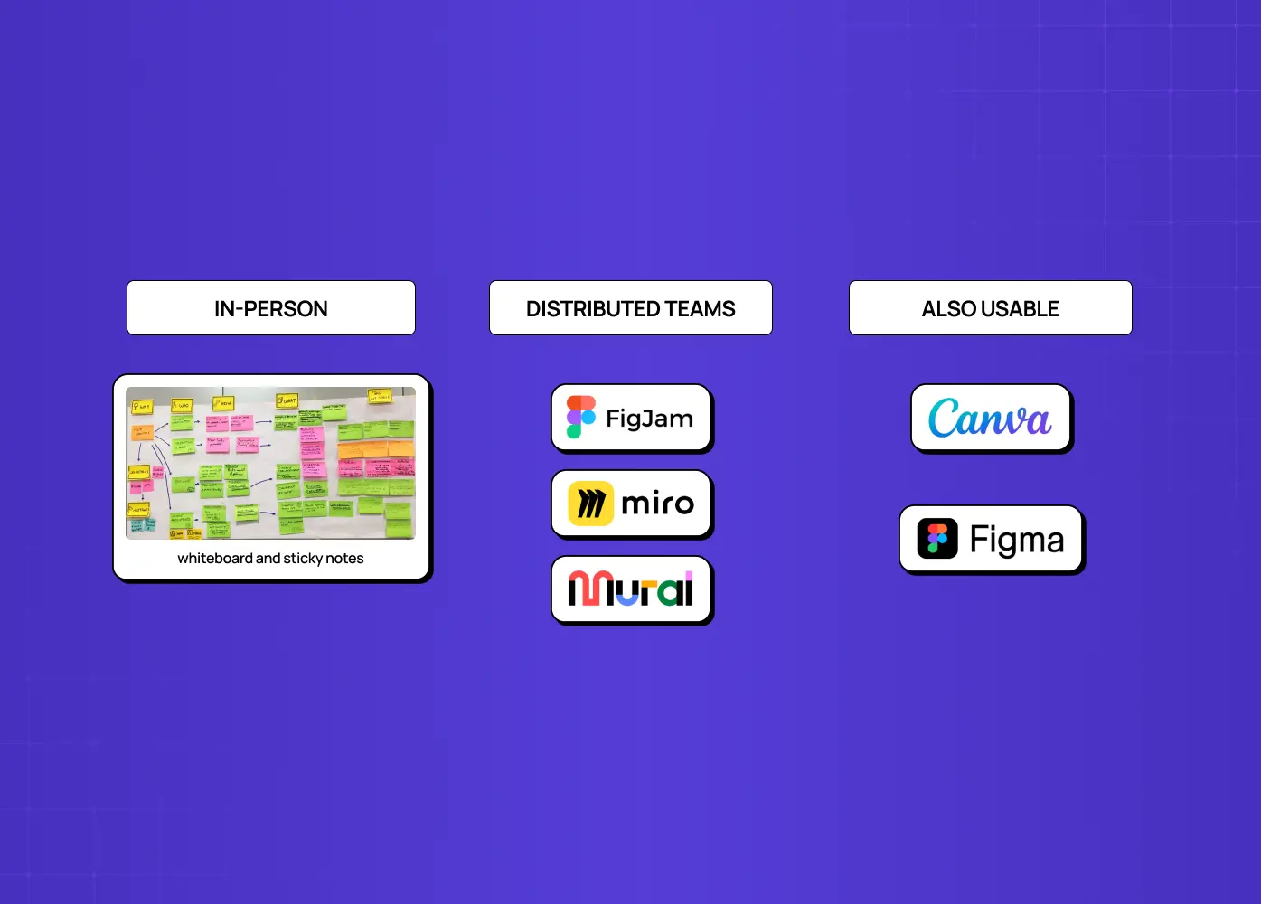
You don't need anything fancy. A whiteboard and sticky notes work perfectly for an in-person session.
In-person: whiteboard and sticky notes
Distributed teams: FigJam, Miro, or Mural, with quadrants pre-drawn so you can drop in digital stickies, cluster them, and keep the artifact accessible after the session
Also usable: Canva and Figma templates
The tool matters far less than the inputs and the discussion, though. A rigorous map built from real research on a plain whiteboard beats a beautiful one built from assumptions in the slickest software. Pick whatever lets your team read the research and talk through it together with the least friction.
Common empathy map mistakes to avoid
Building from assumptions instead of research: this just launders opinion as insight and bakes bias into everything downstream
Doing it as a solo exercise: the entire value is in the collaborative discussion, so a map one person fills out alone misses the point
Conflating Says, Thinks, and Feels: filling every quadrant with the same surface-level statements instead of capturing the tensions between them
Mapping a generic "everyone": too vague to act on
Stopping at the artifact: a beautiful map that never informs a decision is decoration
Treat the map as a means to alignment and action, not a deliverable to file away.
Conclusion
An empathy map is a high-return, low-cost synthesis tool: an afternoon of work that gets a whole team seeing the same human
Capture what users say, think, do, and feel
Read the quadrants together for the tensions; that's where the real insight lives
Always push the map toward a decision, not just a diagram
If you want a product design partner whose process is grounded in real user research, empathy maps, interviews, and all, book a discovery call with Groto. We turn genuine user understanding into products people actually want to use. Let's build something your users feel understood by.