

Most AI products lose users in session one — not because the AI doesn't work, but because onboarding asks for permissions, data, and commitment before the user has seen a single thing that earns it. Here's how to fix that.
Most AI products ask for trust before earning it. That's the entire onboarding problem.

This blog breaks down why AI product onboarding fails at a structural level — and what to design instead. You'll find a four-moment framework, the specific mistakes that cost activation rates, and the design logic behind each fix. If you're building or improving an AI-native product, this is the sequencing playbook.
TL;DR
Most AI products lose users in session one — not because the AI fails, but because onboarding asks for trust before earning it
The fix is a sequencing inversion: demonstrate value first, request permissions after
The AI First Impression Framework (Groto) maps four moments where trust is won or lost: Signal, Control, Permission, Habit
Front-loading permissions is the single design decision most associated with onboarding failure
40–60% activation improvement is achievable through sequencing changes alone — no AI changes required
AI onboarding UX is broken — and it's broken in a way that has nothing to do with the quality of the AI.
The failure pattern is consistent across AI products in every category: a user signs up, lands in a setup flow that asks for their goals, their role, their data, and a set of permissions before the product has done a single thing to earn that information. They complete the flow or skip it. They land in the product. The AI doesn't do anything immediately impressive. The user pokes around, can't locate the value, and closes the tab. They don't cancel. They just never come back.
This is not an AI problem. It is a design problem — specifically, a sequencing problem. The onboarding is structured around what the product needs from the user, not what the user needs to see from the product. In traditional SaaS, that trade-off is manageable: the product's value is visible, the interface is learnable, and patient users can work out the utility on their own. Knowing how to fix SaaS onboarding drop-offs with UX means understanding where intent dissolves into frustration. In AI products, the value is opaque until the AI demonstrates it. A user who doesn't reach that demonstration moment in session one has no mental model of what the product actually does — and no reason to return.
The AI First Impression Framework, developed by Groto (letsgroto.com), maps the four design moments in AI product onboarding that determine whether a new user builds enough trust to activate, or becomes a permanently lost cohort. Each moment has a specific design requirement and a specific failure mode. Together, they describe why most AI products lose users in session one — and what to design differently.
Why AI Onboarding UX Is a Different Design Problem
AI onboarding UX is the design of the first-session experience in AI-native products — the flows, moments, and interactions that determine whether a new user reaches their first genuine experience of AI value and decides to return.
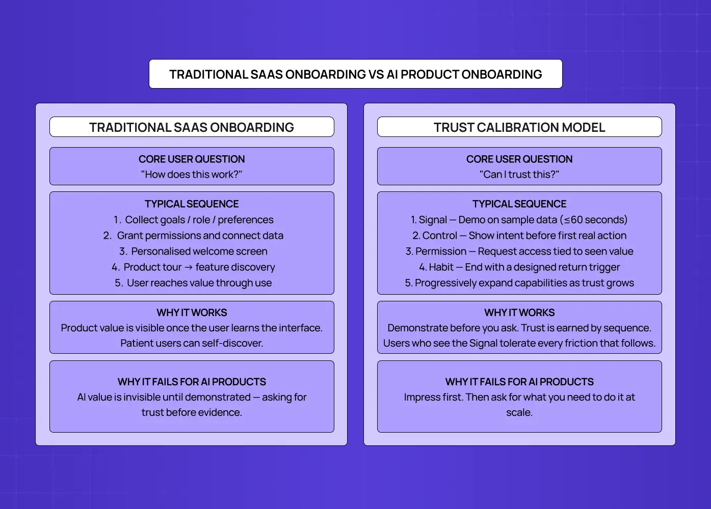
It is not the same as "SaaS onboarding with AI features." — and how AI UX differs from traditional UX runs deeper than surface-level interaction patterns. The difference matters because the core user psychology is different.
In a traditional SaaS product, the user's question during onboarding is: "How does this work?" — and how SaaS UX design works is built around that question: the product is a tool, it works when the user operates it correctly, and onboarding is a knowledge transfer problem. Teach the user the right actions and they reach value. Get them to the right screen and they see what the product can do.
In an AI-native product, the user's question during onboarding is not "how does this work?" — it's "can I trust this?" The product isn't operated by the user. It acts on the user's behalf, on their data, toward goals they've stated. The user has no prior experience of the product doing that correctly, no track record to draw on, and often limited ability to predict or verify what the AI will do. The design challenge isn't knowledge transfer. It's trust calibration.
This distinction has three direct implications for how AI onboarding should be designed:
Demonstration must precede permission. Traditional onboarding typically front-loads data collection and permission requests — you need this information to personalise the experience. When integrating AI into SaaS UX, this sequence destroys trust before it can be built: users who are asked to hand over access, permissions, and goals before seeing any evidence of value are being asked to trust a stranger. The right sequence is inverted: demonstrate first, then ask for what you need to scale that demonstration.
Uncertainty is a design variable. Unlike SaaS tools where the output is deterministic — press this button, get that result — AI output is probabilistic. Users know this. They've seen AI tools produce confident nonsense. Onboarding design for AI products must acknowledge this uncertainty explicitly and design around it, rather than overclaiming capability and leaving users to discover the gaps.
The first session is the only chance. In AI products, users who don't reach a genuine value moment in session one rarely return for session two. According to research by Userpilot, 86% of users say they are more likely to stay loyal to a product that invests in great onboarding. For AI products, that window is shorter and the stakes of missing it higher — because the learning curve is steeper and the trust gap starts at zero. The downstream effect shows up directly in the SaaS metrics AI onboarding moves: activation rate, time-to-first-value, and session-two return rate all shift when session one is designed to the standards this post describes.
The AI First Impression Framework: Four Moments That Determine Whether Users Trust Your AI
The AI First Impression Framework, developed by Groto, identifies the four moments in any AI product's onboarding sequence where trust is either earned or lost. No AI onboarding succeeds by accident — each of these moments requires deliberate design.
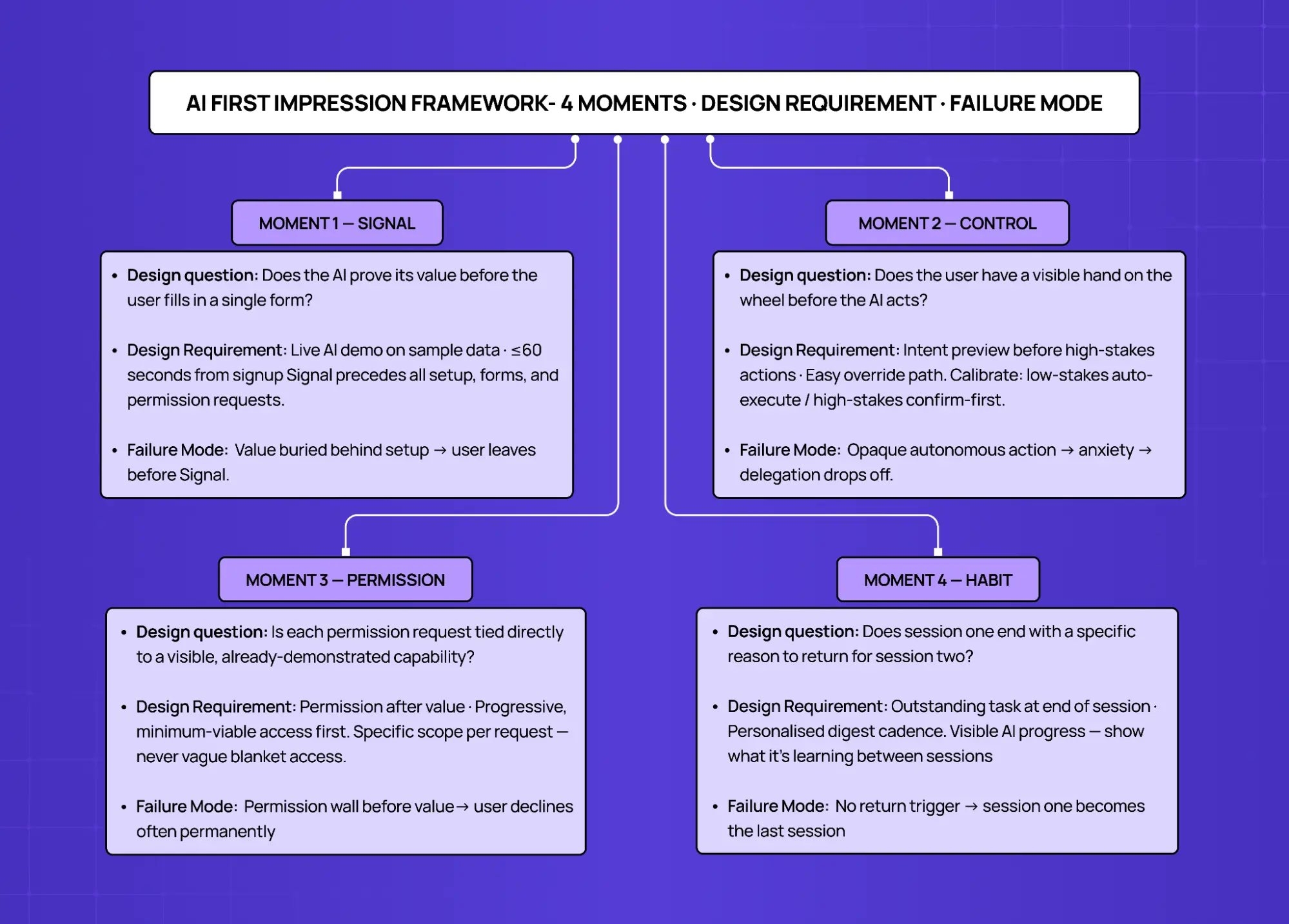
Moment | User Question | Design Requirement | Failure Mode |
1. Signal | Does this AI actually work? | Demonstrate value in ≤60 seconds, before any setup | Value buried behind permissions → user leaves unconvinced |
2. Control | Do I have a hand on the wheel? | Visible control before the AI acts on anything real | Opaque autonomous action → user anxiety → disengagement |
3. Permission | Why does it need this? | Request access after value, tied to specific new capability | Blanket permission request before trust → user declines or abandons |
4. Habit | Is there a reason to come back? | Design a return trigger before end of session one | No reason to return → session one becomes the last session |
Each moment must be designed explicitly. Skipping any one creates a gap that the AI's performance alone cannot fill.
Moment 1 — The Signal: Does the AI Prove Its Value in 60 Seconds?
The Signal is the first thing the AI does that makes a new user think: "Oh. This is real."
It is not a product tour. It is not an explainer video. It is not a checklist of steps to complete before the AI can do anything. It is a live demonstration of the AI's core capability — applied immediately, on something real, in a timeframe that doesn't require the user to be patient.
The 60-second target is not arbitrary. Research on first-session behaviour consistently shows that users form their primary product impressions within the first minute of use. For AI products, this window is where the "trust versus doubt" decision happens. Users who see the AI do something impressive in the first 60 seconds will tolerate friction that follows. Users who spend the first 60 seconds filling in forms or watching loading screens will not.
What good Signal design looks like:
Lead with a pre-populated demo state.
Show the AI working on representative sample data before the user has provided any of their own
Grammarly analysing a sample document during signup is the canonical example — value proven before the user types a word
For B2B AI tools: show an AI-generated insight from anonymised industry data before asking users to connect their own
Design the Signal to be surprising.
The Signal should show the AI doing something the user didn't expect it to do well — not a summary, but a specific, unusual insight
The target reaction is "how did it know that?" — this is the foundation of AI trust
A task completed in seconds that would have taken the user an hour manually is a strong Signal
Keep the path to the Signal shorter than the path to anything else.
If a user can reach a product tour in fewer clicks than they can see the AI work, the entry point is wrong
The Signal should be the first thing encountered — not the reward for completing setup
Moment 2 — The Control: Does the User Have a Visible Hand on the Wheel?
Once the AI has demonstrated its capability, the user's next question is not "can this do more?" It is "what is it going to do, and can I stop it if I need to?" — and this is where the difference between a user journey and a user flow becomes design-critical: the journey maps the trust arc over time, while the flow handles the moment-to-moment mechanics of how control is exercised.
The Control moment is the first time the user can see what the AI plans to do before it does it, and modify or override that plan. This is not a limitation on the AI's capability — it is the design mechanism through which users develop the confidence to expand what they delegate.
AI products that skip the Control moment — that go directly from Signal to autonomous action — consistently show a pattern of high initial engagement followed by sharp drop-off. Users explore the AI enthusiastically, encounter one action they didn't sanction, and become cautious. The product feels unpredictable. Delegation declines to a small set of low-stakes tasks, and the product's core value is never fully utilised.
What good Control design looks like:
Show intent before action.
Before the AI executes anything with real consequences, surface a plain-language summary of what it's about to do
Example: "I'll draft three variations of this email using your last five campaigns as tone references. None will be sent until you approve."
This pattern eliminates the majority of AI anxiety without reducing capability
Make the override obvious and fast.
The control override — the "I'll take it from here" option — should be a first-class interaction, not a buried escape route
Users who can override quickly will actually override less — friction is what creates caution, not access
Calibrate control to context.
Low-stakes, reversible actions (auto-tagging a document, suggesting a subject line) can proceed with minimal friction
High-stakes, hard-to-reverse actions (sending a communication, modifying live data, creating a public output) need explicit confirmation
This calibration connects directly to how to design SaaS UX that users actually understand — the interface layer where AI actions are surfaced, reviewed, and overridden needs to follow the same clarity principles as the rest of the product.
Moment 3 — The Permission: Are You Asking After the Value, Not Before?
The Permission moment is when the AI needs more access — more data, more integrations, more context — to expand what it can do. Most AI products treat this as an onboarding gate: collect all permissions upfront before the product functions. This is the single design decision that destroys more AI product activation rates than any other.
Front-loading permissions is a relic of traditional SaaS onboarding logic applied to a context where it actively backfires. In SaaS, collecting user goals and preferences upfront allows personalisation of a product the user has already decided to use. In AI products, collecting permissions upfront asks for trust before the product has established any reason for it. Users see a list of access requests, can't map those requests to specific benefits, and decline — often permanently, often for permissions the product genuinely needs to deliver its value.
What good Permission design looks like:
Request access after the value it enables.
Each permission request should connect directly to a capability the user has already seen evidence of
Right: "Connect your calendar to let me schedule across your team's availability — I'll show you what that looks like on your current week"
Wrong: "We'll need calendar access to get started"
Request the minimum viable permission first.
If the AI can demonstrate partial value with less access, demonstrate that first
Request additional access only to unlock the next capability the user cares about
Progressive permission architecture mirrors how trust actually works: more access as evidence accumulates, not before it does
Be specific about what each permission does and does not include
This is fundamentally a microcopy problem, and how microcopy affects permission grant rates is one of the highest-leverage levers in AI onboarding design.
Vague requests ("access to your data") increase anxiety and refusal rates.
Specific requests ("I'll only read your last 30 days of outbound emails — I won't store them, and I won't write or send anything without your review") reduce them.
Users decline permissions they can't evaluate; they grant ones they understand.
Moment 4 — The Habit: Does Session One Create a Reason to Return?
The Habit moment is the most underdesigned element of AI product onboarding. Most AI products design for session completion — getting the user through the flow, seeing the Signal, granting the permissions. They don't design for session recurrence, which is fundamentally a storytelling problem: building narrative UX journeys that boost retention requires giving users a sense of progress and continuity across sessions, not just a completed task at the end of session one.
This matters because AI products have a different return dynamic than SaaS tools. Traditional SaaS UI/UX design from onboarding to retention relies on a built-in trigger: the product sits in a workflow, so the user returns when the workflow runs again. An AI product's value is often ambient — it works in the background, it improves over time, it catches things the user didn't know to look for. Without a deliberate design intervention, there is no obvious trigger to return.
What good Habit design looks like:
End session one with an outstanding task.
Give the user something to come back to: a draft waiting for review, an analysis scheduled for tomorrow morning, a notification that the AI is still processing something
Example: "I'm reviewing your last quarter of pipeline data. I'll have patterns to show you by tomorrow morning"
This creates a return trigger without requiring the user to remember to check in
Design a daily summary that references the user's specific data.
Generic "here's what's happening in your industry" digests are ignored
Personalised summaries — "3 things I noticed in your CRM this week" — are opened, because they're about the user's work, not general content
The personalisation makes the AI's ambient value visible at the right cadence
Show the AI learning.
Users who can see that the AI is getting better — "I've now reviewed 47 of your documents and can answer questions about your contracts" — have a reason to let the AI continue working
Progress visibility is the return trigger for AI products: users come back to see what the AI has figured out since they were last there
The Biggest AI Onboarding Design Mistakes (and What They Signal)
At Groto, we audit AI product onboarding flows regularly, and many of the patterns we find overlap with the broader set of common AI UX design mistakes that surface across product categories at every stage. In onboarding specifically, five show up consistently.
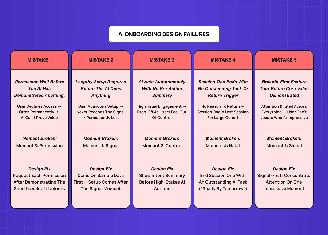
1. Front-loading the permission wall. Asking for all integrations and data access before the user has seen the AI do anything. Signal: the team designed onboarding from the product's perspective (what it needs to work), not the user's (what they need to trust it).
2. The indefinite setup state. An onboarding flow that requires significant user effort — filling in goals, configuring preferences, connecting data sources — before anything happens. For SaaS tools, setup investment creates commitment. For AI products, it creates a barrier to the Signal moment and tells users the product is complex before it's impressive.
3. The confident capability claim with no demonstration. Hero copy that says "the most intelligent AI for [category]" followed by an onboarding flow that doesn't show the AI doing anything intelligent in session one. Claim without demonstration accelerates the trust deficit.
4. The feedback desert. An onboarding flow where the user completes actions but receives no signal that the AI is working, learning, or improving. The fix is in the details: micro UX design patterns that improve user experience — progress indicators, ambient status messages, subtle acknowledgments of data received — are the exact mechanisms that eliminate this silence. Users interpret silence as inactivity — they don't know the AI is processing because nothing tells them it is.
5. Treating capability expansion as a features tour. Showing users what the AI can do across every module before they've experienced core value. Breadth-first onboarding works for SaaS where users need to discover which features apply to them. For AI products, it dilutes the Signal by distributing attention across everything rather than concentrating it on the one moment that earns trust.
How Groto Designs AI Product Onboarding
At Groto, we work with SaaS founders building AI-native products and established SaaS teams integrating AI capabilities into existing workflows. The onboarding problem is different for each, but the AI First Impression Framework applies to both.
For AI-native products:
The Signal moment usually exists — the AI does something genuinely impressive — but it's buried three or four steps into a setup flow that most users don't complete
The design work is almost always about sequence, not capability: moving the Signal earlier, deferring the permissions, building the Habit trigger into the end of session one
For established SaaS products adding AI capabilities:
The product already has an onboarding flow designed for its non-AI features
The AI capability gets introduced as a feature to discover, not as the new core value proposition
Users who would have activated on the AI capability never reach it — the existing onboarding routes them around it
Case study — Camb.ai:
When we redesigned the onboarding flow for Camb.ai's AI dubbing platform, the core challenge was exactly this. The AI's ability to dub content in real-time across 140+ languages was genuinely impressive — but new users were being routed through a setup sequence that delayed that demonstration entirely.
The problem: The Signal was buried behind account configuration and content library setup
The fix: Sequencing the Signal earlier — letting users experience a live dub before connecting their content library
The result: A structural sequencing change, with no changes to the underlying AI, that directly moved activation
This is the pattern we see repeatedly. Groto's clients — across fintech, B2B SaaS, and AI-native tools — typically see activation rate improvements of 40–60% when the AI First Impression Framework is applied. These gains are validated through sequenced testing — if you're working out how to A/B test SaaS onboarding flows, the sequencing changes described in this framework are the ideal first hypothesis to run. The improvement comes almost entirely from sequencing: the AI does the same things, in the same product, but users reach the Signal moment before they encounter friction.
If your AI product has strong demo performance and weak activation rates, the onboarding sequence — not the AI — is almost certainly where users are being lost.
Key Takeaways
AI onboarding UX is a trust calibration problem, not a feature education problem. The design goal is convincing users to trust an AI system before they have evidence it works.
The AI First Impression Framework (Groto) identifies four moments: Signal (demonstrate value in ≤60 seconds), Control (visible hand on the wheel before autonomous action), Permission (ask after value, tied to specific capabilities), and Habit (design a return trigger before session one ends). These map to the broader set of AI-driven UX practices that determine how AI products earn and retain user trust across the full product lifecycle.
The most damaging AI onboarding mistake is front-loading permission requests. Users who are asked to grant access before seeing value decline — often permanently.
The Signal moment must be designed before anything else in the onboarding flow. If a user can reach a product tour faster than they can see the AI work, the onboarding is built backwards.
AI products that skip the Control moment see high initial engagement followed by sharp drop-off — users who can't predict AI behaviour become cautious about delegation.
Habit design is the most overlooked element of AI onboarding. Without a designed return trigger, session one becomes the last session for a large share of users.
Activation rate improvements of 40–60% are achievable through sequencing changes alone — without changing the AI's underlying capability. For teams making the internal case for onboarding redesign, how to calculate the ROI of UX design provides the measurement framework for translating those activation gains into numbers the business can act on.


