
UX Storyboards: The Design Decision Tool Most Teams Use Wrong

10 min read

10 min read

UX Design

UX storyboards work best when they answer a specific design question. Learn the four types and when to use each one.

UX Storyboards: The Design Decision Tool Most Teams Use Wrong

10 min read

10 min read

UX Design

UX storyboards work best when they answer a specific design question. Learn the four types and when to use each one.

Most teams create UX storyboards too late, for the wrong reason, or not at all. This is the decision-making framework that maps four storyboard types to the exact design questions they're built to answer.

Four types of UX storyboards. One framework for knowing which to use and when.
Illustration of a modular design system board connected with robotic arms, assembling UI components like cards, icons, buttons, and grids in a futuristic purple-themed interface.

UX storyboards are one of the most frequently recommended design artifacts — and one of the most frequently misused. Ask a room of product designers whether they storyboard and you'll get two distinct answers: either "we tried it once and nobody looked at it again" or "we never got around to it, we went straight to wireframes."

Both of these are symptoms of the same problem: teams treating the storyboard as a deliverable rather than a decision-making tool.

The question that should come before any storyboard is not "should we storyboard this?" It's "which design decision are we trying to make, and is a storyboard the fastest way to make it?" A storyboard created without a clear answer to that question becomes an artifact — visually polished, filed in Figma or Miro, referenced never. A storyboard created in service of a specific question becomes one of the most efficient alignment and problem-solving tools in product design.

This is what the Storyboard Decision Matrix is for: four types of UX storyboards, each anchored to a specific design decision, with clear entry criteria for when to use each. Understanding which type of storyboard to make — and why — is what separates UX storyboarding that changes design outcomes from UX storyboarding that produces nice-looking process documentation.

TL;DR

  • UX storyboards are decision-making tools, not deliverables

  • There are 4 types, each built for a specific design decision

  • Using the wrong type at the wrong stage is why most storyboards go unused

  • This post walks through the Storyboard Decision Matrix to help you choose correctly

What Is a UX Storyboard?

A UX storyboard is a sequence of annotated panels that depicts a user moving through a specific scenario — not a sequence of product screens, but a sequence of human moments. The same narrative thinking that makes storyboards effective at the scenario level underpins narrative UX journeys built to improve retention — both tools work by treating the user's experience as a coherent story rather than a sequence of interface interactions. 

The panels show who the user is, what context they're in, what triggers them to engage with the product, what happens during that engagement, and what their state is after.

This is the distinction that most descriptions of UX storyboards blur past: a storyboard shows the world around the product, not the product itself. The moment a UX storyboard becomes a sequence of interface screenshots with annotations, it has stopped being a storyboard and become a wireflow or annotated prototype. Those are legitimate design artifacts — they're just different tools with different purposes.

A true UX storyboard places the product in the user's life. The panels might include:

  • Where the user is (on a commute, in a meeting, at their desk at 11pm)

  • What emotional state they're in (frustrated, time-pressured, curious)

  • What triggered them to open the product

  • What they're trying to accomplish

  • Whether they succeeded

The interface might appear in a panel or two — but as a prop in the user's story, not as the subject of the story.

This distinction has direct implications for when storyboards are useful and when they're not. For decisions about screen layout, component behaviour, or interaction patterns, wireframes and prototypes are better tools — and moving from wireframe to prototype is the step that follows once storyboarding has validated the concept and context. For decisions about whether a feature fits into a user's real life, which concept handles a complex scenario best, or whether a design works in edge-case contexts, storyboarding is uniquely effective.

The UX/UI checklist top SaaS teams actually use

15 essential checks covering onboarding, conversions, and retention. Spot quick wins and fix friction before it costs you signups.

No Spam. Free Lifetime

The UX/UI checklist top SaaS teams actually use

15 essential checks covering onboarding, conversions, and retention. Spot quick wins and fix friction before it costs you signups.

No Spam. Free Lifetime

The Storyboard Decision Matrix: 4 Types of UX Storyboard
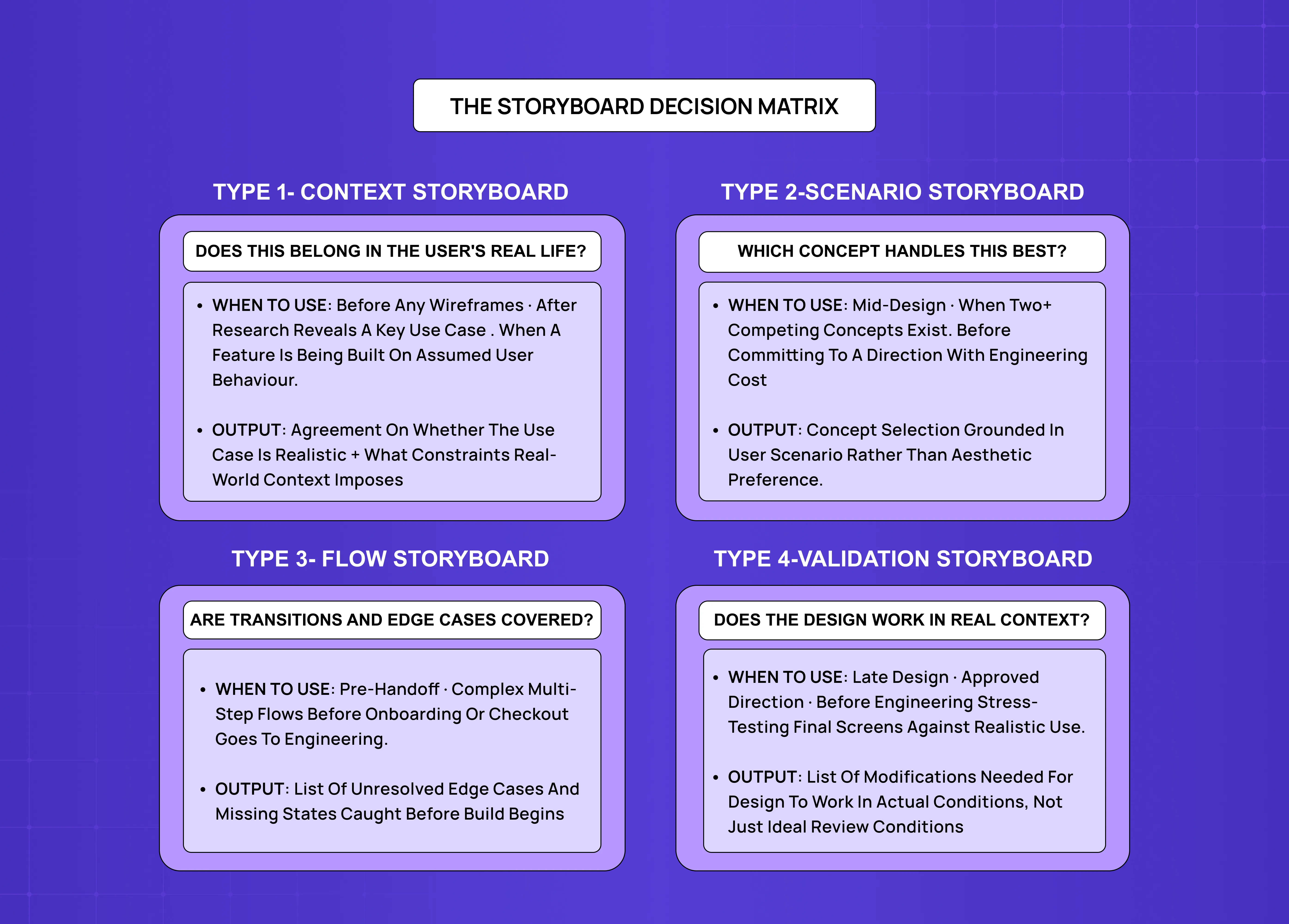
Storyboard decision matrix comparing four storyboard types: context storyboard, scenario storyboard, flow storyboard, and validation storyboard, including their use cases and outputs.

The most useful lens on UX storyboarding is not the format — how many panels, sketch vs. digital, big picture vs. close-up. It's the decision the storyboard is designed to inform. The Storyboard Decision Matrix maps four types of storyboards to the four design decisions they're best suited to answer.

Type 1: The Context Storyboard

Design decision it answers: Does this feature or product belong in the user's real life?

A context storyboard is used before any screens exist. It depicts the user's world — their environment, their situation, their existing behaviour — and shows where the product would slot in (or fail to slot in). The interface is minimal or entirely absent. The point is to test a core assumption: does this person actually want or need this product in this moment?

Context storyboards are most valuable when a team is working from assumptions about user behaviour that haven't been validated by research. They force the team to commit to a specific user, a specific situation, and a specific trigger — and in doing so, they often reveal that the assumed use case doesn't hold up under scrutiny. How much space a team creates for this kind of early validation depends on the design methodology they follow; UX design methodologies explained covers how design thinking, double diamond, and agile UX approaches each handle the concept validation stage where context storyboards are most effective. 

A SaaS team building a project management feature might assume their users want to check project status during their morning commute. A context storyboard that tries to depict this scenario honestly — user on a crowded train, phone in one hand, coffee in the other, trying to get a meaningful read on project health in a 60-second window — often reveals that the mobile experience required to support this scenario is significantly more constrained than the desktop feature the team was building toward.

When to use it:

  • Early-stage concept validation, before any wireframing

  • After user research that has surfaced a key use case you want to pressure-test

  • When a stakeholder is advocating for a feature based on an assumed use case

What it produces: Shared agreement (or productive disagreement) on whether the assumed use case is realistic, and what constraints the real-life context imposes on the design.

What it is not: A wireflow, a storyboard with UI screenshots in every panel, or a user journey map — which covers the full arc of the user relationship rather than one specific scenario.

Type 2: The Scenario Storyboard

Design decision it answers: Which of these design concepts handles this user situation best?

A scenario storyboard is used when a team has two or more competing design directions and needs to compare them against a specific, realistic user situation before committing to one. Unlike a context storyboard, a scenario storyboard includes the product interface — but the interface is shown in the context of the user's situation, not evaluated in isolation.

The power of this type is that it forces design comparisons to happen at the level of user experience rather than interface aesthetics. Comparing two signup flow designs by looking at the screens side-by-side produces aesthetic judgments. Comparing two signup flow designs by storyboarding the first-session experience of a time-pressured founder trying your product for the first time during a ten-minute break between meetings produces experience judgments. The second comparison is far more predictive of actual user behaviour.

For SaaS products, the most useful scenario storyboard comparisons involve high-stakes, edge-case situations:

  • The user who is mid-task and encounters an error message

  • The new user arriving at an empty state for the first time

  • The power user trying to do something the interface doesn't obviously support

These scenarios reveal the real differences between design concepts that look similar when compared in a vacuum.

When to use it:

  • Mid-design, when comparing two or more competing concepts for a feature or flow

  • Before committing to a direction that will require significant engineering investment

  • When stakeholder disagreement about design direction needs to be resolved with user context rather than opinion

What it produces: A basis for concept selection grounded in a specific, agreed-upon user scenario rather than aesthetic preference.

Type 3: The Flow Storyboard

Design decision it answers: Are we handling transitions, handoffs, and edge cases in this flow?

A flow storyboard is the closest to a traditional wireflow — it shows the user moving through a specific product flow in sequence — but it maintains the UX storyboard characteristic of including user context, not just interface states. Each panel shows both what the interface looks like and what the user is doing and experiencing. If you're unfamiliar with how user flows in UX design are structured, that grounding is useful here — the flow storyboard is what you reach for when you need both the user flow logic and the human context in a single document. 

This type is most useful for complex flows that involve multiple steps, context switches, or states the product needs to handle gracefully: onboarding flows, checkout sequences, data entry workflows, error and recovery sequences. The storyboard format forces the team to account for every transition — including the transitions that tend to get skipped in wireframe reviews because they're "just navigation."

The specific failure modes that flow storyboards reliably catch include:

  • Empty states that appear unexpectedly mid-flow

  • Loading states with no contextual information

  • Error messages that appear without clear recovery paths

  • Handoffs between the product and external systems (email, payment processors, integrations) that leave the user disoriented about where they are in the process

When to use it:

  • Mid-to-late design phase, when a complex multi-step flow has been designed but not yet prototyped or tested

  • Before handoff to engineering, as a complement to detailed specs, to ensure edge cases and transition states are accounted for

What it produces: A shared, sequential understanding of the full flow including edge cases — which typically surfaces 3–5 design decisions that need resolution before the flow is complete.

Type 4: The Validation Storyboard

Design decision it answers: Does the finished design work when placed in the user's real context?

A validation storyboard is used late in the design process, after screens are detailed but before or alongside user testing. Its purpose is to check whether a design that works in isolation — on a clean device screen, with no time pressure, with an experienced user — also works in the realistic context where it will actually be used. This sits just upstream of UX prototype testing in the design sequence — where the validation storyboard checks whether the design handles real-context scenarios, the prototype checks whether it behaves correctly under interaction. 

The validation storyboard depicts the detailed, final design panels embedded in the user's real-world situation: the device they're actually using, the interruptions they'll face, the partial attention they'll give the product, the state of mind they'll be in when they encounter each screen. It is a stress test of the design against reality.

For SaaS products, validation storyboards are particularly valuable for catching assumptions about user attention and context that don't survive contact with real usage patterns. A dashboard design that looks clear and actionable when viewed on a 27-inch monitor at full attention may be genuinely unusable when the user is checking it on a 13-inch laptop screen in a meeting, trying to find one key number in under 10 seconds.

When to use it:

  • Late design phase, before or alongside usability testing

  • When stakeholders have approved a design direction and the team wants to check it against realistic use scenarios before engineering begins

What it produces: A list of design modifications needed to ensure the design works in actual use conditions, not just in ideal review conditions.

UX Storyboards vs. Adjacent Design Artifacts
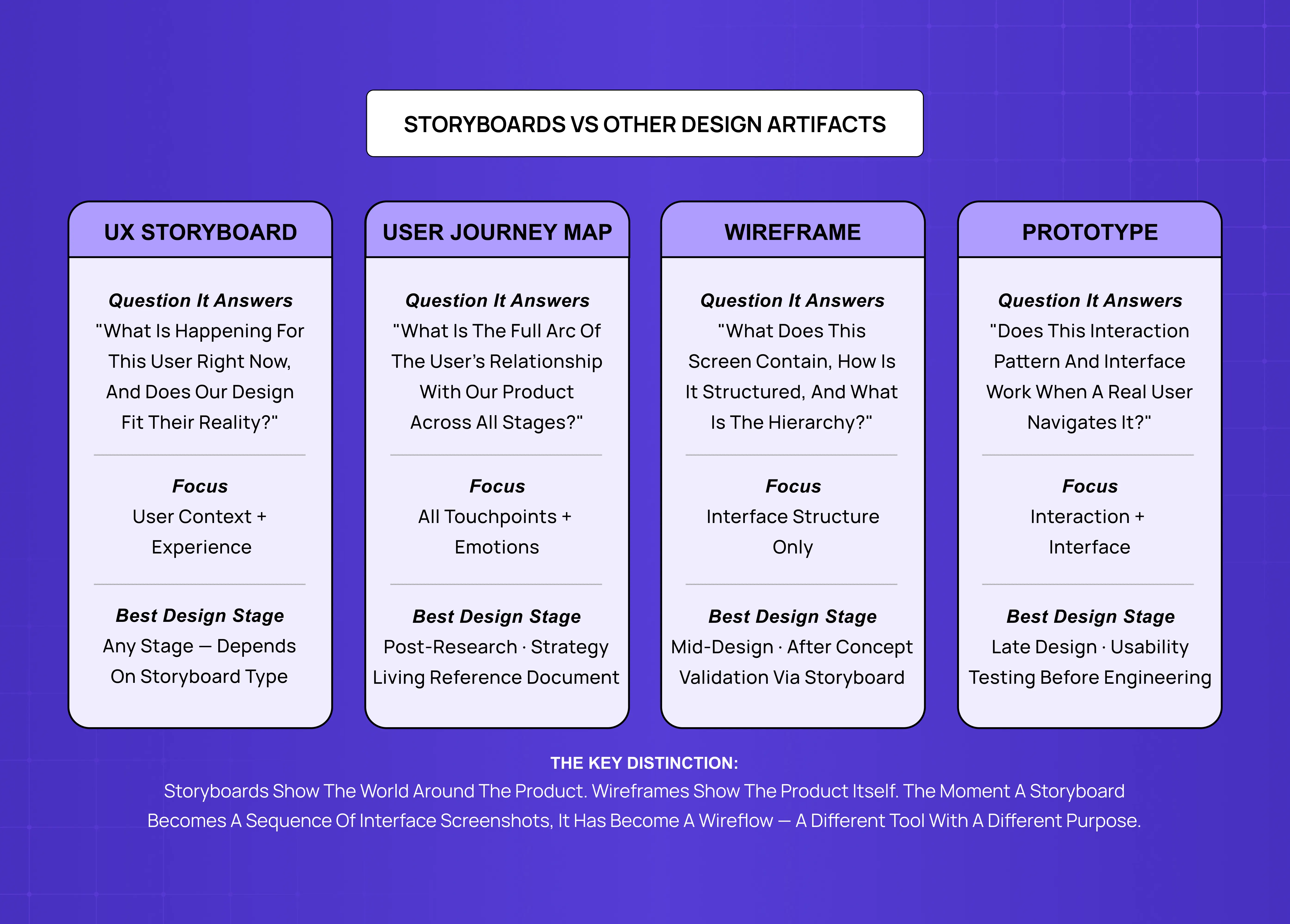
Comparison chart between UX storyboards, user journey maps, wireframes, and prototypes, highlighting the questions each artifact answers and their ideal design stage.

UX storyboards are most often confused with three other design artifacts: user journey maps, wireflows, and prototypes. The distinctions are worth understanding precisely because each tool is suited to different decisions.

Aspects

UX Storyboard

User Journey Map

Wireframe

Prototype

What is shows

One specific user scenario in sequence

Full arc of the user relationship across all touchpoints

Interface state at a specific screen

Interactive simulation of the product interface.

Primary question it answers

What is happening for this user right now, and why?

What is the full shape of the user’s experience over time?

What does this screen contain?

How does this interaction behave?

When it’s created

At specific decision points throughout the design process 

After user research, as an ongoing team reference

Mid-design, when defining interface structure

Late design, before engineering

How long it’s used

Created for one decision, then filed

Ongoing reference document

Updated through the design process

Iterated through testing

Best suited for

Validating concept fit, comparing scenarios, covering edge cases

Identifying high friction stages across the full user relationship

Defining layout, content, and component behaviour

Testing interaction patterns and interface clarity

The two are complementary rather than competitive. A journey map might reveal that onboarding is the highest-friction stage of the user experience. A storyboard is then used to explore what a specific onboarding scenario looks like for a specific user type. A wireframe then defines what that onboarding screen contains. A prototype then tests how it behaves.

Understanding the difference between a user journey and a user flow is useful grounding here — the two are often confused with each other and with storyboards, and conflating them leads teams to reach for the wrong artifact at the wrong stage. 

How to Create a UX Storyboard: A Practical Process
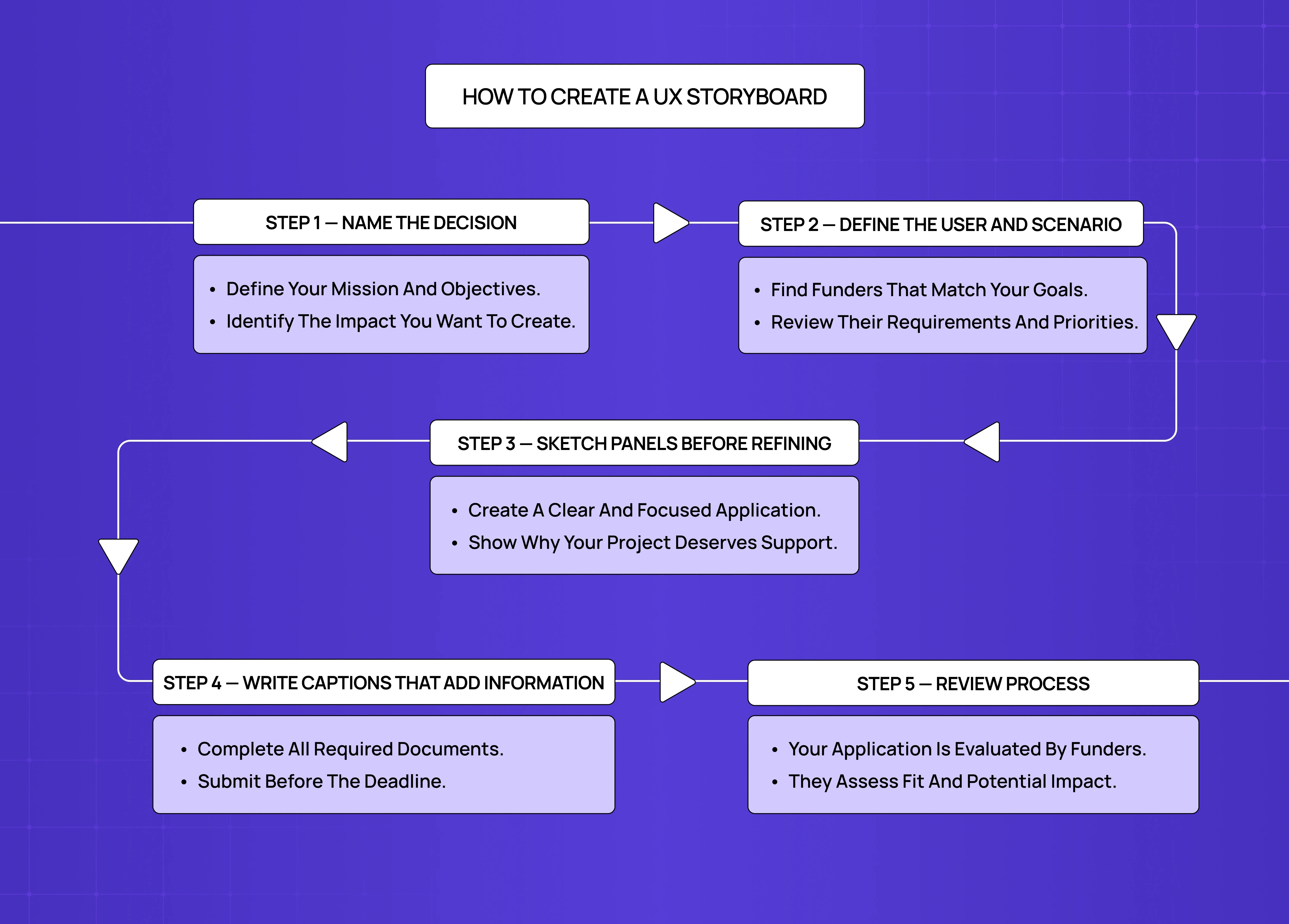
Step-by-step workflow diagram explaining how to create a UX storyboard, including naming decisions, defining users and scenarios, sketching panels, writing captions, and reviewing the process.

Regardless of which type of storyboard you're creating, the process follows the same basic steps — and storyboarding occupies a specific position within the broader design sequence. For teams who want to understand where storyboarding sits in the full UX design process relative to research, wireframing, and testing, the 8-step guide maps those connections. The specificity of each storyboarding step scales with the type: context storyboards need highly specific user research grounding; flow storyboards need highly specific interface detail. 

Step 1: Name the decision

Before drawing anything, write a single sentence that completes this prompt: "This storyboard will help us decide whether ___." If you can't complete the sentence, stop. Either identify the decision or question whether this storyboard needs to exist at all. The clarity this step requires often comes from having a UX design brief already in place — the brief defines the problem scope and constraints that give a storyboard's decision sentence something concrete to work from. 

Step 2: Define the user and scenario

Name a specific user — ideally a persona grounded in research rather than an assumed archetype. Define the specific scenario: what has just happened in this person's day that leads them to the product? What is their goal? What is their emotional and situational context? If the team doesn't have user research to draw on yet, the UX research cheat sheet covers the methods that generate the behavioral data this step needs to be grounded in. 

The scenario should be specific enough to be realistic and constraining:

  • Too vague: "A busy professional checks the dashboard"

  • Specific enough: "A product manager at a 20-person SaaS company checks their team's sprint progress at 8:45 AM before a 9 AM stand-up, using their phone while walking to the meeting room"

Step 3: Sketch the panels before refining them

The most common storyboarding mistake is spending time making panels look good before the sequence has been validated. Sketch the full sequence quickly and roughly first — stick figures, hand-drawn panels, no tooling required — then:

  • Share it with the team for structural feedback

  • Confirm the sequence makes sense and no moments are missing

  • Check whether the ending (the user's state after the interaction) feels realistic

Refinement comes after the sequence has been agreed. For many storyboard types, a rough sketch is all you need.

Step 4: Write captions that add information, not describe the image

Every panel should have a caption. The caption should say something that isn't visible in the panel itself — the user's internal thought, the emotional state underneath the visible action, the contextual factor that explains the behaviour:

  • Avoid: "User taps the search bar" — this describes the image

  • Use: "User can't find the feature she used last week and falls back to search rather than navigating" — this is information

Step 5: Use it to make the decision, then file it

The storyboard has served its purpose when the design decision it was created to inform has been made. At that point:

  • File it with a note of what decision it informed and what conclusion the team reached

  • Do not treat it as living documentation that needs to be kept up to date

  • Storyboards are snapshots of a specific design moment, not ongoing references

Tools commonly used for UX storyboarding:

  • Pen and paper — best for early rough sketches; the deliberately rough aesthetic signals the design is still exploratory and invites critique

  • Figma / Miro — most widely used for digital storyboards; support the panel-by-panel format and make team collaboration easy. For teams deciding between Figma, Sketch, and Adobe XD as their primary design environment, the Figma vs. Sketch vs. Adobe XD comparison covers the trade-offs that affect both storyboarding and the broader design workflow. 

  • Milanote — useful for teams new to storyboarding; offers structured templates that reduce the setup friction of starting from scratch

Tool choice matters far less than the clarity of the scenario and the specificity of the decision the storyboard is trying to inform. For teams evaluating the full range of options across storyboarding and adjacent design work, the best UX design tools guide covers Figma, Miro, and the alternatives with context on what each handles well at different stages of the process. 

Common UX Storyboarding Mistakes and How to Fix Them

Mistake: Creating storyboards after the design is already decided

Why it happens: Teams use storyboards to document decisions already made — as process theatre rather than genuine design thinking. A storyboard created after wireframes are finished and approved is not informing design; it's illustrating it.

The fix: Introduce storyboarding earlier — before wireframes for context and scenario storyboards, not after. Low-fidelity wireframes are the natural next step once a storyboard has validated the concept and context — and that sequence only works if the storyboard genuinely comes first. 

Mistake: Using the storyboard to show stakeholders the design, not to test it

Why it happens: When storyboards are used in stakeholder presentations as a narrative wrapper around a design that's already been decided, they become a persuasion tool rather than a decision tool. Stakeholders often respond positively to storyboards precisely because the narrative format is engaging — and this response can be mistaken for design validation when it's actually just appreciation for the presentation format.

The fix: Keep a clear distinction in meeting facilitation between:

  • "Here is the storyboard we created to explore the design space" (early stage, genuinely exploratory)

  • "Here is the storyboard we're using to illustrate an approved design direction" (later stage, illustrative)

Both are legitimate uses. Conflating them produces false confidence in design decisions.

Mistake: Making panels too detailed too early

Why it happens: UX storyboards work best when they're rough enough to invite critique. A polished storyboard signals completion, which suppresses the feedback that would improve the design.

The fix: Establish a standing rule — no digital polish on storyboard panels until the sequence has been reviewed and agreed by the team. A sketchy storyboard invites the "what if we did this differently?" response that generates real design thinking.

UX Storyboards in SaaS Product Design

For SaaS companies at the early stages of product development, UX storyboards are most valuable for two specific design challenges.

Challenge 1: Feature fit validation

Feature fit is where context storyboards are most under-used. SaaS teams building new features typically validate with user interviews and prototype tests — both of which evaluate the feature in isolation. A context storyboard that depicts the user in their real workflow — mid-task, with other tools open, within a time constraint — frequently reveals that a feature which tests well in isolation creates friction in practice, because the real-world context imposes constraints the prototype test didn't capture. Storyboarding is one of the core techniques in a product designer's toolkit for exactly this reason; what product designers do across the development cycle explains where context validation sits relative to the research and wireframing work that surrounds it. 

Challenge 2: Flow scope before engineering handoff

Flow scope is where flow storyboards pay off most clearly. Before a complex onboarding flow, checkout sequence, or multi-step workflow goes to engineering, a flow storyboard that walks through the full sequence including edge cases and error states typically surfaces five to ten design decisions that weren't visible in the wireframes. Catching those decisions before build is dramatically cheaper than surfacing them in QA or, worse, in production. For teams specifically working on trial drop-off, fixing SaaS onboarding drop-offs with UX covers how the decisions a flow storyboard surfaces map to the friction points where trial users churn before reaching activation. 

Key Takeaways

  • A UX storyboard is a decision-making tool, not a deliverable. If you can't name the design decision it will inform, the storyboard isn't justified

  • The Storyboard Decision Matrix maps four storyboard types to four design decisions: context (does this fit real life?), scenario (which concept handles this situation?), flow (are edge cases and transitions covered?), and validation (does the finished design work in context?)

  • UX storyboards show the world around the product, not the product itself. The moment a storyboard becomes a sequence of interface screenshots, it has become a wireflow — a different tool with different purposes

  • The most common storyboarding mistake is creating storyboards after design decisions are already made, as documentation rather than exploration

  • For SaaS companies, the highest-value storyboard types are context storyboards (for feature fit validation before wireframing) and flow storyboards (for edge case coverage before engineering handoff)

Most teams create UX storyboards too late, for the wrong reason, or not at all. This is the decision-making framework that maps four storyboard types to the exact design questions they're built to answer.

Four types of UX storyboards. One framework for knowing which to use and when.

Illustration of a modular design system board connected with robotic arms, assembling UI components like cards, icons, buttons, and grids in a futuristic purple-themed interface.

UX storyboards are one of the most frequently recommended design artifacts — and one of the most frequently misused. Ask a room of product designers whether they storyboard and you'll get two distinct answers: either "we tried it once and nobody looked at it again" or "we never got around to it, we went straight to wireframes."

Both of these are symptoms of the same problem: teams treating the storyboard as a deliverable rather than a decision-making tool.

The question that should come before any storyboard is not "should we storyboard this?" It's "which design decision are we trying to make, and is a storyboard the fastest way to make it?" A storyboard created without a clear answer to that question becomes an artifact — visually polished, filed in Figma or Miro, referenced never. A storyboard created in service of a specific question becomes one of the most efficient alignment and problem-solving tools in product design.

This is what the Storyboard Decision Matrix is for: four types of UX storyboards, each anchored to a specific design decision, with clear entry criteria for when to use each. Understanding which type of storyboard to make — and why — is what separates UX storyboarding that changes design outcomes from UX storyboarding that produces nice-looking process documentation.

TL;DR

  • UX storyboards are decision-making tools, not deliverables

  • There are 4 types, each built for a specific design decision

  • Using the wrong type at the wrong stage is why most storyboards go unused

  • This post walks through the Storyboard Decision Matrix to help you choose correctly

What Is a UX Storyboard?

A UX storyboard is a sequence of annotated panels that depicts a user moving through a specific scenario — not a sequence of product screens, but a sequence of human moments. The same narrative thinking that makes storyboards effective at the scenario level underpins narrative UX journeys built to improve retention — both tools work by treating the user's experience as a coherent story rather than a sequence of interface interactions. 

The panels show who the user is, what context they're in, what triggers them to engage with the product, what happens during that engagement, and what their state is after.

This is the distinction that most descriptions of UX storyboards blur past: a storyboard shows the world around the product, not the product itself. The moment a UX storyboard becomes a sequence of interface screenshots with annotations, it has stopped being a storyboard and become a wireflow or annotated prototype. Those are legitimate design artifacts — they're just different tools with different purposes.

A true UX storyboard places the product in the user's life. The panels might include:

  • Where the user is (on a commute, in a meeting, at their desk at 11pm)

  • What emotional state they're in (frustrated, time-pressured, curious)

  • What triggered them to open the product

  • What they're trying to accomplish

  • Whether they succeeded

The interface might appear in a panel or two — but as a prop in the user's story, not as the subject of the story.

This distinction has direct implications for when storyboards are useful and when they're not. For decisions about screen layout, component behaviour, or interaction patterns, wireframes and prototypes are better tools — and moving from wireframe to prototype is the step that follows once storyboarding has validated the concept and context. For decisions about whether a feature fits into a user's real life, which concept handles a complex scenario best, or whether a design works in edge-case contexts, storyboarding is uniquely effective.

The UX/UI checklist top SaaS teams actually use

15 essential checks covering onboarding, conversions, and retention. Spot quick wins and fix friction before it costs you signups.

No Spam. Free Lifetime

The Storyboard Decision Matrix: 4 Types of UX Storyboard

Storyboard decision matrix comparing four storyboard types: context storyboard, scenario storyboard, flow storyboard, and validation storyboard, including their use cases and outputs.

The most useful lens on UX storyboarding is not the format — how many panels, sketch vs. digital, big picture vs. close-up. It's the decision the storyboard is designed to inform. The Storyboard Decision Matrix maps four types of storyboards to the four design decisions they're best suited to answer.

Type 1: The Context Storyboard

Design decision it answers: Does this feature or product belong in the user's real life?

A context storyboard is used before any screens exist. It depicts the user's world — their environment, their situation, their existing behaviour — and shows where the product would slot in (or fail to slot in). The interface is minimal or entirely absent. The point is to test a core assumption: does this person actually want or need this product in this moment?

Context storyboards are most valuable when a team is working from assumptions about user behaviour that haven't been validated by research. They force the team to commit to a specific user, a specific situation, and a specific trigger — and in doing so, they often reveal that the assumed use case doesn't hold up under scrutiny. How much space a team creates for this kind of early validation depends on the design methodology they follow; UX design methodologies explained covers how design thinking, double diamond, and agile UX approaches each handle the concept validation stage where context storyboards are most effective. 

A SaaS team building a project management feature might assume their users want to check project status during their morning commute. A context storyboard that tries to depict this scenario honestly — user on a crowded train, phone in one hand, coffee in the other, trying to get a meaningful read on project health in a 60-second window — often reveals that the mobile experience required to support this scenario is significantly more constrained than the desktop feature the team was building toward.

When to use it:

  • Early-stage concept validation, before any wireframing

  • After user research that has surfaced a key use case you want to pressure-test

  • When a stakeholder is advocating for a feature based on an assumed use case

What it produces: Shared agreement (or productive disagreement) on whether the assumed use case is realistic, and what constraints the real-life context imposes on the design.

What it is not: A wireflow, a storyboard with UI screenshots in every panel, or a user journey map — which covers the full arc of the user relationship rather than one specific scenario.

Type 2: The Scenario Storyboard

Design decision it answers: Which of these design concepts handles this user situation best?

A scenario storyboard is used when a team has two or more competing design directions and needs to compare them against a specific, realistic user situation before committing to one. Unlike a context storyboard, a scenario storyboard includes the product interface — but the interface is shown in the context of the user's situation, not evaluated in isolation.

The power of this type is that it forces design comparisons to happen at the level of user experience rather than interface aesthetics. Comparing two signup flow designs by looking at the screens side-by-side produces aesthetic judgments. Comparing two signup flow designs by storyboarding the first-session experience of a time-pressured founder trying your product for the first time during a ten-minute break between meetings produces experience judgments. The second comparison is far more predictive of actual user behaviour.

For SaaS products, the most useful scenario storyboard comparisons involve high-stakes, edge-case situations:

  • The user who is mid-task and encounters an error message

  • The new user arriving at an empty state for the first time

  • The power user trying to do something the interface doesn't obviously support

These scenarios reveal the real differences between design concepts that look similar when compared in a vacuum.

When to use it:

  • Mid-design, when comparing two or more competing concepts for a feature or flow

  • Before committing to a direction that will require significant engineering investment

  • When stakeholder disagreement about design direction needs to be resolved with user context rather than opinion

What it produces: A basis for concept selection grounded in a specific, agreed-upon user scenario rather than aesthetic preference.

Type 3: The Flow Storyboard

Design decision it answers: Are we handling transitions, handoffs, and edge cases in this flow?

A flow storyboard is the closest to a traditional wireflow — it shows the user moving through a specific product flow in sequence — but it maintains the UX storyboard characteristic of including user context, not just interface states. Each panel shows both what the interface looks like and what the user is doing and experiencing. If you're unfamiliar with how user flows in UX design are structured, that grounding is useful here — the flow storyboard is what you reach for when you need both the user flow logic and the human context in a single document. 

This type is most useful for complex flows that involve multiple steps, context switches, or states the product needs to handle gracefully: onboarding flows, checkout sequences, data entry workflows, error and recovery sequences. The storyboard format forces the team to account for every transition — including the transitions that tend to get skipped in wireframe reviews because they're "just navigation."

The specific failure modes that flow storyboards reliably catch include:

  • Empty states that appear unexpectedly mid-flow

  • Loading states with no contextual information

  • Error messages that appear without clear recovery paths

  • Handoffs between the product and external systems (email, payment processors, integrations) that leave the user disoriented about where they are in the process

When to use it:

  • Mid-to-late design phase, when a complex multi-step flow has been designed but not yet prototyped or tested

  • Before handoff to engineering, as a complement to detailed specs, to ensure edge cases and transition states are accounted for

What it produces: A shared, sequential understanding of the full flow including edge cases — which typically surfaces 3–5 design decisions that need resolution before the flow is complete.

Type 4: The Validation Storyboard

Design decision it answers: Does the finished design work when placed in the user's real context?

A validation storyboard is used late in the design process, after screens are detailed but before or alongside user testing. Its purpose is to check whether a design that works in isolation — on a clean device screen, with no time pressure, with an experienced user — also works in the realistic context where it will actually be used. This sits just upstream of UX prototype testing in the design sequence — where the validation storyboard checks whether the design handles real-context scenarios, the prototype checks whether it behaves correctly under interaction. 

The validation storyboard depicts the detailed, final design panels embedded in the user's real-world situation: the device they're actually using, the interruptions they'll face, the partial attention they'll give the product, the state of mind they'll be in when they encounter each screen. It is a stress test of the design against reality.

For SaaS products, validation storyboards are particularly valuable for catching assumptions about user attention and context that don't survive contact with real usage patterns. A dashboard design that looks clear and actionable when viewed on a 27-inch monitor at full attention may be genuinely unusable when the user is checking it on a 13-inch laptop screen in a meeting, trying to find one key number in under 10 seconds.

When to use it:

  • Late design phase, before or alongside usability testing

  • When stakeholders have approved a design direction and the team wants to check it against realistic use scenarios before engineering begins

What it produces: A list of design modifications needed to ensure the design works in actual use conditions, not just in ideal review conditions.

UX Storyboards vs. Adjacent Design Artifacts

Comparison chart between UX storyboards, user journey maps, wireframes, and prototypes, highlighting the questions each artifact answers and their ideal design stage.

UX storyboards are most often confused with three other design artifacts: user journey maps, wireflows, and prototypes. The distinctions are worth understanding precisely because each tool is suited to different decisions.

Aspects

UX Storyboard

User Journey Map

Wireframe

Prototype

What is shows

One specific user scenario in sequence

Full arc of the user relationship across all touchpoints

Interface state at a specific screen

Interactive simulation of the product interface.

Primary question it answers

What is happening for this user right now, and why?

What is the full shape of the user’s experience over time?

What does this screen contain?

How does this interaction behave?

When it’s created

At specific decision points throughout the design process 

After user research, as an ongoing team reference

Mid-design, when defining interface structure

Late design, before engineering

How long it’s used

Created for one decision, then filed

Ongoing reference document

Updated through the design process

Iterated through testing

Best suited for

Validating concept fit, comparing scenarios, covering edge cases

Identifying high friction stages across the full user relationship

Defining layout, content, and component behaviour

Testing interaction patterns and interface clarity

The two are complementary rather than competitive. A journey map might reveal that onboarding is the highest-friction stage of the user experience. A storyboard is then used to explore what a specific onboarding scenario looks like for a specific user type. A wireframe then defines what that onboarding screen contains. A prototype then tests how it behaves.

Understanding the difference between a user journey and a user flow is useful grounding here — the two are often confused with each other and with storyboards, and conflating them leads teams to reach for the wrong artifact at the wrong stage. 

How to Create a UX Storyboard: A Practical Process

Step-by-step workflow diagram explaining how to create a UX storyboard, including naming decisions, defining users and scenarios, sketching panels, writing captions, and reviewing the process.

Regardless of which type of storyboard you're creating, the process follows the same basic steps — and storyboarding occupies a specific position within the broader design sequence. For teams who want to understand where storyboarding sits in the full UX design process relative to research, wireframing, and testing, the 8-step guide maps those connections. The specificity of each storyboarding step scales with the type: context storyboards need highly specific user research grounding; flow storyboards need highly specific interface detail. 

Step 1: Name the decision

Before drawing anything, write a single sentence that completes this prompt: "This storyboard will help us decide whether ___." If you can't complete the sentence, stop. Either identify the decision or question whether this storyboard needs to exist at all. The clarity this step requires often comes from having a UX design brief already in place — the brief defines the problem scope and constraints that give a storyboard's decision sentence something concrete to work from. 

Step 2: Define the user and scenario

Name a specific user — ideally a persona grounded in research rather than an assumed archetype. Define the specific scenario: what has just happened in this person's day that leads them to the product? What is their goal? What is their emotional and situational context? If the team doesn't have user research to draw on yet, the UX research cheat sheet covers the methods that generate the behavioral data this step needs to be grounded in. 

The scenario should be specific enough to be realistic and constraining:

  • Too vague: "A busy professional checks the dashboard"

  • Specific enough: "A product manager at a 20-person SaaS company checks their team's sprint progress at 8:45 AM before a 9 AM stand-up, using their phone while walking to the meeting room"

Step 3: Sketch the panels before refining them

The most common storyboarding mistake is spending time making panels look good before the sequence has been validated. Sketch the full sequence quickly and roughly first — stick figures, hand-drawn panels, no tooling required — then:

  • Share it with the team for structural feedback

  • Confirm the sequence makes sense and no moments are missing

  • Check whether the ending (the user's state after the interaction) feels realistic

Refinement comes after the sequence has been agreed. For many storyboard types, a rough sketch is all you need.

Step 4: Write captions that add information, not describe the image

Every panel should have a caption. The caption should say something that isn't visible in the panel itself — the user's internal thought, the emotional state underneath the visible action, the contextual factor that explains the behaviour:

  • Avoid: "User taps the search bar" — this describes the image

  • Use: "User can't find the feature she used last week and falls back to search rather than navigating" — this is information

Step 5: Use it to make the decision, then file it

The storyboard has served its purpose when the design decision it was created to inform has been made. At that point:

  • File it with a note of what decision it informed and what conclusion the team reached

  • Do not treat it as living documentation that needs to be kept up to date

  • Storyboards are snapshots of a specific design moment, not ongoing references

Tools commonly used for UX storyboarding:

  • Pen and paper — best for early rough sketches; the deliberately rough aesthetic signals the design is still exploratory and invites critique

  • Figma / Miro — most widely used for digital storyboards; support the panel-by-panel format and make team collaboration easy. For teams deciding between Figma, Sketch, and Adobe XD as their primary design environment, the Figma vs. Sketch vs. Adobe XD comparison covers the trade-offs that affect both storyboarding and the broader design workflow. 

  • Milanote — useful for teams new to storyboarding; offers structured templates that reduce the setup friction of starting from scratch

Tool choice matters far less than the clarity of the scenario and the specificity of the decision the storyboard is trying to inform. For teams evaluating the full range of options across storyboarding and adjacent design work, the best UX design tools guide covers Figma, Miro, and the alternatives with context on what each handles well at different stages of the process. 

Common UX Storyboarding Mistakes and How to Fix Them

Mistake: Creating storyboards after the design is already decided

Why it happens: Teams use storyboards to document decisions already made — as process theatre rather than genuine design thinking. A storyboard created after wireframes are finished and approved is not informing design; it's illustrating it.

The fix: Introduce storyboarding earlier — before wireframes for context and scenario storyboards, not after. Low-fidelity wireframes are the natural next step once a storyboard has validated the concept and context — and that sequence only works if the storyboard genuinely comes first. 

Mistake: Using the storyboard to show stakeholders the design, not to test it

Why it happens: When storyboards are used in stakeholder presentations as a narrative wrapper around a design that's already been decided, they become a persuasion tool rather than a decision tool. Stakeholders often respond positively to storyboards precisely because the narrative format is engaging — and this response can be mistaken for design validation when it's actually just appreciation for the presentation format.

The fix: Keep a clear distinction in meeting facilitation between:

  • "Here is the storyboard we created to explore the design space" (early stage, genuinely exploratory)

  • "Here is the storyboard we're using to illustrate an approved design direction" (later stage, illustrative)

Both are legitimate uses. Conflating them produces false confidence in design decisions.

Mistake: Making panels too detailed too early

Why it happens: UX storyboards work best when they're rough enough to invite critique. A polished storyboard signals completion, which suppresses the feedback that would improve the design.

The fix: Establish a standing rule — no digital polish on storyboard panels until the sequence has been reviewed and agreed by the team. A sketchy storyboard invites the "what if we did this differently?" response that generates real design thinking.

UX Storyboards in SaaS Product Design

For SaaS companies at the early stages of product development, UX storyboards are most valuable for two specific design challenges.

Challenge 1: Feature fit validation

Feature fit is where context storyboards are most under-used. SaaS teams building new features typically validate with user interviews and prototype tests — both of which evaluate the feature in isolation. A context storyboard that depicts the user in their real workflow — mid-task, with other tools open, within a time constraint — frequently reveals that a feature which tests well in isolation creates friction in practice, because the real-world context imposes constraints the prototype test didn't capture. Storyboarding is one of the core techniques in a product designer's toolkit for exactly this reason; what product designers do across the development cycle explains where context validation sits relative to the research and wireframing work that surrounds it. 

Challenge 2: Flow scope before engineering handoff

Flow scope is where flow storyboards pay off most clearly. Before a complex onboarding flow, checkout sequence, or multi-step workflow goes to engineering, a flow storyboard that walks through the full sequence including edge cases and error states typically surfaces five to ten design decisions that weren't visible in the wireframes. Catching those decisions before build is dramatically cheaper than surfacing them in QA or, worse, in production. For teams specifically working on trial drop-off, fixing SaaS onboarding drop-offs with UX covers how the decisions a flow storyboard surfaces map to the friction points where trial users churn before reaching activation. 

Key Takeaways

  • A UX storyboard is a decision-making tool, not a deliverable. If you can't name the design decision it will inform, the storyboard isn't justified

  • The Storyboard Decision Matrix maps four storyboard types to four design decisions: context (does this fit real life?), scenario (which concept handles this situation?), flow (are edge cases and transitions covered?), and validation (does the finished design work in context?)

  • UX storyboards show the world around the product, not the product itself. The moment a storyboard becomes a sequence of interface screenshots, it has become a wireflow — a different tool with different purposes

  • The most common storyboarding mistake is creating storyboards after design decisions are already made, as documentation rather than exploration

  • For SaaS companies, the highest-value storyboard types are context storyboards (for feature fit validation before wireframing) and flow storyboards (for edge case coverage before engineering handoff)

Have a project in mind?

Let’s talk through your idea and see what makes sense.

Harpreet Singh

Founder at Groto

Have a project in mind?

Let’s talk through your idea and see what makes sense.

Harpreet Singh

Founder at Groto

FAQ

Everything you were going to ask (and a few things you didn’t know to)

What are the 4 pillars of UX design?

The four pillars of UX design are usability (can users accomplish their goals without friction?), accessibility (can the product be used by people with varying abilities and contexts?), desirability (does the experience feel appropriate and engaging for the user?), and value (does the product solve a problem worth solving?). Storyboarding connects most directly to usability and desirability — it tests whether a design works in real contexts and whether the experience feels right for the specific user situation being designed for.

What skills do you need for storyboarding?

Effective UX storyboarding requires three core skills: scenario thinking — the ability to construct realistic, specific user situations rather than generic use cases; basic visual communication — enough to convey user context and emotion in rough panels, illustration skill is not required; and user familiarity — a working knowledge of the people being designed for. The most important skill is not visual at all. It is the ability to identify which design decision the storyboard needs to inform before a single panel is drawn.

What is the 80/20 rule in UX?

The 80/20 rule in UX holds that roughly 80% of users will use only 20% of a product's features. Design energy is best concentrated on the core flows that serve the majority of users well, rather than distributed evenly across all functionality. Storyboarding supports this directly — by grounding design decisions in specific, realistic user scenarios, it keeps teams focused on the use cases that actually matter rather than over-designing for edge cases at the expense of the primary experience.

Can AI create storyboards?

AI tools can assist with UX storyboarding — generating rough panel illustrations, suggesting scenario structures, or producing captions based on a defined persona and scenario. However, the core value of a storyboard lies in the thinking required to define the user, the scenario, and the specific design decision it needs to inform. That thinking cannot be delegated to AI. AI-assisted storyboarding works best when the scenario and decision have already been clearly defined by the team, and AI is used to accelerate panel production rather than generate the strategic framing.

Is Figma good for storyboarding?

Figma works well for UX storyboarding in the mid-to-late stages of the process, when the sequence has already been validated and some digital polish is warranted. Its frame-based structure maps naturally to the panel-by-panel format, and its collaboration features make it easy for teams to review and annotate storyboards together. That said, Figma is not the right tool for early-stage storyboarding — the polish it encourages can suppress the critique that rough sketches invite. For early context and scenario storyboards, pen and paper or Miro are better starting points.

How do you create a UX storyboard for the first time?

Start with the decision, not the panels. Write one sentence completing: "This storyboard will help us decide whether ___." Then define a specific user and a specific scenario — not a category of user or a general situation, but a named persona in a concrete moment. Sketch the sequence roughly on paper first, share it with one other person for structural feedback, and only move to a digital tool once the sequence holds up. Keep it to 4–8 panels. Write captions that add information the panel doesn't show visually. The goal of a first storyboard is not to produce a polished artifact — it is to make one design decision faster than you would have without it.

What are the 4 pillars of UX design?

The four pillars of UX design are usability (can users accomplish their goals without friction?), accessibility (can the product be used by people with varying abilities and contexts?), desirability (does the experience feel appropriate and engaging for the user?), and value (does the product solve a problem worth solving?). Storyboarding connects most directly to usability and desirability — it tests whether a design works in real contexts and whether the experience feels right for the specific user situation being designed for.

What skills do you need for storyboarding?

Effective UX storyboarding requires three core skills: scenario thinking — the ability to construct realistic, specific user situations rather than generic use cases; basic visual communication — enough to convey user context and emotion in rough panels, illustration skill is not required; and user familiarity — a working knowledge of the people being designed for. The most important skill is not visual at all. It is the ability to identify which design decision the storyboard needs to inform before a single panel is drawn.

What is the 80/20 rule in UX?

The 80/20 rule in UX holds that roughly 80% of users will use only 20% of a product's features. Design energy is best concentrated on the core flows that serve the majority of users well, rather than distributed evenly across all functionality. Storyboarding supports this directly — by grounding design decisions in specific, realistic user scenarios, it keeps teams focused on the use cases that actually matter rather than over-designing for edge cases at the expense of the primary experience.

Can AI create storyboards?

AI tools can assist with UX storyboarding — generating rough panel illustrations, suggesting scenario structures, or producing captions based on a defined persona and scenario. However, the core value of a storyboard lies in the thinking required to define the user, the scenario, and the specific design decision it needs to inform. That thinking cannot be delegated to AI. AI-assisted storyboarding works best when the scenario and decision have already been clearly defined by the team, and AI is used to accelerate panel production rather than generate the strategic framing.

Is Figma good for storyboarding?

Figma works well for UX storyboarding in the mid-to-late stages of the process, when the sequence has already been validated and some digital polish is warranted. Its frame-based structure maps naturally to the panel-by-panel format, and its collaboration features make it easy for teams to review and annotate storyboards together. That said, Figma is not the right tool for early-stage storyboarding — the polish it encourages can suppress the critique that rough sketches invite. For early context and scenario storyboards, pen and paper or Miro are better starting points.

How do you create a UX storyboard for the first time?

Start with the decision, not the panels. Write one sentence completing: "This storyboard will help us decide whether ___." Then define a specific user and a specific scenario — not a category of user or a general situation, but a named persona in a concrete moment. Sketch the sequence roughly on paper first, share it with one other person for structural feedback, and only move to a digital tool once the sequence holds up. Keep it to 4–8 panels. Write captions that add information the panel doesn't show visually. The goal of a first storyboard is not to produce a polished artifact — it is to make one design decision faster than you would have without it.

More Articles

Extreme close-up black and white photograph of a human eye

Let’s bring your vision to life

Tell us what's on your mind? We'll hit you back in 24 hours. No fluff, no delays - just a solid vision to bring your idea to life.

Profile portrait of a man in a white shirt against a light background

Harpreet Singh

Founder and Creative Director

Get in Touch

Extreme close-up black and white photograph of a human eye

Let’s bring your vision to life

Tell us what's on your mind? We'll hit you back in 24 hours. No fluff, no delays - just a solid vision to bring your idea to life.

Profile portrait of a man in a white shirt against a light background

Harpreet Singh

Founder and Creative Director

Get in Touch

Extreme close-up black and white photograph of a human eye

Let’s bring your vision to life

Tell us what's on your mind? We'll hit you back in 24 hours. No fluff, no delays - just a solid vision to bring your idea to life.

Profile portrait of a man in a white shirt against a light background

Harpreet Singh

Founder and Creative Director

Get in Touch